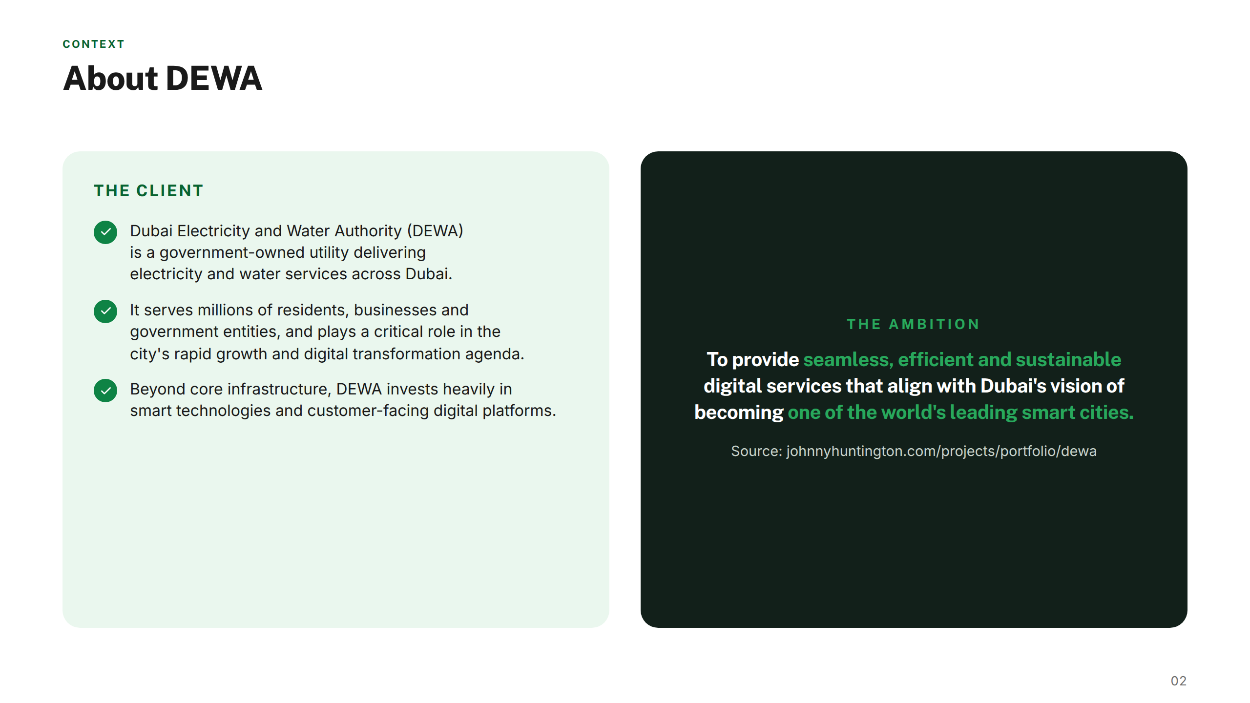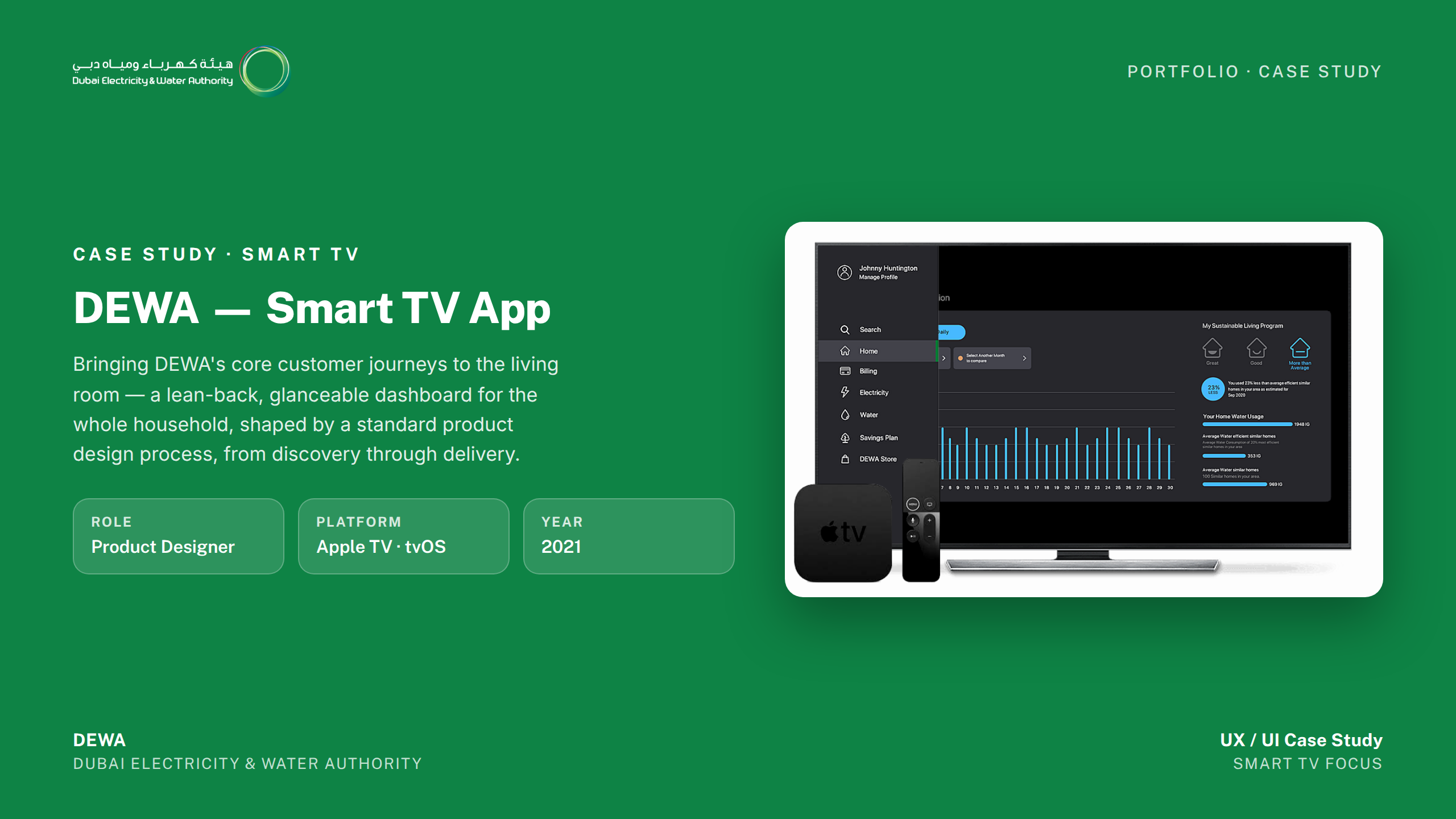
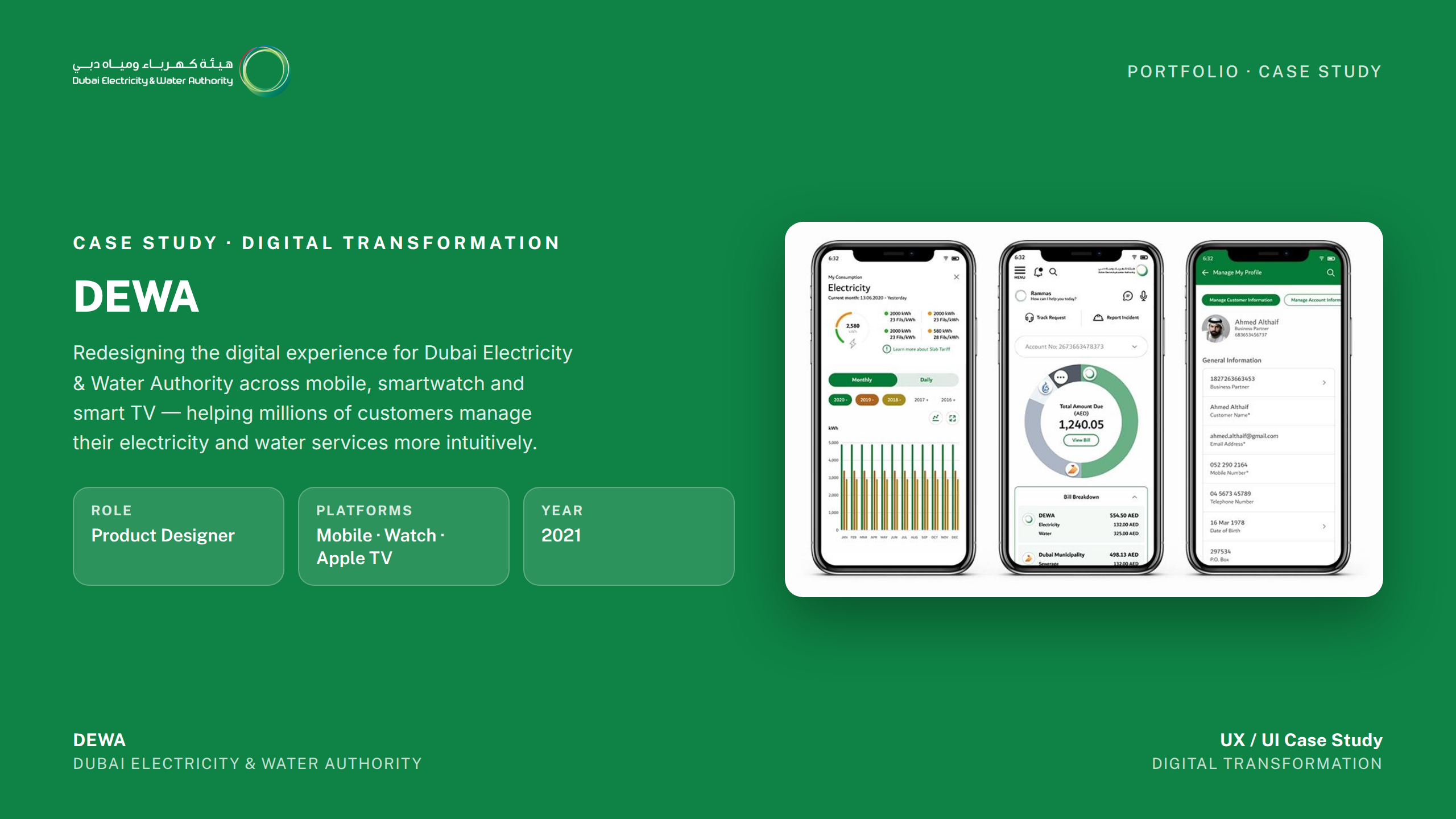
Dubai Electricity and Water Authority (DEWA) is the sole provider of electricity and water services across Dubai — a government entity that serves over 1.1 million customers and manages the infrastructure powering one of the world's fastest-growing cities. DEWA is widely regarded as a global benchmark for utility services, consistently ranked among the top utilities worldwide for efficiency, sustainability, and customer satisfaction.
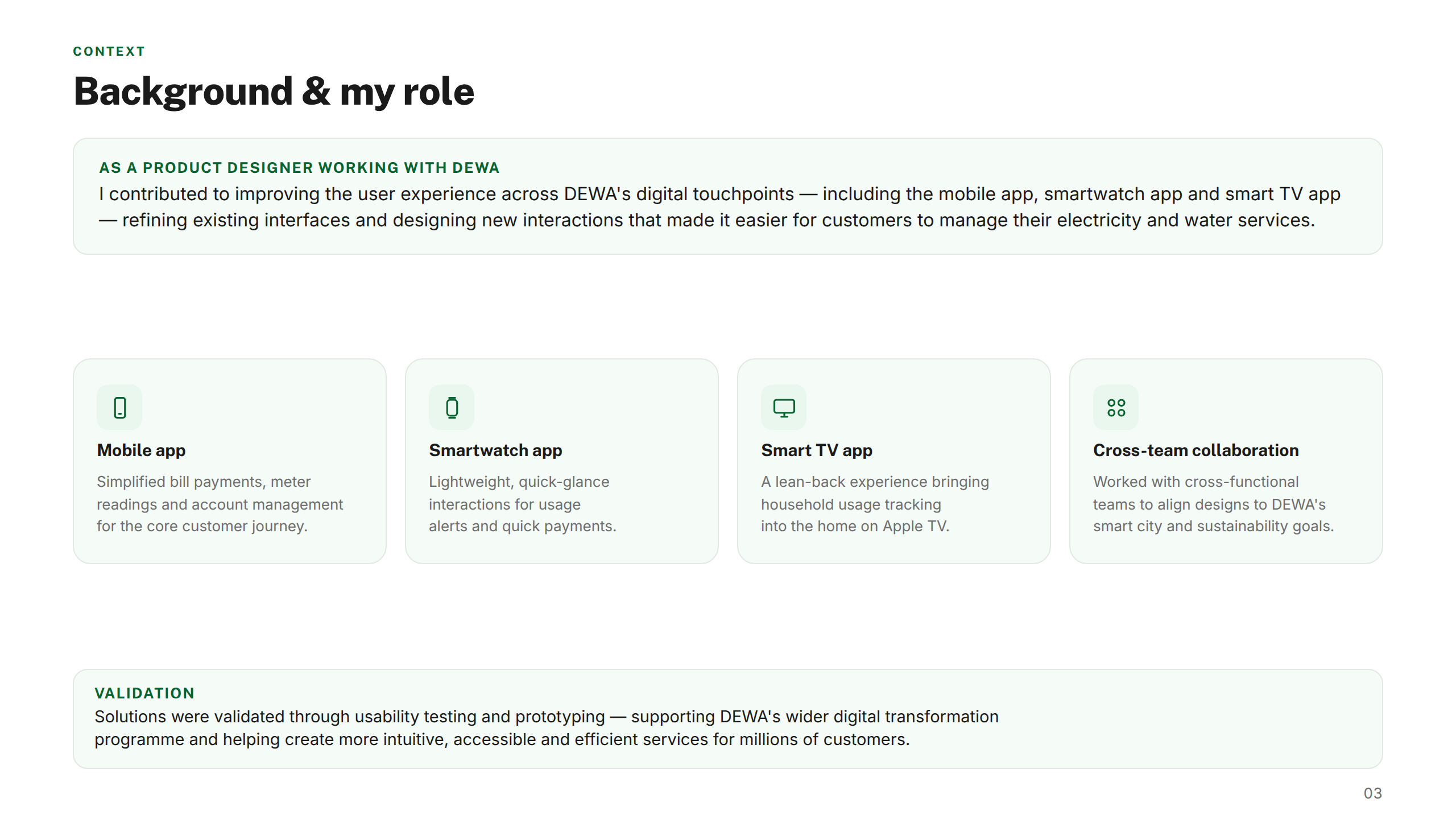
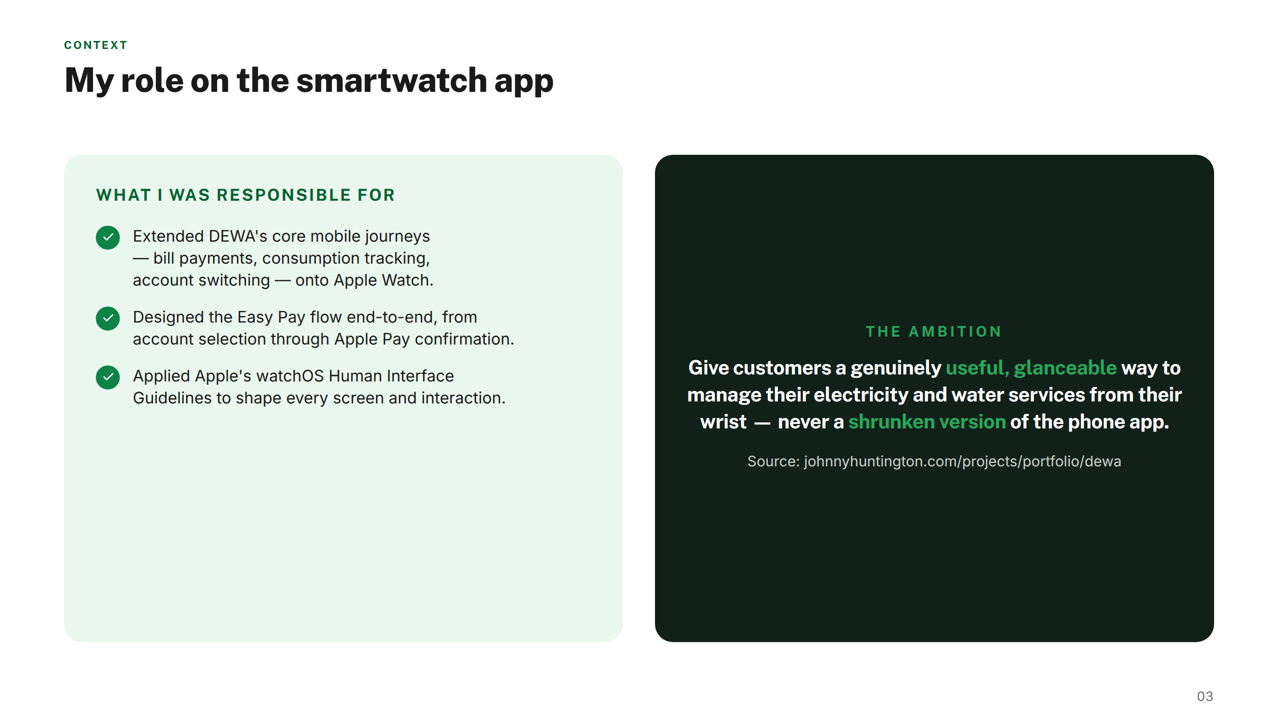
Aligned with Dubai's Smart City vision, DEWA has invested heavily in its digital platforms — giving customers the ability to manage their accounts, track consumption, pay bills, and access services entirely online. Those platforms span a native mobile app serving millions of active users, an Apple Watch companion app, and a Smart TV interface — each needing to deliver the same clarity and accessibility across very different screen contexts. My role was to unify the experience across all three, built on a shared design system foundation.
The challenge
DEWA serves millions of Dubai residents, businesses, and government entities across a sprawling set of digital channels. Customers managed complex tasks — bill payments, meter readings, account management — across mobile, smartwatch, and smart TV, but each platform had grown independently, creating inconsistent experiences at exactly the moments that mattered most.
As part of Dubai's wider smart-city initiative, DEWA needed these touchpoints to feel like one coherent service, not three separate products.
My approach
I mapped the existing digital ecosystem end to end, identifying pain points across every platform and aligning improvements with DEWA's smart-city goals. Rather than designing each app in isolation, I built a shared design language that could flex across screen sizes.
Cross-functional collaboration, usability testing, and prototyping ensured the experience stayed consistent and intuitive from a glance on a smartwatch to a lean-back experience on Apple TV.
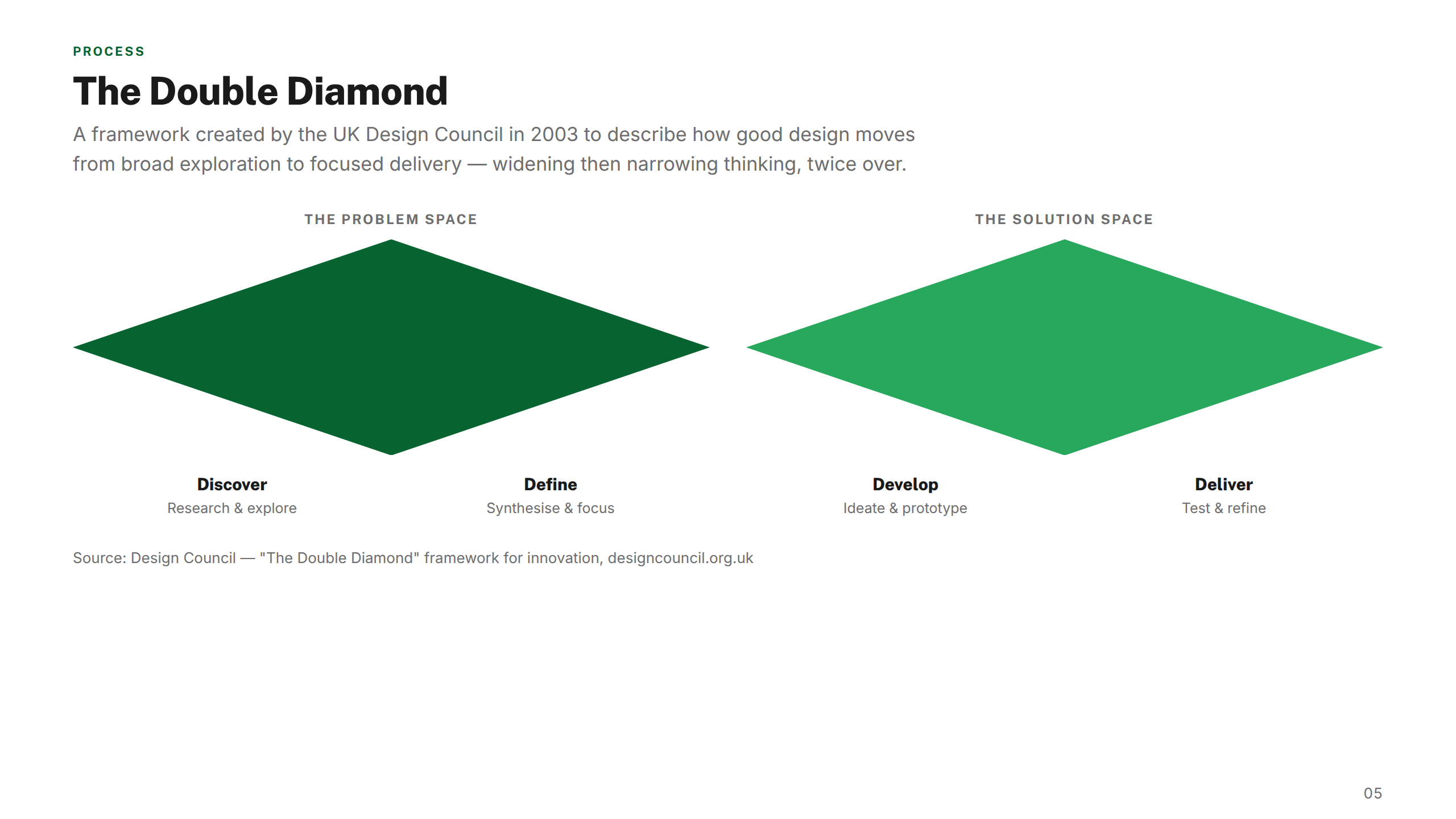
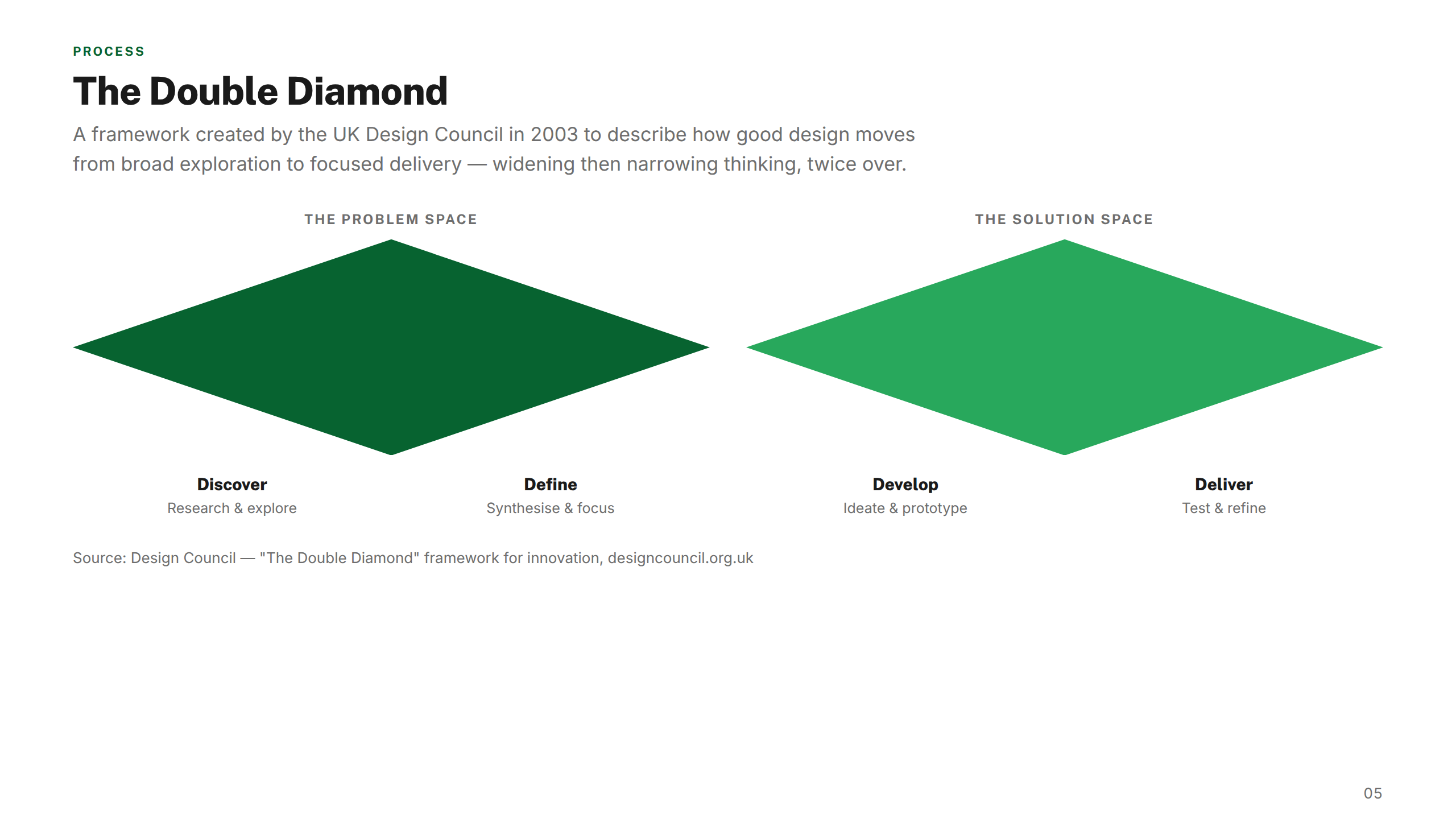
01 — Discover
Research & audit
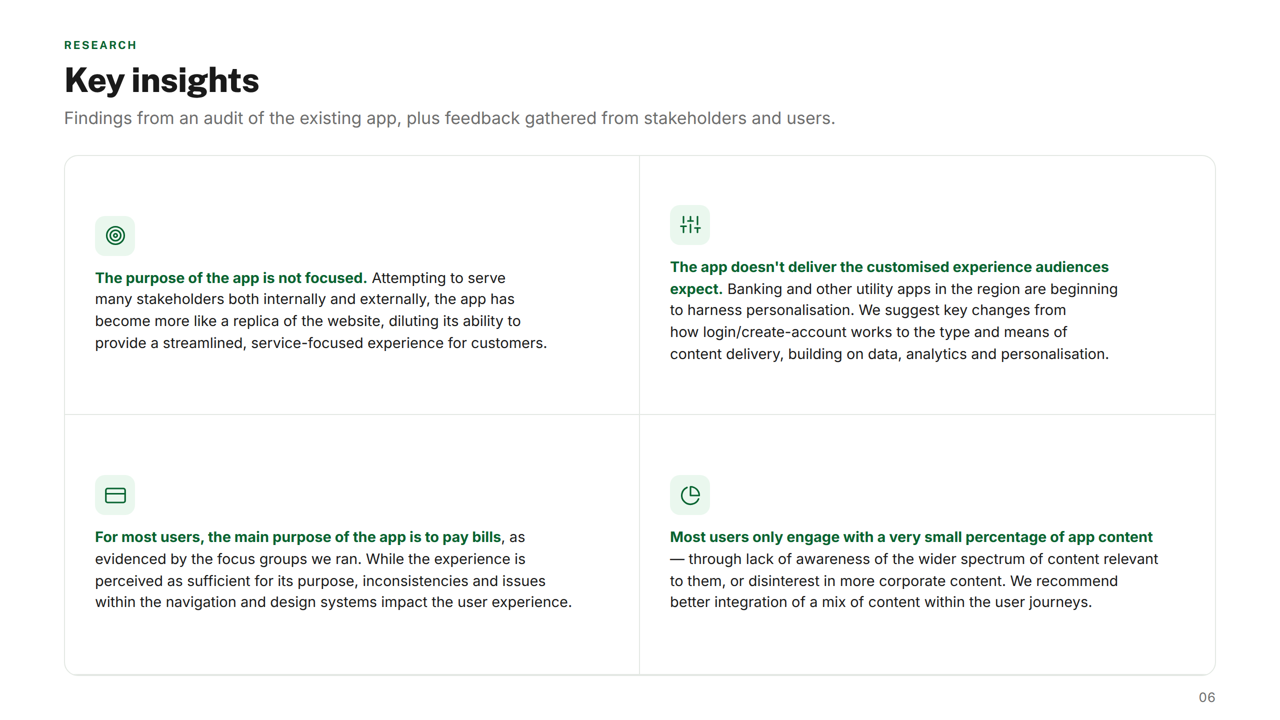
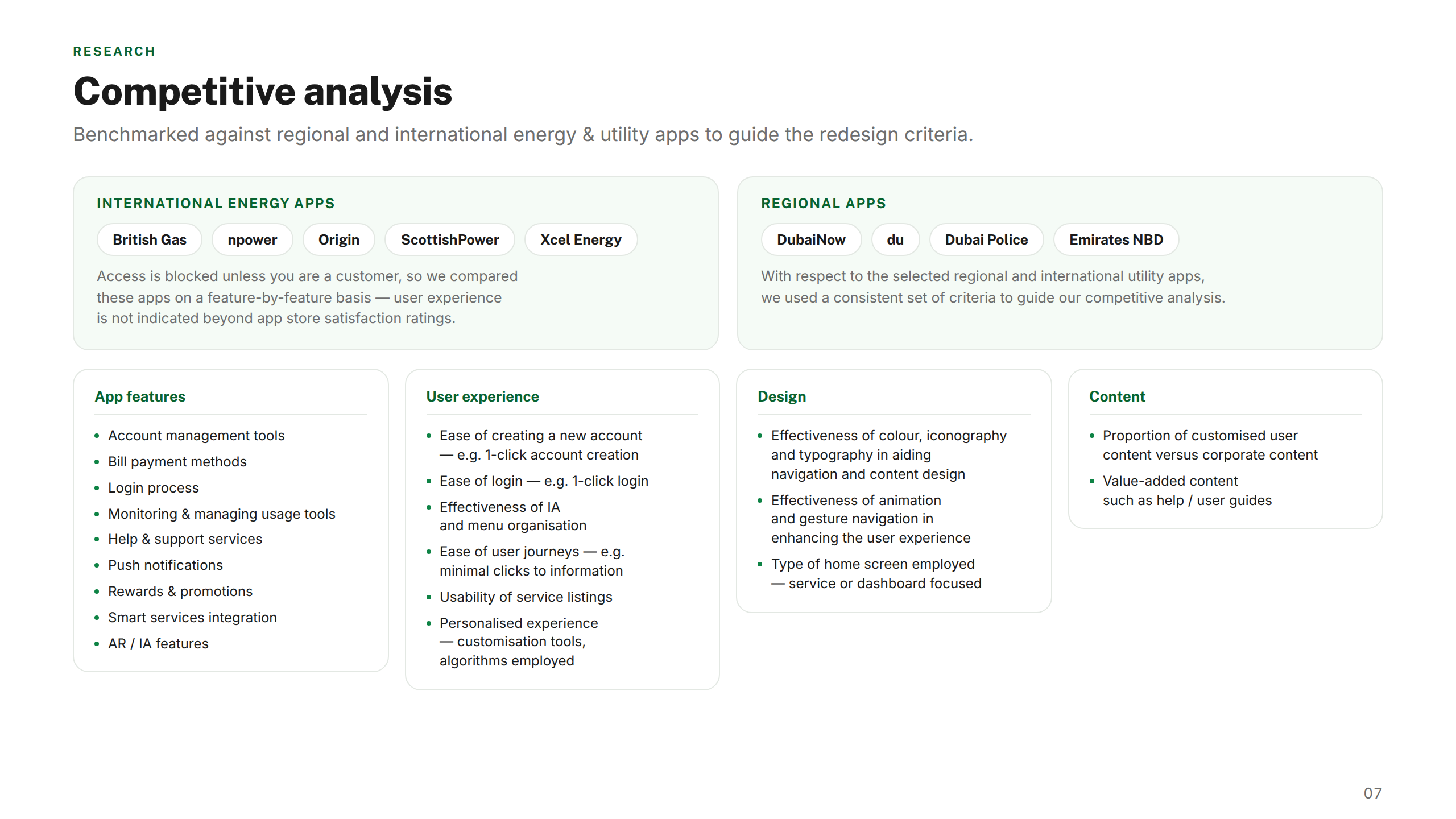
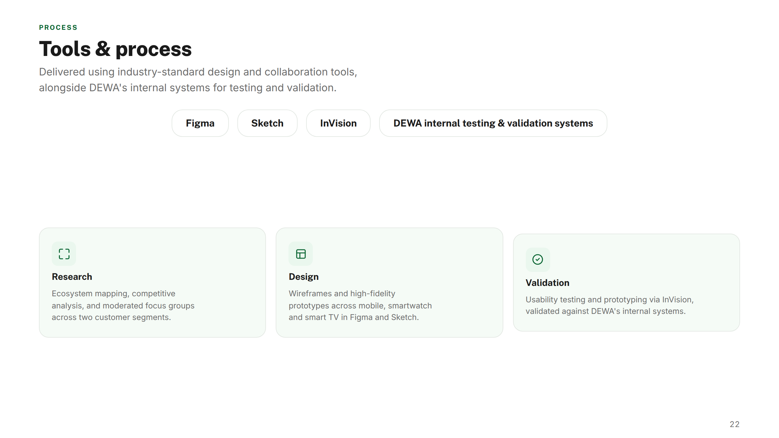
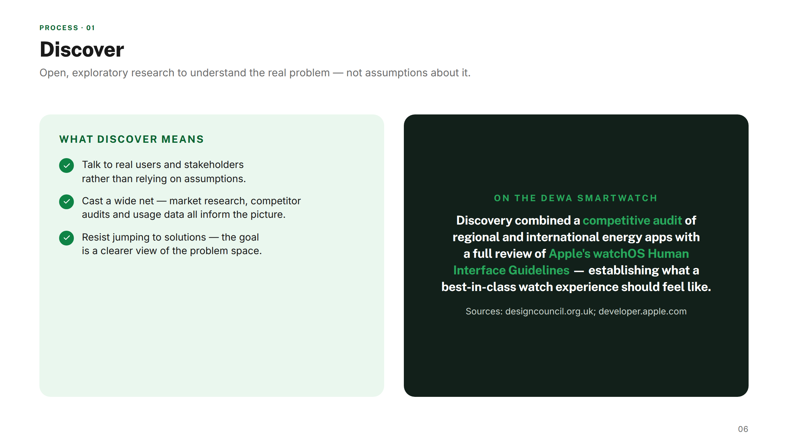
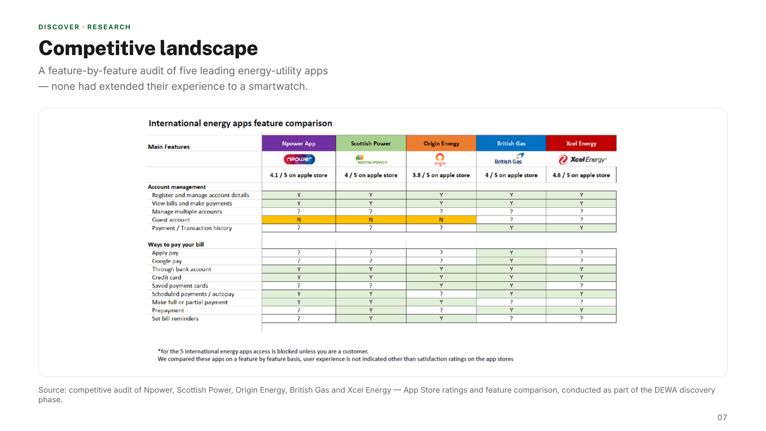
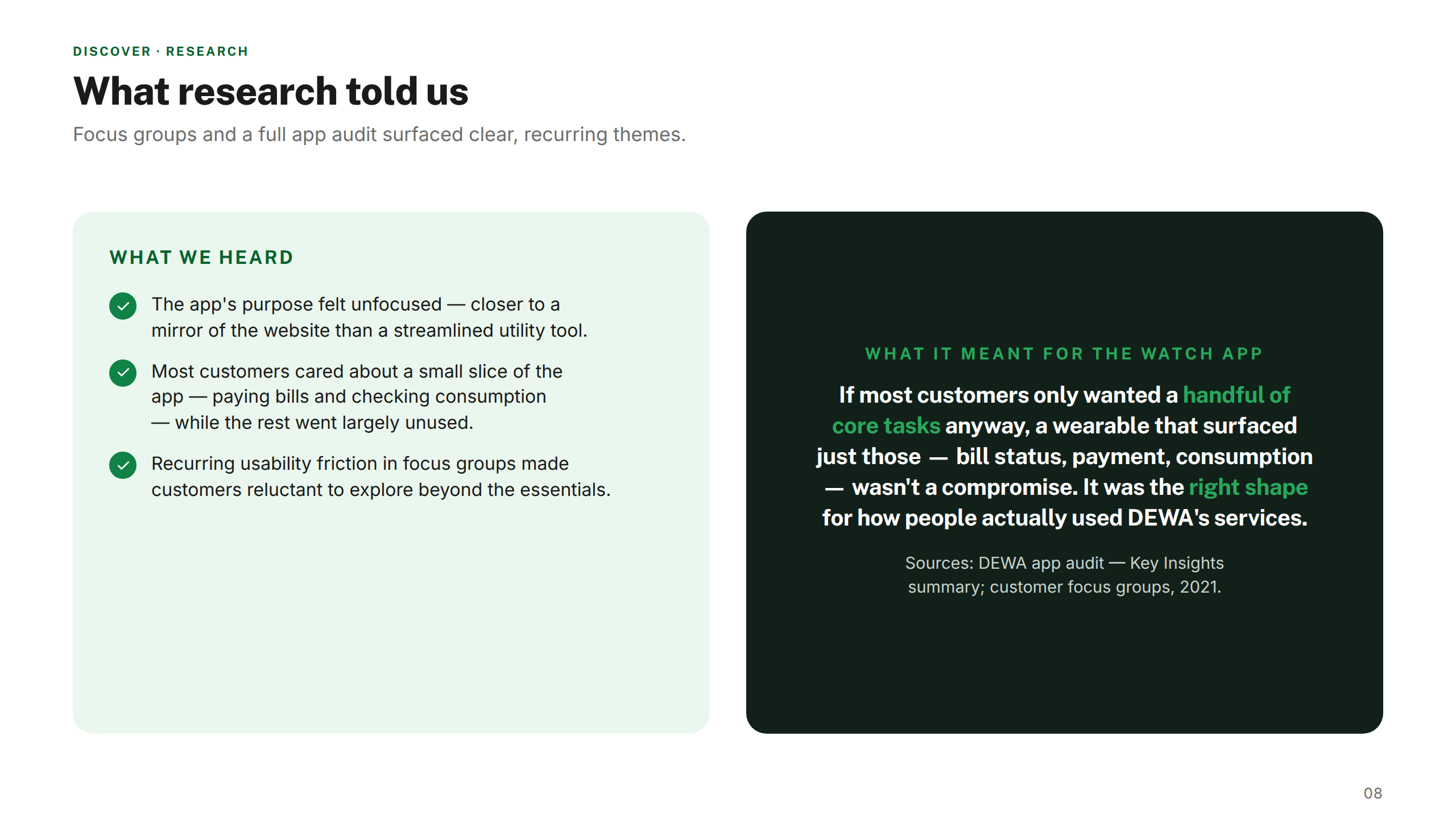
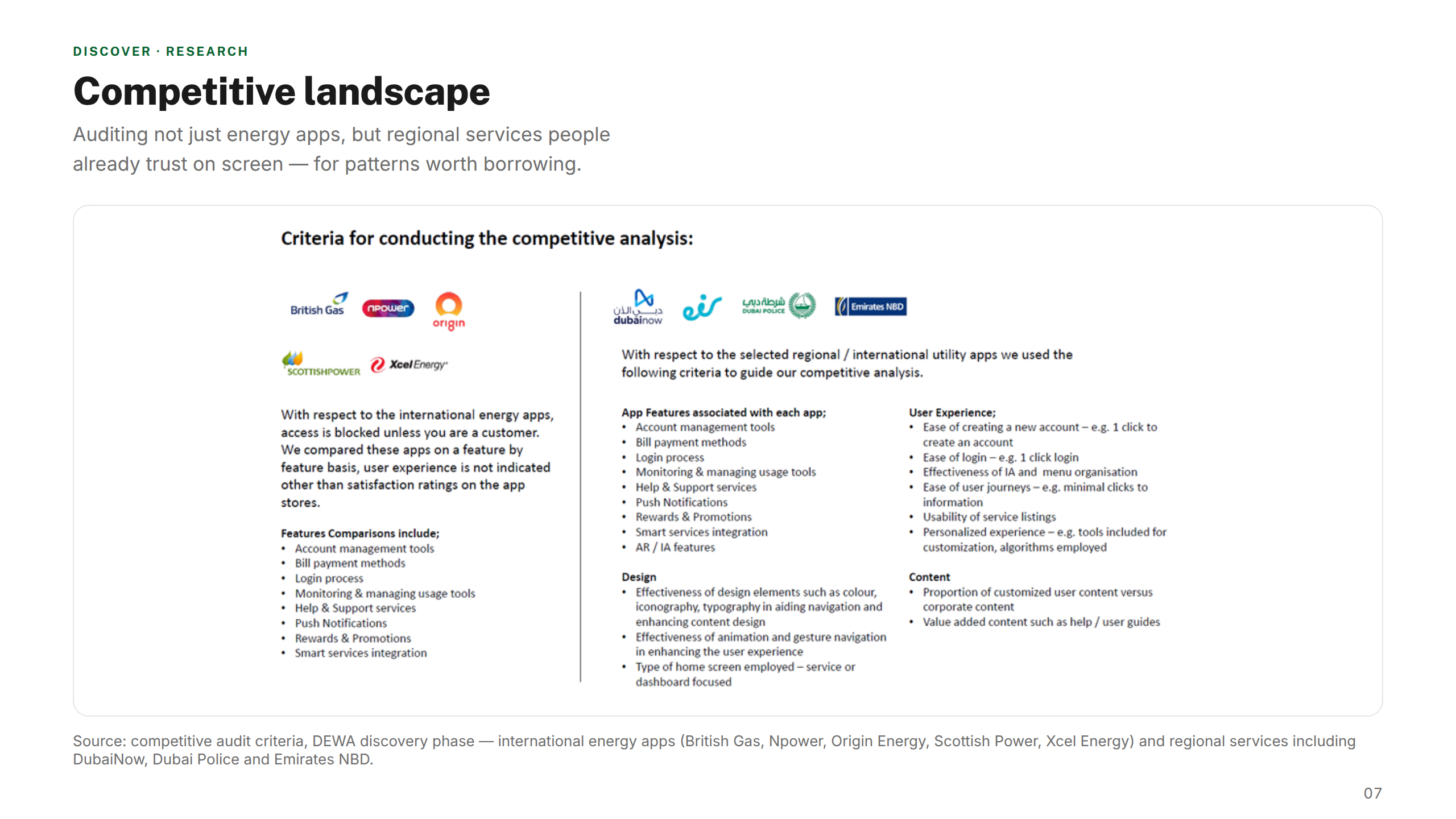
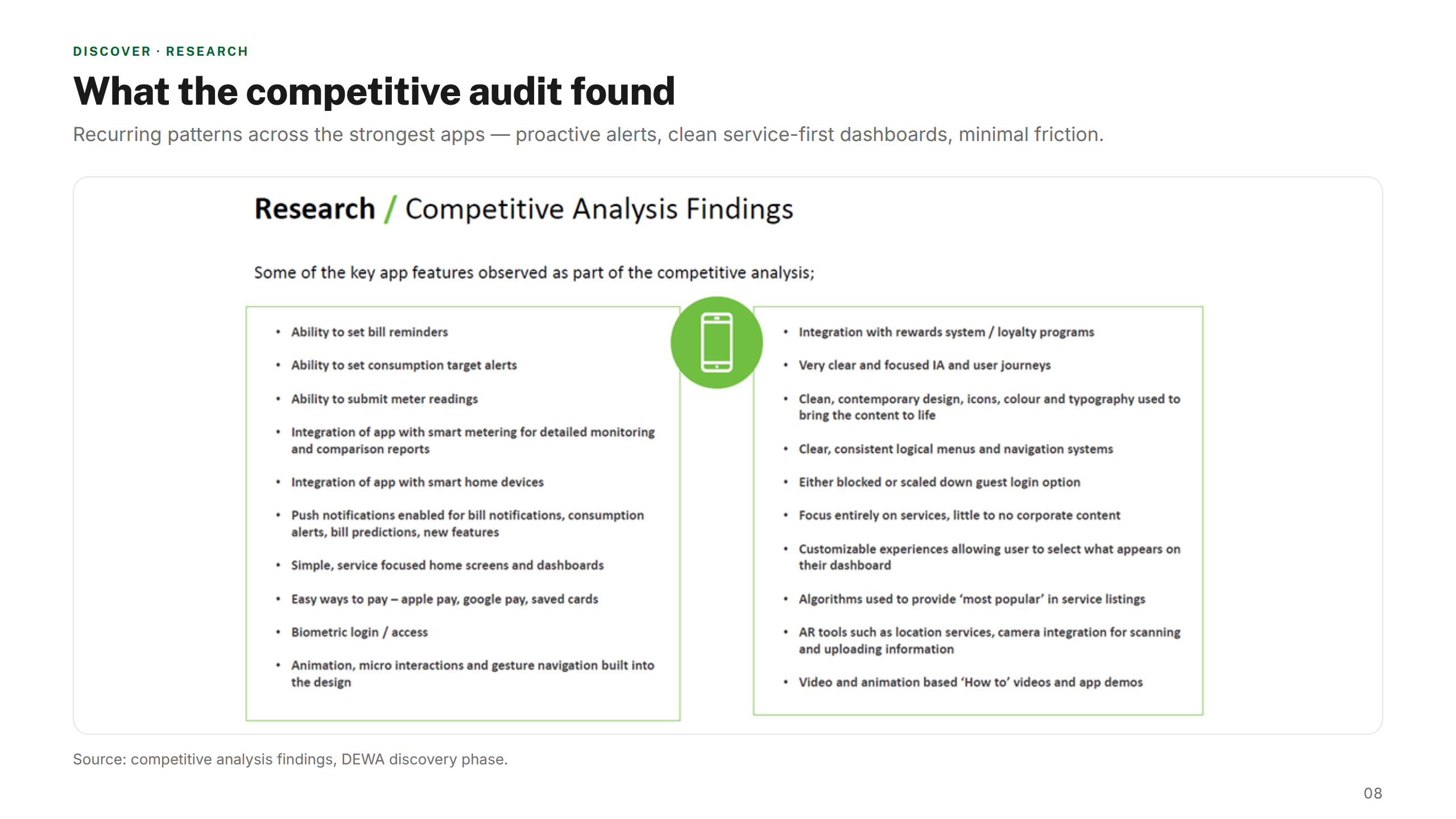
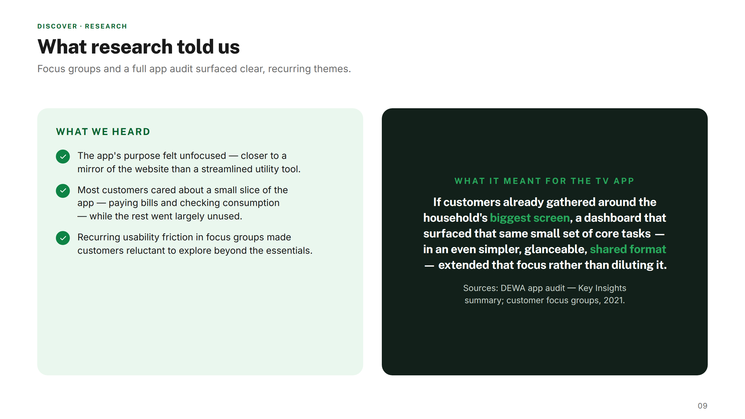
Mapped the existing DEWA digital ecosystem across all three platforms. Conducted heuristic reviews, user interviews, and competitive benchmarking to identify pain points and opportunities.
02 — Define
Strategy & principles
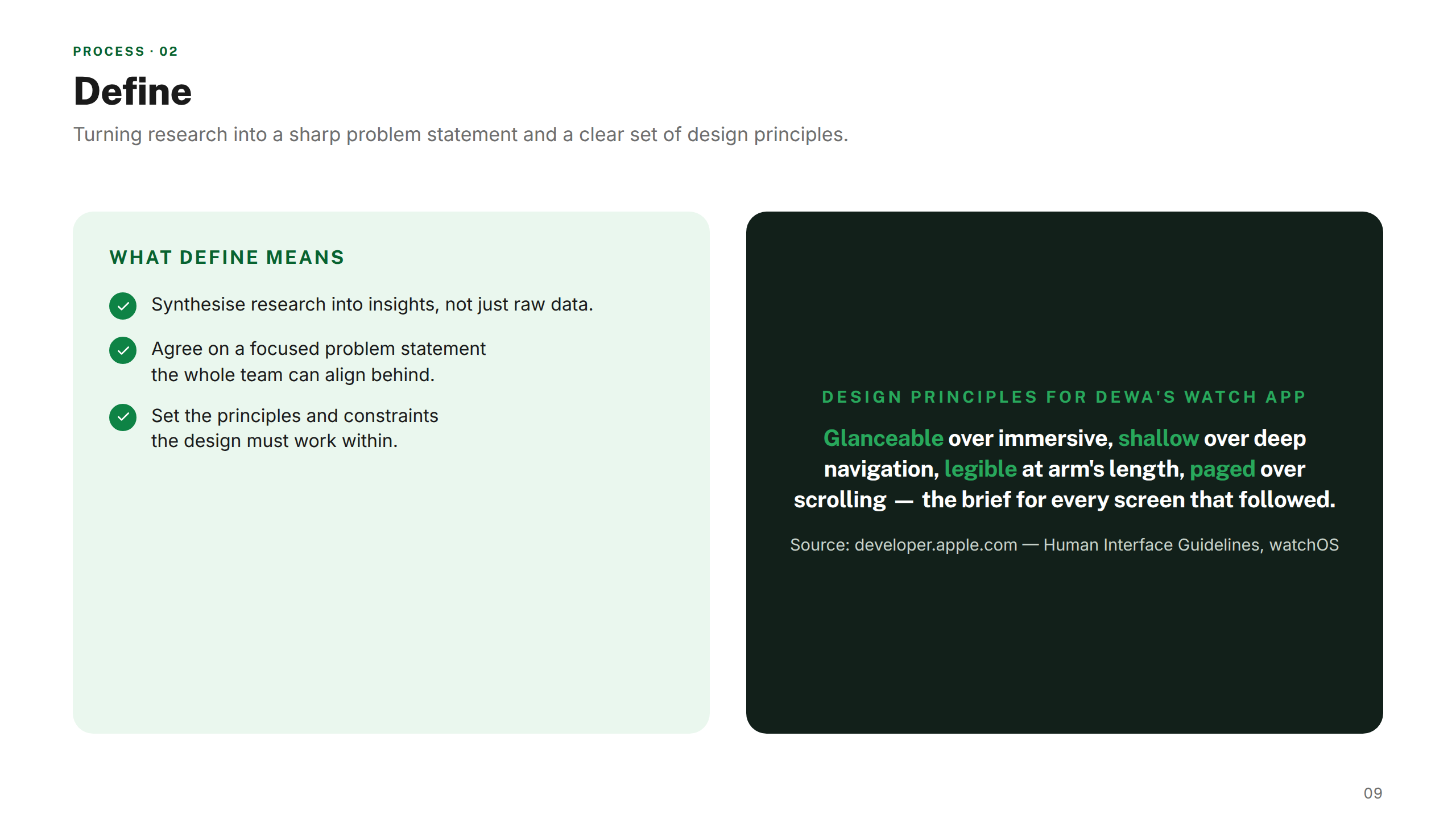
Synthesised research into a unified design brief. Established platform-specific UX principles and a shared design language to ensure coherence across mobile, wearable, and TV.
03 — Develop
Design & prototype
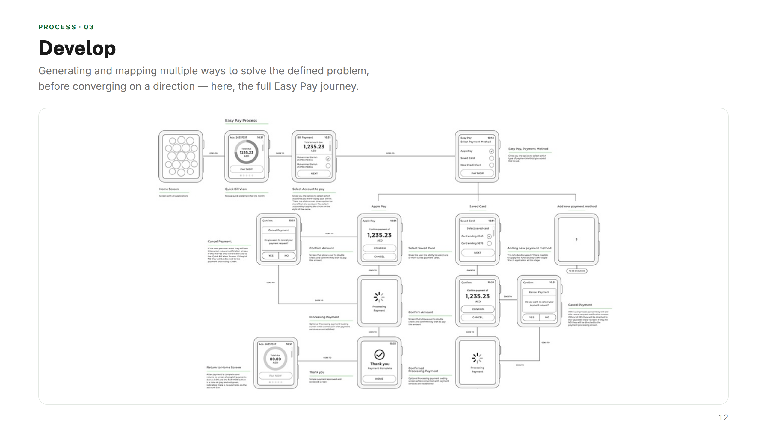
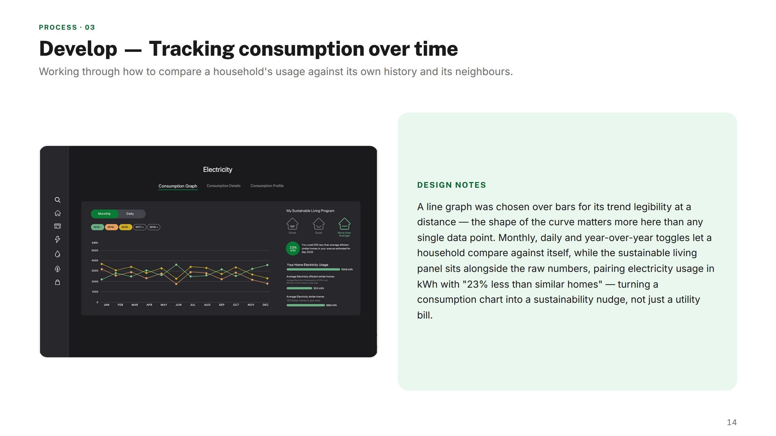
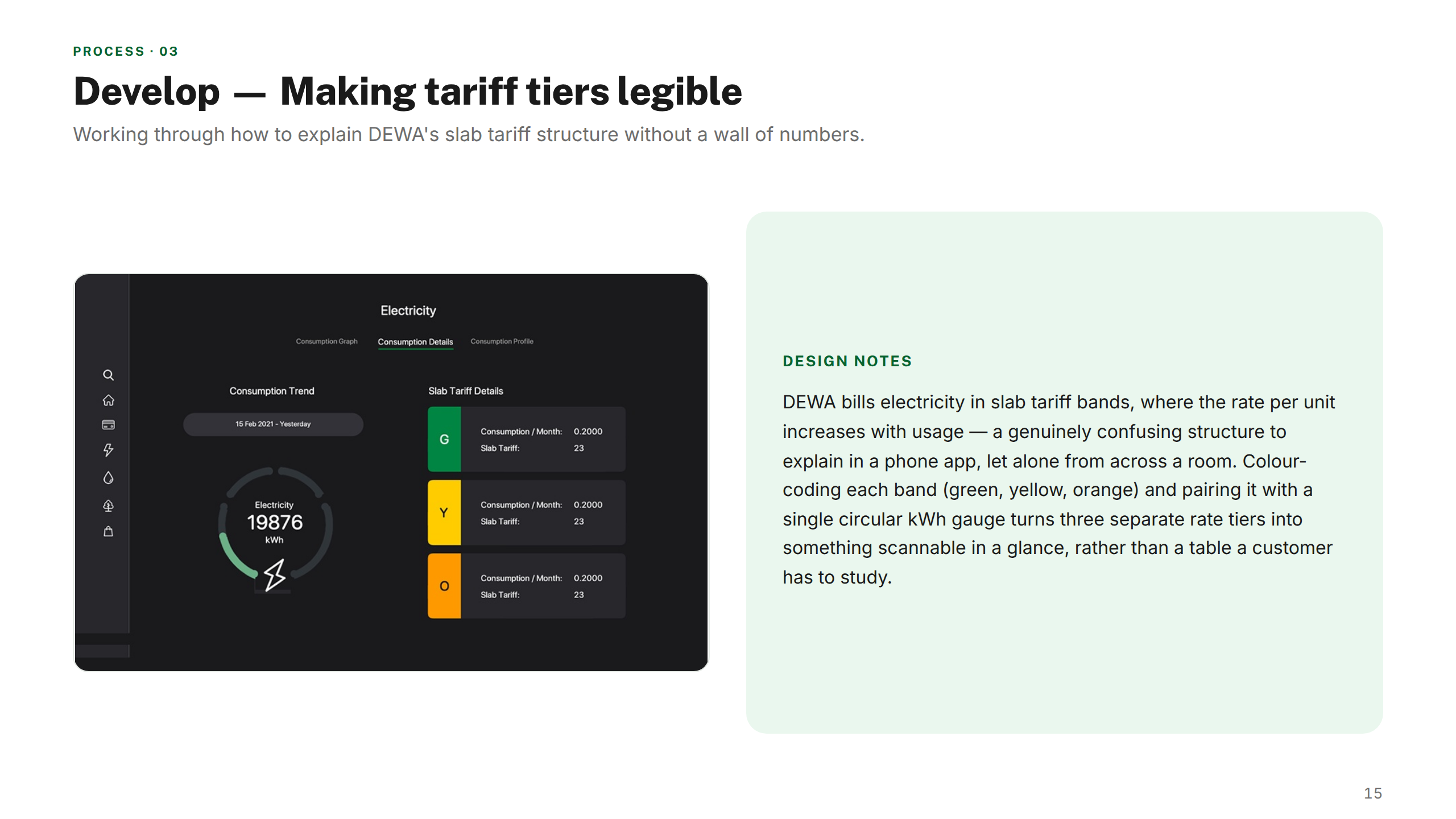
Produced wireframes, high-fidelity designs, and interactive prototypes for all three platforms. Iterated through rounds of stakeholder review and usability testing.
04 — Deliver
Handoff & system
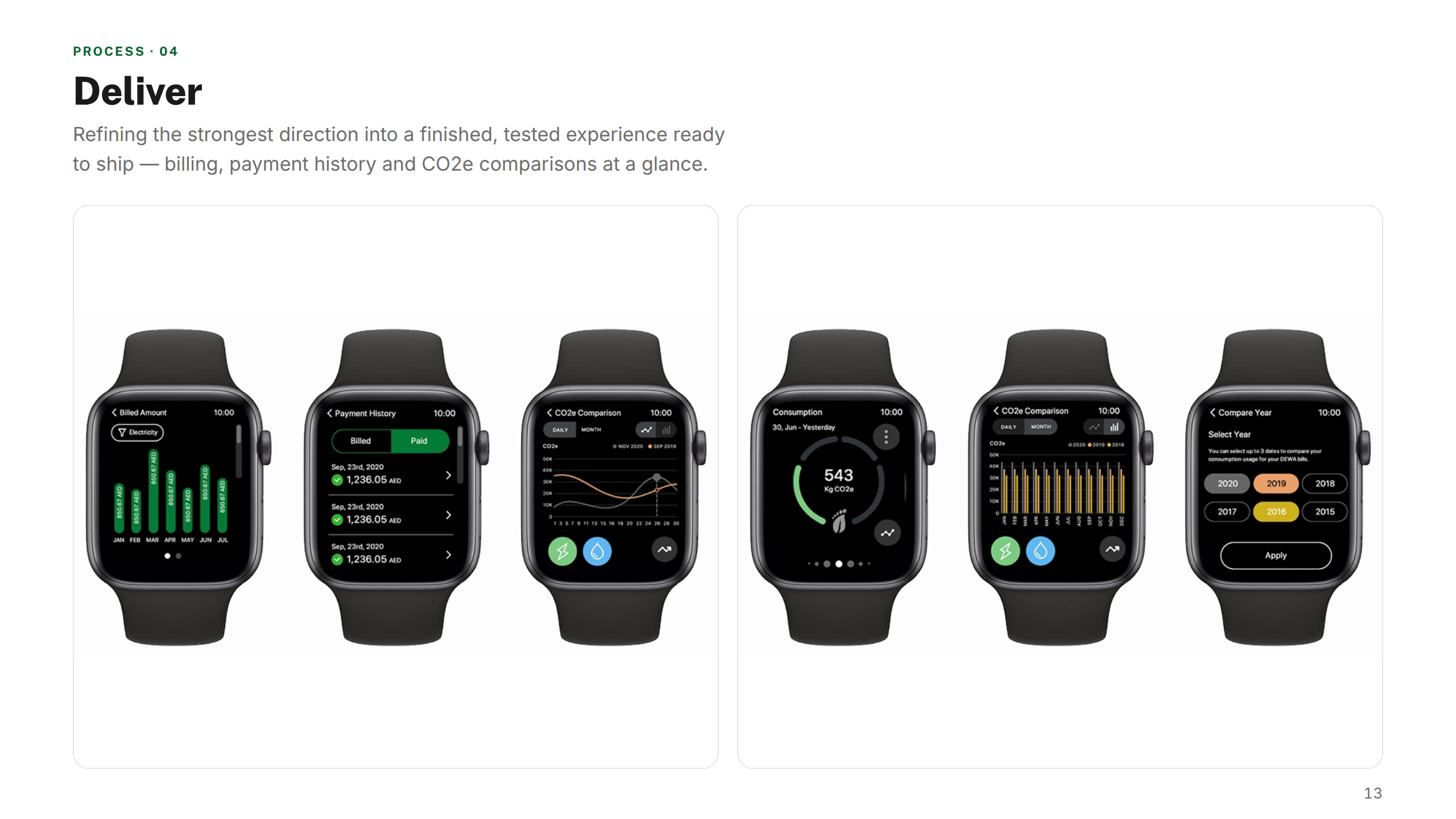
Delivered annotated design specs, a shared component library, and developer handoff documentation. Supported engineering teams through build, QA, and launch.
The solution
A unified, multi-platform experience — a refined mobile app, a smartwatch companion, and a smart TV interface, all built on shared design system foundations.
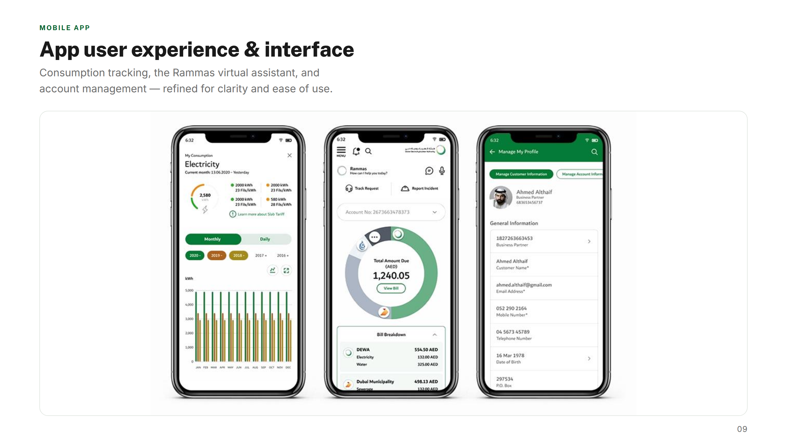
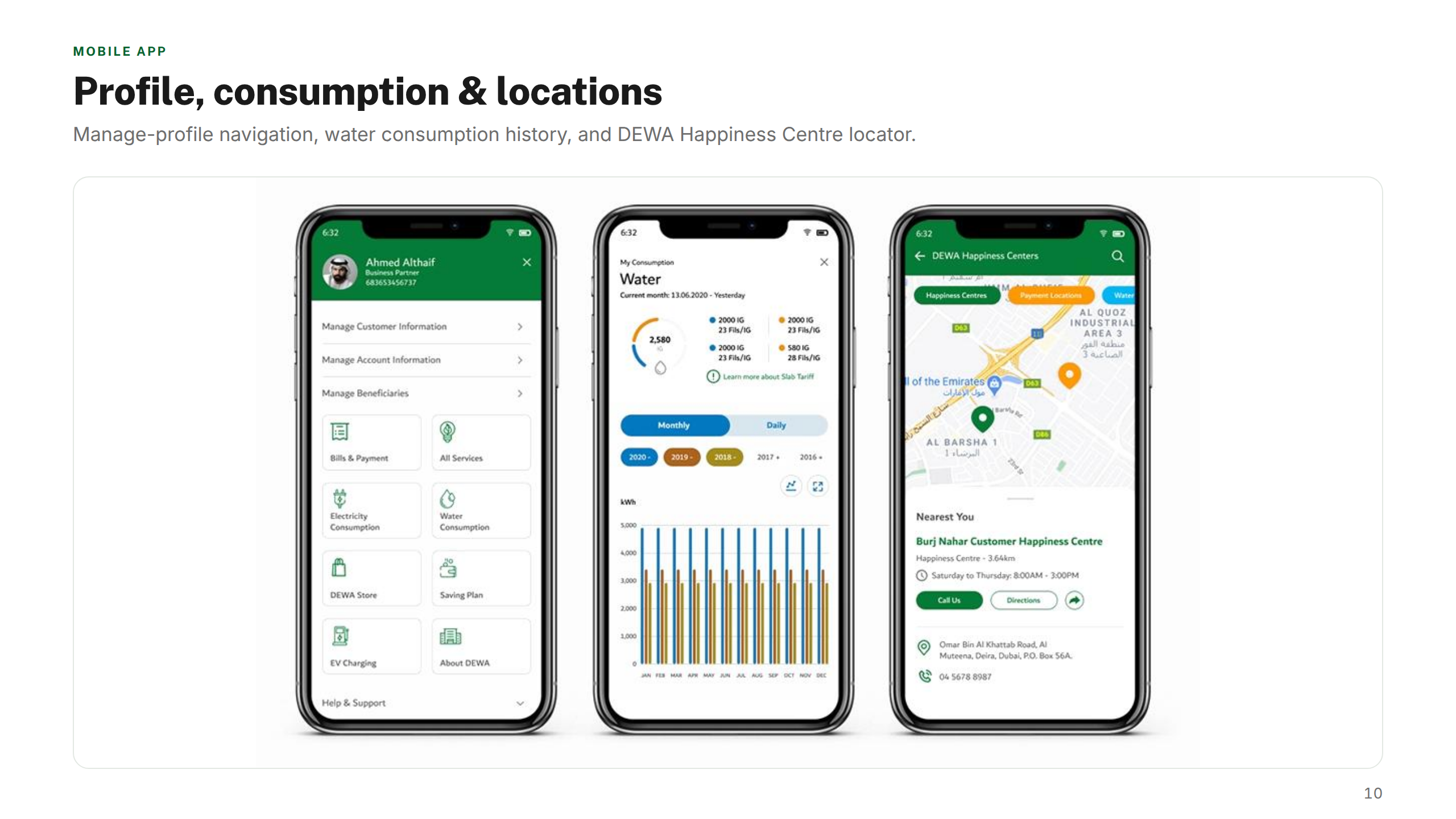
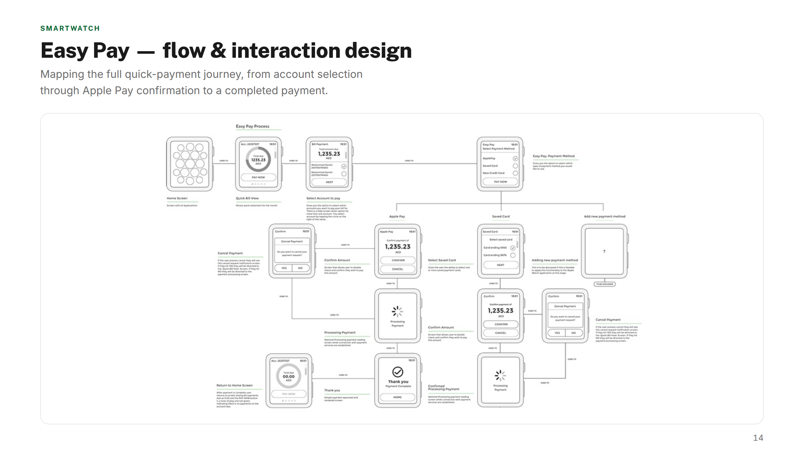
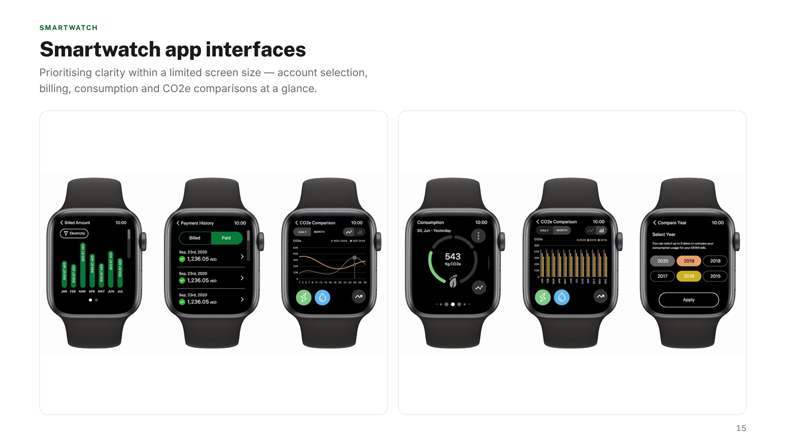
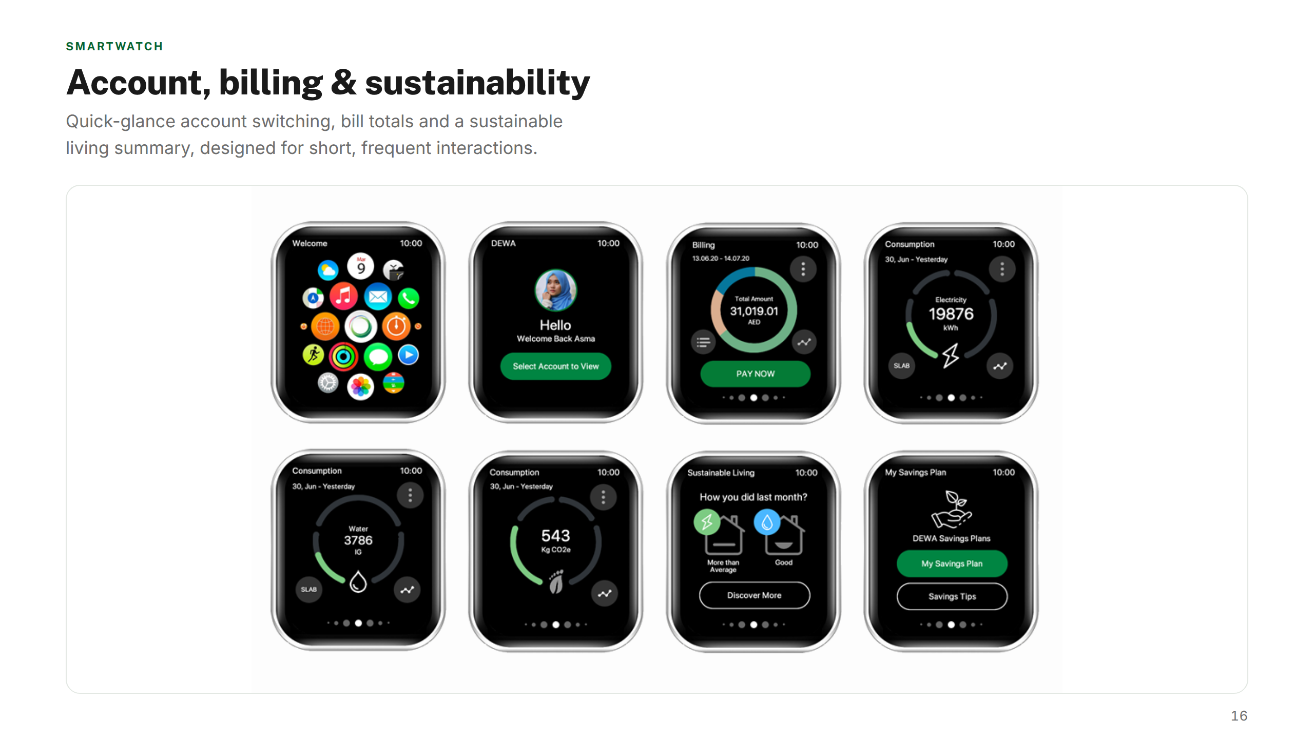
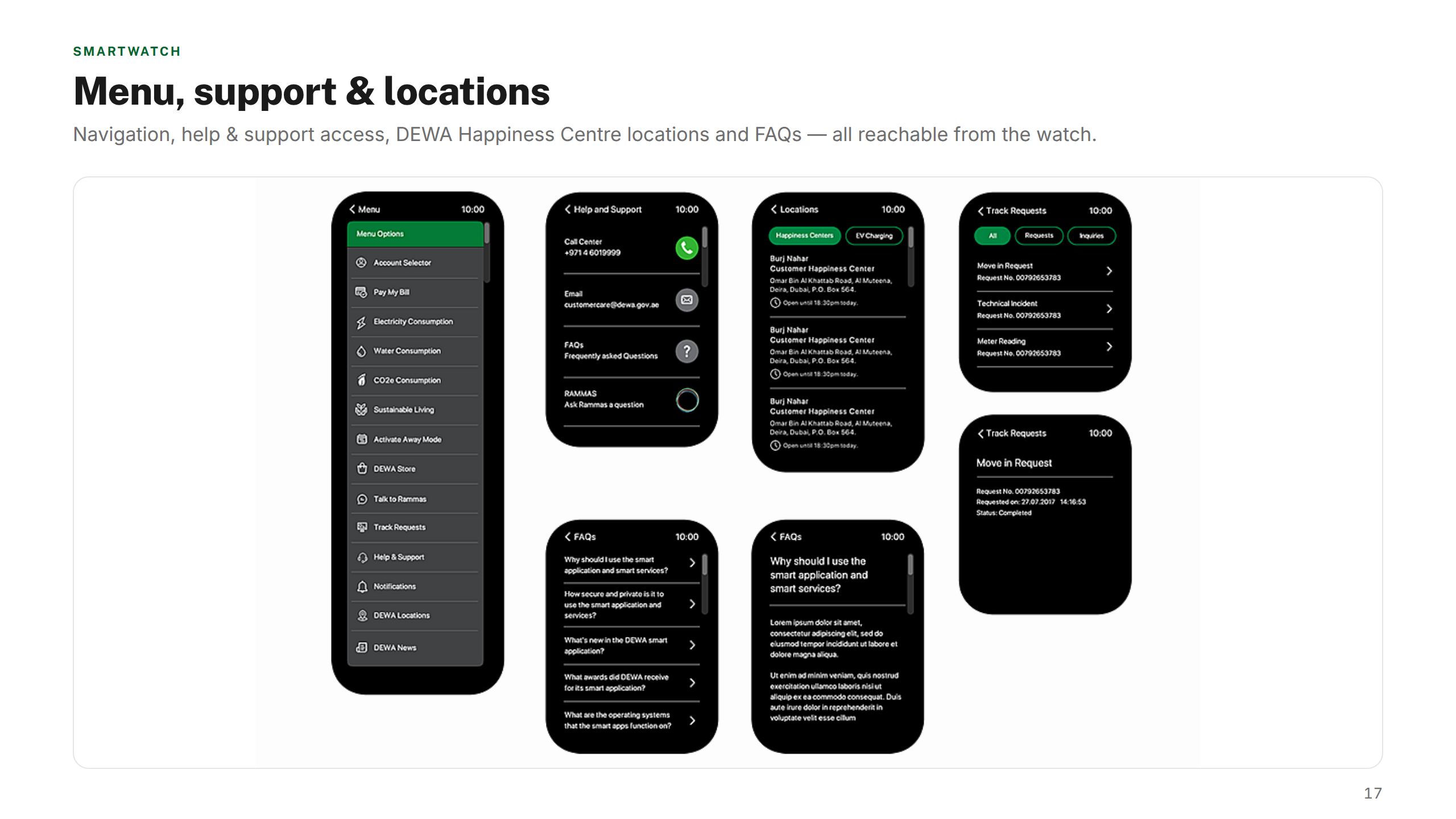
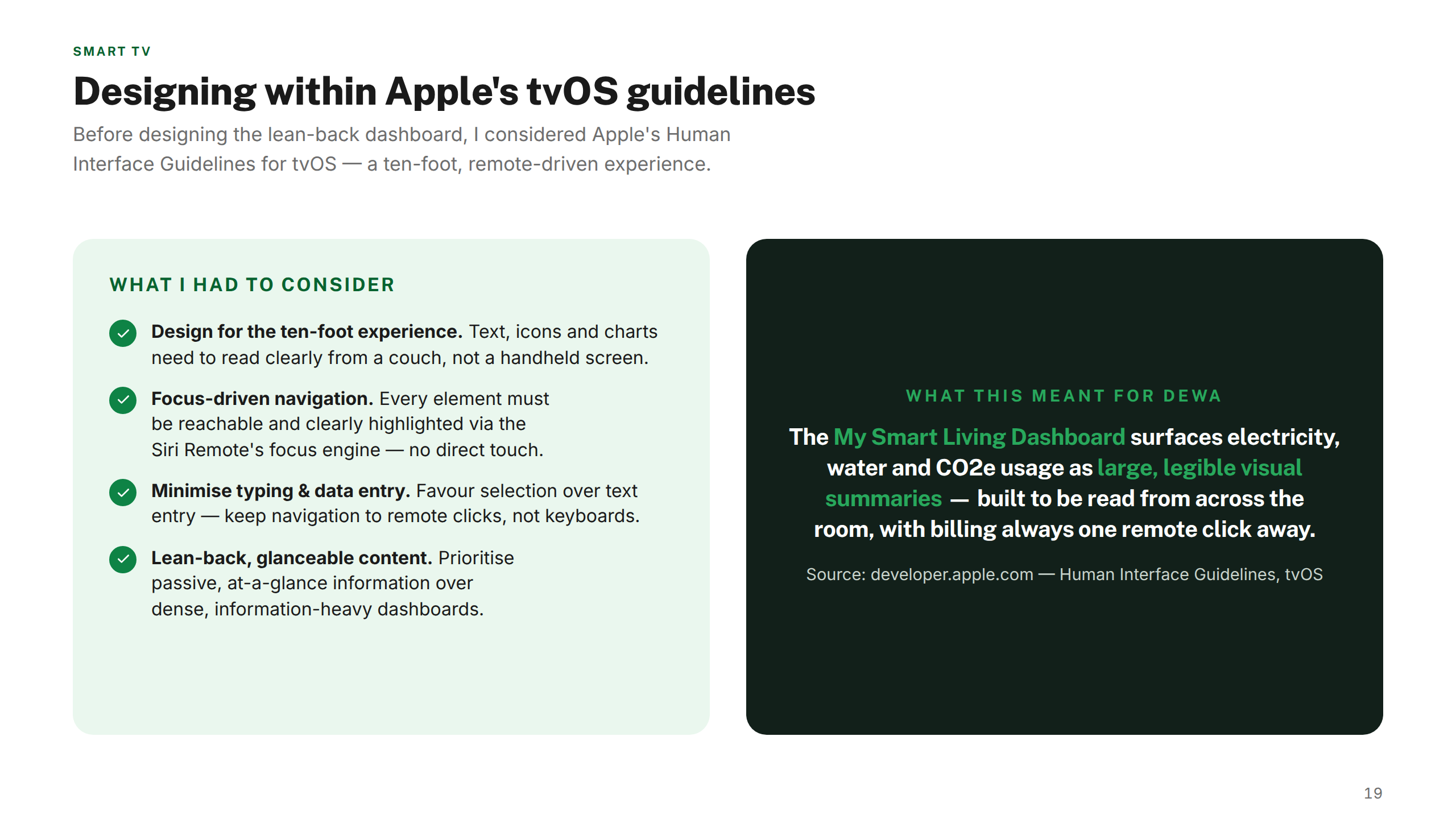
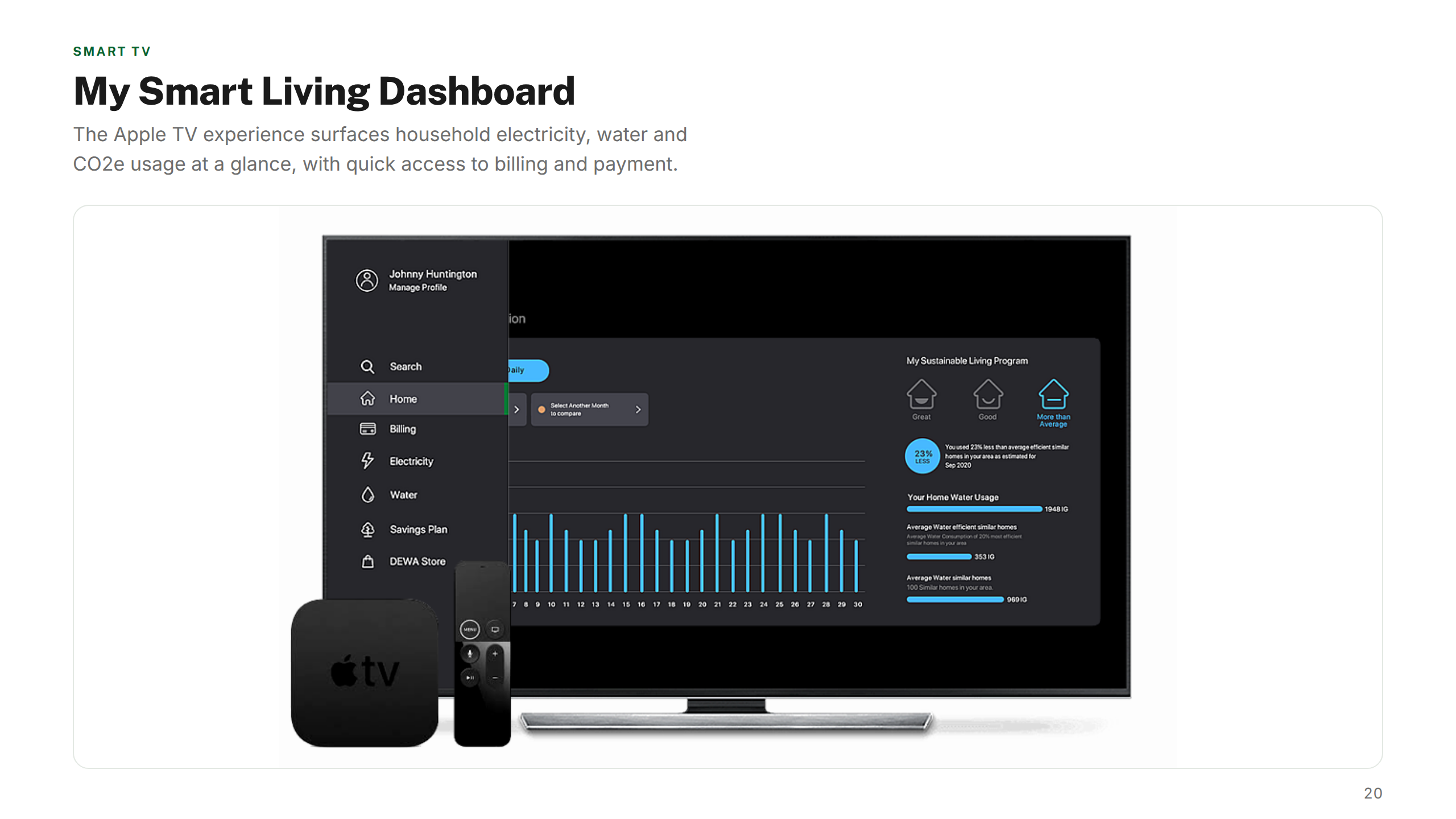
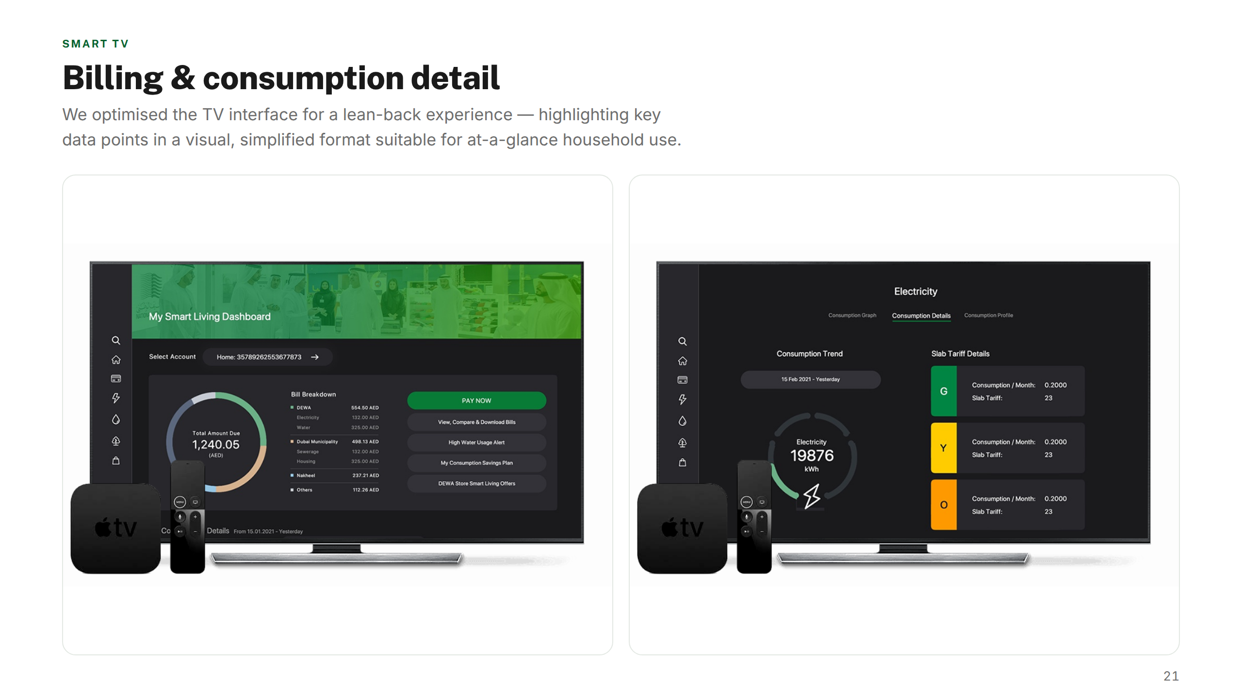
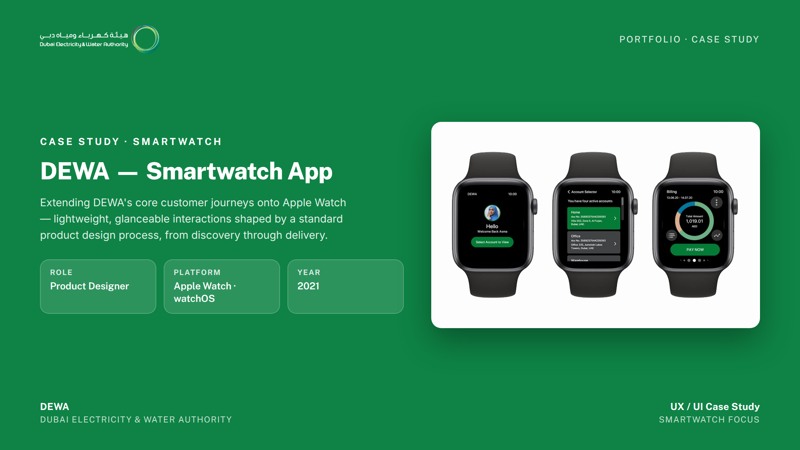
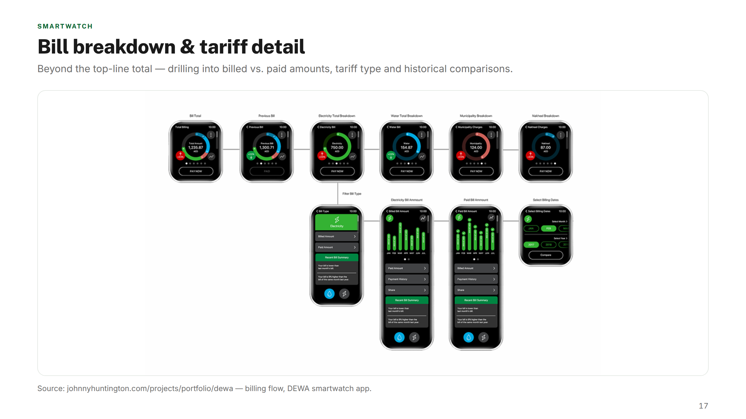
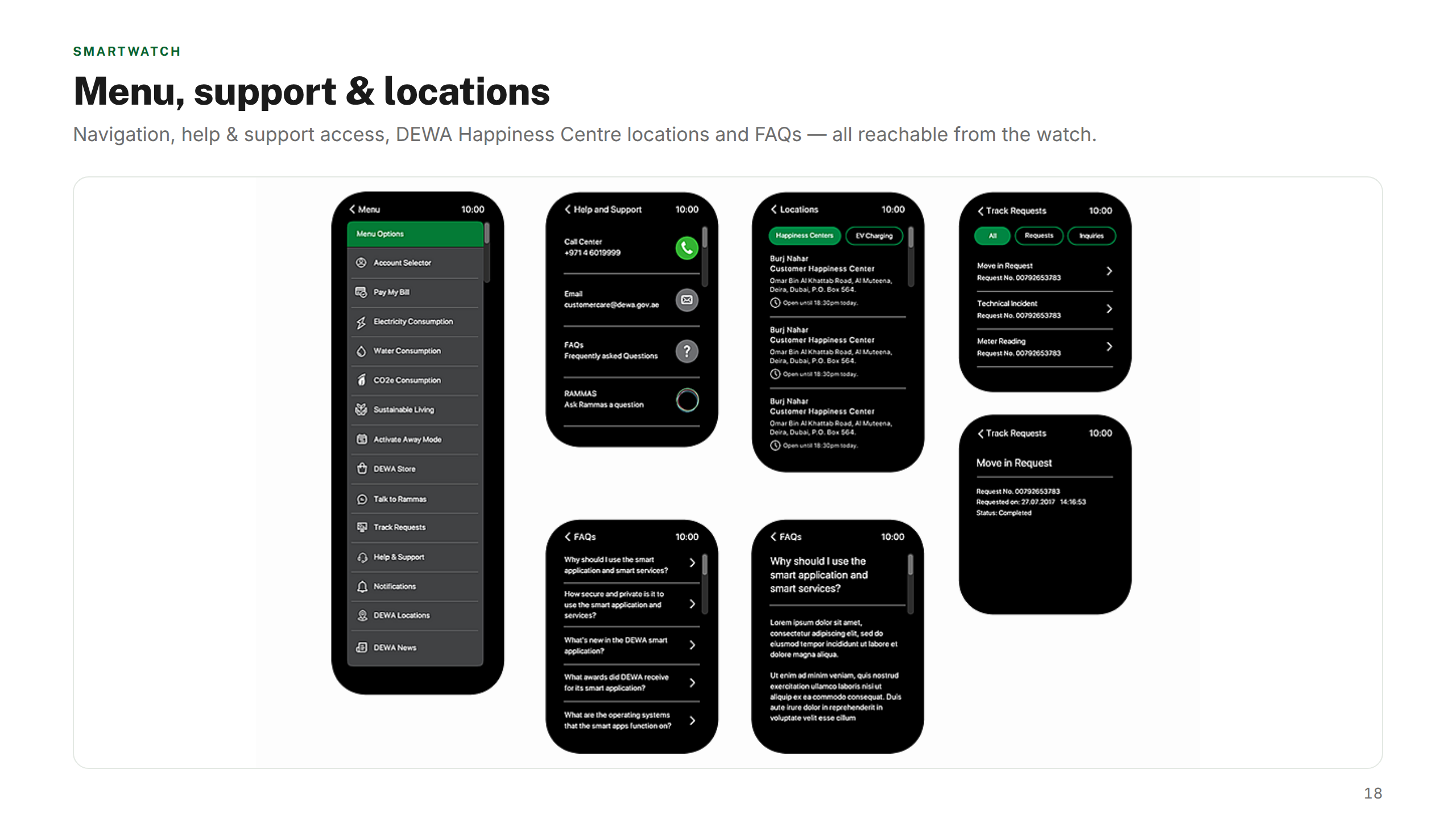
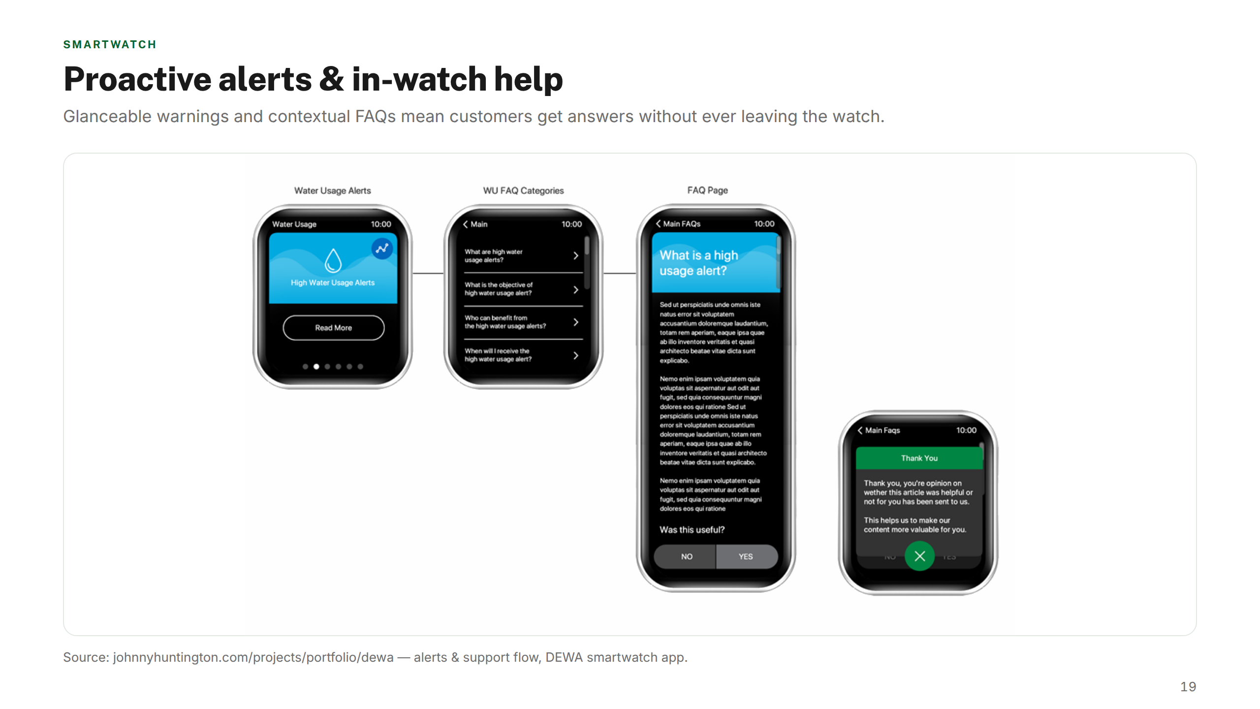
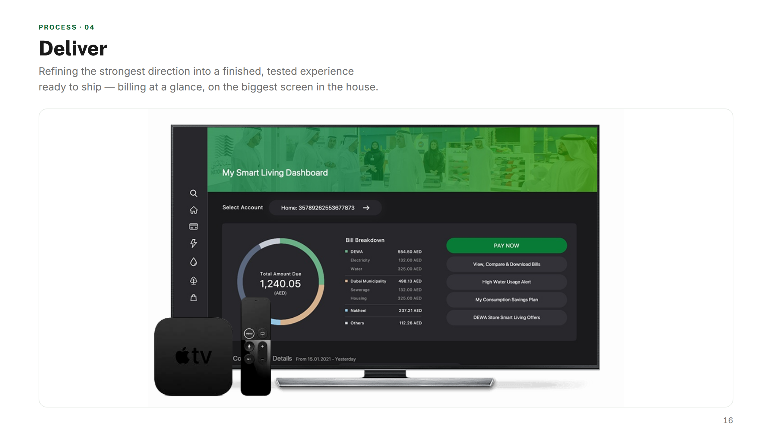
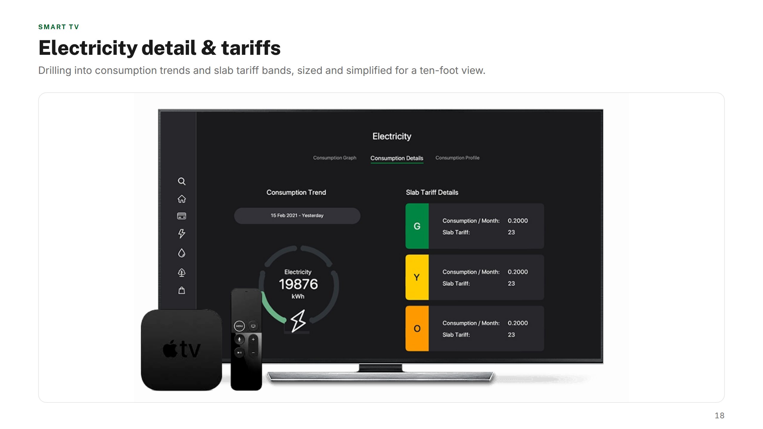
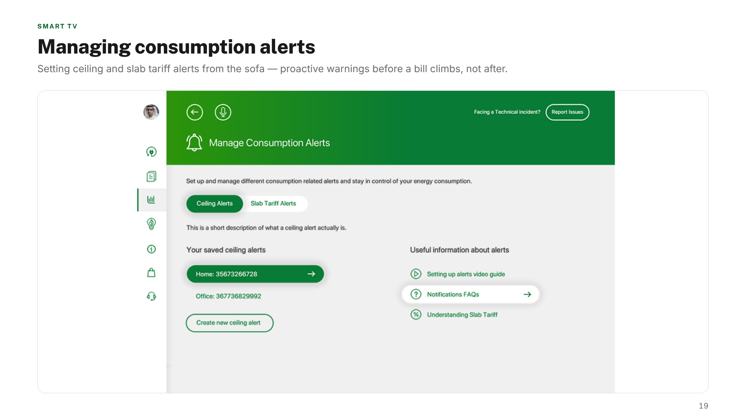
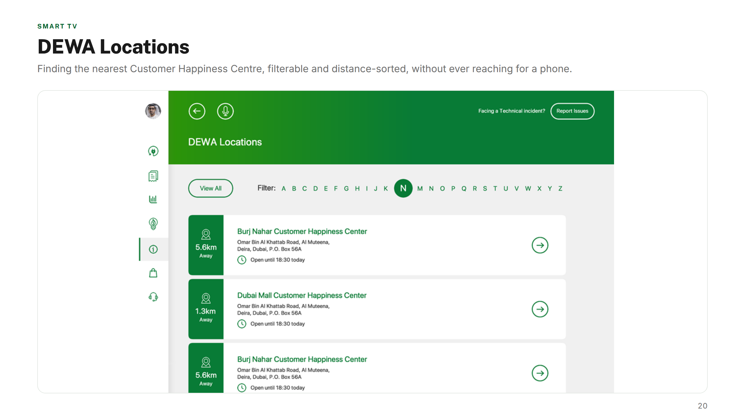
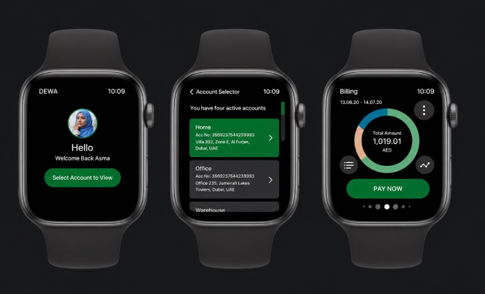
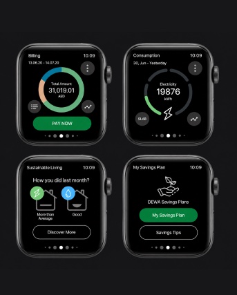
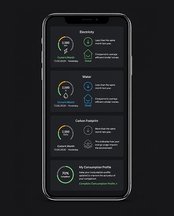
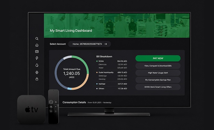
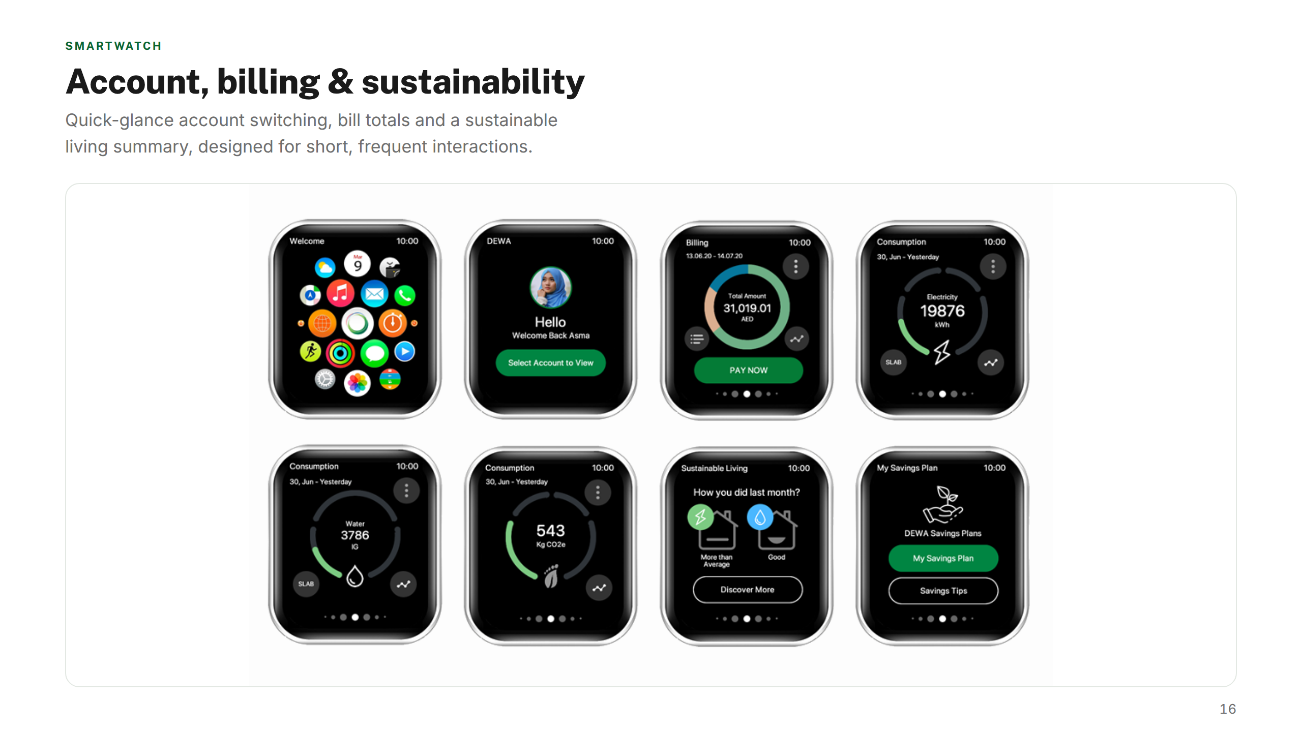
Each platform was designed for its context of use. The mobile app streamlined high-frequency tasks — bill payments and meter readings — into clear, fast flows. The smartwatch app surfaced glanceable account information and alerts. The Apple TV experience reimagined utility management for the living room with a simplified, lean-back interface.
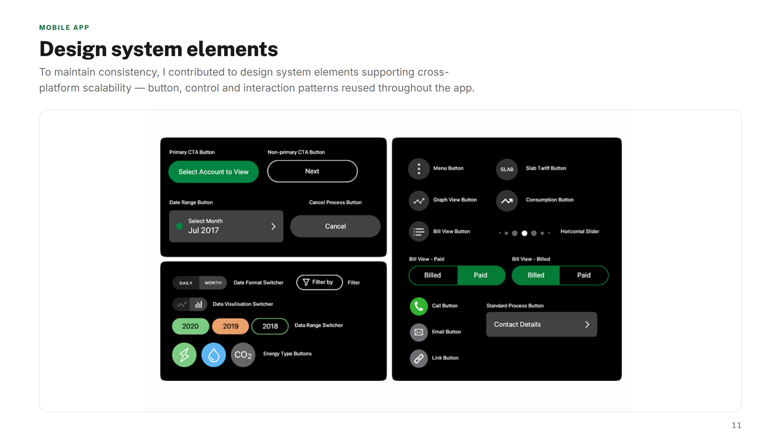
Shared design system elements kept the experience coherent across all three, while wireframes, prototypes, and user research documentation gave DEWA's teams a clear foundation to build and maintain the platforms going forward.
Mobile App
iOS · Android · 375px min
High-frequency tasks — bill payment, meter readings, account management — redesigned for speed and clarity. Simplified navigation reduced cognitive load for DEWA's 3+ million active users, with accessibility baked in from the start.
Apple Watch
watchOS · 41mm & 45mm canvas
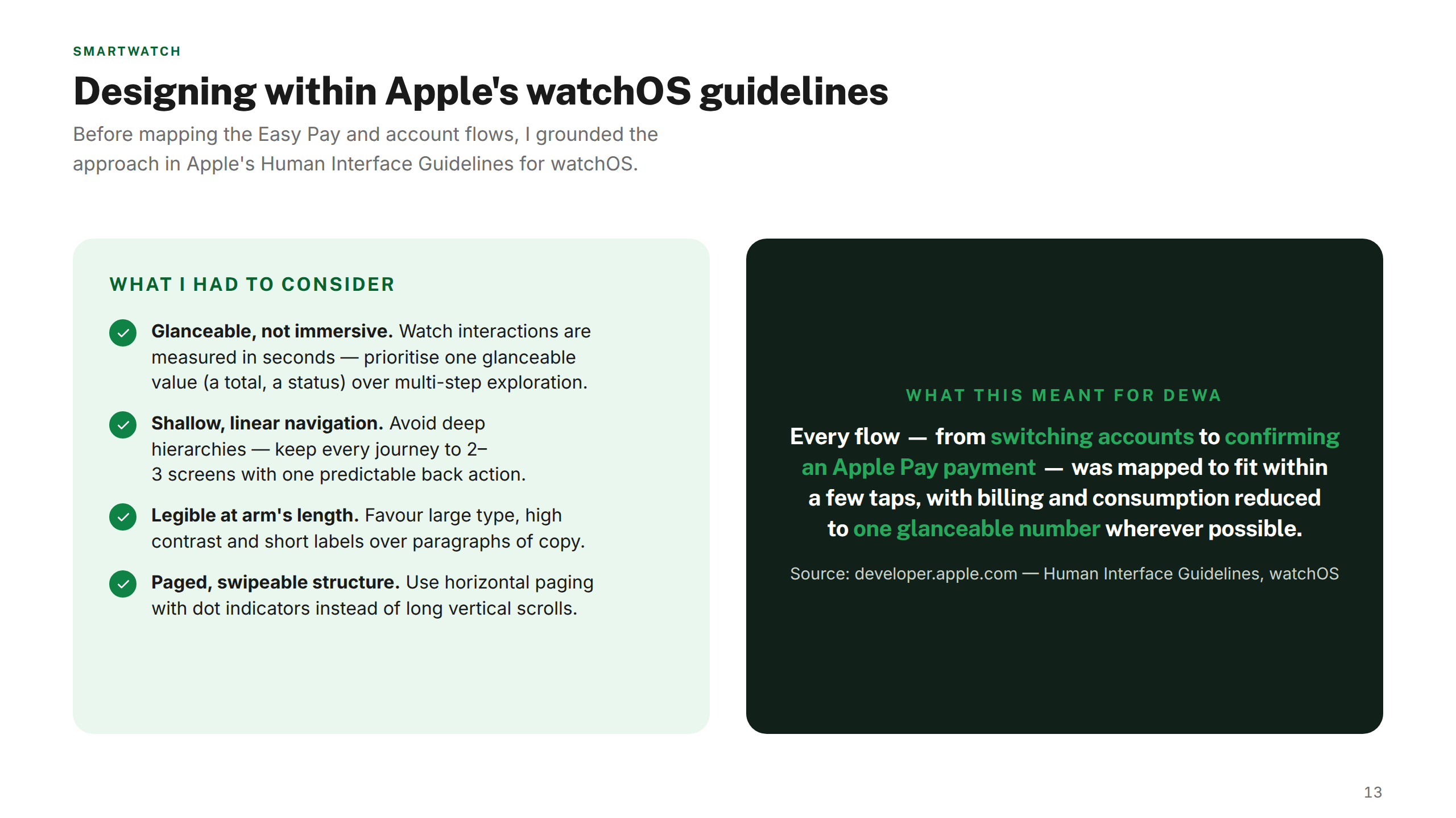
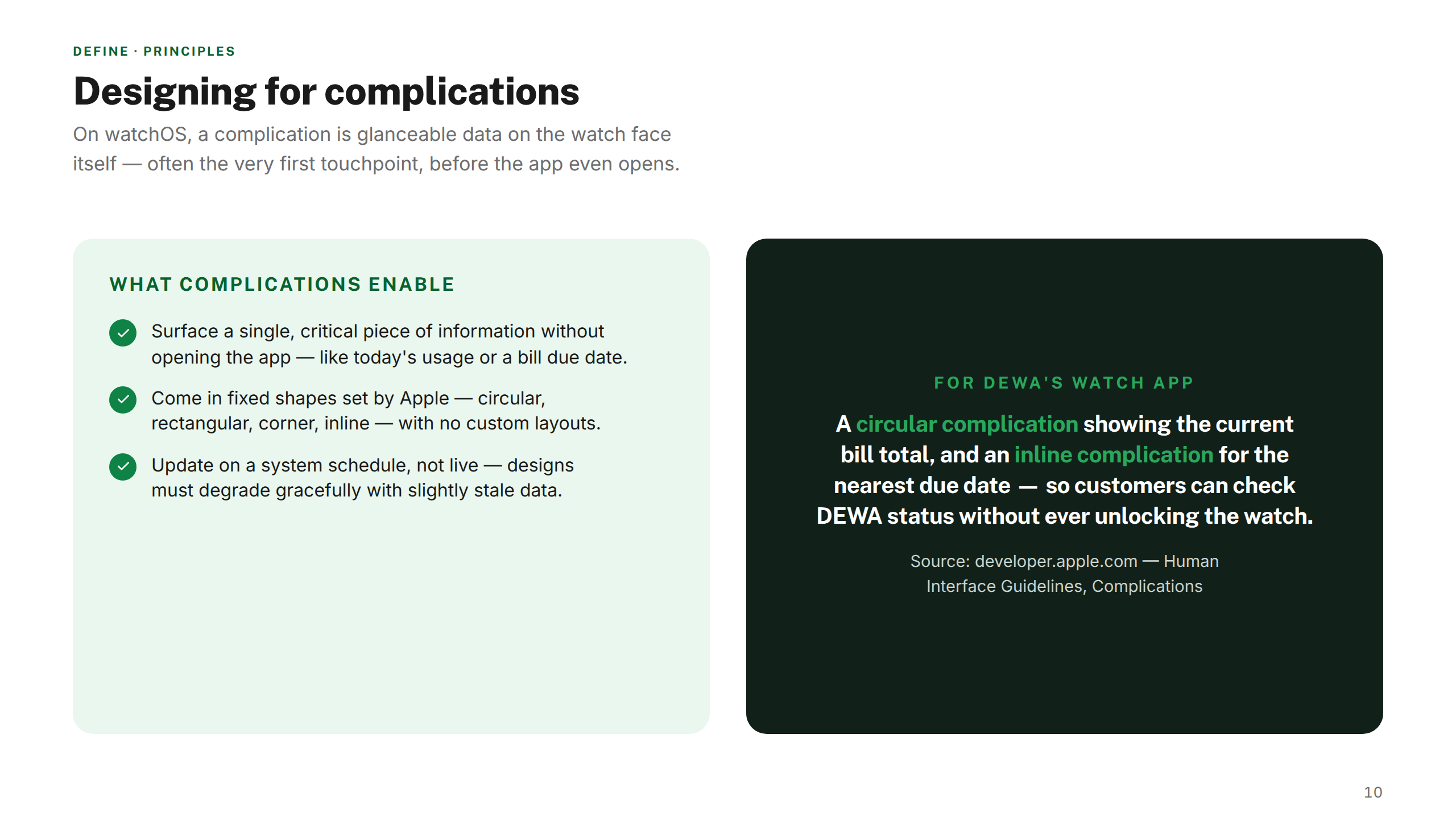
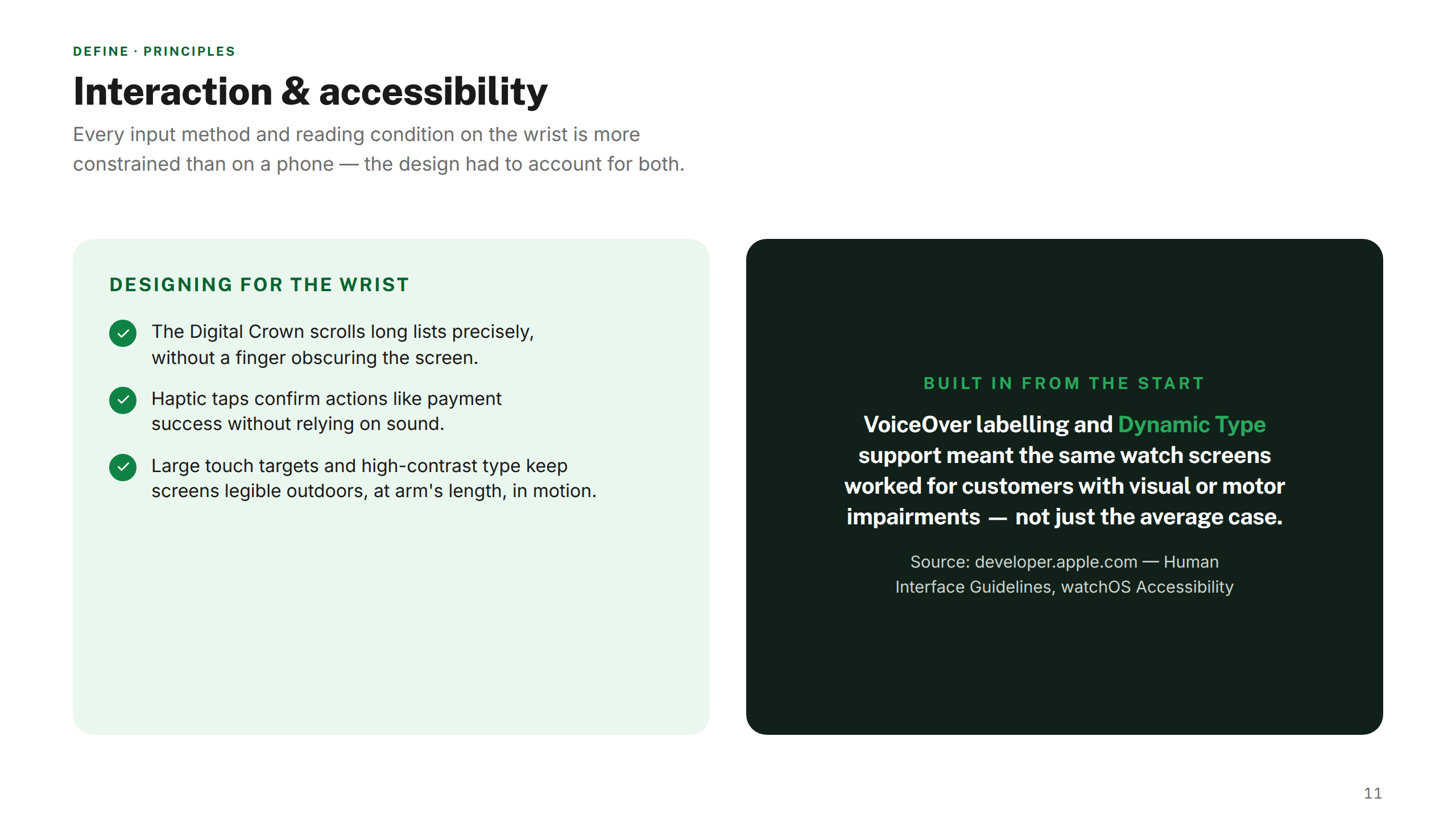
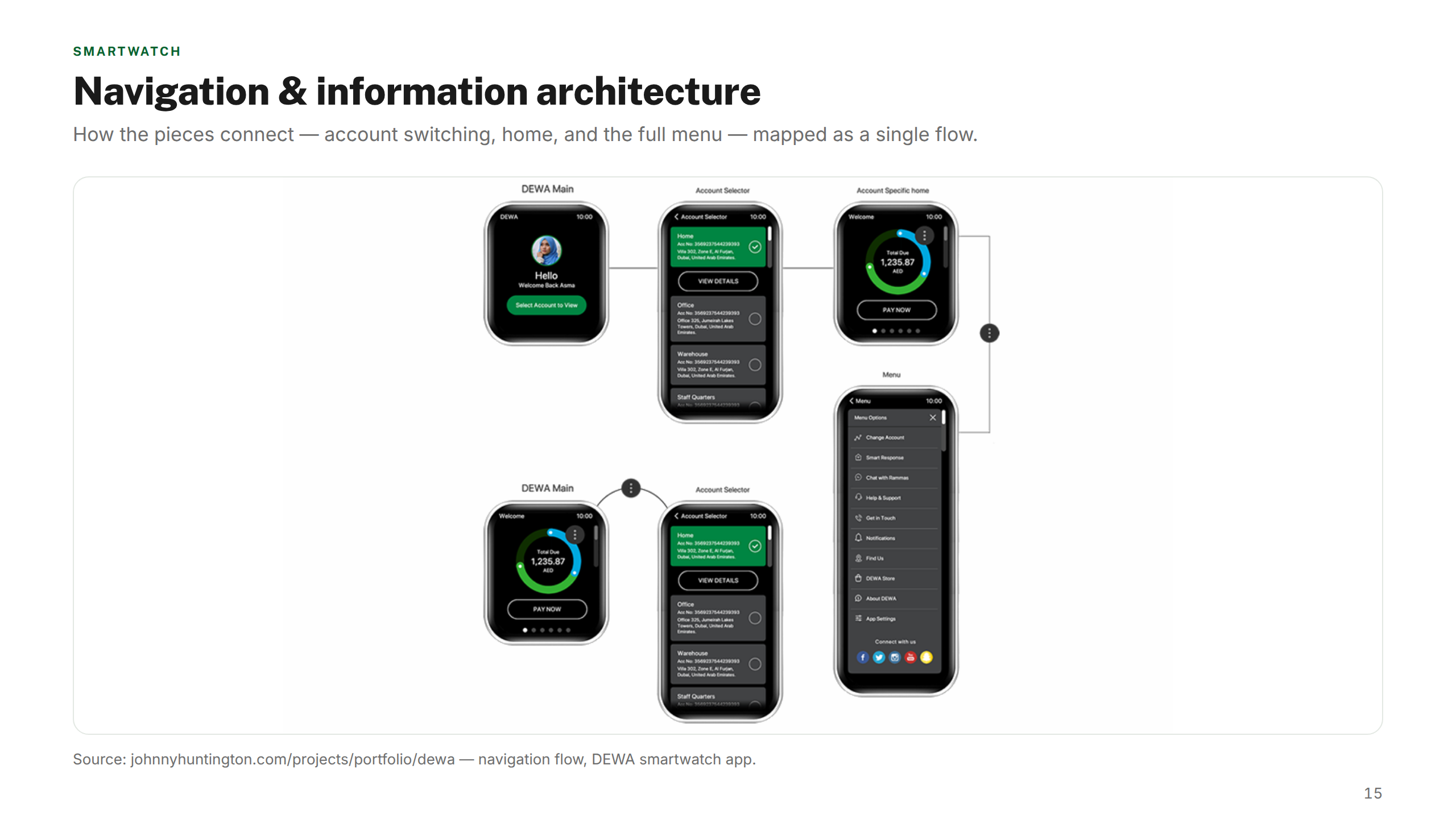
Glanceable account info, bill alerts, and quick actions designed around the Apple Watch's 41mm canvas and Digital Crown constraints. Complications let users track usage without opening the app.
Smart TV
tvOS · Focus model · 10ft UX
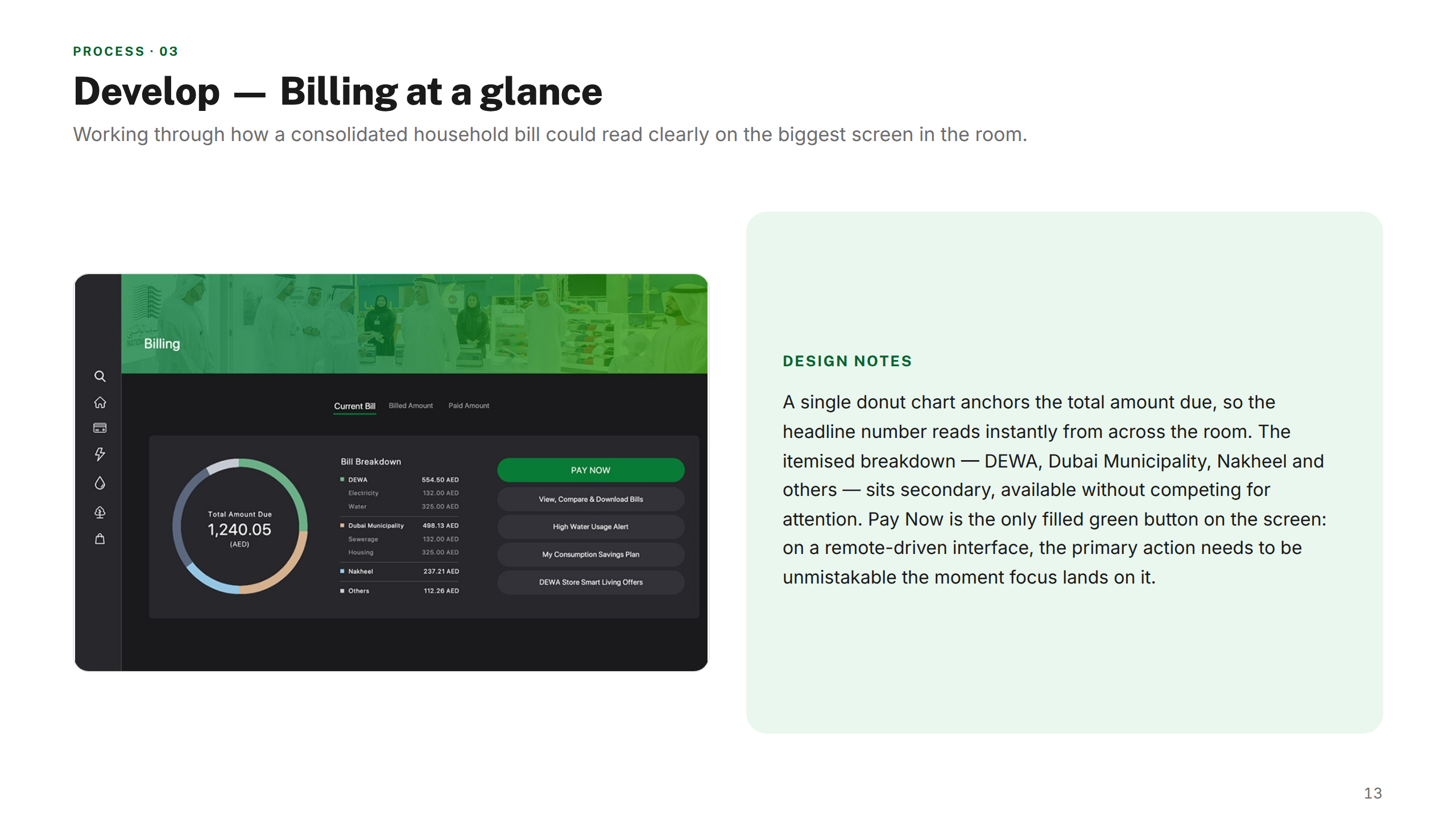
A lean-back utility experience designed around tvOS's Siri Remote and focus-based navigation. Large type, minimal hierarchy, and a 10-foot viewing distance shaped every decision — turning bill management into a living-room-native interaction.
Design thinking
Key decisions
Navigation
One shared IA, three adaptive interfaces
Rather than designing three separate navigation structures, I mapped a single information architecture across all platforms and adapted the interaction model to each screen. This meant a user familiar with the mobile app could immediately orient themselves on the Watch or TV — reducing learning curve and reinforcing brand coherence.
Design System
Tokens first, components second
I built the design system from shared design tokens — colour, spacing, and type scales — before any component work. This meant platform-specific components could diverge in form (a Watch complication vs a TV card) while staying visually coherent. It also gave engineering a single source of truth to implement across codebases.
Accessibility
Designing for the 10-foot rule and glanceability simultaneously
Smart TV and Watch have opposing contrast and size demands — one requires large, bold, high-contrast type readable at distance; the other needs compact, scannable layouts on a tiny screen. I defined separate type scales per platform, validated against WCAG AA and Apple HIG guidelines, and pressure-tested with prototype sessions.
Prototyping
Prototype on the real device, not the artboard
Early Watch and TV concepts that looked right in Figma felt wrong on device — tap targets too small, text unreadable at distance. I moved to device-on-device testing early, using Principle for Watch flows and a mirrored Apple TV for lean-back review sessions. This caught critical issues before engineering got involved.
Outcomes
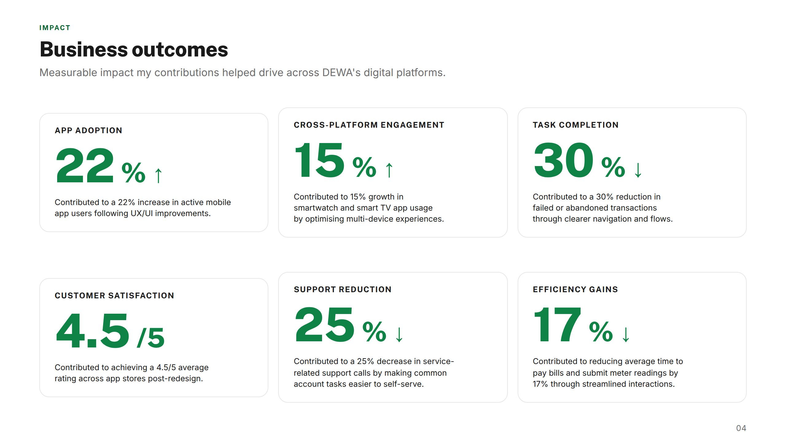
22%↑
App adoption
Contributed to a 22% increase in active mobile app users following UX/UI improvements.
15%↑
Cross-platform engagement
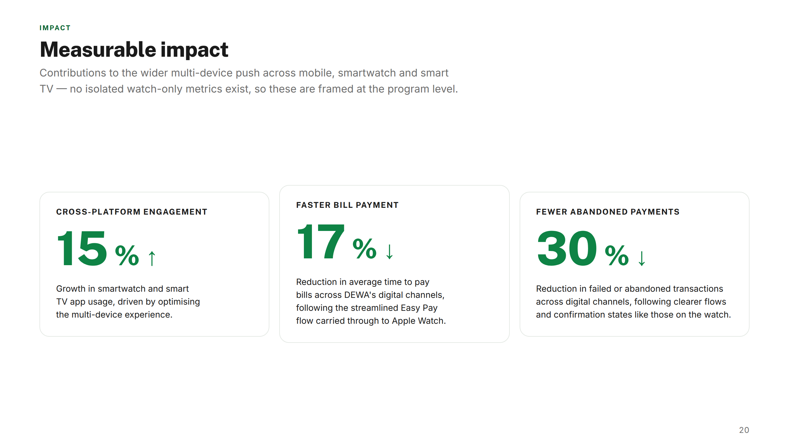
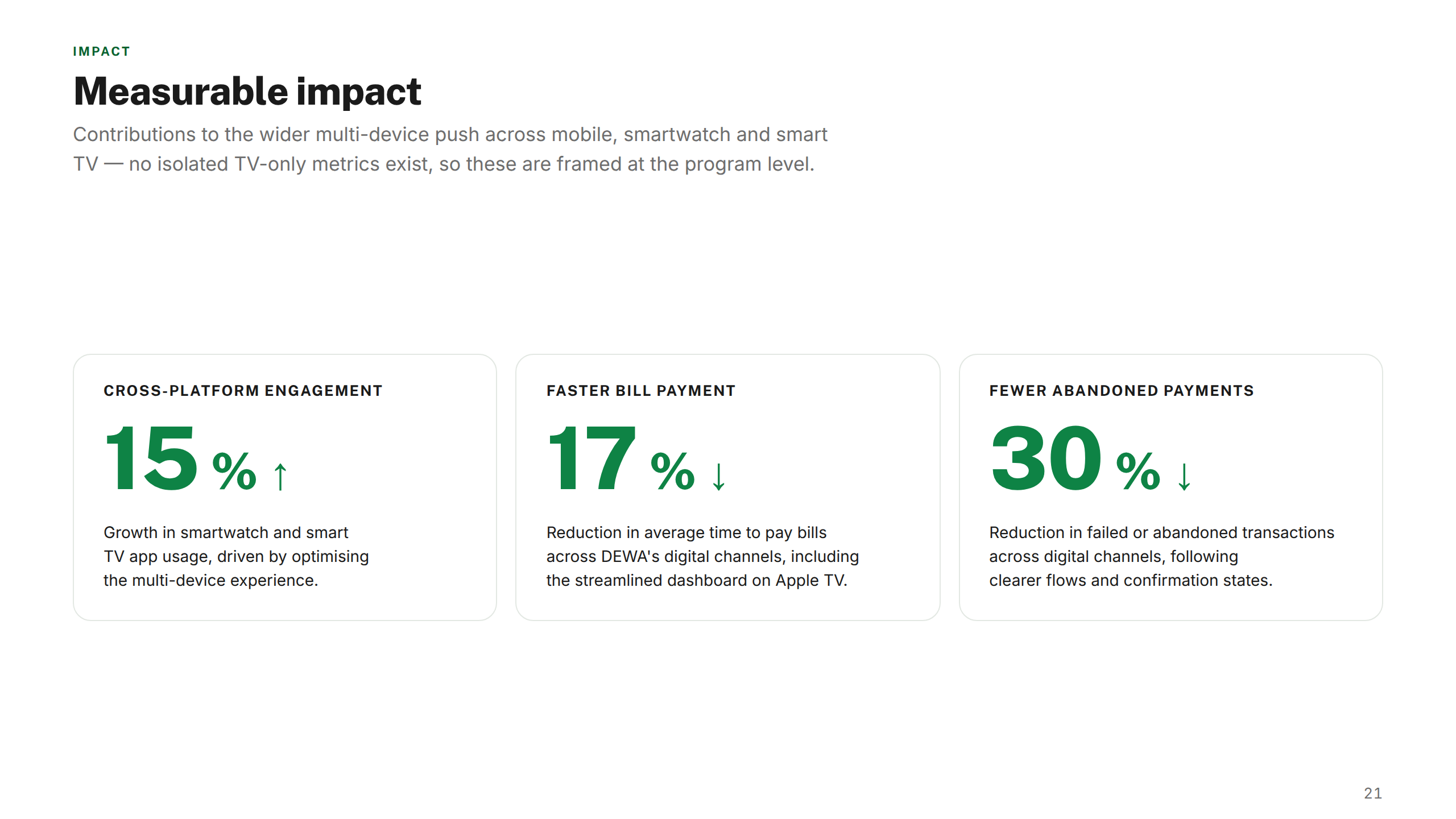
Contributed to 15% growth in smartwatch and smart TV app usage by optimising multi-device experiences.
30%↓
Task completion
Contributed to a 30% reduction in failed or abandoned transactions through clearer navigation and flows.
4.5/5
Customer satisfaction
Contributed to achieving a 4.5/5 average rating across app stores post-redesign.
25%↓
Support reduction
Contributed to a 25% decrease in service-related support calls by making common account tasks easier to self-serve.
17%↓
Efficiency gains
Contributed to reducing average time to pay bills and submit meter readings by 17% through streamlined interactions.
"Johnny brought a level of rigour and cross-platform thinking we hadn't seen before. He didn't just design screens — he gave us a system we could build on and maintain. The coherence across mobile, Watch, and TV was exactly what DEWA needed."
Projects shown include live work, pitch deliverables, and design produced as part of embedded or collaborative engagements. Some work was completed as part of a wider team. Deliverables reflect the scope and direction at the time of engagement — the live experience may have since changed, launched in a different form, or not proceeded to production. All brand assets and trademarks shown remain the property of their respective owners and are displayed here for portfolio reference only.