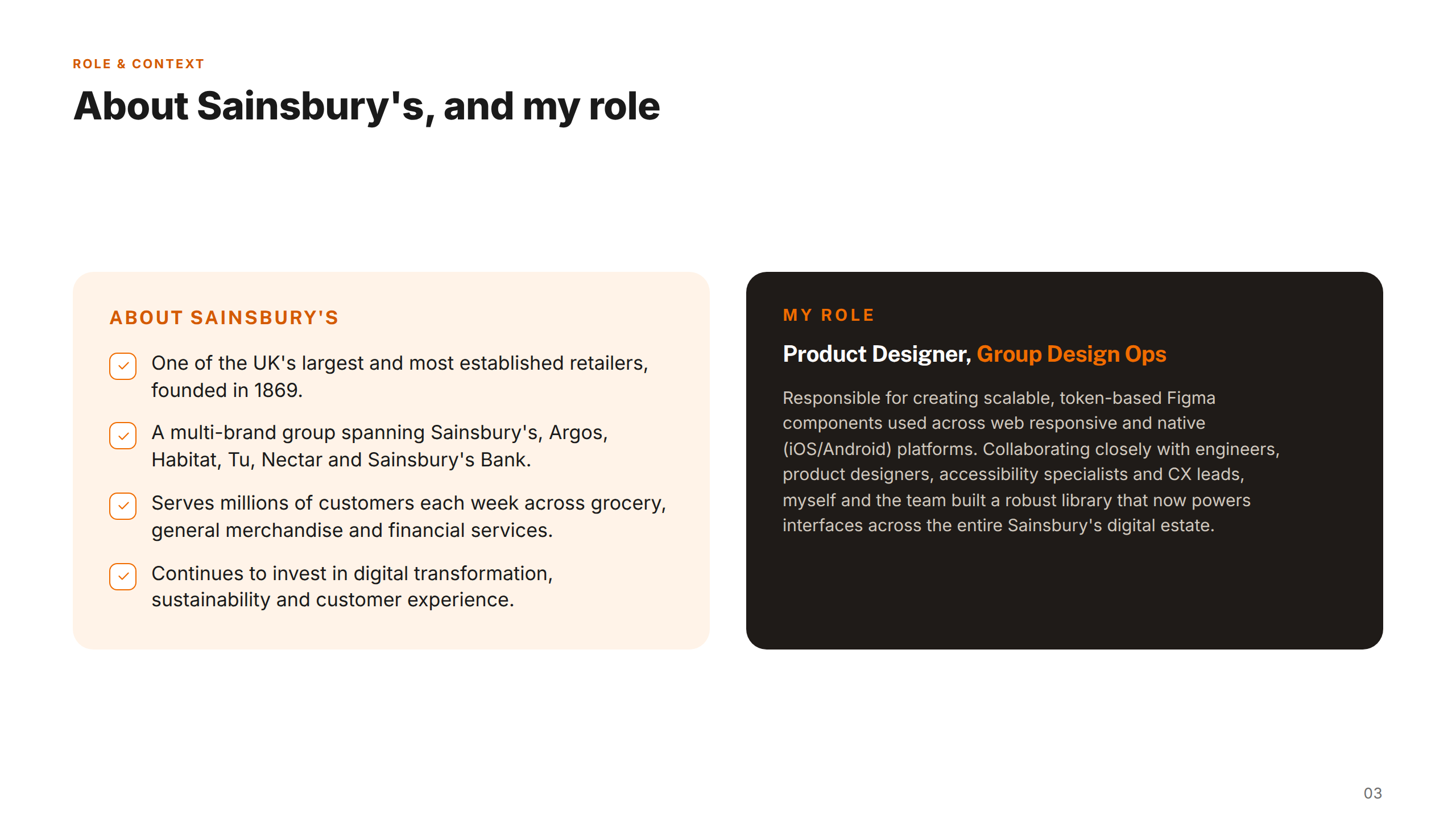
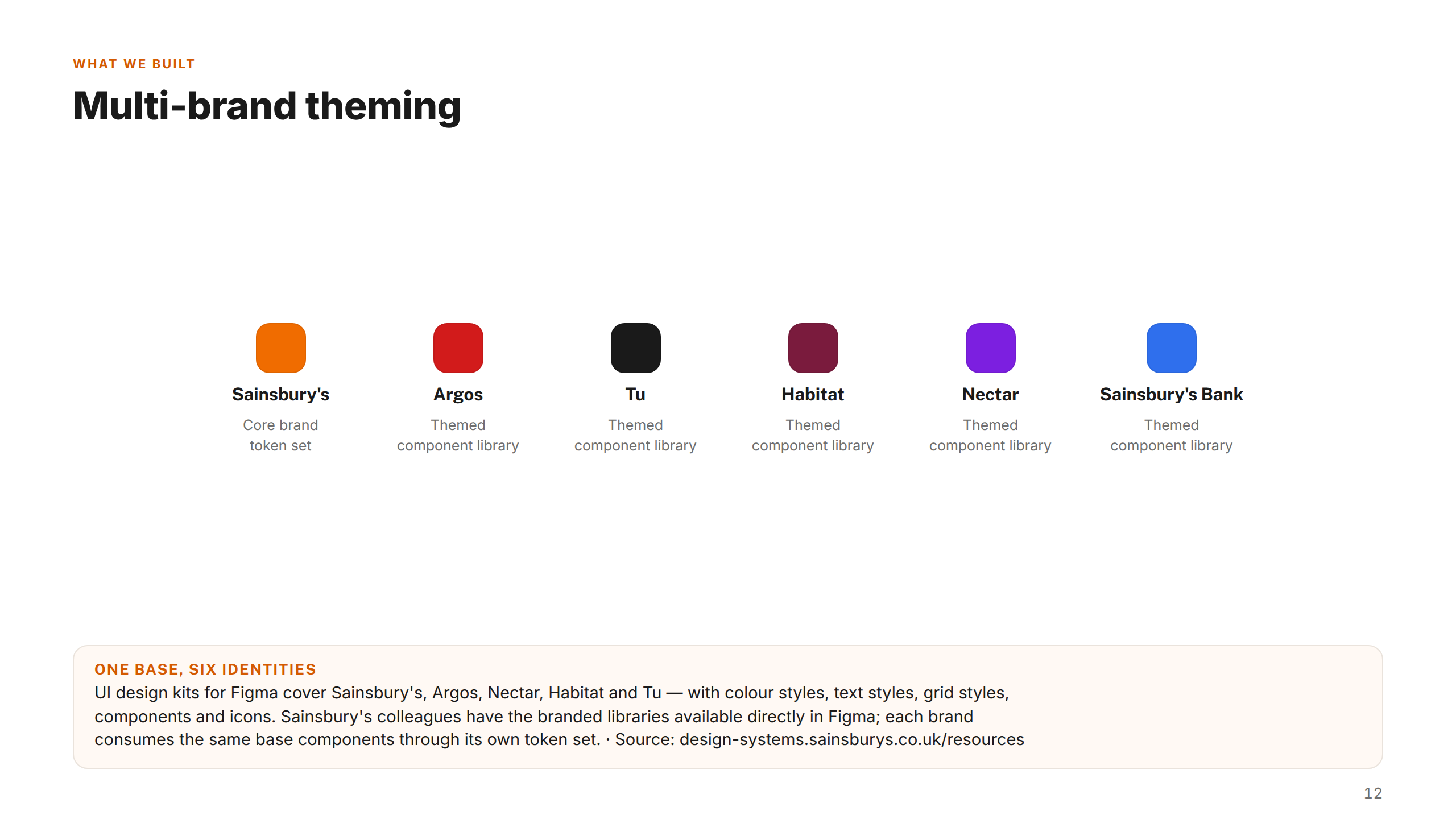
Sainsbury's Group is the UK's second-largest supermarket chain and one of the country's most significant retail conglomerates — operating across grocery, general merchandise, clothing, and financial services. Beyond its core supermarket business, the Group owns Argos (one of the UK's biggest general merchandise retailers), Tu Clothing, Habitat, and the Nectar loyalty programme, giving it a diverse portfolio of digital customer touchpoints serving tens of millions of people.
Across those five brands, Sainsbury's operates some of the UK's most-visited ecommerce platforms — from grocery delivery and click-and-collect to Argos's catalogue-driven online store and the Nectar loyalty app. Each brand had its own product teams building digital experiences independently, creating significant design and engineering duplication. My role was to work within the design systems team to build the shared foundation that unified them.
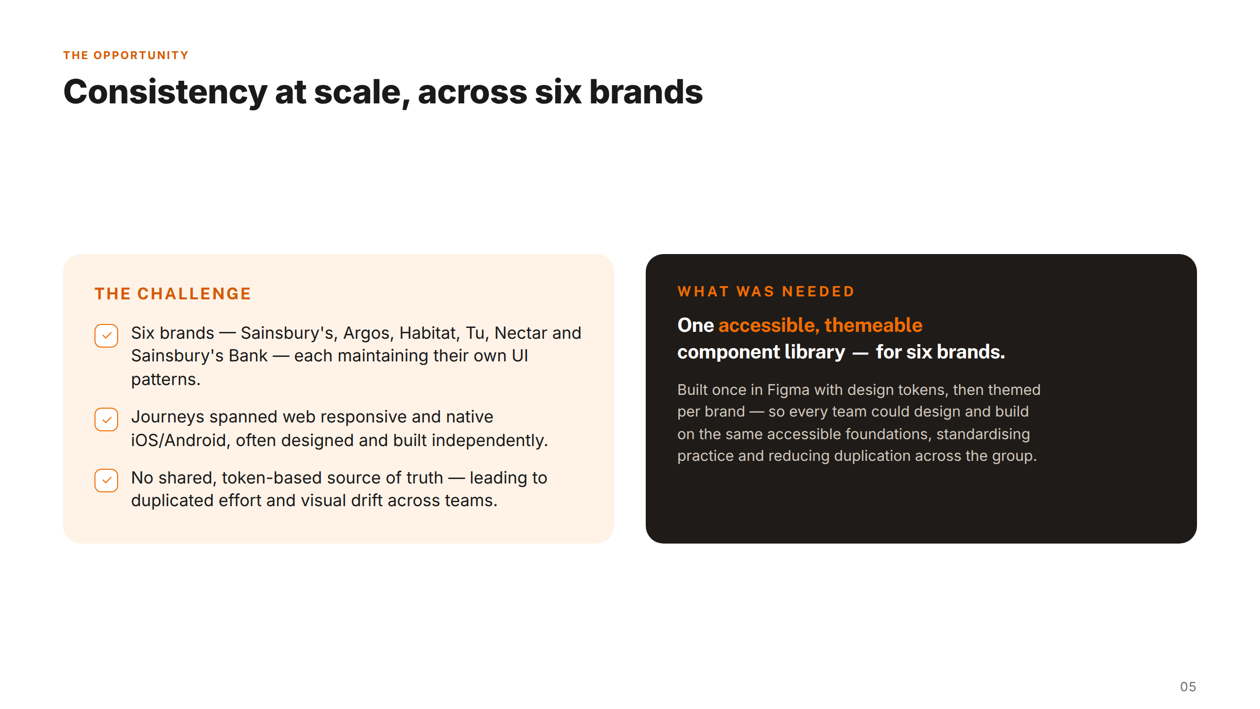
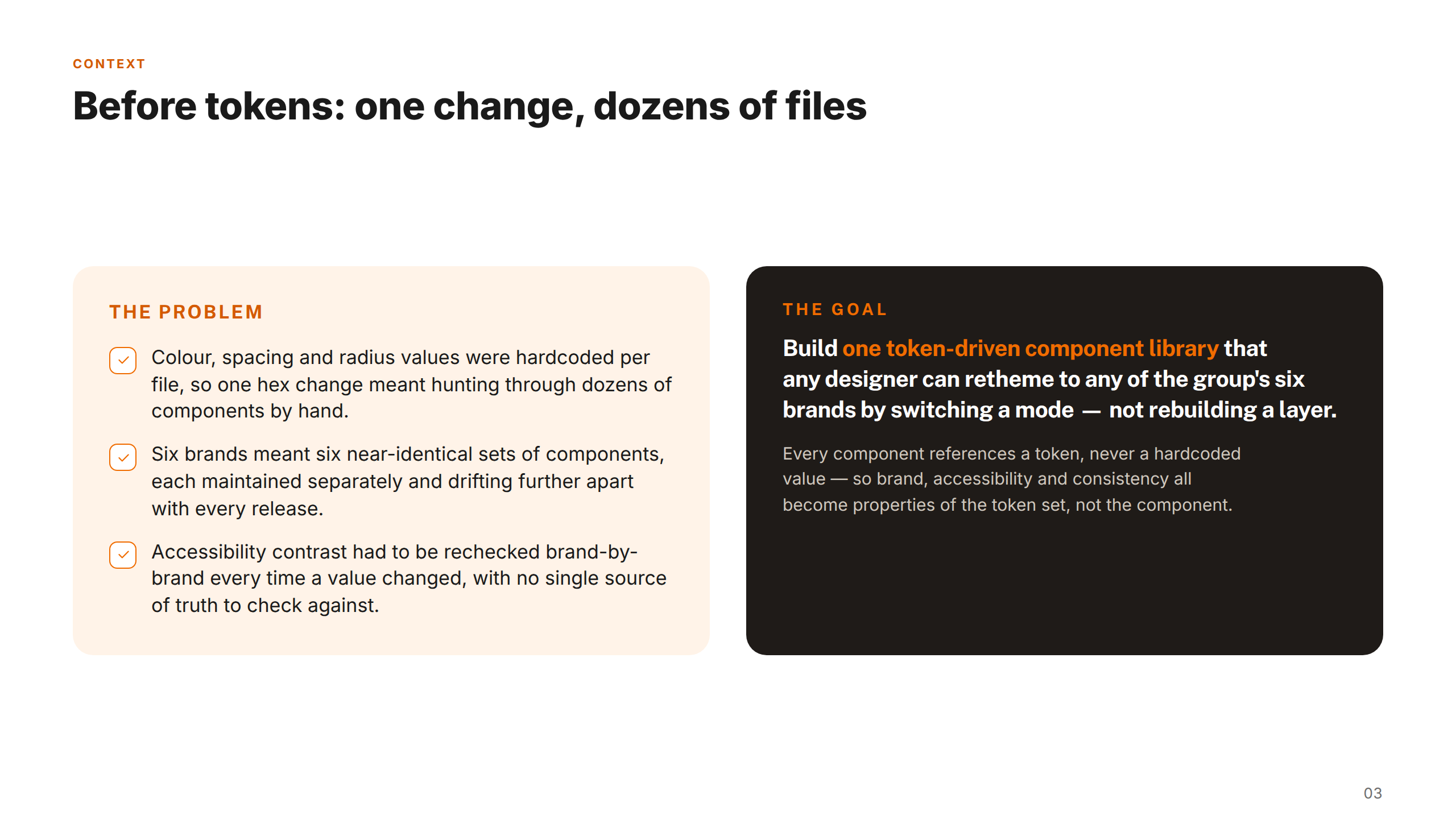
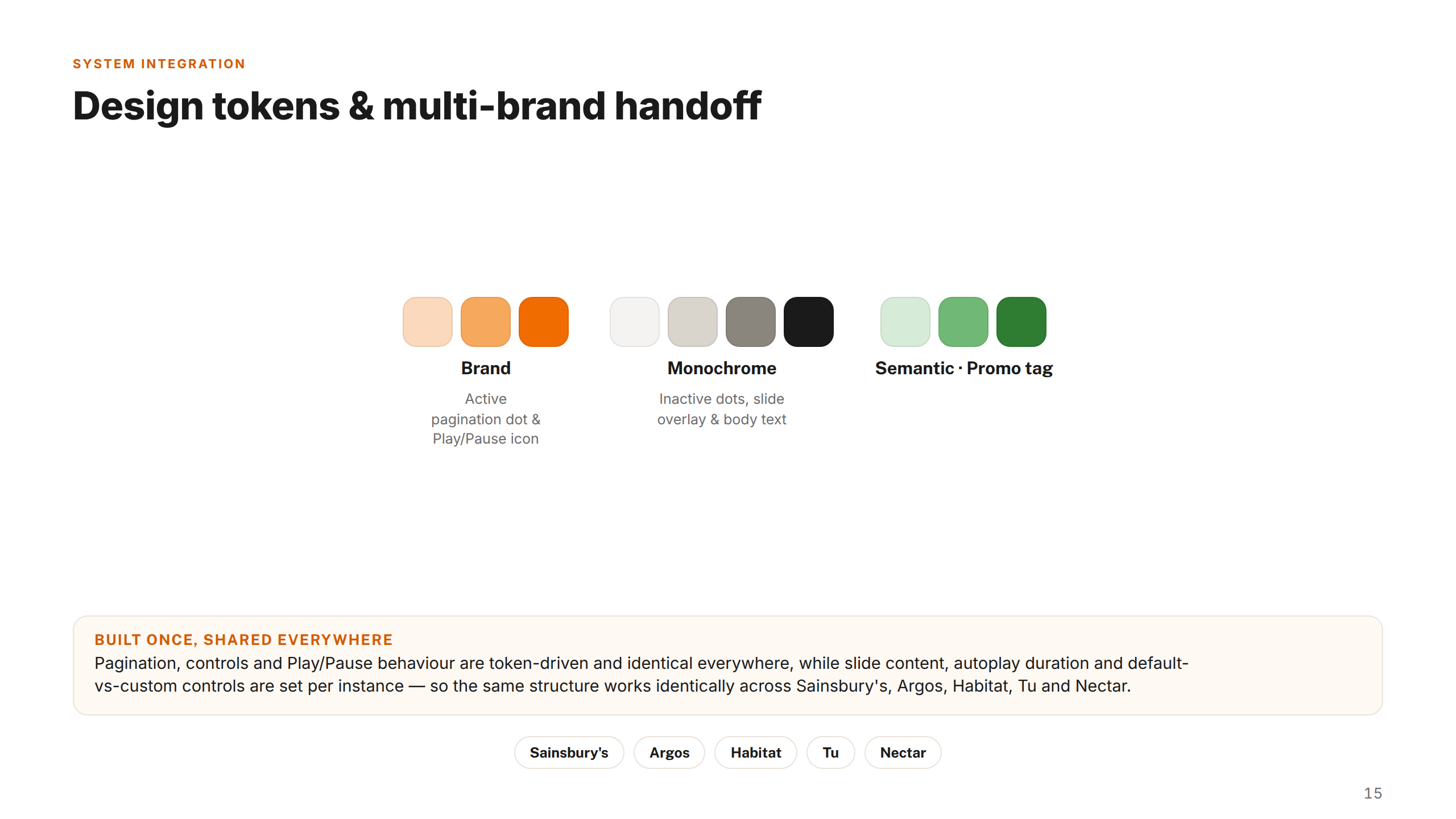
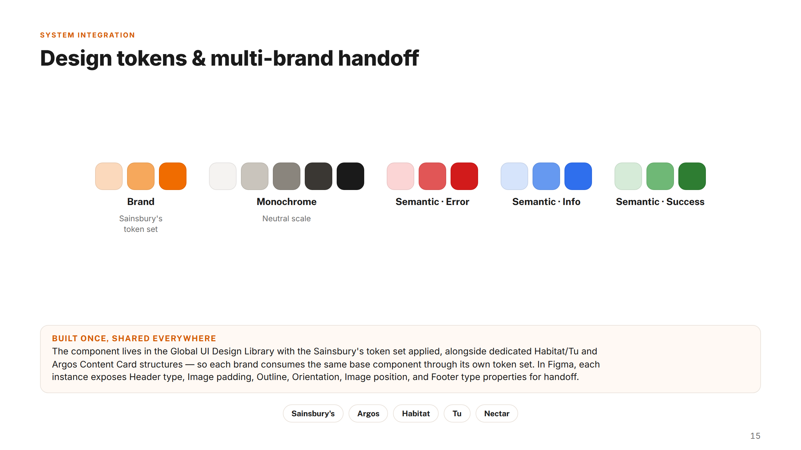
Sainsbury's Group operates five digital brands — Sainsbury's, Argos, Habitat, Tu Clothing, and Nectar — each with their own product teams building interfaces independently. Without a shared foundation, components were rebuilt from scratch across teams, accessibility was inconsistently applied, and the design-to-engineering handoff was slow and error-prone.
The group needed a system flexible enough to adapt to multiple brand identities, robust enough to meet accessibility standards, and practical enough that designers and engineers would actually adopt it.
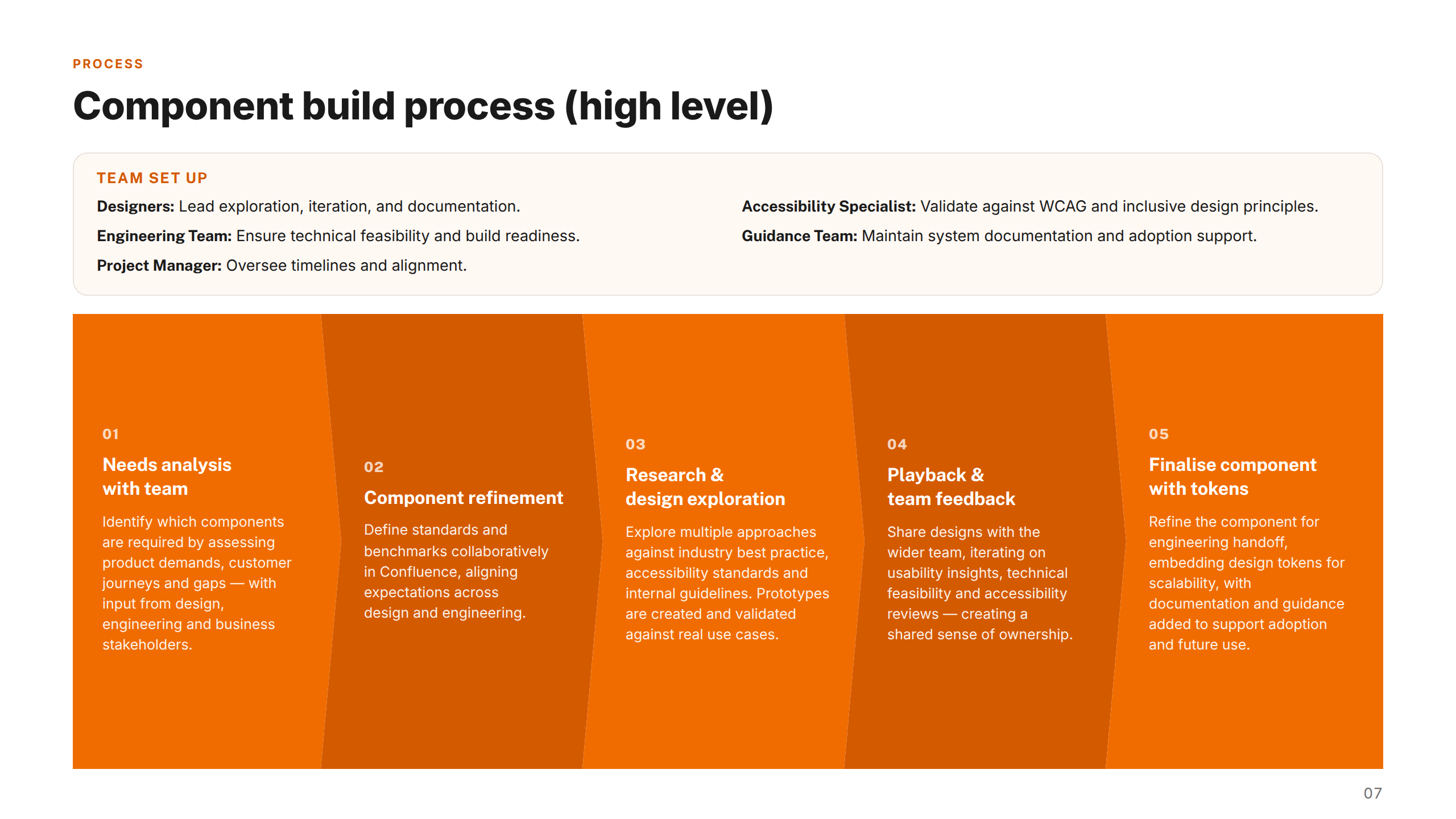
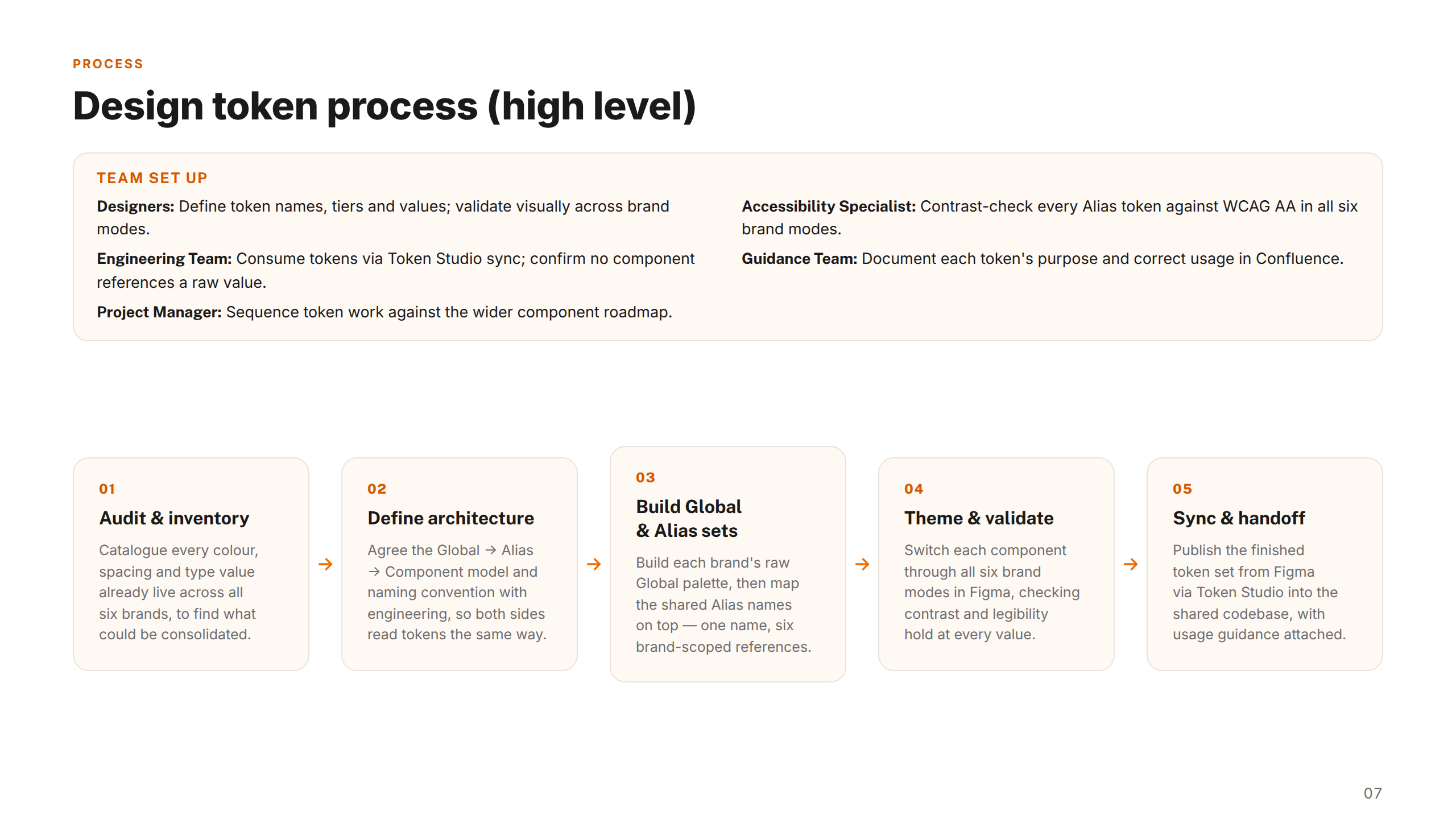
Embedded within the Design Ops team alongside accessibility specialists, engineers, product designers, and CX leads, I took an inventory-first approach. Rather than designing components in isolation, I audited the existing digital estate to identify patterns, duplication, and gaps across brands.
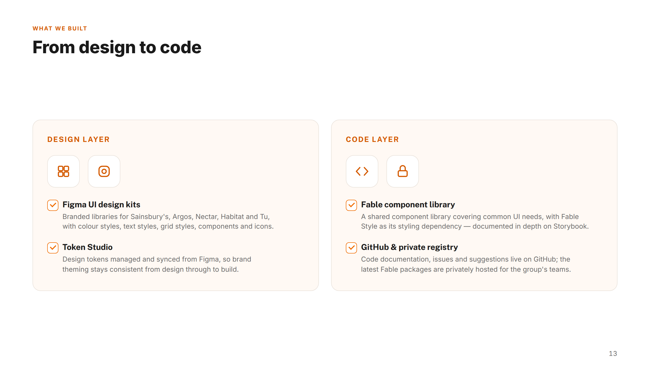
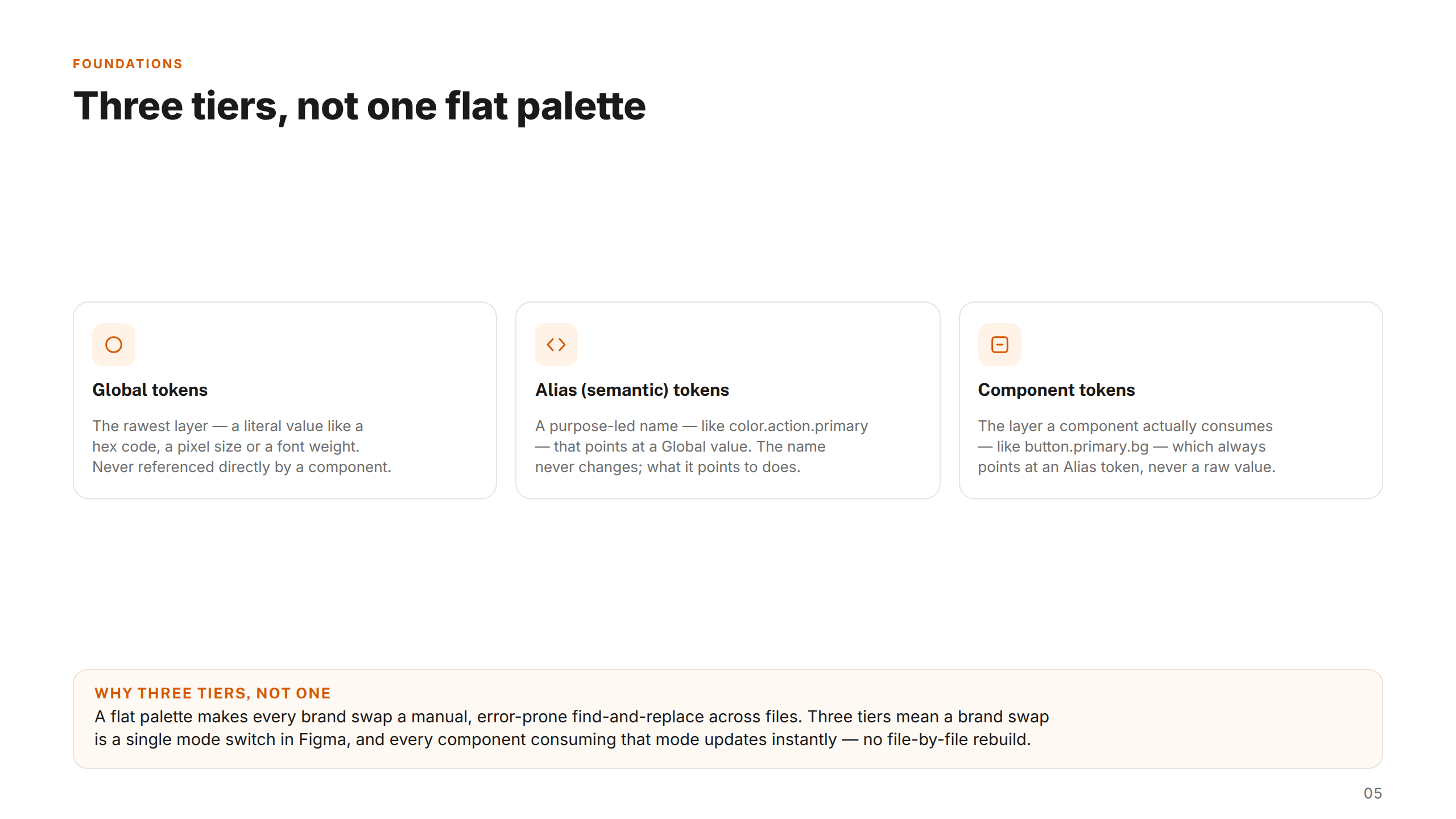
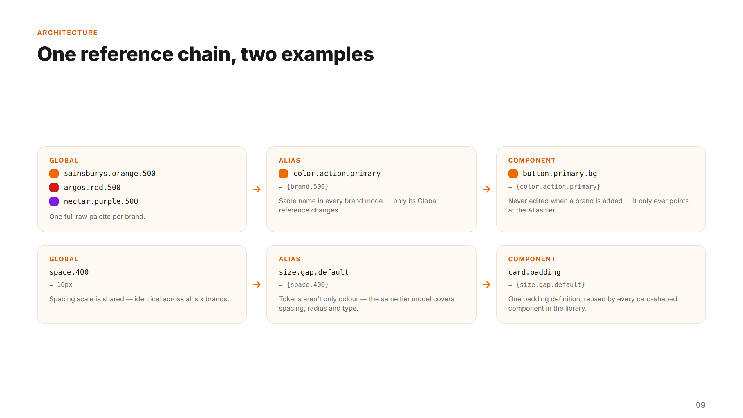
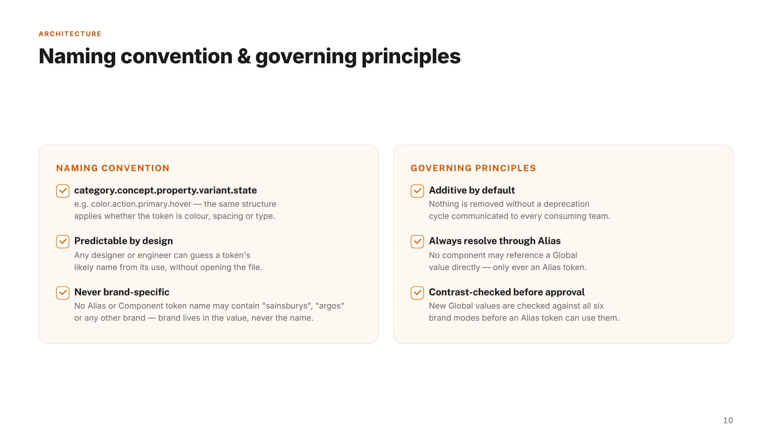
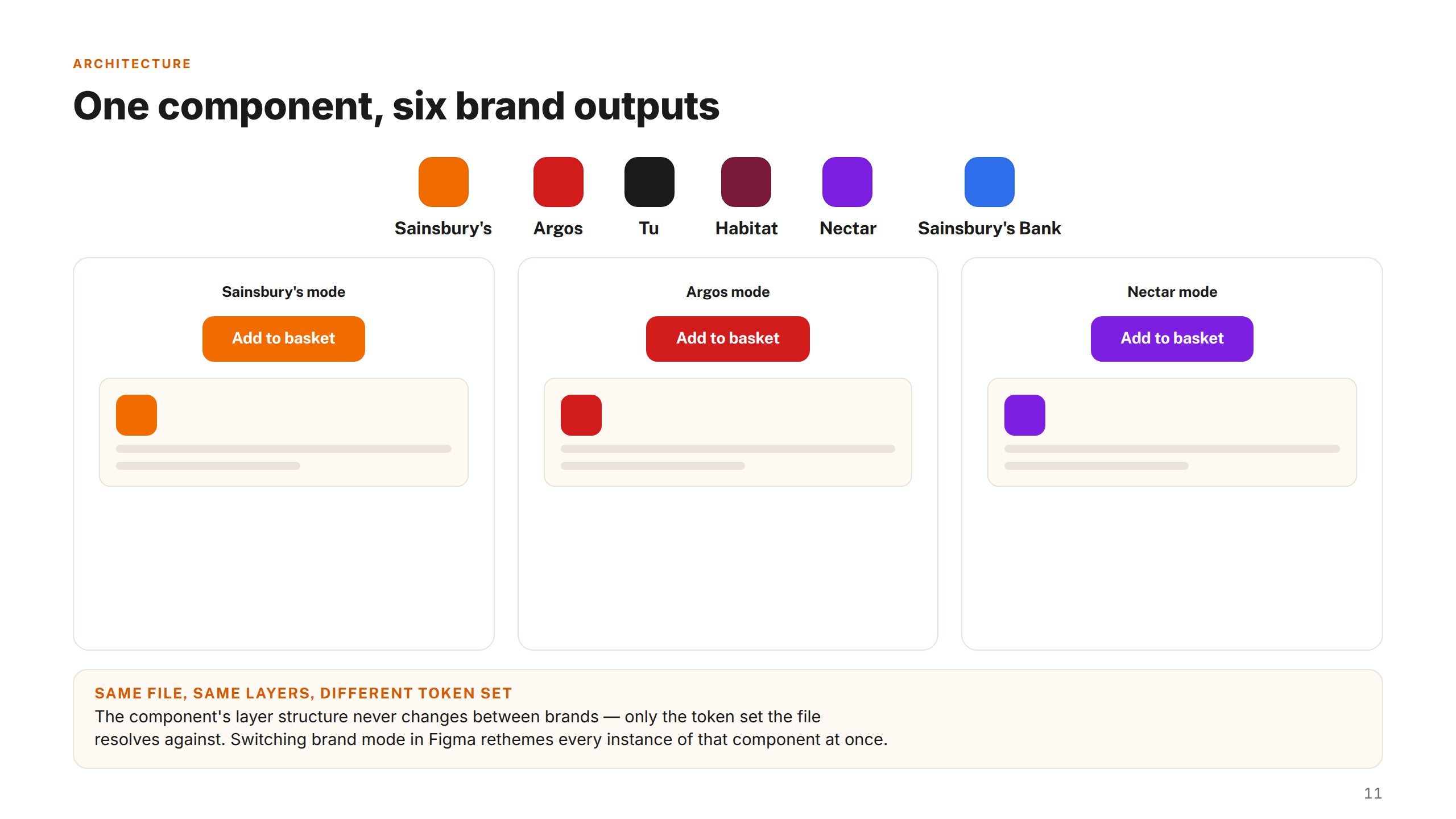
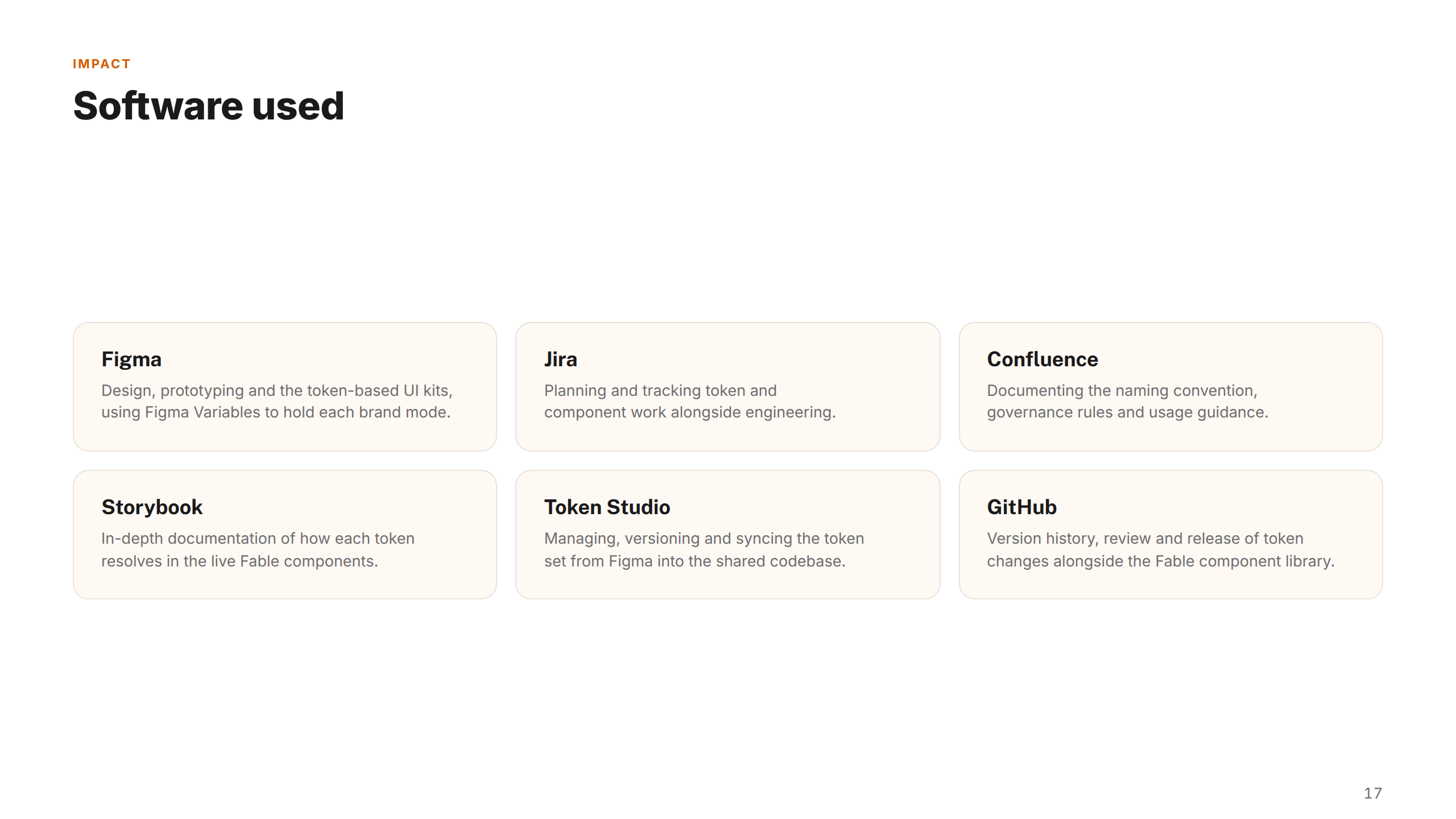
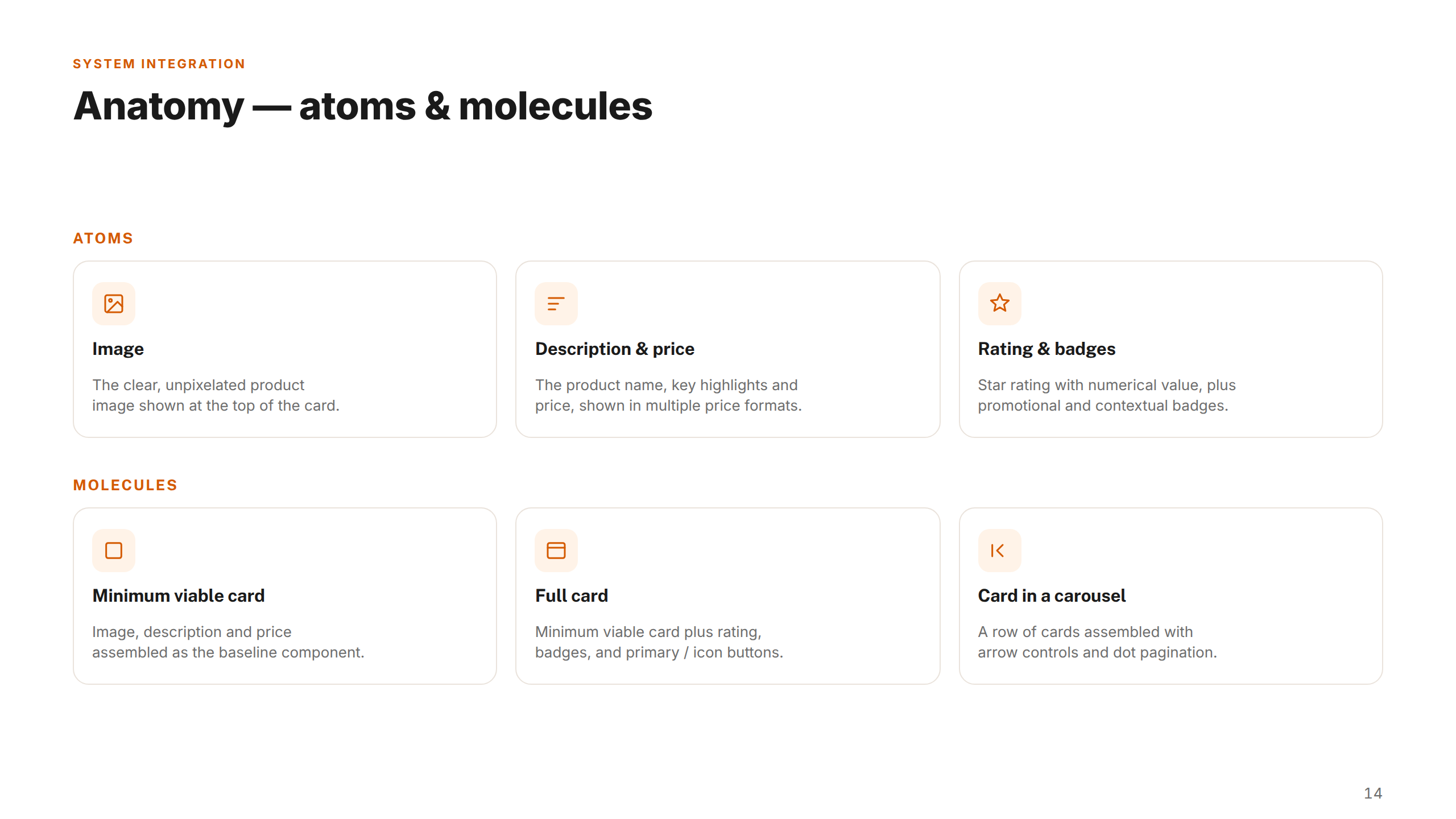
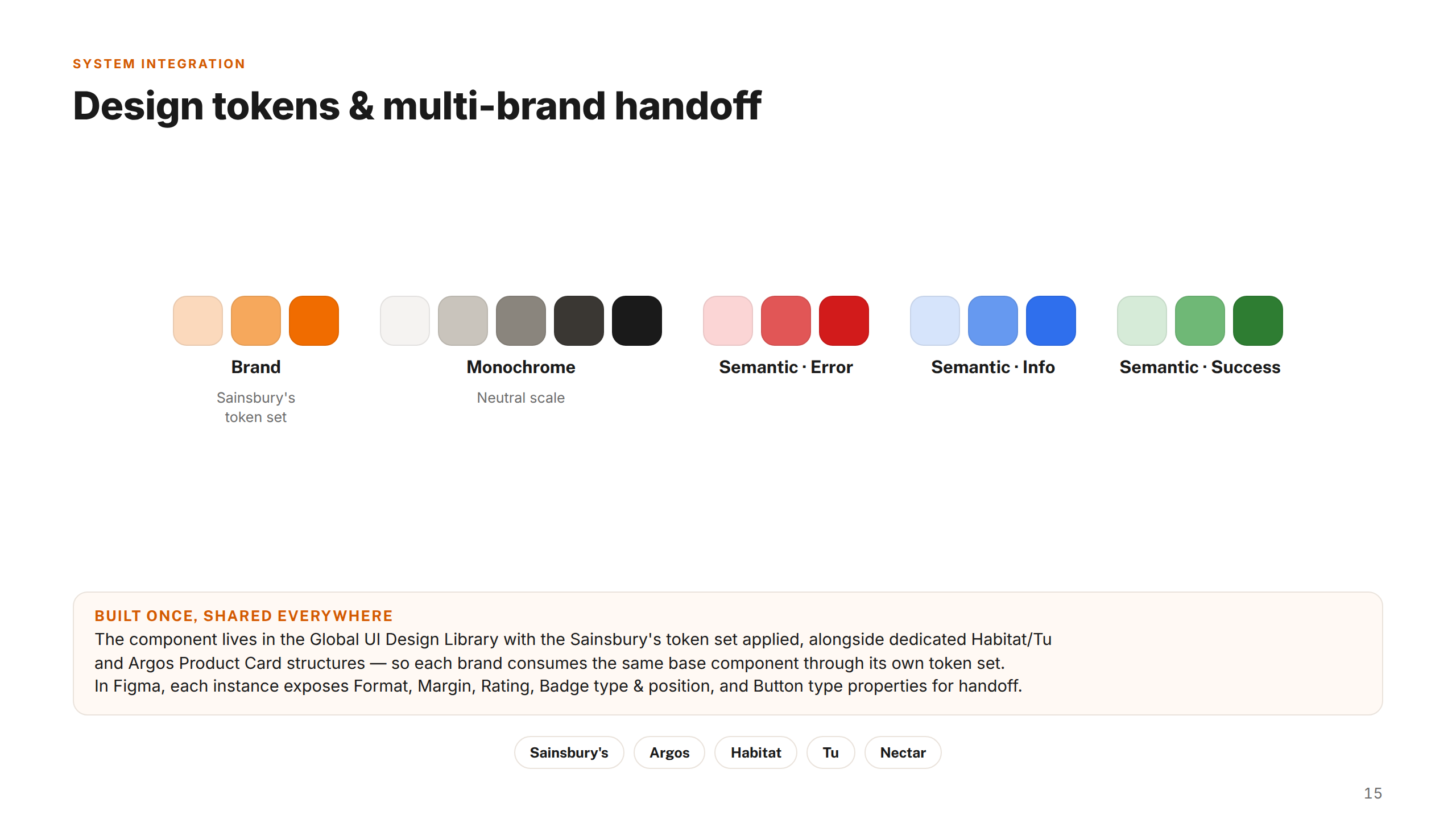
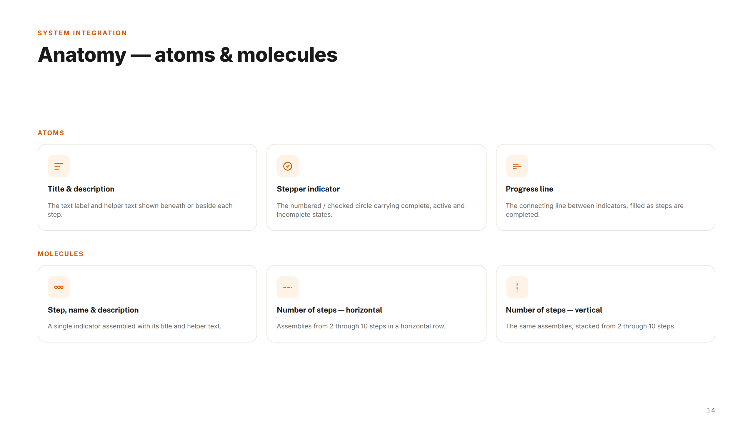
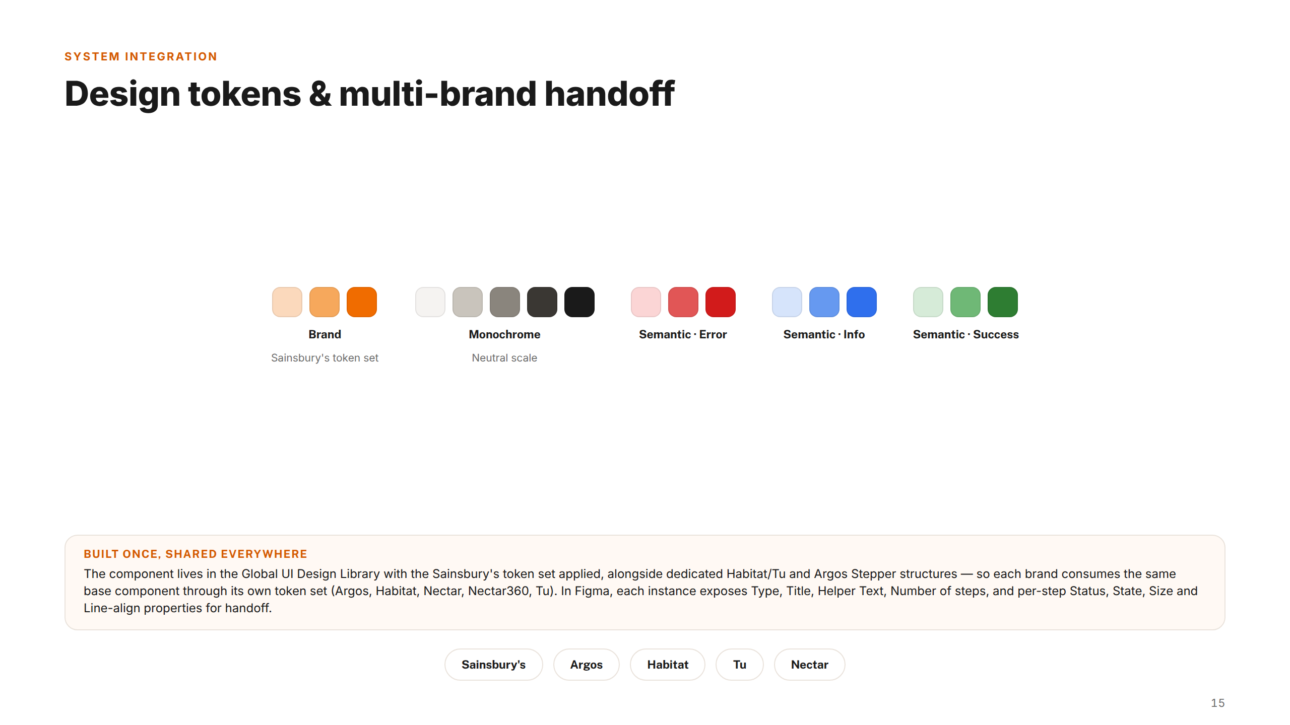
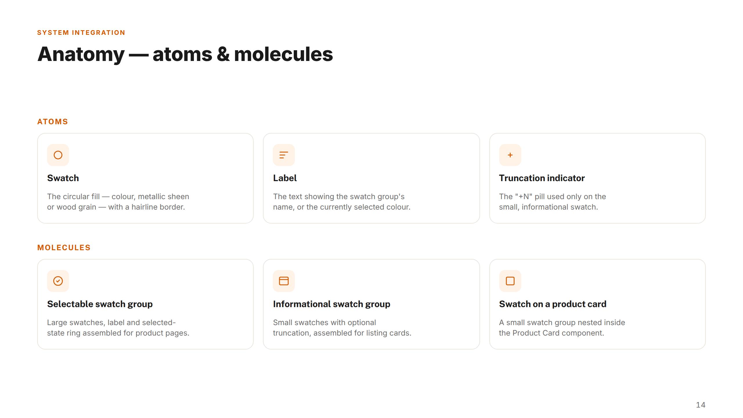
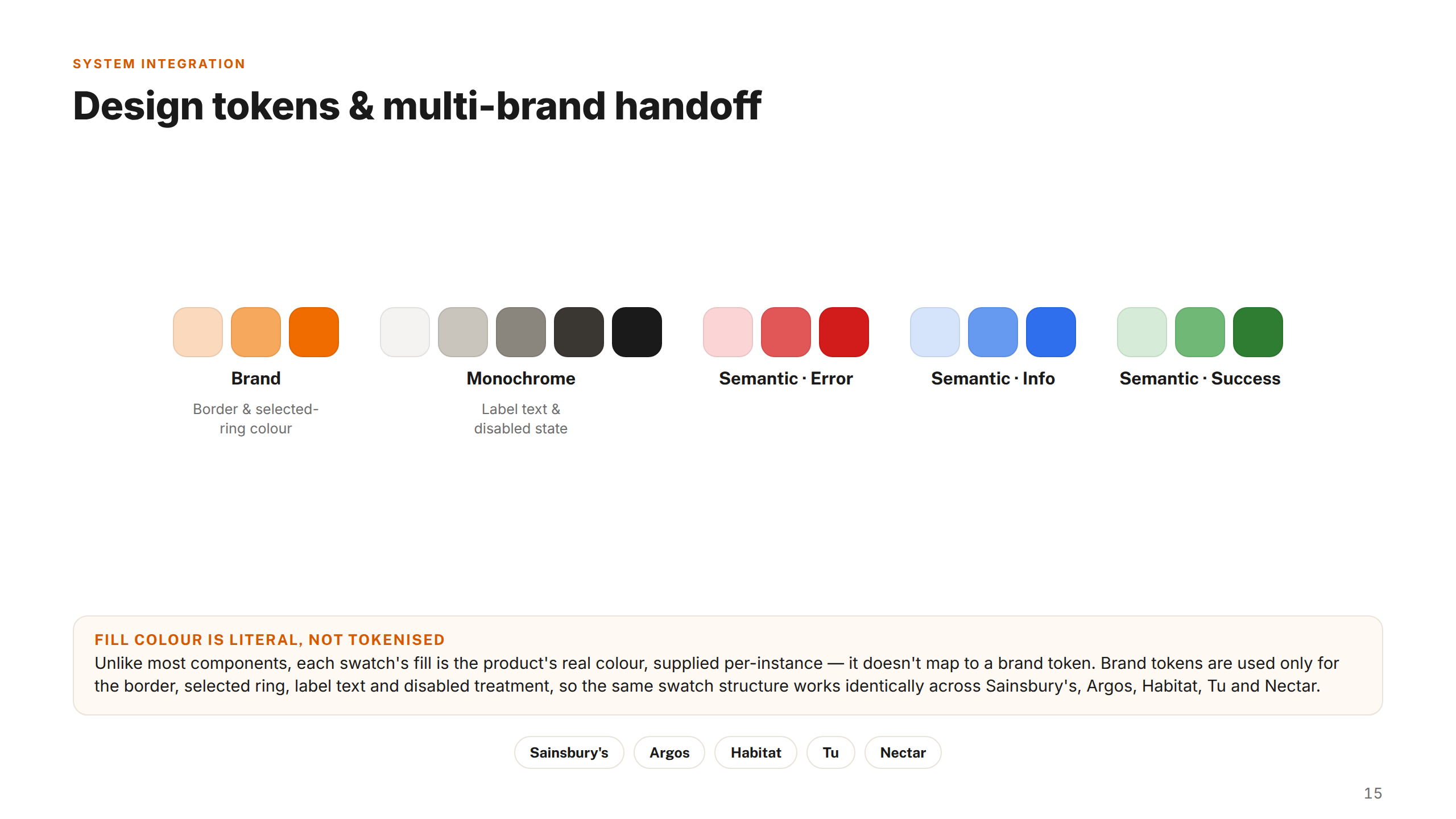
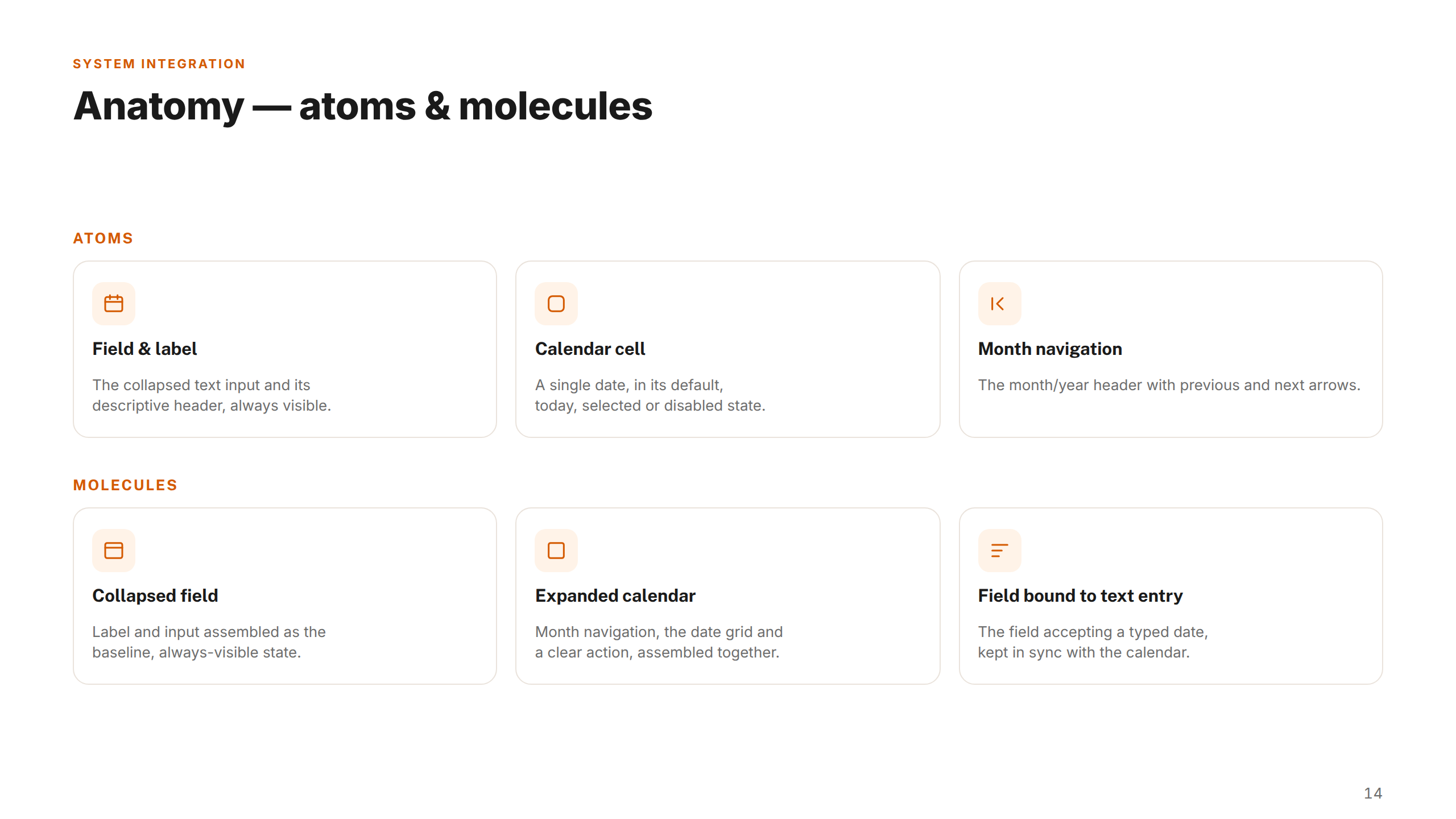
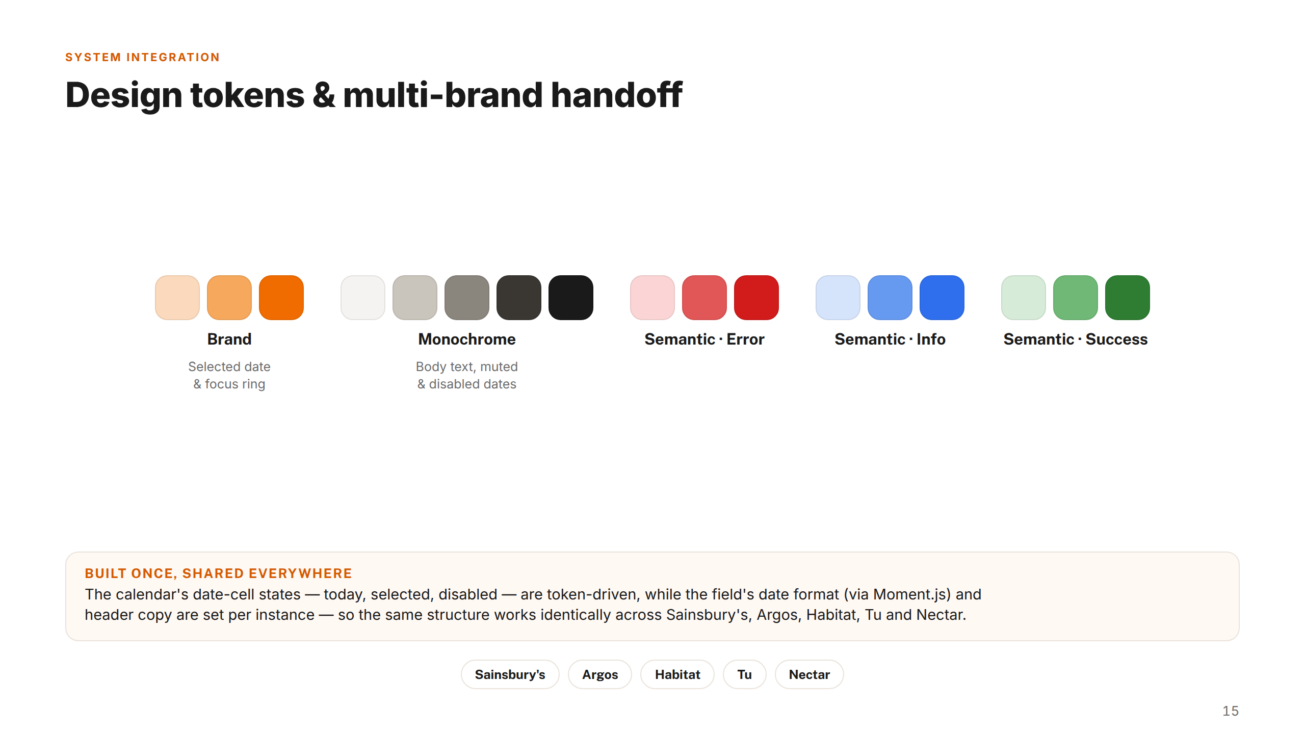
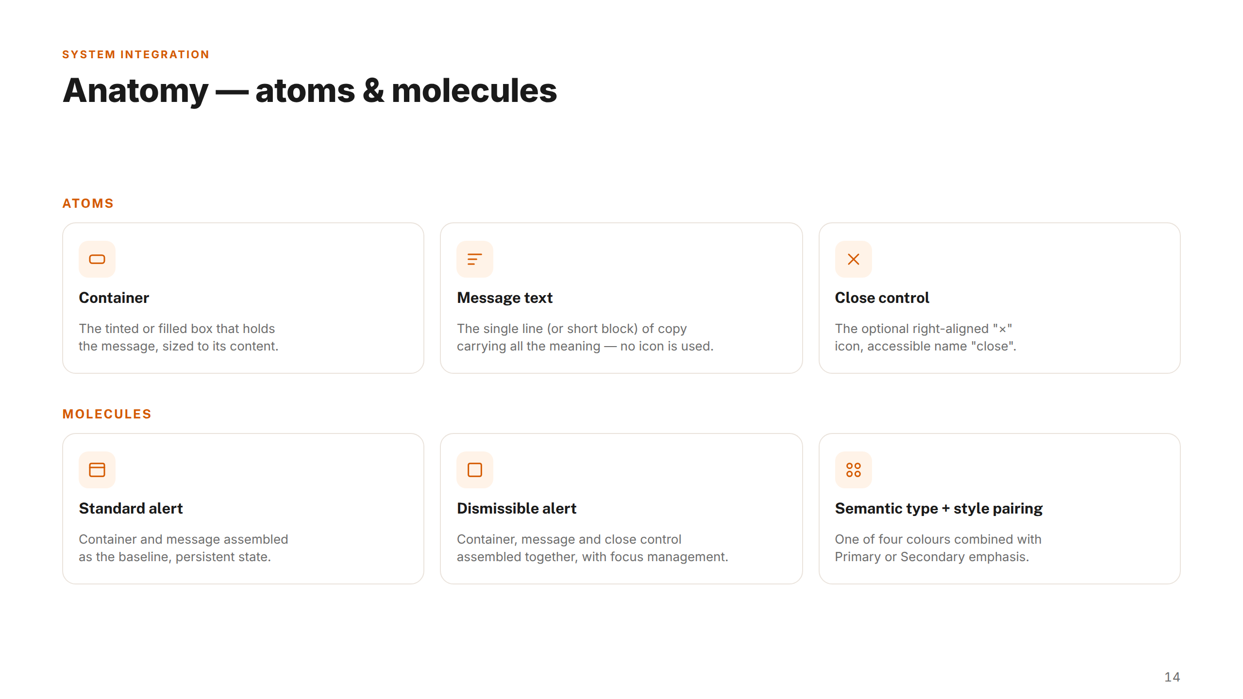
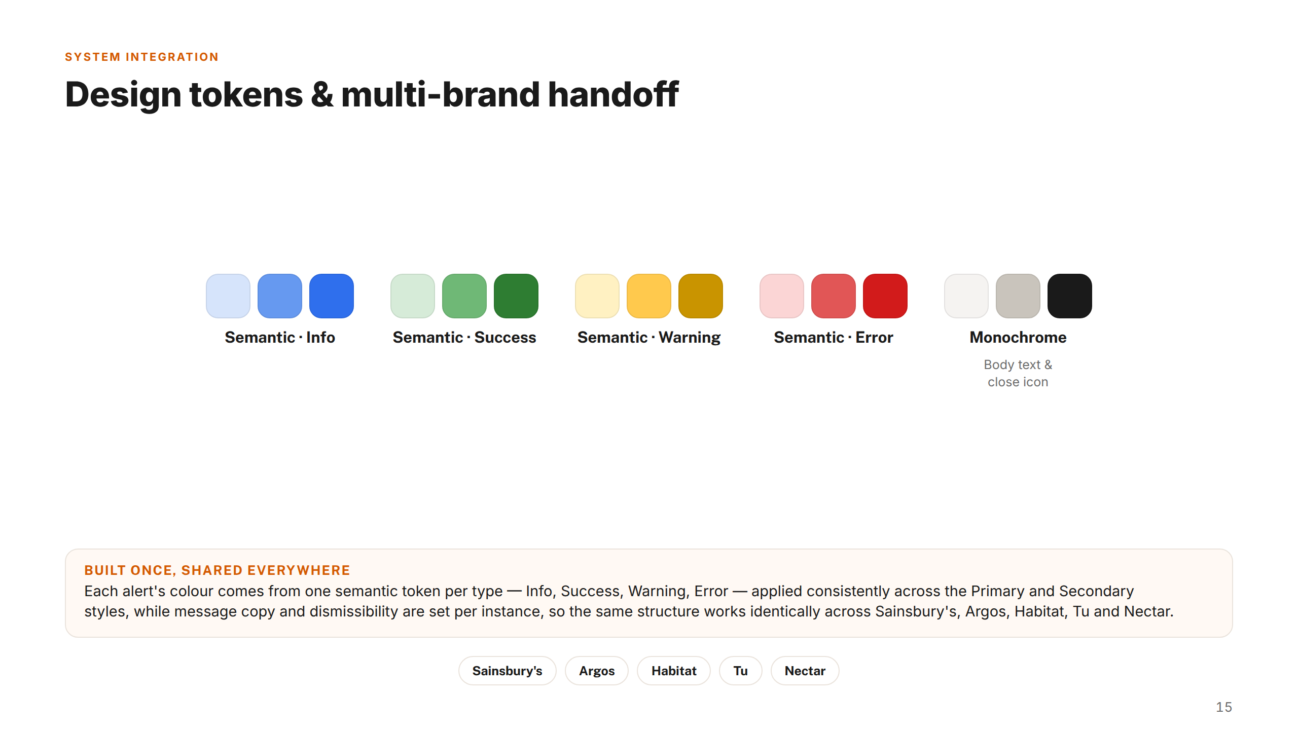
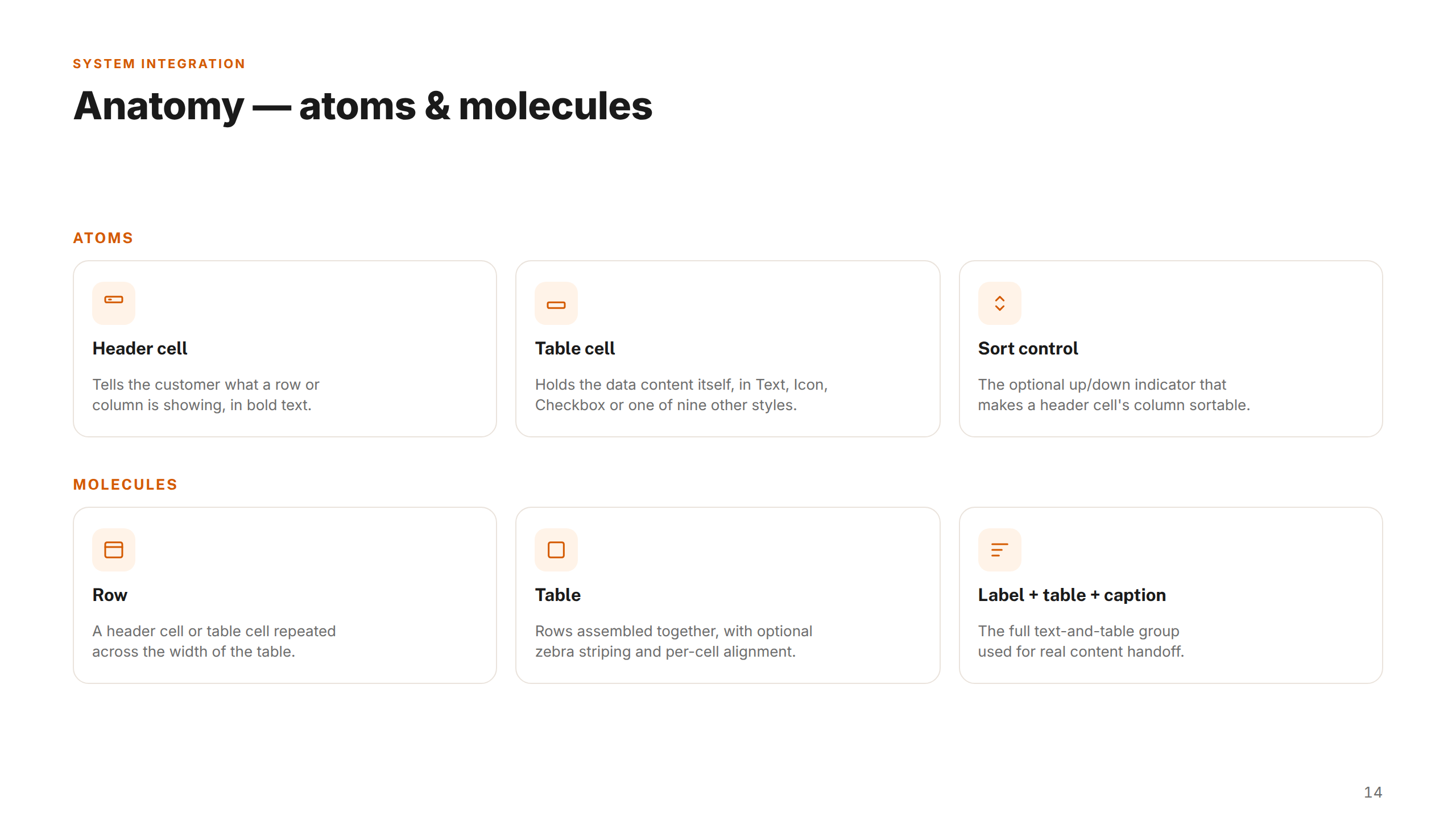
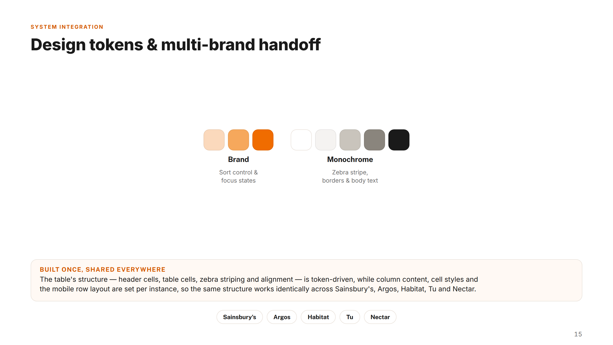
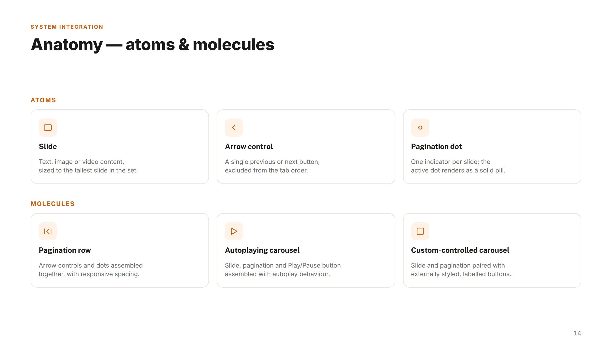
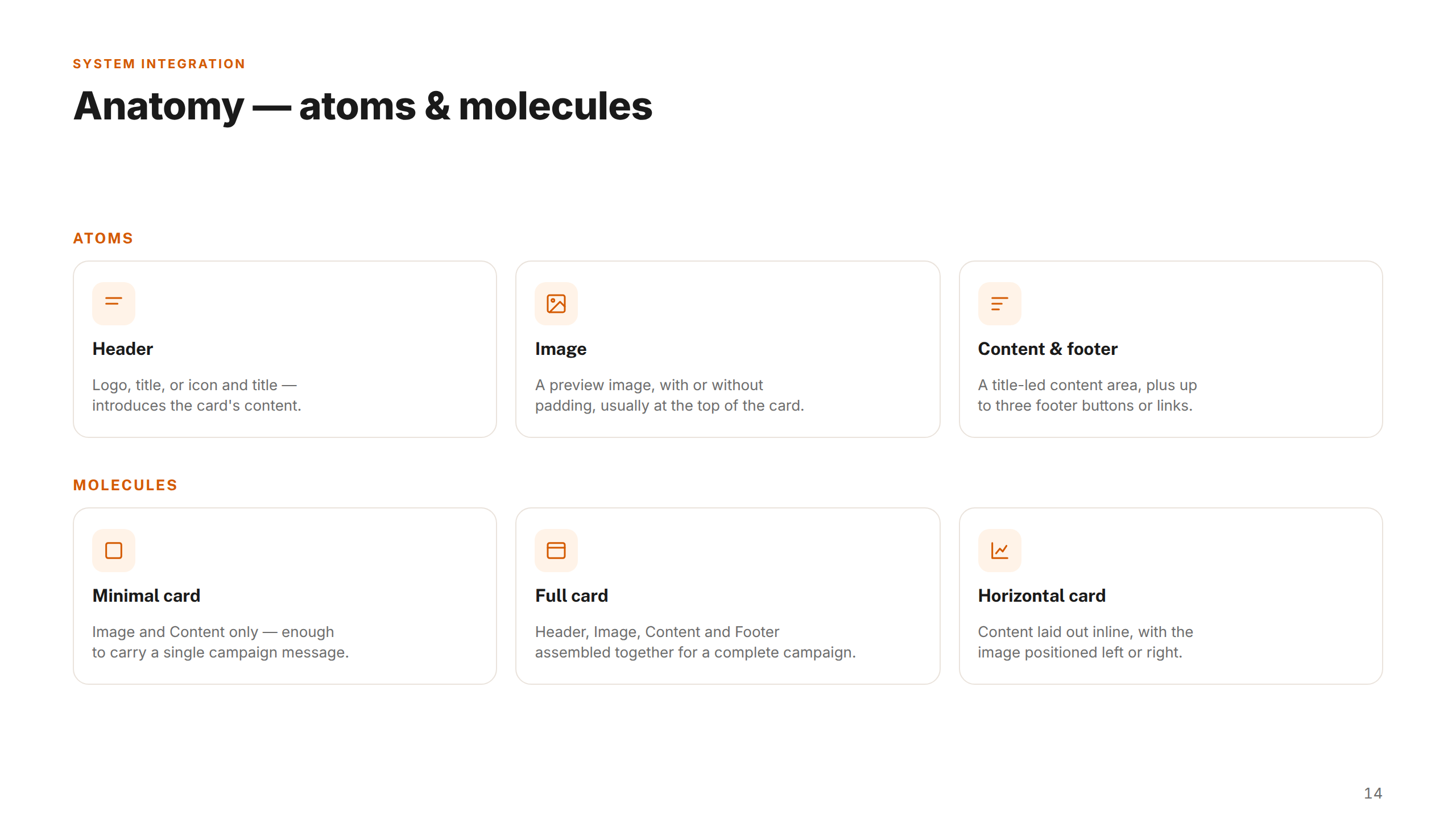
I then built a token-based component architecture in Figma — separating global decisions (colour, spacing, typography) from component-level choices — enabling brand-level theming without duplicating components. Every decision was made alongside engineering to ensure Figma and code stayed in sync.
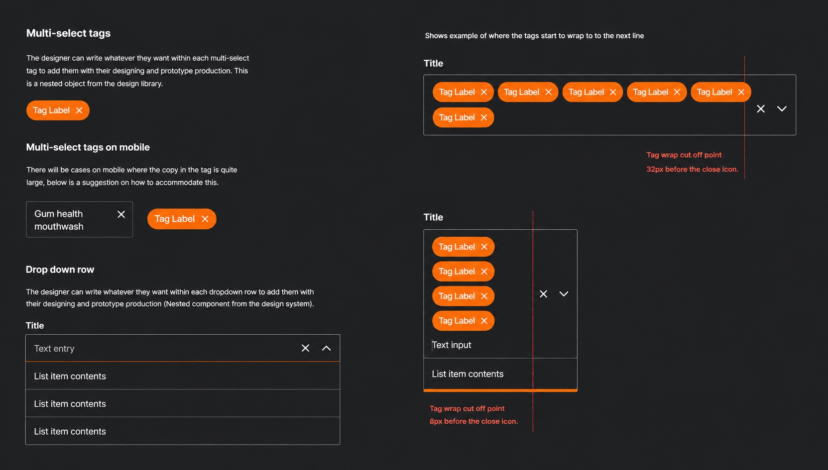
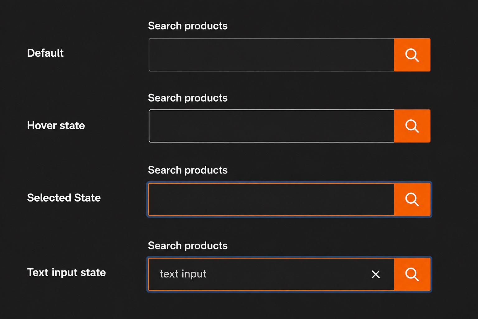
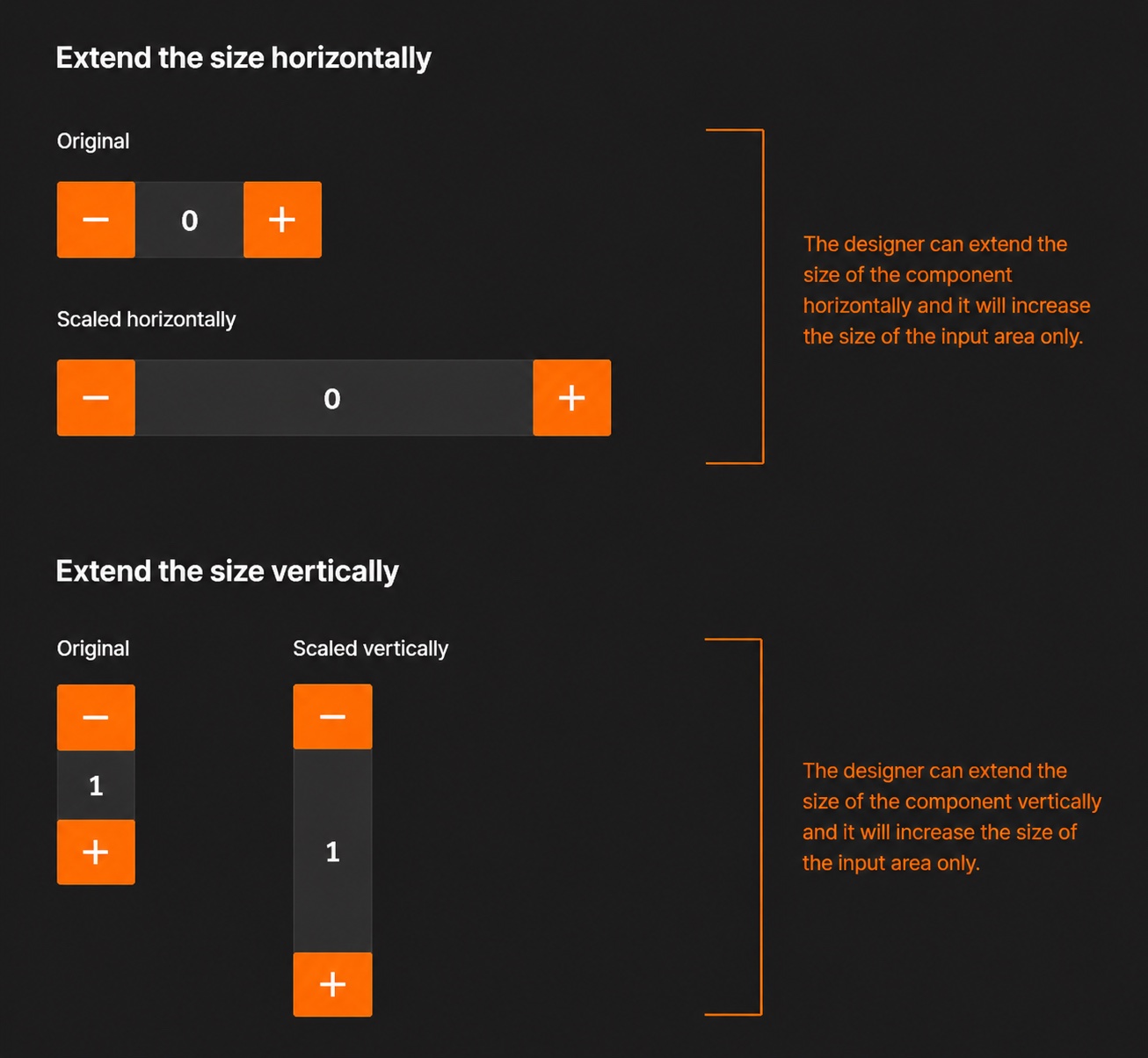
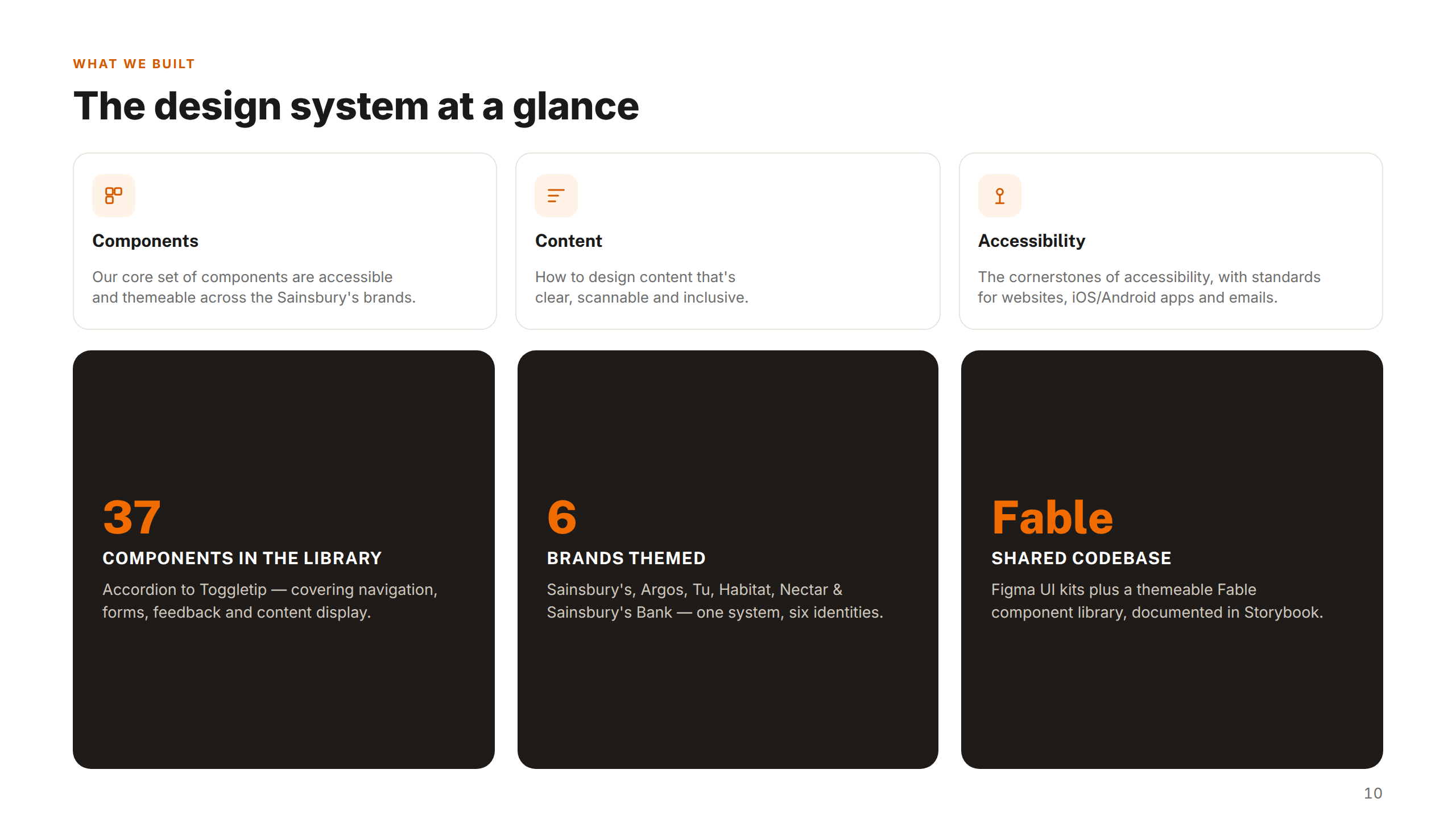
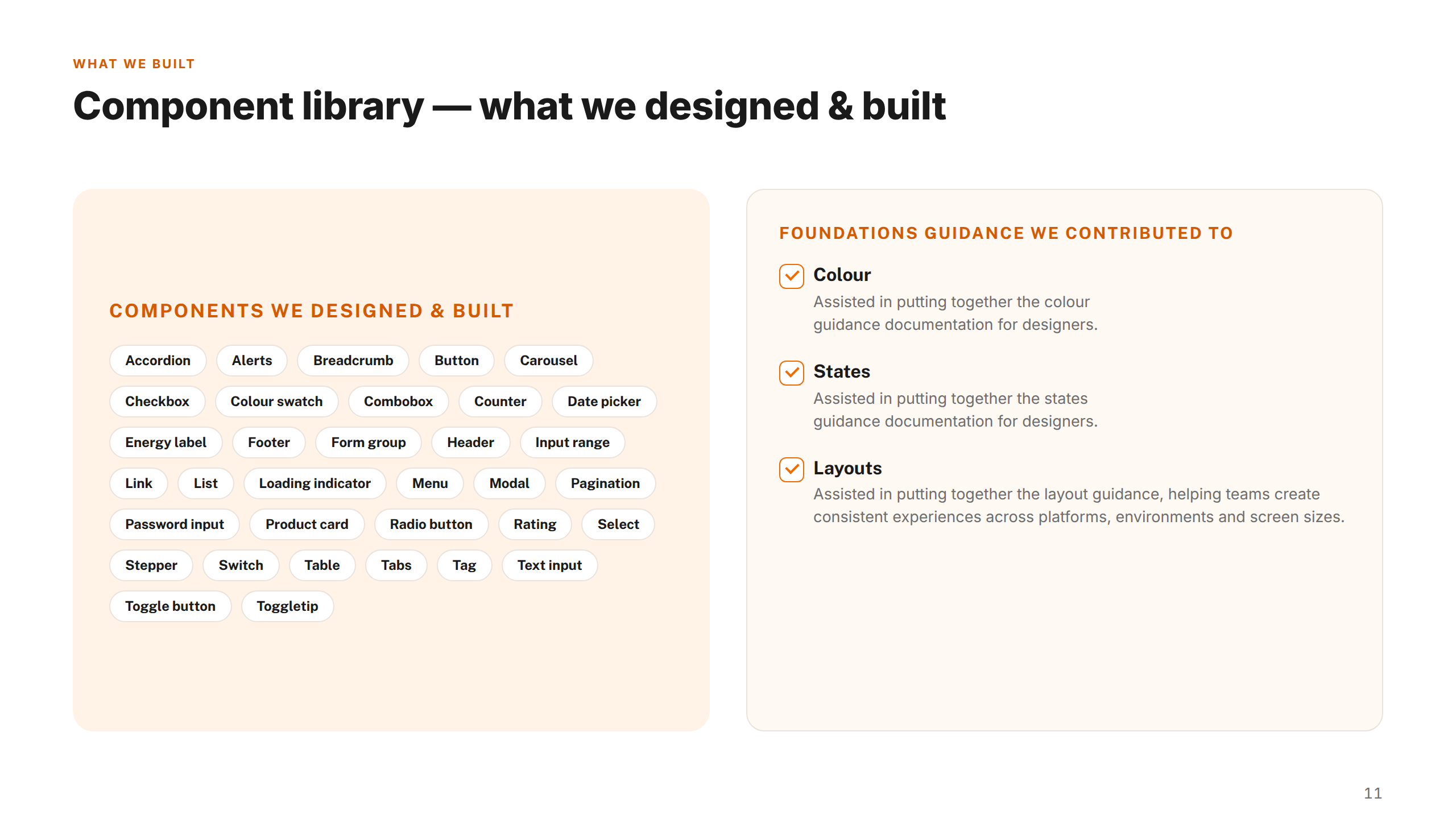
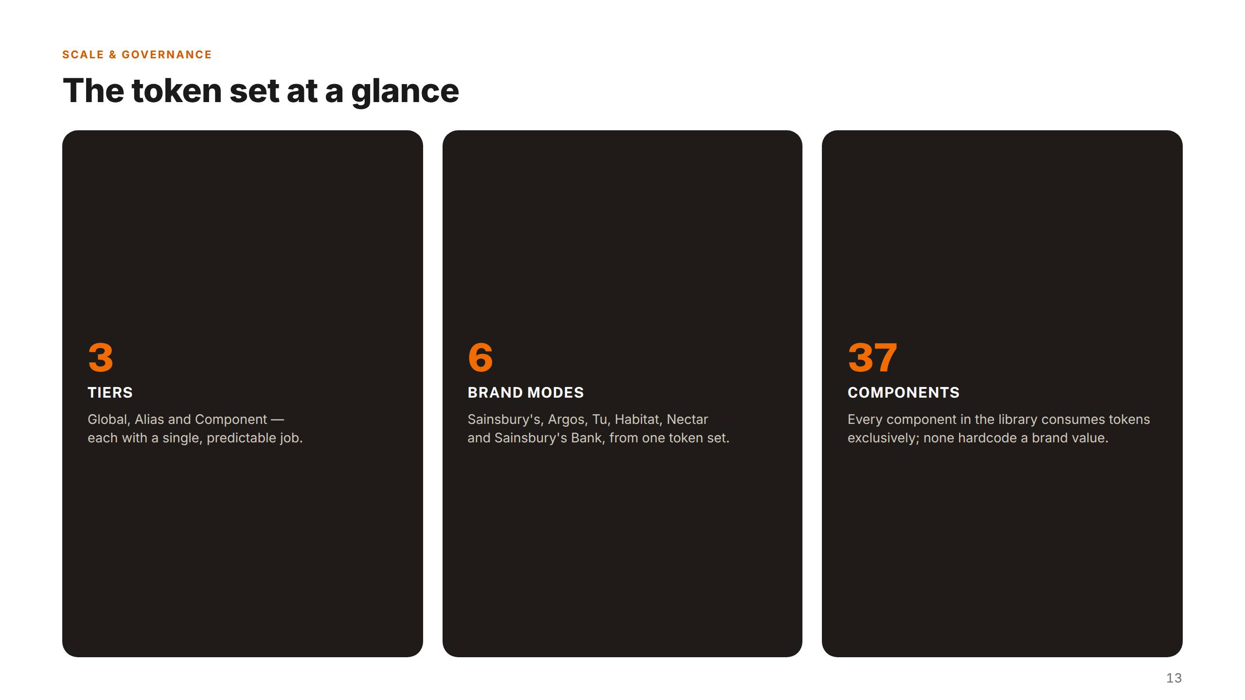
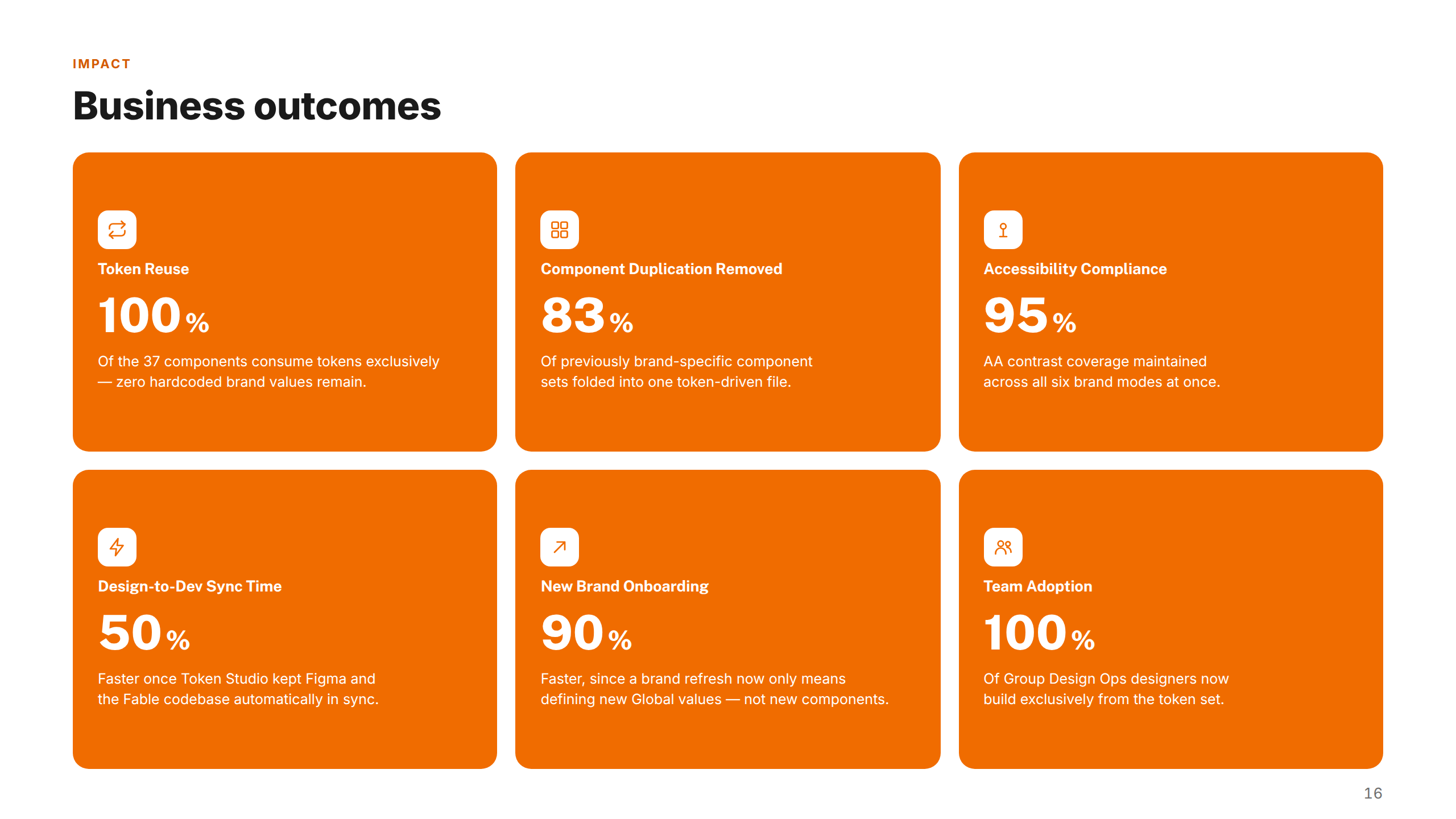
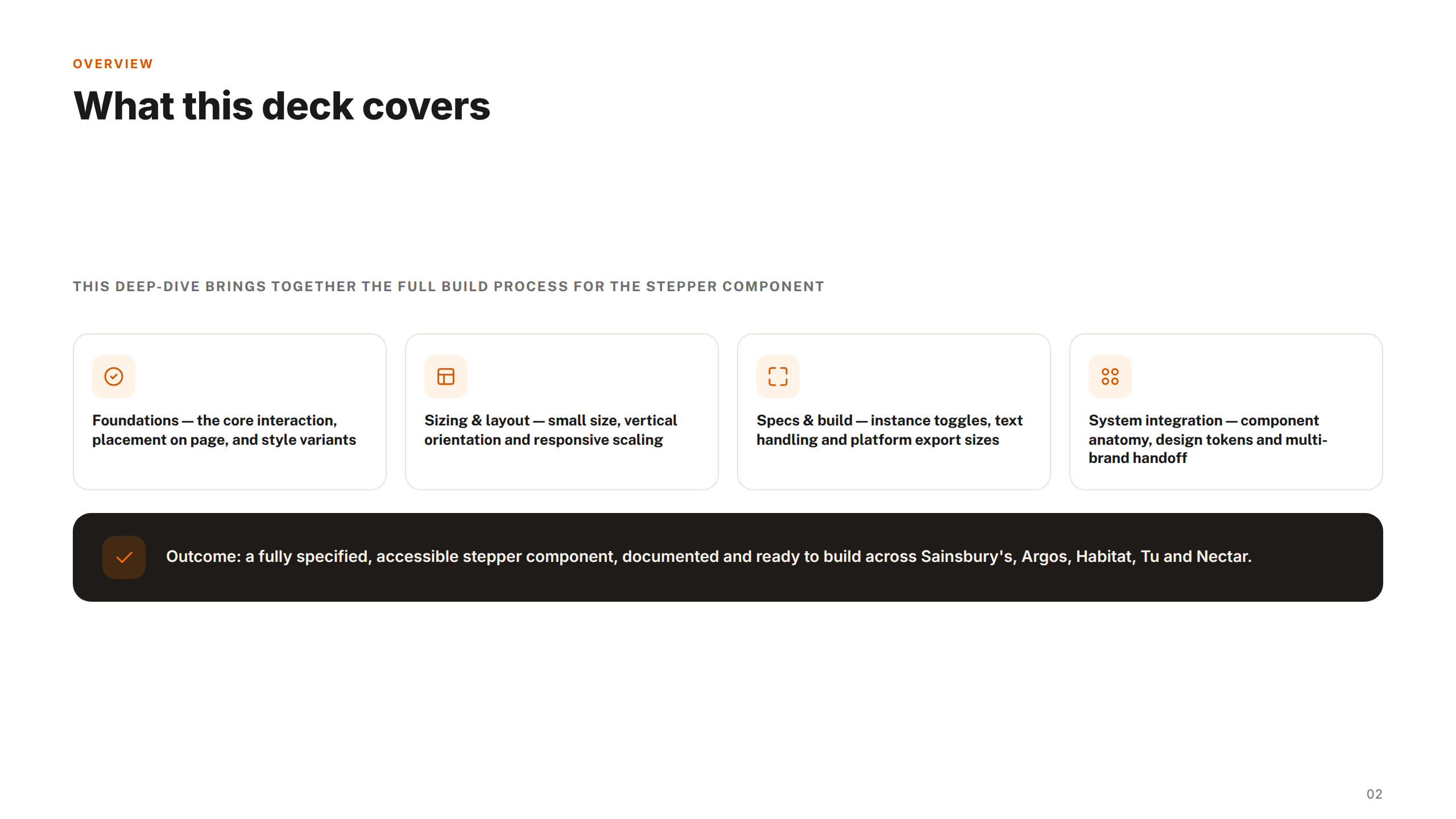
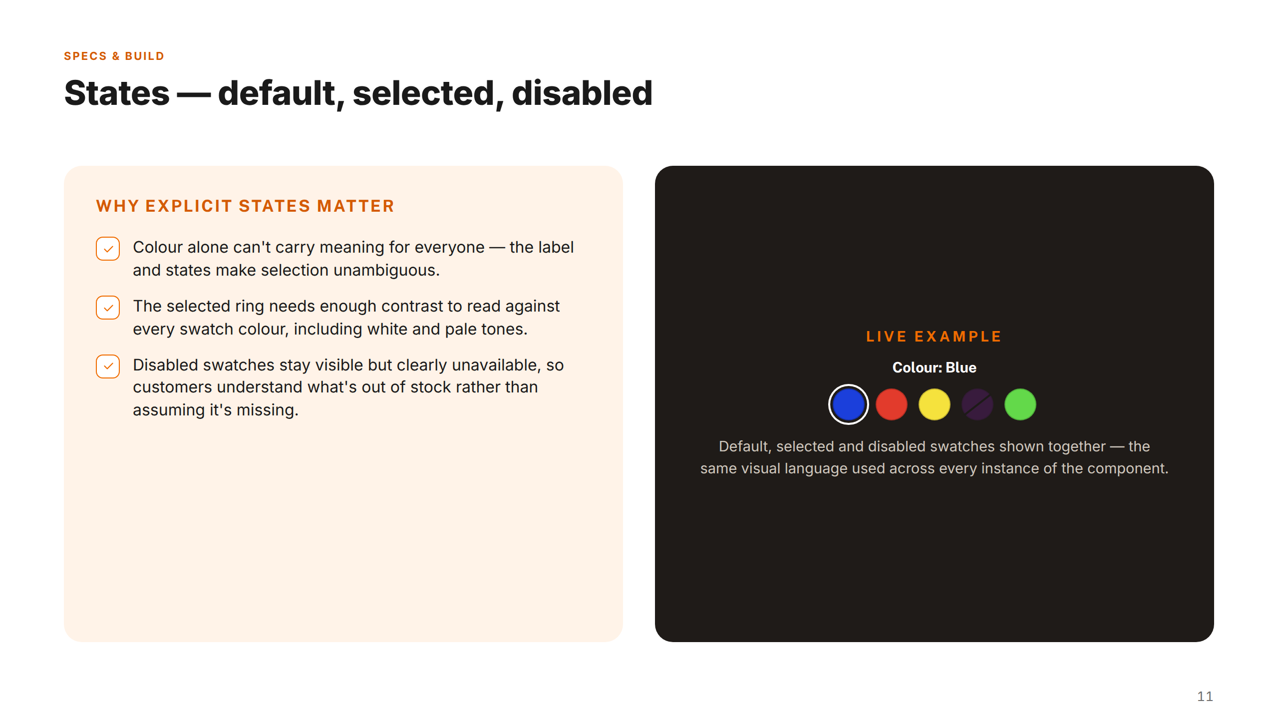
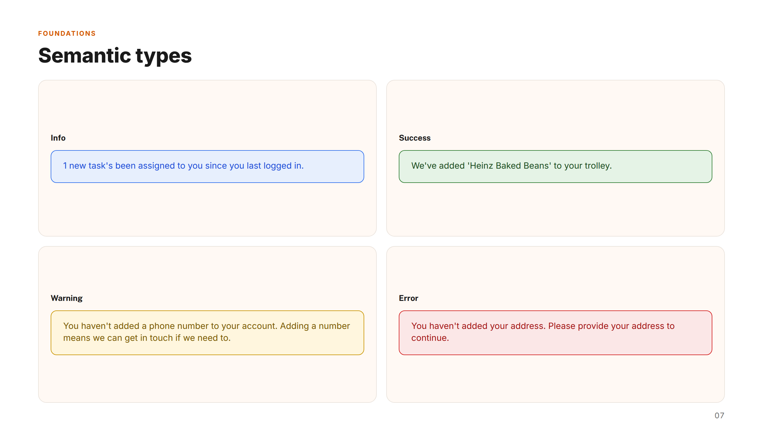
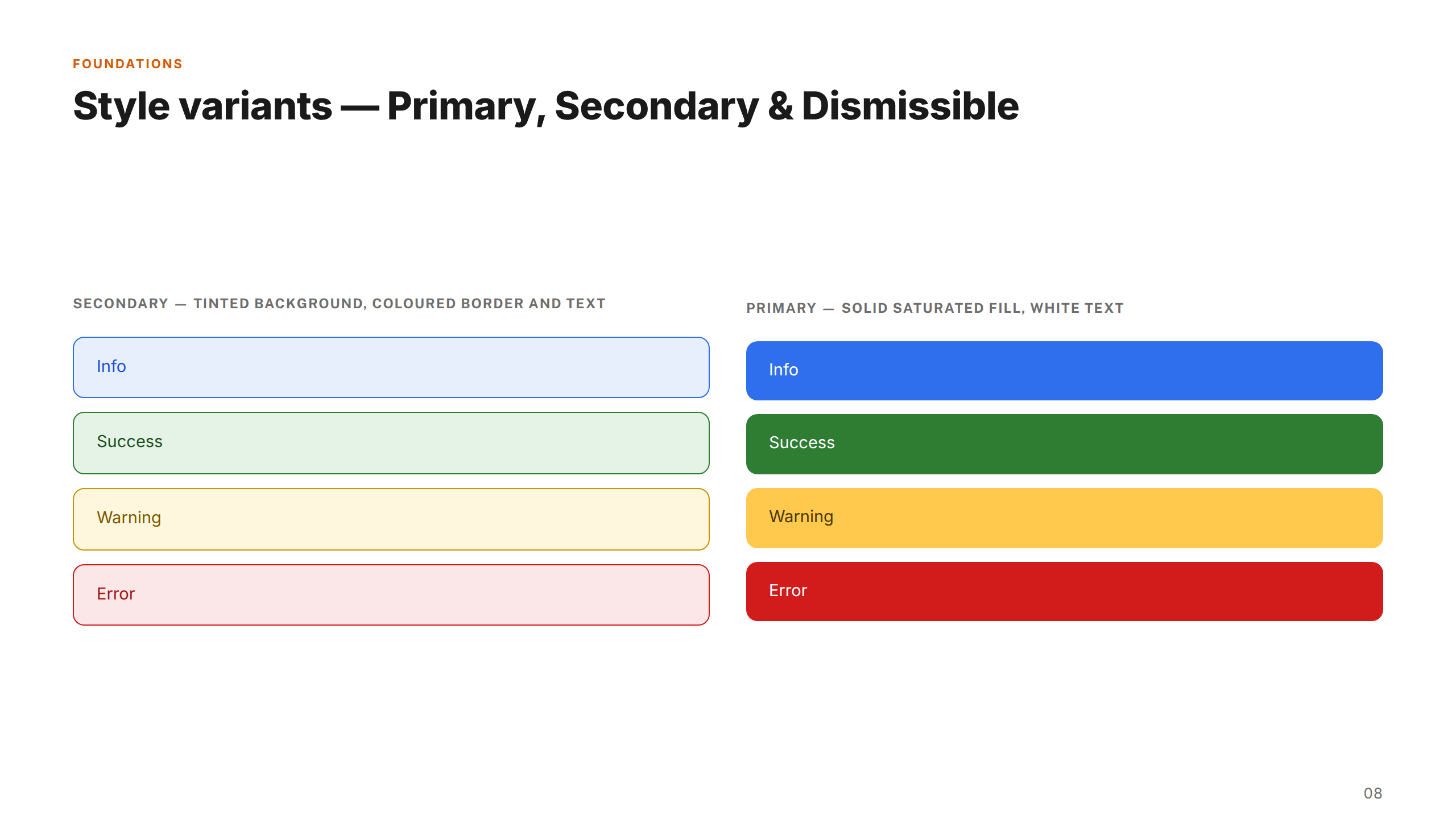
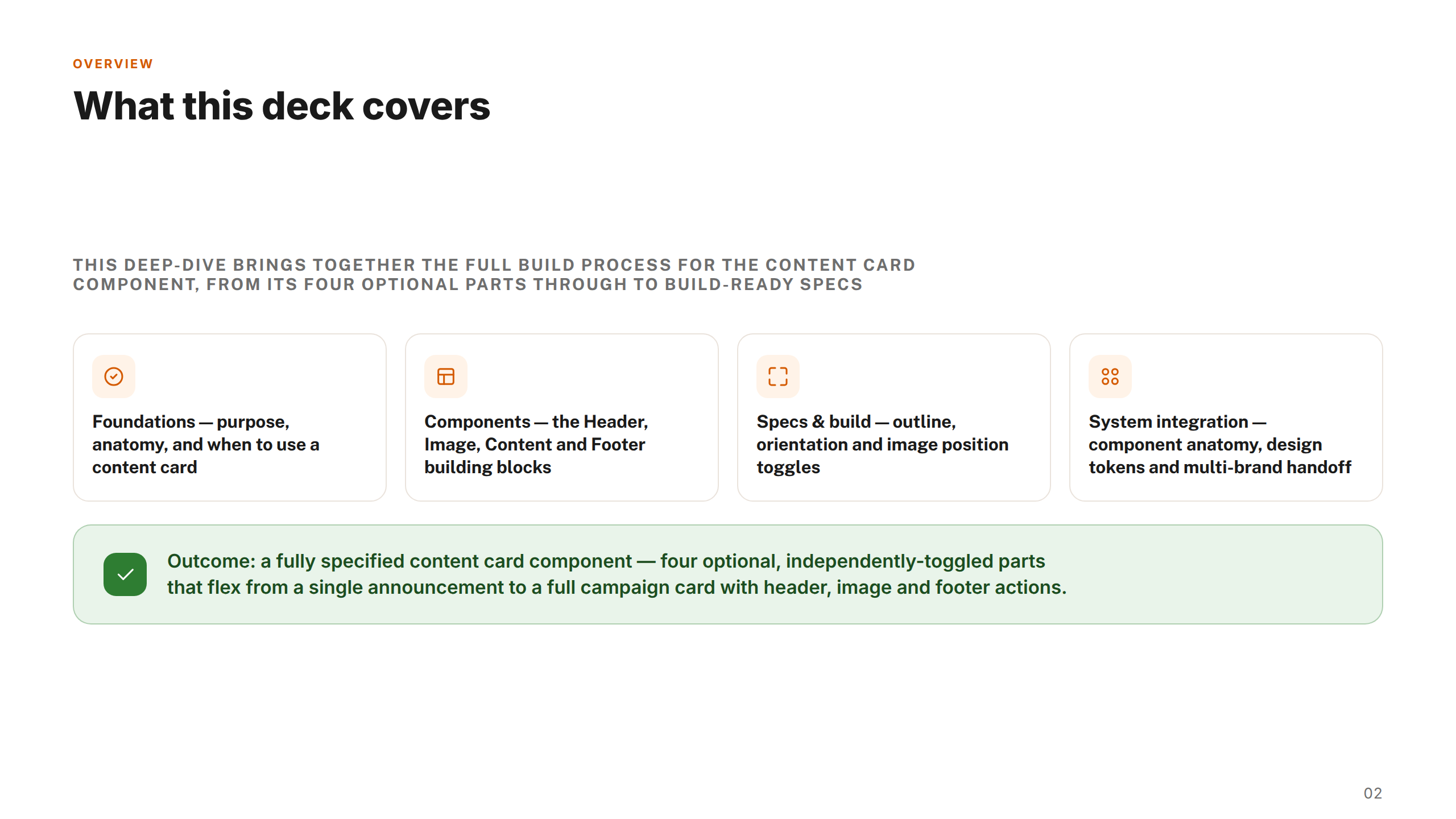
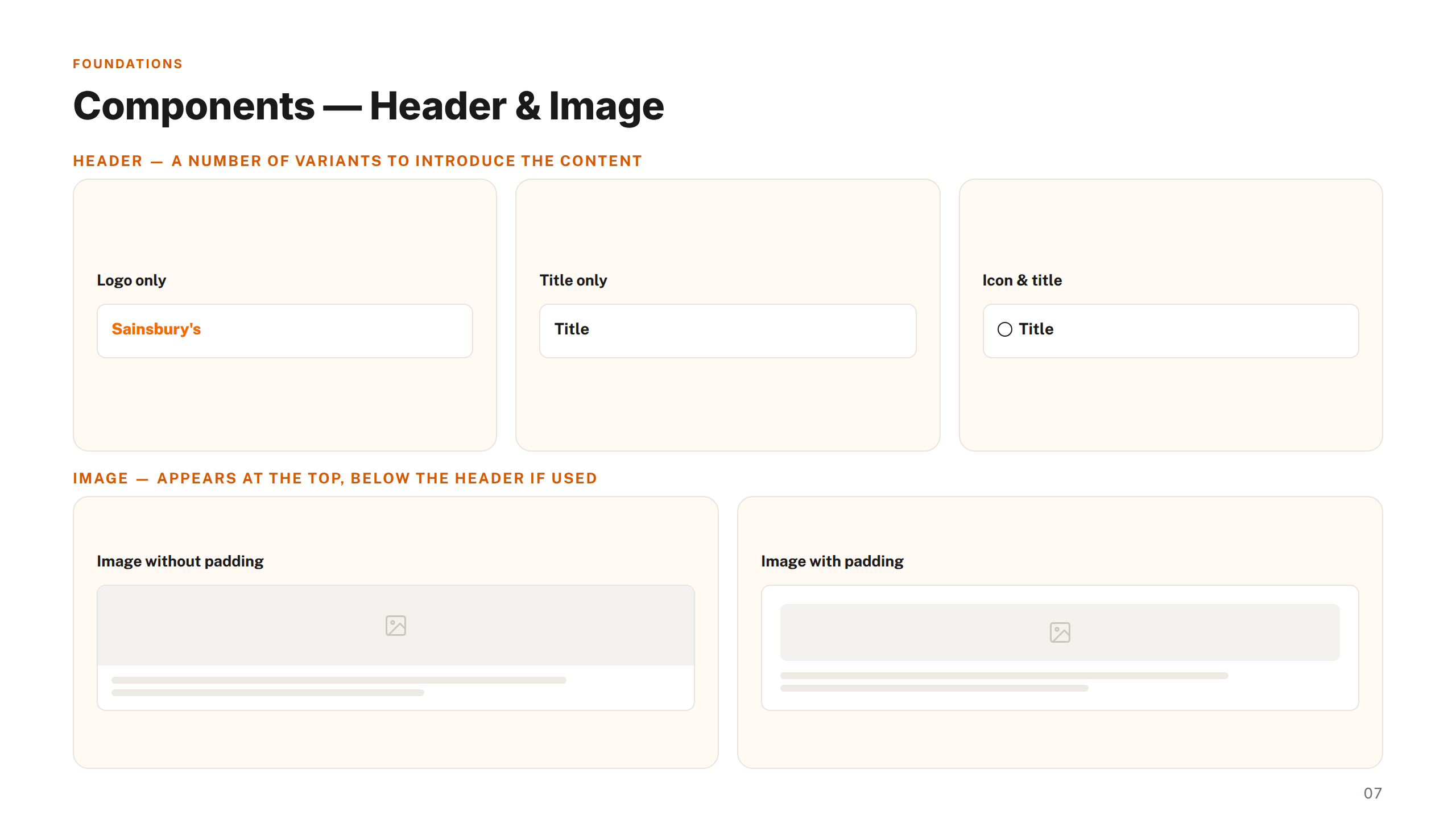
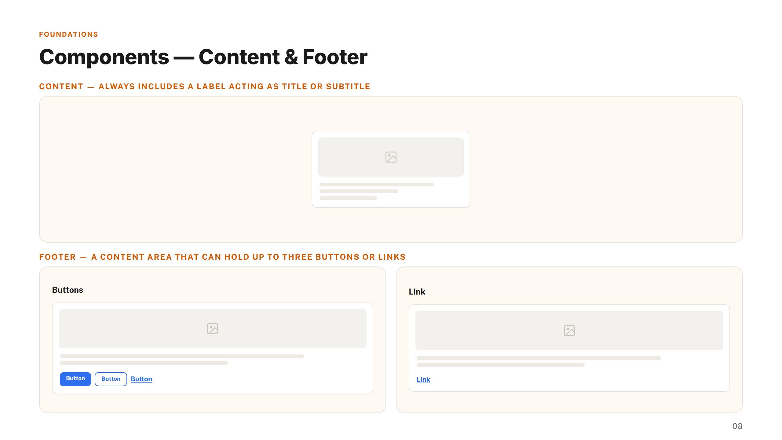
A complete, token-based component library in Figma — with 37 core component types, hundreds of variants, and comprehensive foundation documentation covering colour, states, and layouts.
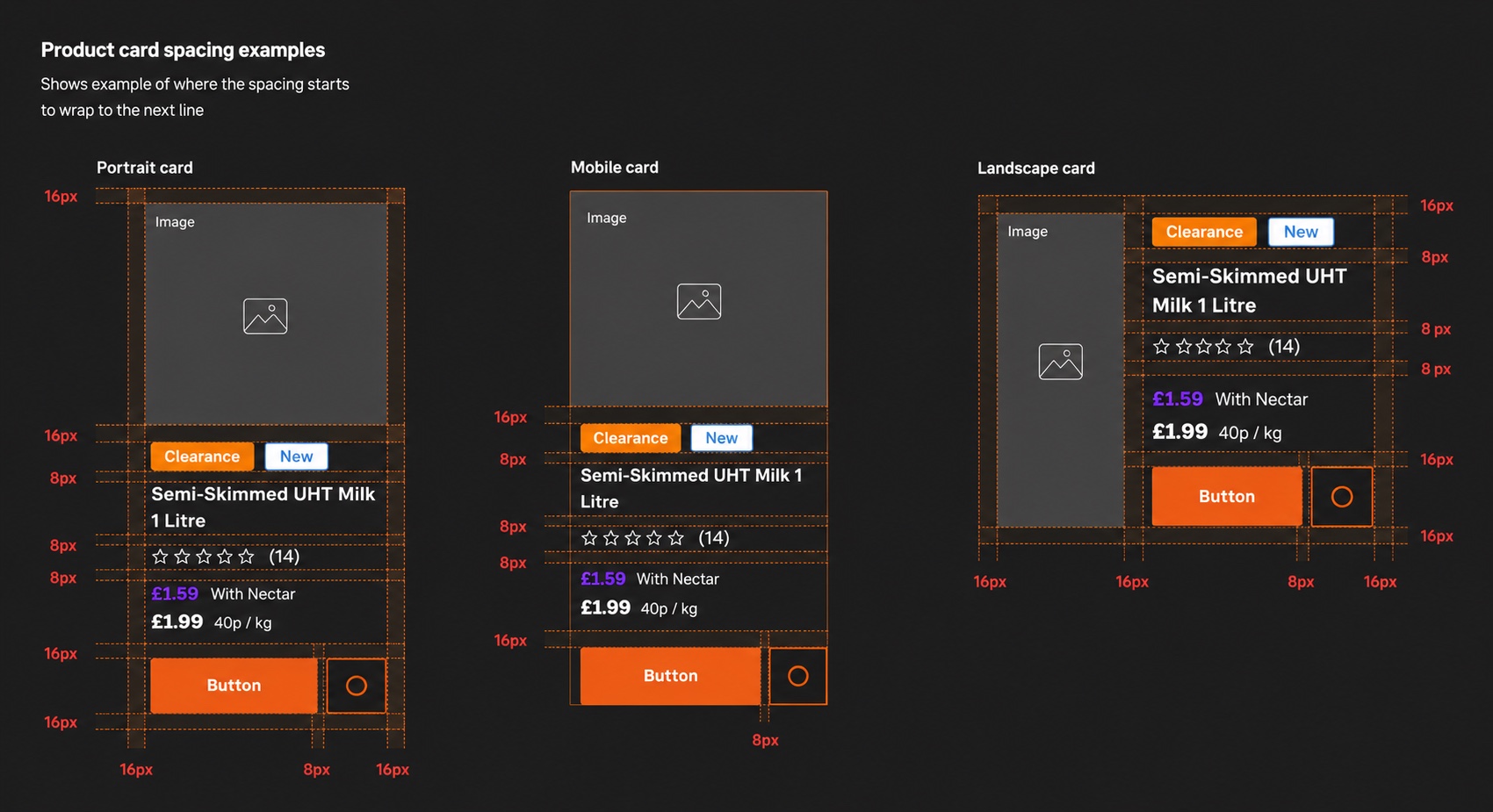
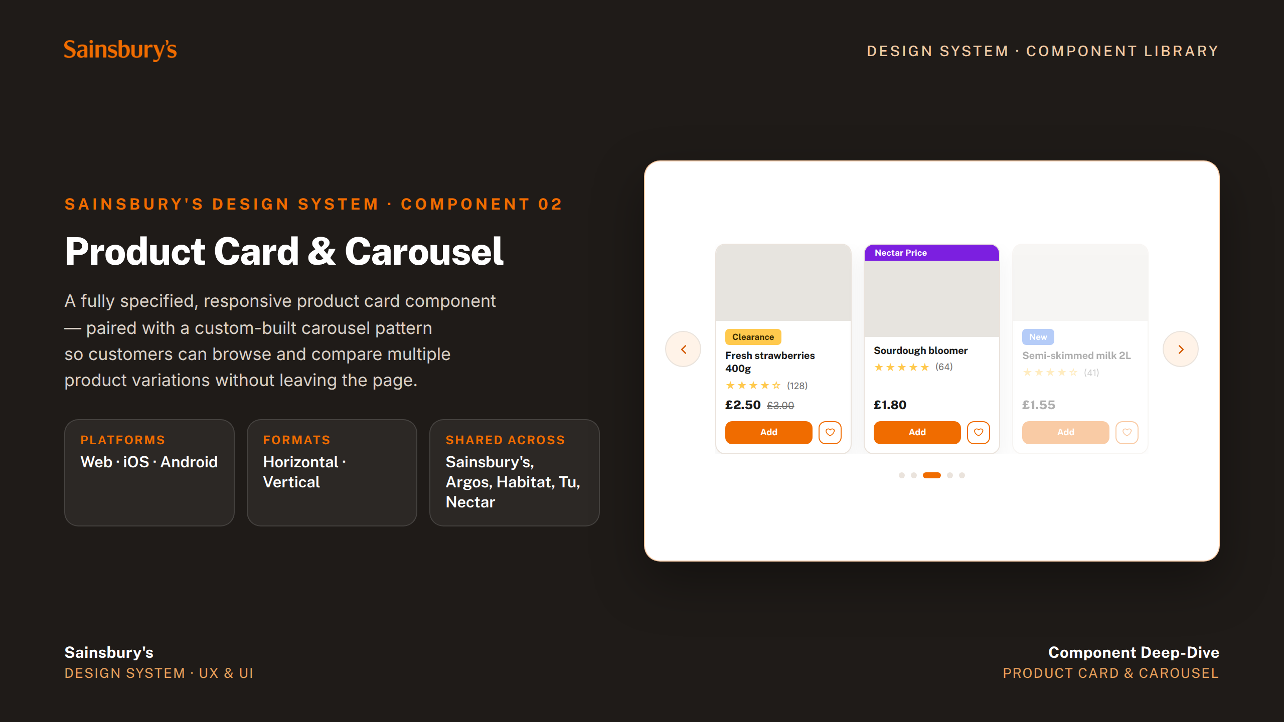
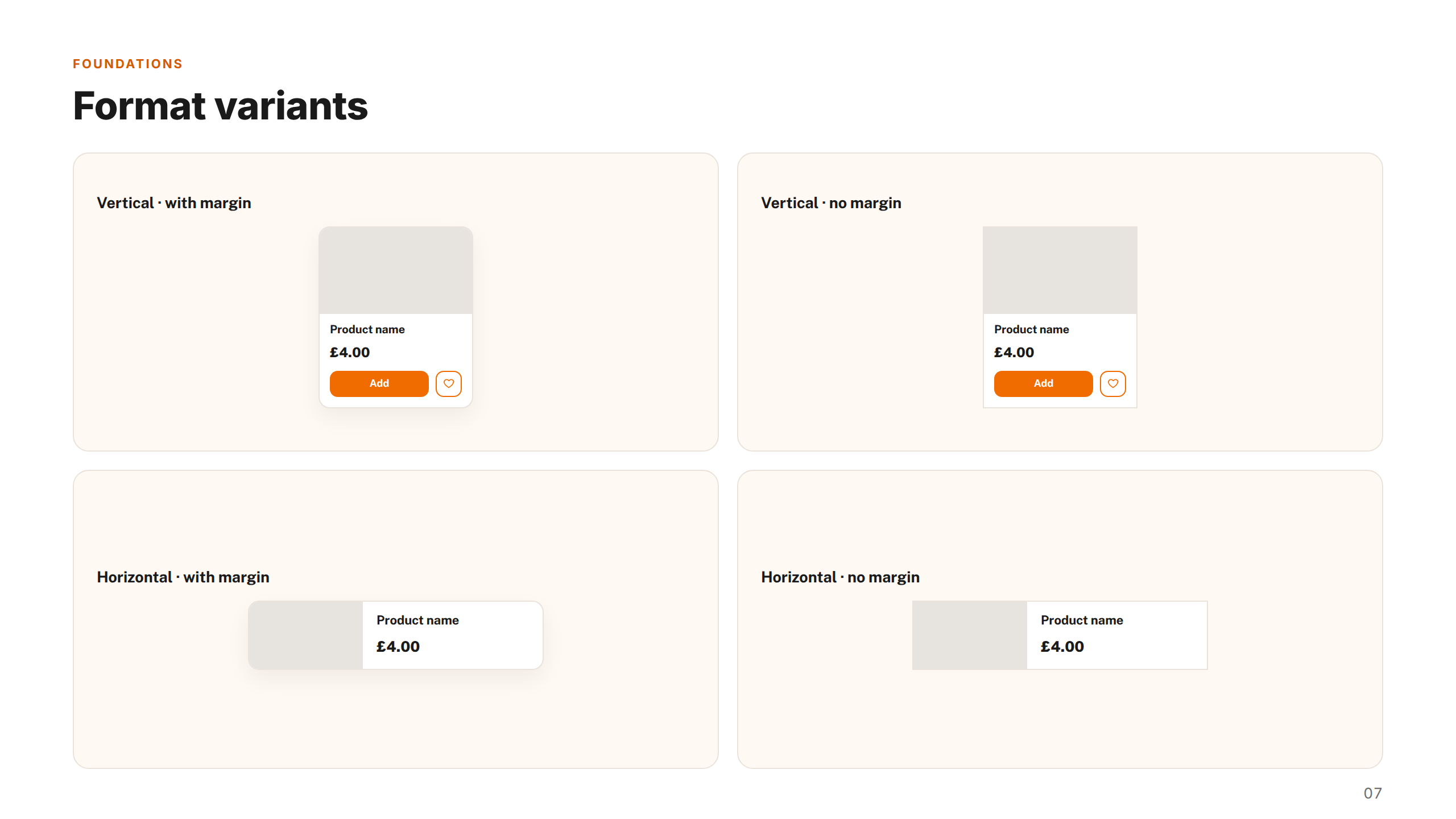
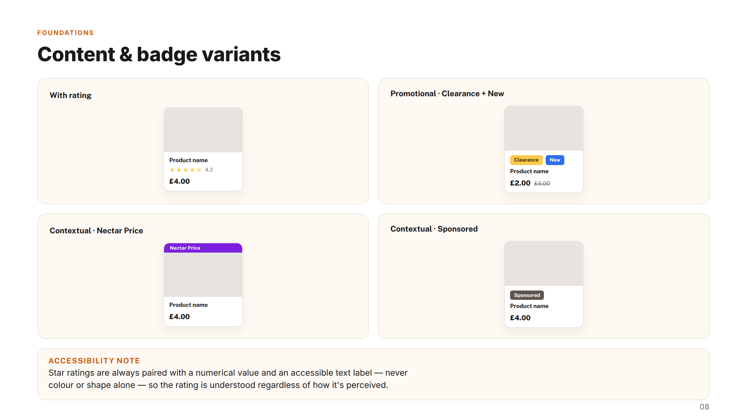
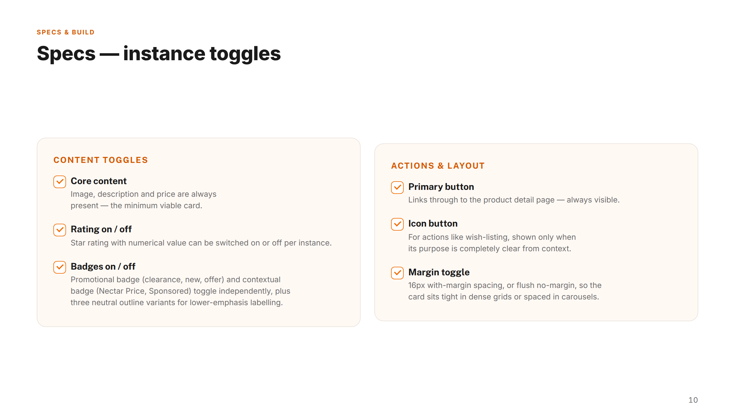
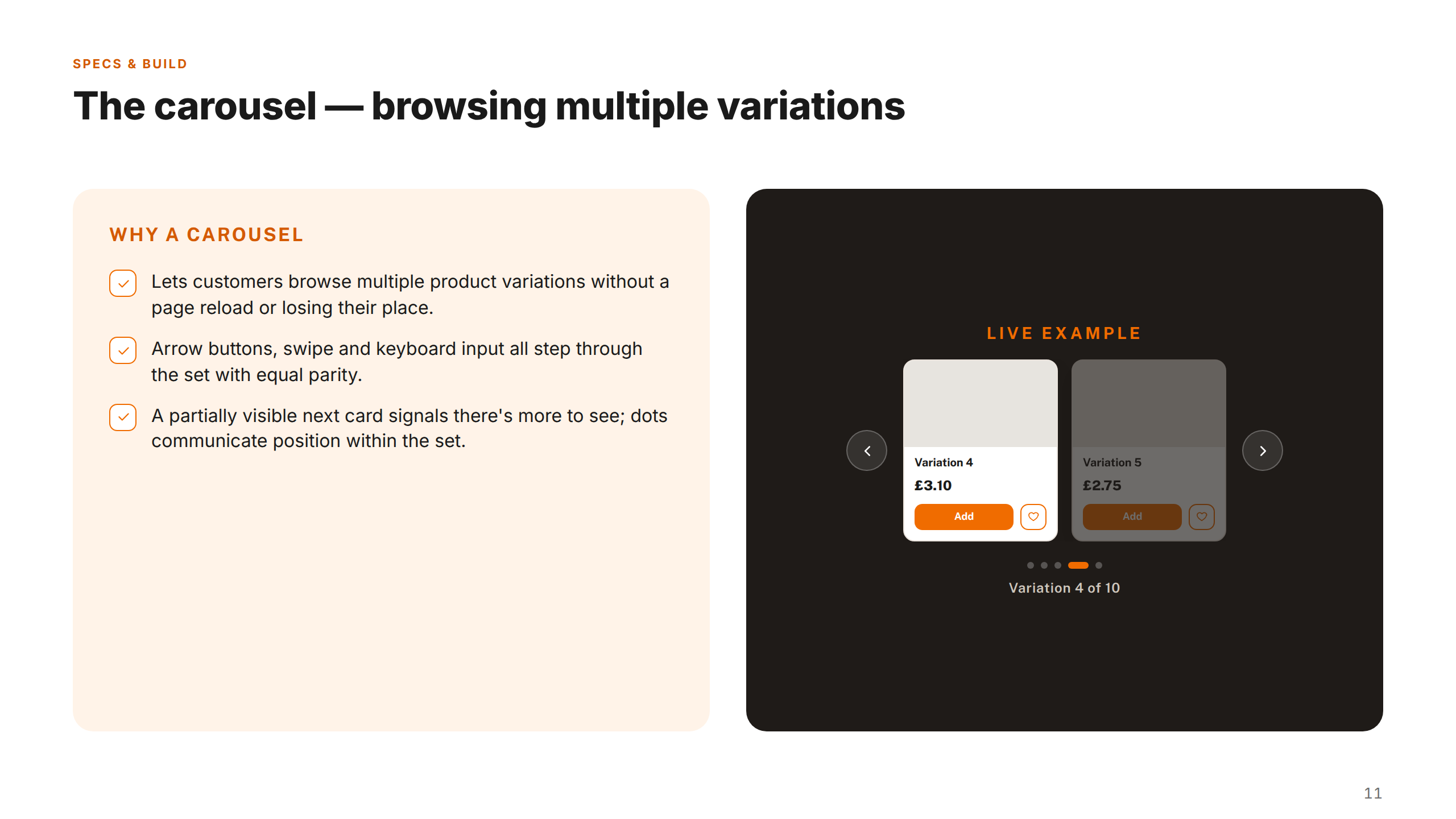
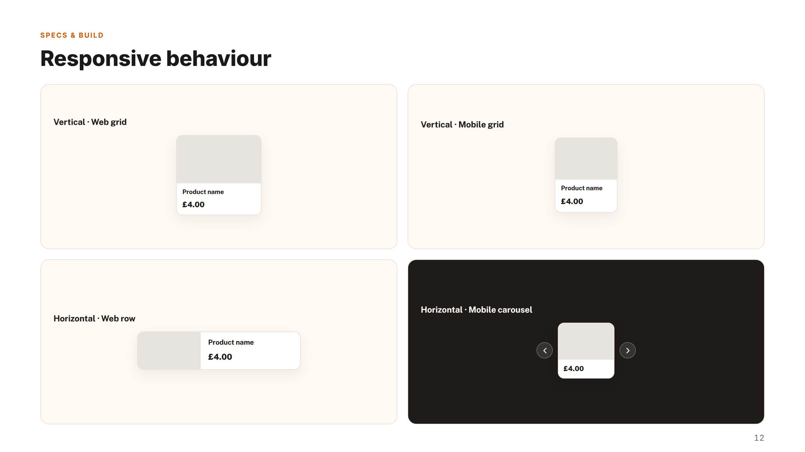
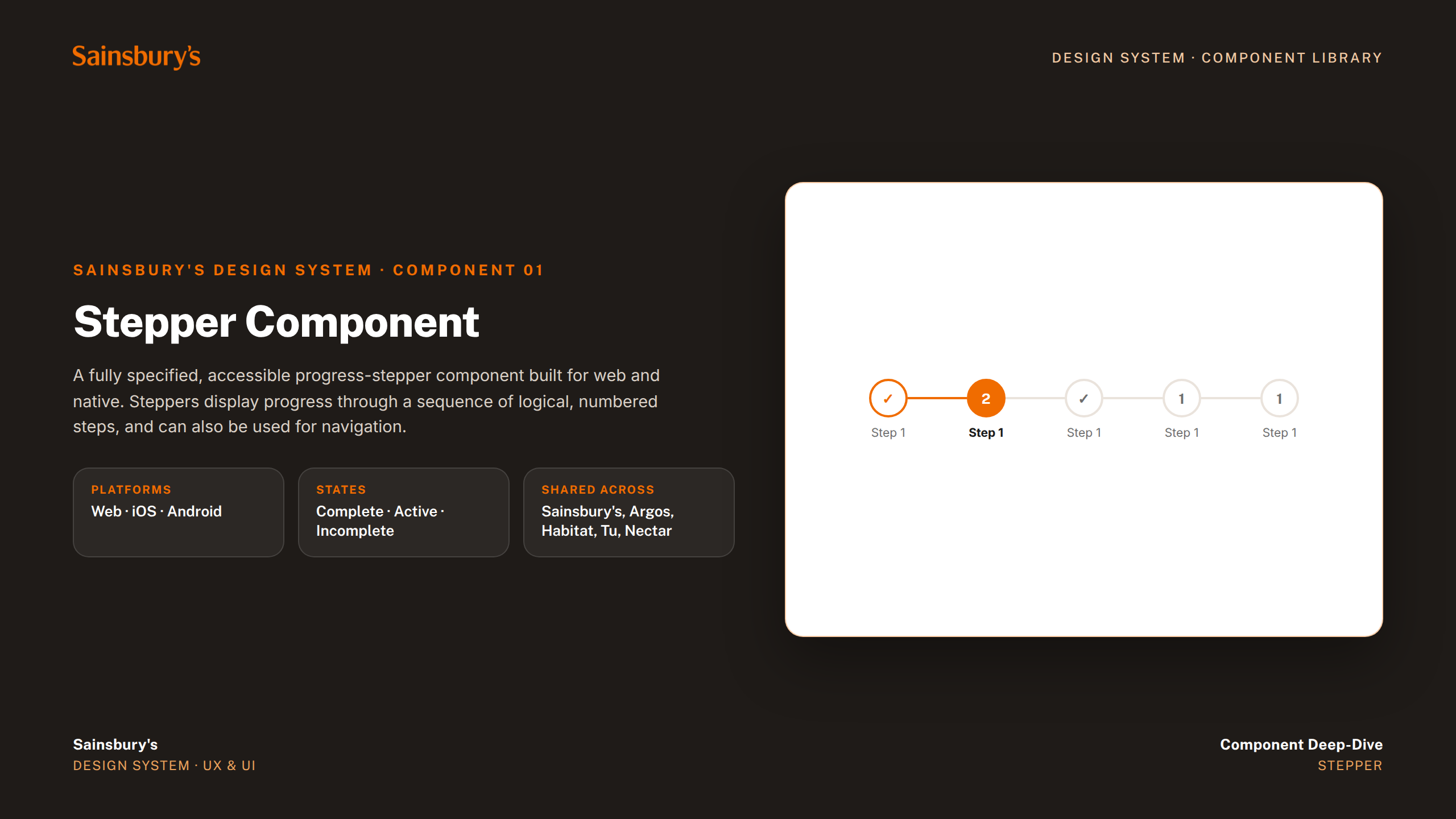
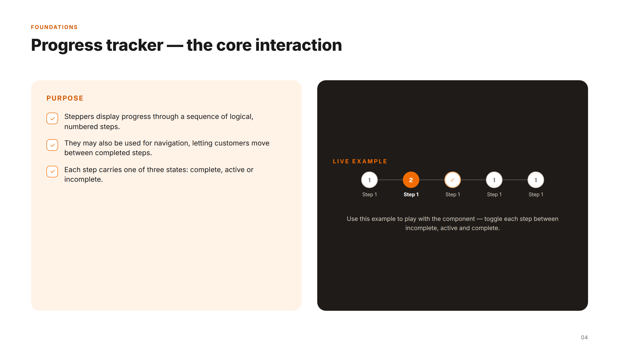
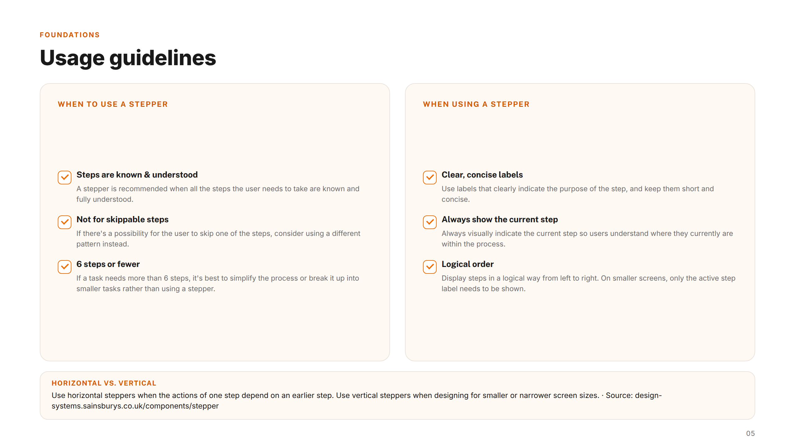
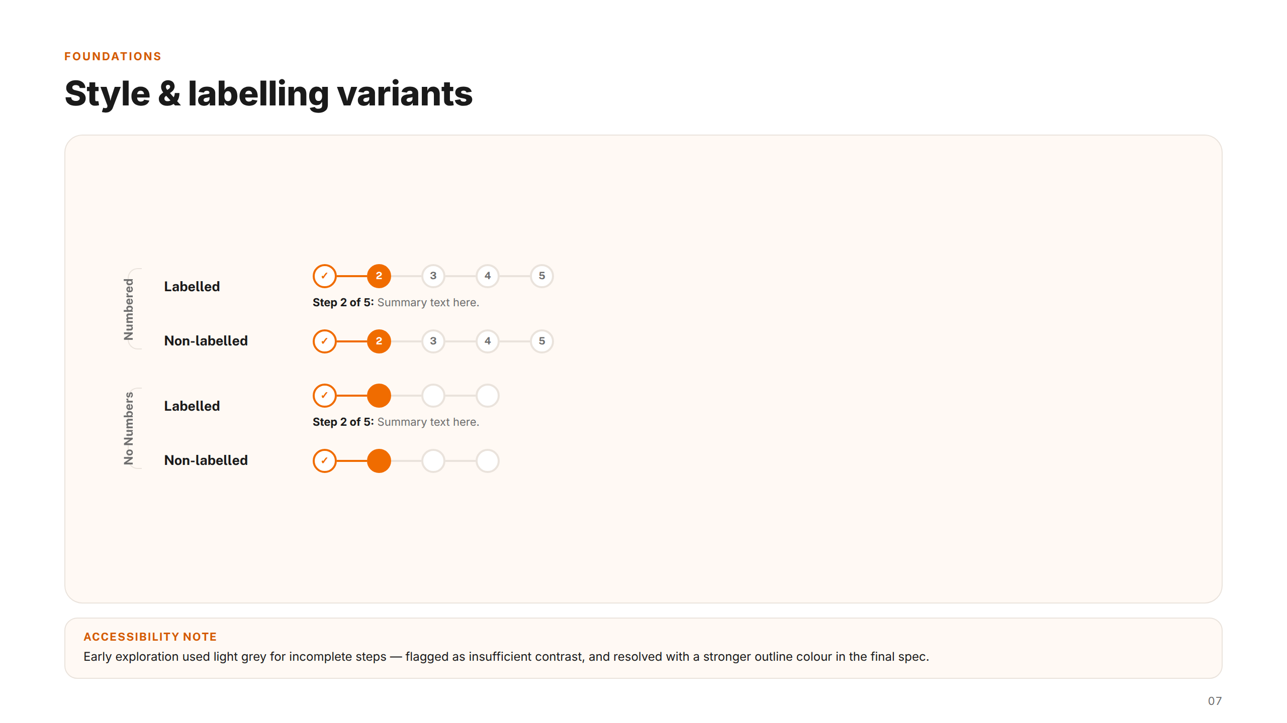
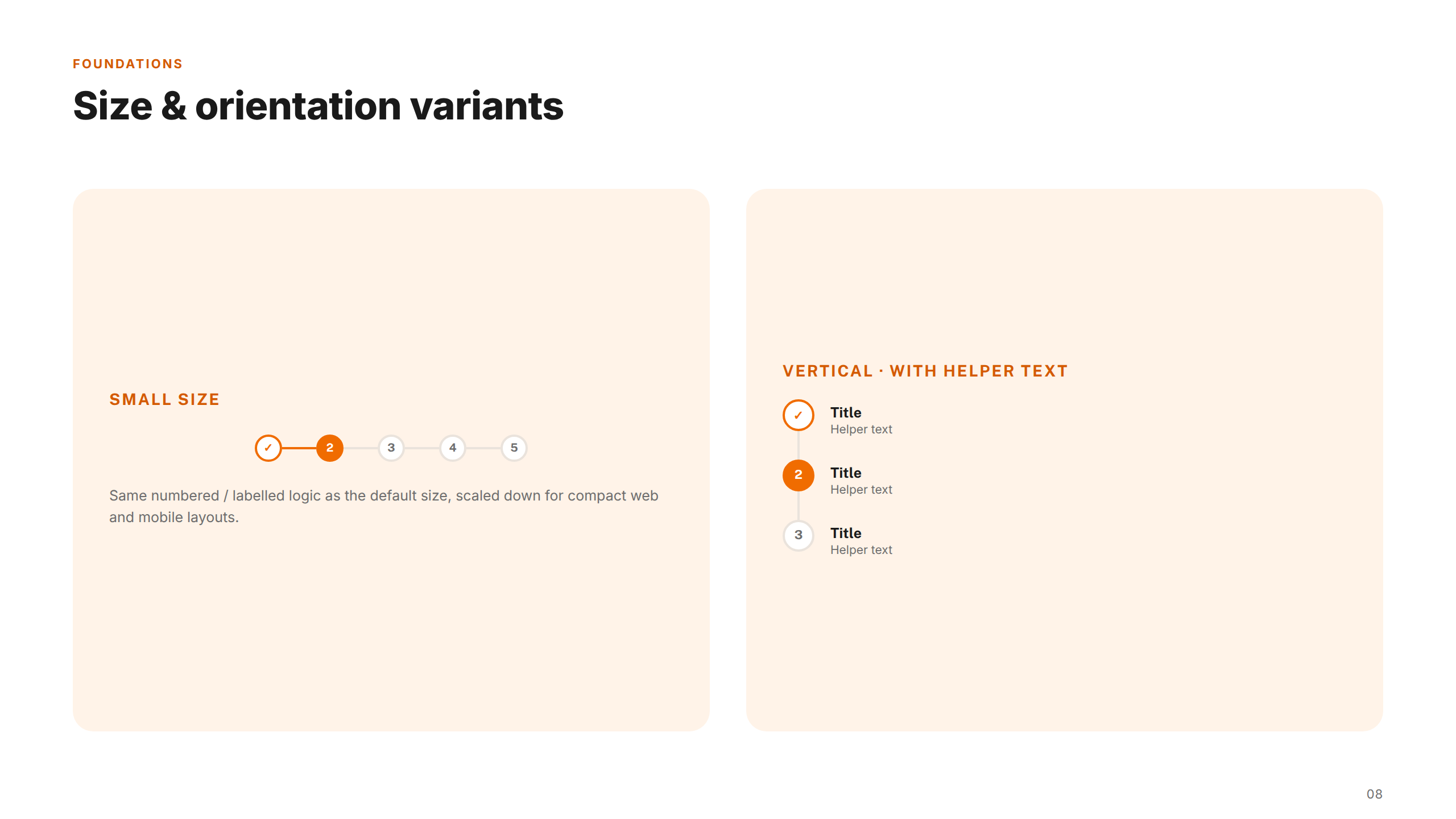
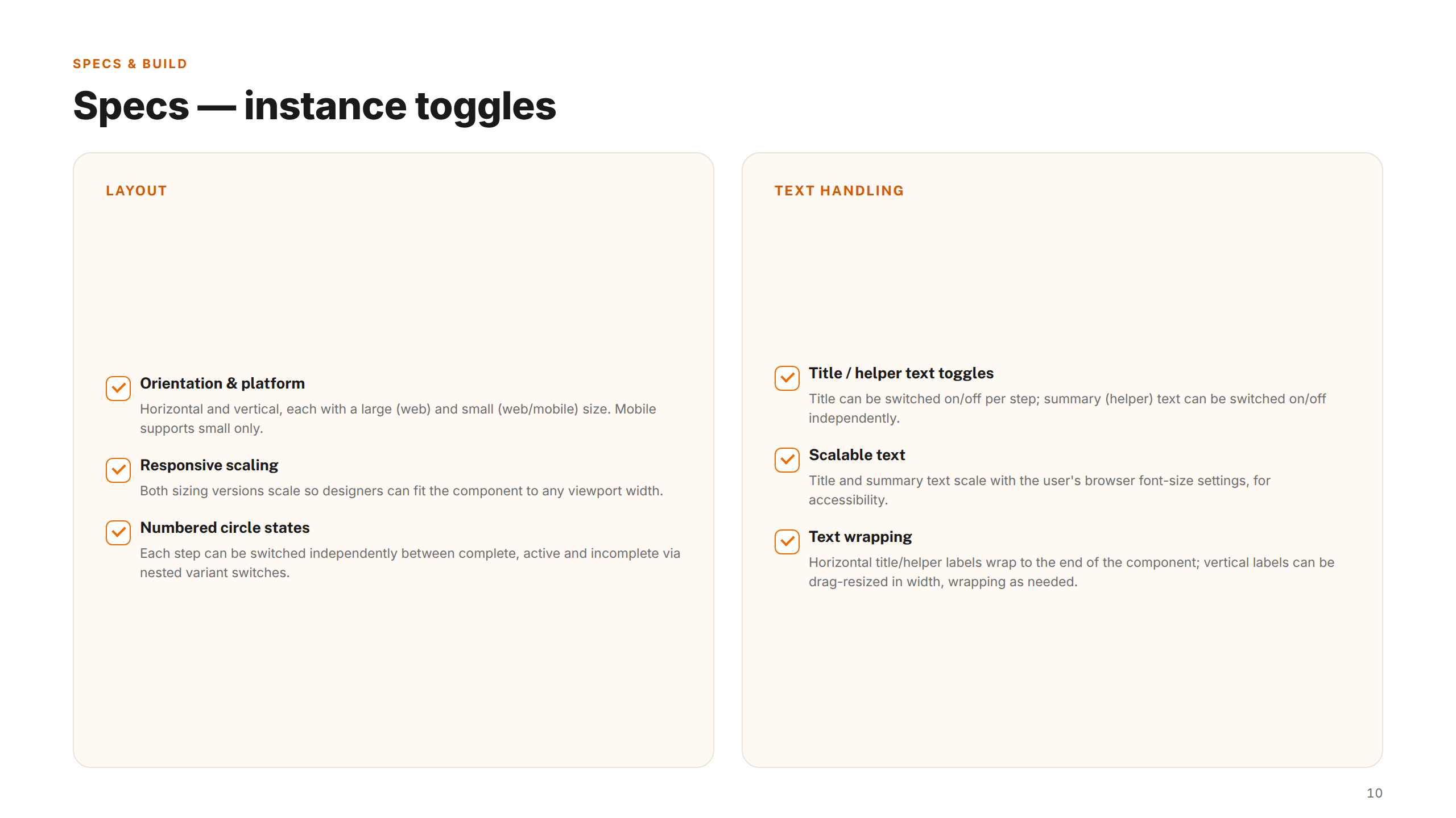
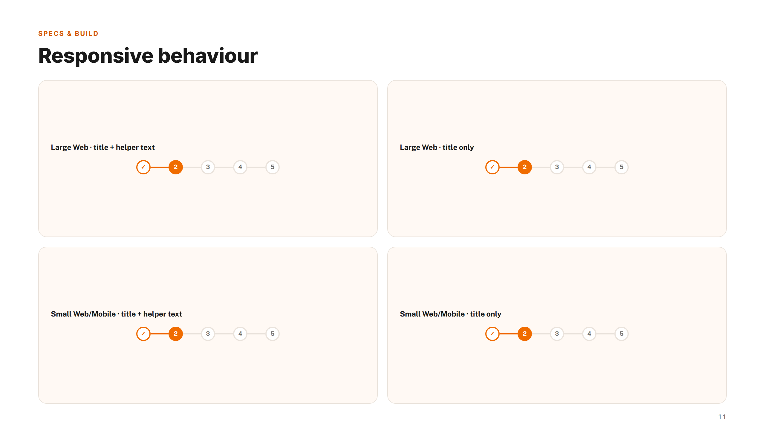
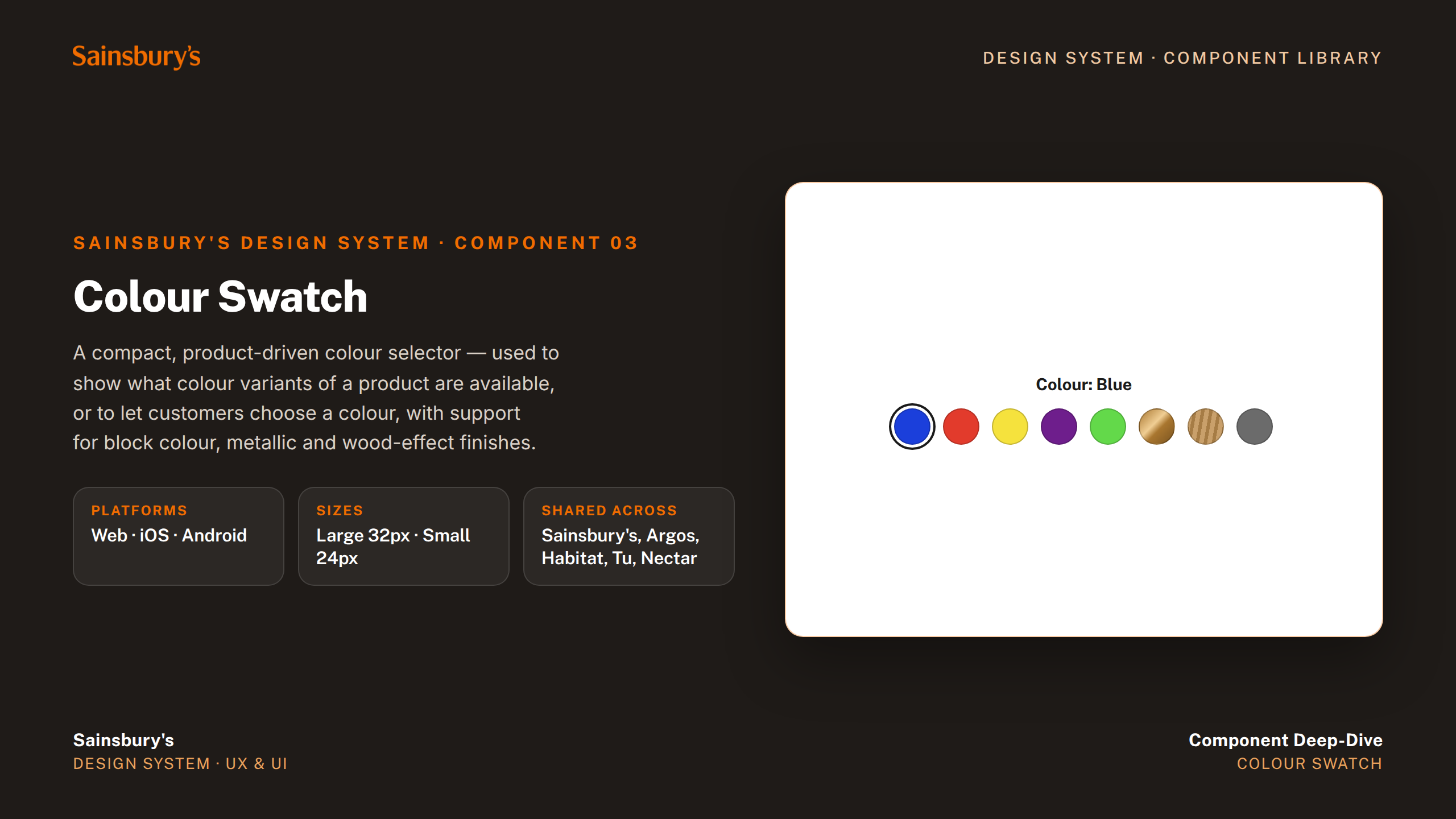
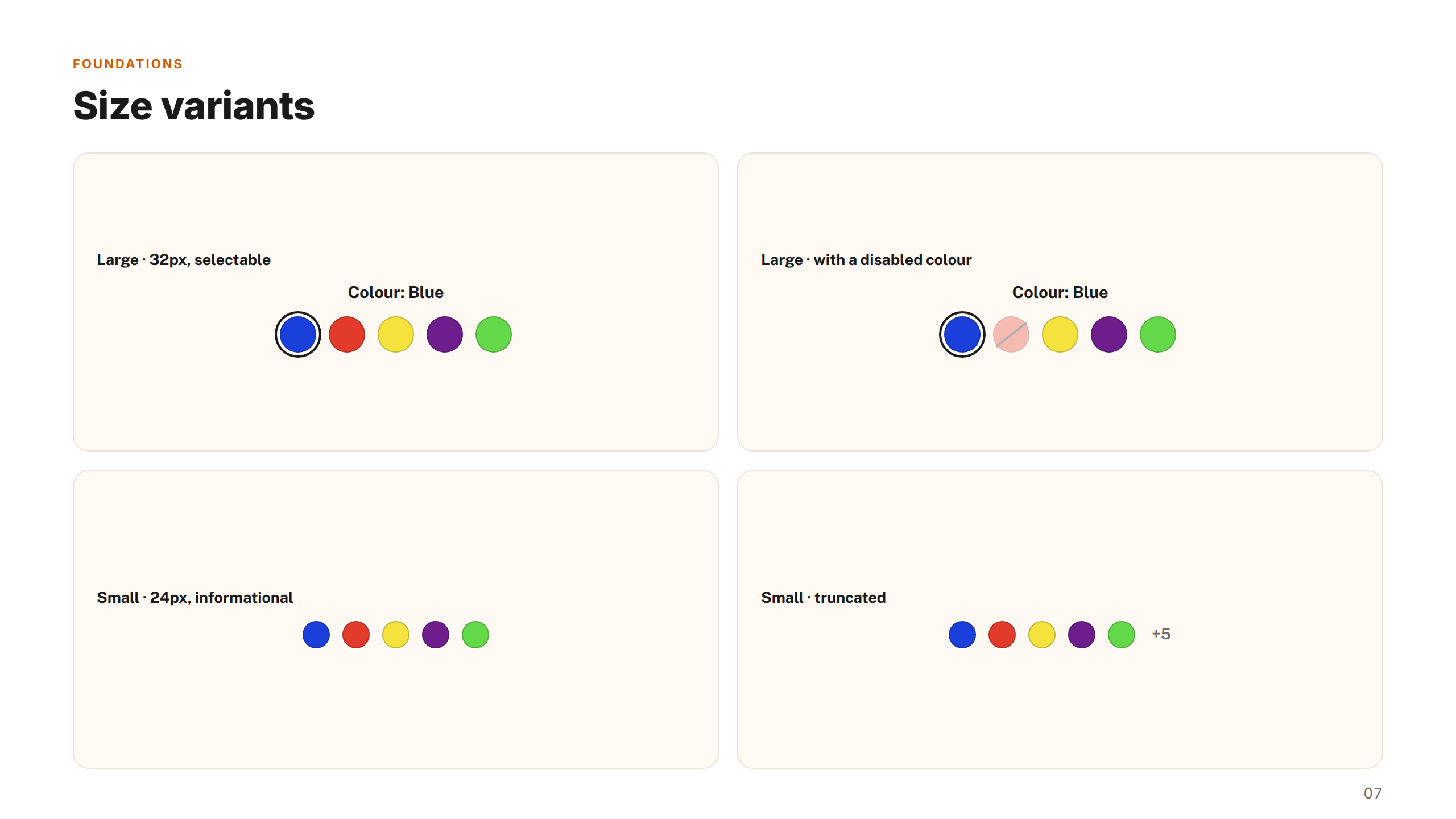
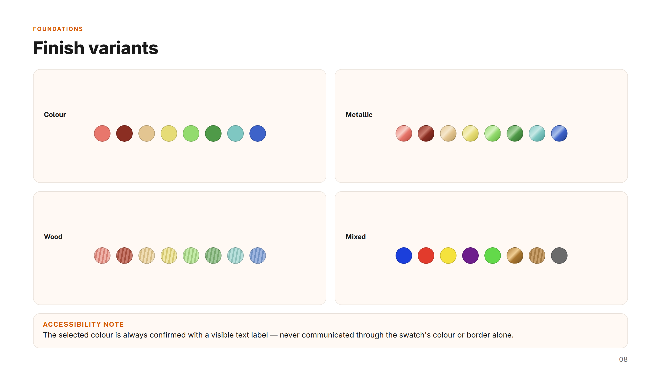
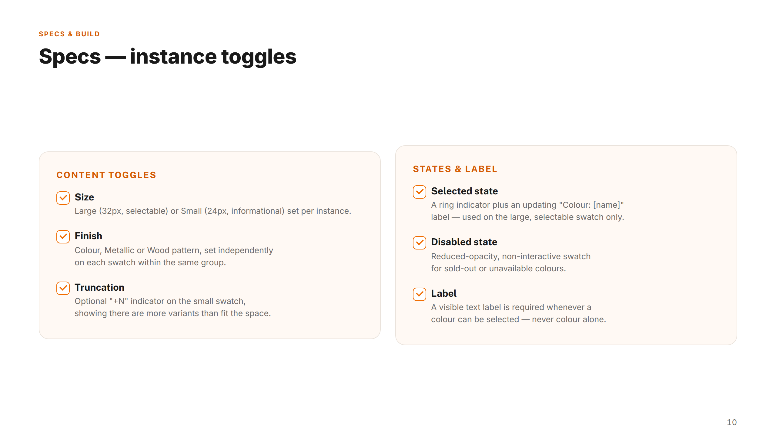
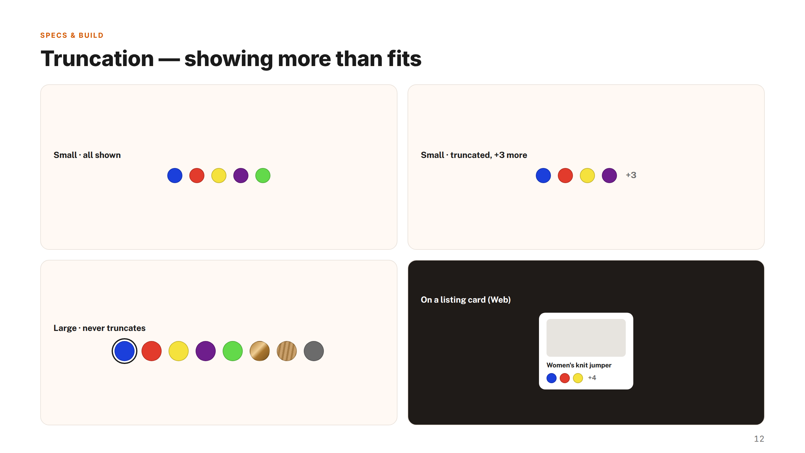
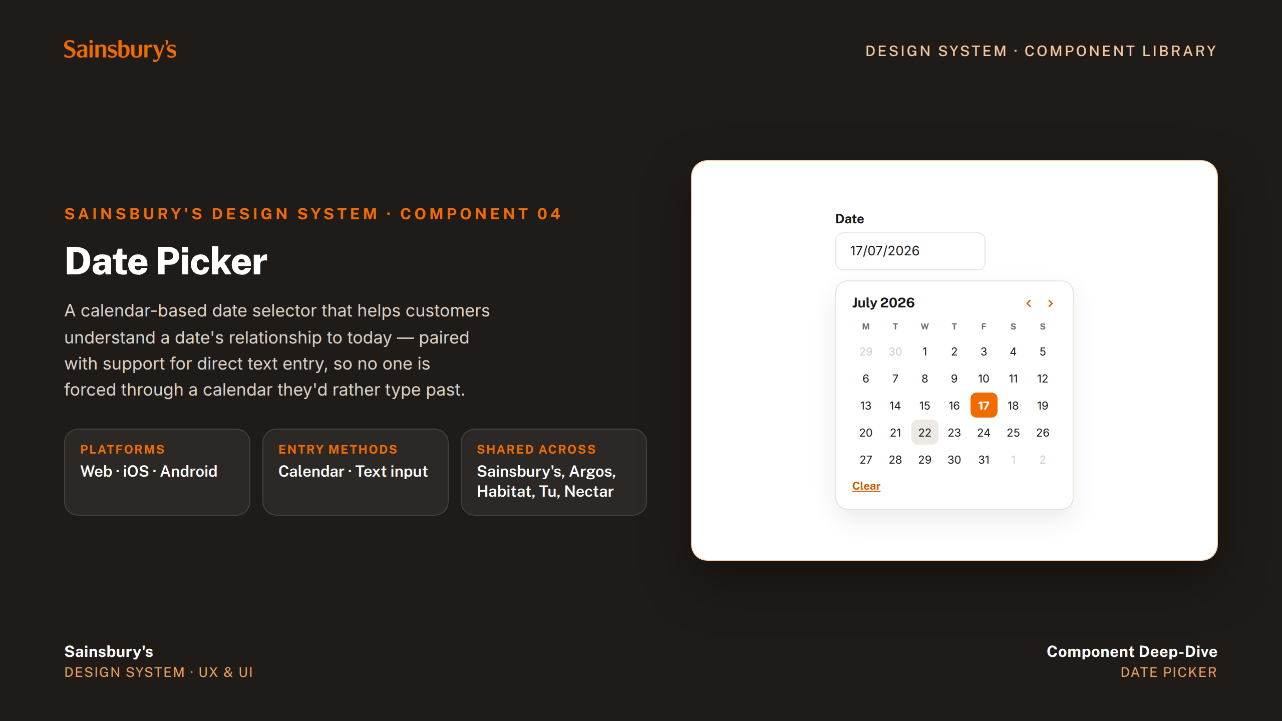
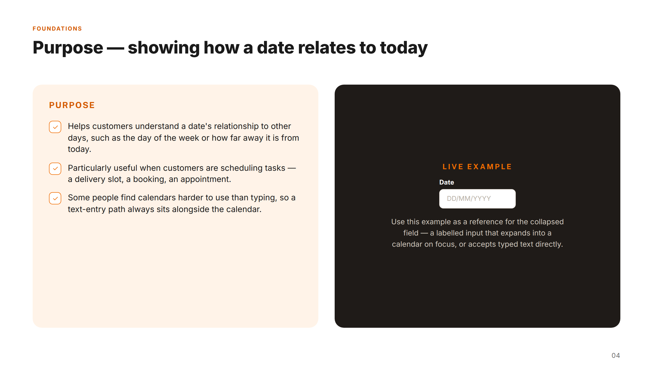
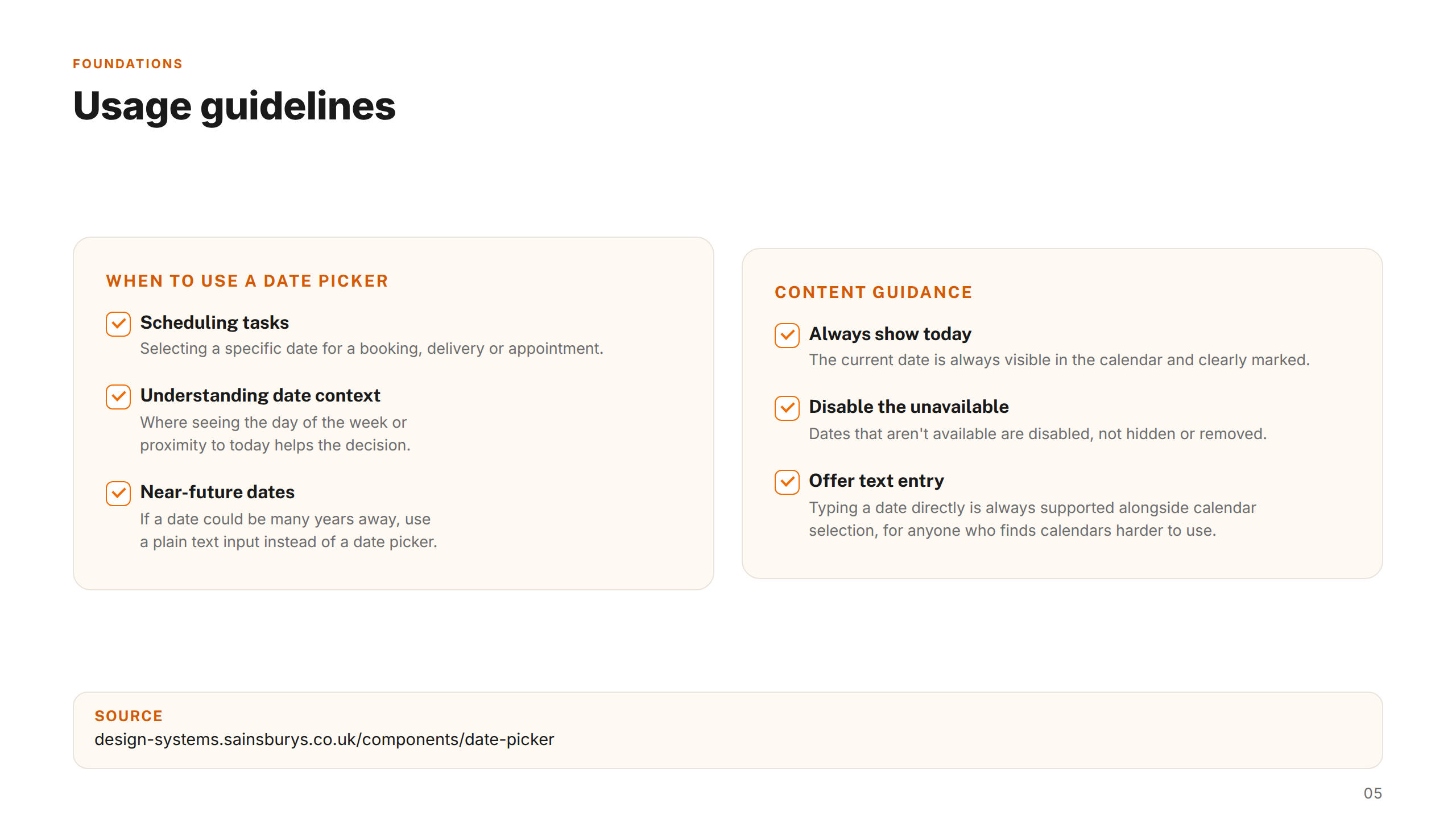
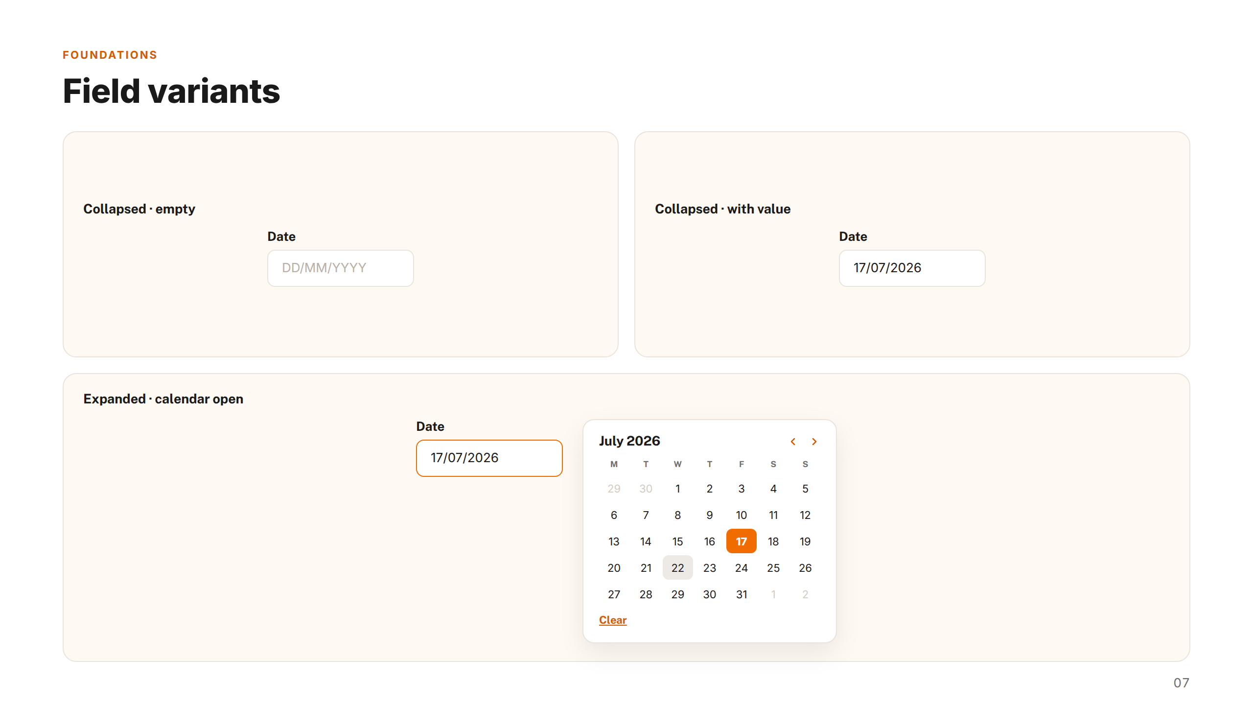
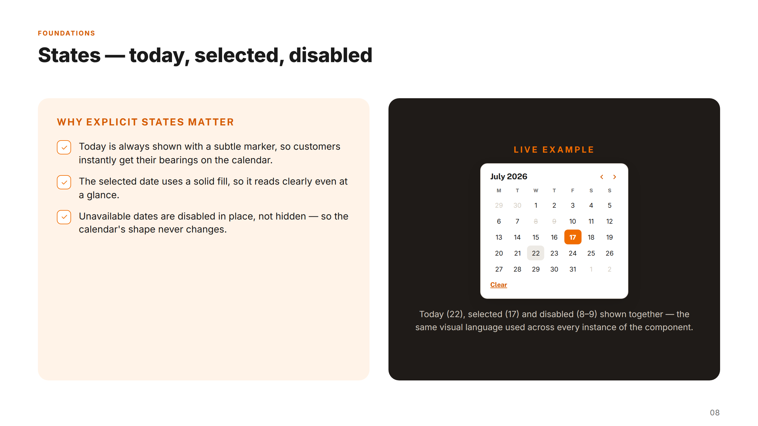
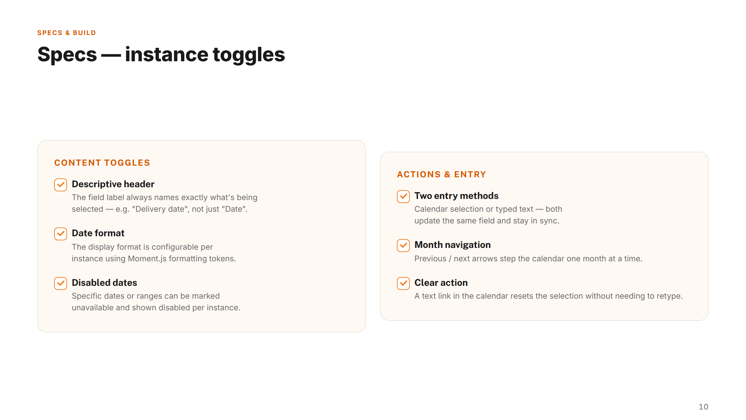
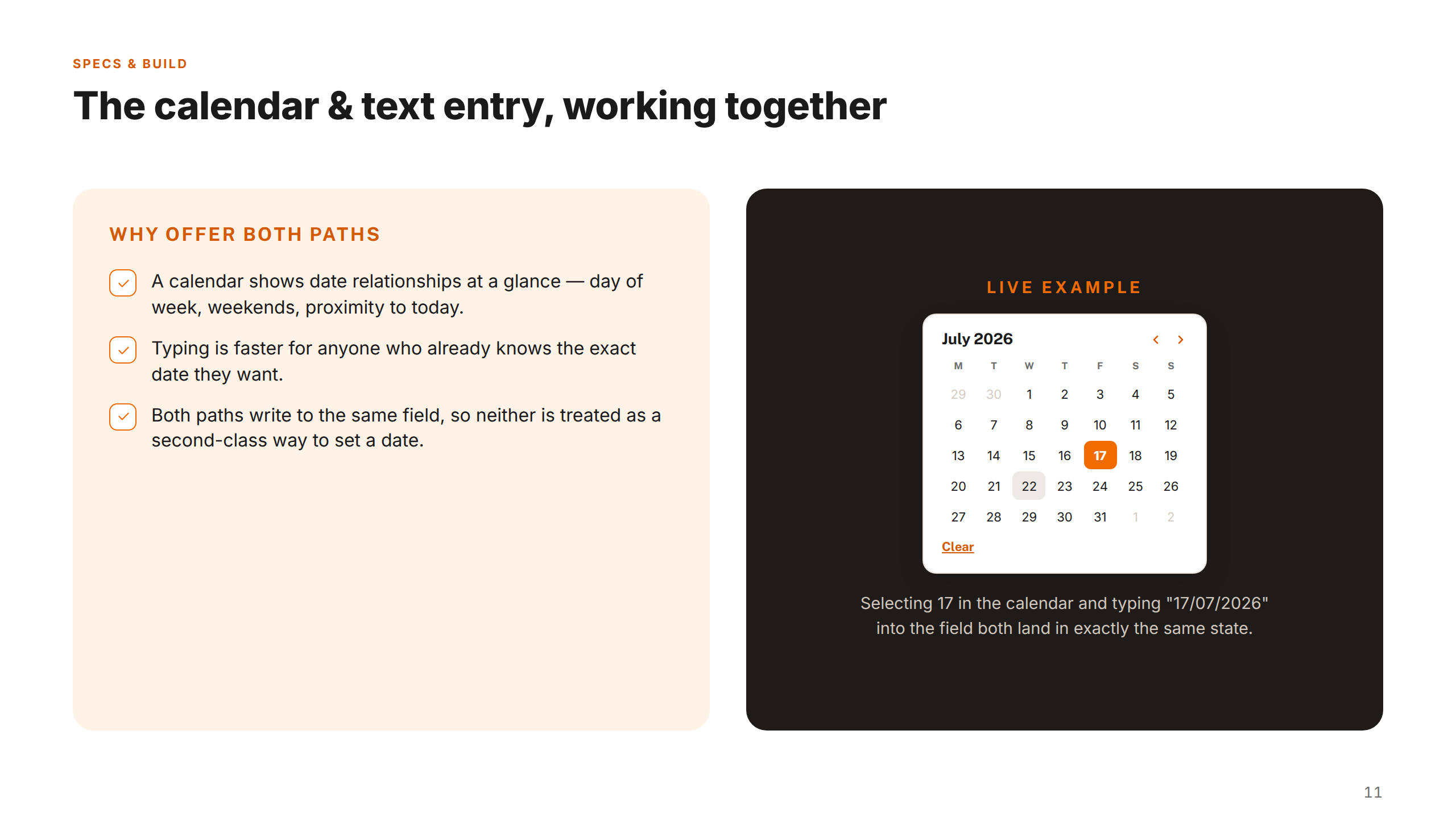
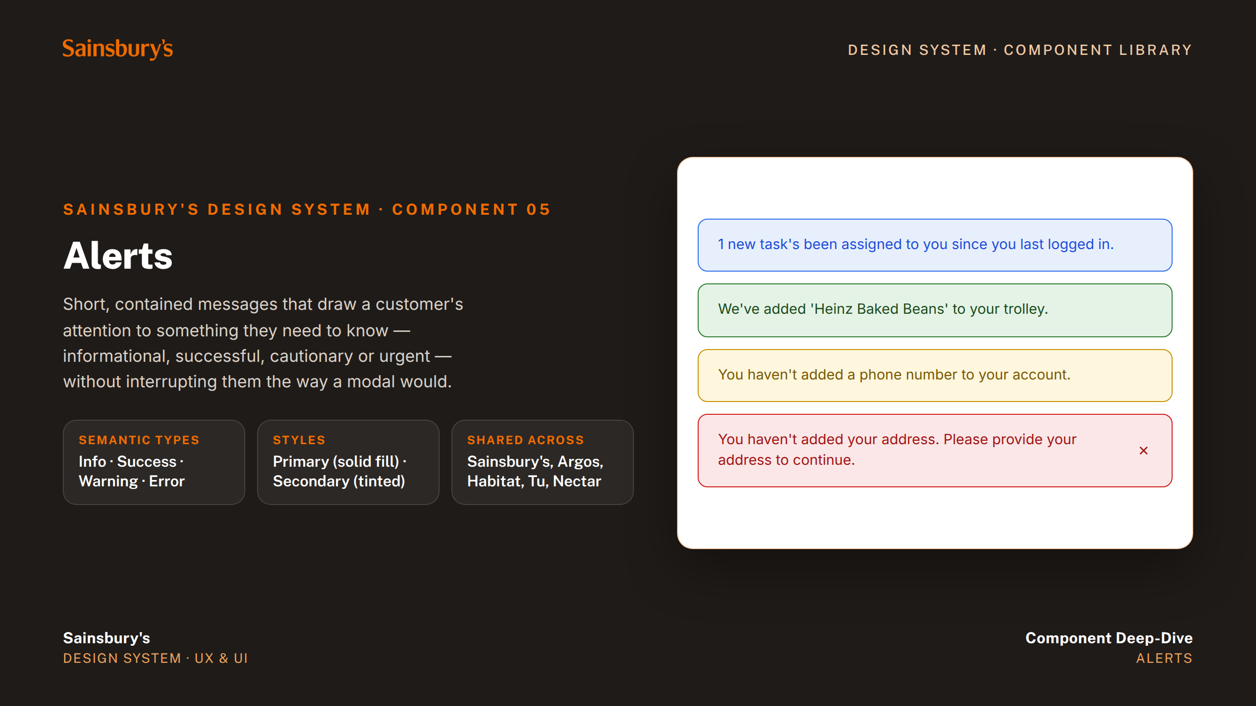
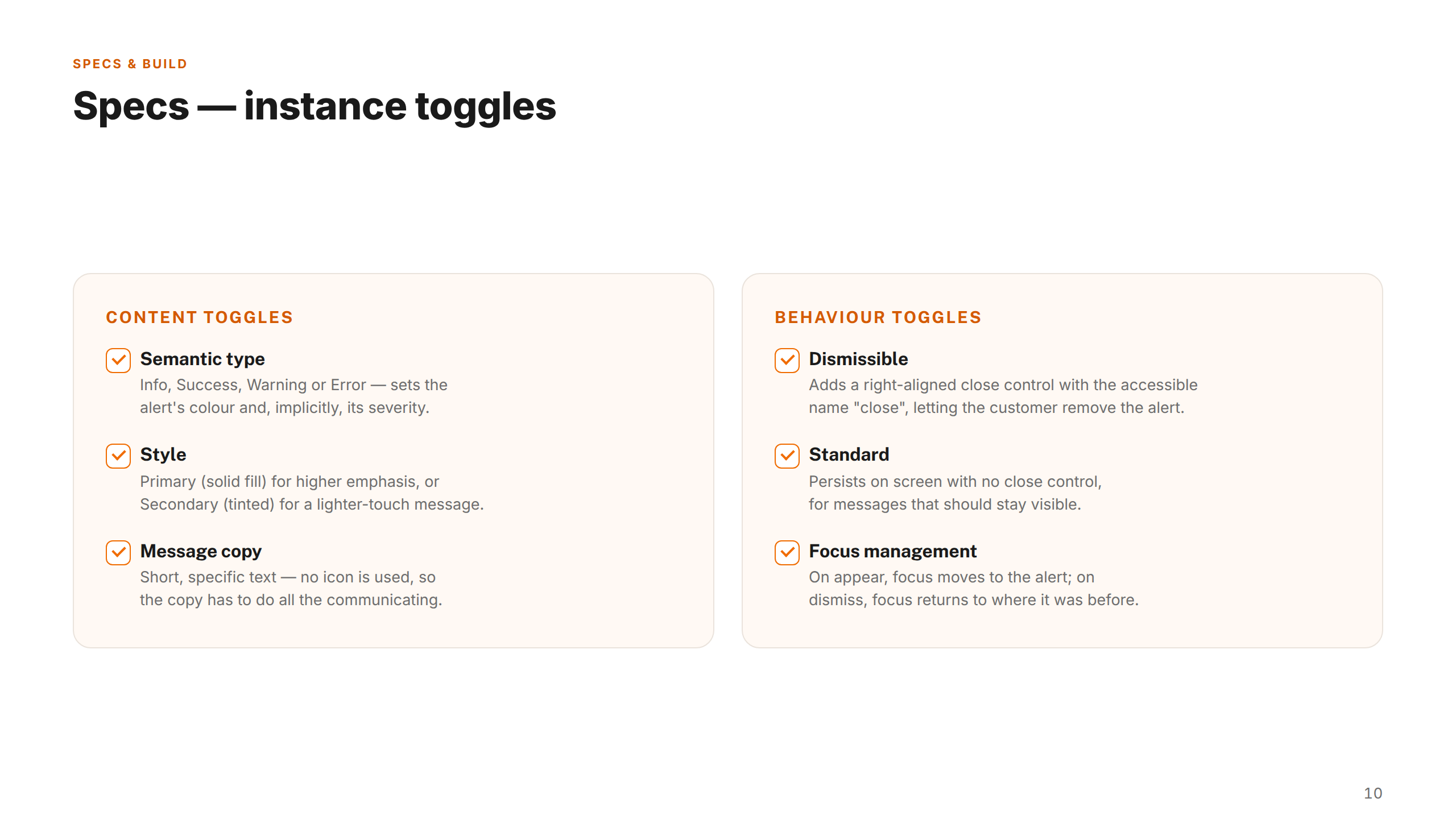
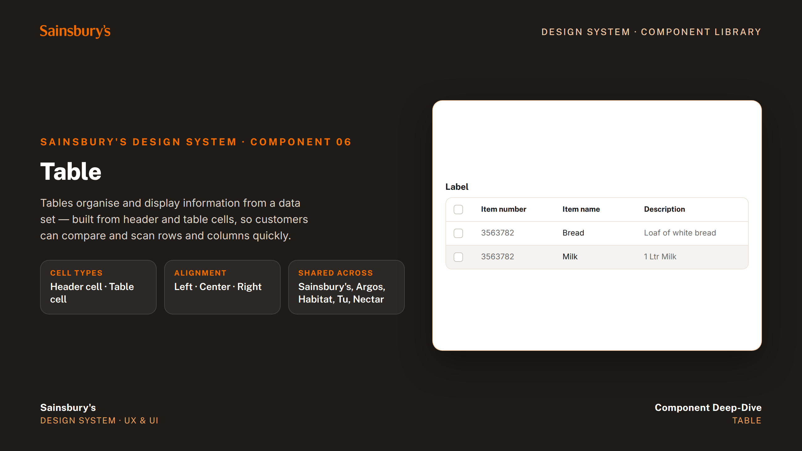
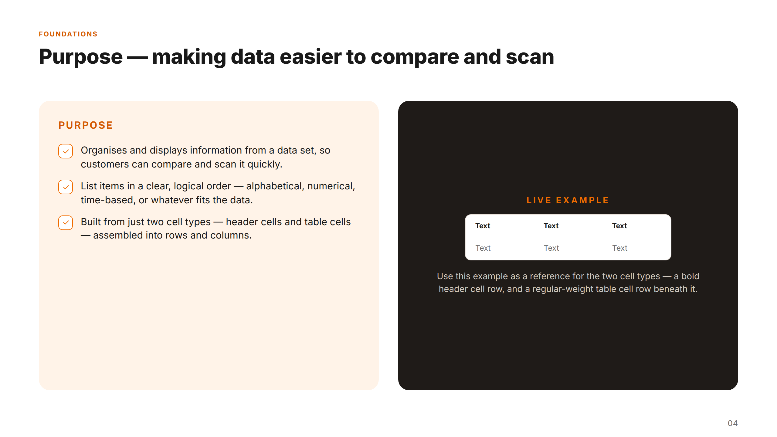
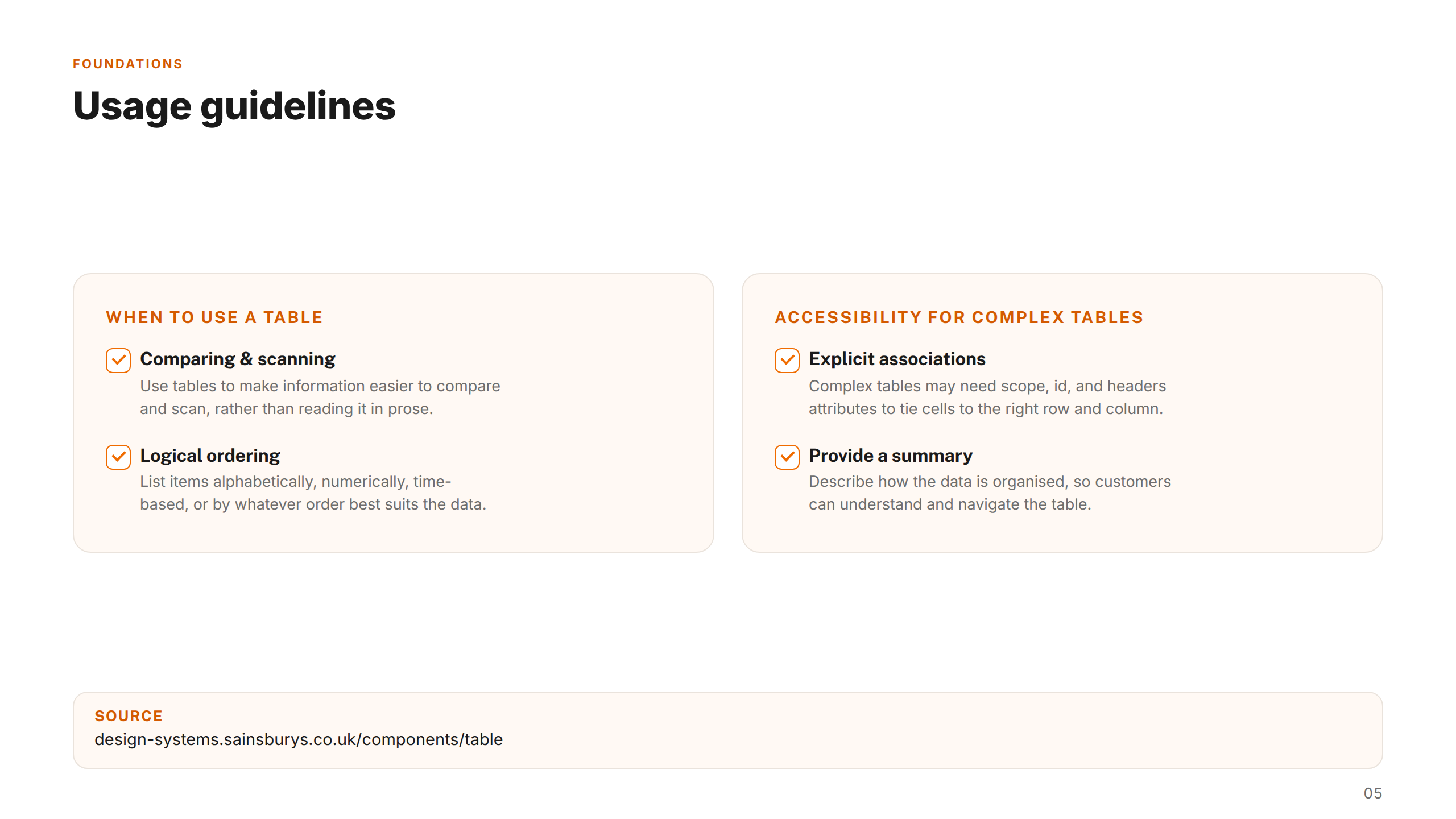
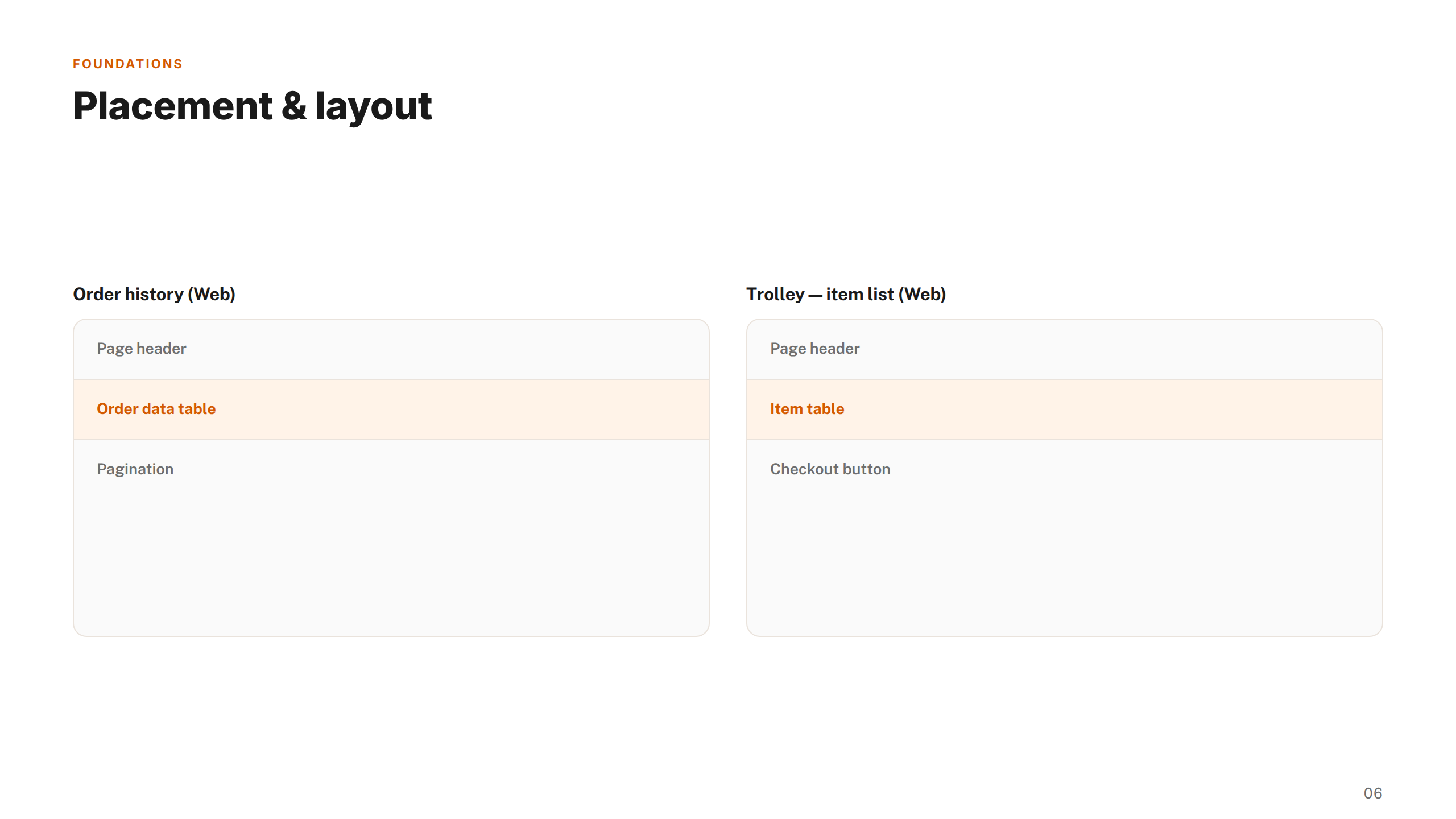
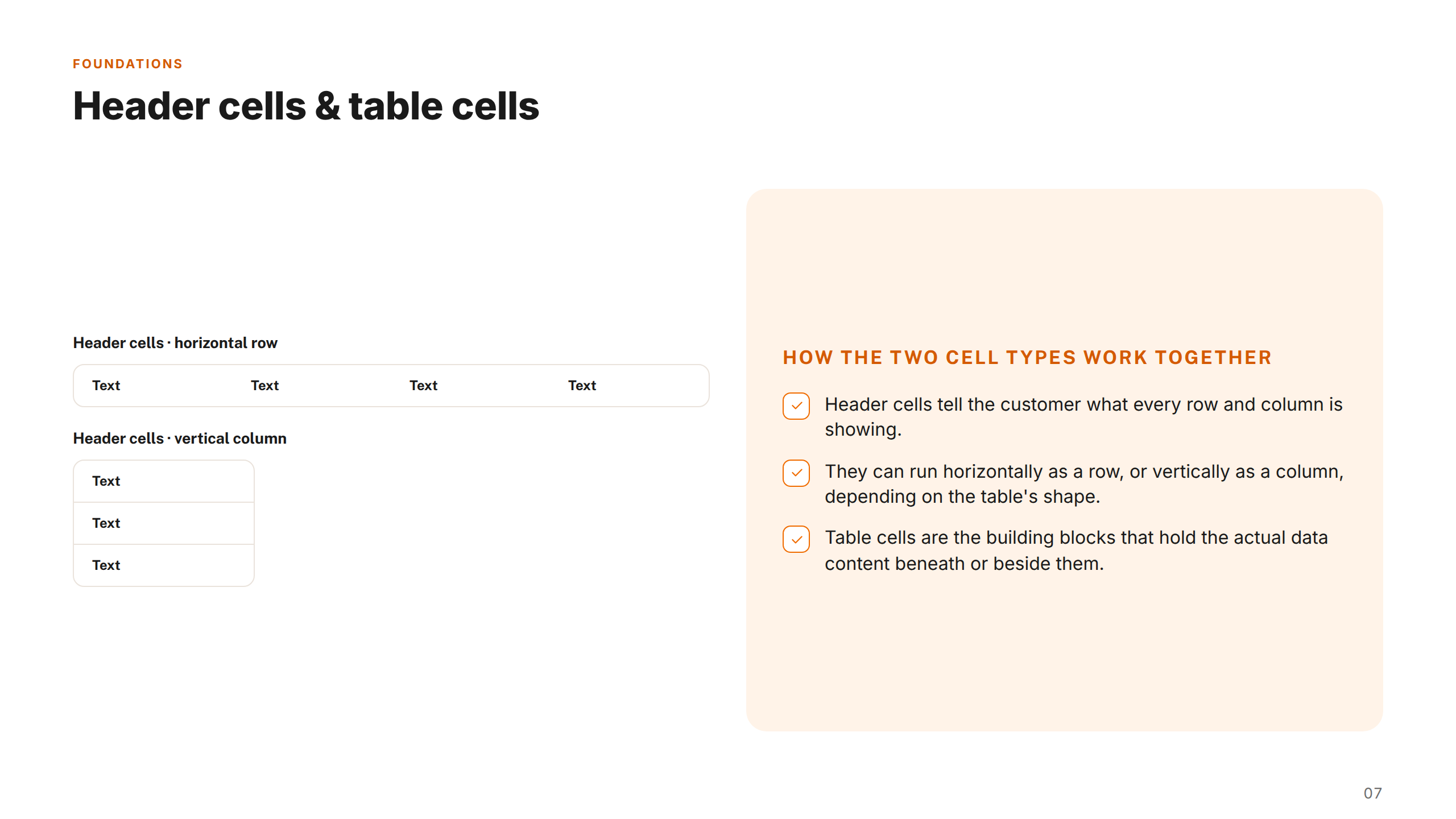
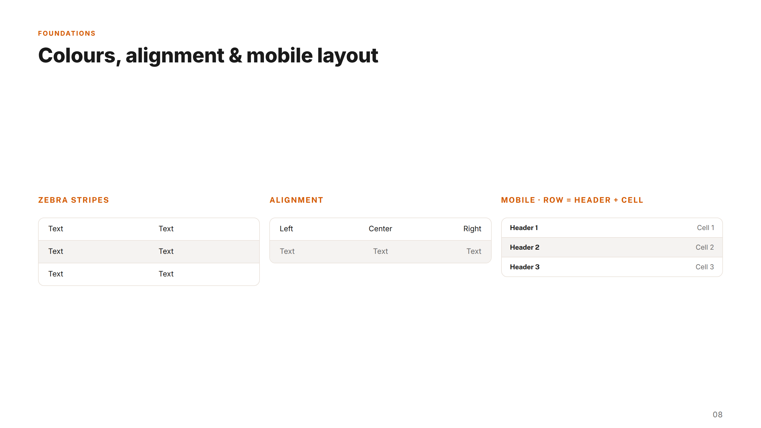
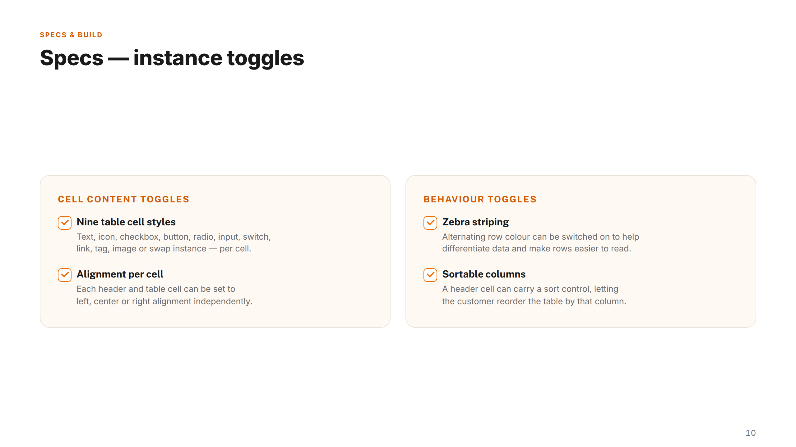
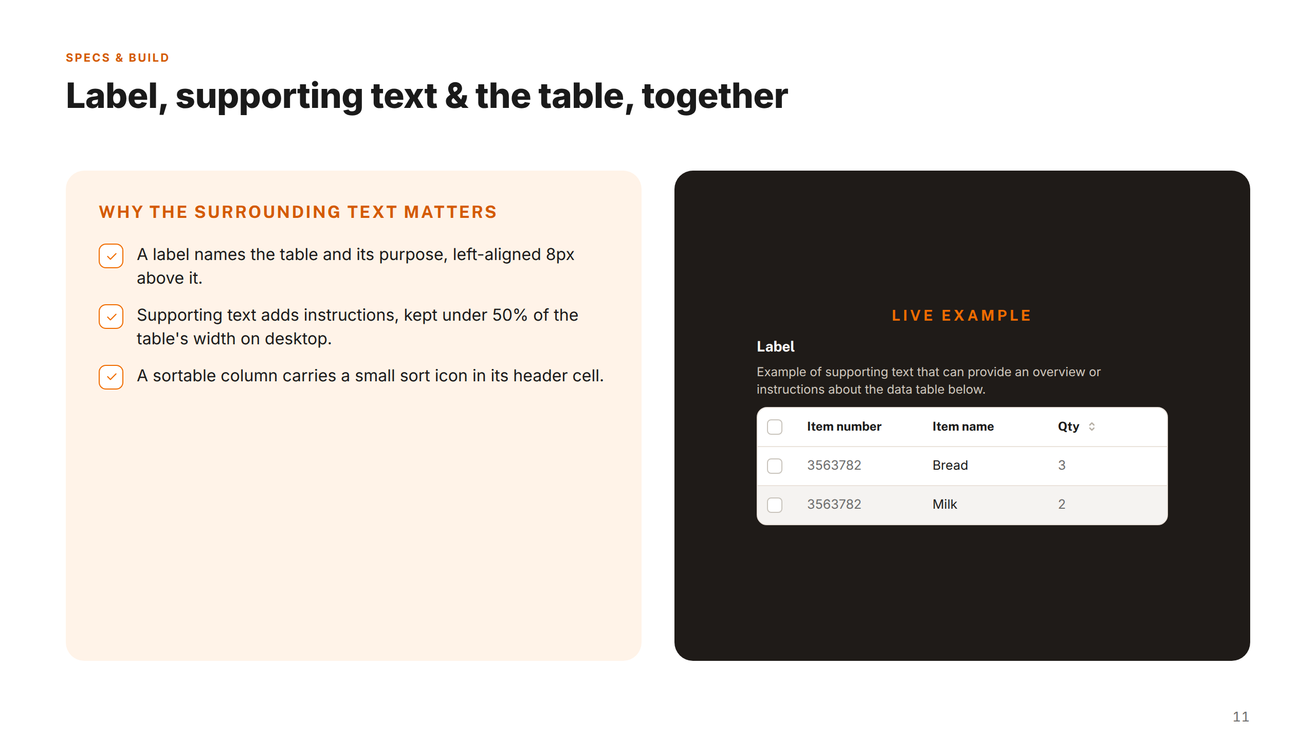
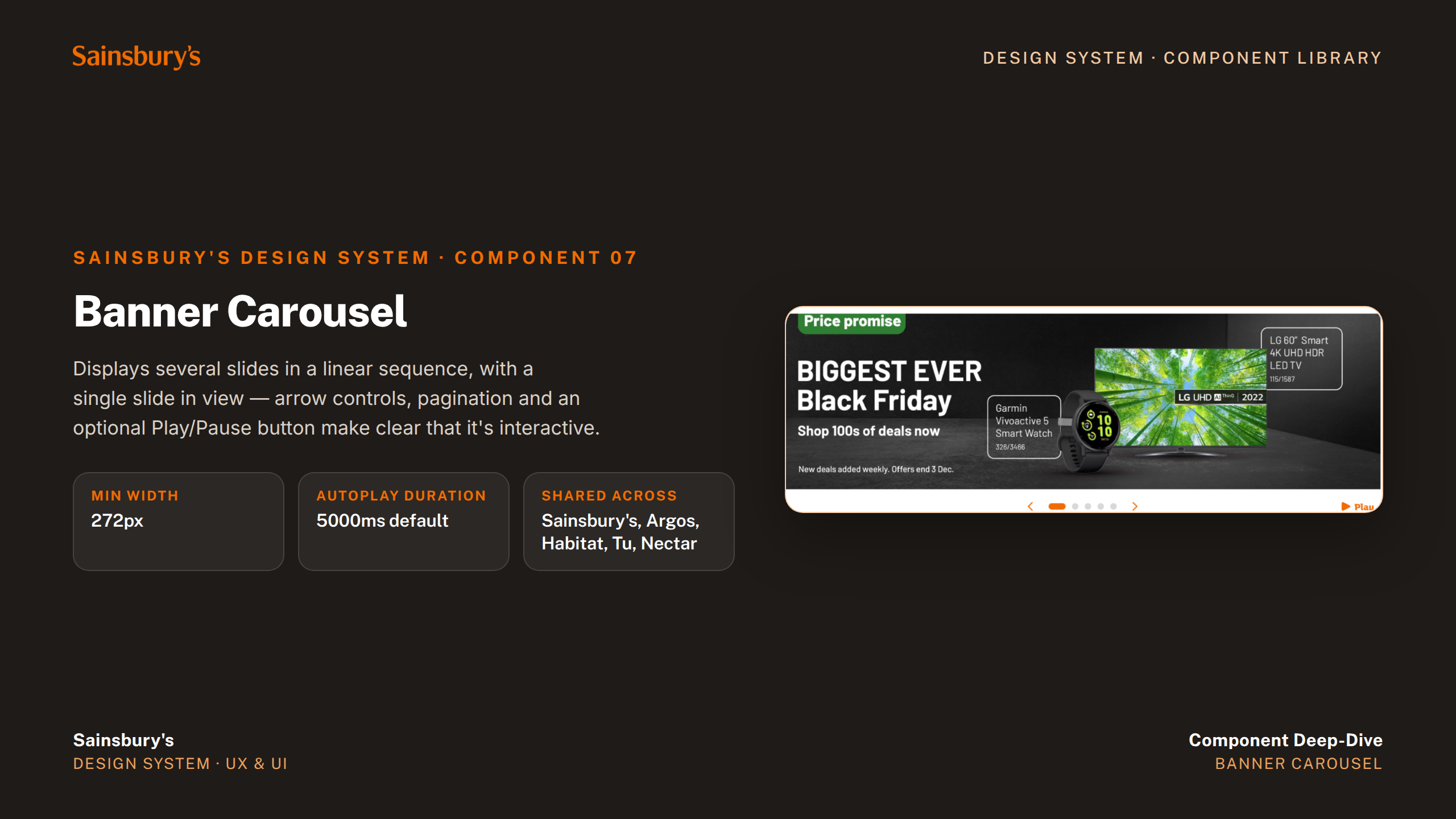
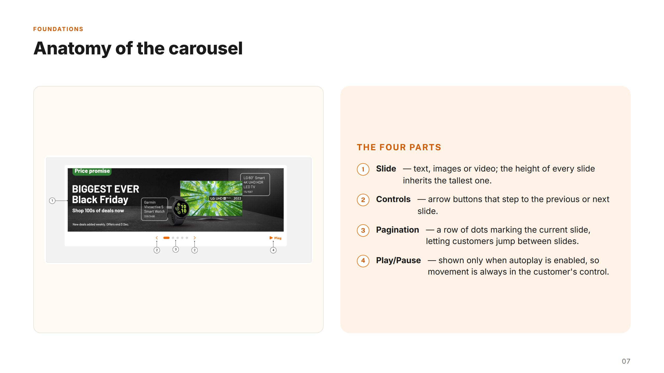
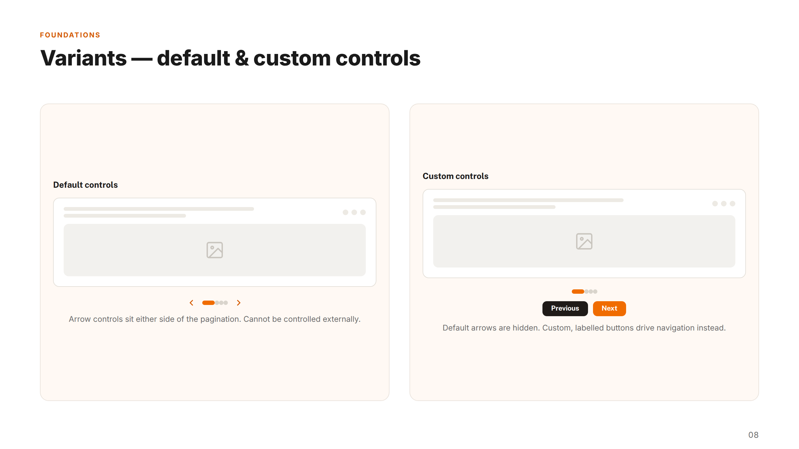
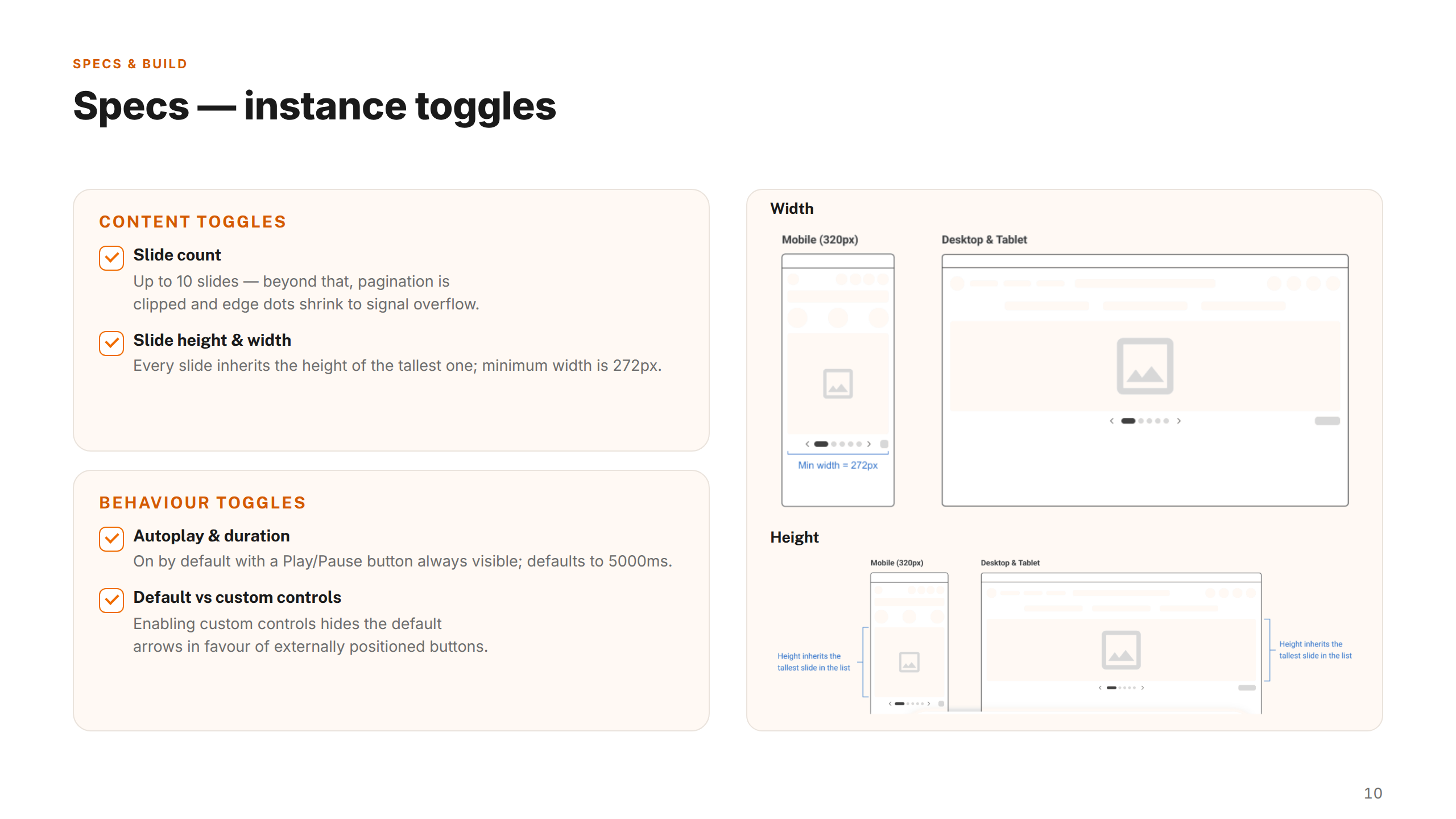
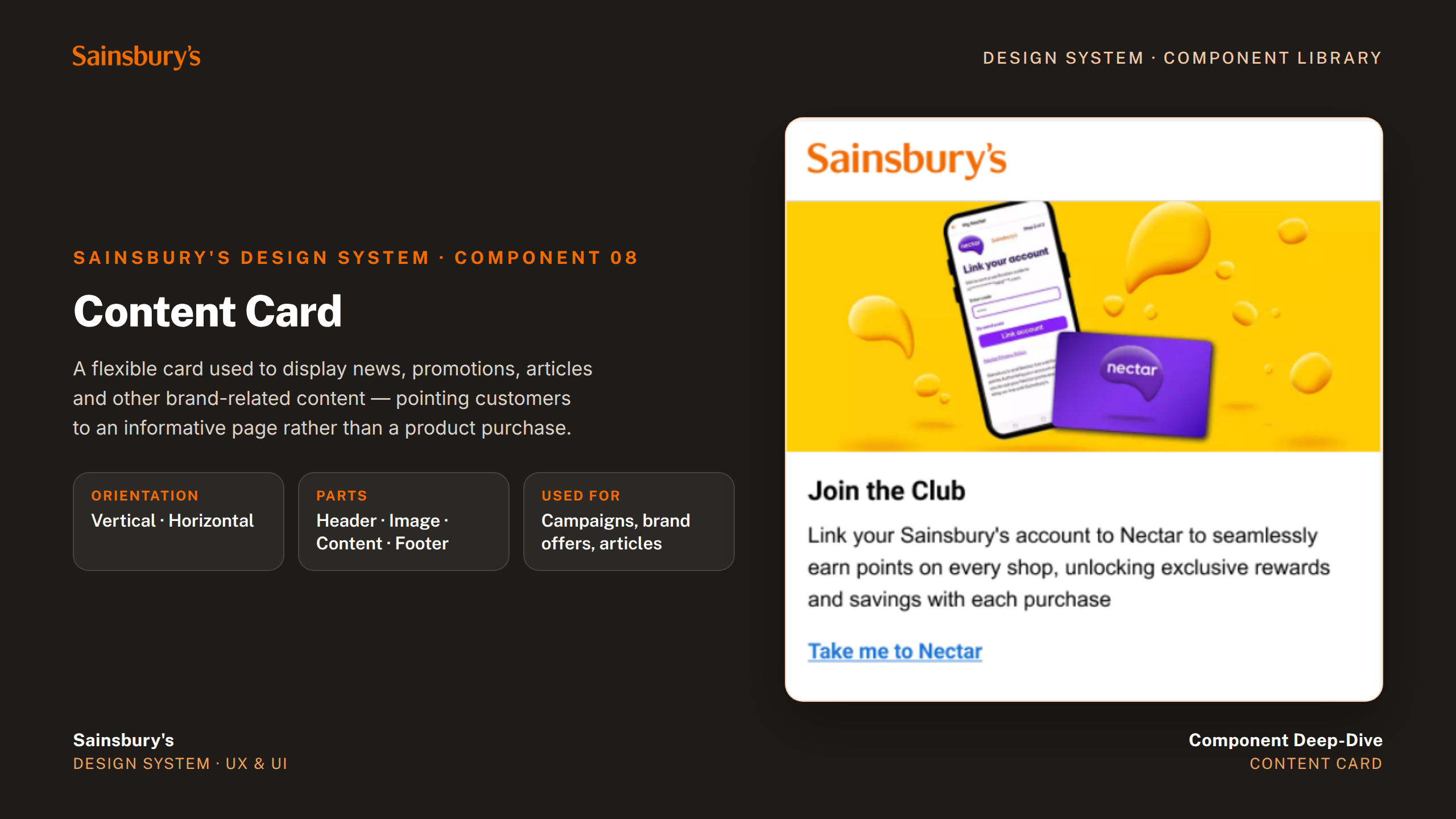
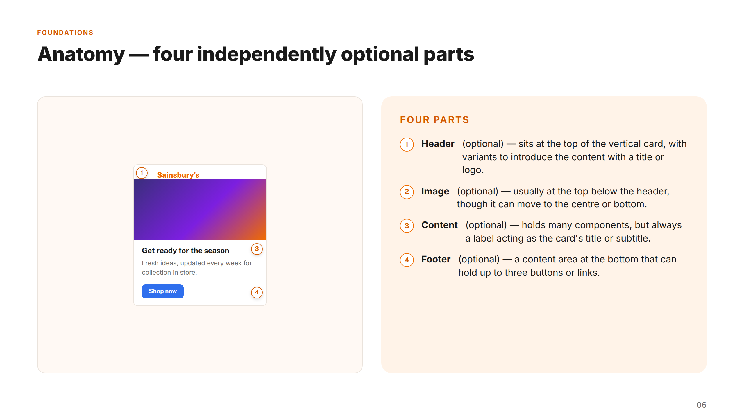
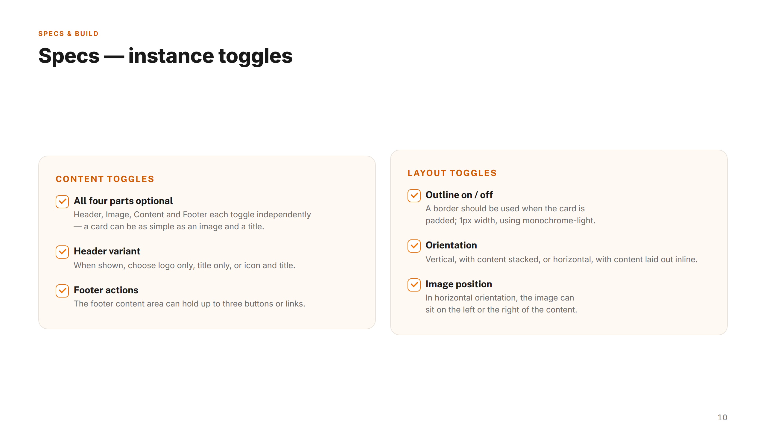
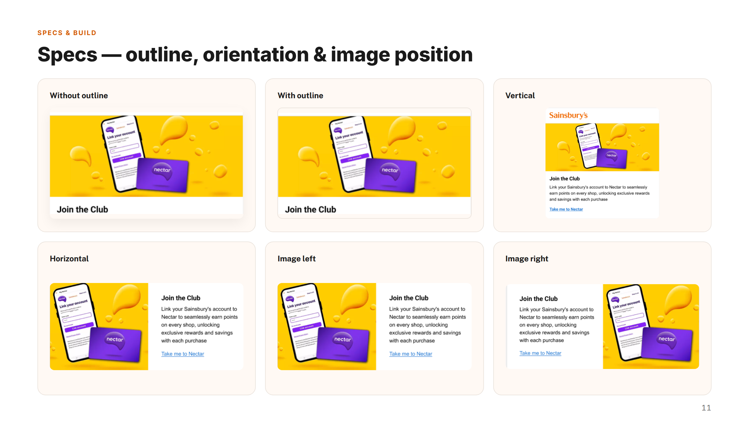
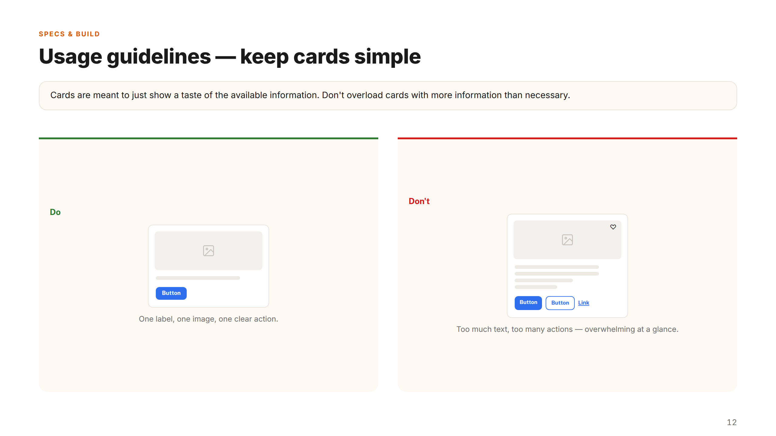
The component library was built with real-world usage patterns in mind. Each component — from date pickers and data tables to product cards and steppers — was designed with a full variant set covering interactive states, error handling, and edge cases. Accessibility annotations and usage guidelines were embedded directly in Figma, making every component self-documenting for the teams using it.
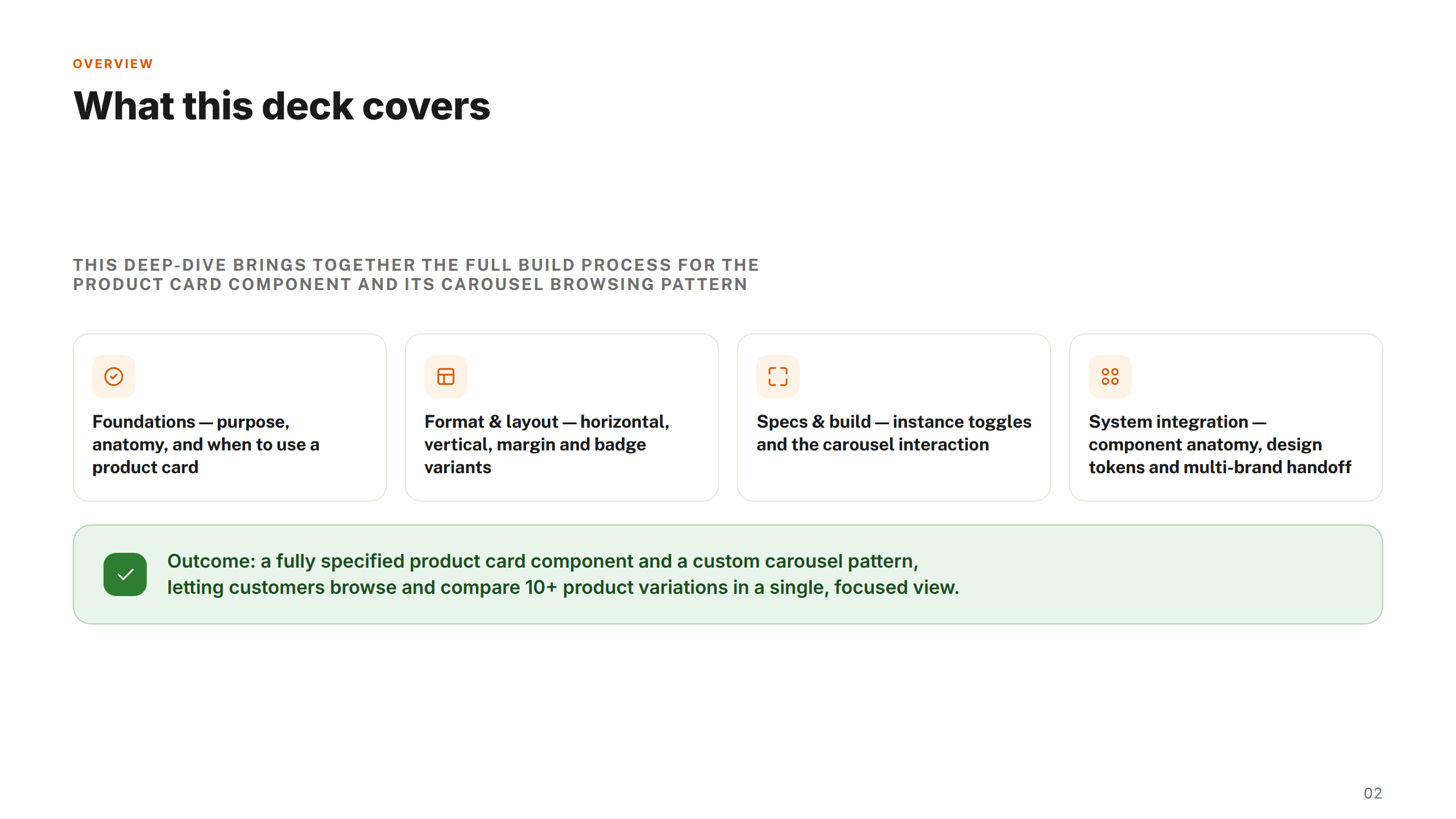
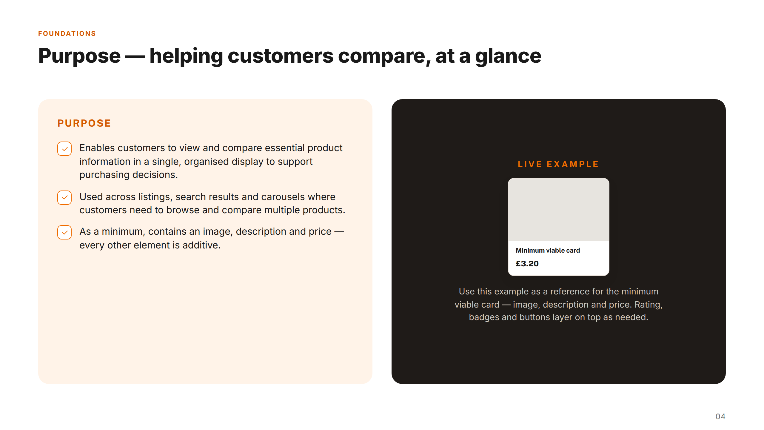
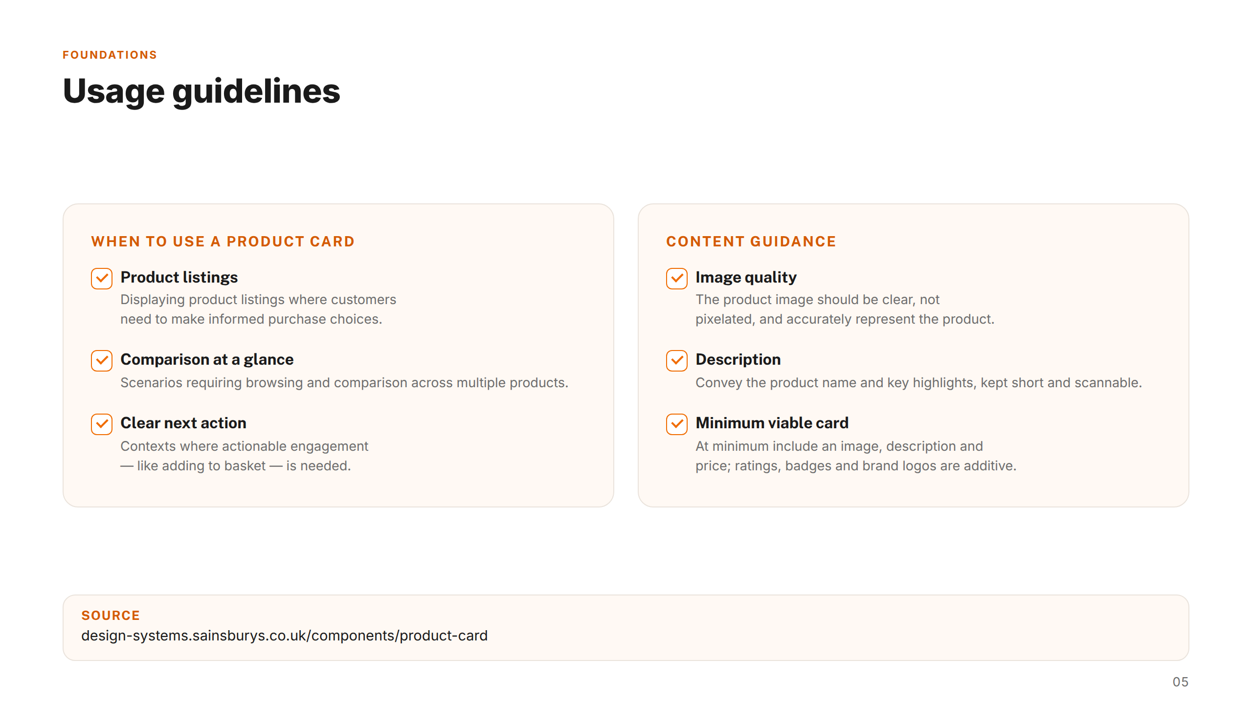
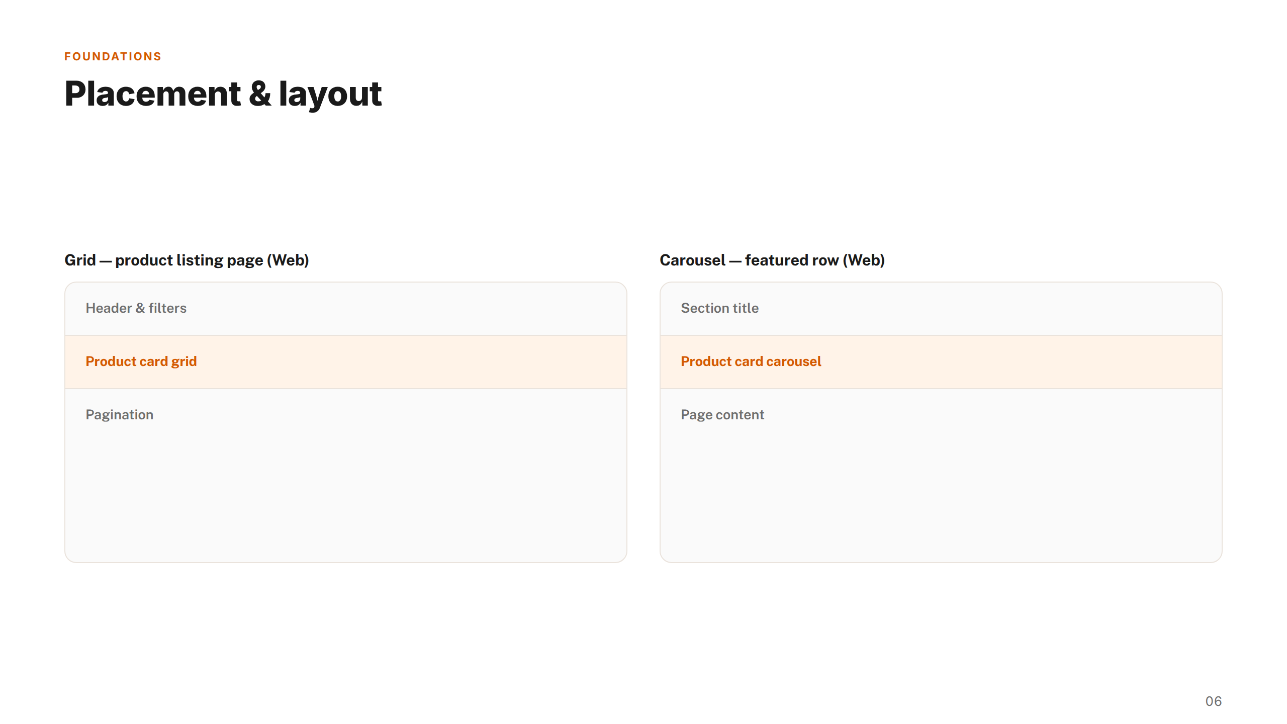
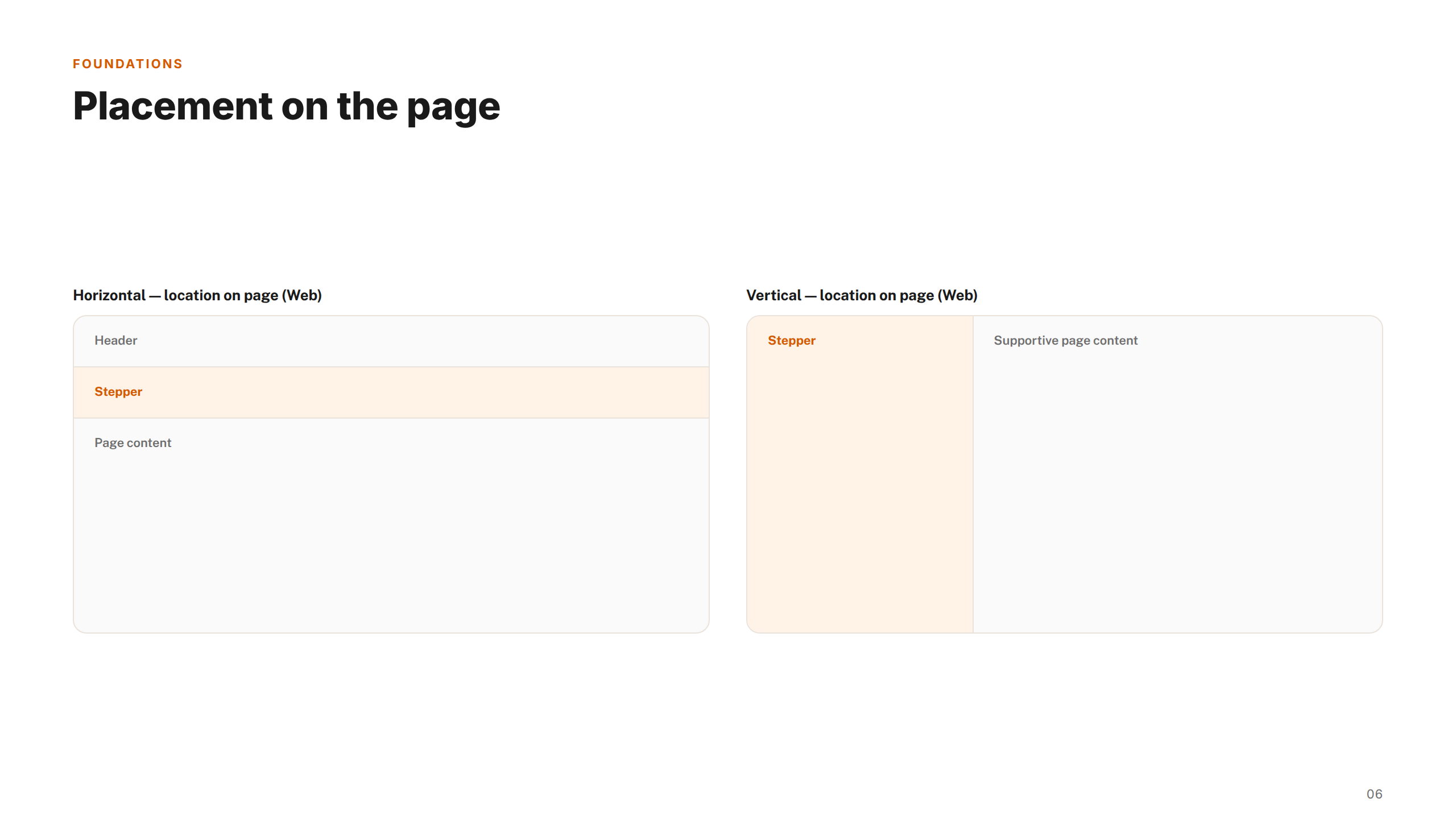
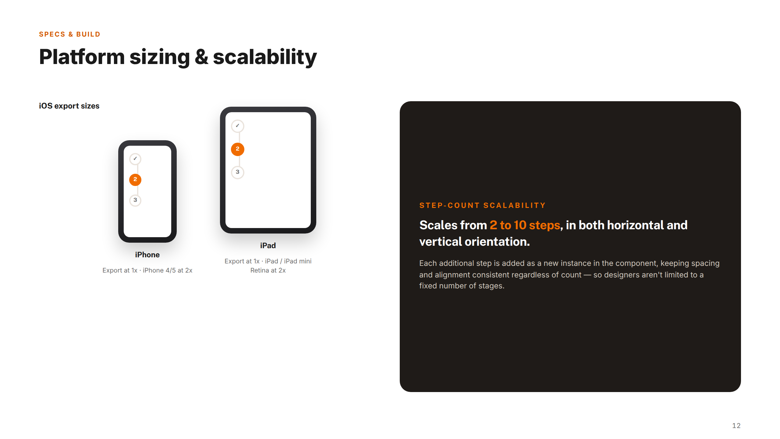
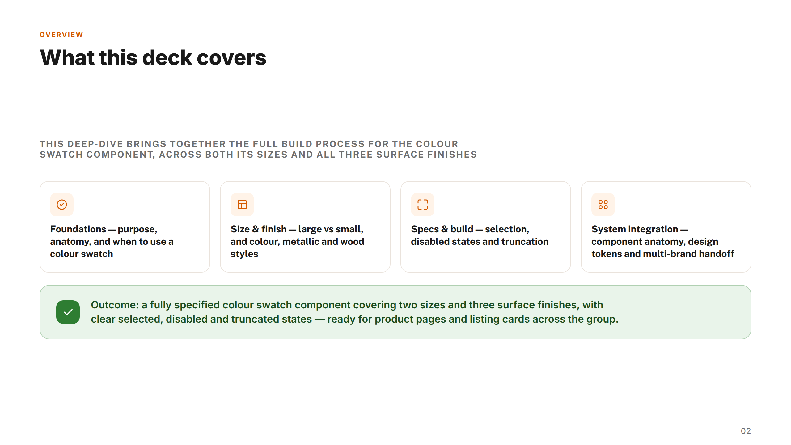
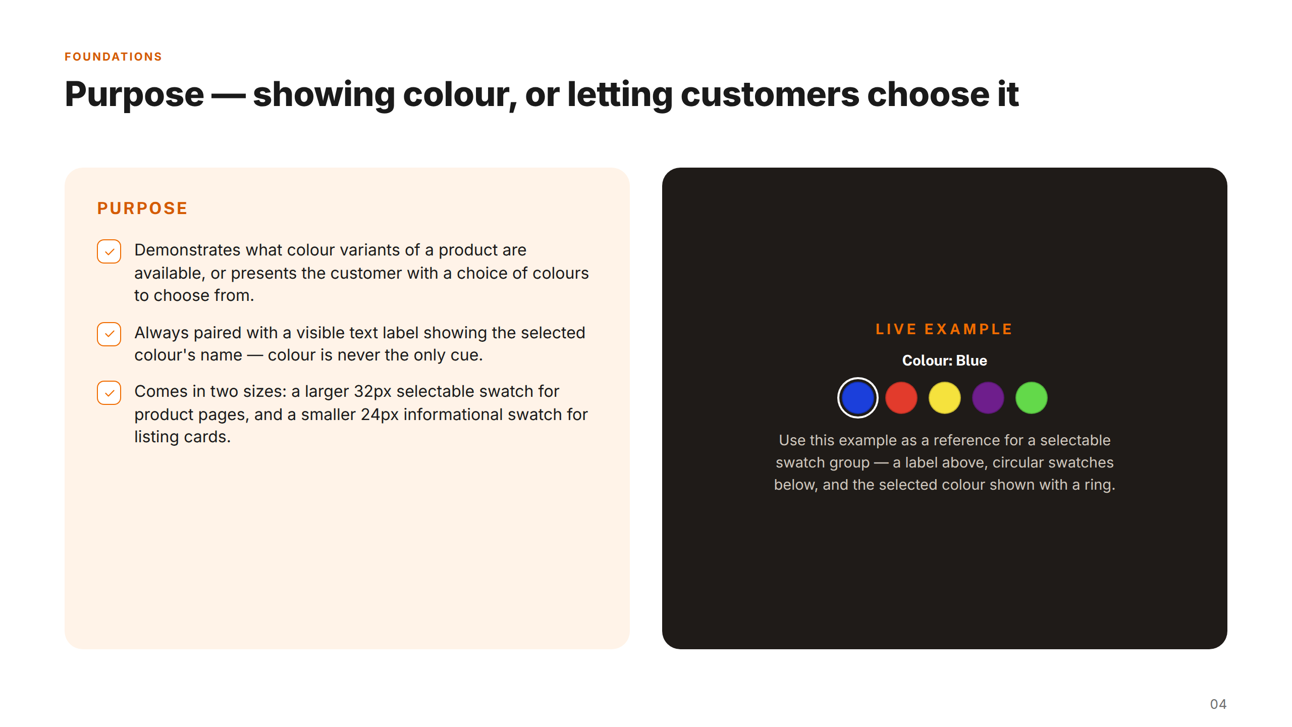
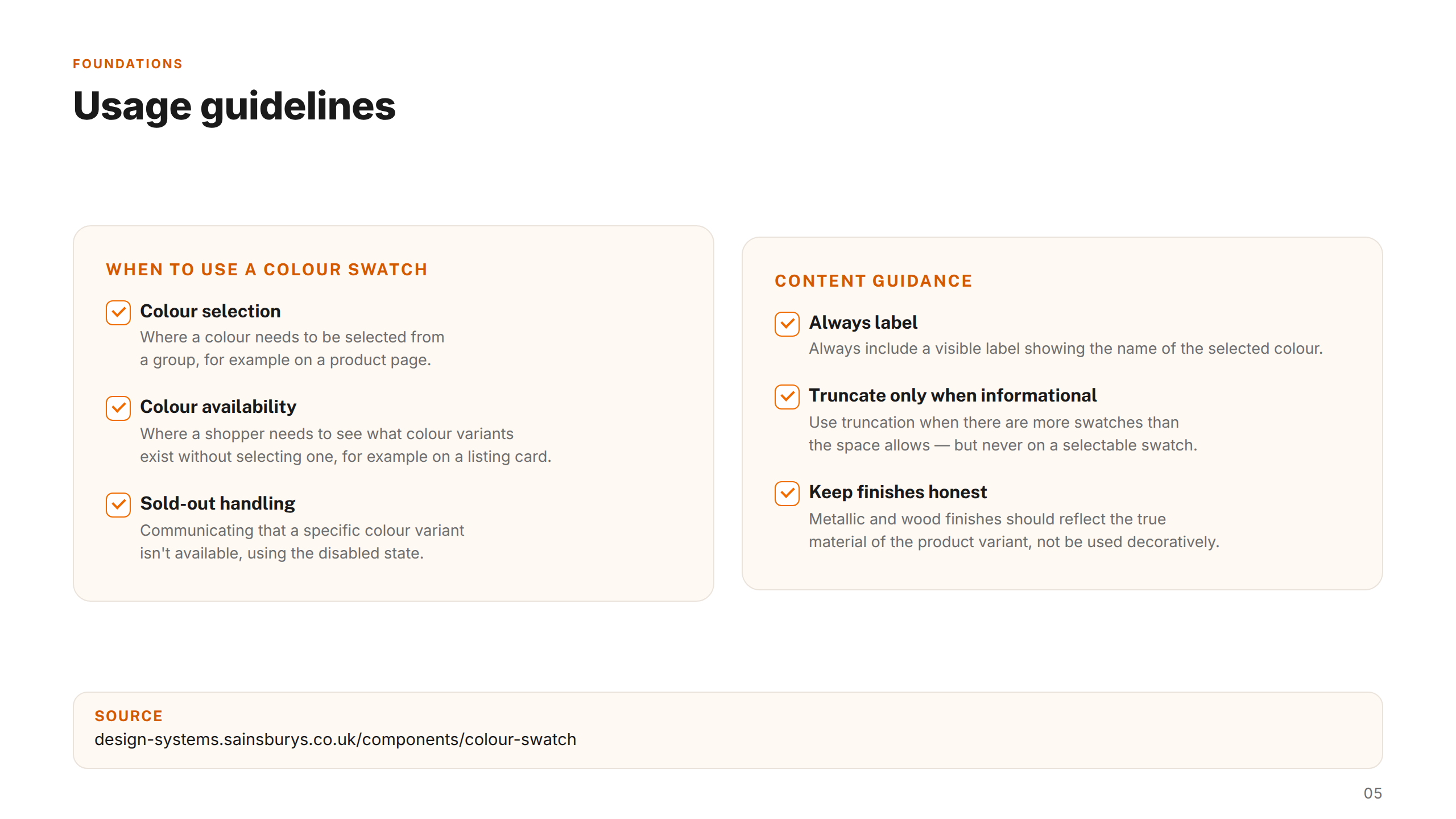
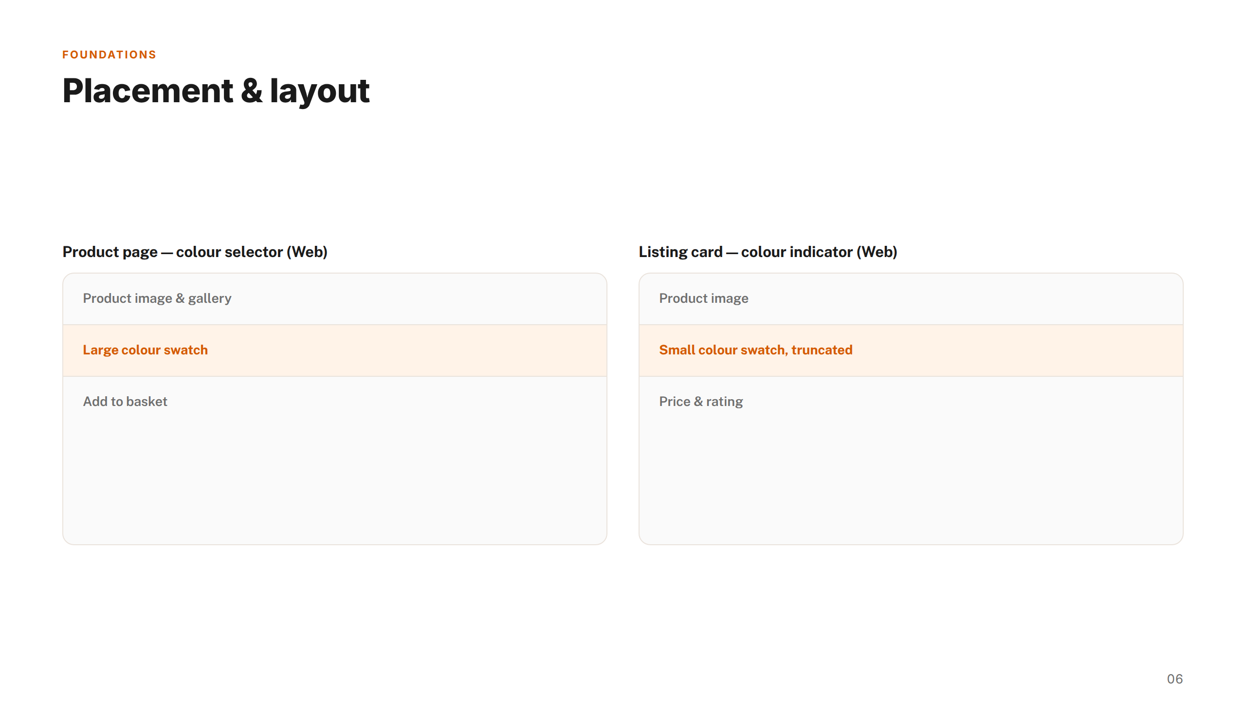
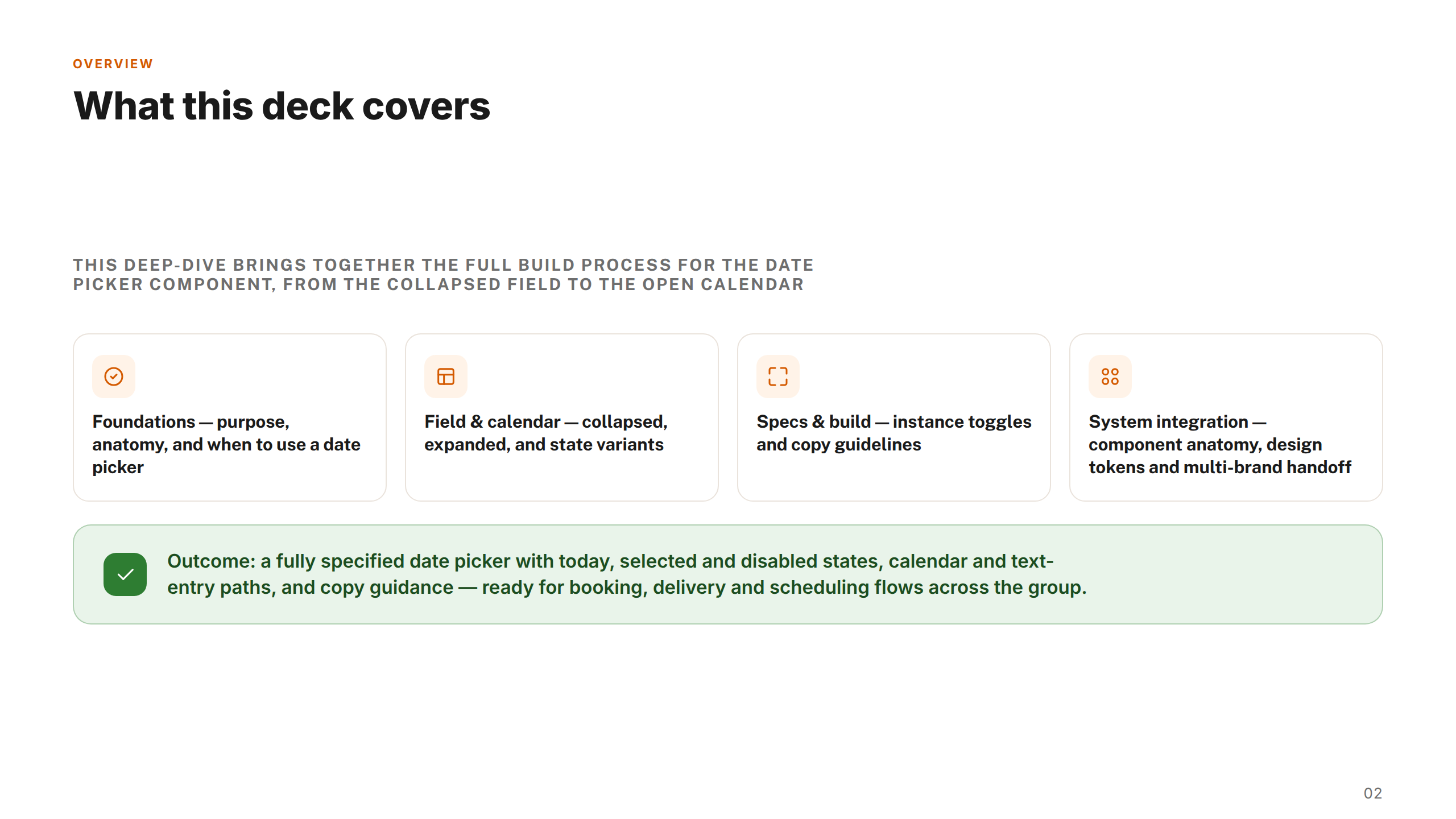
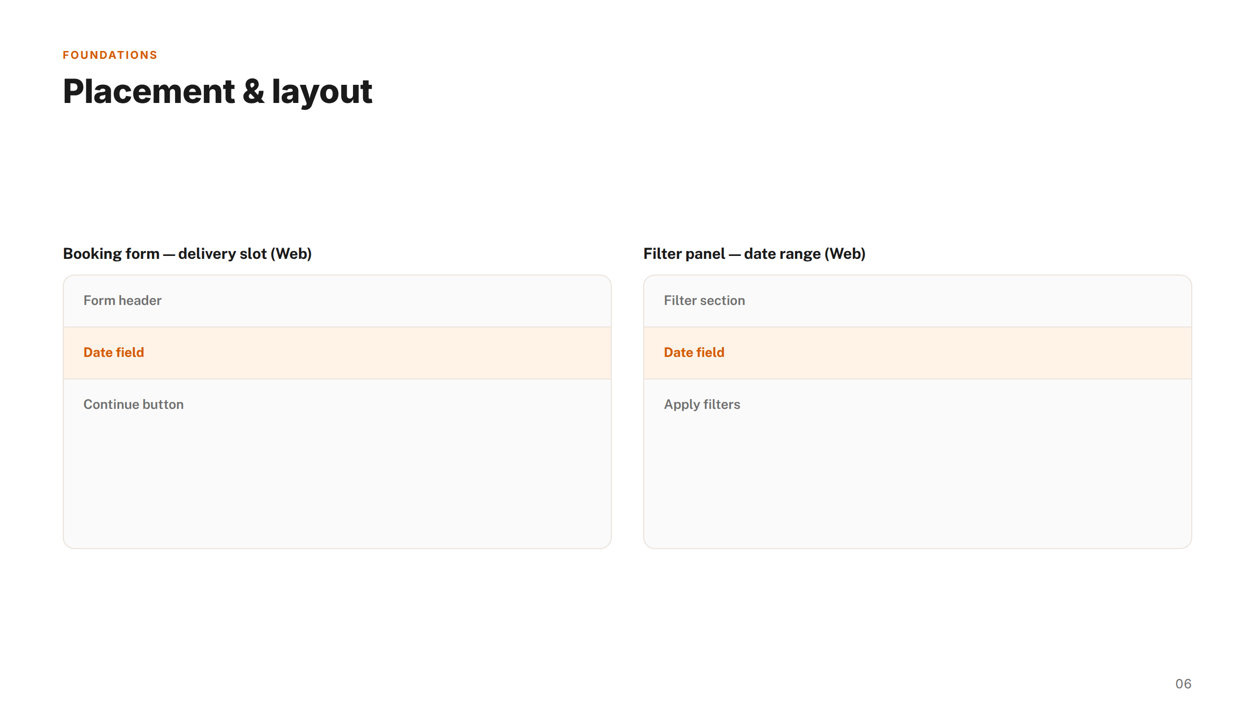
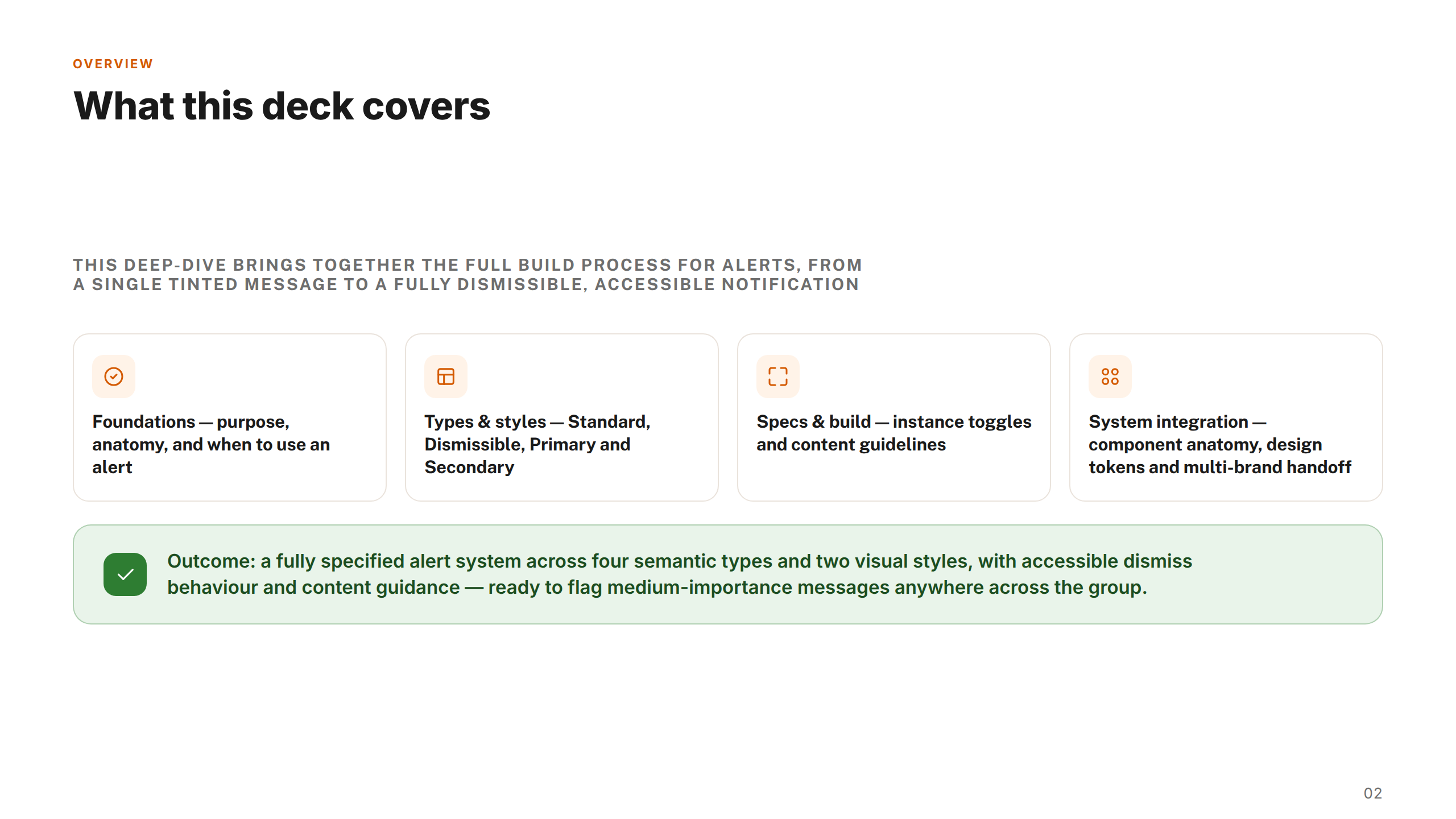
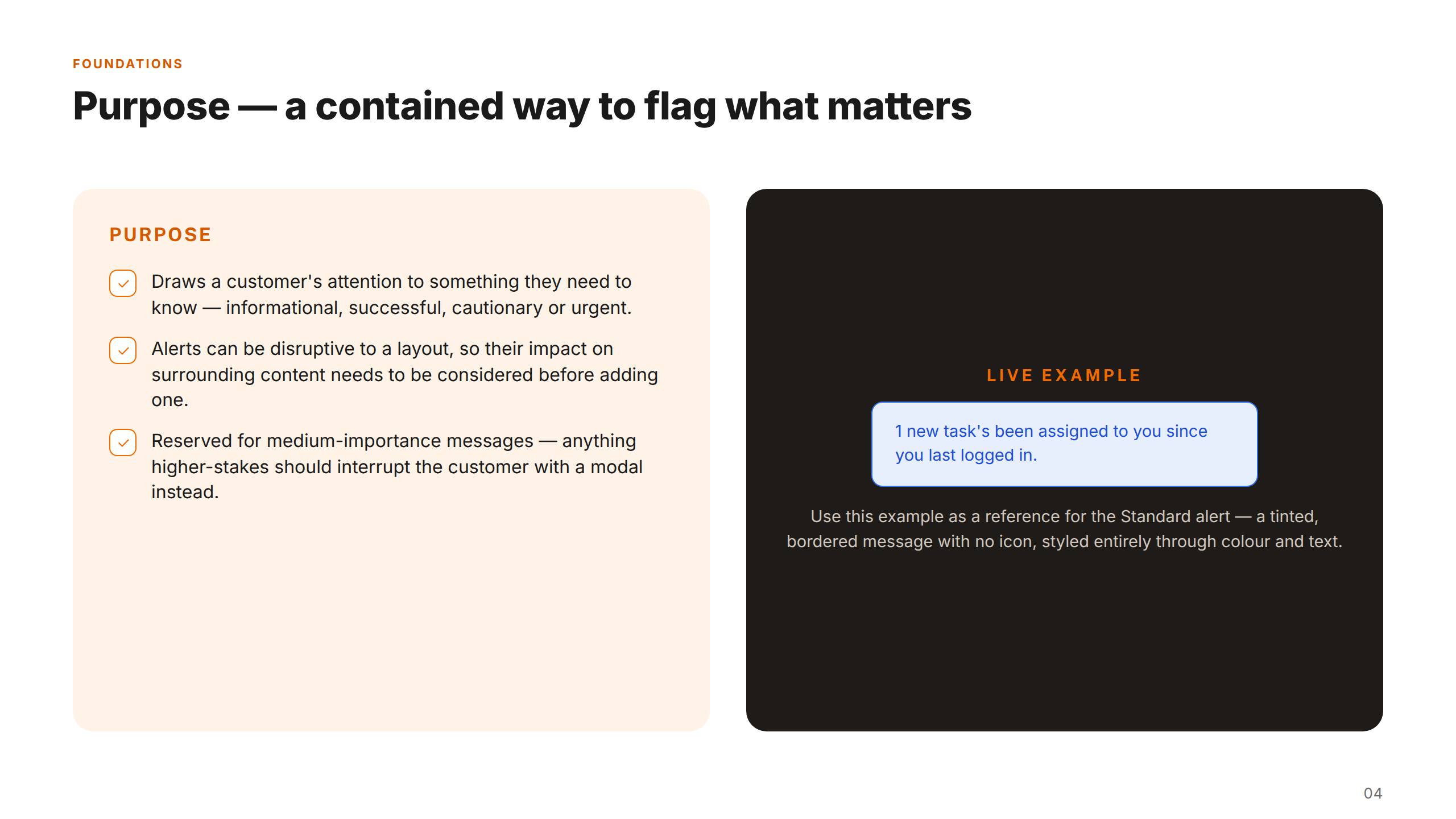
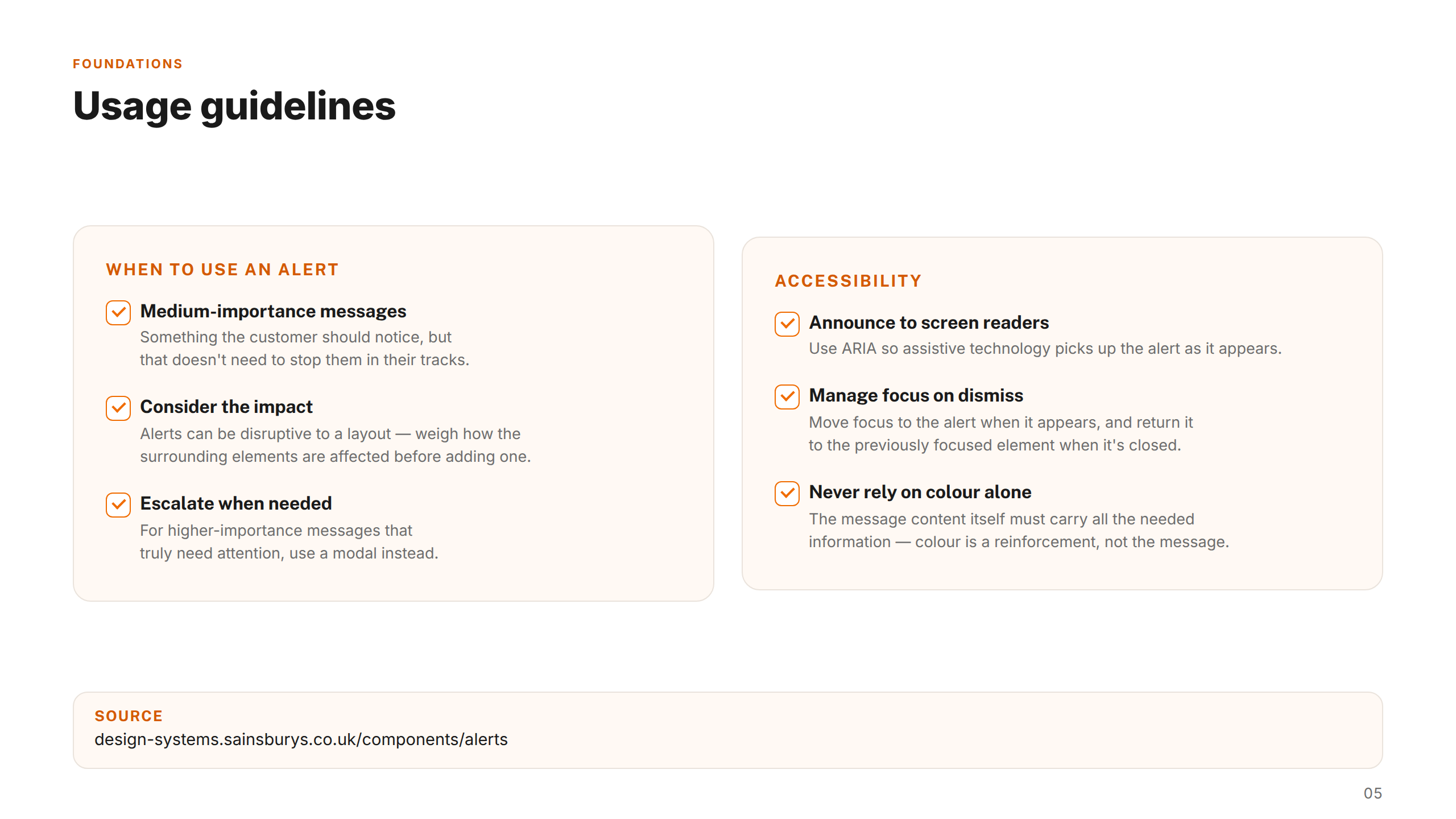
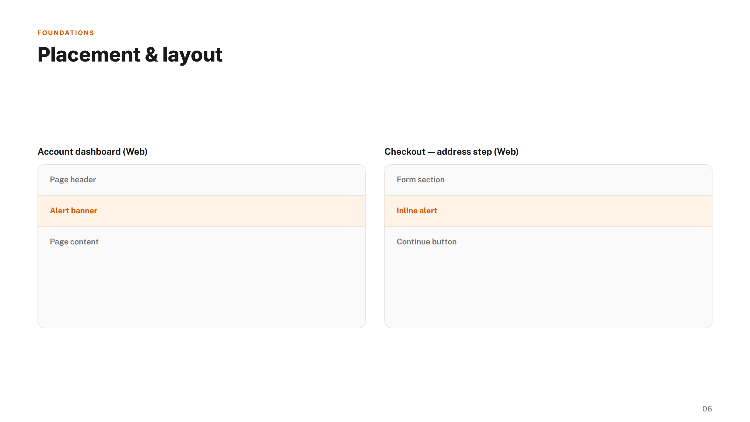
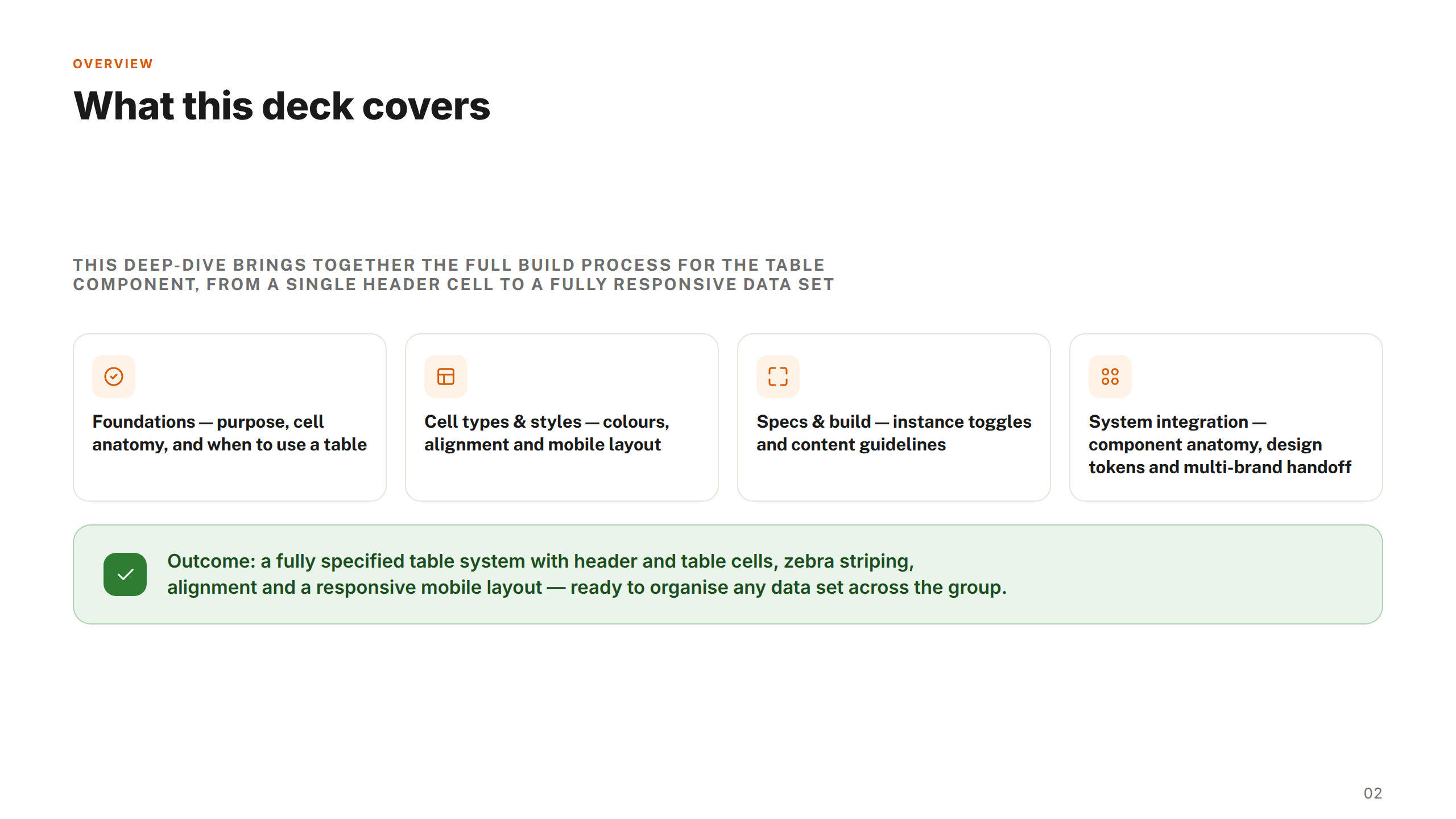
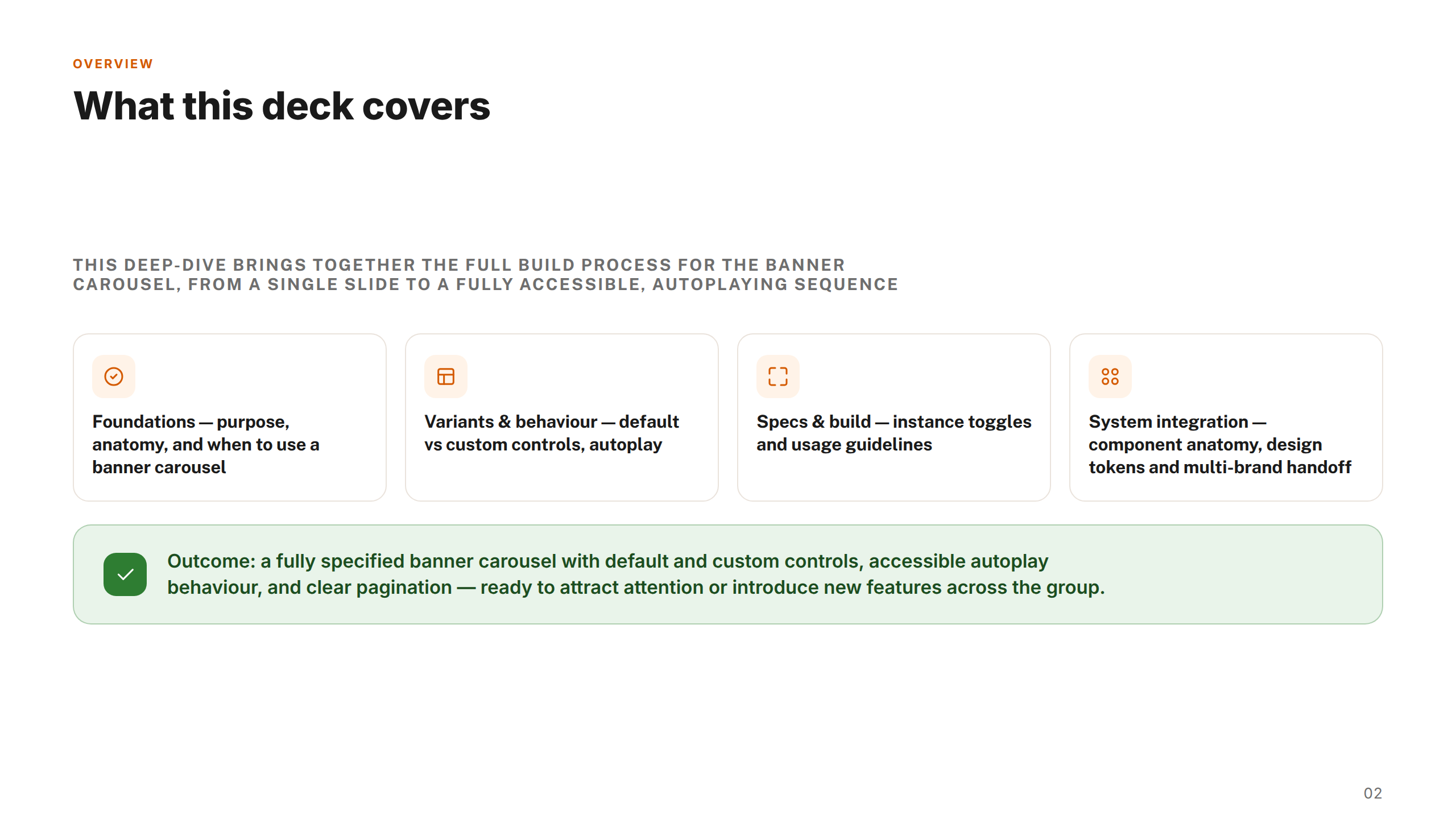
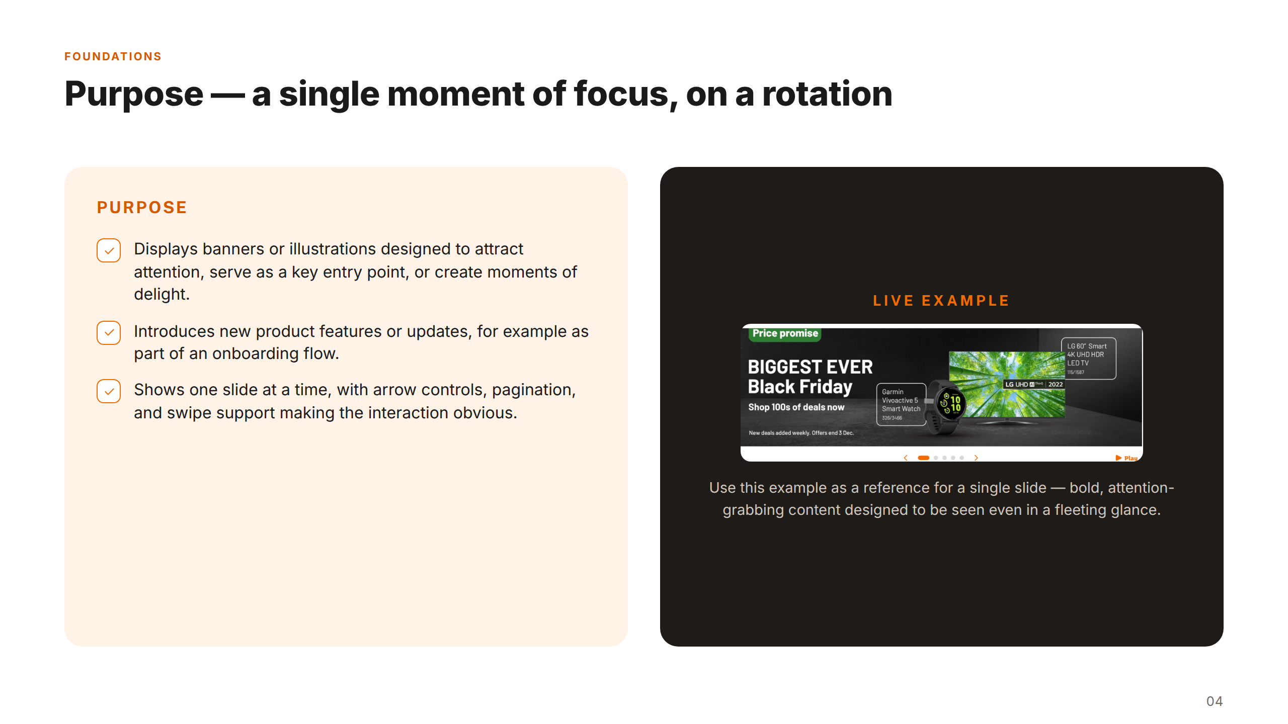
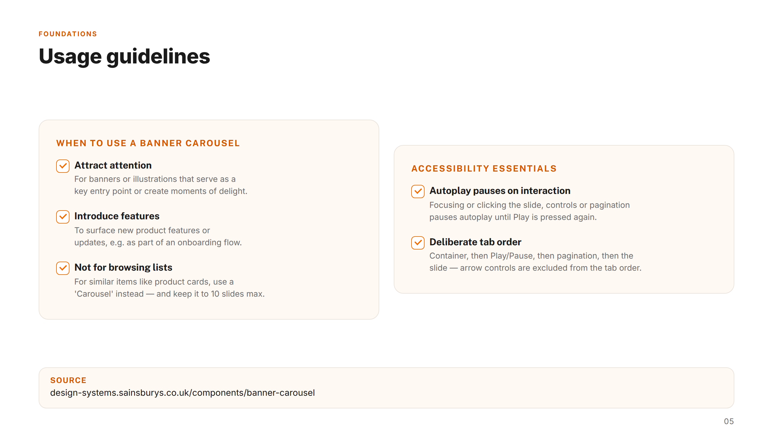
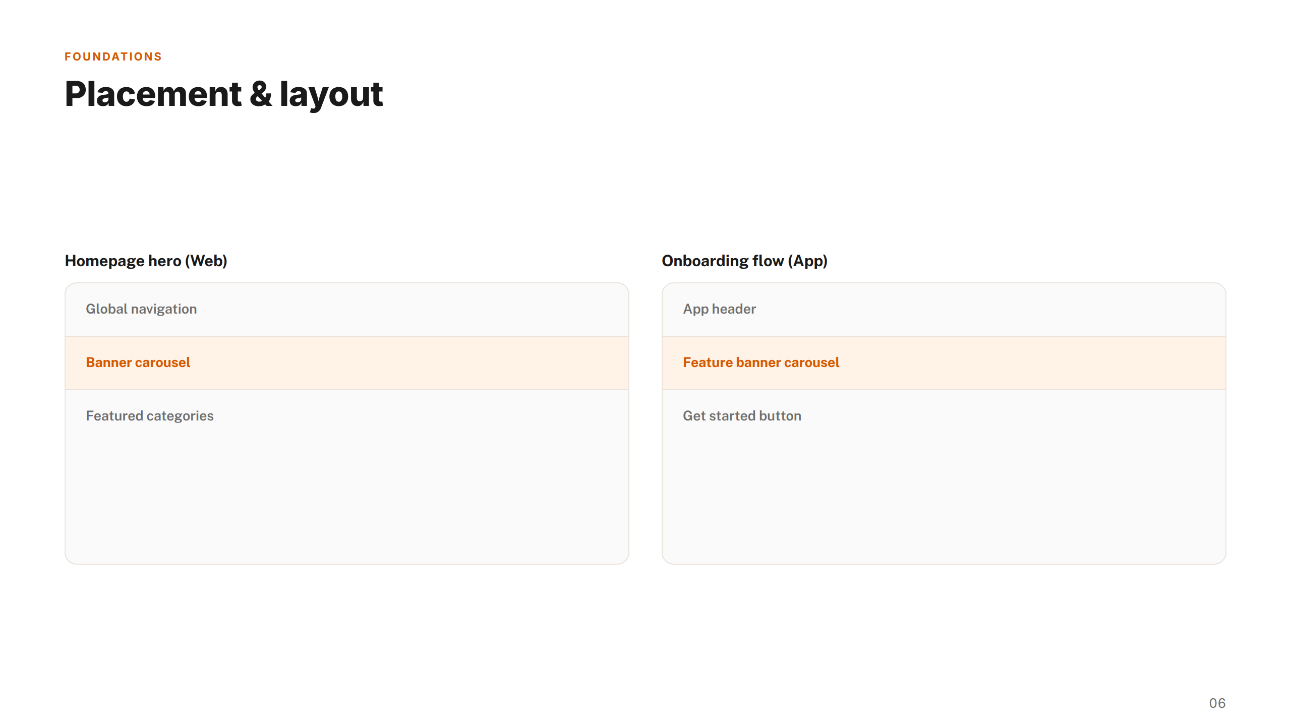
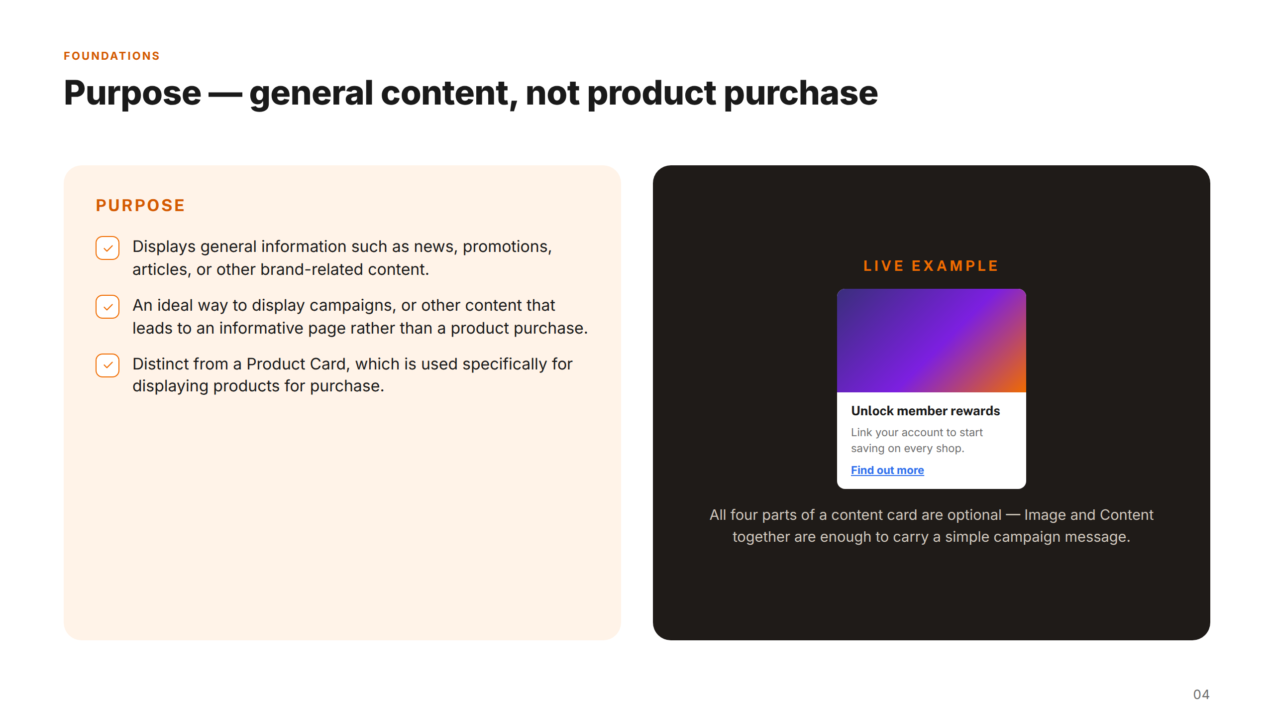
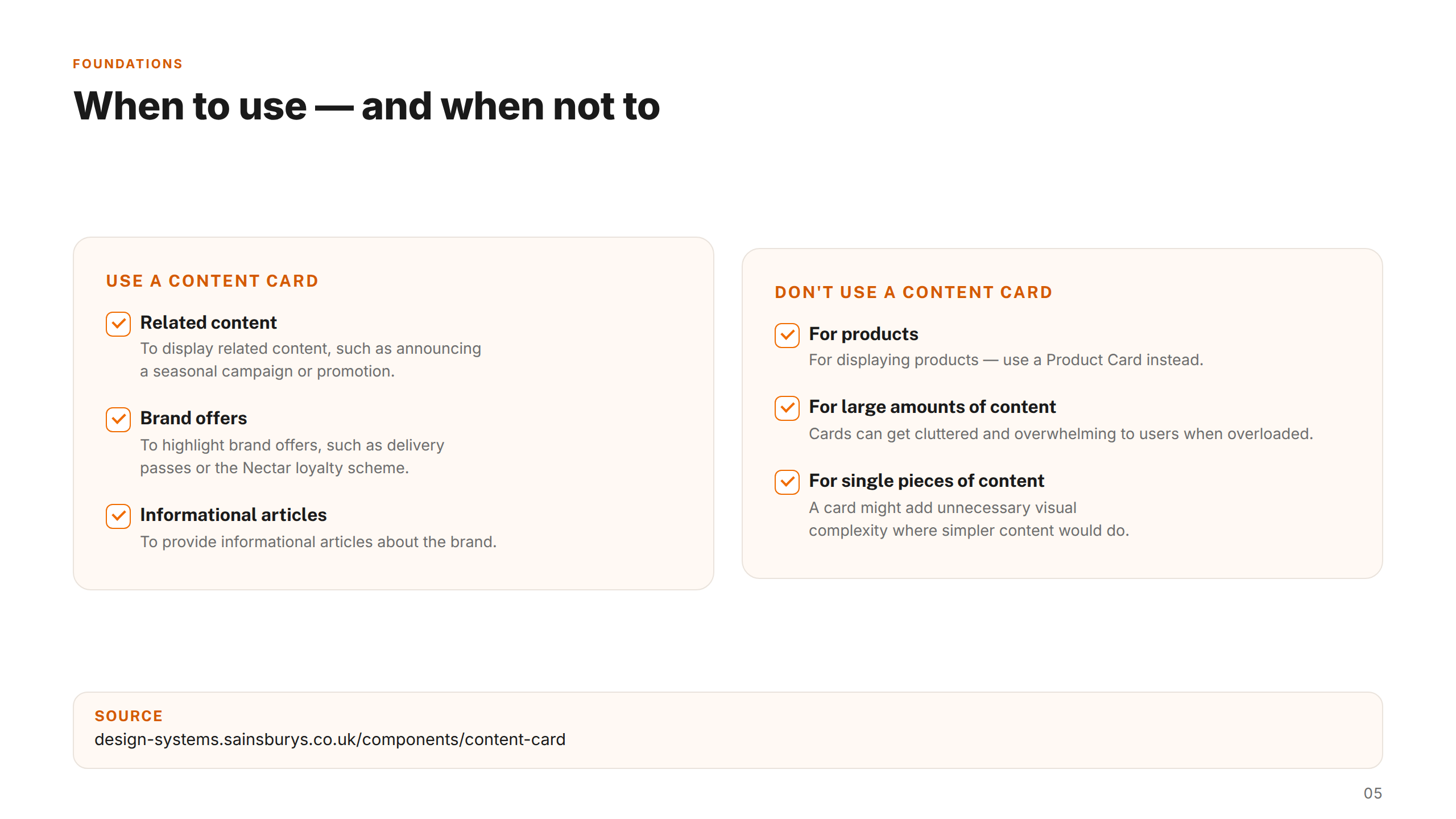
Foundation documentation covered colour guidance, component states, and layout patterns across 40+ detailed guidance slides — creating a single source of truth that product designers, engineers, and QA teams across the Sainsbury's Group could reference with confidence. Components were built to scale across web responsive, iOS, and Android, reducing the duplication that had slowed delivery across the estate.
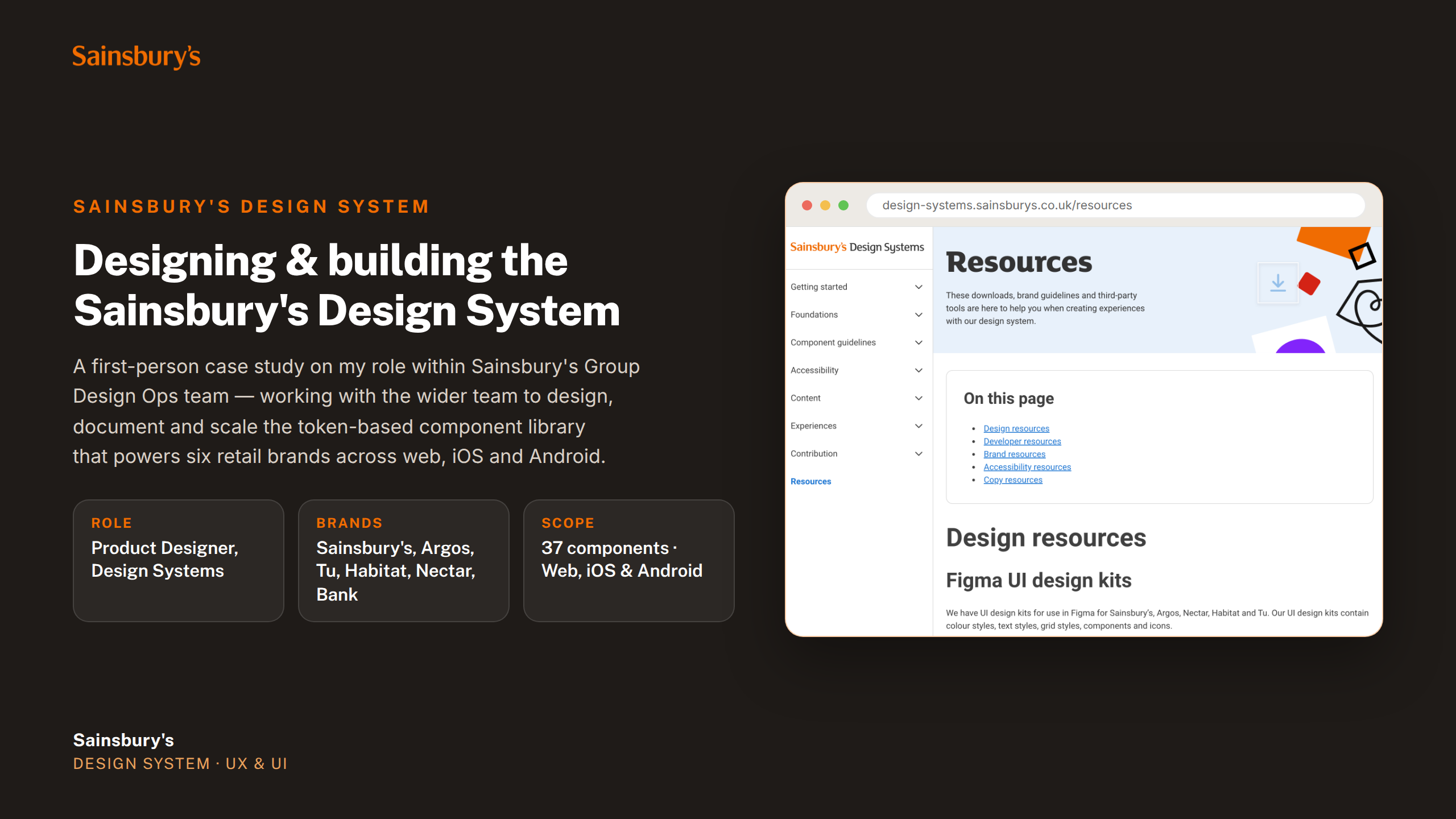
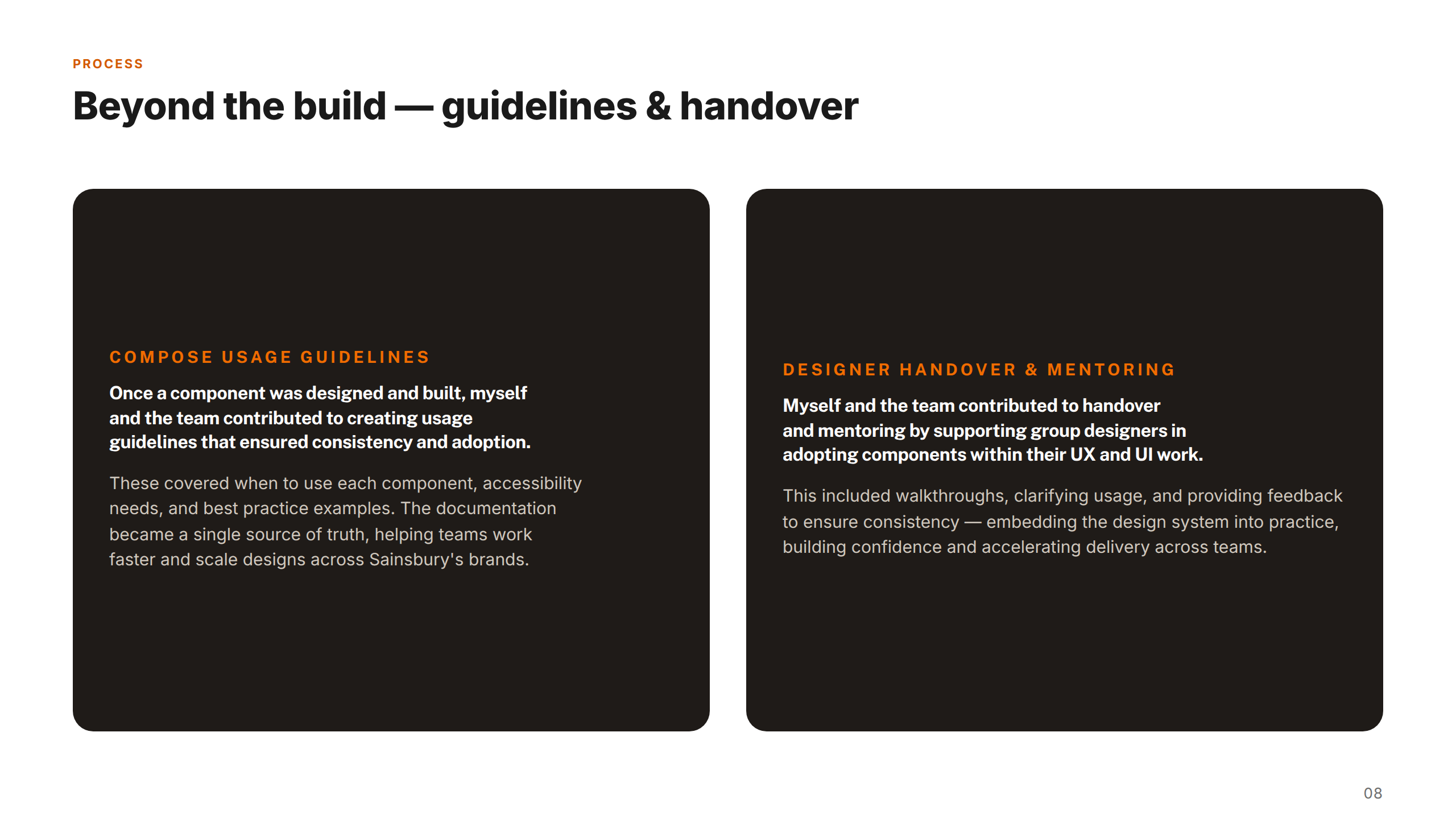
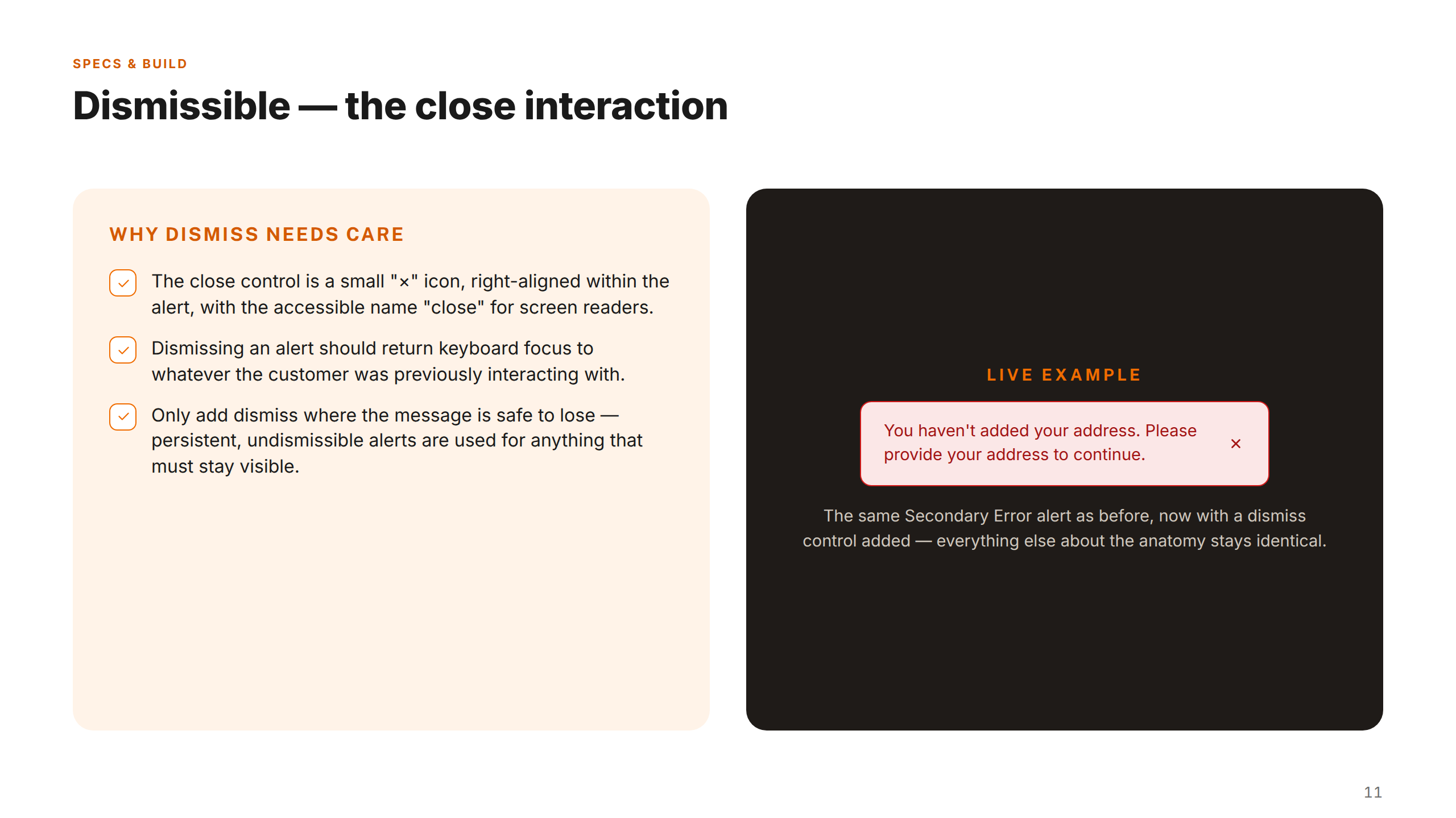
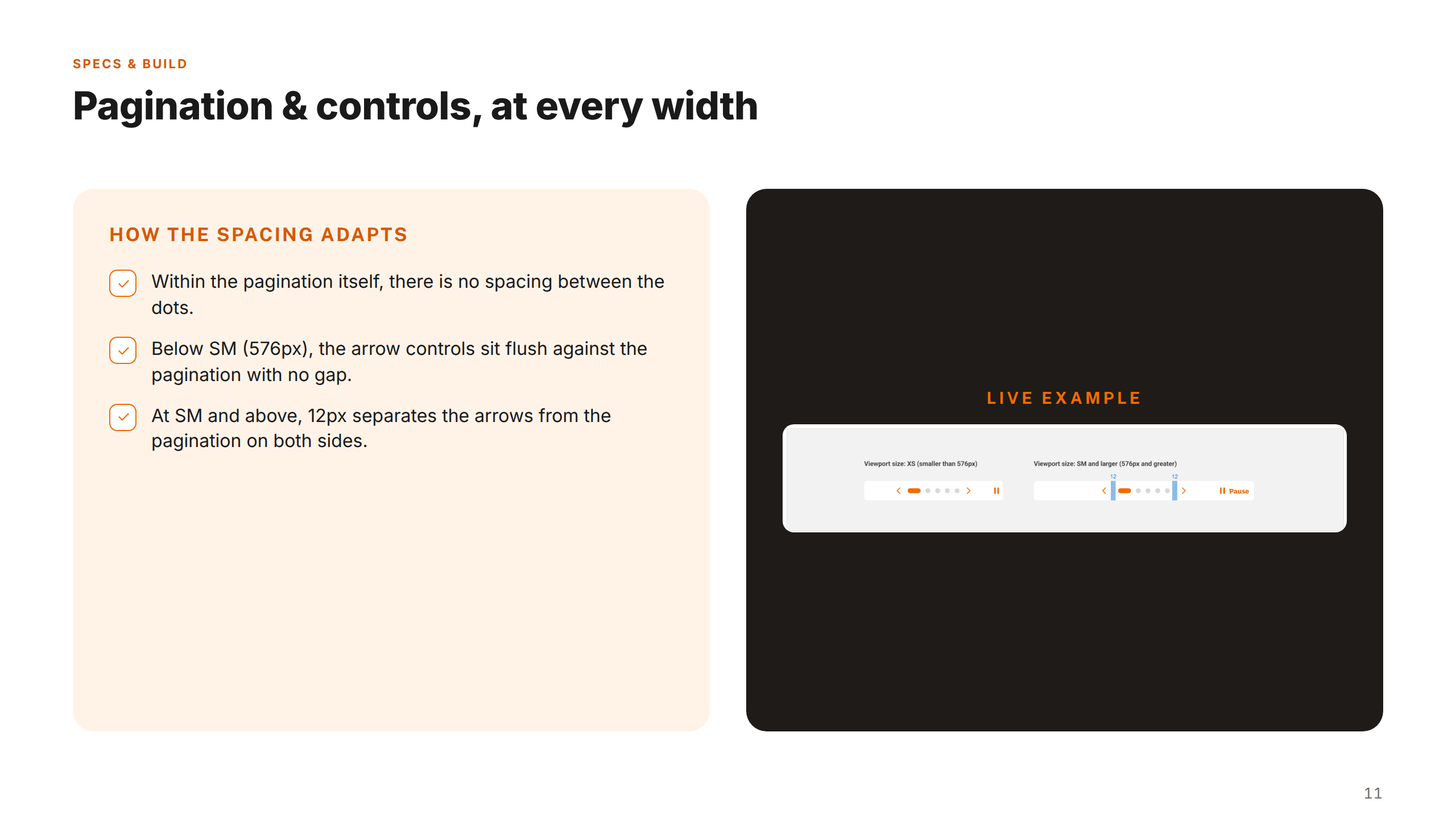
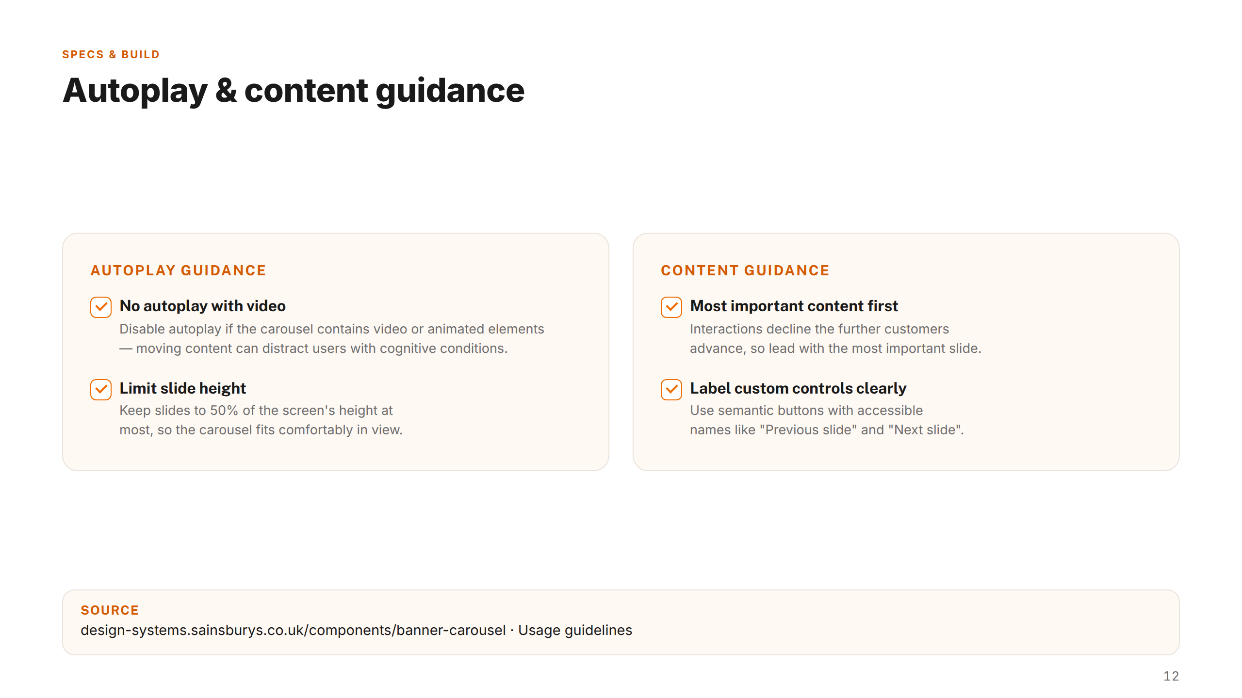
Alongside the Figma library, I contributed to building the Sainsbury's Design System component guidelines site — a publicly accessible resource that documents how every component in the system should be used, written, and implemented across the group's digital products.
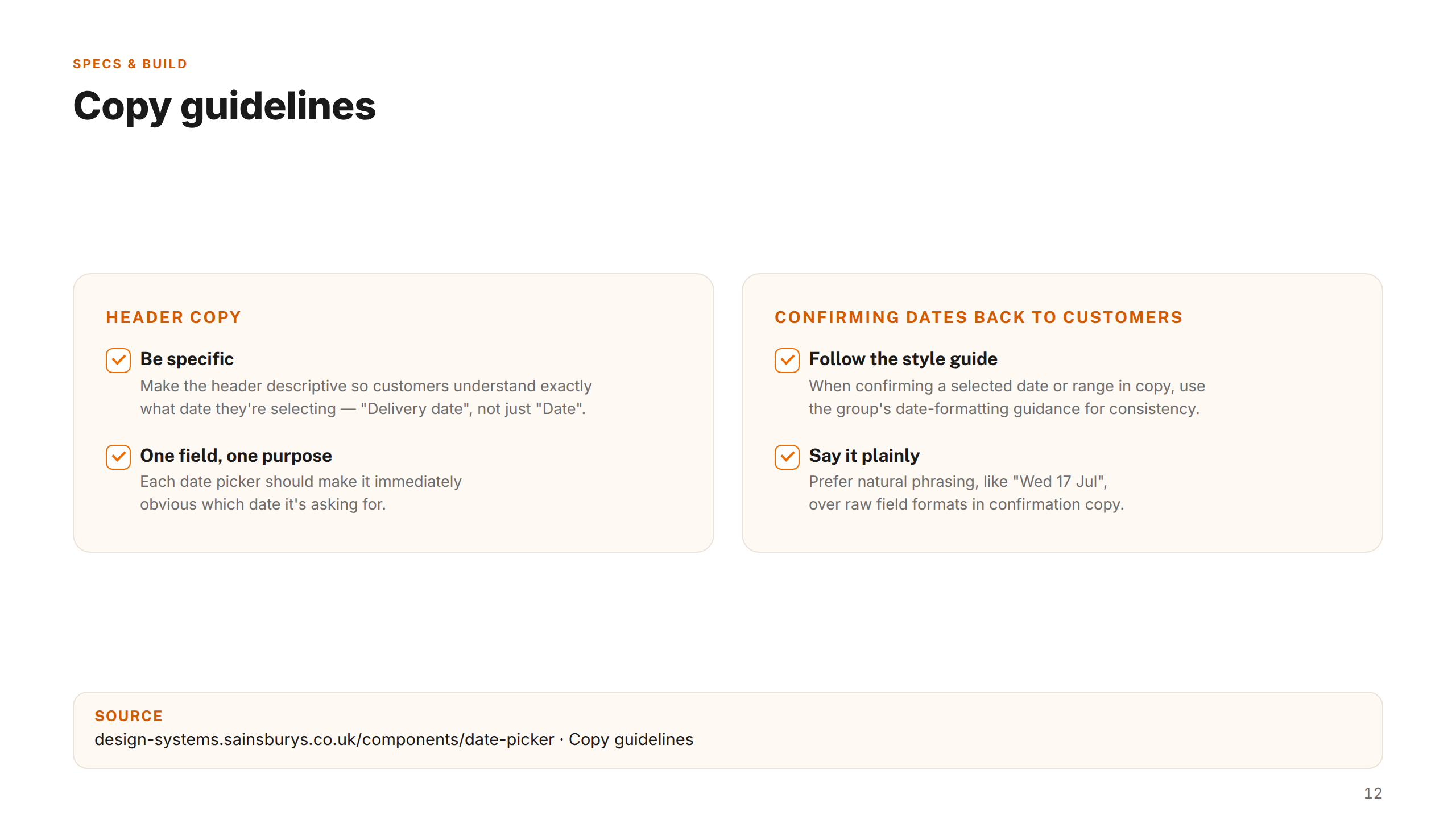
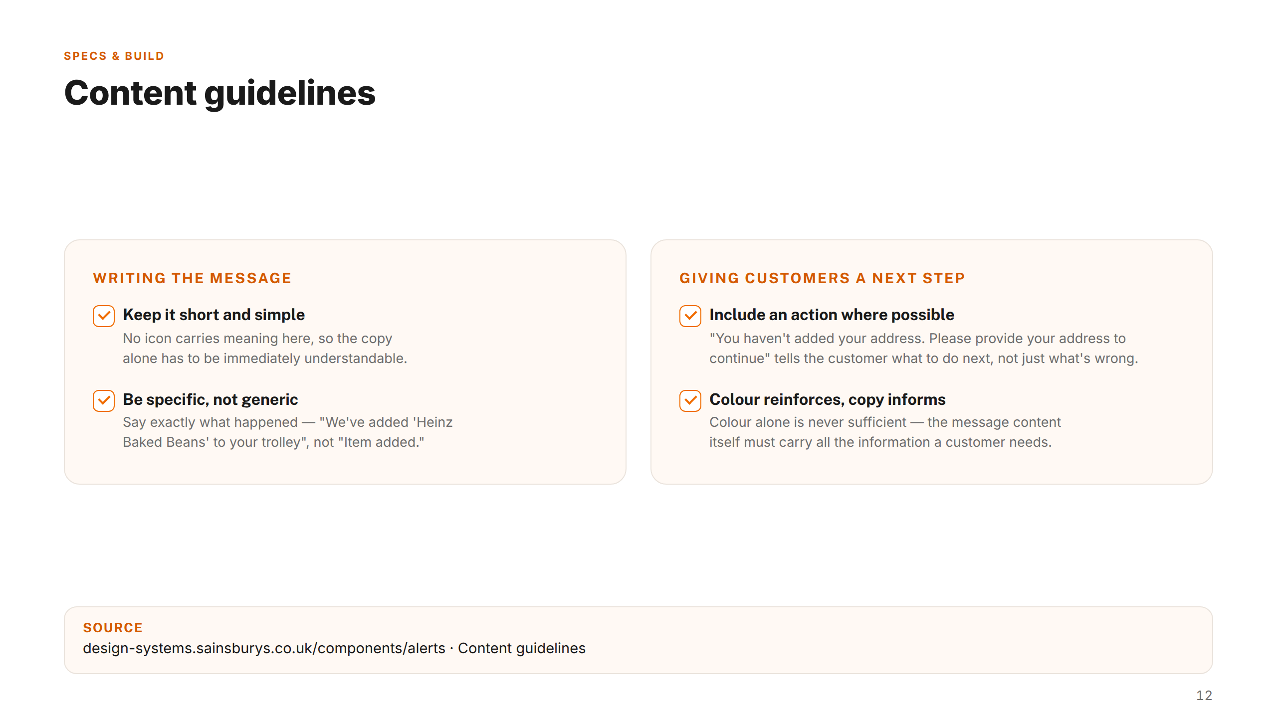
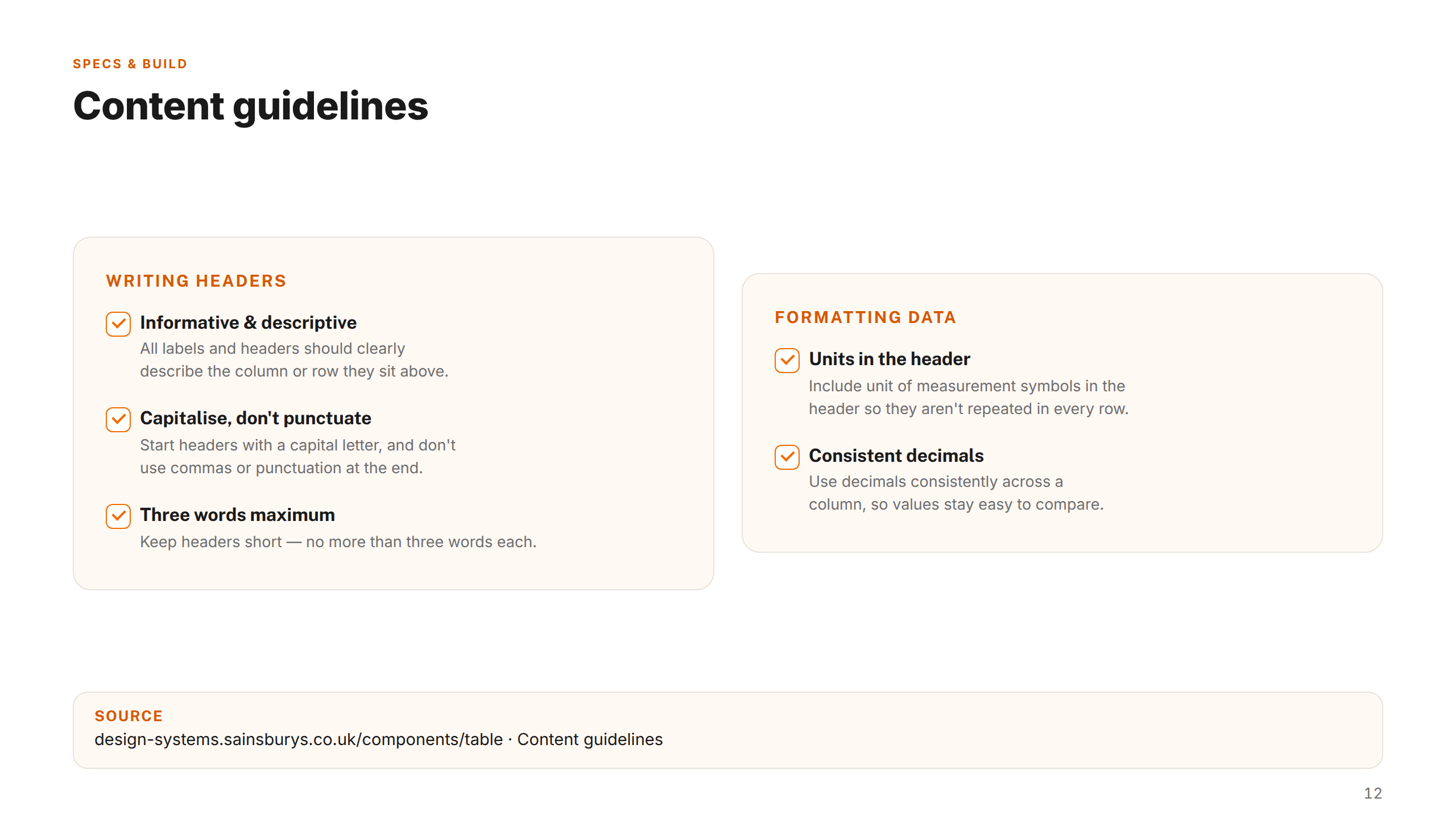
The site acts as the single source of truth for designers, engineers, and content teams across Sainsbury's Group — covering usage principles, do/don't guidance, accessibility requirements, and content standards for each component. Having documentation live alongside the code and Figma library closes the loop between design intent and production implementation, giving teams the confidence to build consistently at scale. Explore the guidelines site →


Projects shown include live work, pitch deliverables, and design produced as part of embedded or collaborative engagements. Some work was completed as part of a wider team. Deliverables reflect the scope and direction at the time of engagement — the live experience may have since changed, launched in a different form, or not proceeded to production. All brand assets and trademarks shown remain the property of their respective owners and are displayed here for portfolio reference only.