Case Study

Boots

Enhancing the ecommerce experience across one of the UK's most recognised health and beauty platforms.

Case Studies Boots
Client
Boots
Location
United Kingdom
Services delivered
Product Design UX Research Journey Mapping Design System Accessibility

Boots is the UK's leading health and beauty retailer — with over 170 years of heritage, more than 2,000 stores nationwide, and an ecommerce platform serving millions of customers every month. The brand sits at a unique intersection of pharmacy, wellness, beauty, and everyday essentials, which means digital experiences need to handle everything from prescription services to gifting with equal clarity and care.

As a consultant Product Designer embedded within the Boots.com digital team, I worked across six distinct workstreams — each targeting a different part of the customer journey, from guided product discovery and search to checkout, transactional communications, and compliance-driven features.

My role

Senior Product Designer, embedded across multiple ecommerce workstreams at Boots.com — spanning guided discovery, navigation, search, checkout, transactional communications, and compliance-led features. All delivered from research through to high-fidelity handoff.

  • UX research & analytics review
  • Mobile-first interaction design
  • Heuristic evaluation & audits
  • High-fidelity prototyping
  • Design system contributions
  • Accessibility review (WCAG 2.1 AA)
  • Dev handoff & QA support

Collaborators

Product
Product Manager, Head of Digital Product
Engineering
Frontend Lead, 3× Frontend Engineers, QA
Design & Research
UX Lead, Design System team, UX Researcher
Stakeholders
Commercial, Marketing, Pharmacy & Healthcare

The challenge

Boots is the UK's leading health and beauty retailer — 170+ years of heritage, 2,000+ stores, and an ecommerce platform serving millions of customers every month.

At that scale, even small points of friction in search, navigation, and product discovery add up. The experience needed to be more intuitive and accessible without losing commercial impact.

My approach

As part of the product design team, I focused on high-impact areas of Boots.com — working mobile-first through user research, wireframing, prototyping, and high-fidelity design.

Every change was made with accessibility and the existing design system in mind, so improvements scaled consistently across the platform.

Six workstreams. One shared goal — make Boots.com easier to trust and easier to use.

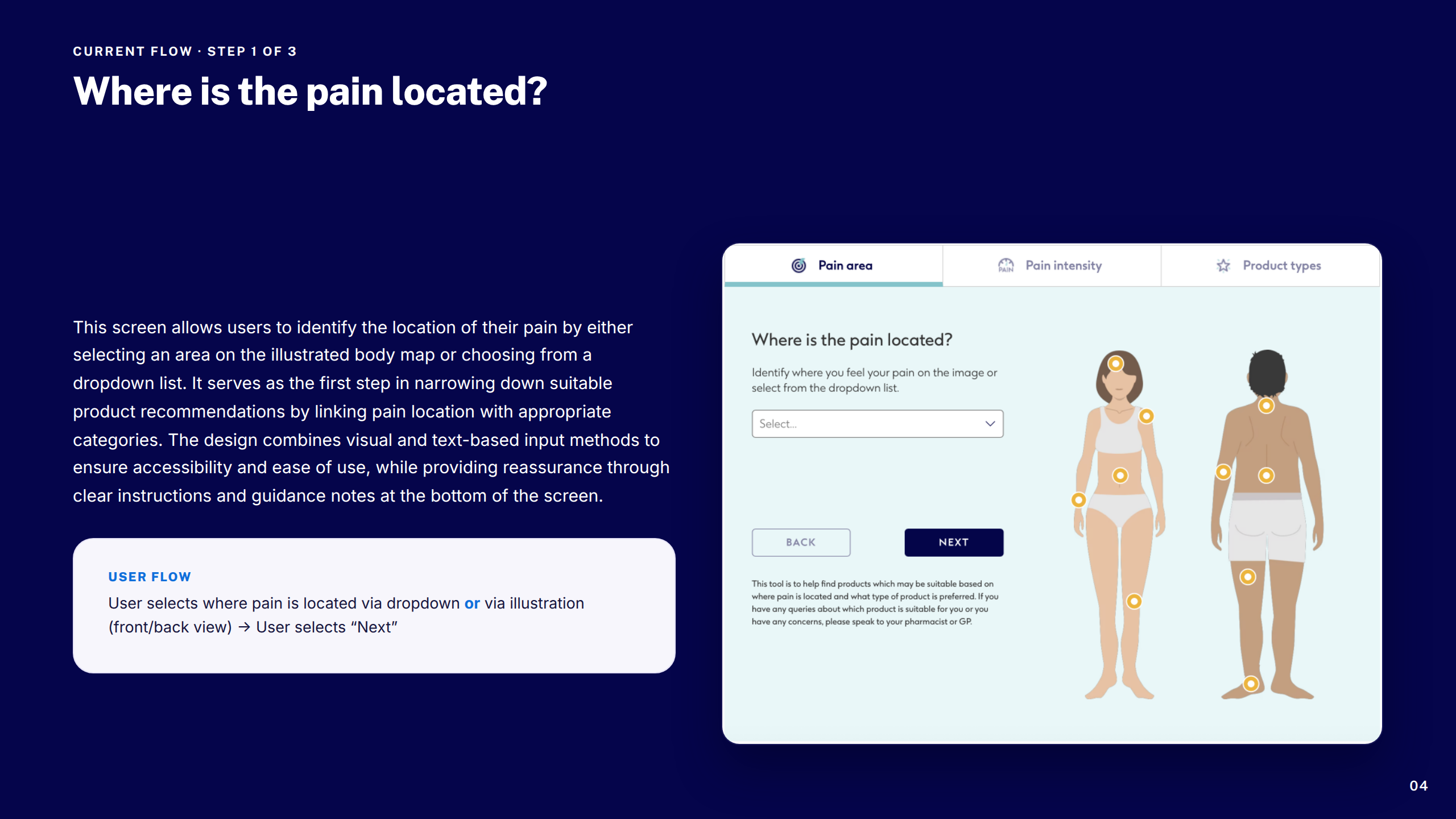
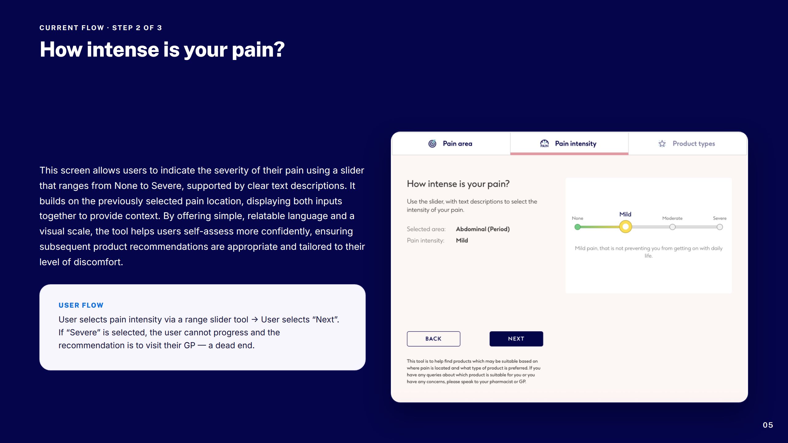
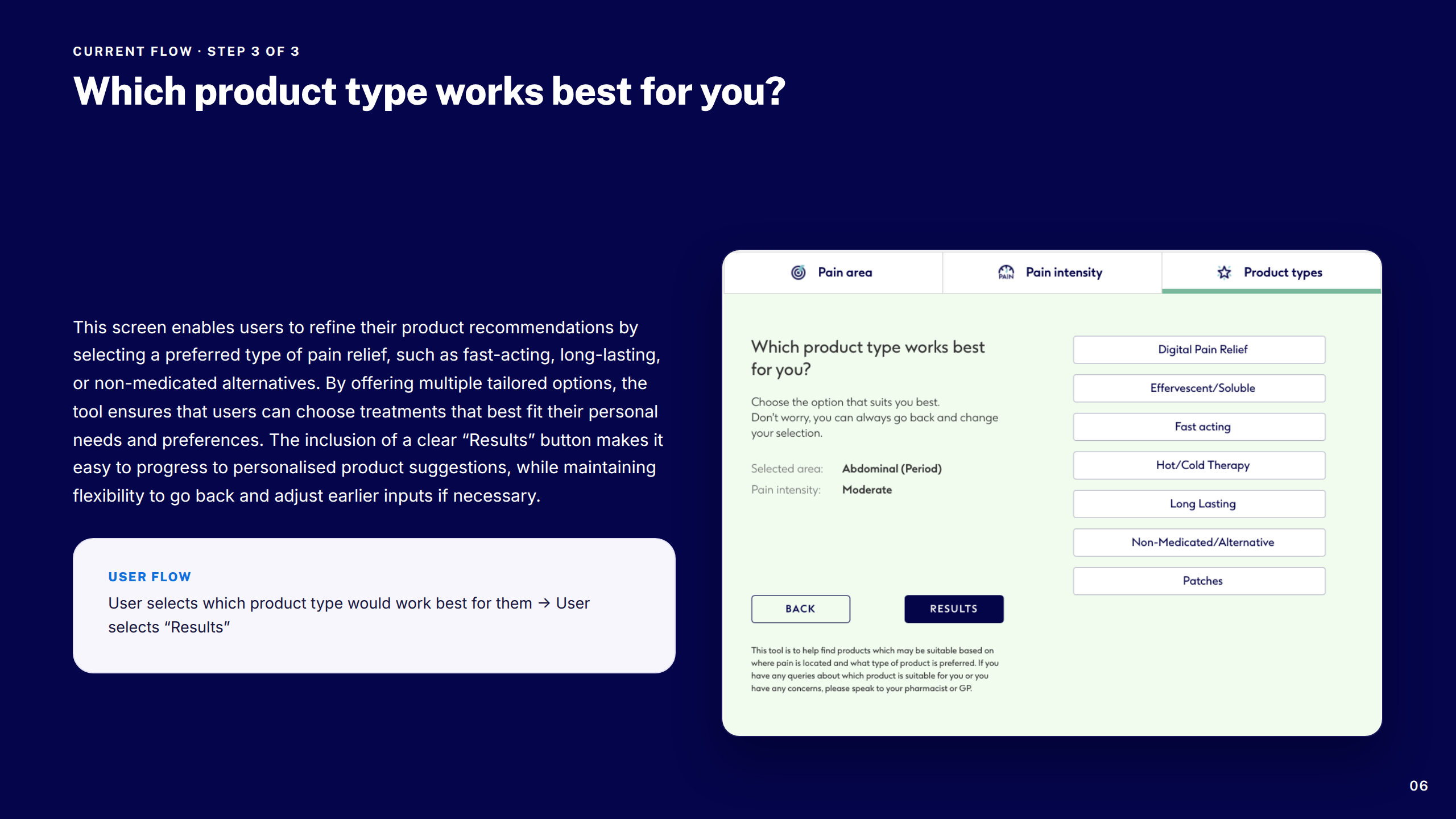
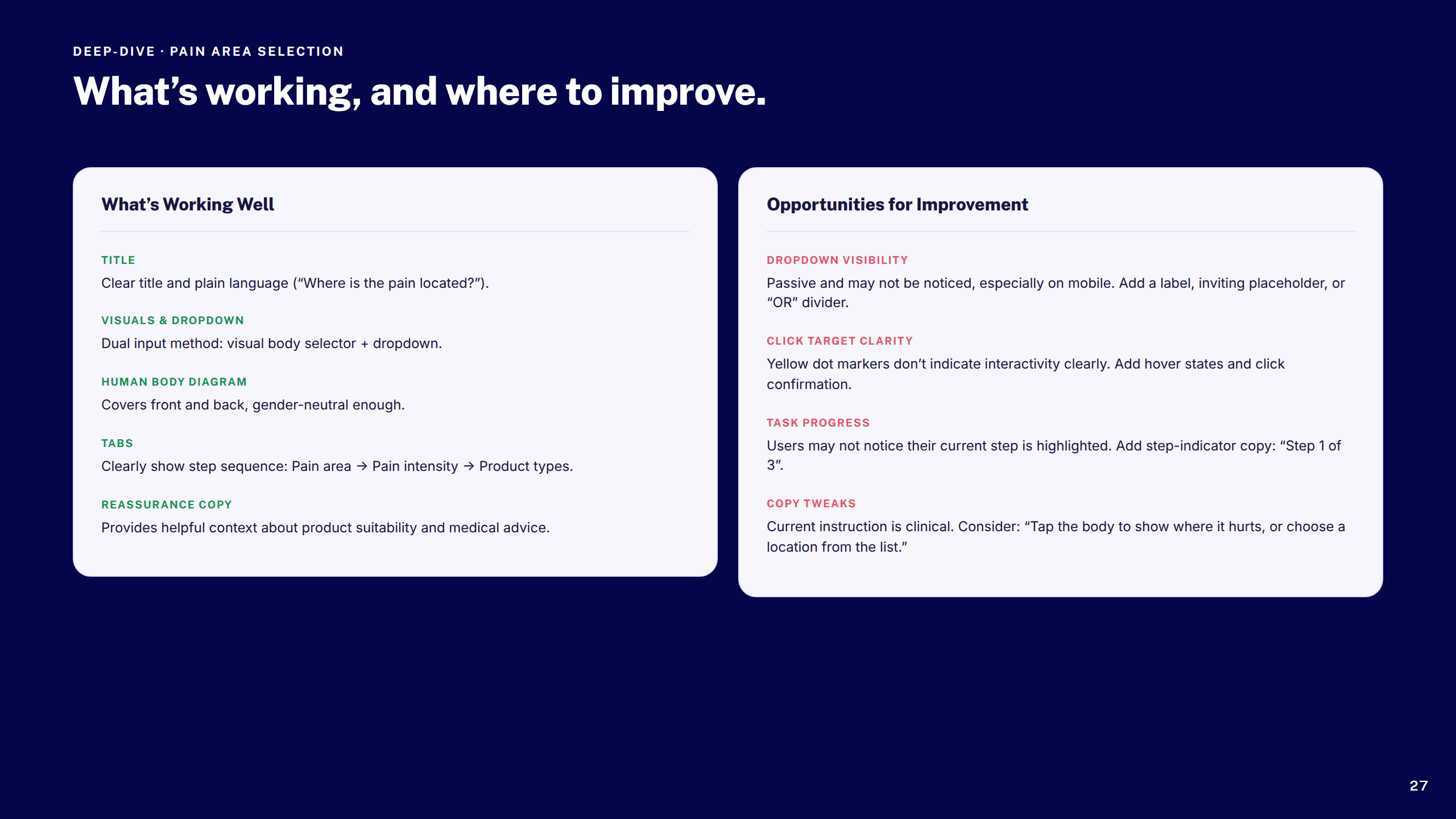
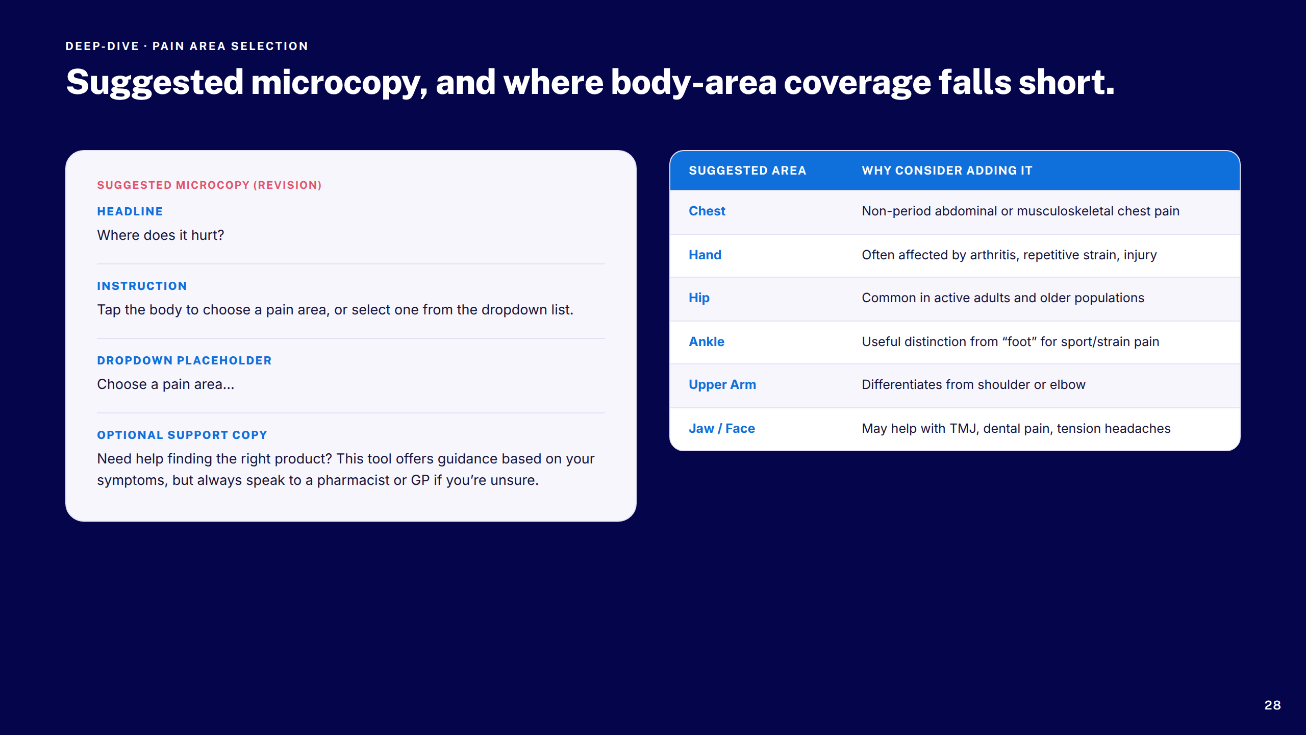
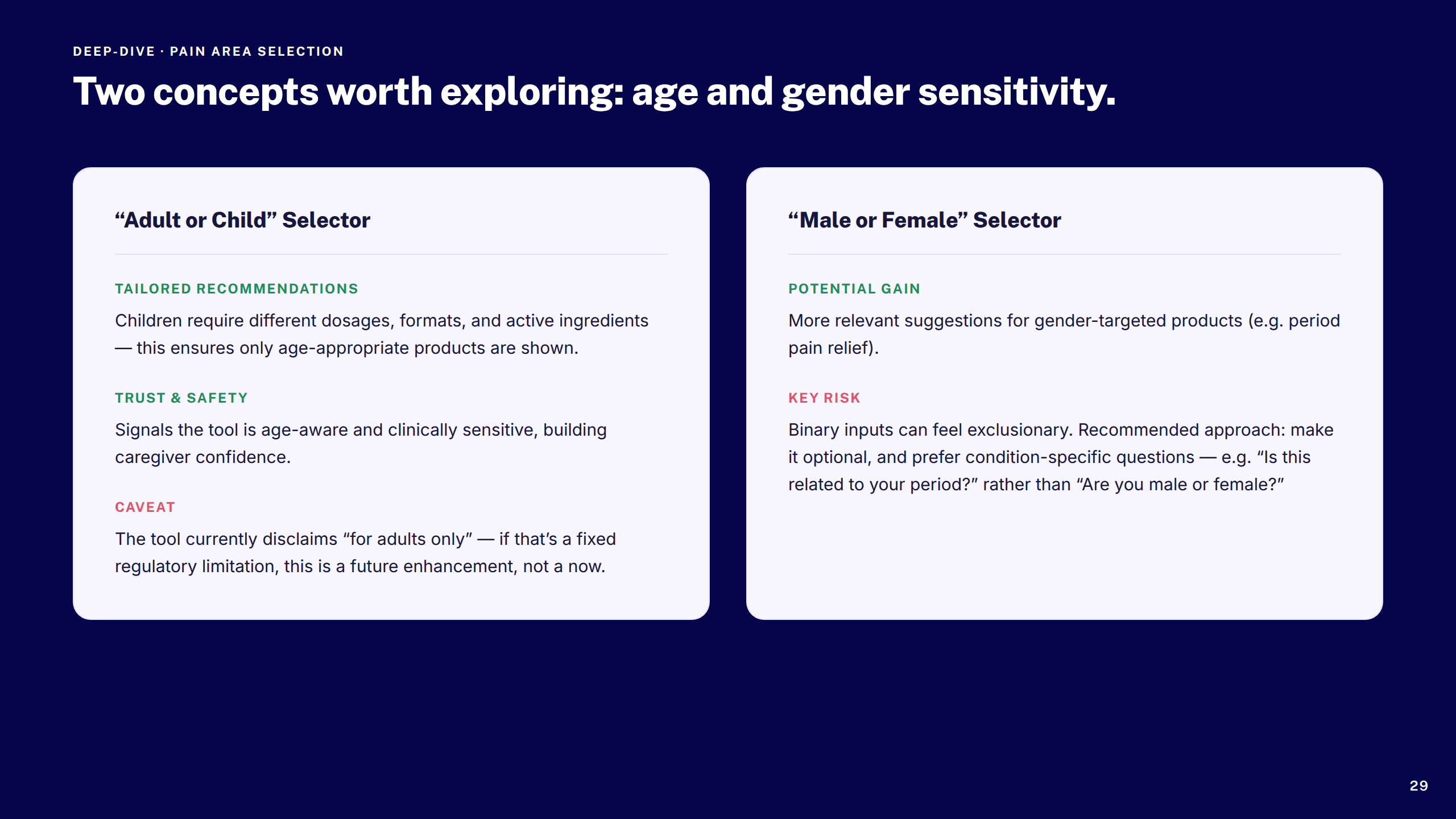
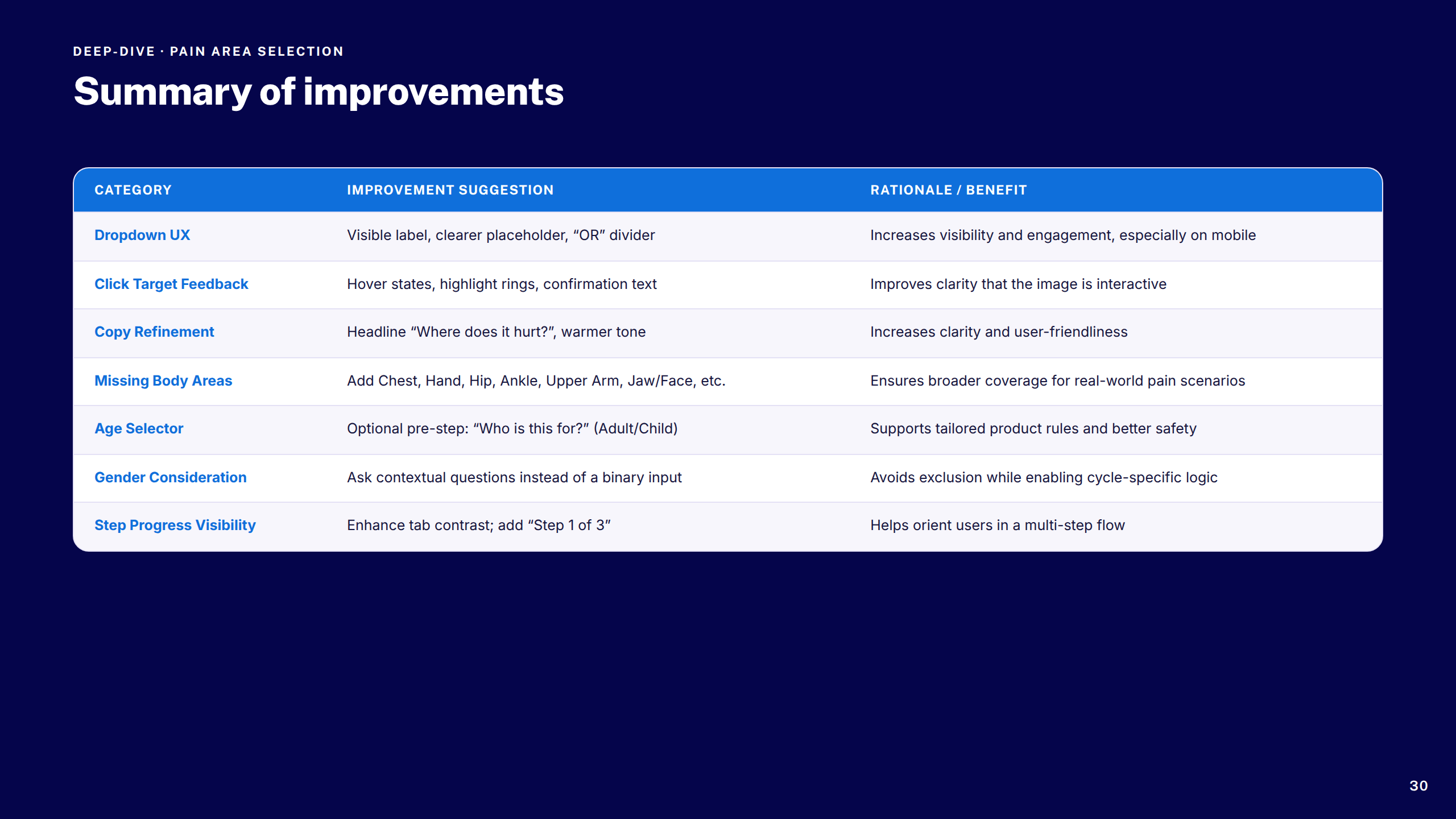
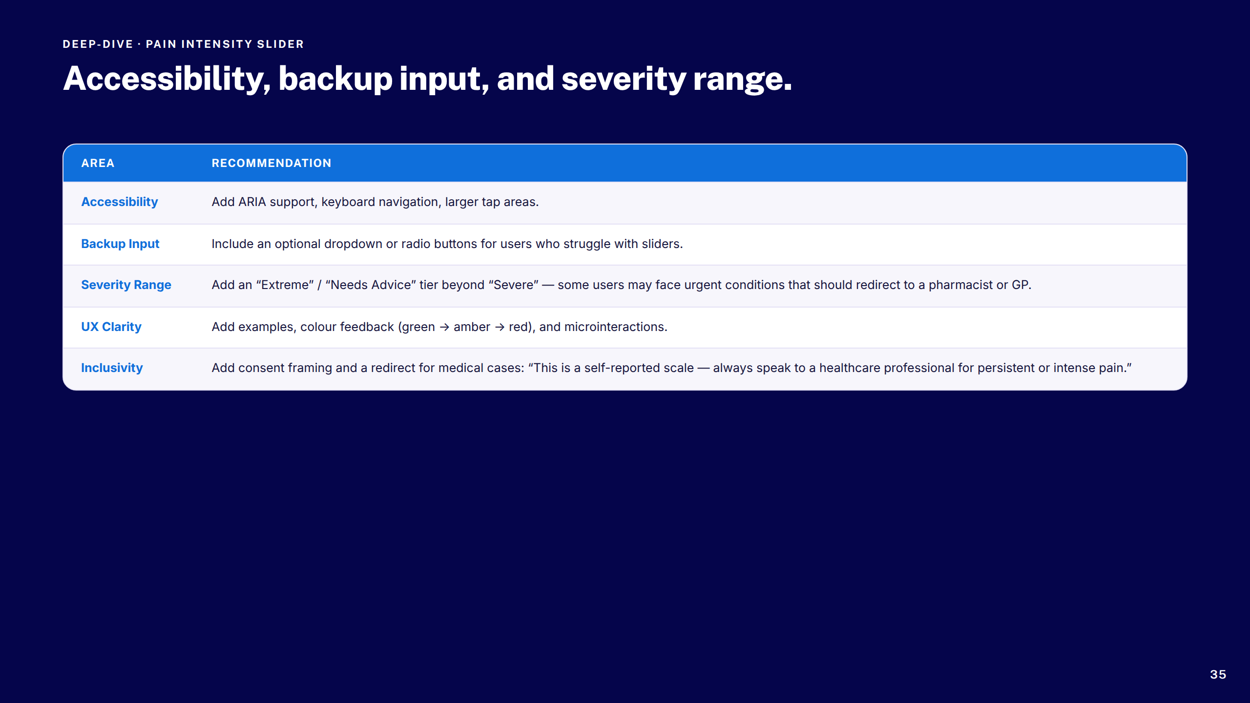
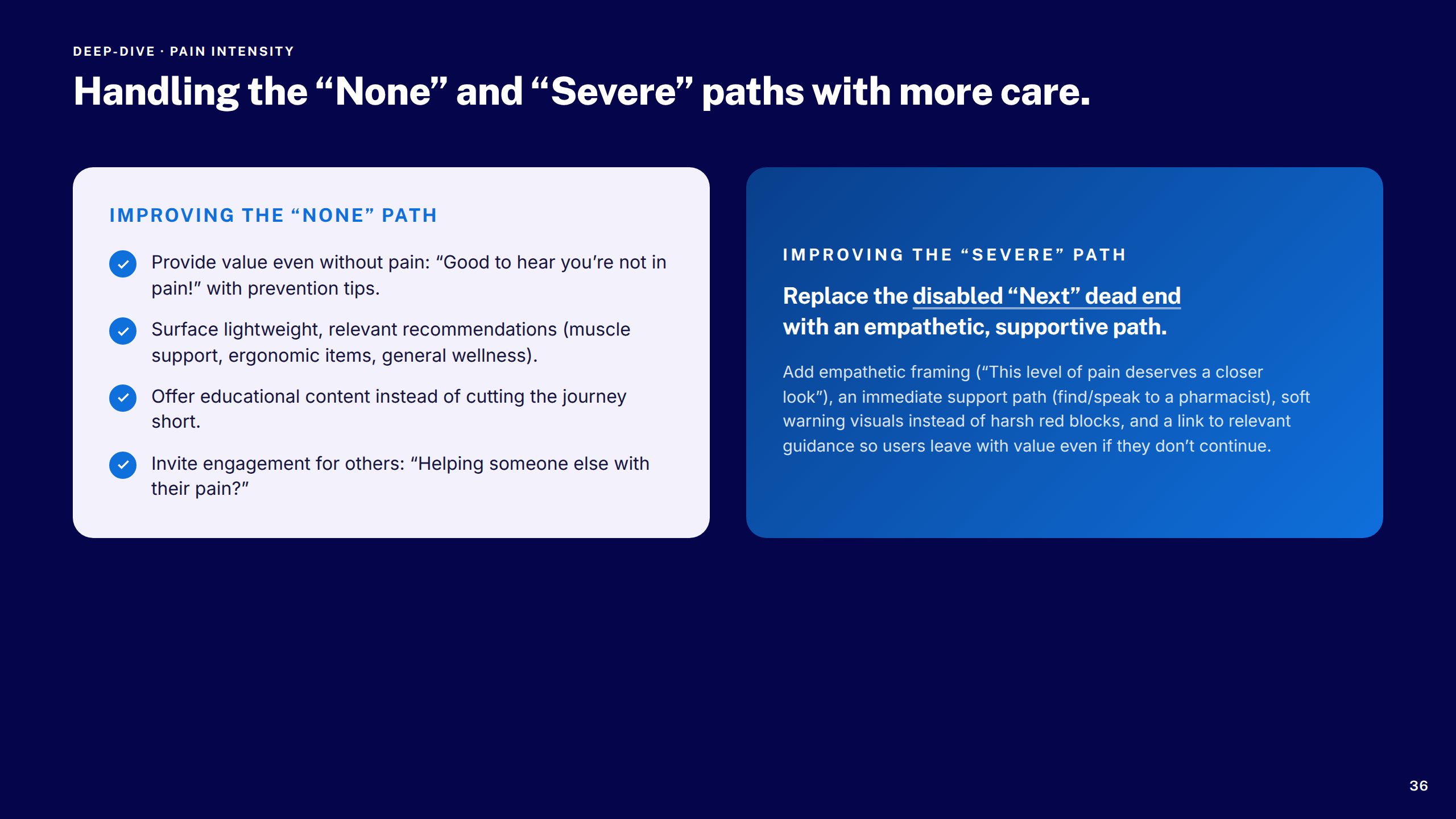
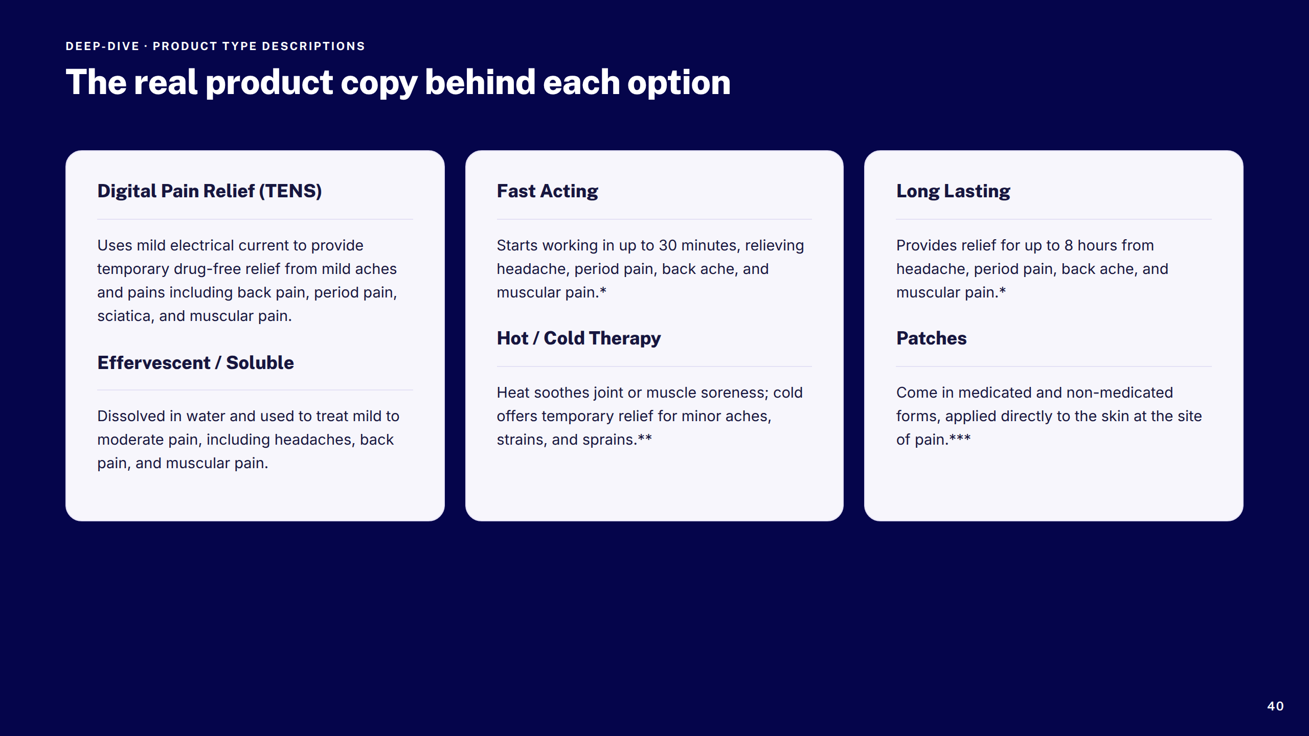
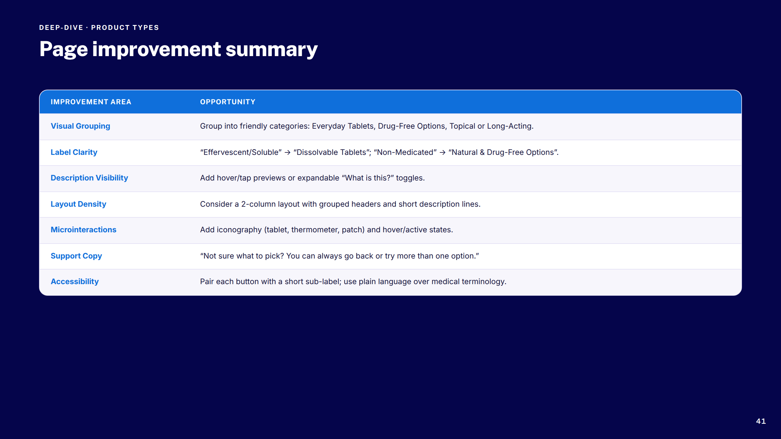
Pain Selector Tool

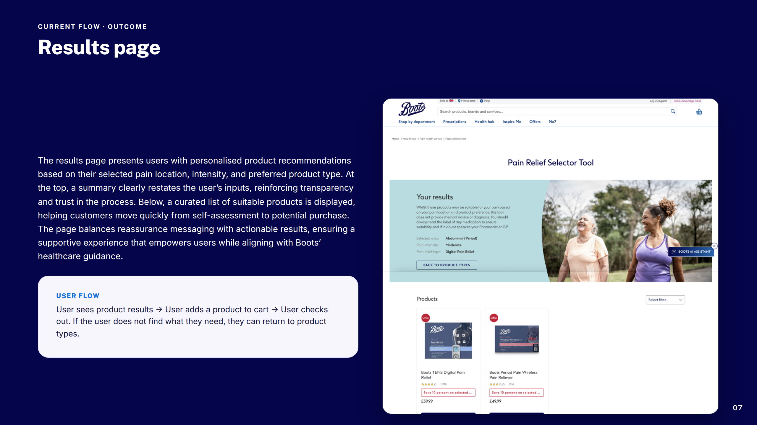
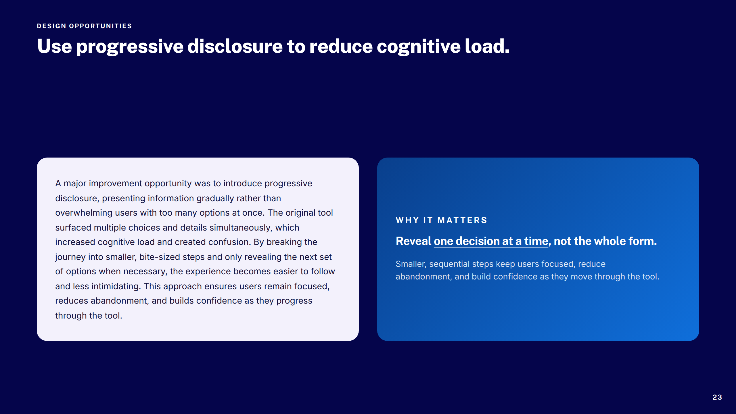
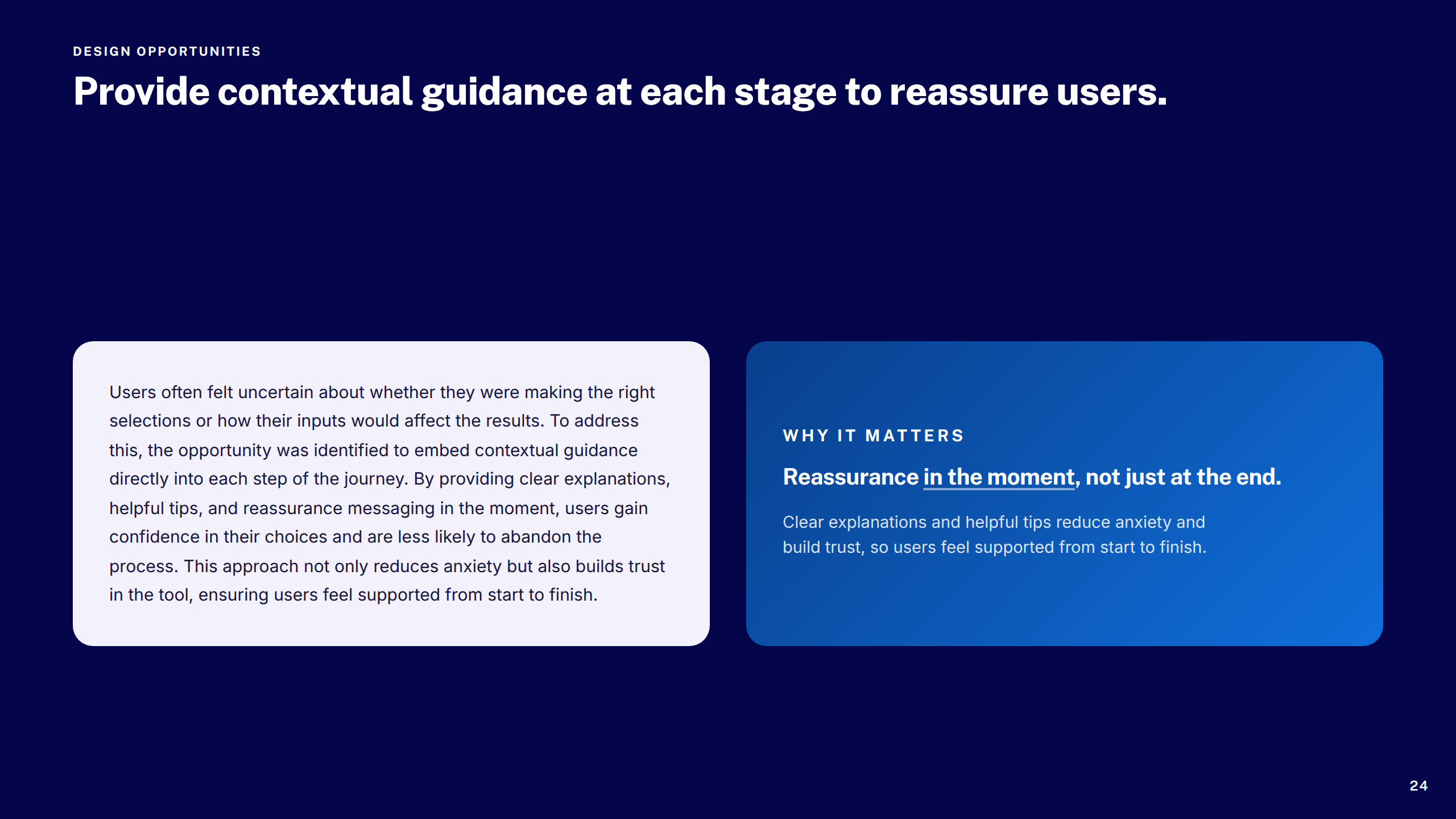
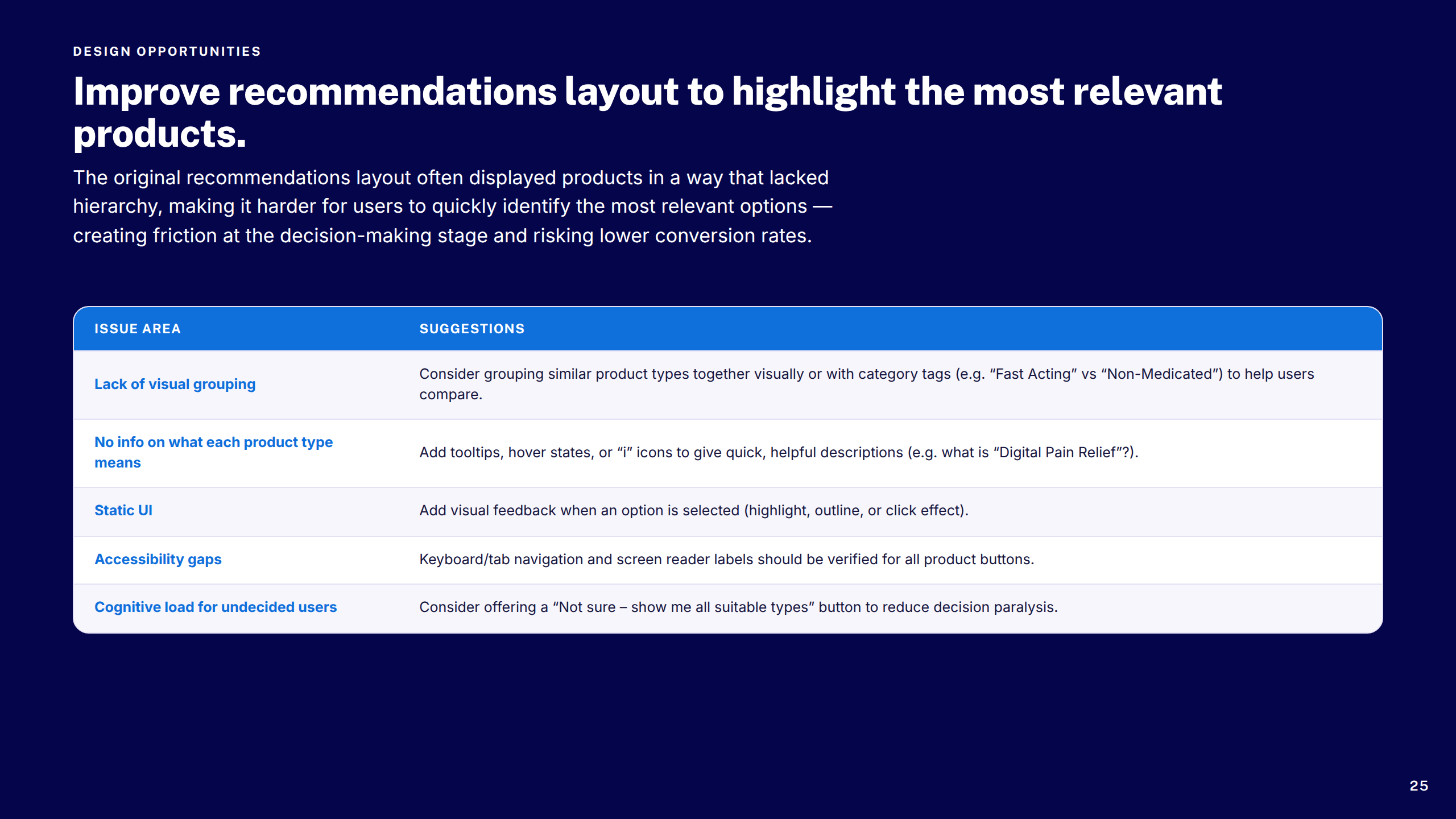
A structured, accessible discovery journey that took customers from symptom to the right product — turning a complex decision tree into a fast, trustworthy experience across all devices.

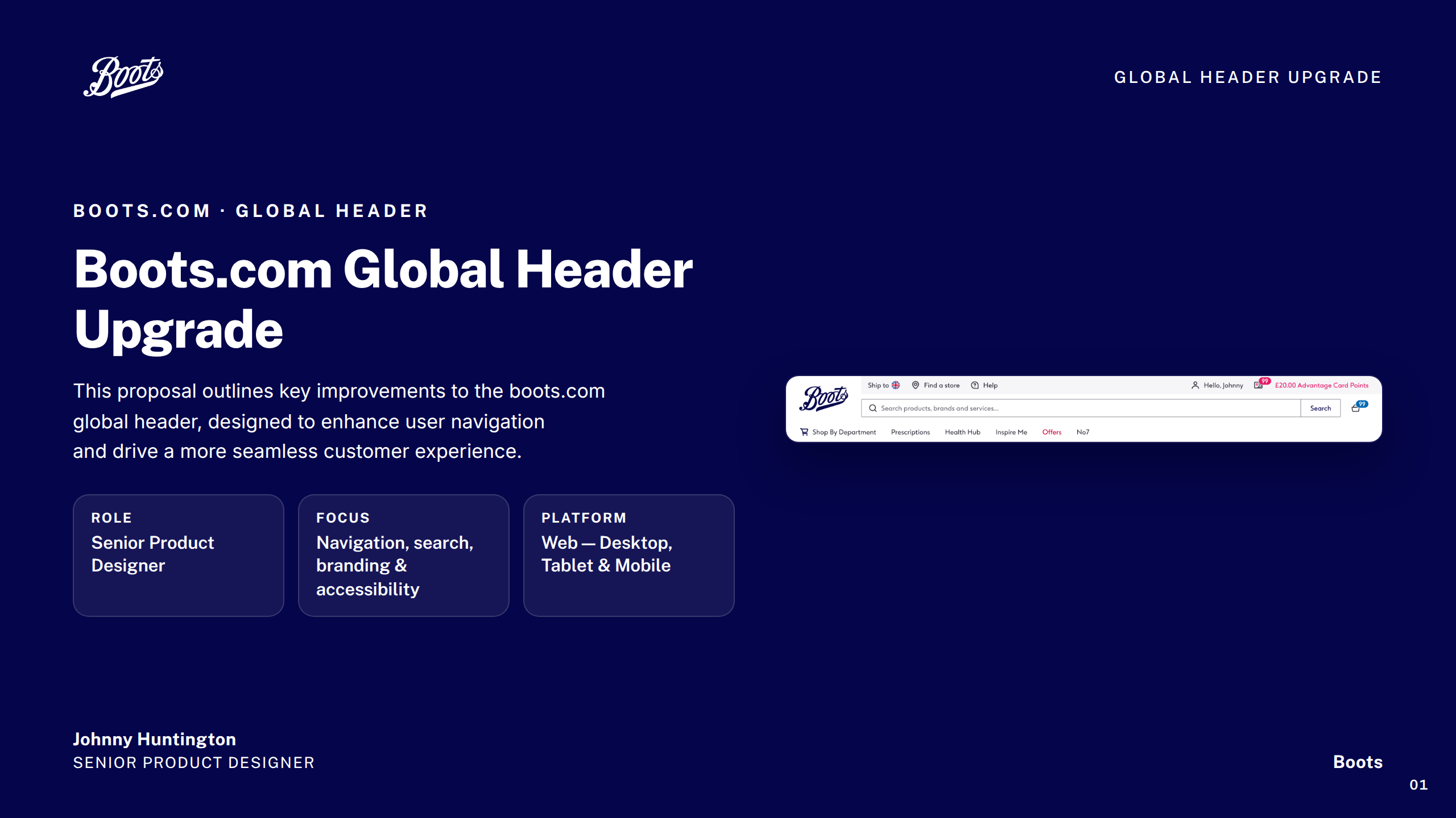
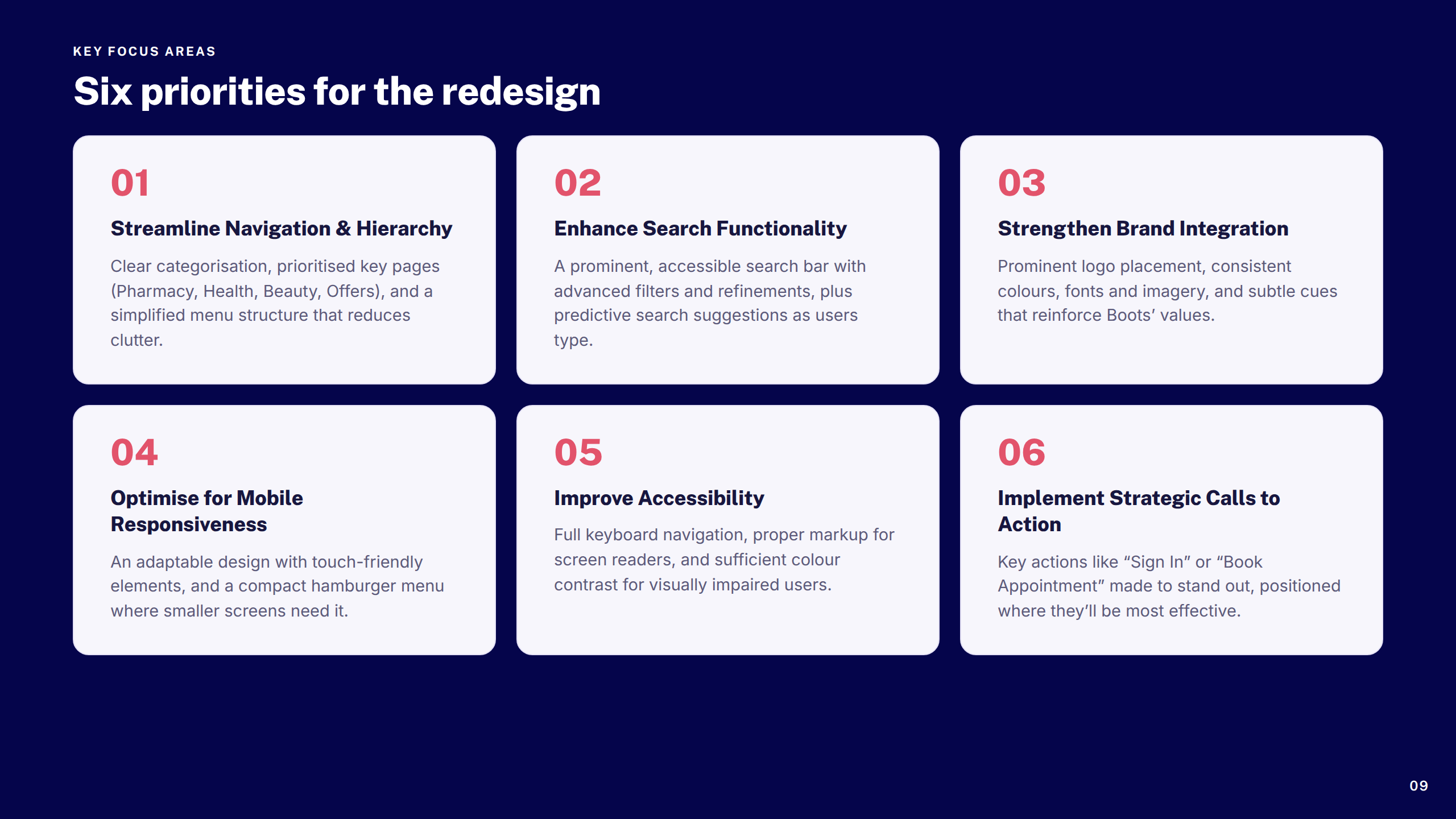
Global Header Upgrade

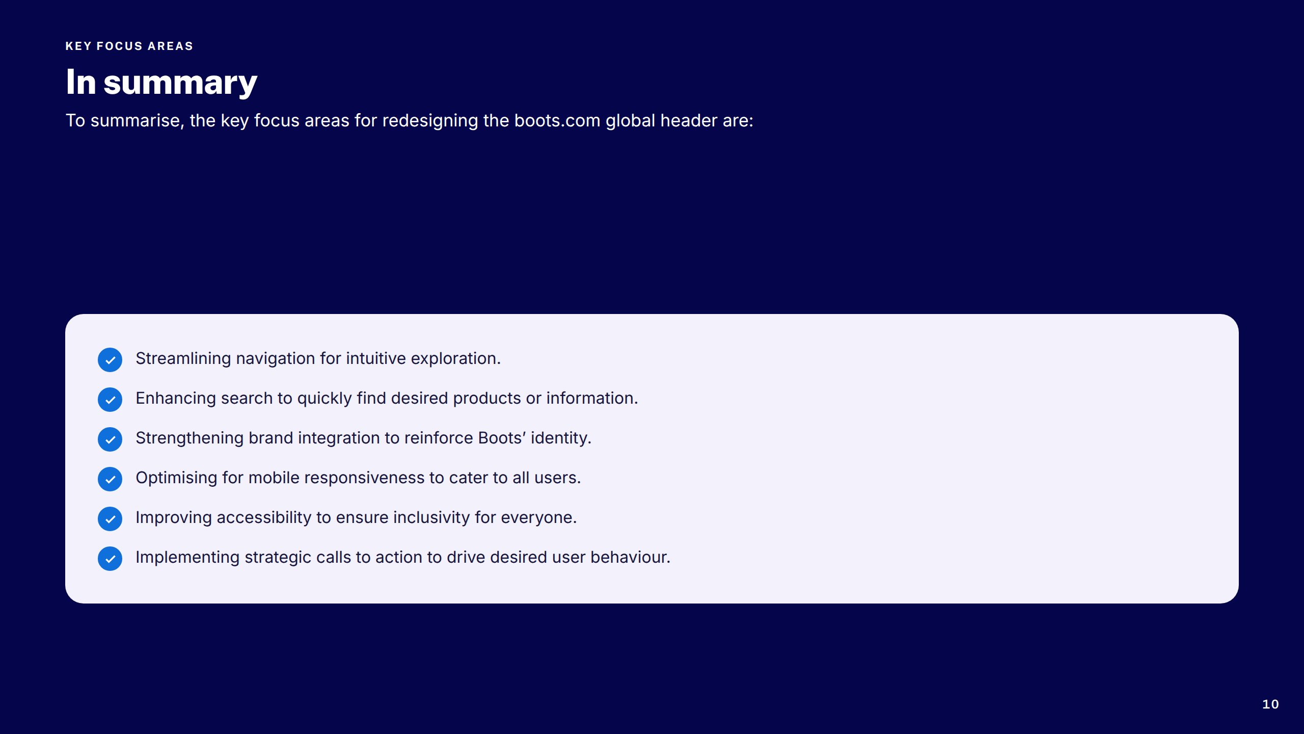
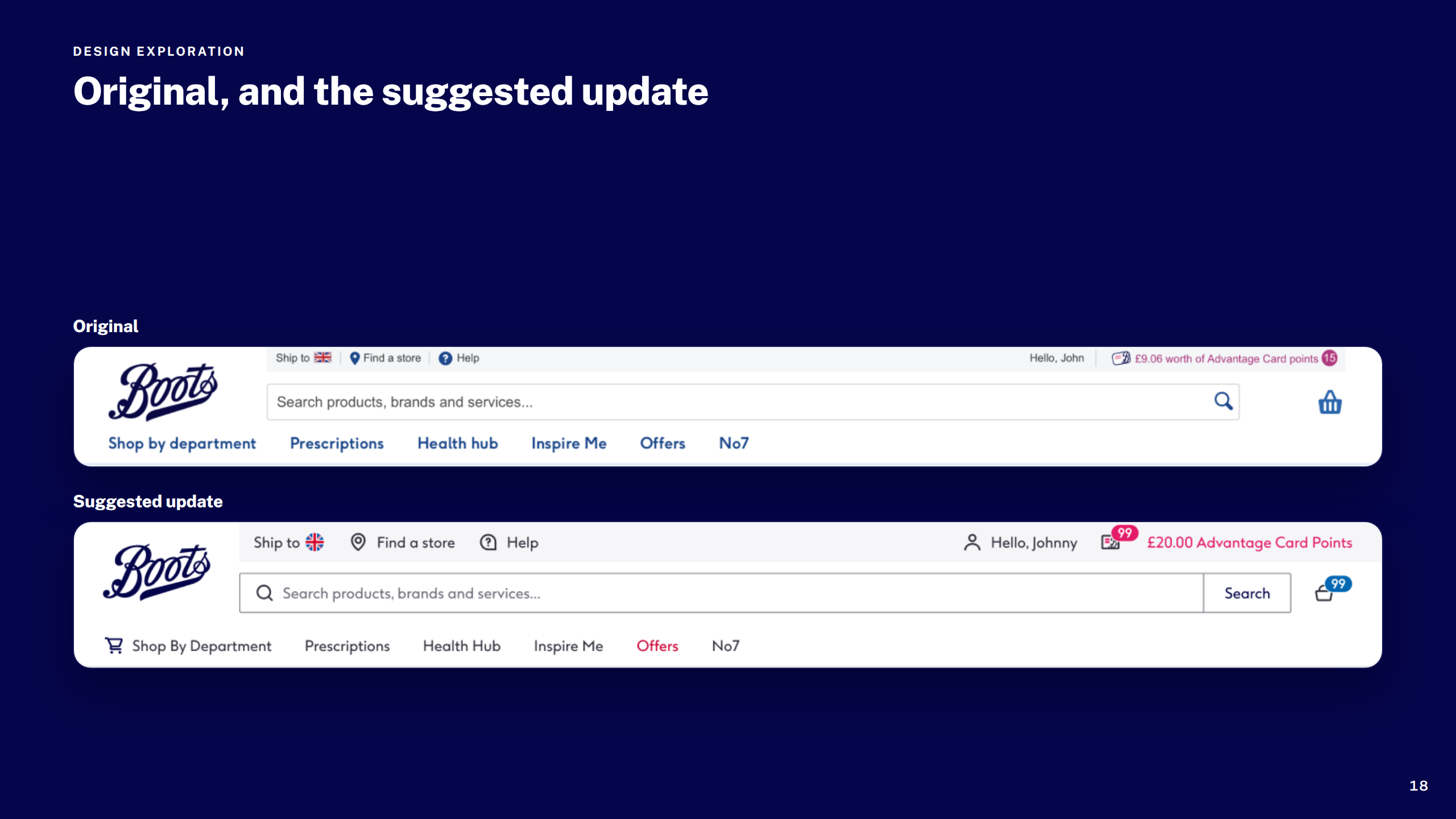
Resolved years of accumulated decisions in Boots.com's global navigation — icon ambiguity, inconsistent signed-in and guest states, and responsive gaps — with a cleaner, more accessible header across all breakpoints.

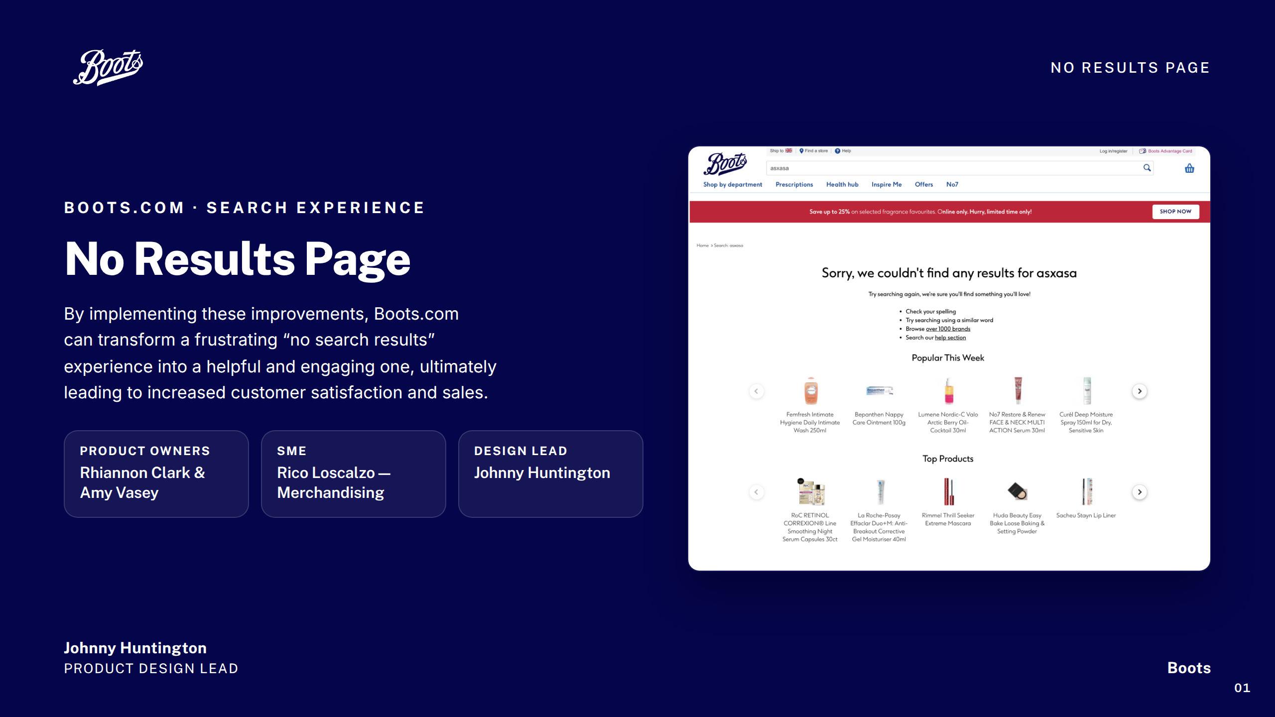
No Results Page

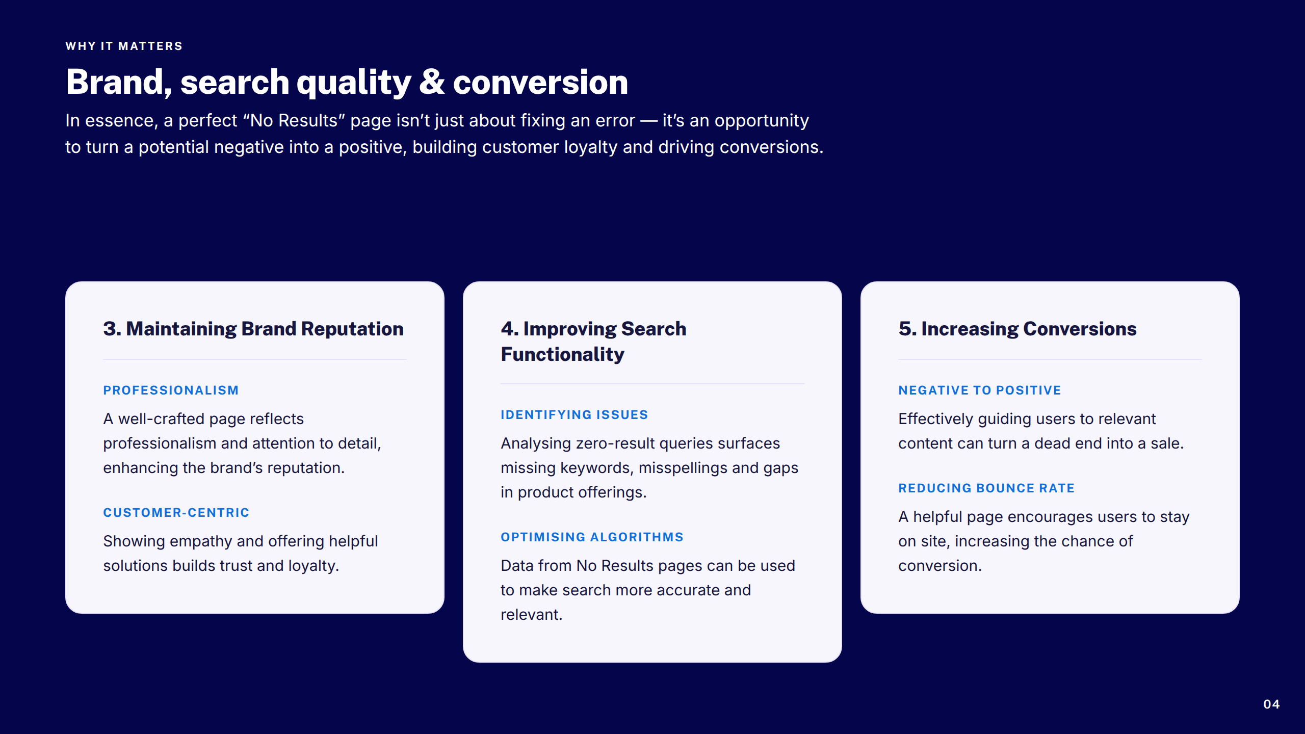
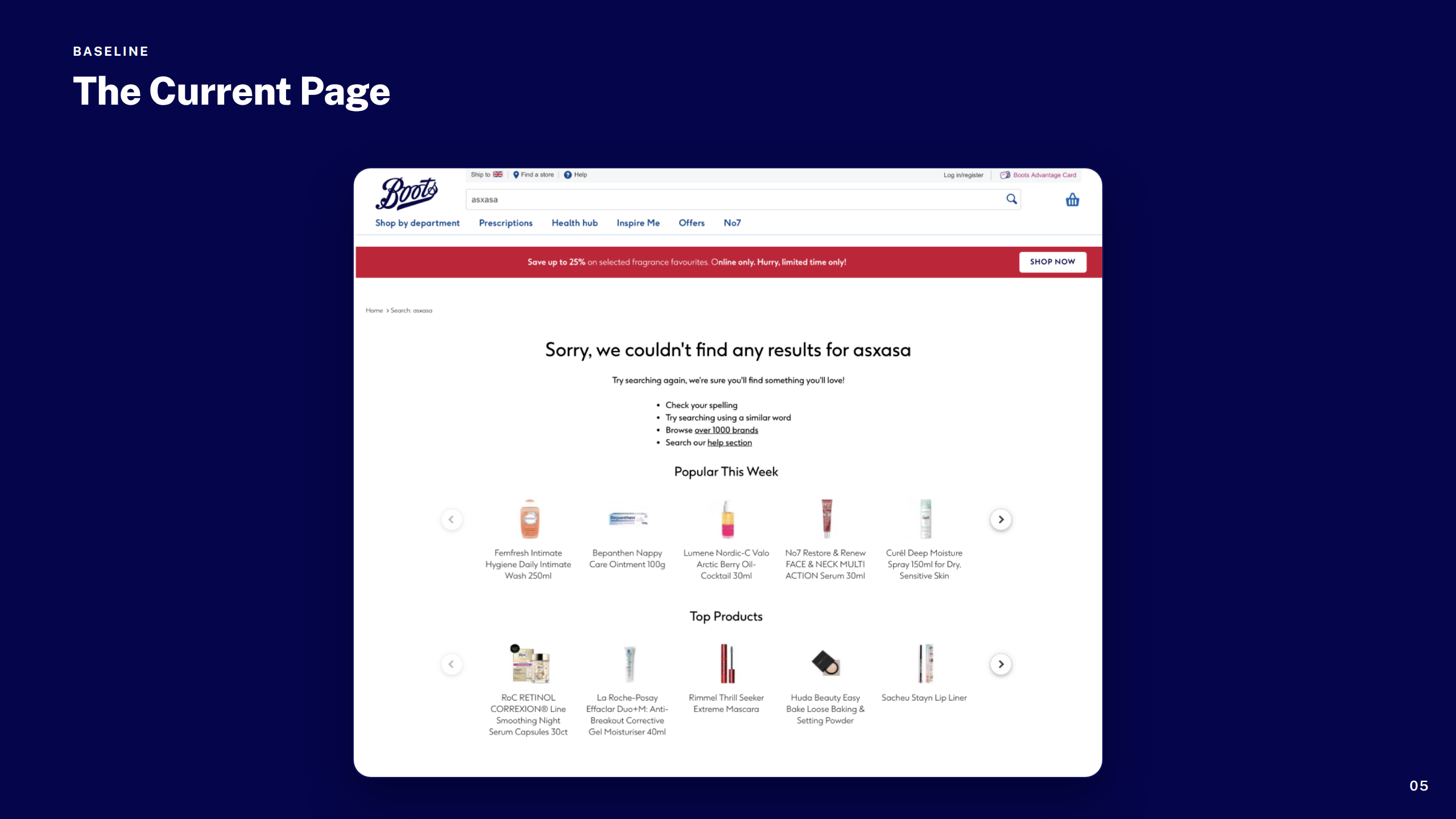
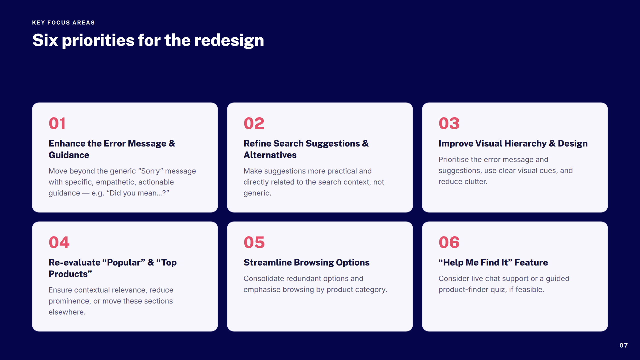
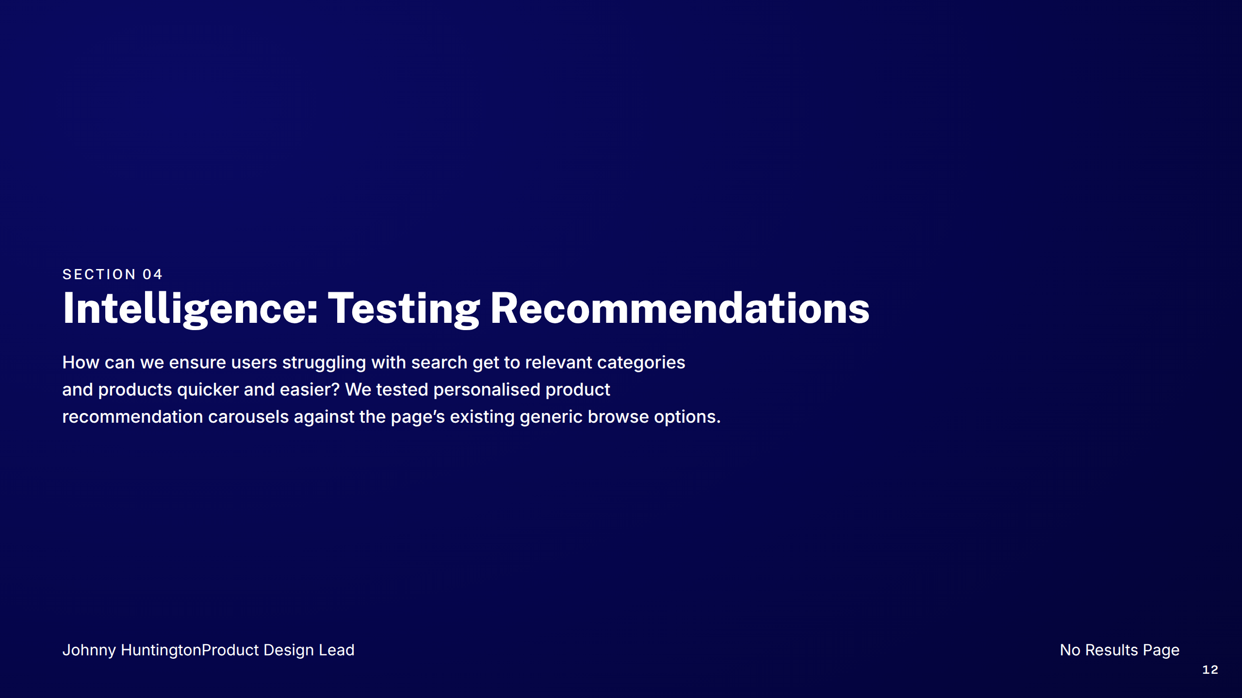
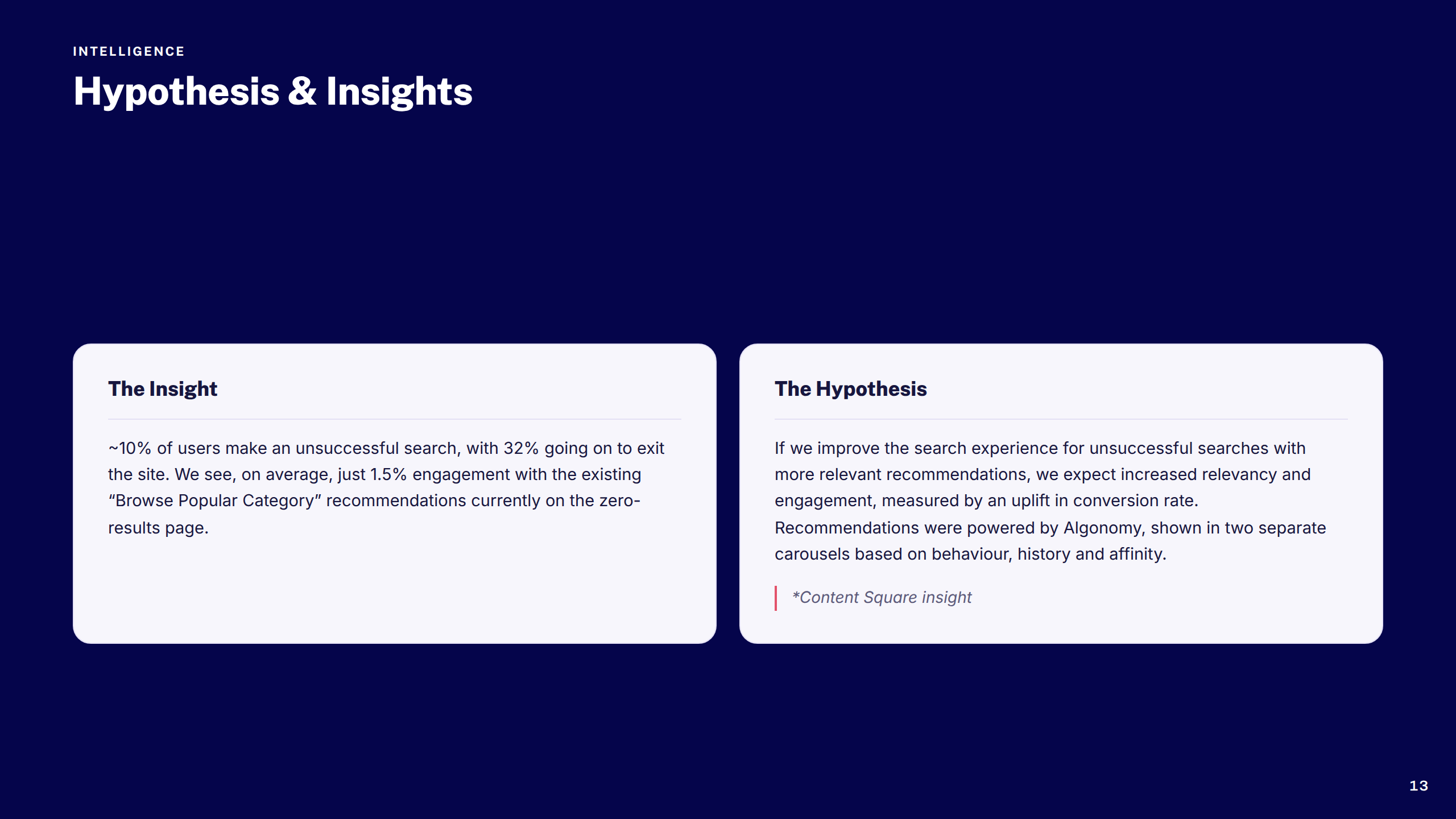
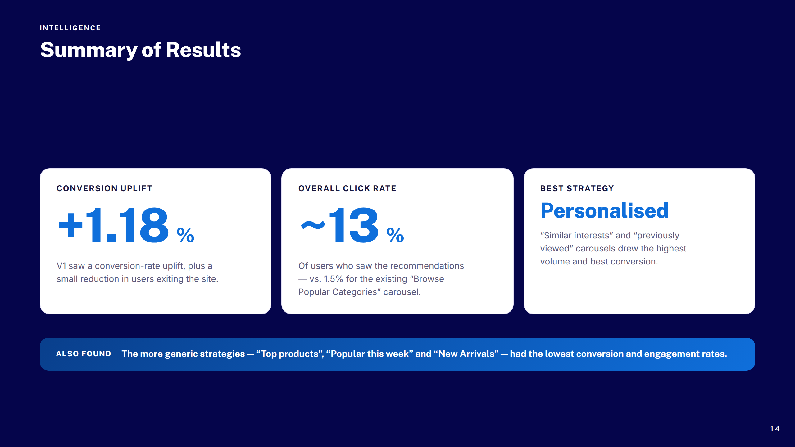
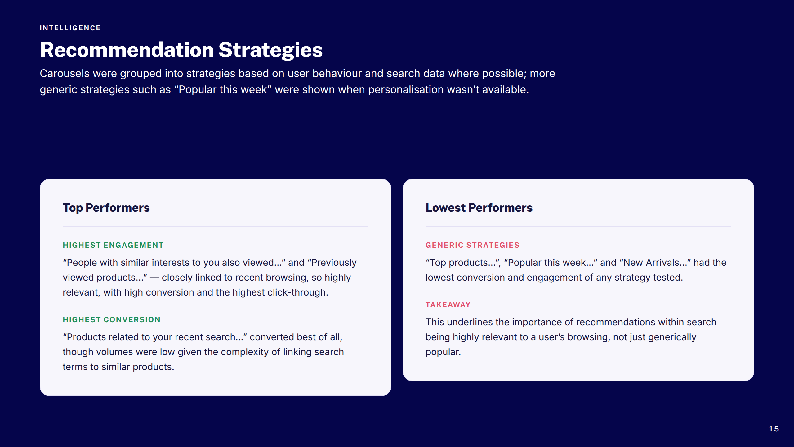
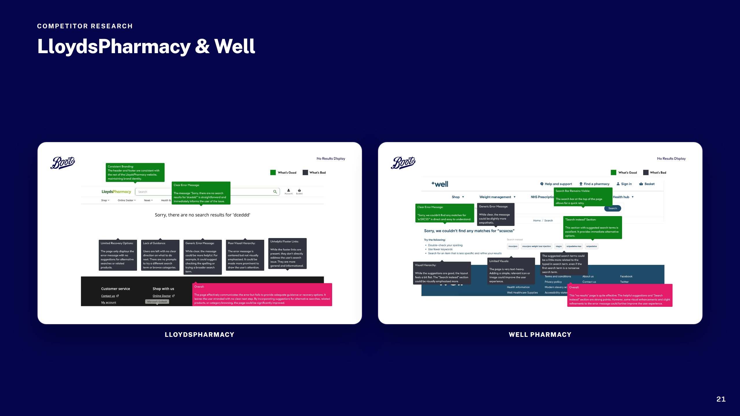
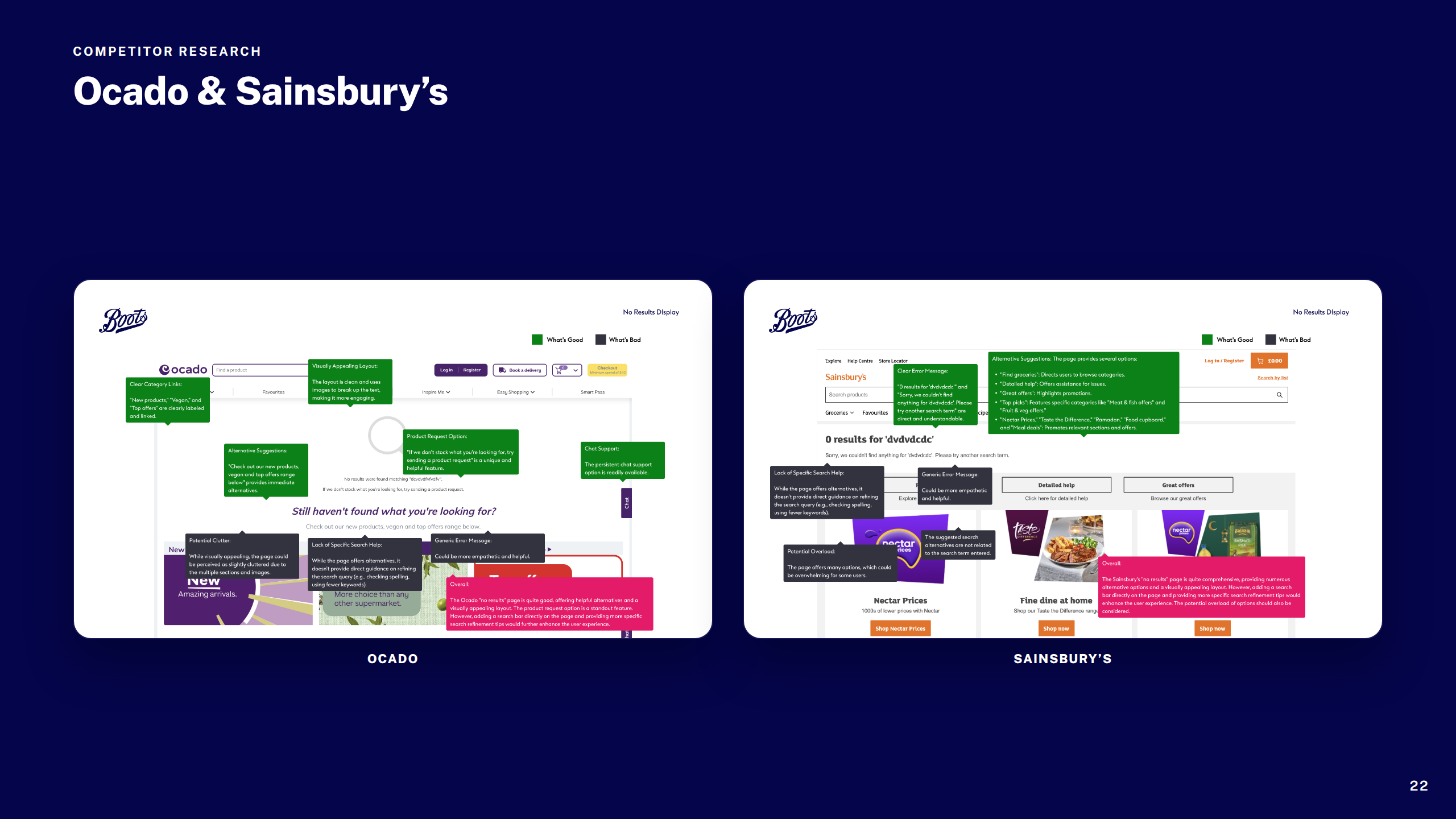
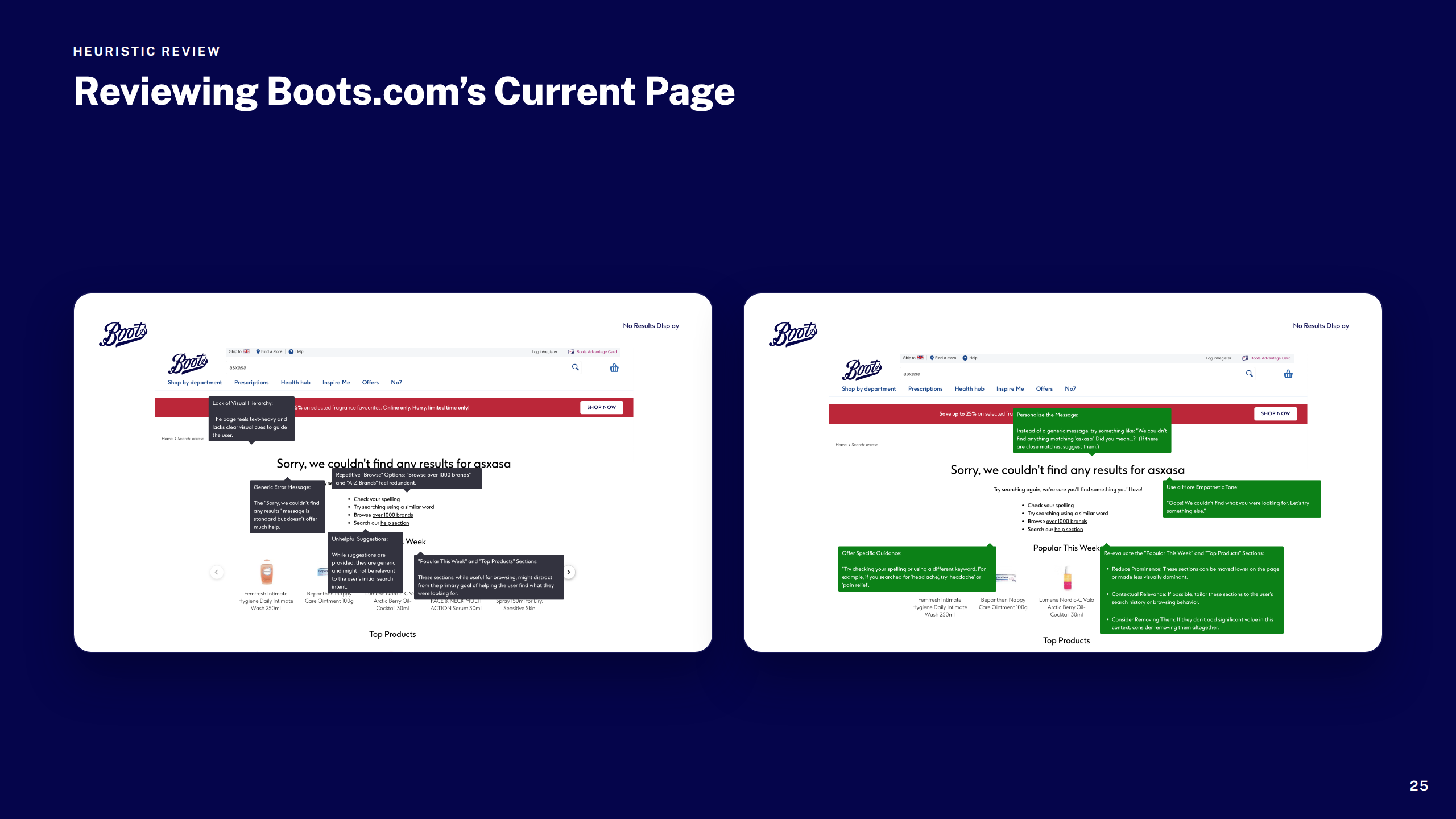
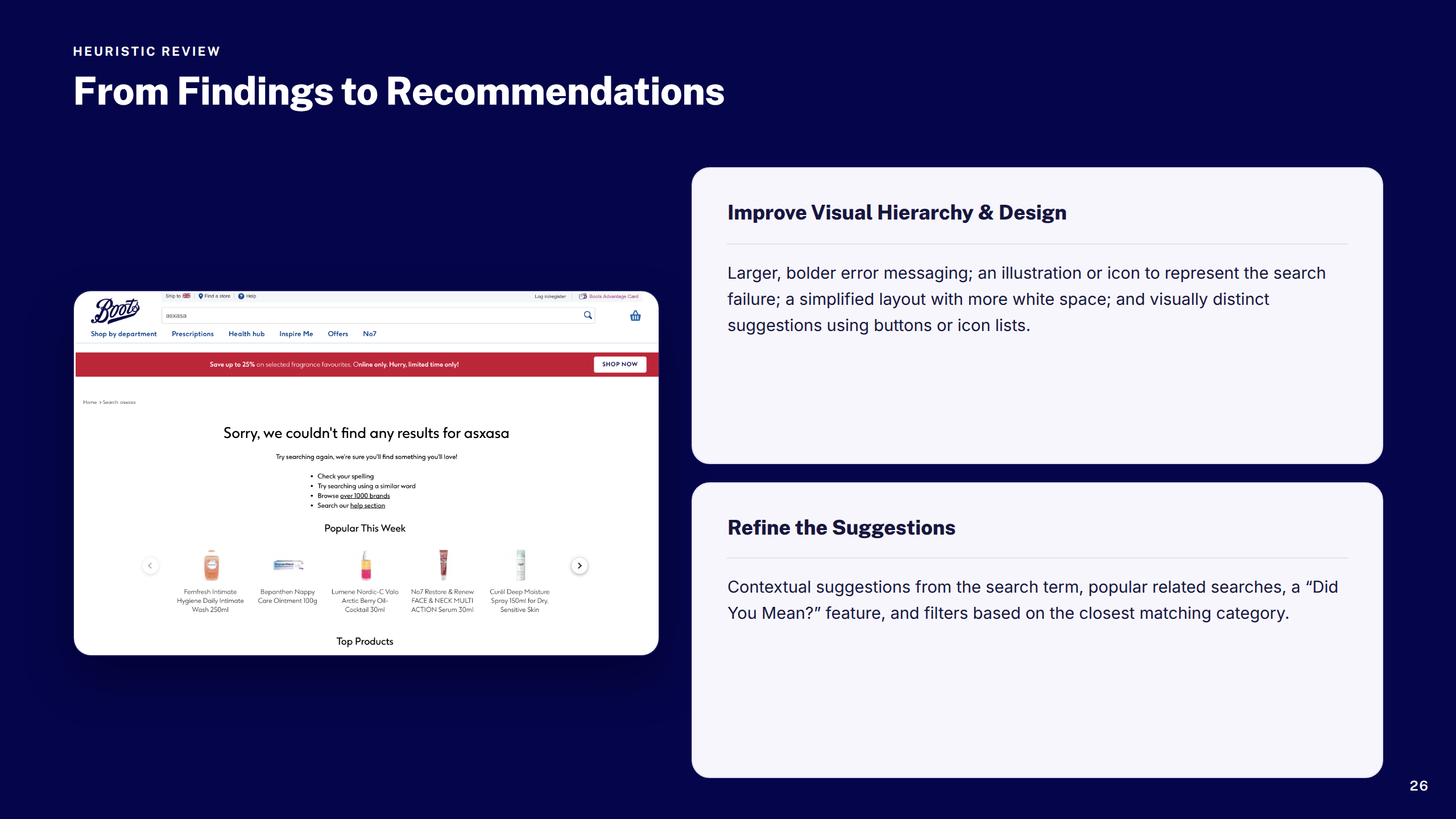
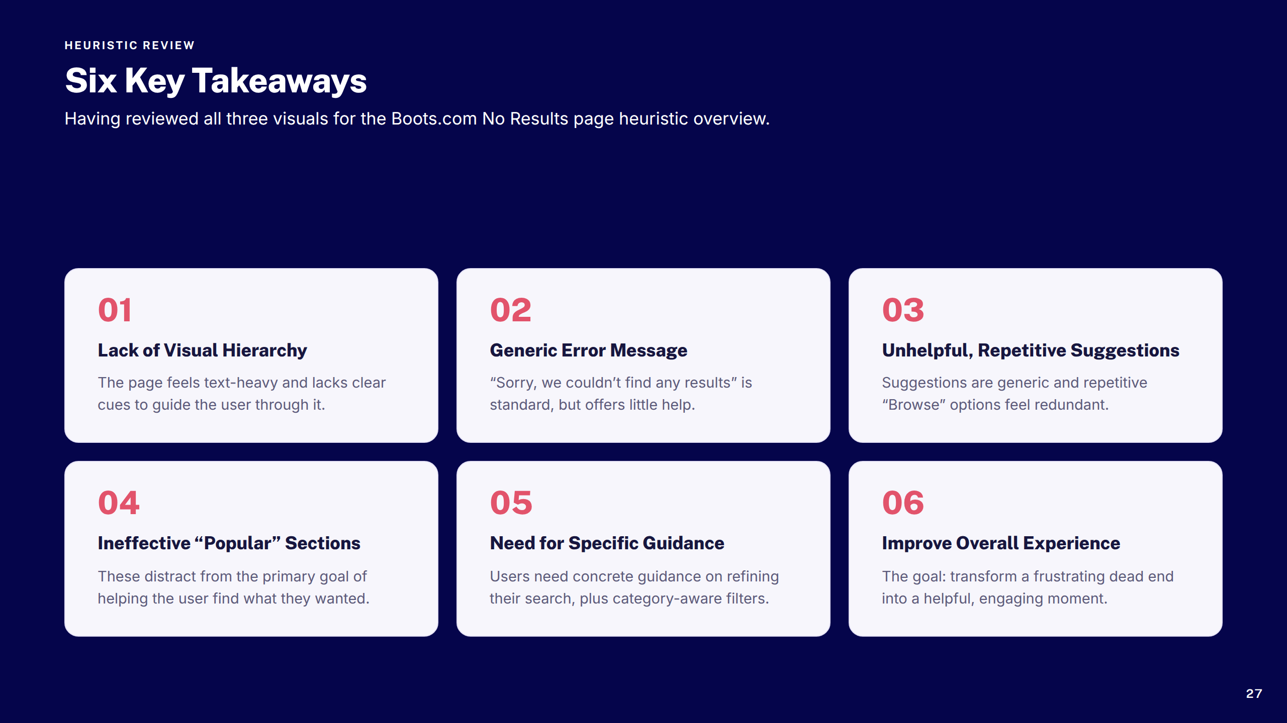
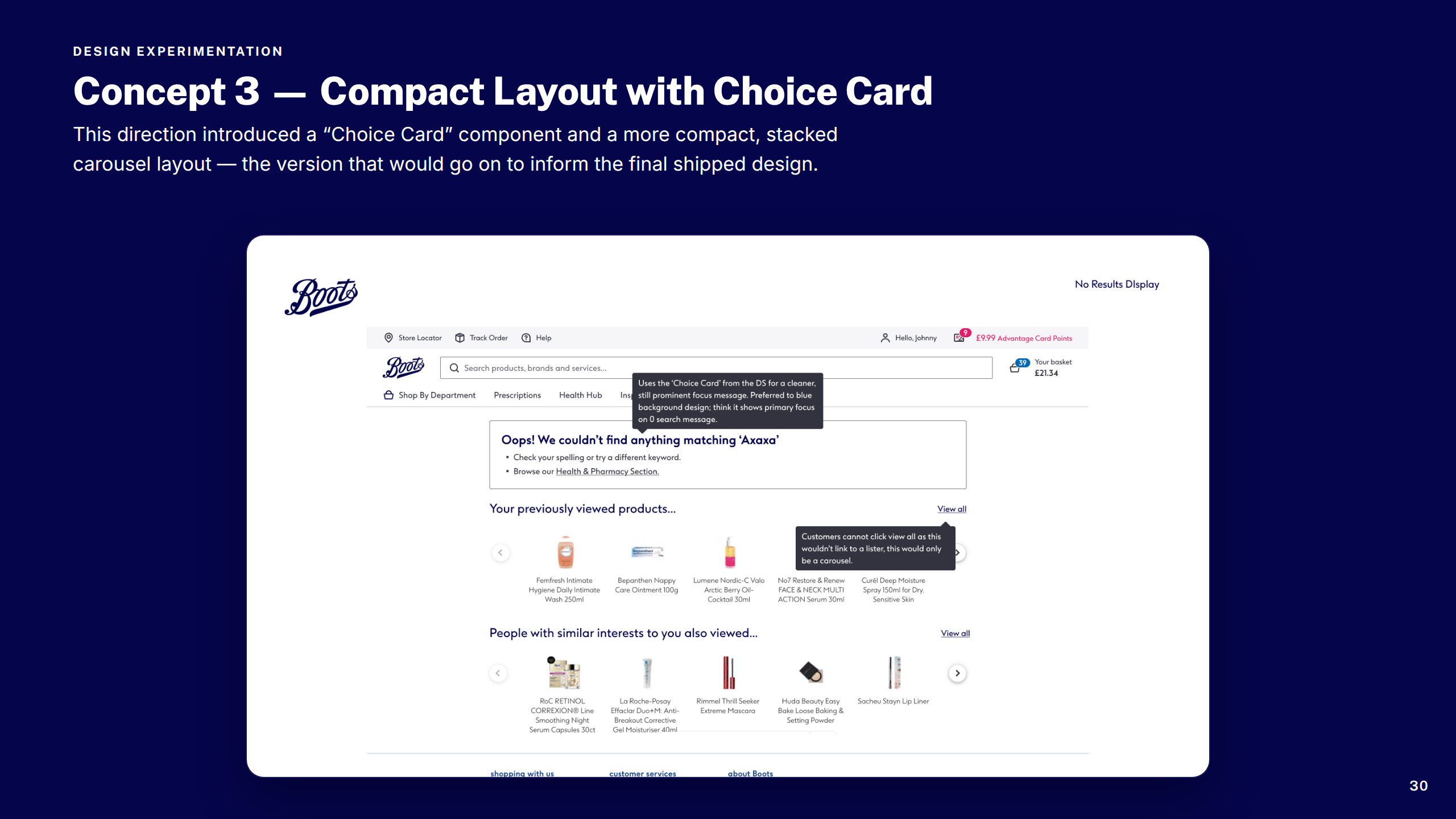
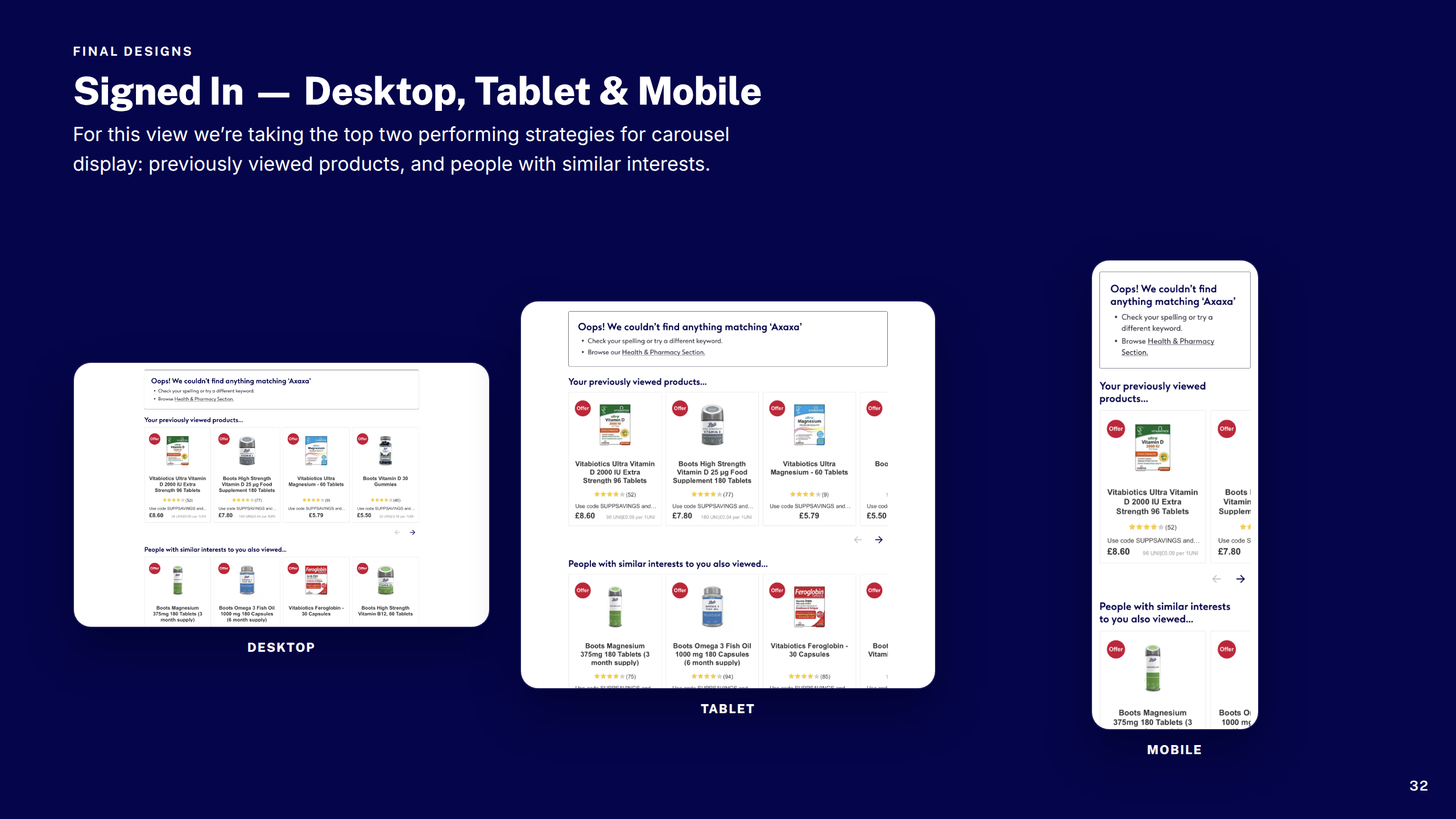
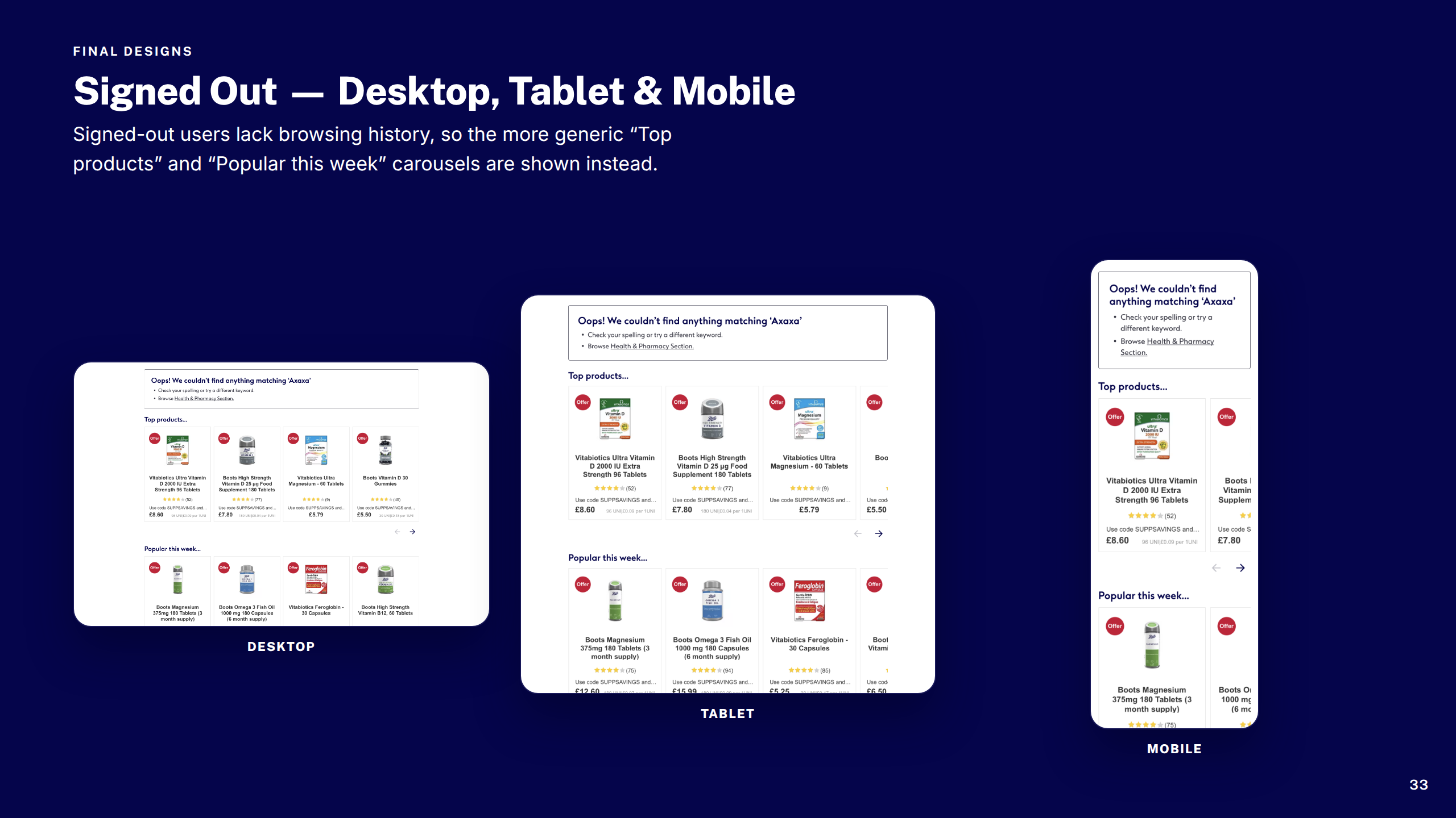
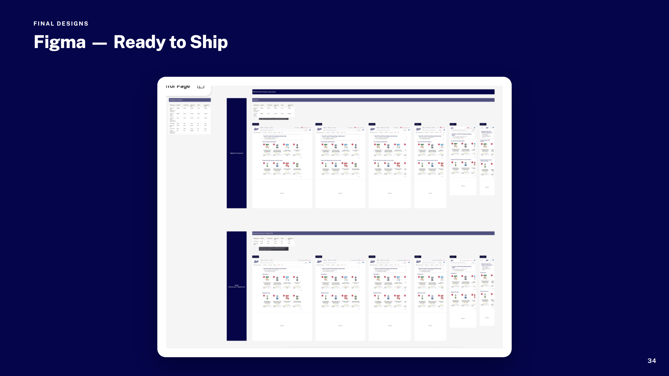
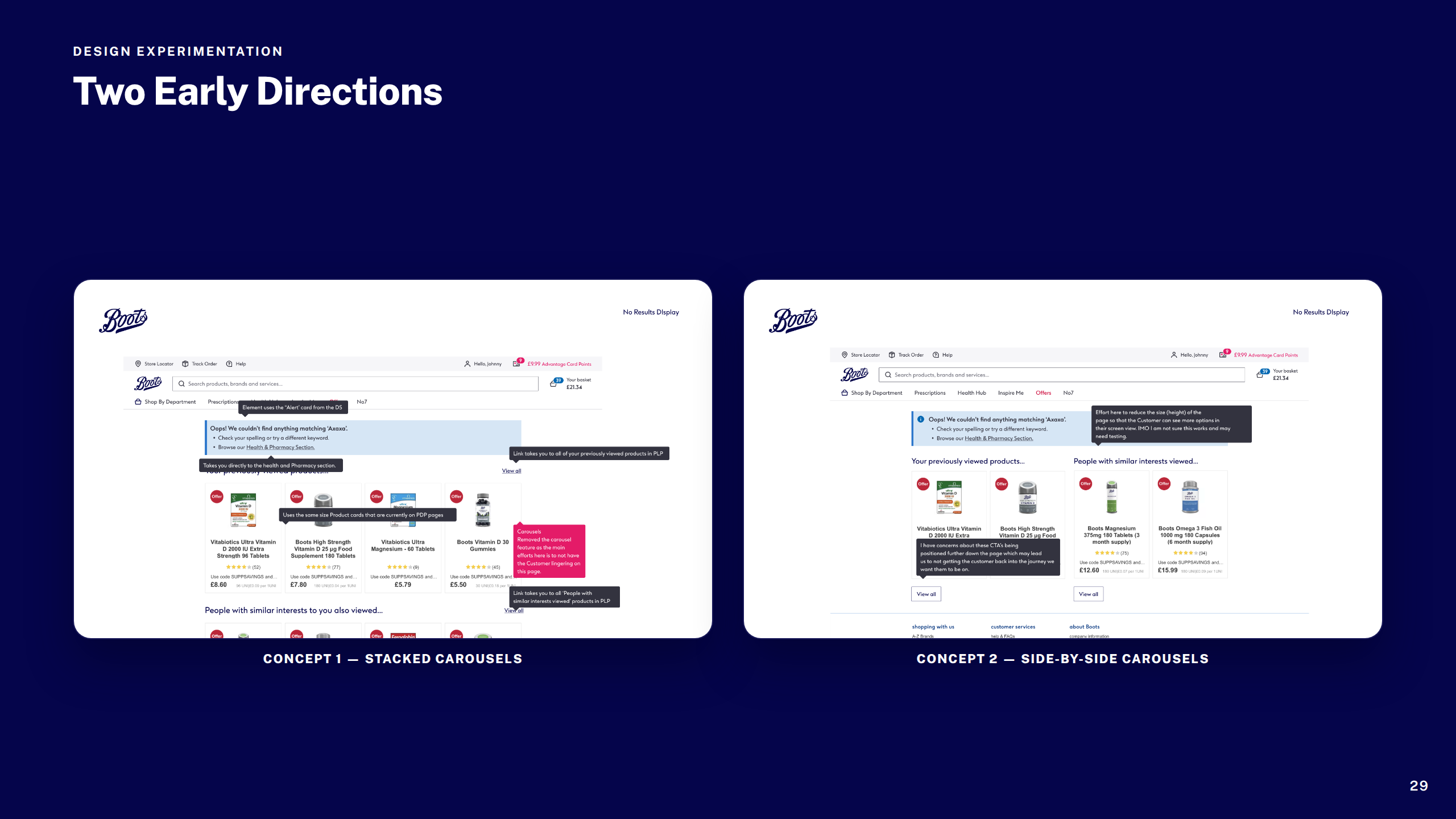
Redesigned the dead-end search experience into a useful recovery page — surfacing smart recommendations, spelling suggestions, and navigational pathways to keep customers moving toward purchase.

OOBO Checkout CSC Parity

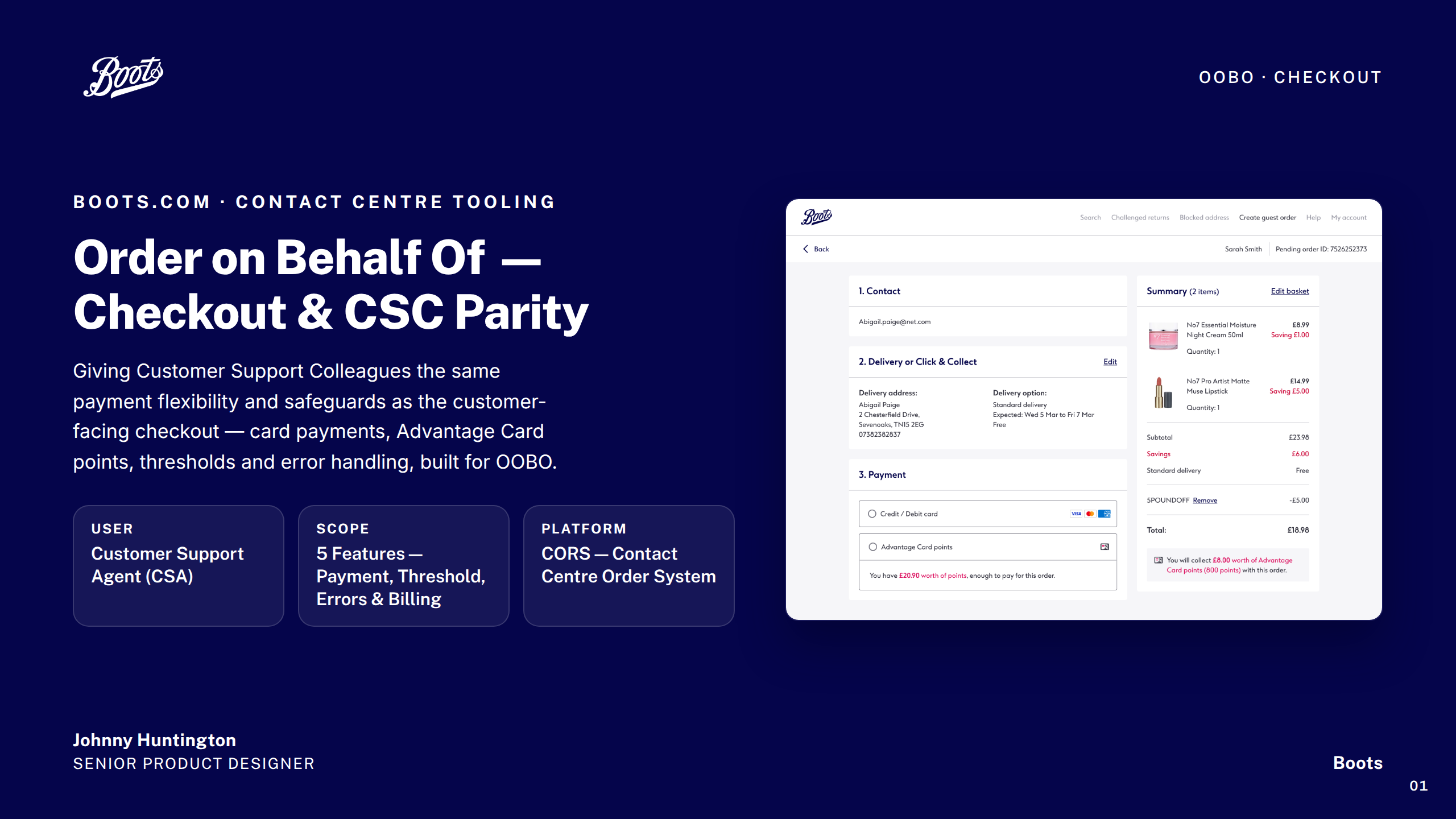
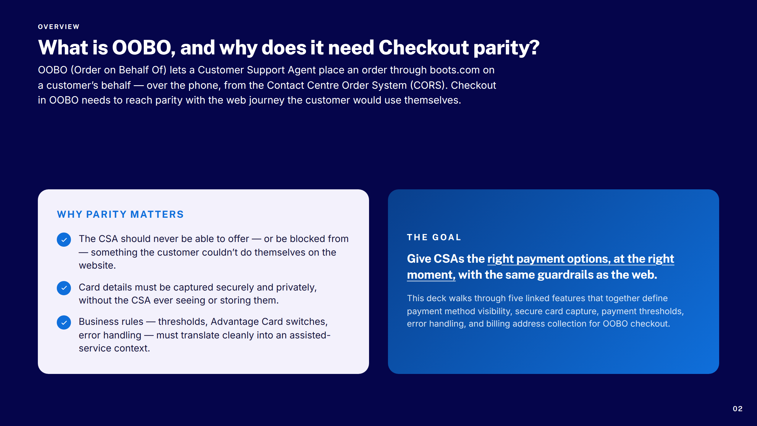
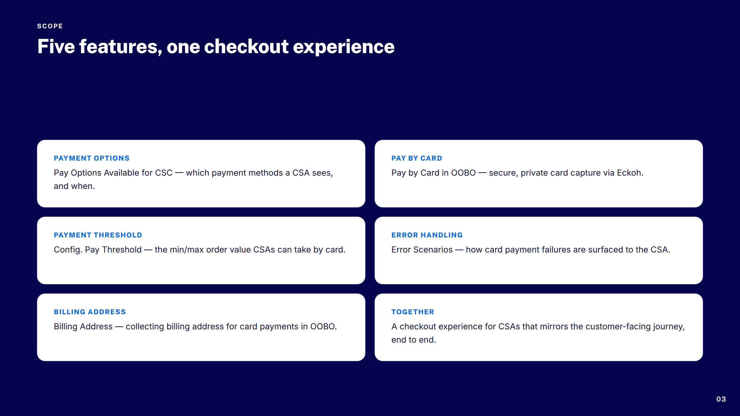
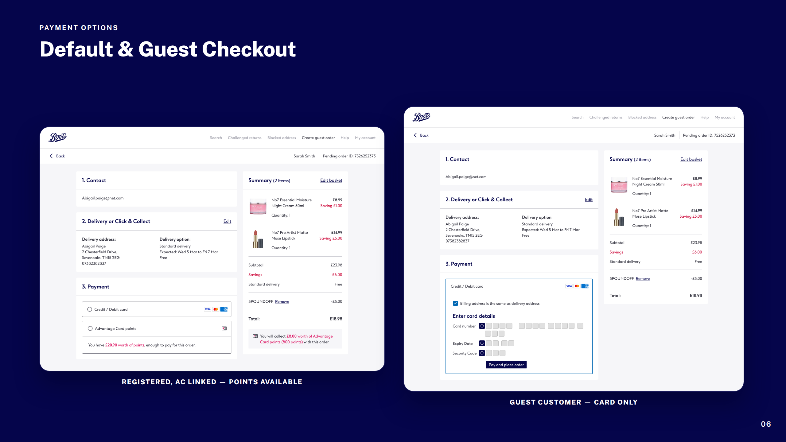
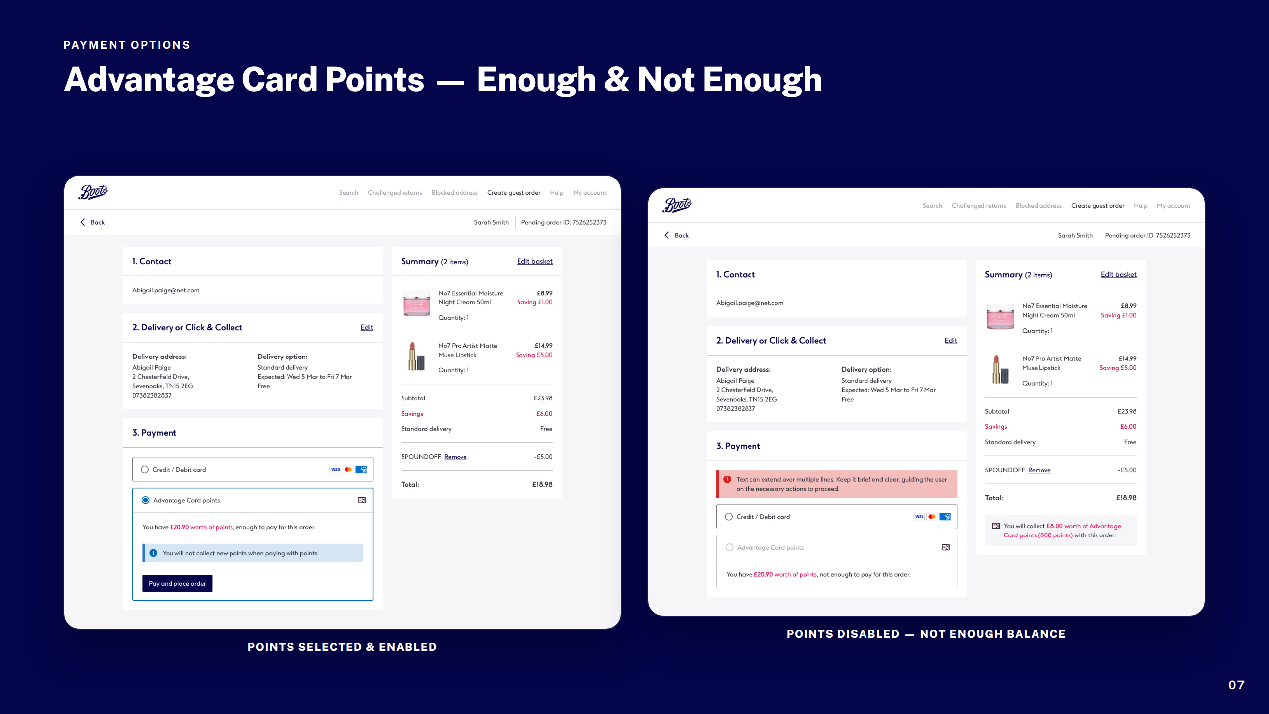
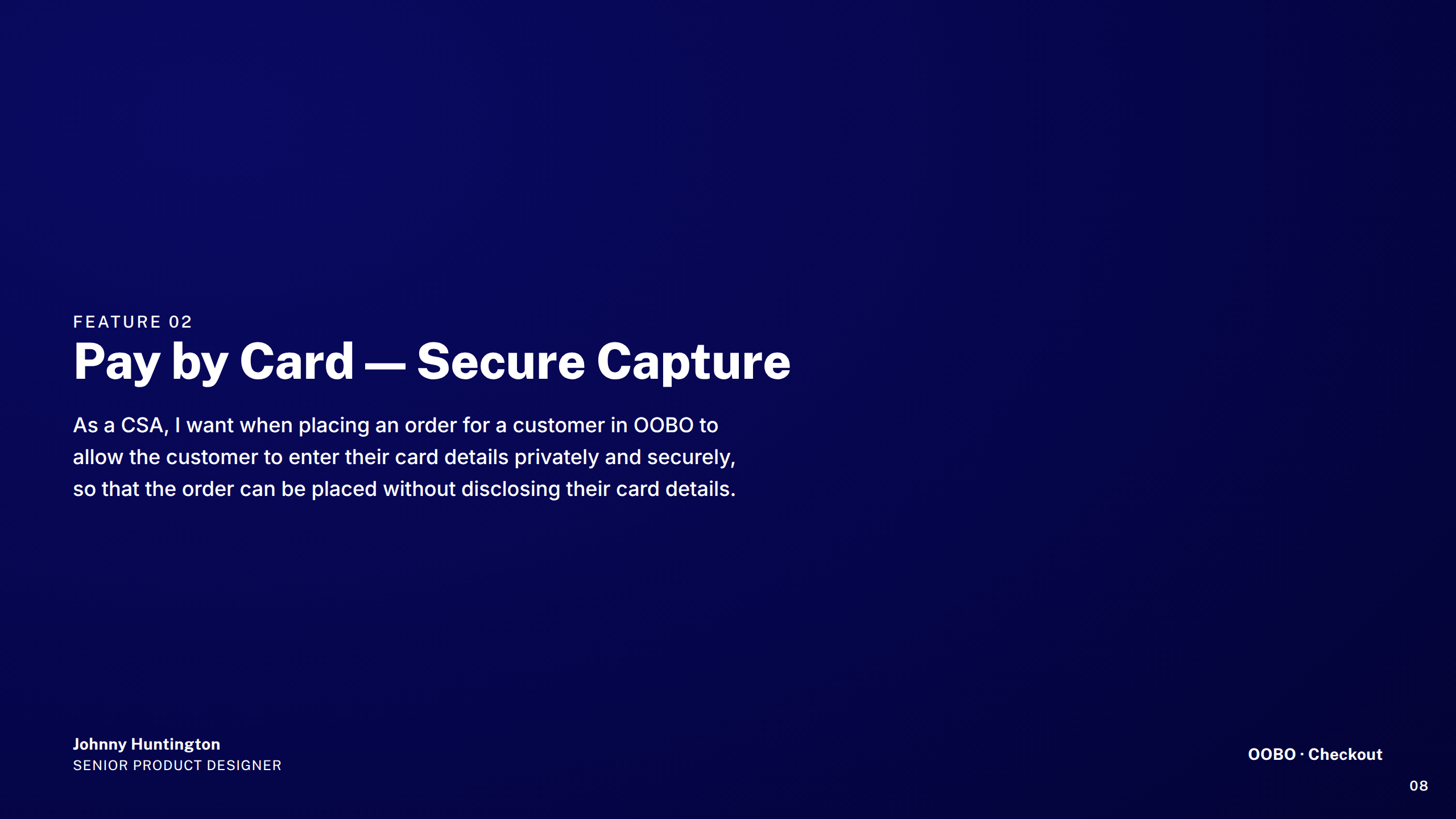
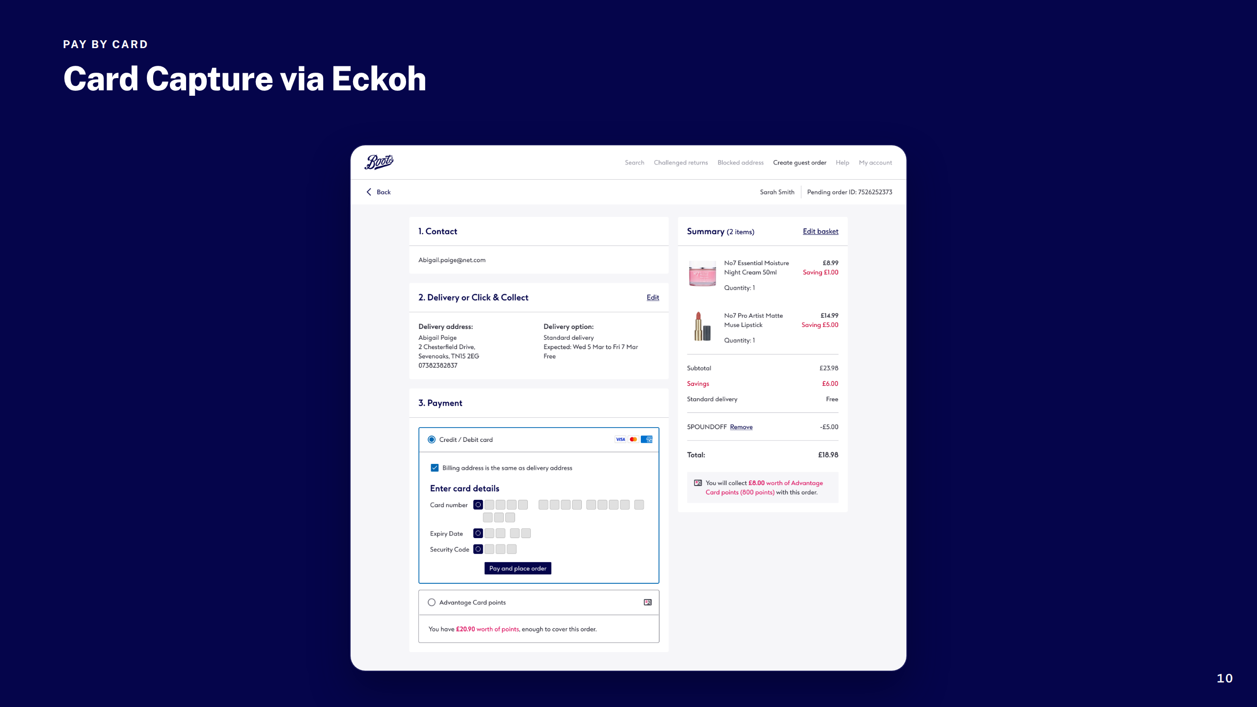
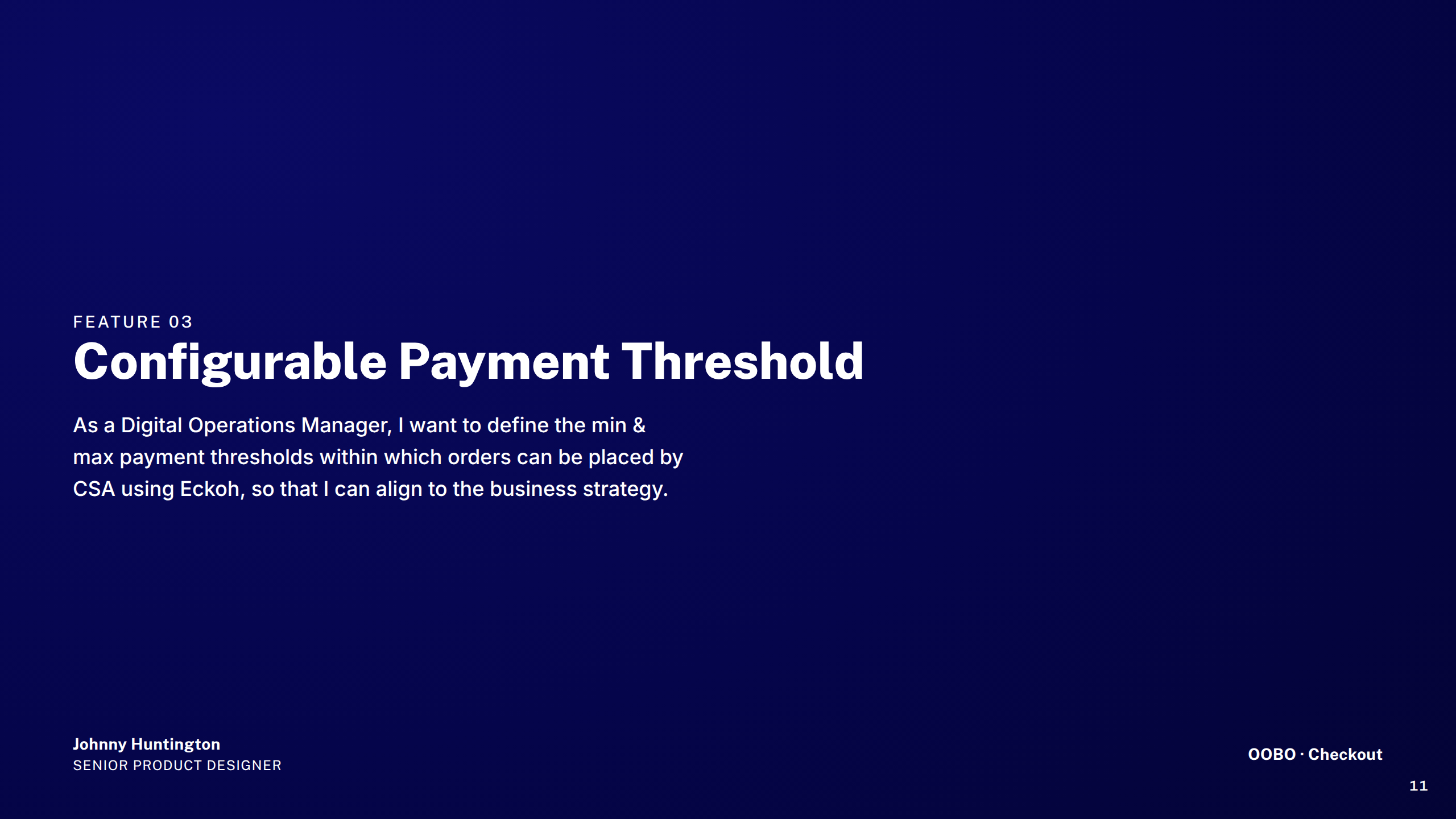
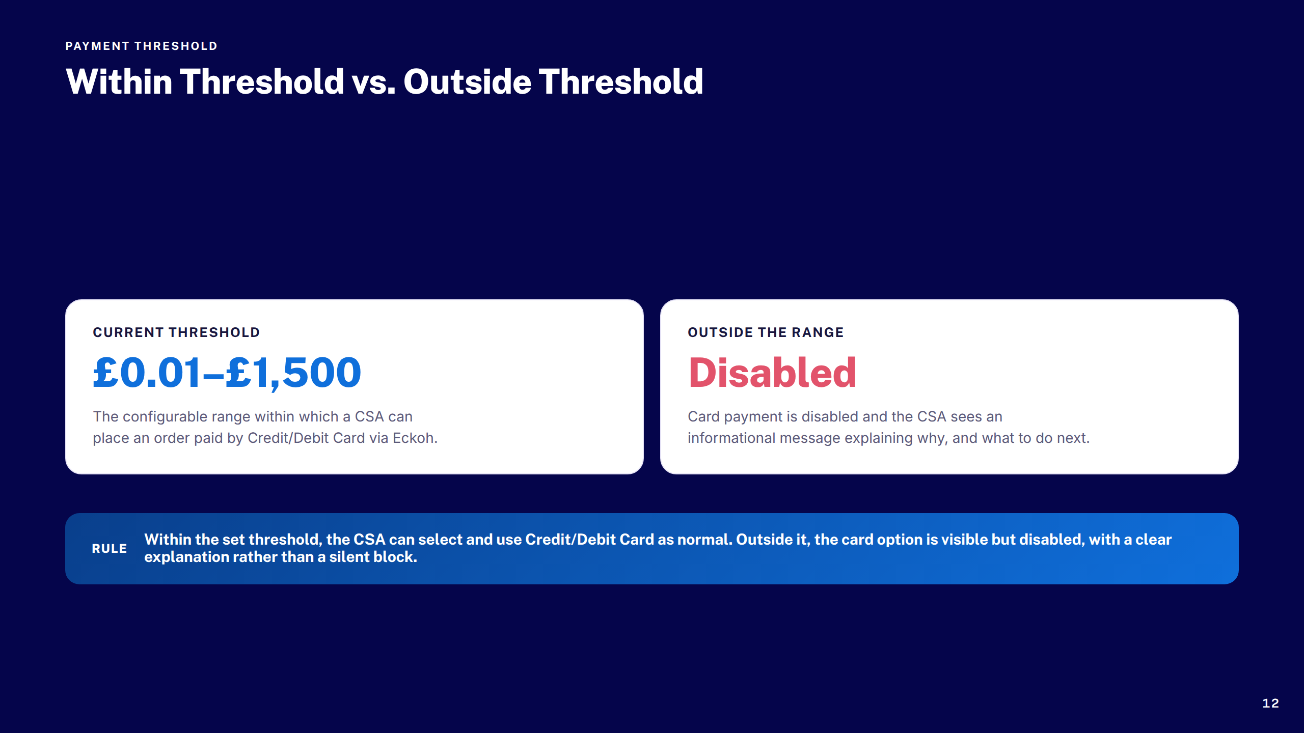
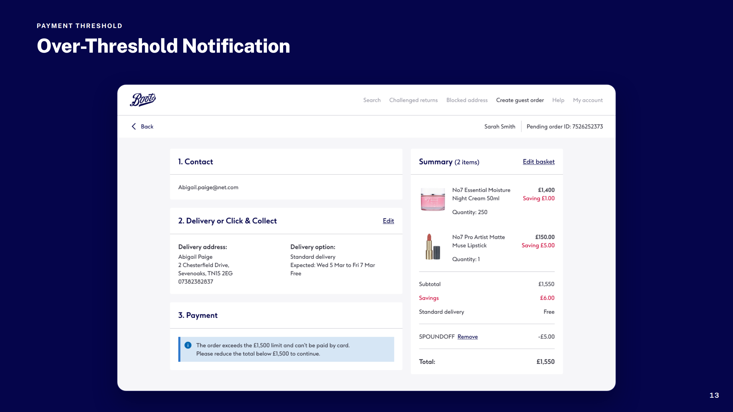
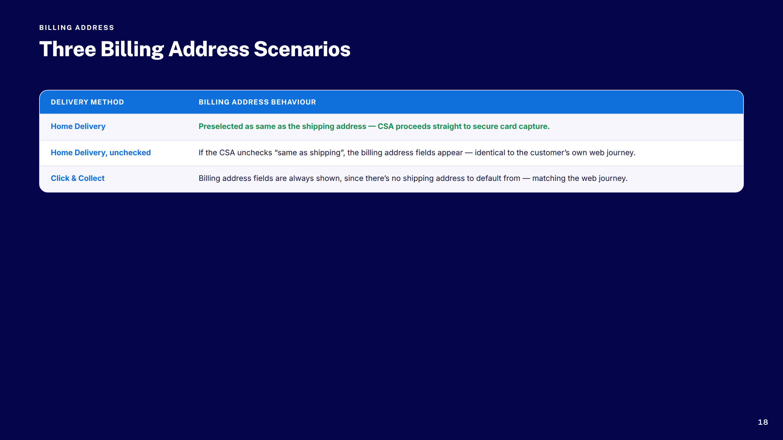
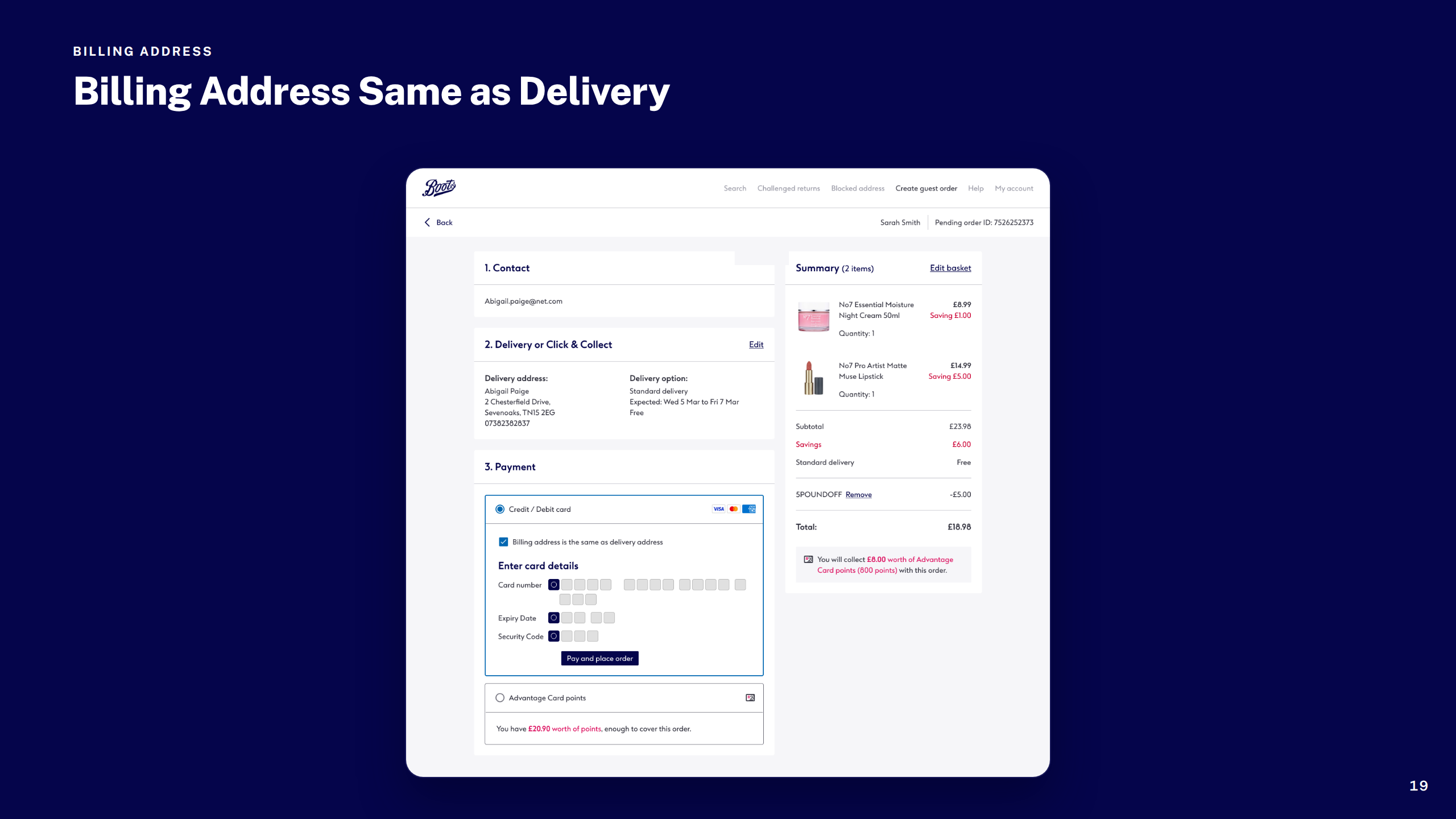
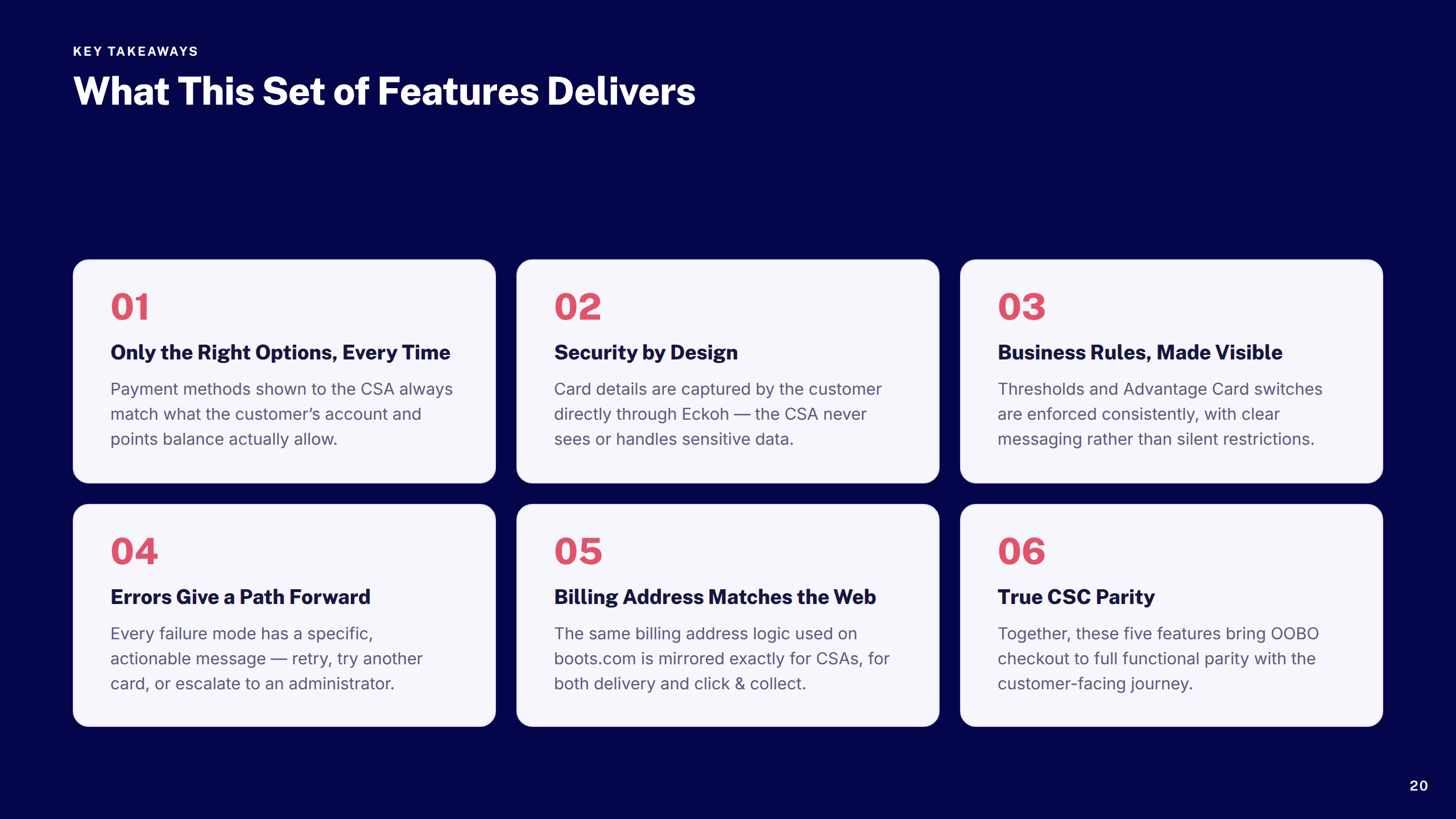
Designed the Order On Behalf Of checkout flow for Customer Service Centre agents — bringing parity with the customer-facing experience while handling edge cases around payment, thresholds, and error states.

Transactional Comms Emails

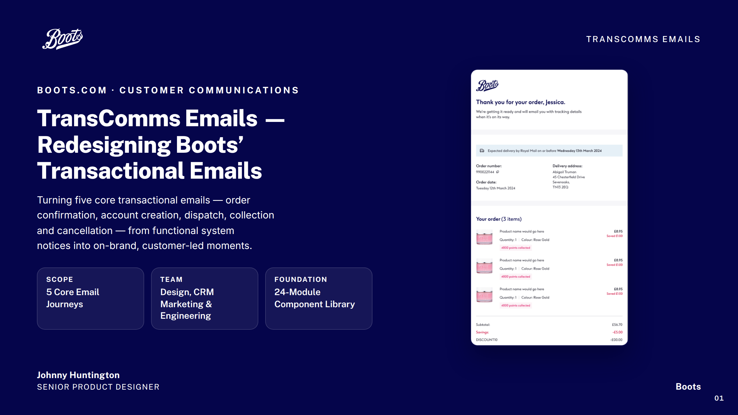
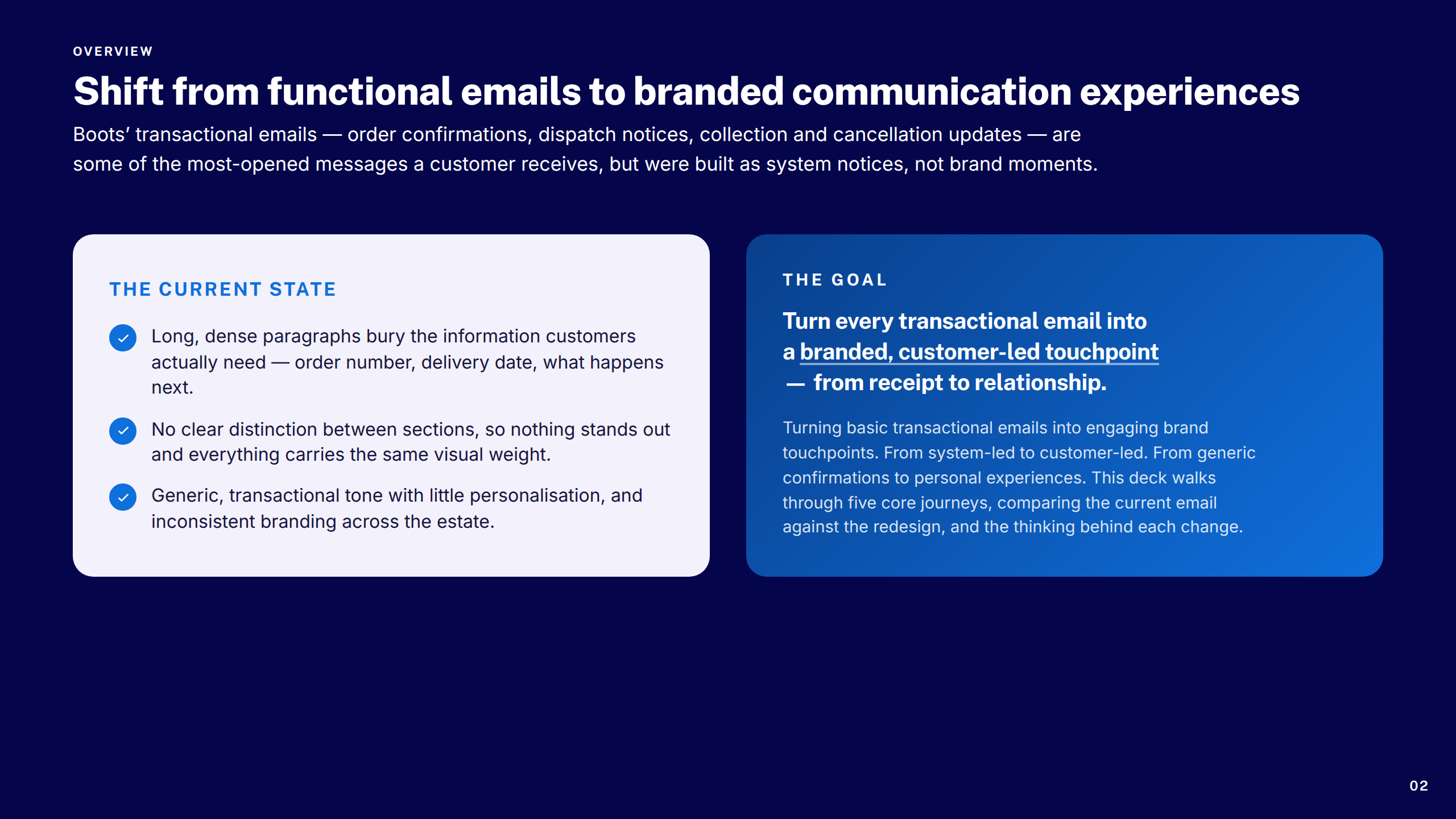
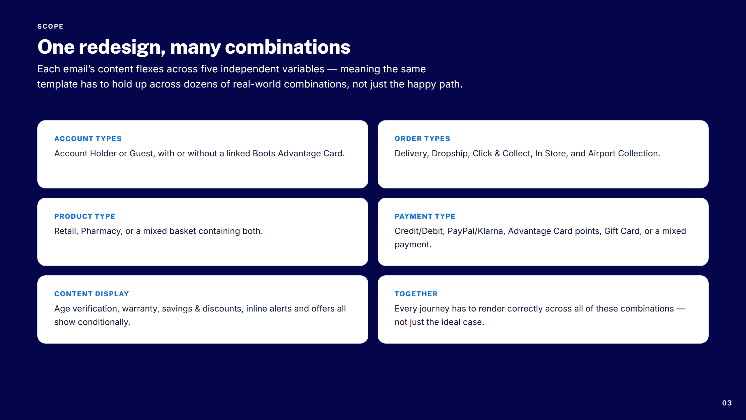
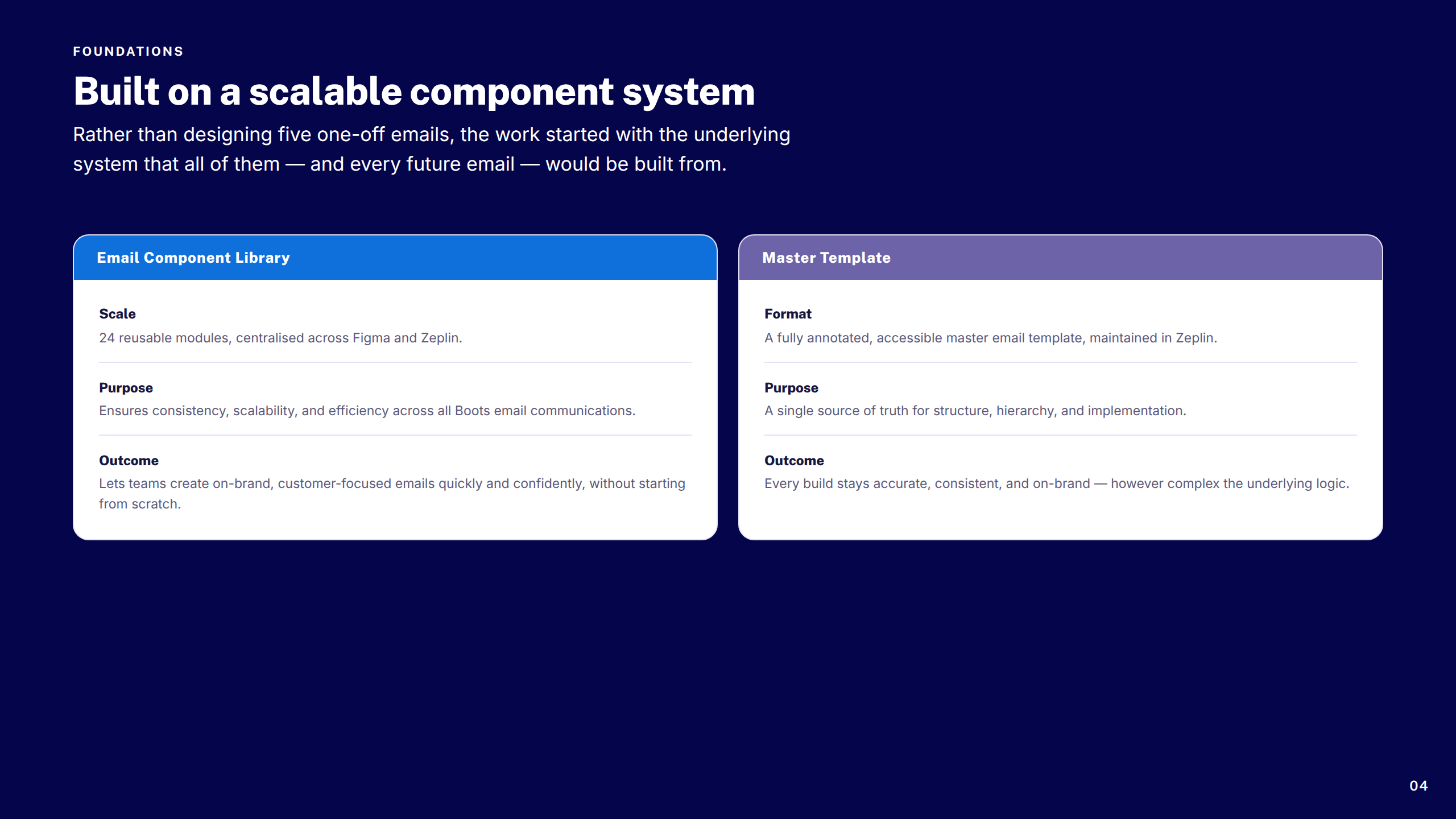
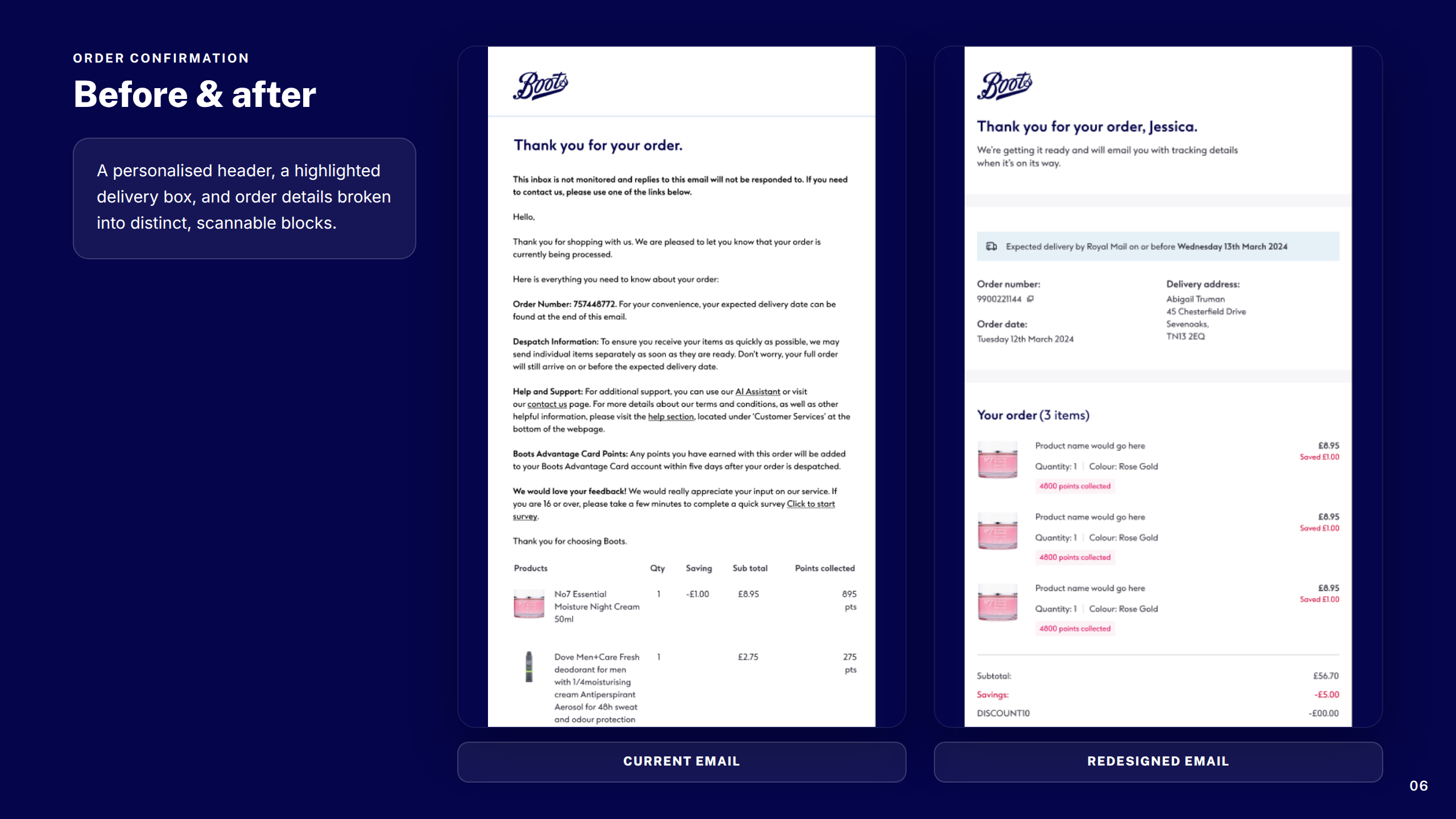
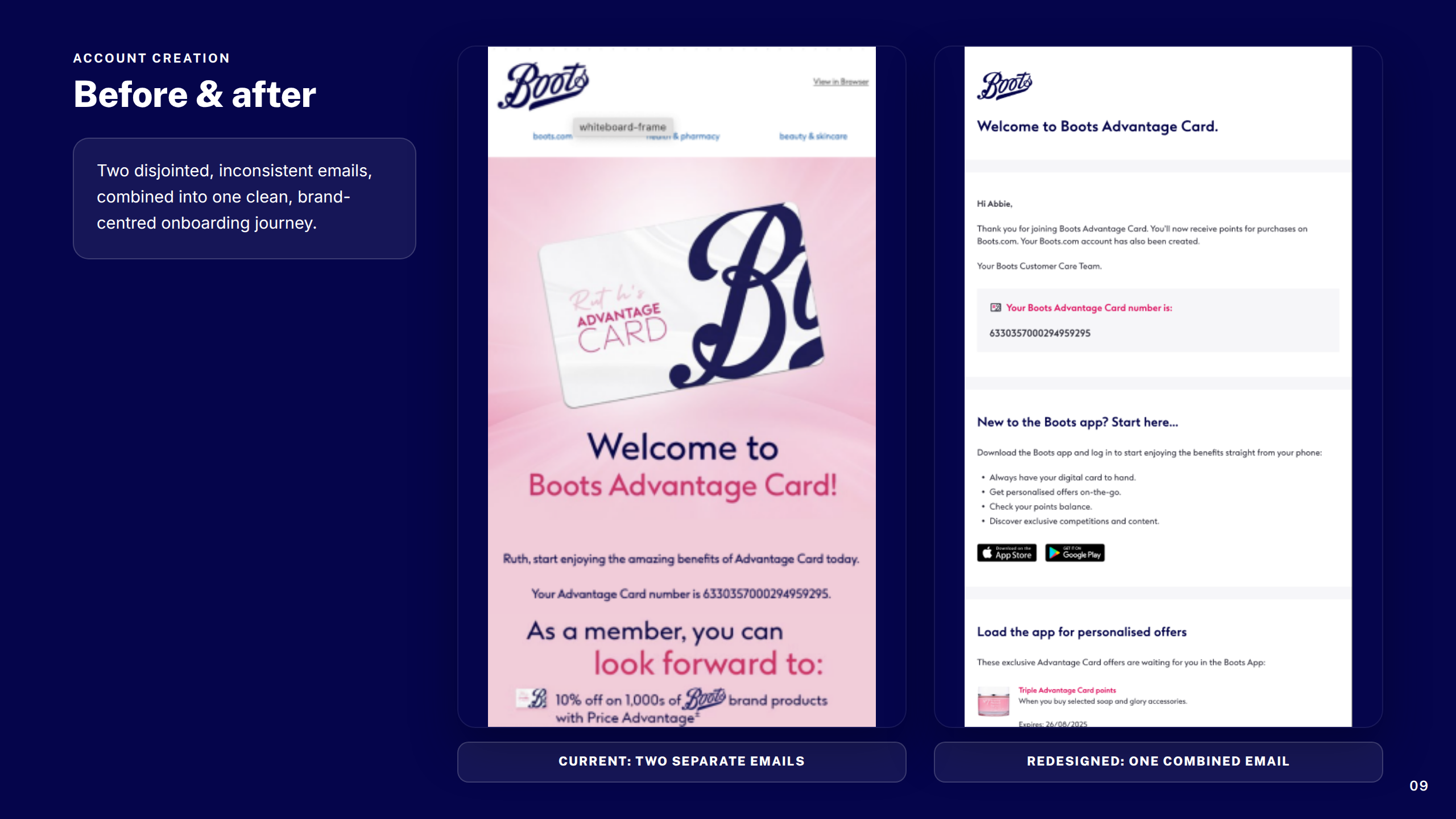
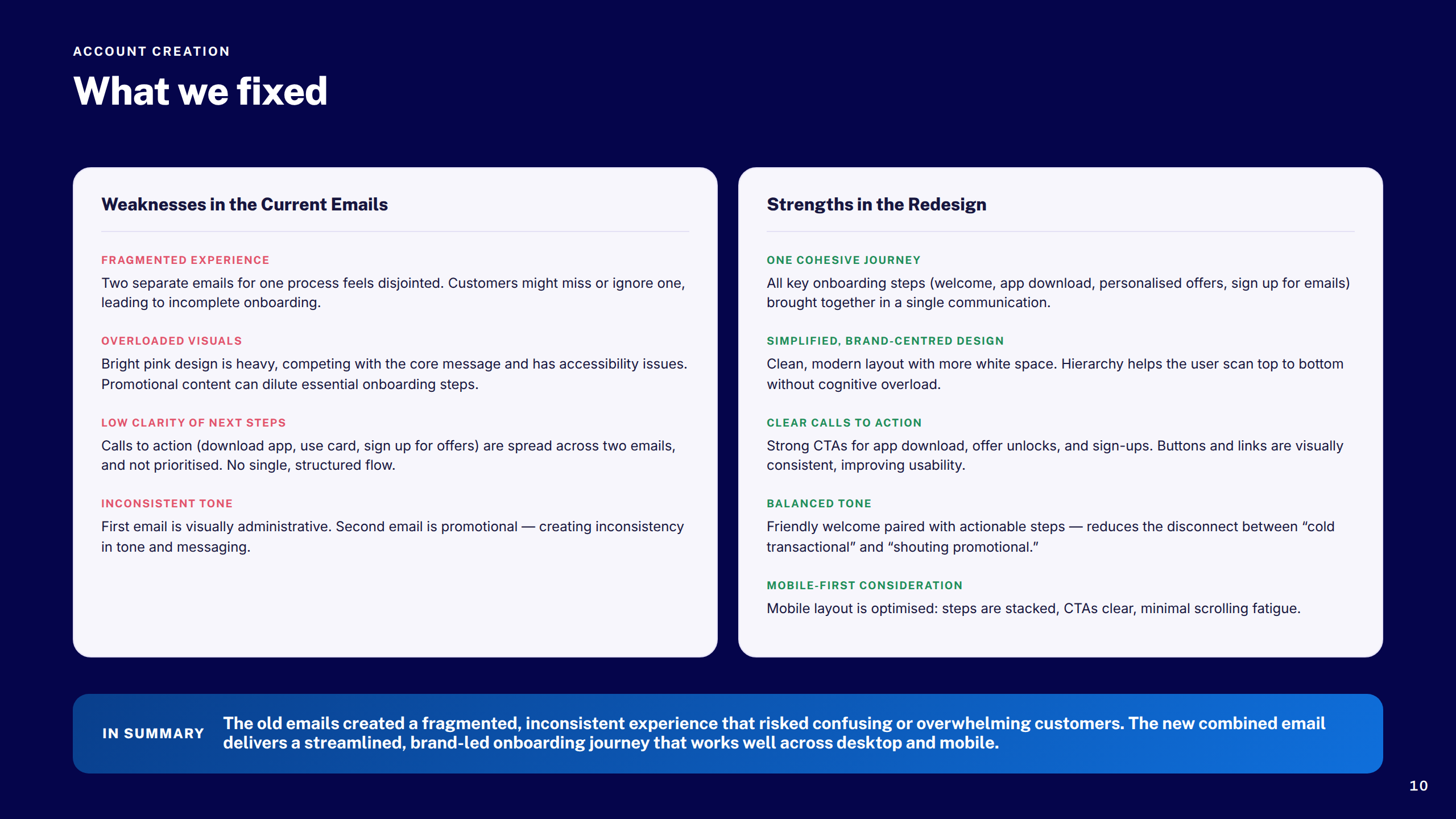
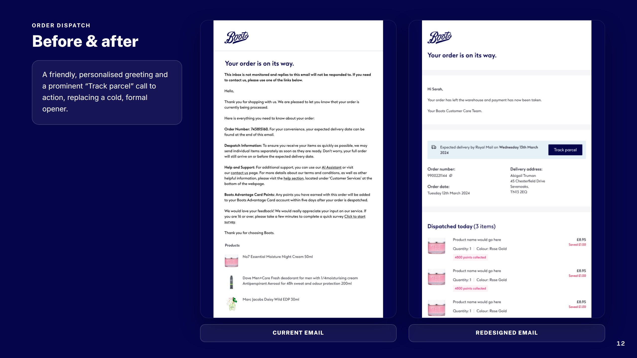
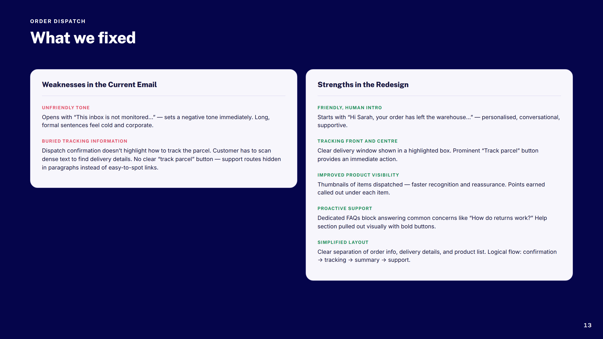
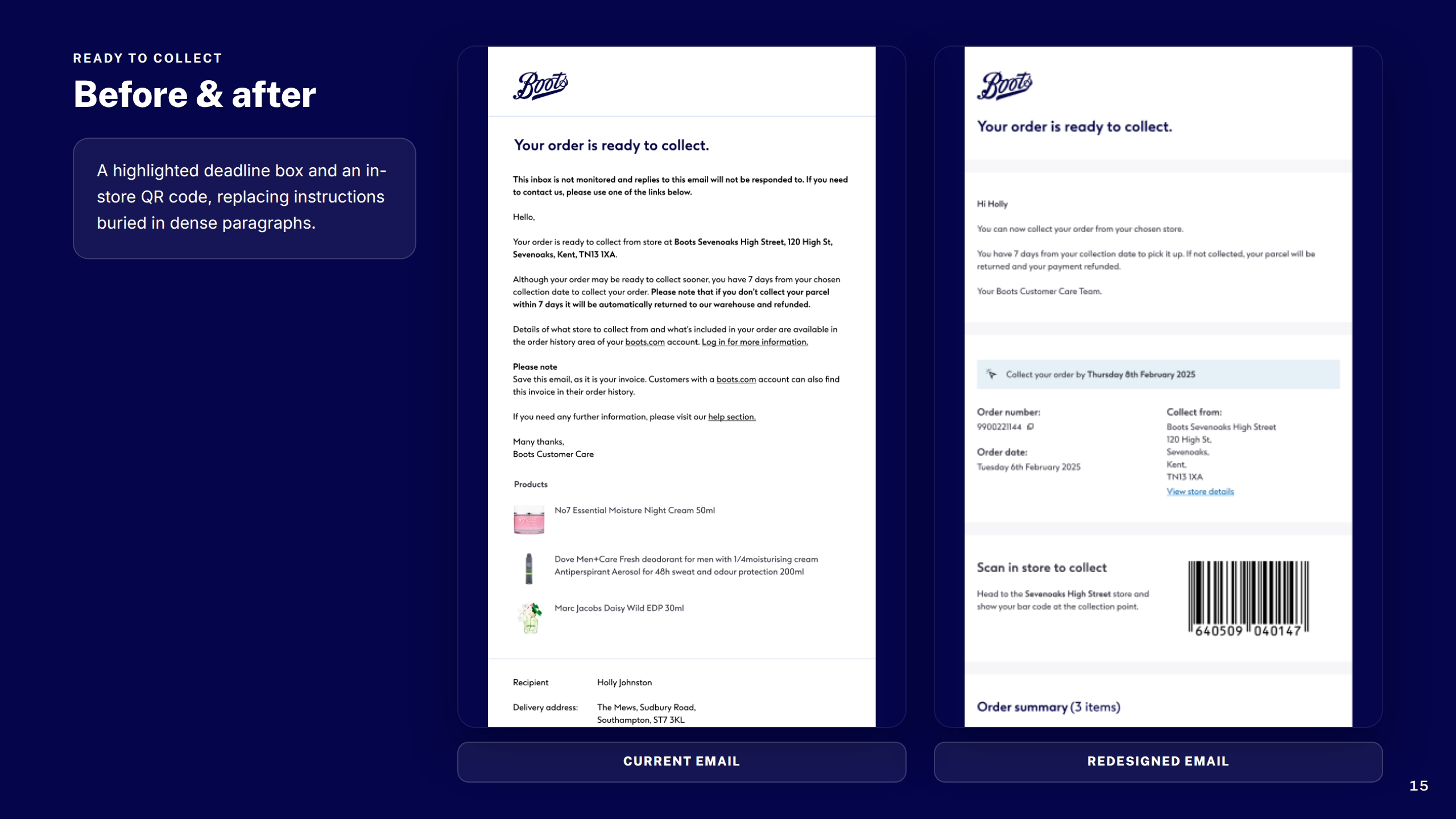
Audited and redesigned Boots's suite of transactional emails — order confirmation, dispatch, ready-to-collect, and cancellation — bringing visual consistency, accessibility, and design system alignment across every touchpoint.

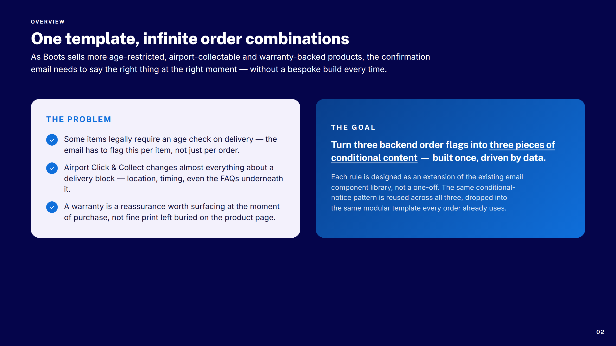
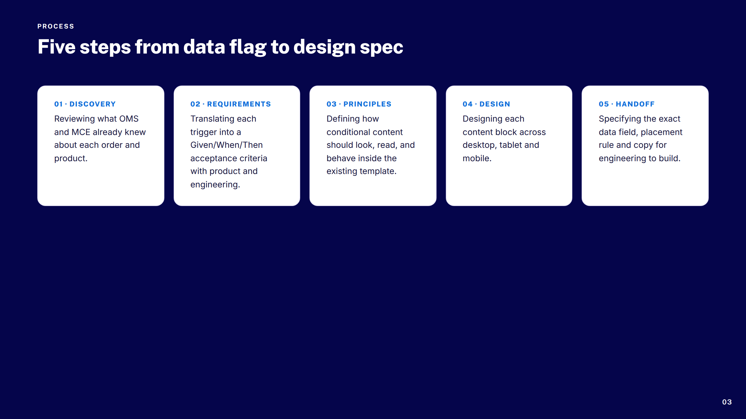
Age, Airports & Warranties

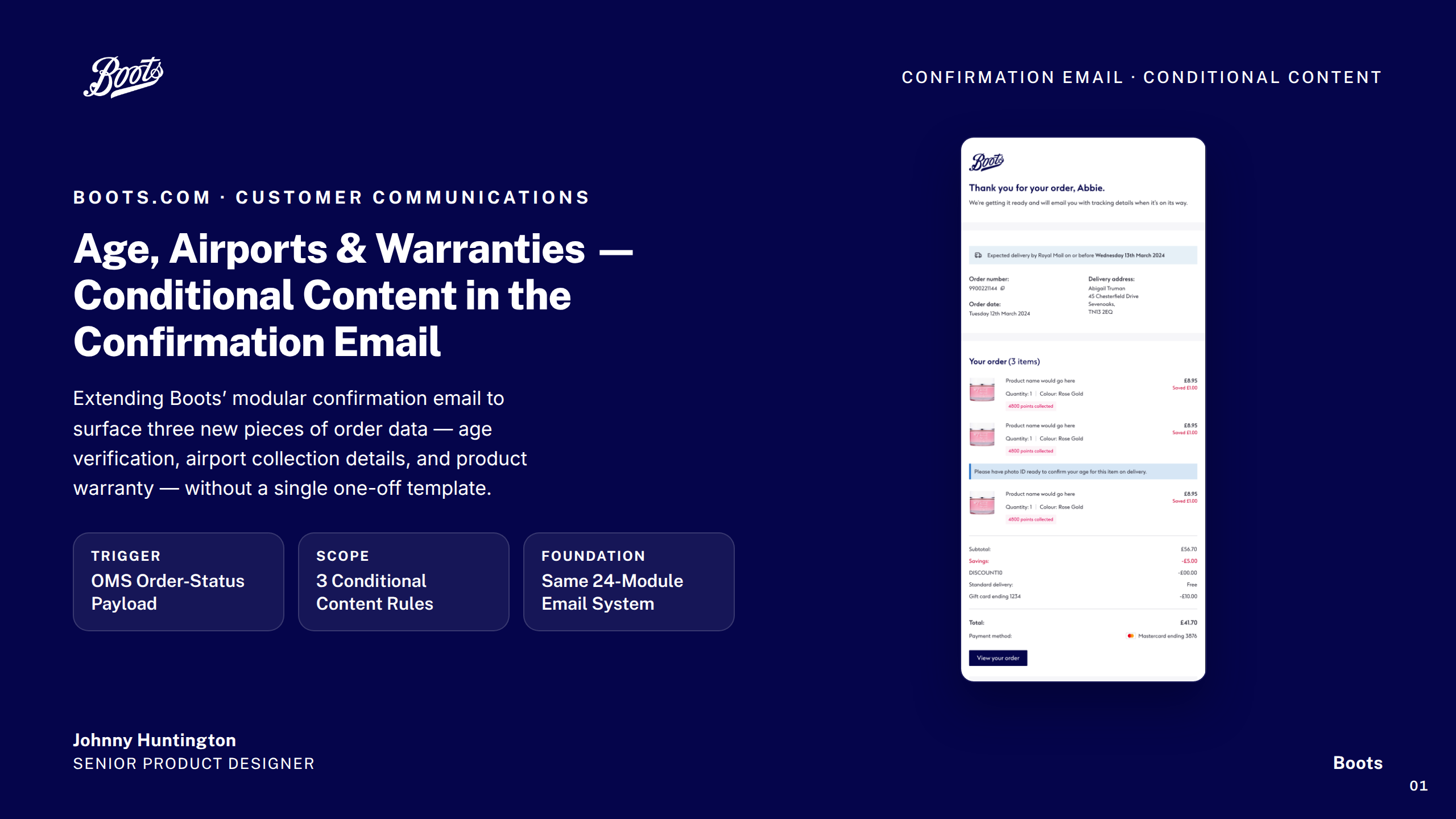
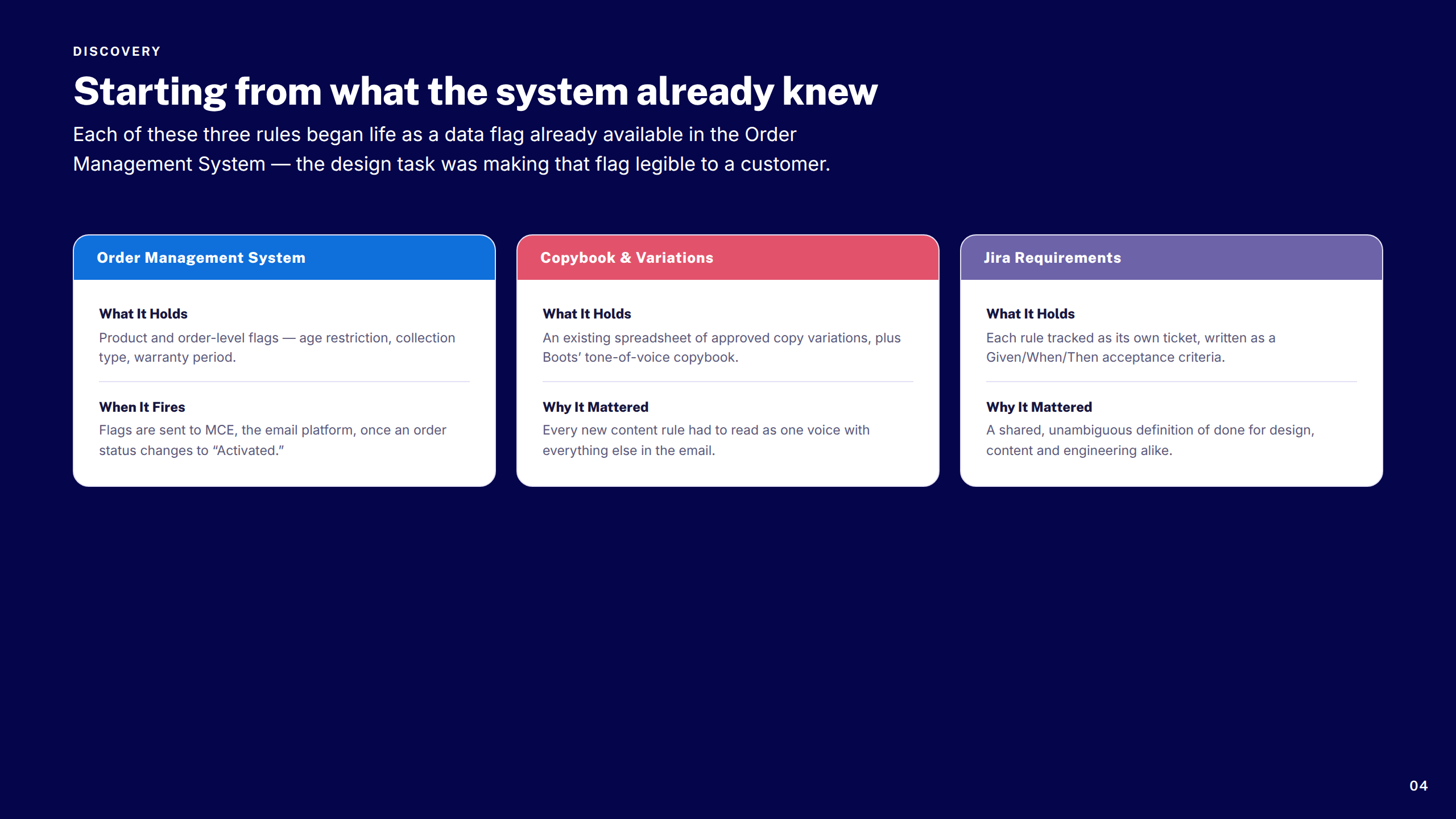
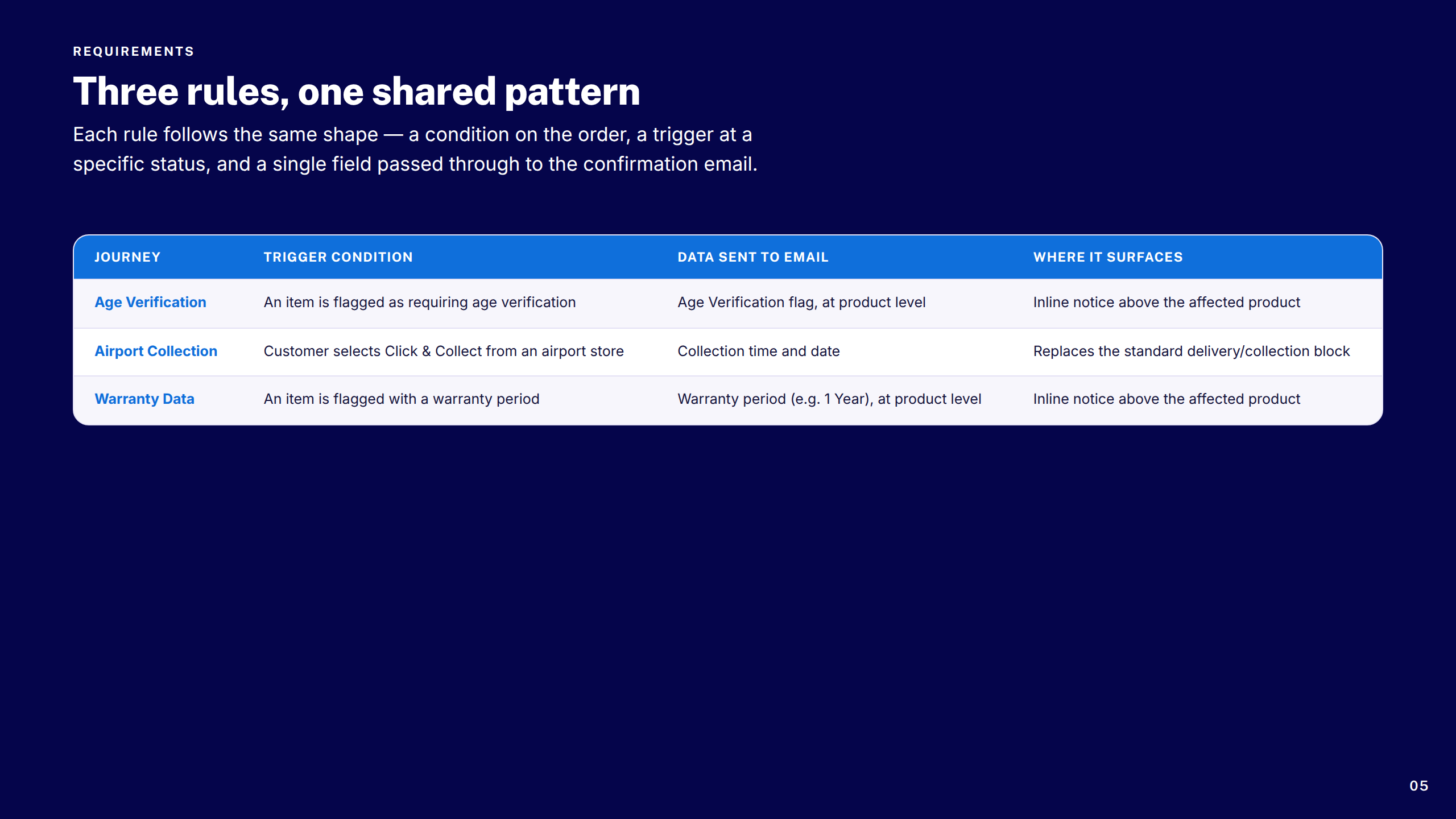
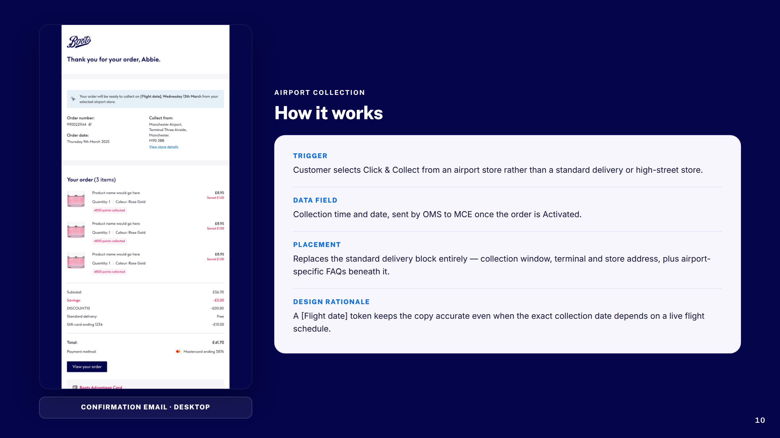
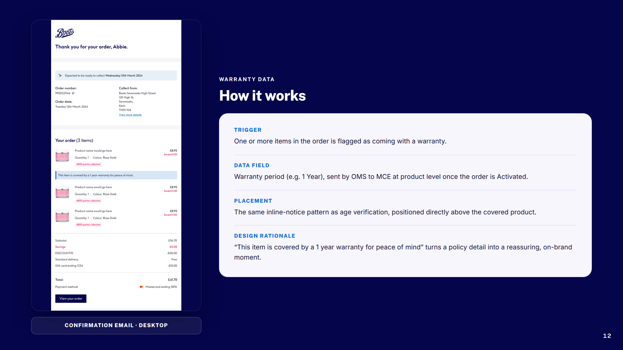
Three compliance-led feature streams — age verification at point of purchase, airport click-and-collect logic, and warranty data capture — each requiring close collaboration with engineering, legal, and operations teams.

Tools & process

Tools used
Figma Hotjar Google Analytics Maze Jira Confluence Miro Zeplin
Design process
1
Discover

Analytics deep-dive, heuristic review, competitor analysis, customer journey mapping

2
Define

Problem framing, friction mapping, success metrics, accessibility requirements

3
Design

Mobile-first wireframes, component design, high-fidelity prototypes, design system contributions

4
Validate

Usability testing, analytics review, accessibility audit, iteration

5
Deliver

Dev handoff, QA support, design system documentation, post-launch review

A set of focused improvements across search, navigation, and guided product discovery.

Six workstreams across discovery, navigation, search, checkout, communications, and compliance: a Pain Selector Tool to guide customers from symptom to product, a No Results page that rescued dead-end searches, a Global Header upgrade that clarified navigation and branding, an OOBO checkout flow for Customer Service agents, a full transactional email redesign, and three compliance-driven features covering age verification, airport collection, and warranty data capture.

Each was designed mobile-first, validated through research, and built to contribute back to the Boots design system — raising the bar on accessibility and commercial performance across the platform.
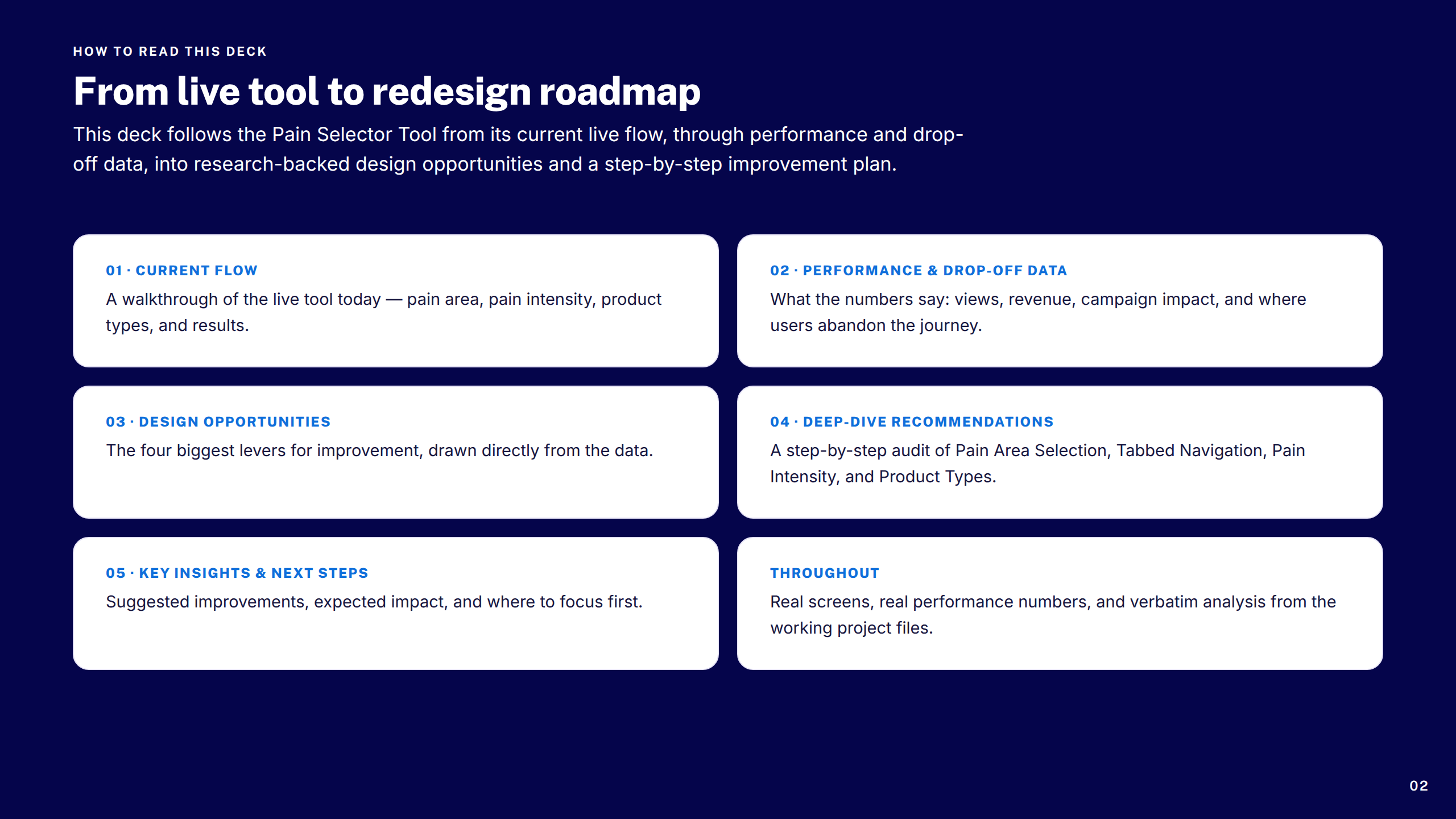
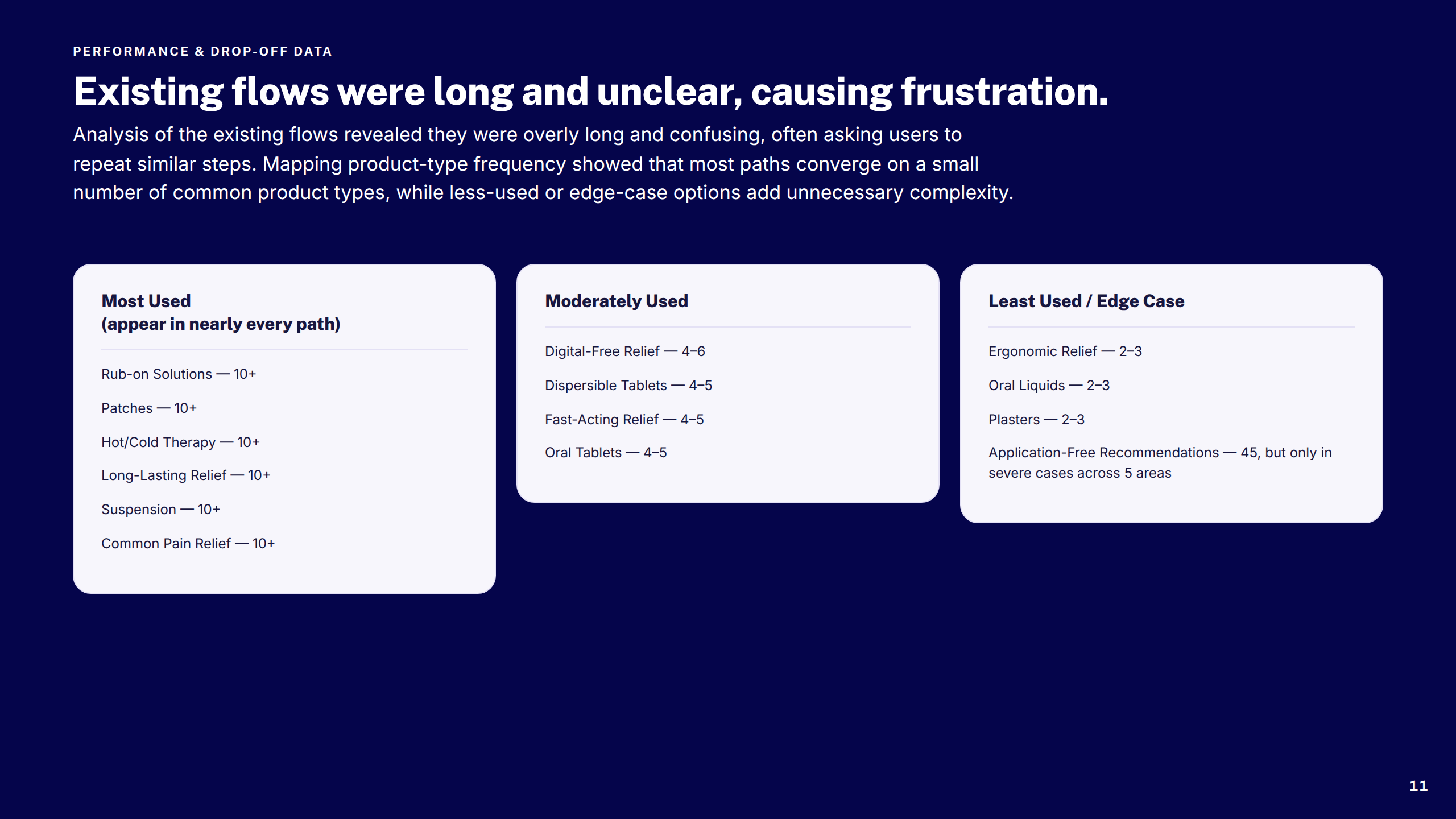
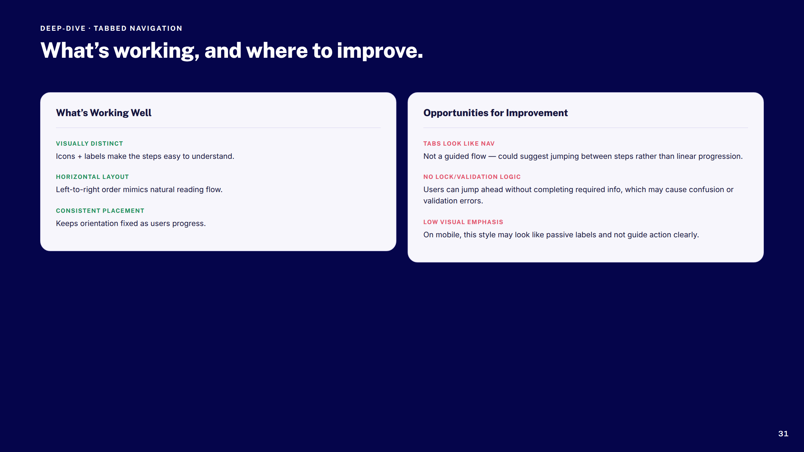
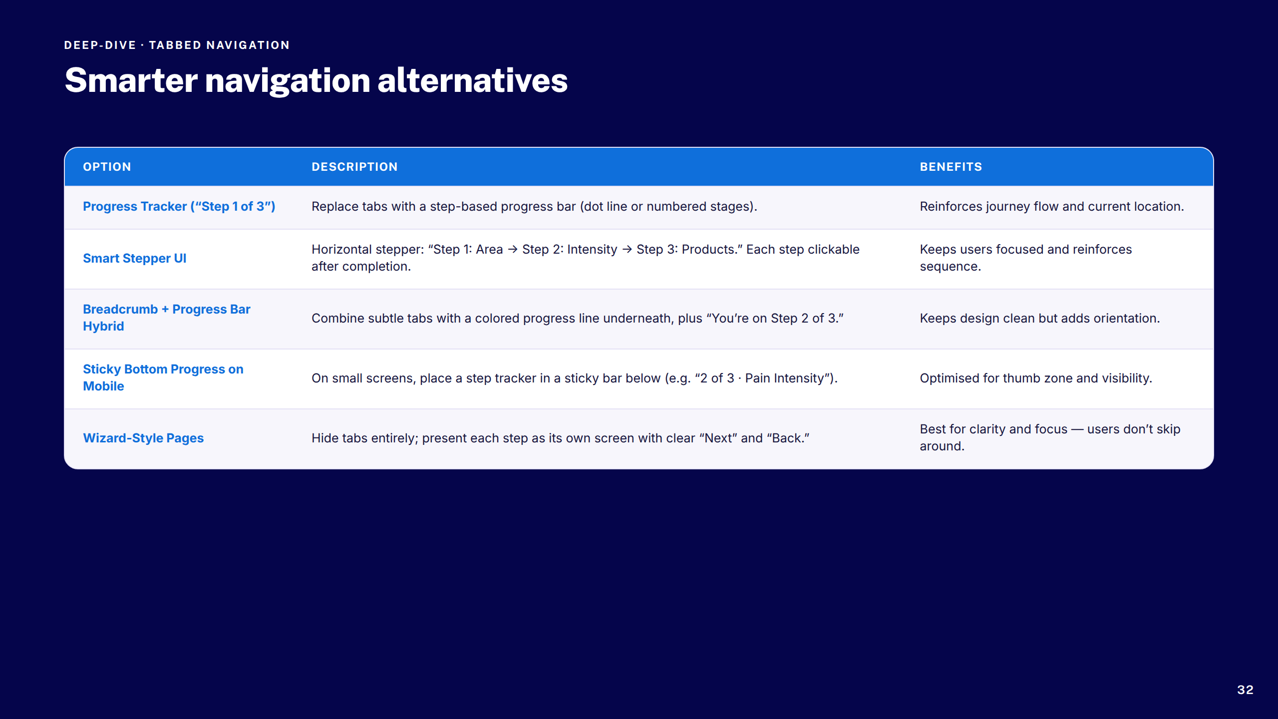
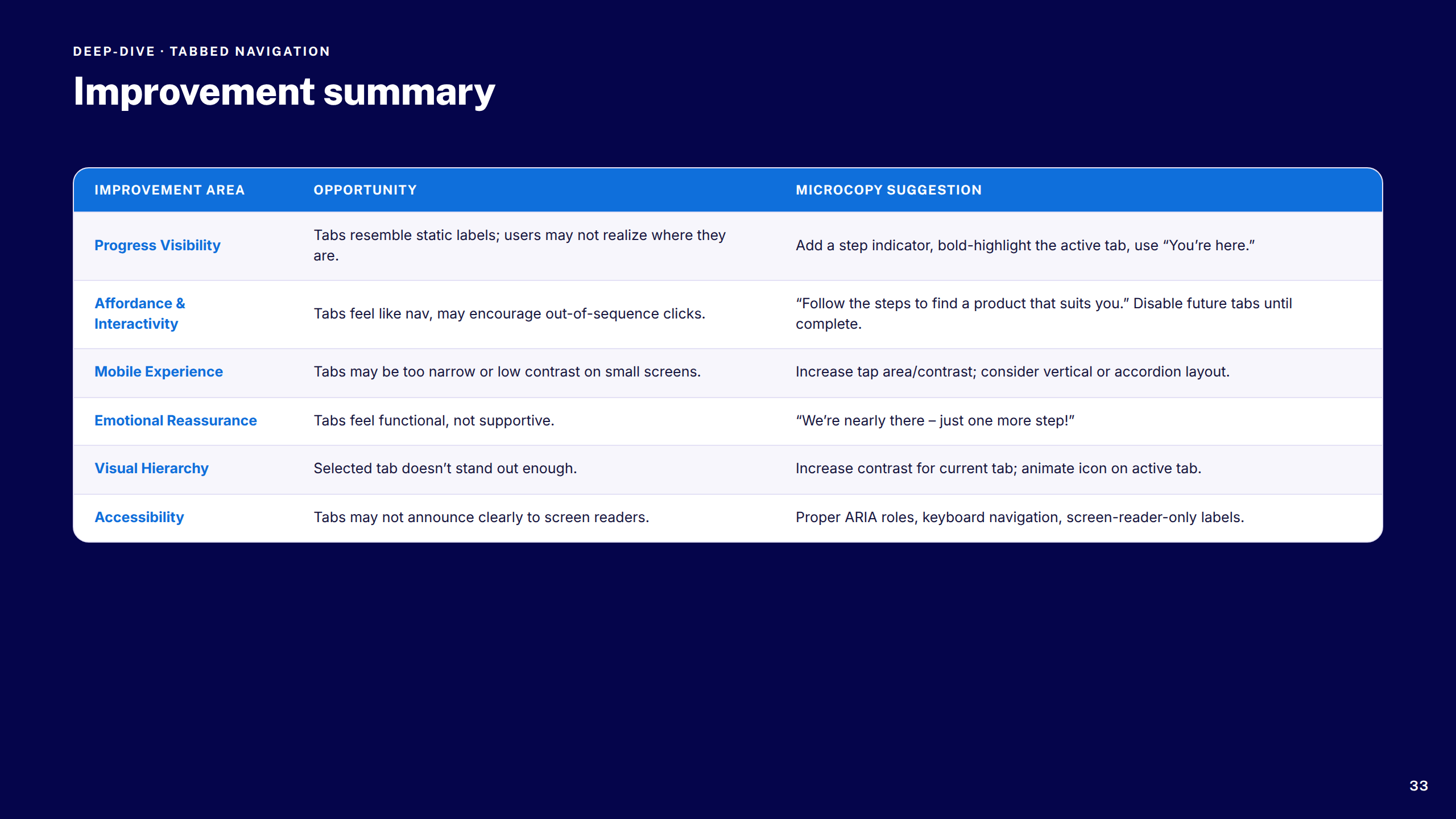
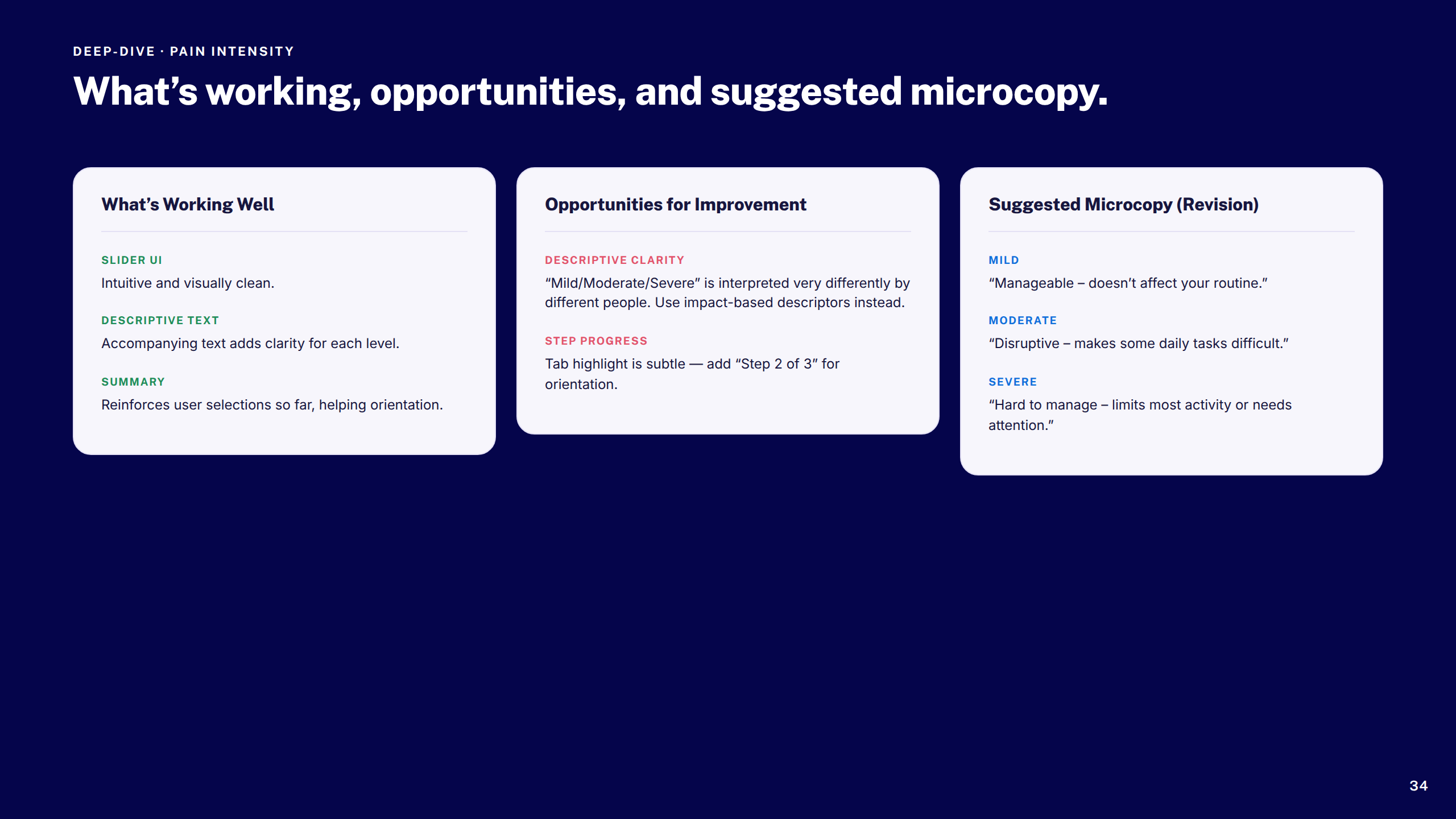
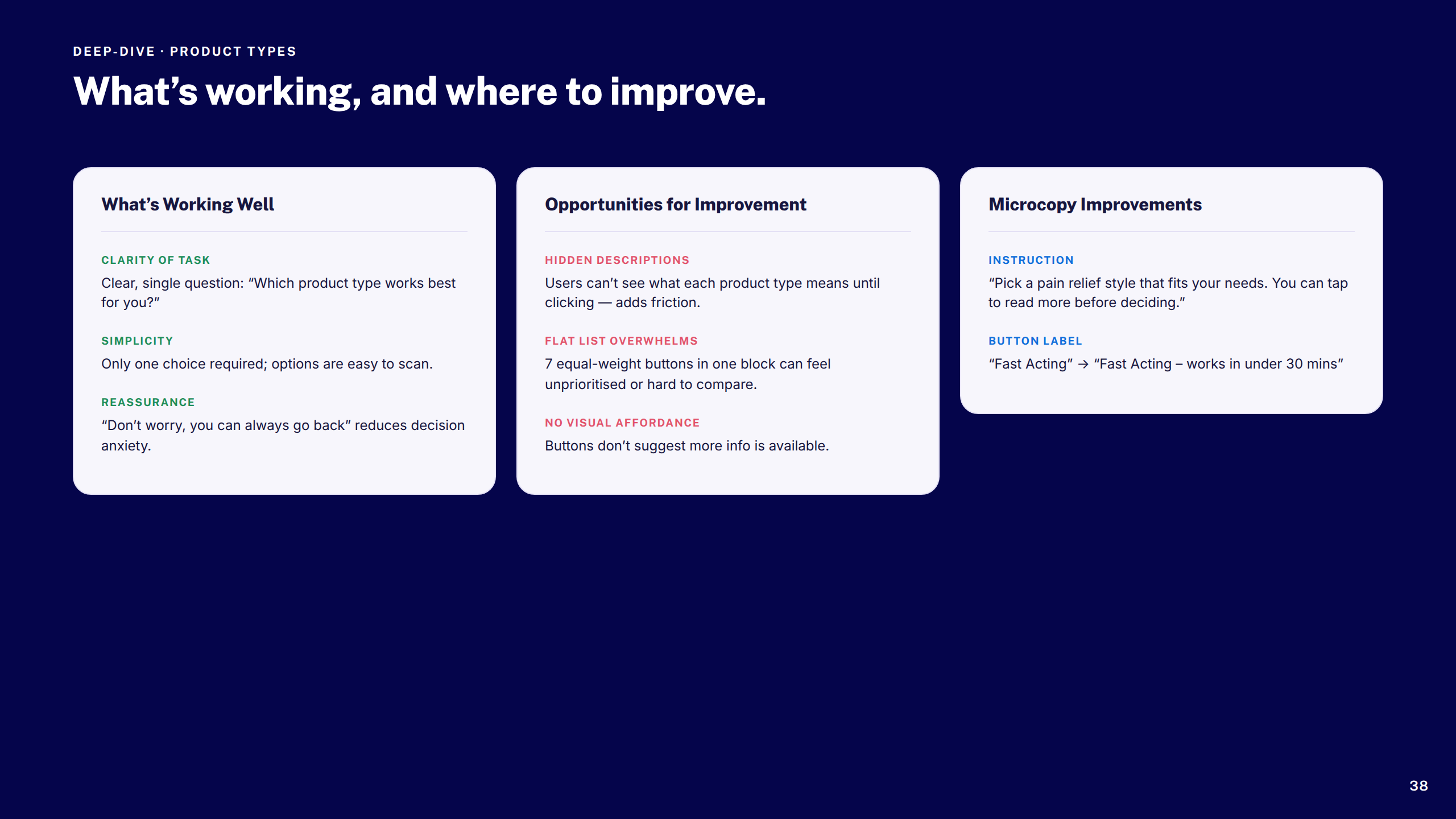
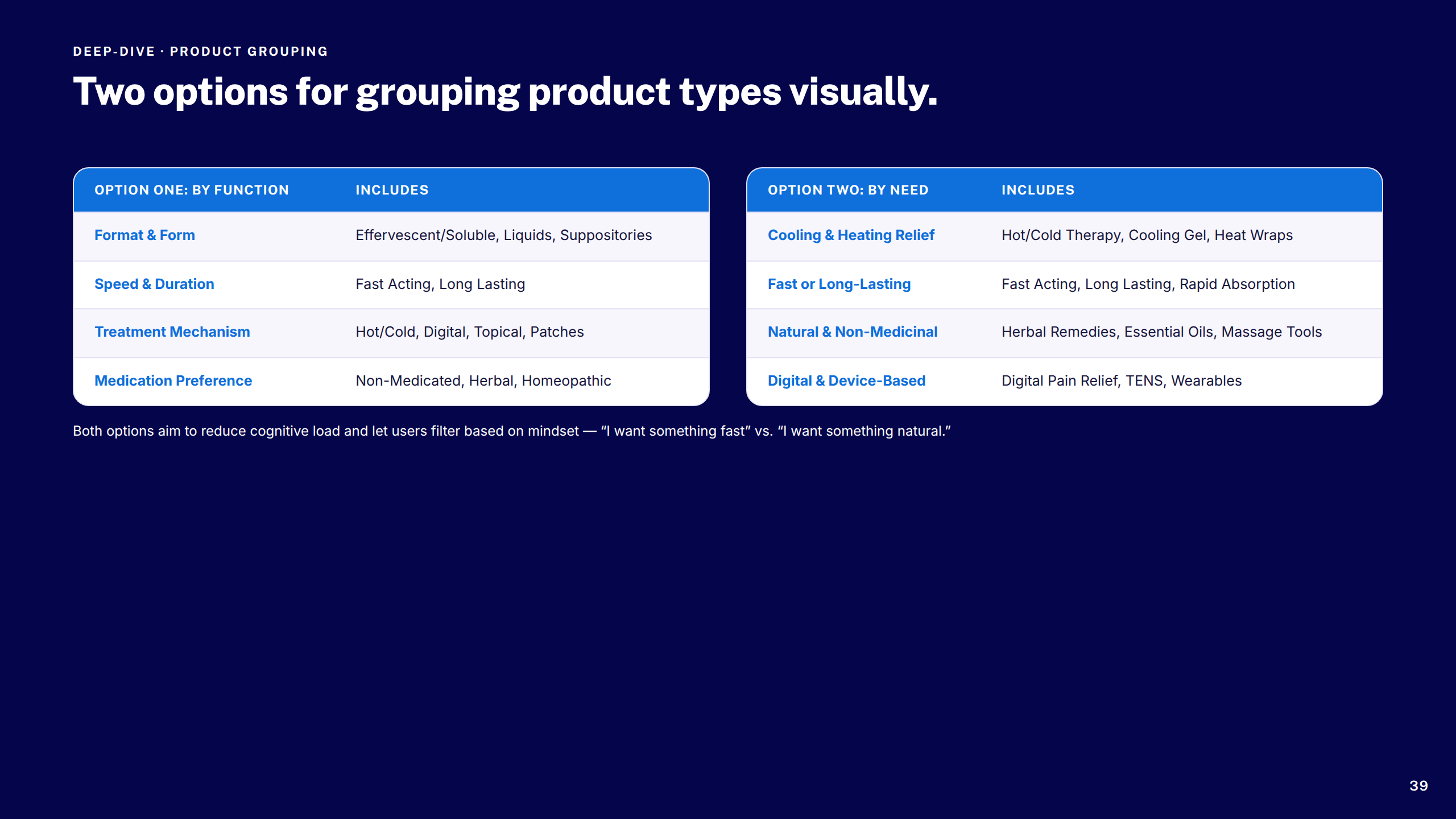
Boots — Pain Selector Tool
1 / 45
Slide 1
Slide 2
Slide 3
Slide 4
Slide 5
Slide 6
Slide 7
Slide 8
Slide 9
Slide 10
Slide 11
Slide 12
Slide 13
Slide 14
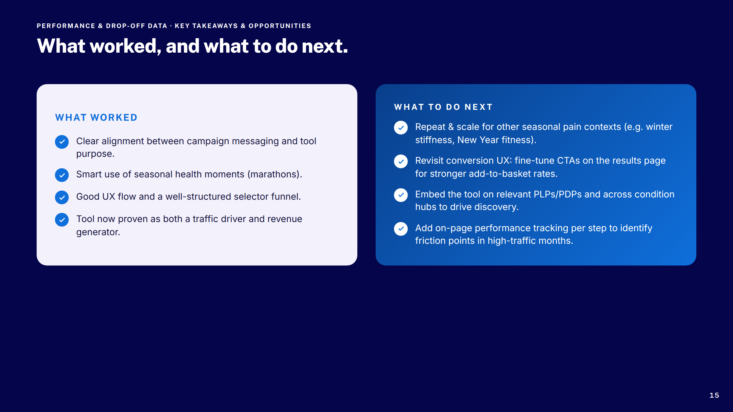
Slide 15
Slide 16
Slide 17
Slide 18
Slide 19
Slide 20
Slide 21
Slide 22
Slide 23
Slide 24
Slide 25
Slide 26
Slide 27
Slide 28
Slide 29
Slide 30
Slide 31
Slide 32
Slide 33
Slide 34
Slide 35
Slide 36
Slide 37
Slide 38
Slide 39
Slide 40
Slide 41
Slide 42
Slide 43
Slide 44
Slide 45
Boots — Global Header Upgrade
1 / 25
Cover
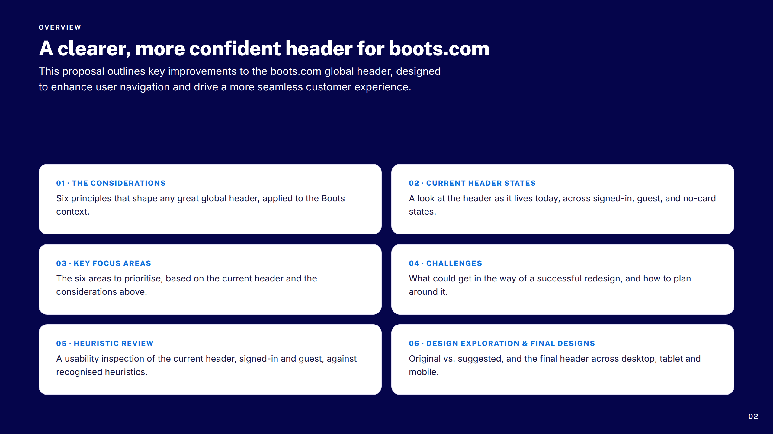
Overview
Section: Considerations
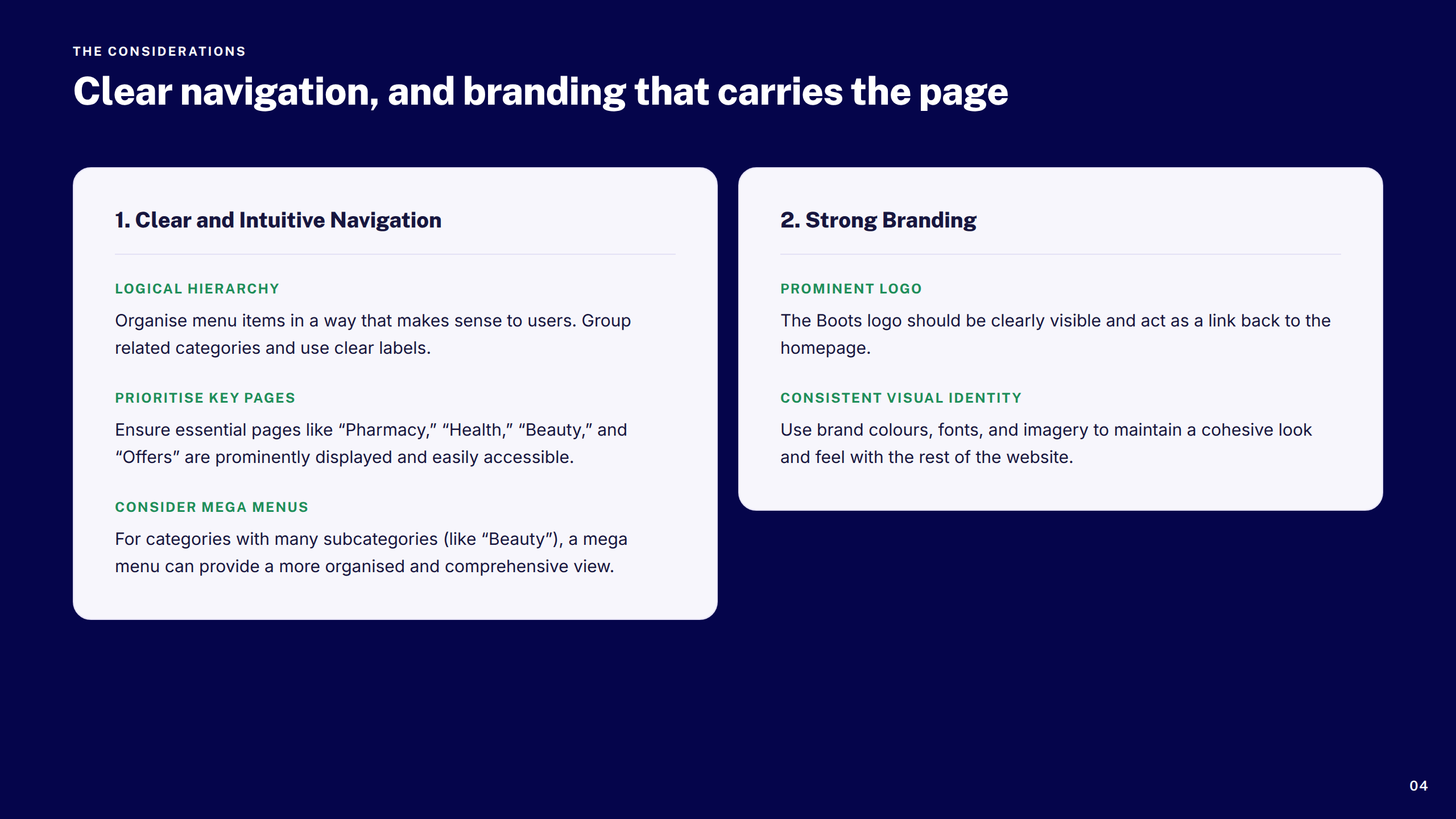
Considerations 1–2
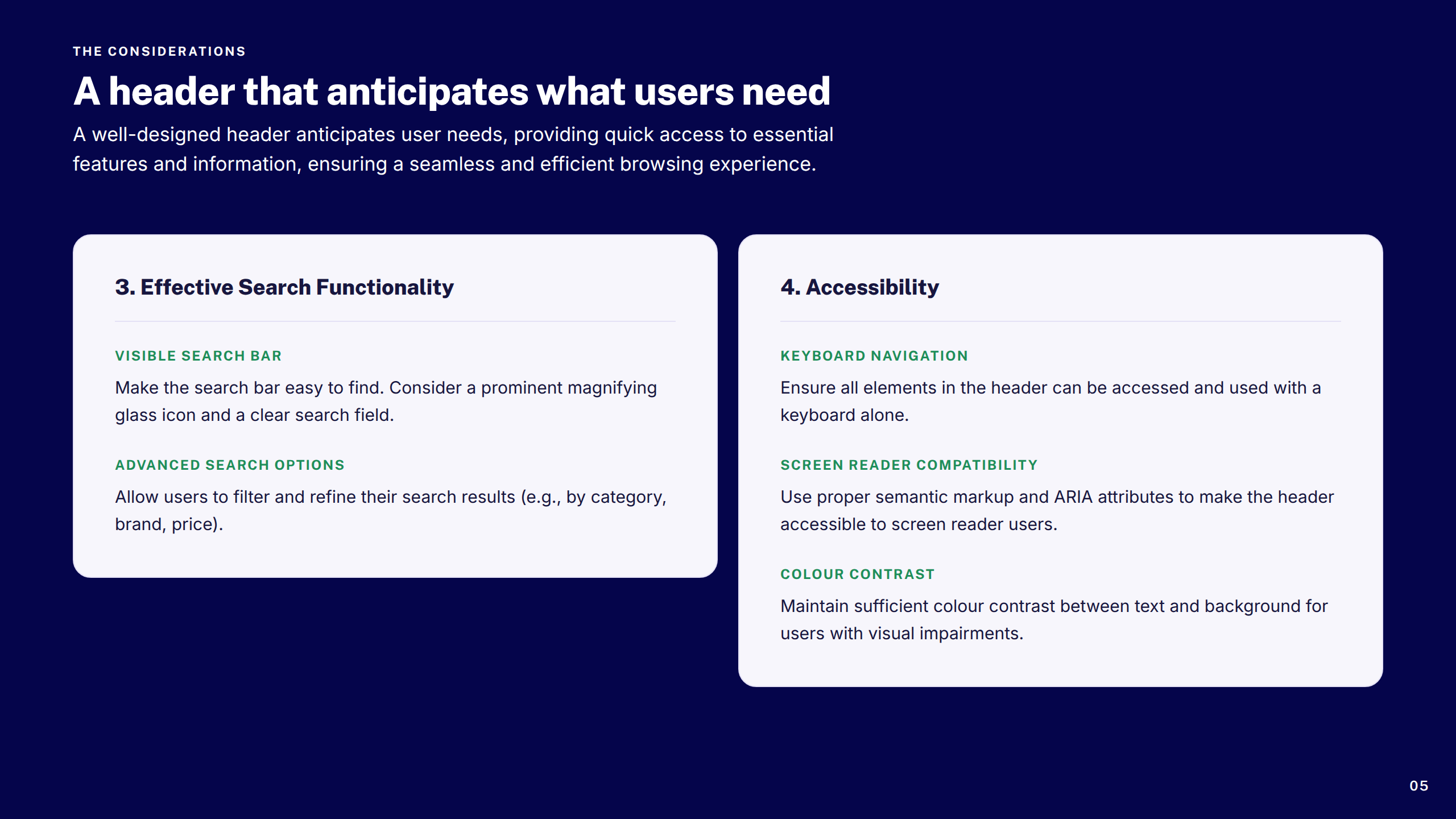
Considerations 3–4
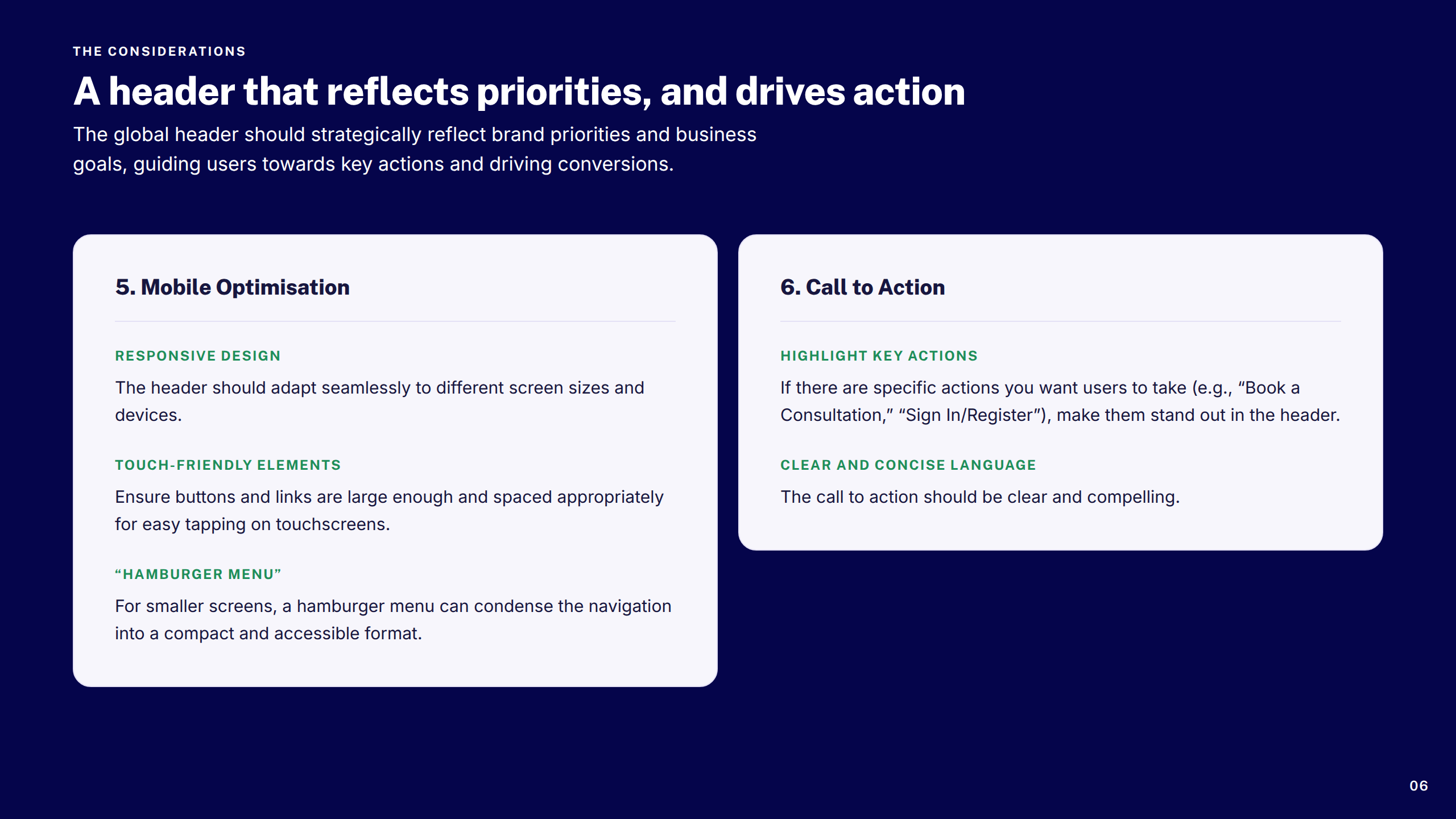
Considerations 5–6
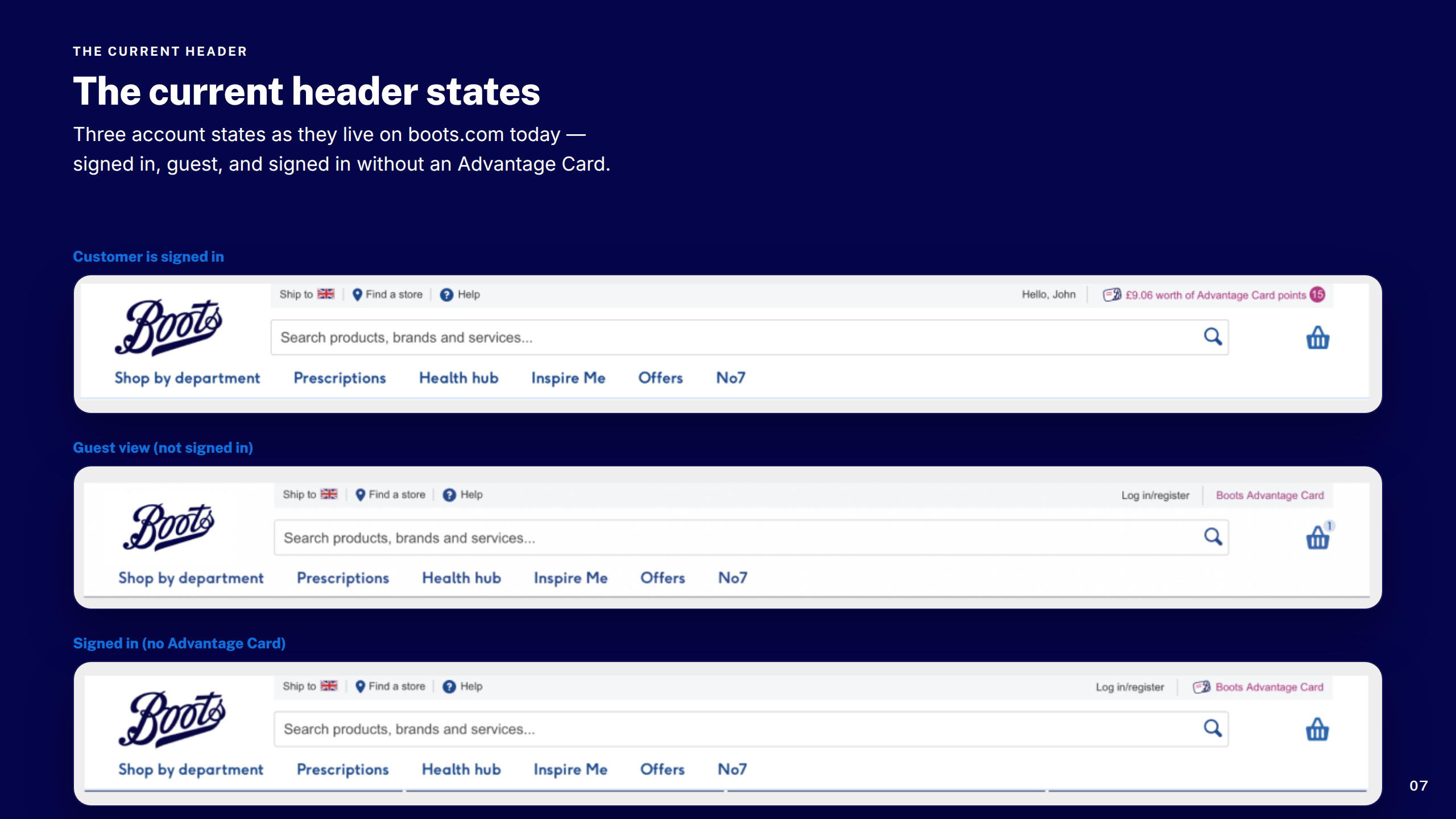
Current Header States
Section: Key Focus Areas
Key Focus Areas Grid
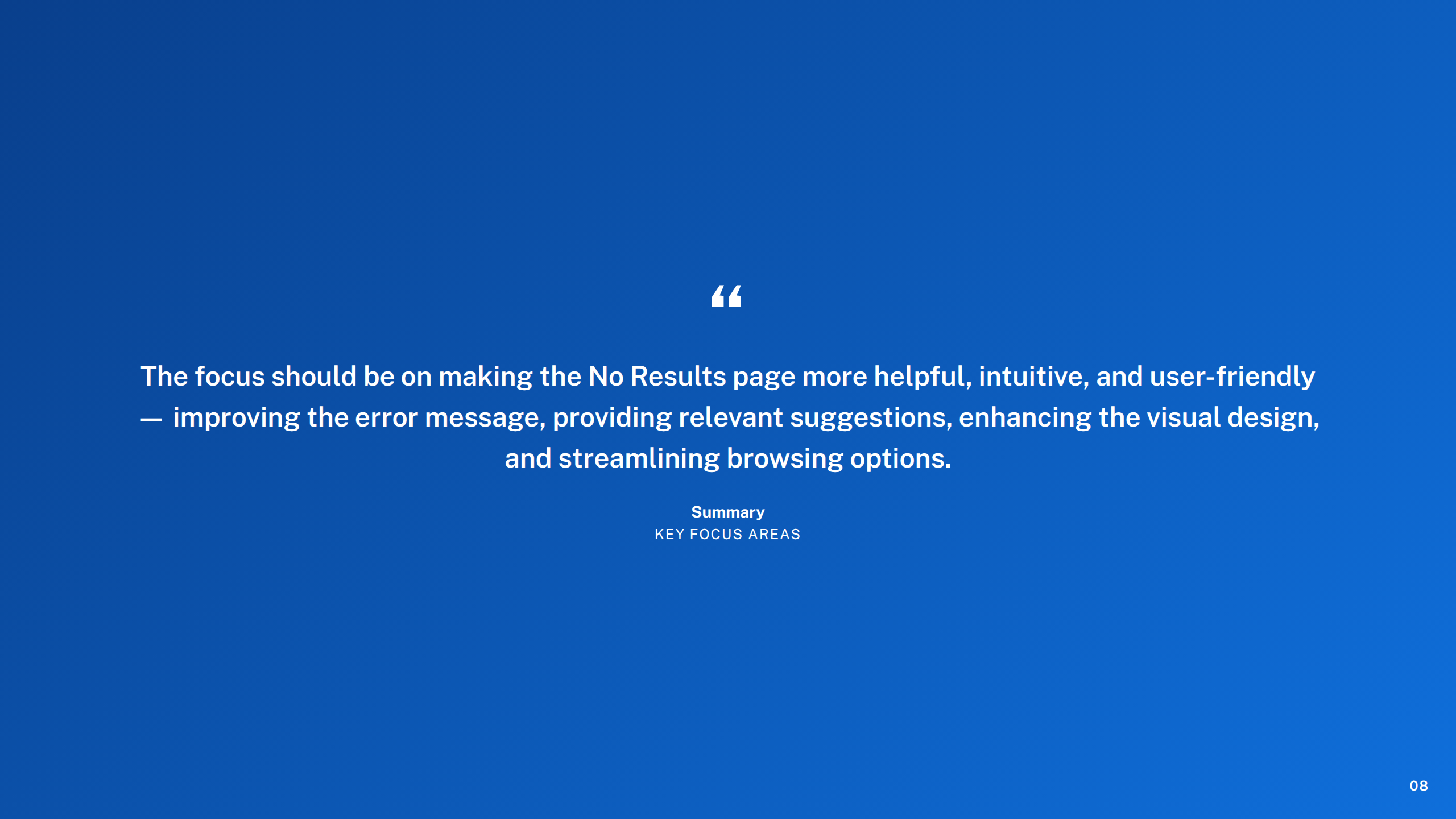
Key Focus Areas Summary
Section: Challenges
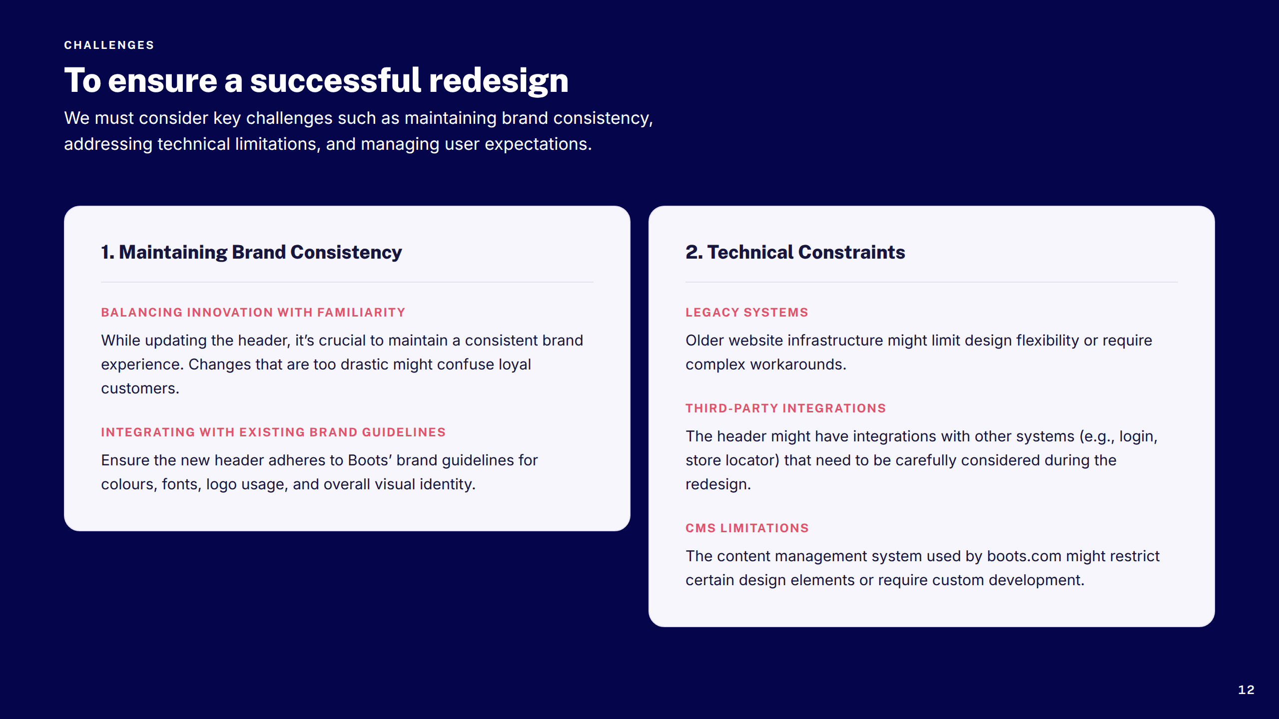
Challenges 1–2
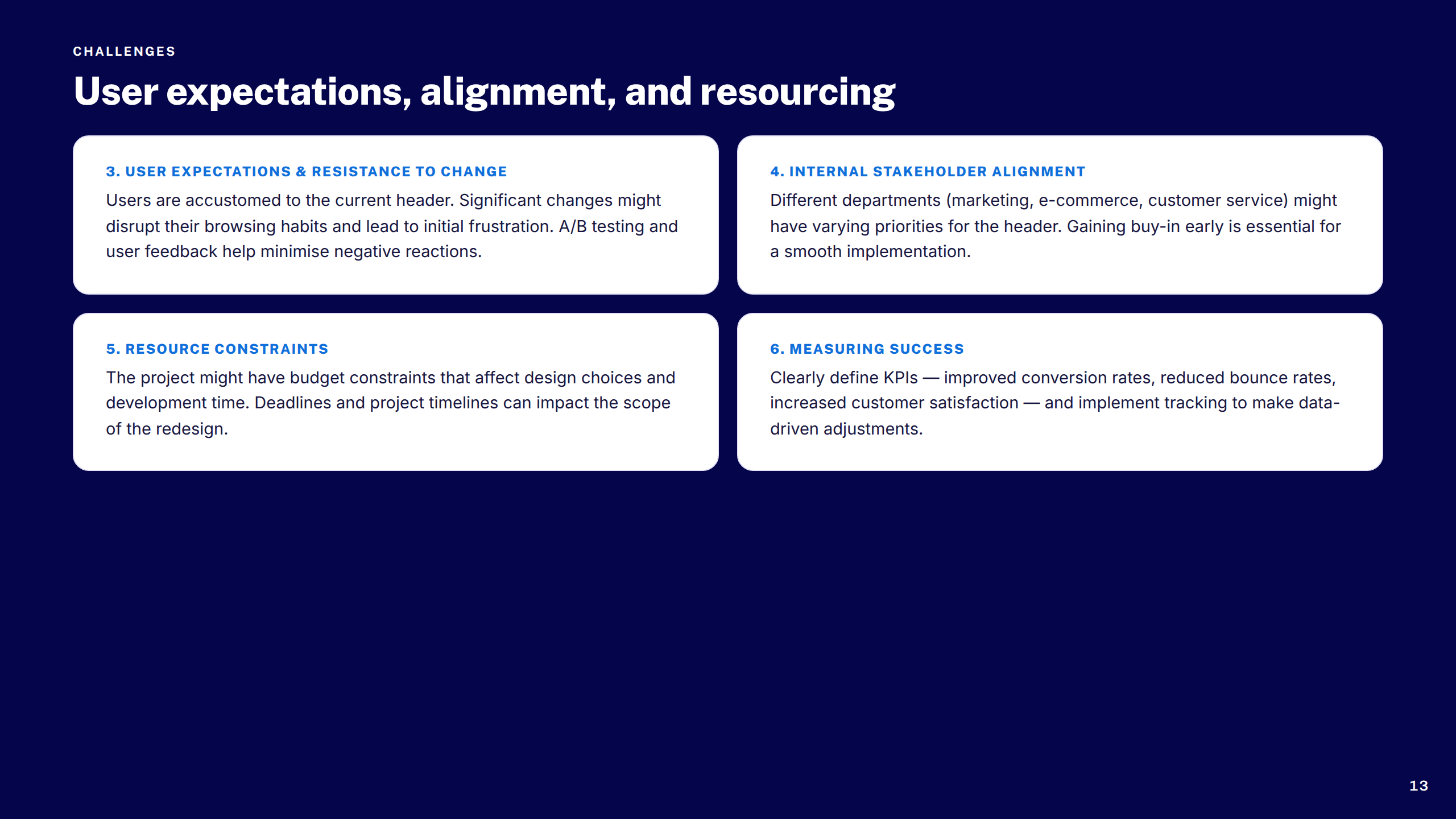
Challenges 3–6
Section: Heuristic Review
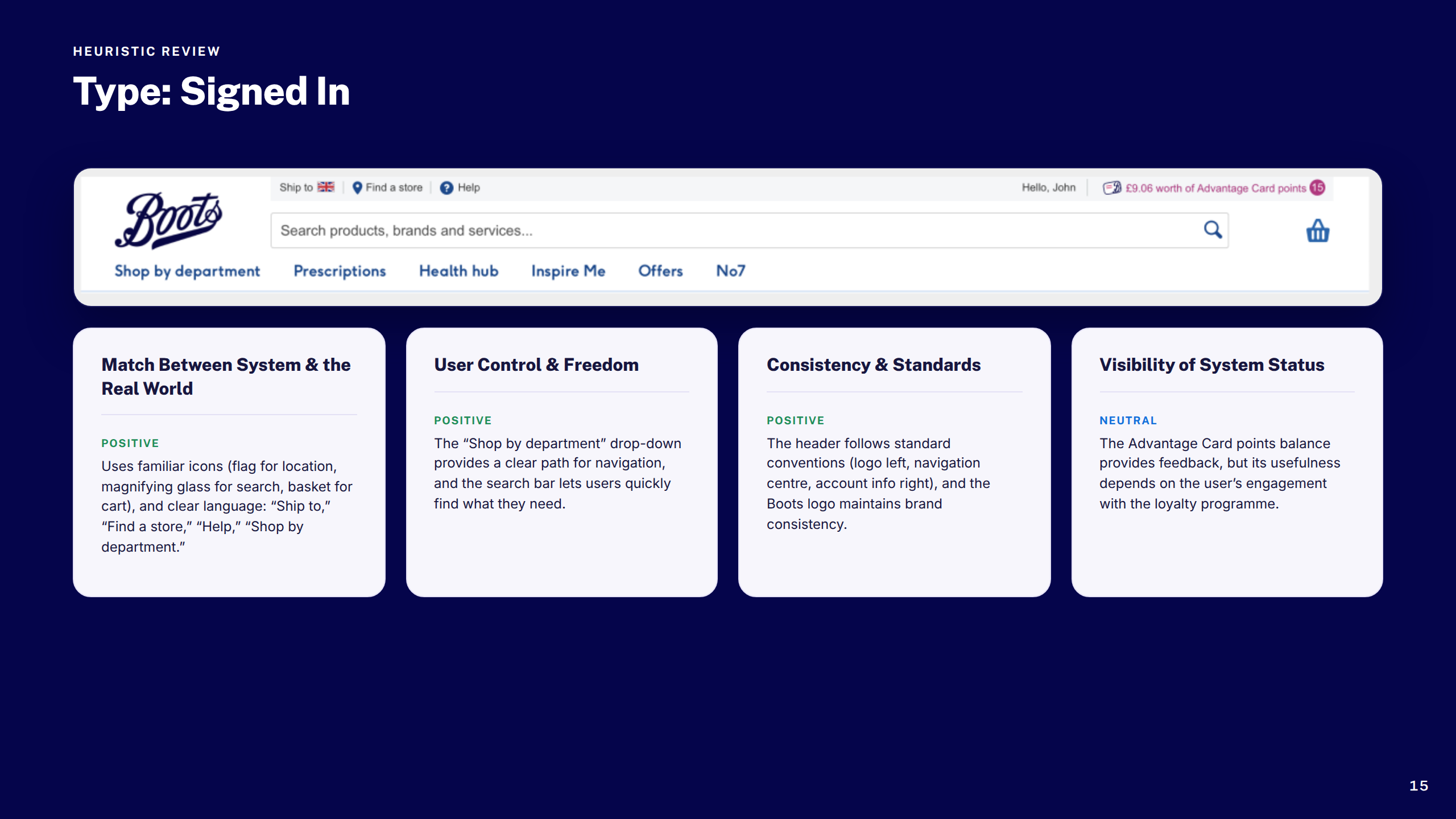
Heuristic Review: Signed In
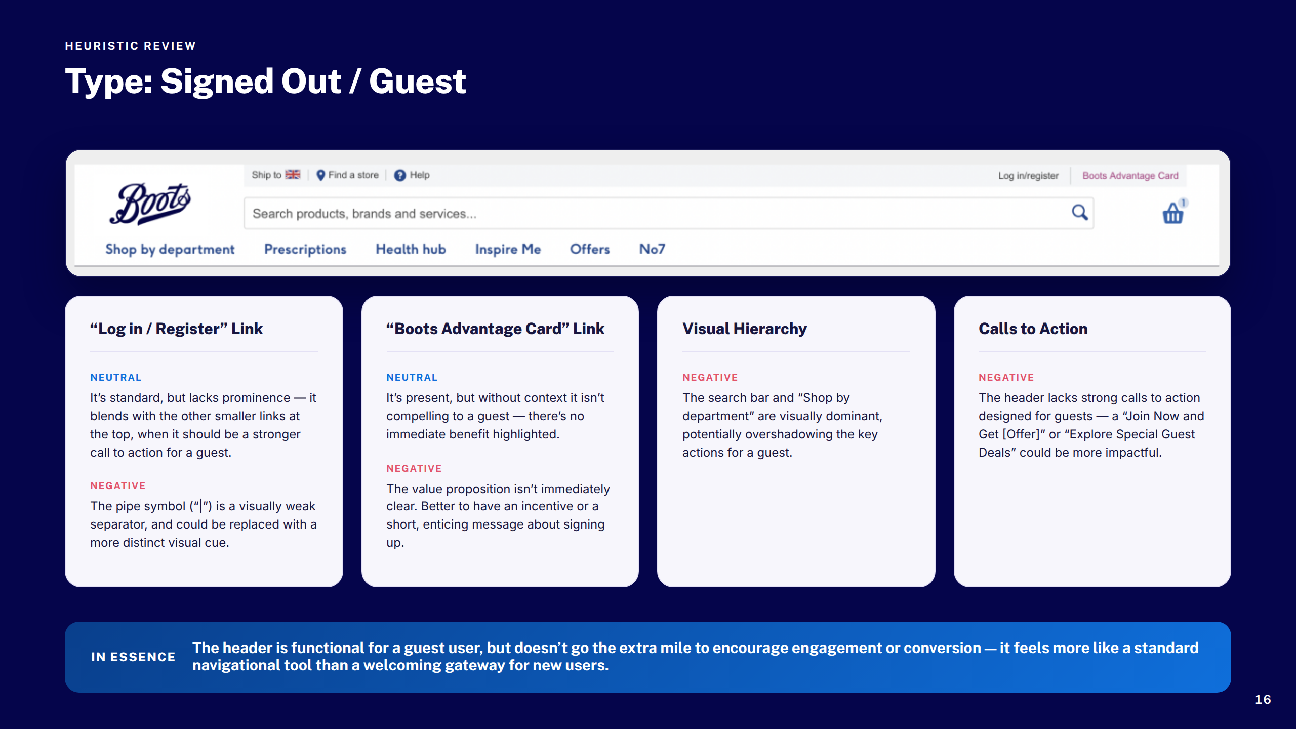
Heuristic Review: Guest
Section: Design Exploration
Original vs. Suggested
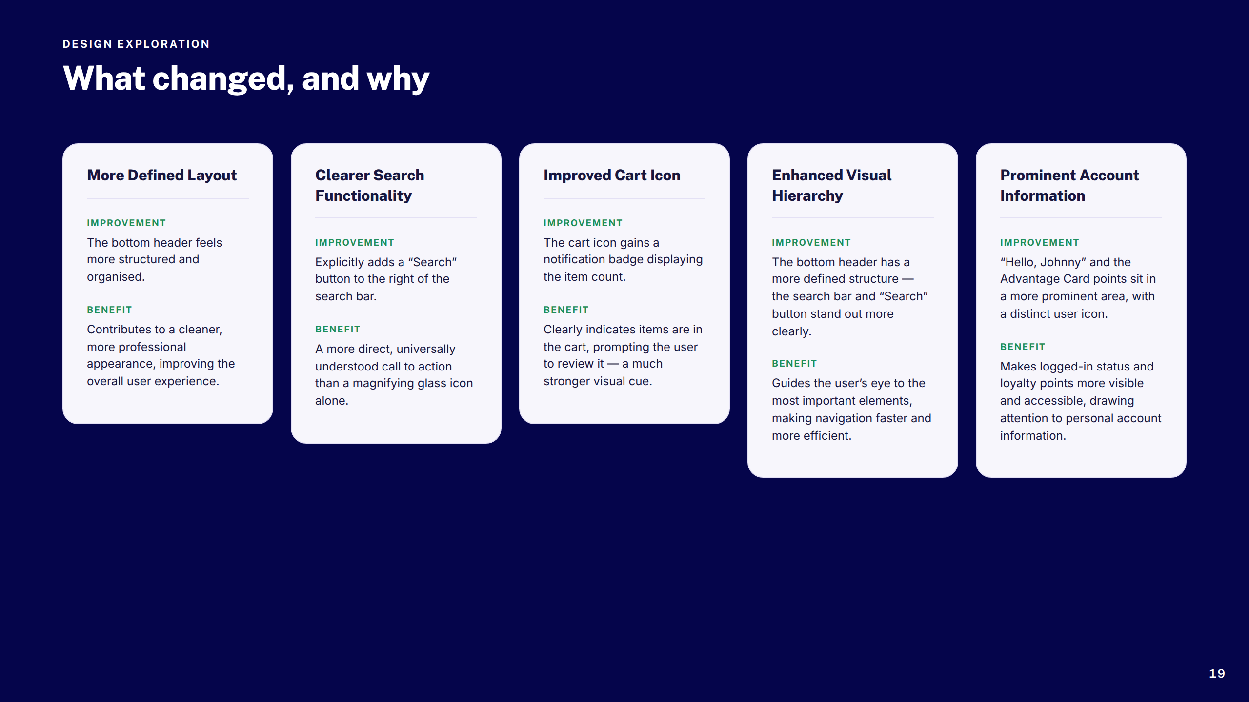
Why the Update Works
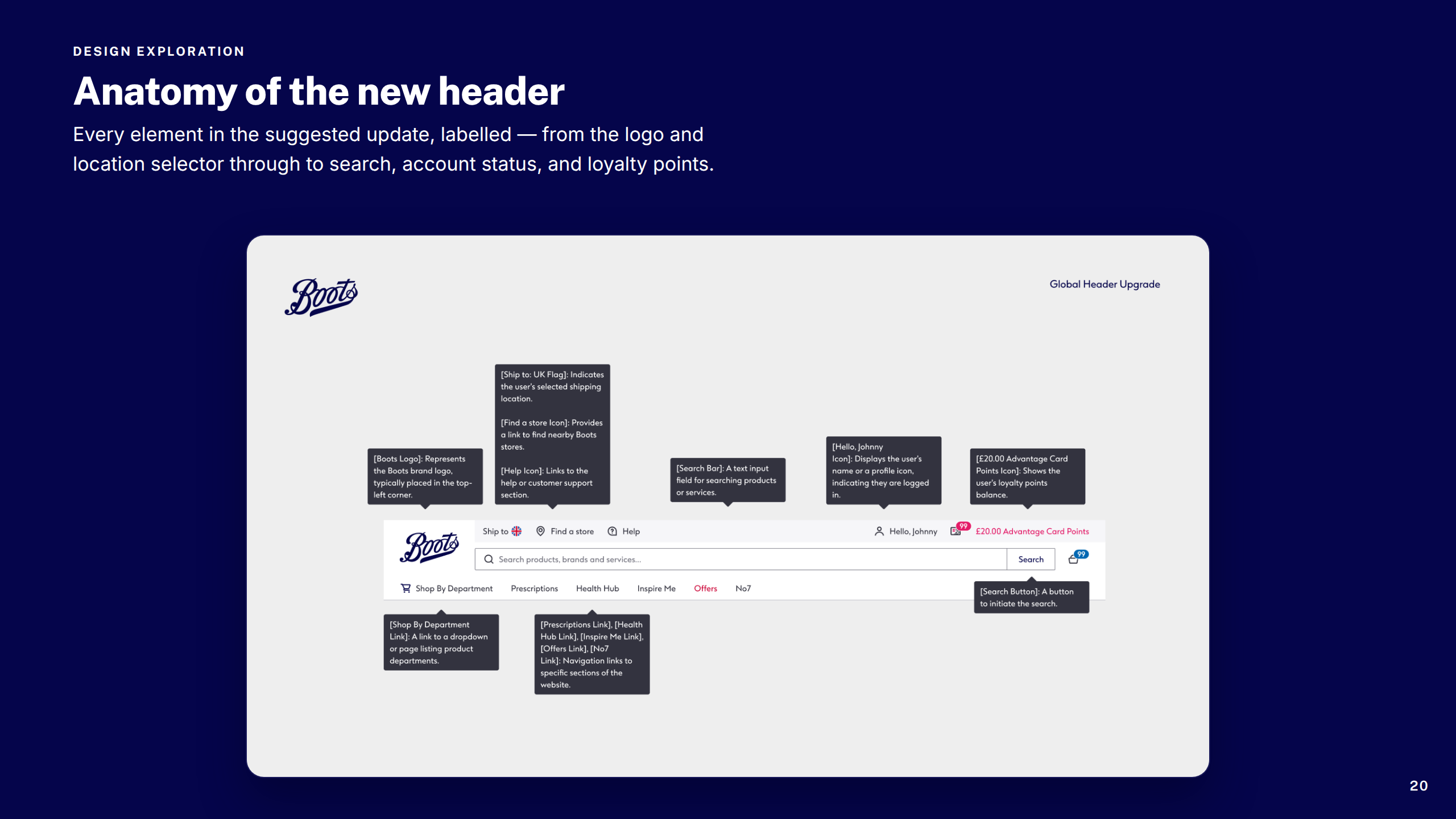
Anatomy of Header
Section: Final Designs
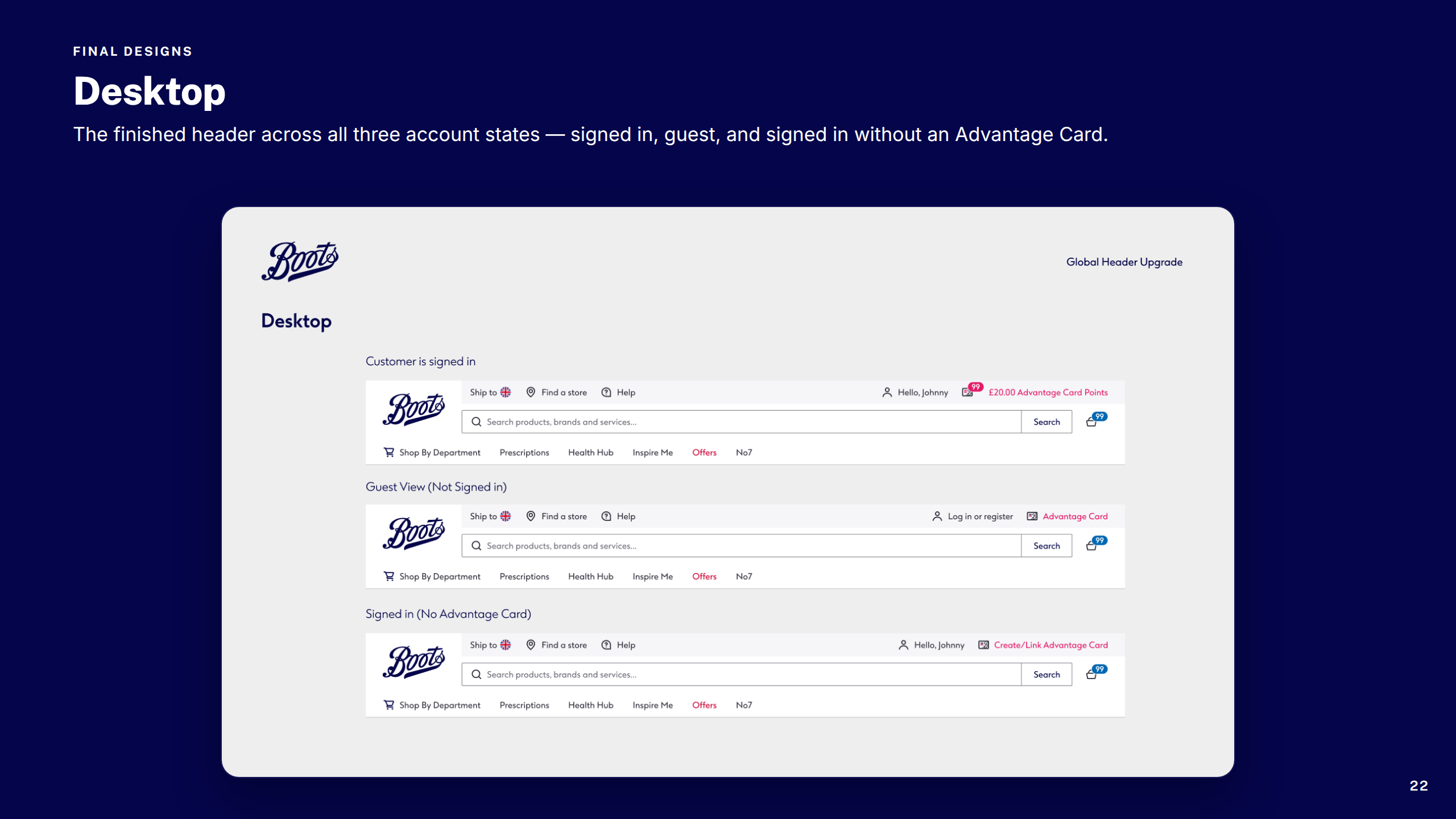
Final Designs: Desktop
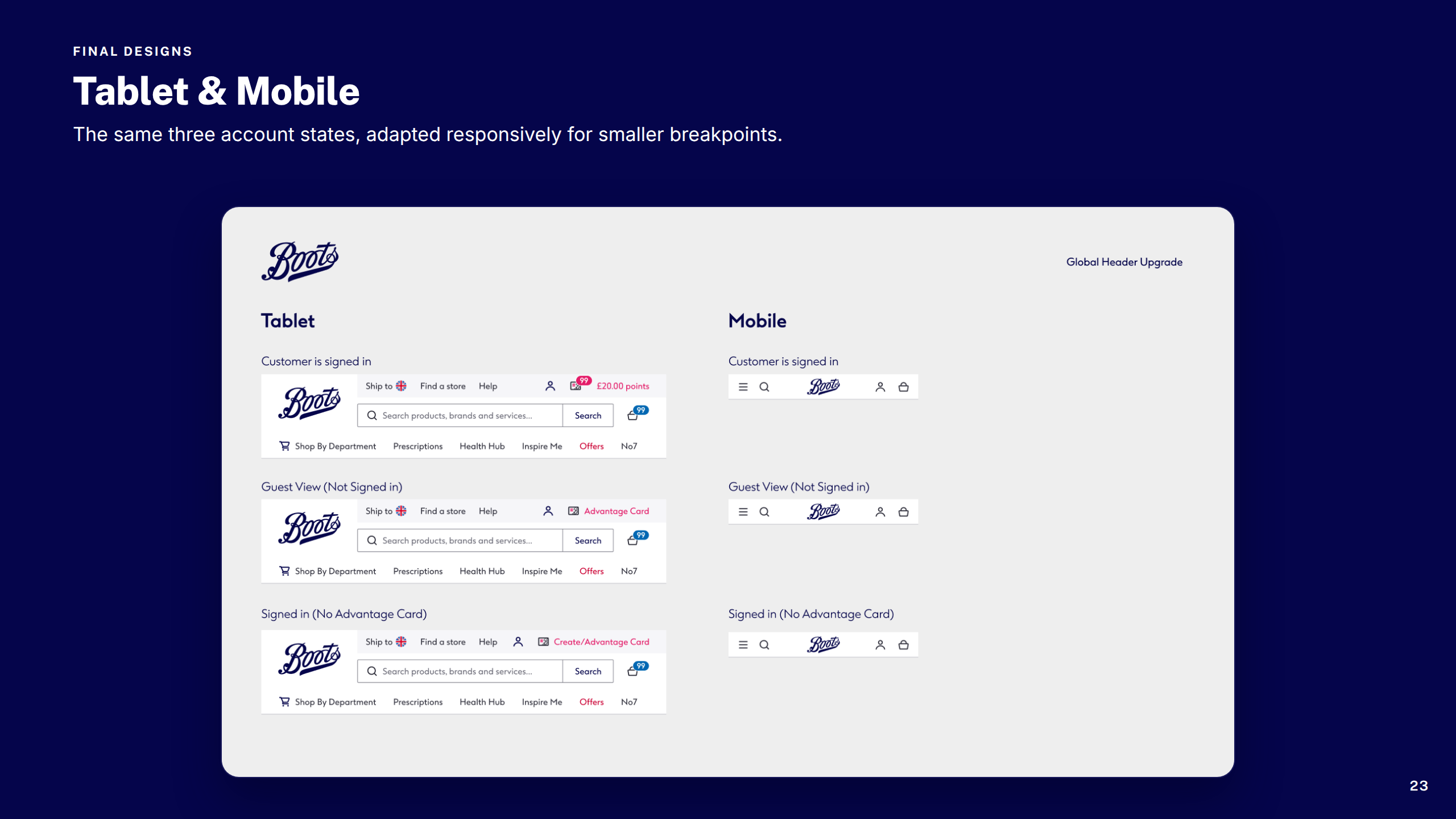
Final Designs: Tablet & Mobile
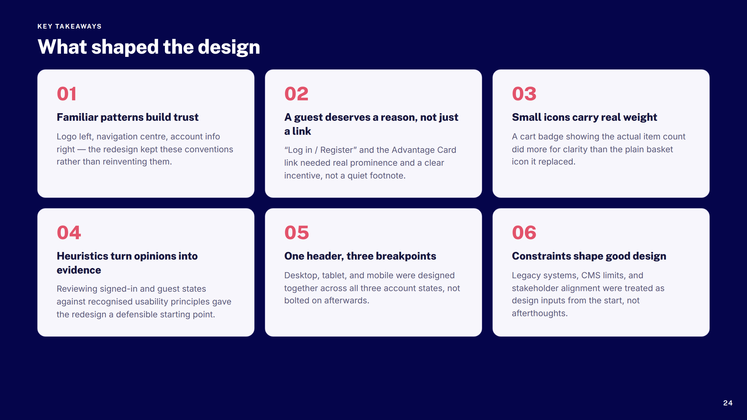
Key Takeaways
Thank You
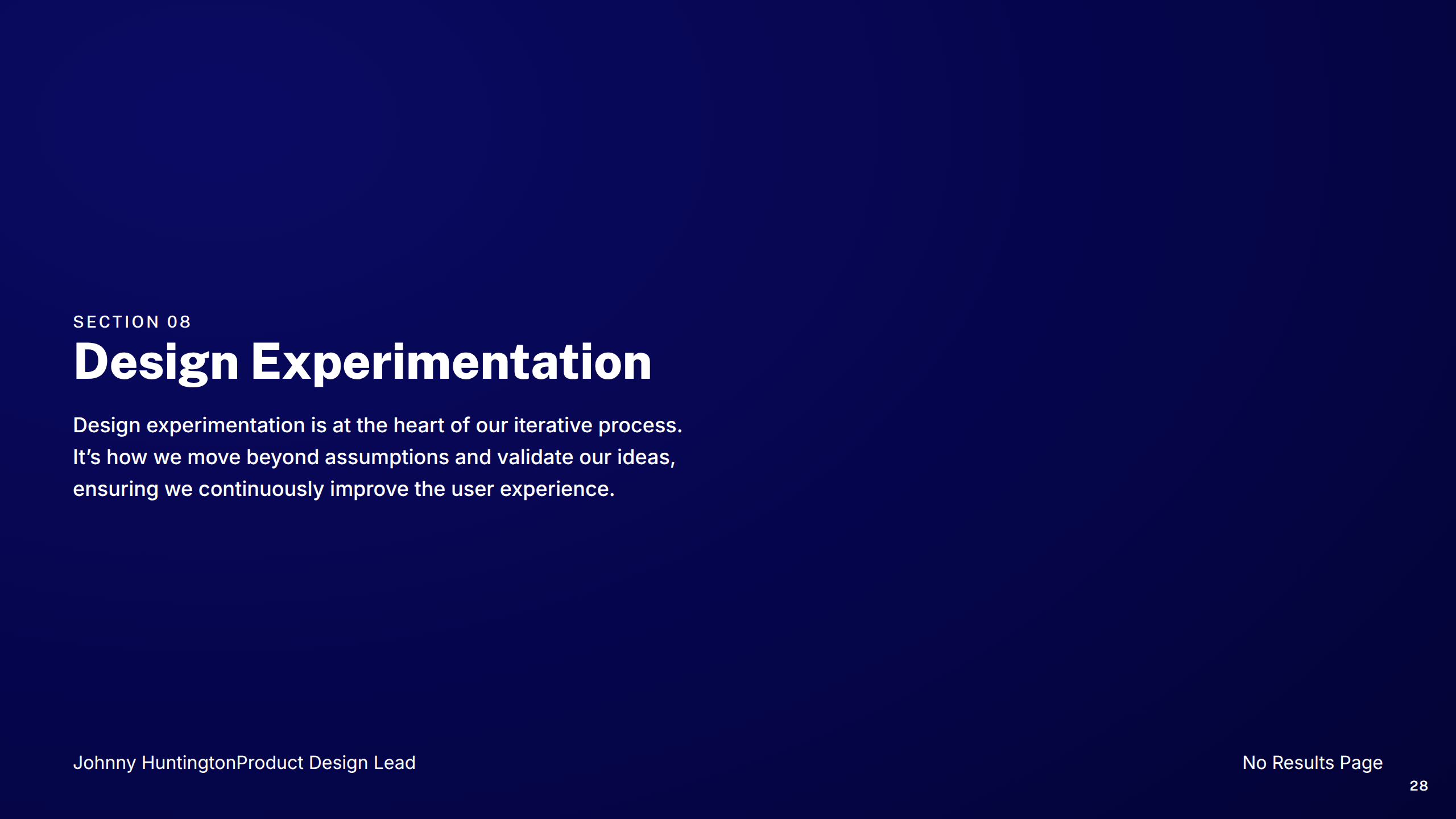
Boots — No Results Page
1 / 36
Cover
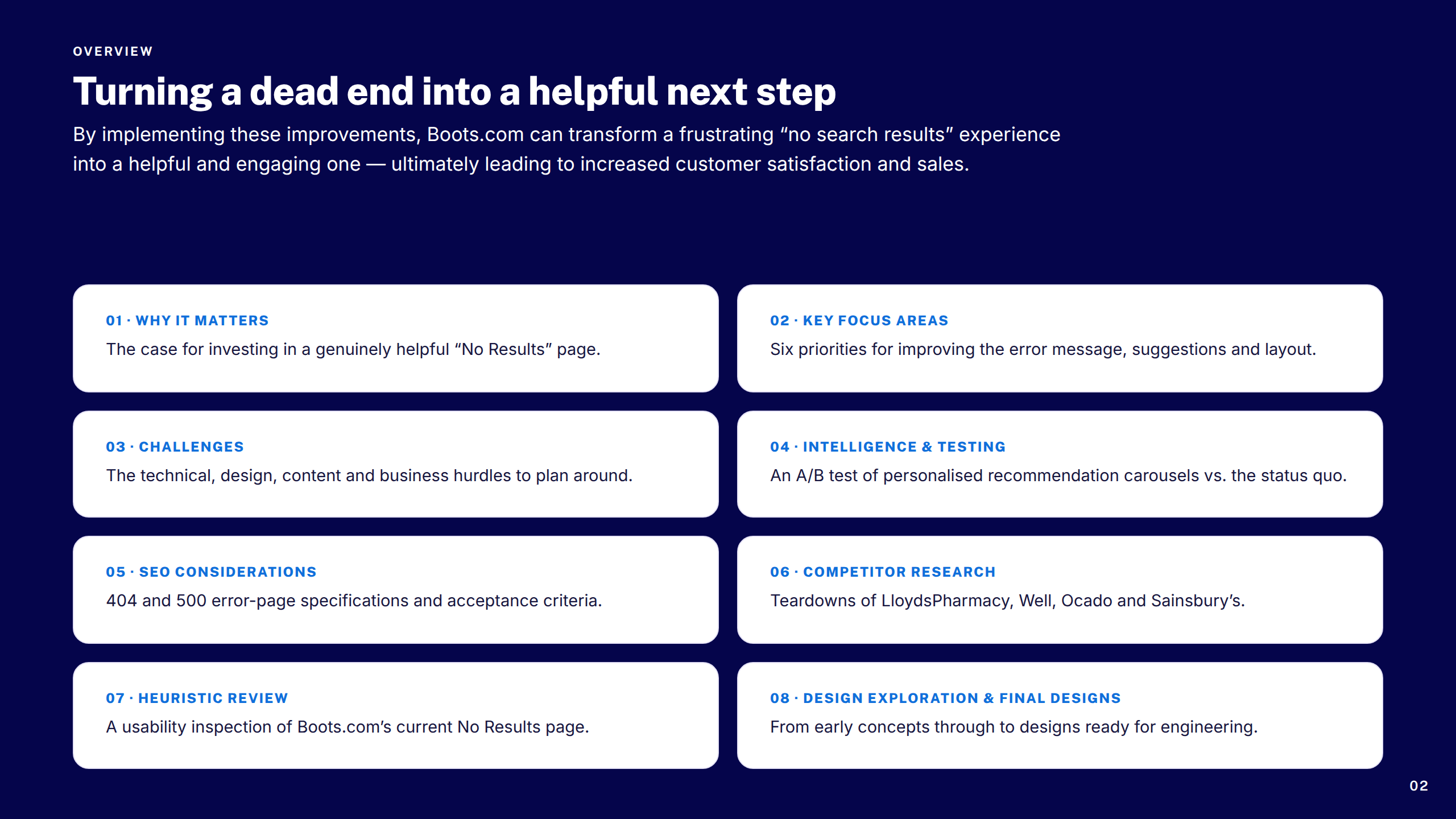
Overview
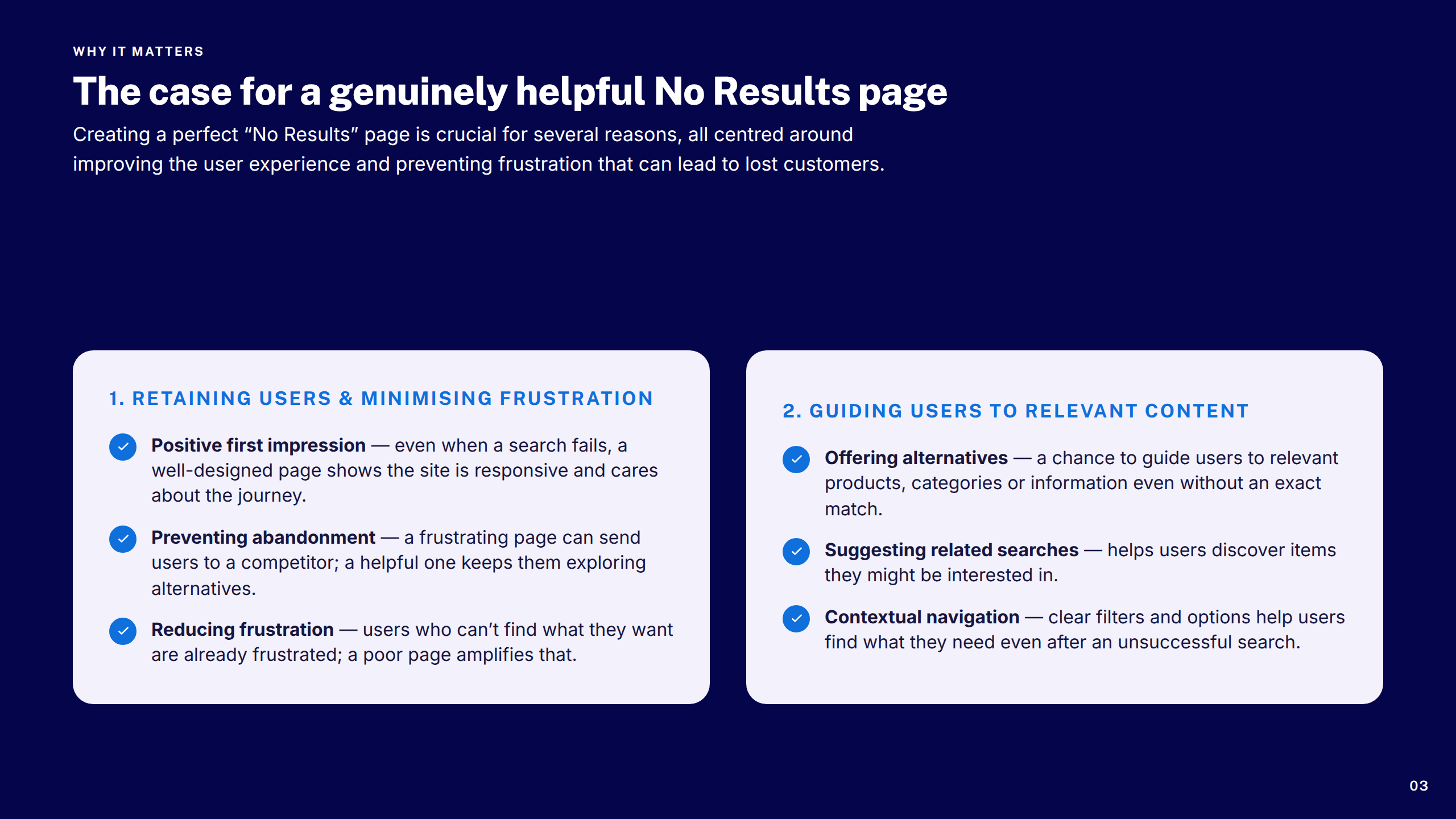
Why It Matters 1–2
Why It Matters 3–5
Current Page
Section: Key Focus Areas
Key Focus Areas Grid
Key Focus Areas Summary
Section: Challenges
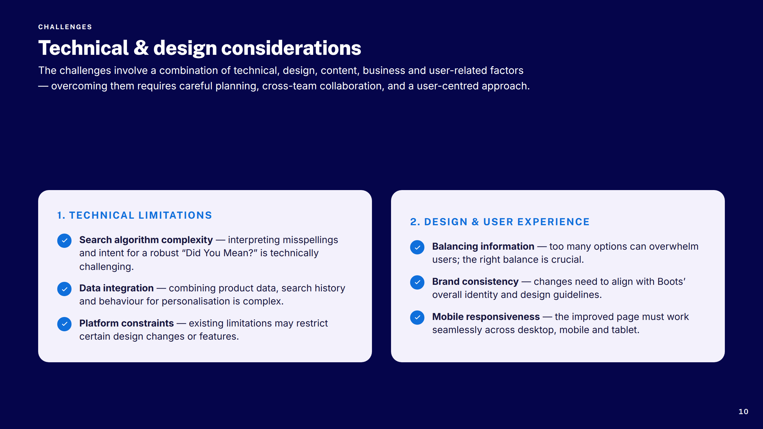
Challenges 1–2
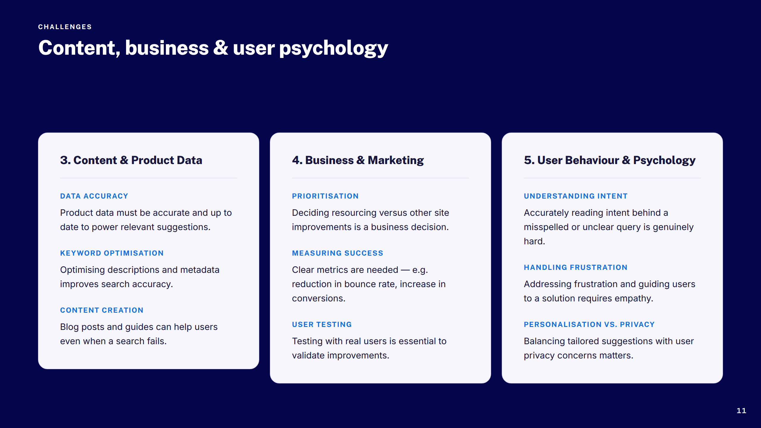
Challenges 3–5
Section: Intelligence
Hypothesis & Insights
Test Results Summary
Recommendation Strategies
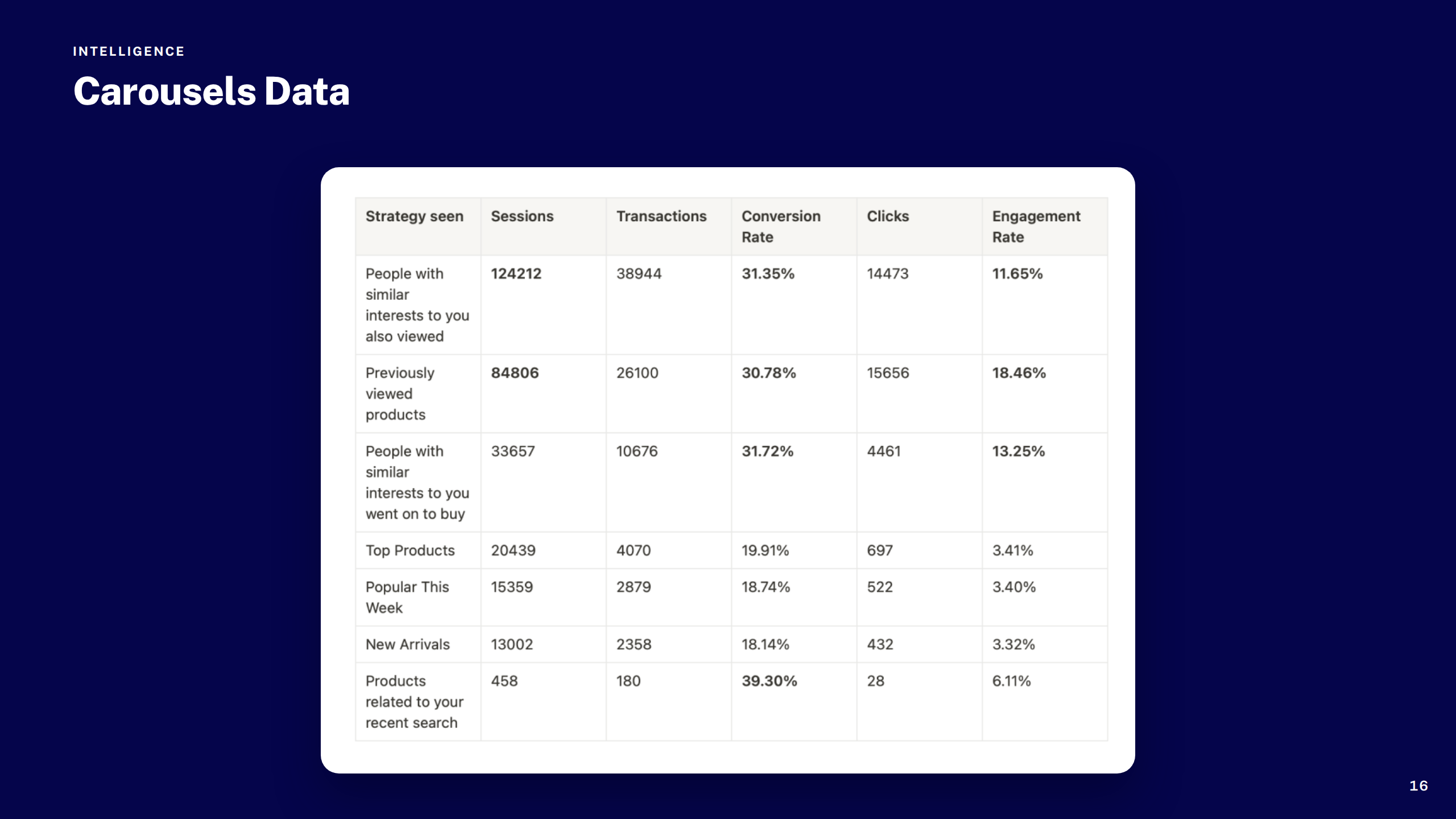
Carousels Data
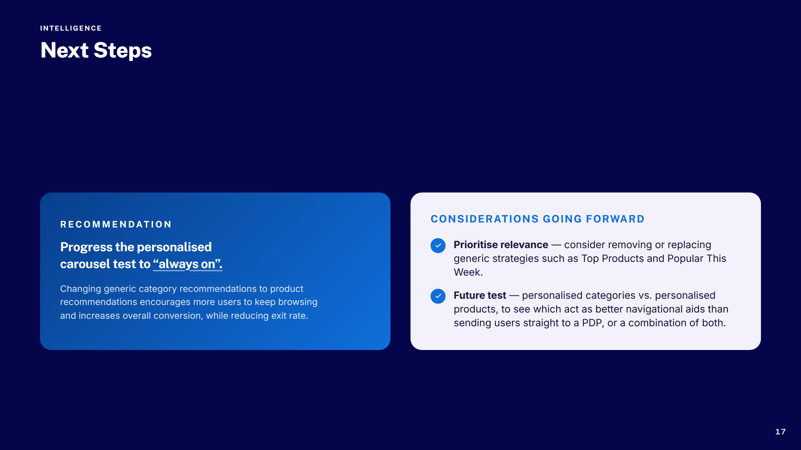
Next Steps
Section: SEO Considerations
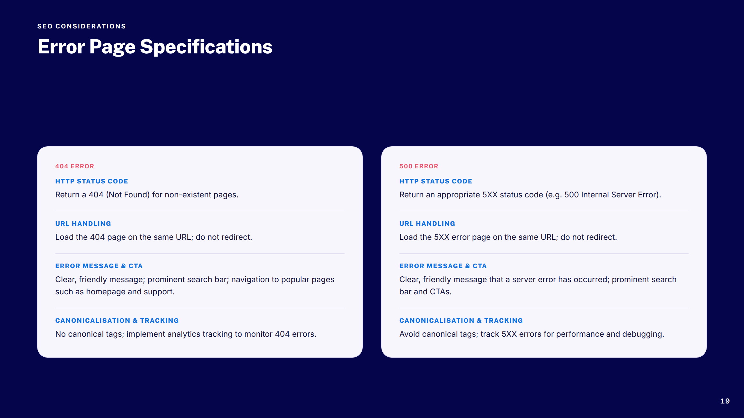
Error Page Specs
Section: Competitor Research
Competitors: Lloyds & Well
Competitors: Ocado & Sainsbury's
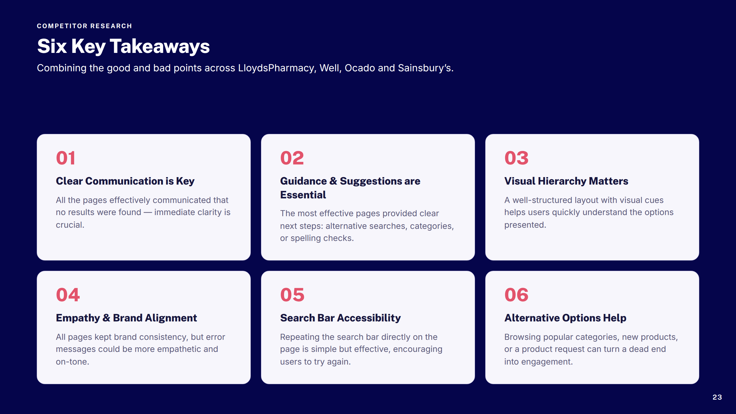
Competitor Takeaways
Section: Heuristic Review
Heuristic Review 1–2
Heuristic Review 3 & Recommendations
Heuristic Review Takeaways
Section: Design Experimentation
Concepts 1–2
Concept 3
Section: Final Designs
Final Designs: Signed In
Final Designs: Signed Out
Ready to Ship
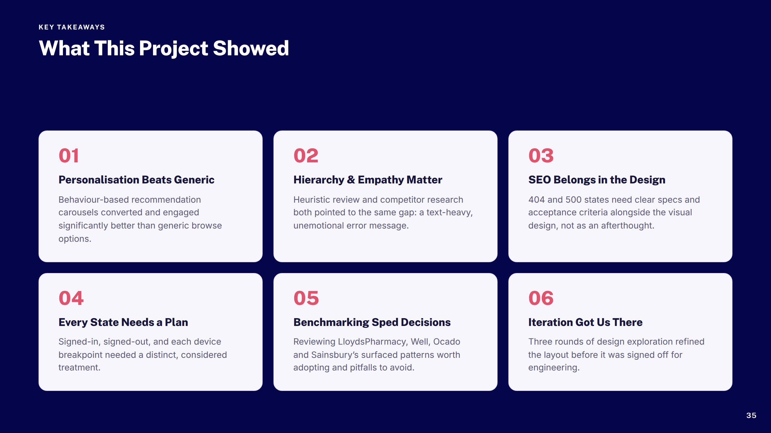
Key Takeaways
Thank You
Boots — OOBO Checkout CSC Parity
1 / 21
Cover
Overview
Scope: Five Features
Section: Payment Options
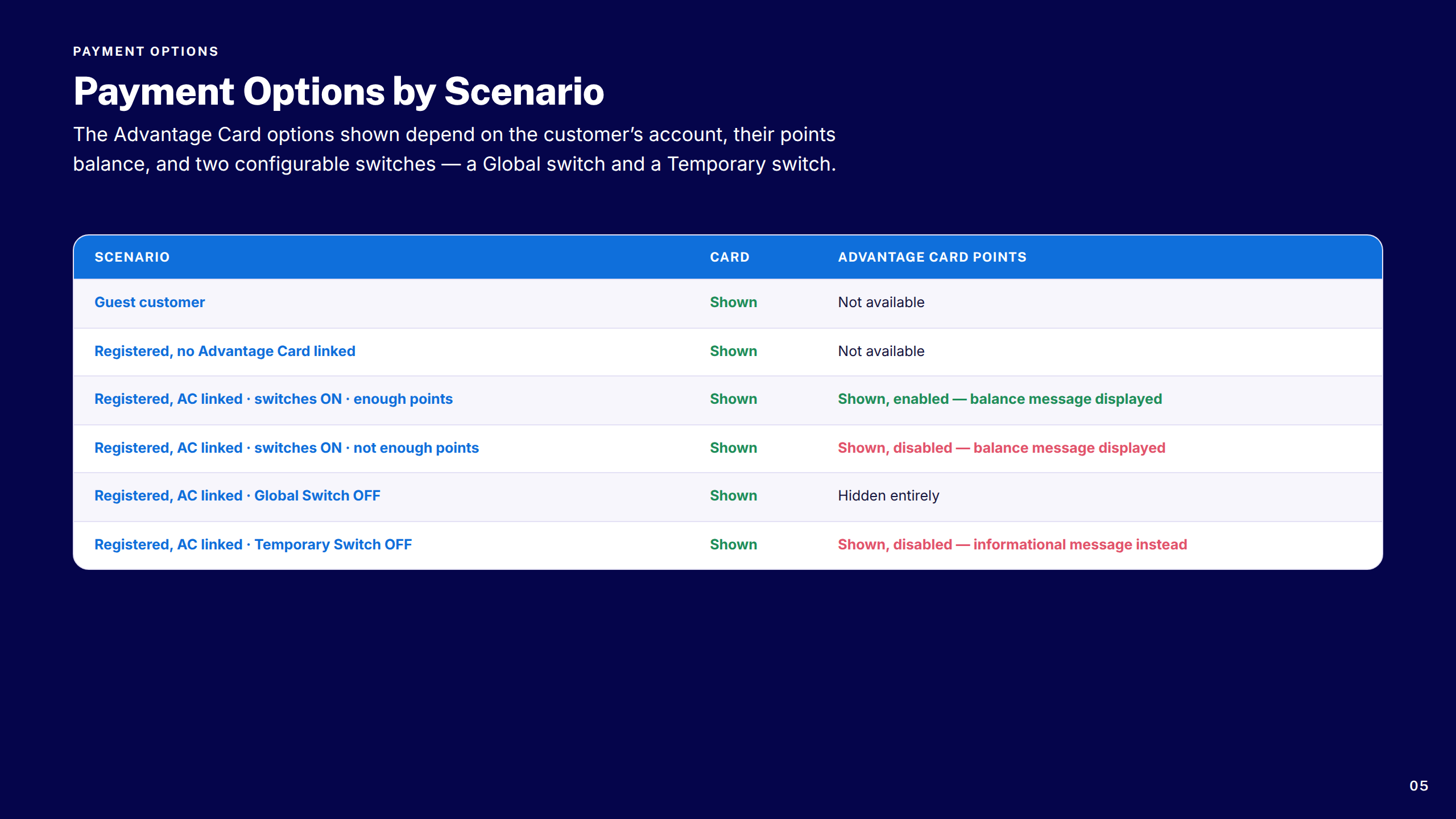
Payment Options by Scenario
Screens: Default & Guest
Screens: Points Available & Insufficient
Section: Pay by Card
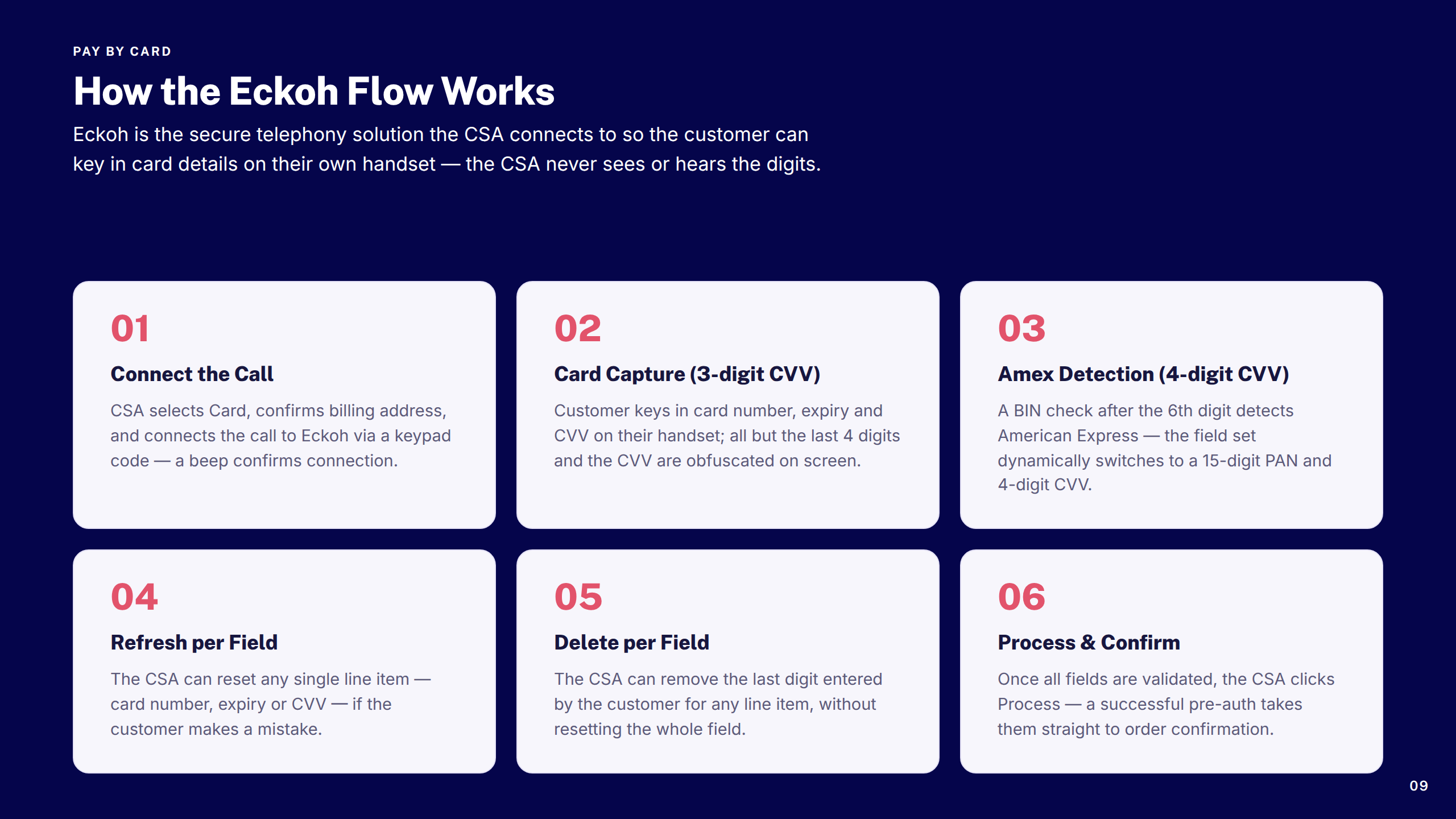
How Eckoh Flow Works
Screen: Card Capture
Section: Payment Threshold
Threshold: Within vs. Outside
Screen: Threshold Notification
Section: Error Scenarios
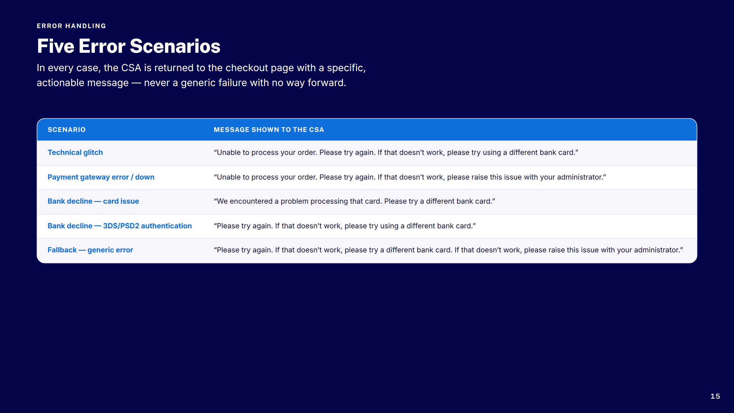
Error Scenarios Table
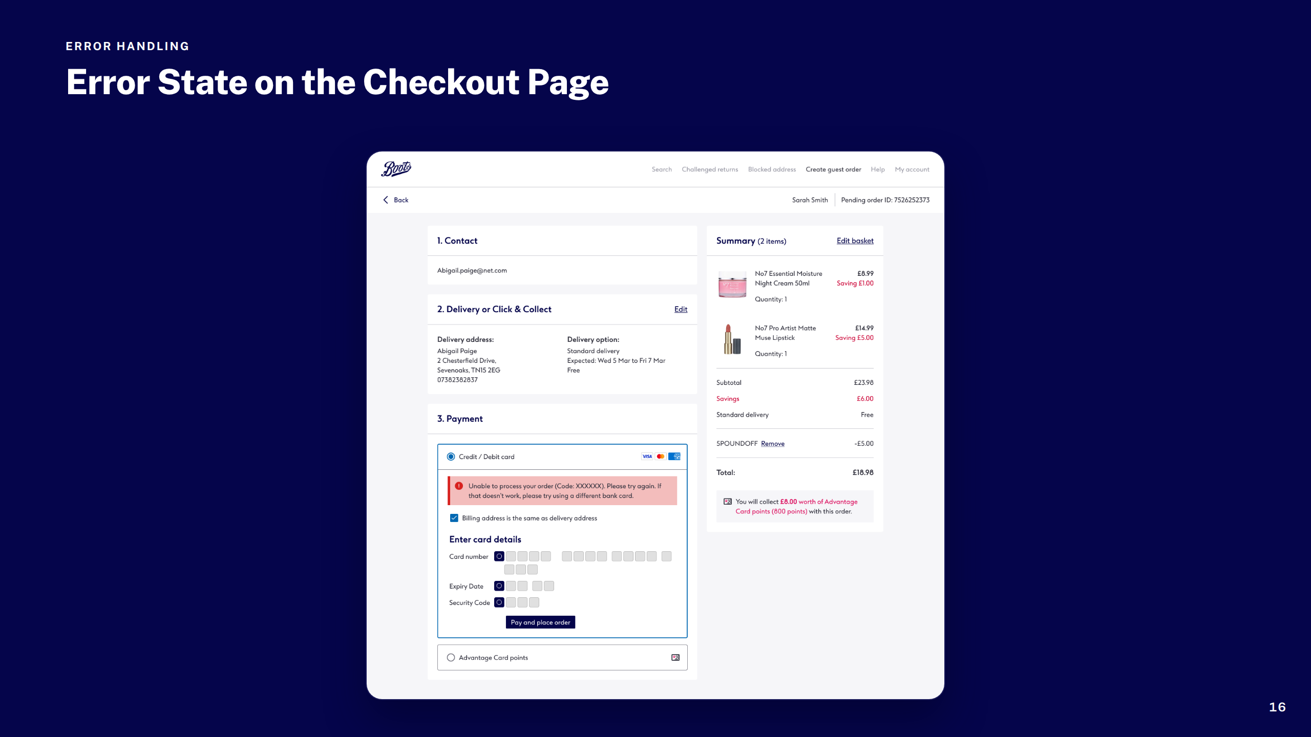
Screen: Error State
Section: Billing Address
Billing Address Scenarios
Screen: Billing Address
Key Takeaways
Thank You
Boots — Transactional Comms Emails
1 / 22
Cover
Overview
Scope: Email Scenarios
Design System Foundations
Section: Order Confirmation
Order Confirmation: Before & After
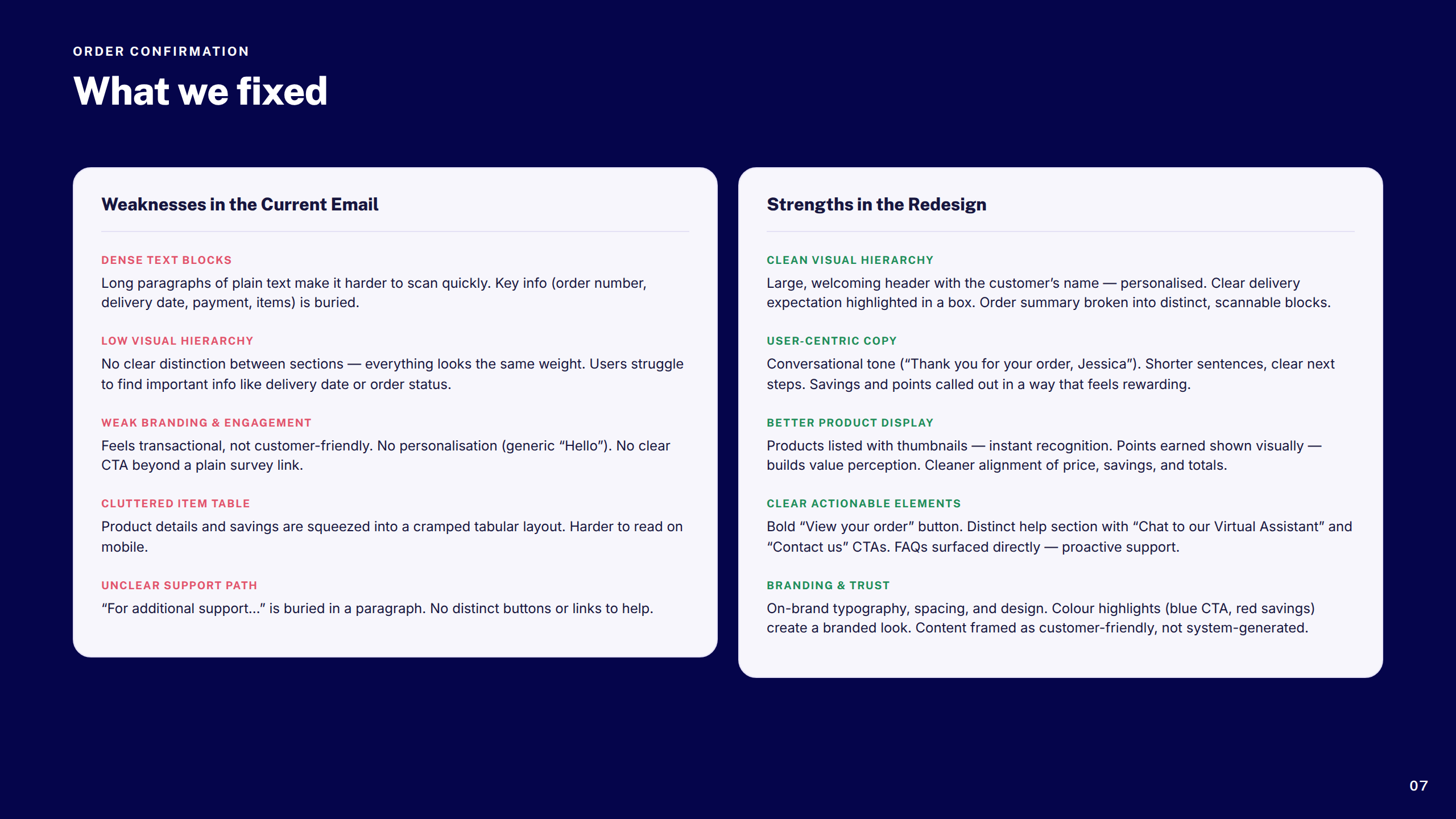
Order Confirmation: What We Fixed
Section: Account Creation
Account Creation: Before & After
Account Creation: What We Fixed
Section: Order Dispatch
Dispatch: Before & After
Dispatch: What We Fixed
Section: Ready to Collect
Collect: Before & After
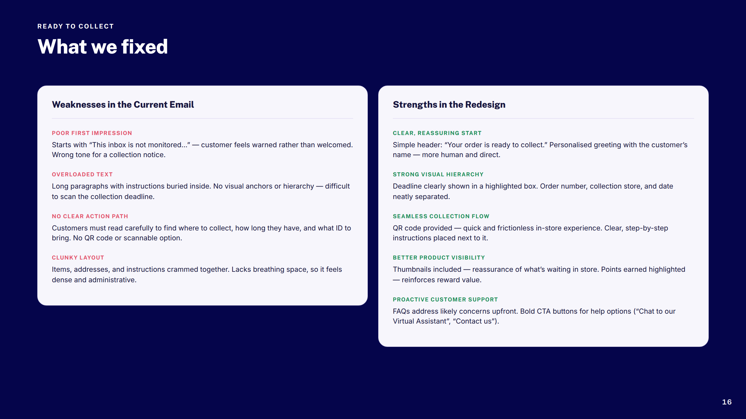
Collect: What We Fixed
Section: Order Cancellation
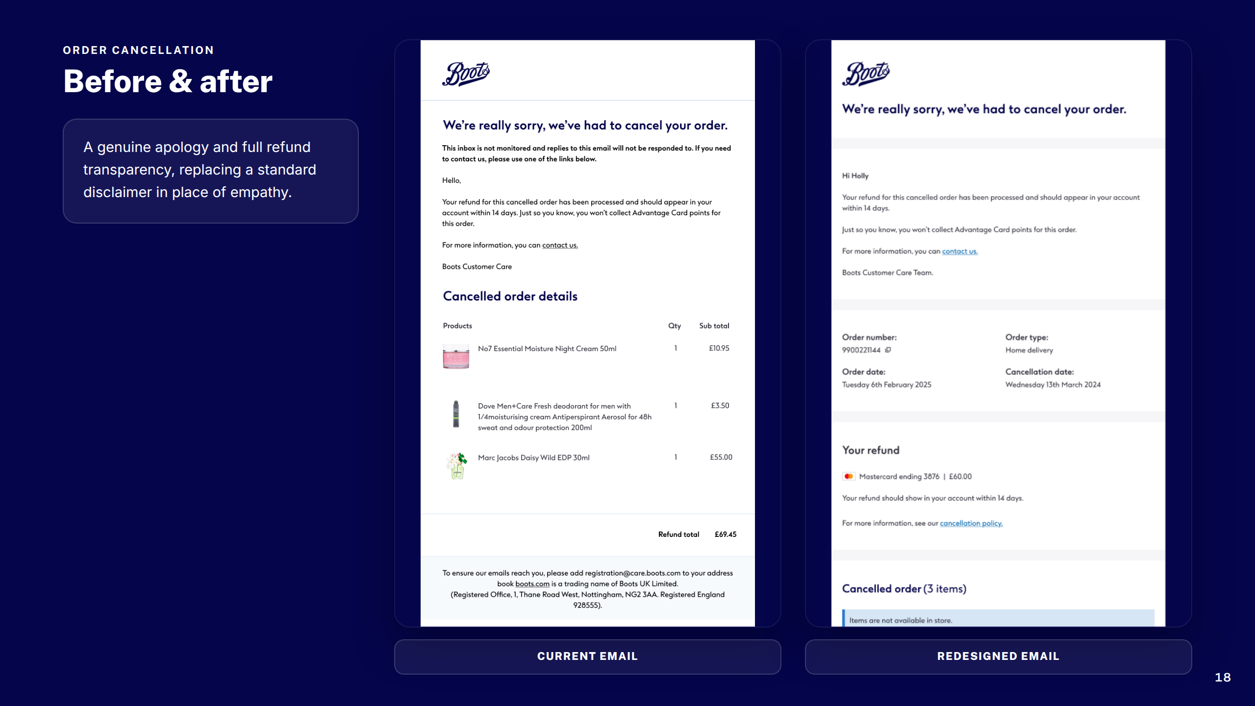
Cancellation: Before & After
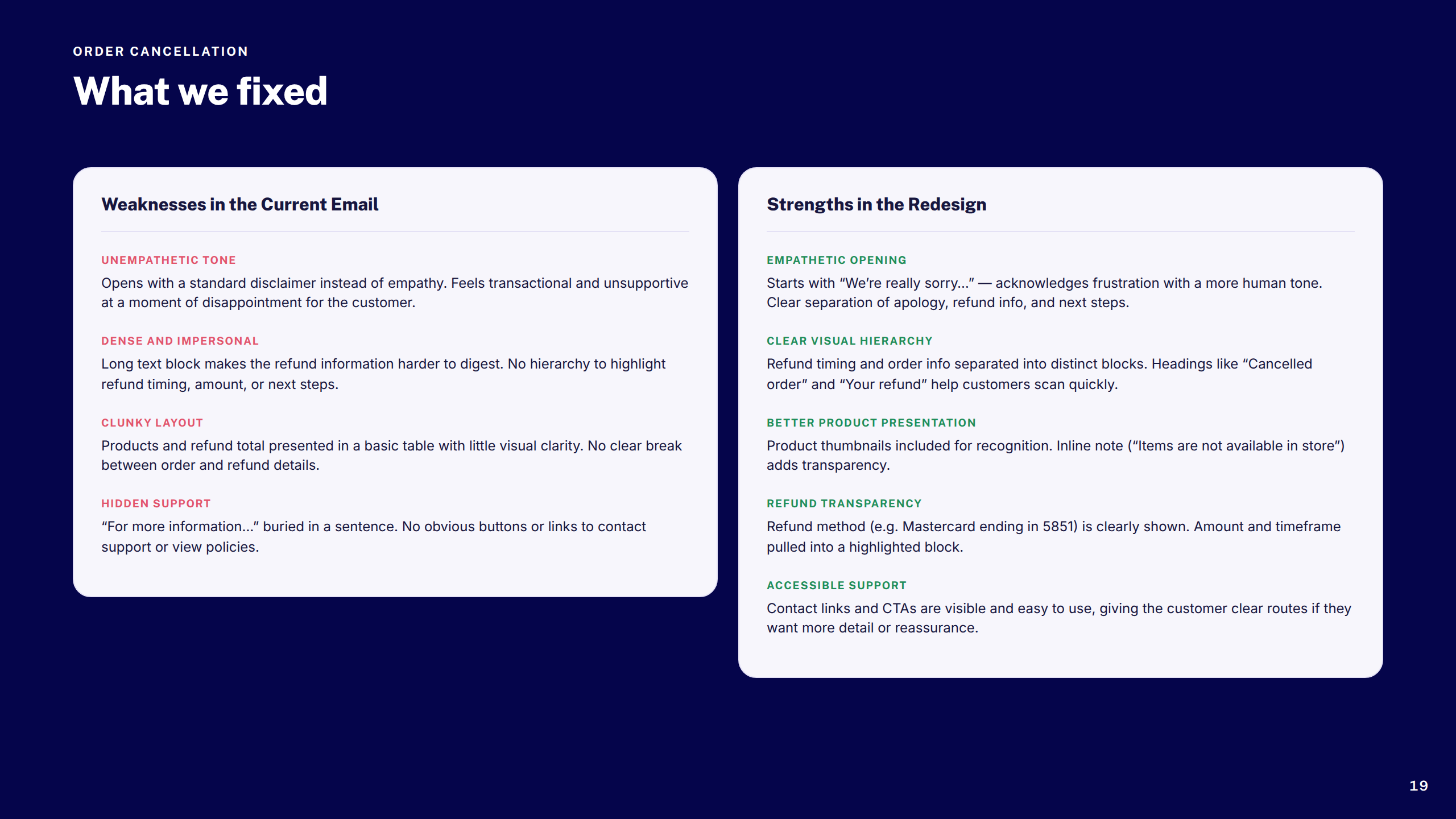
Cancellation: What We Fixed
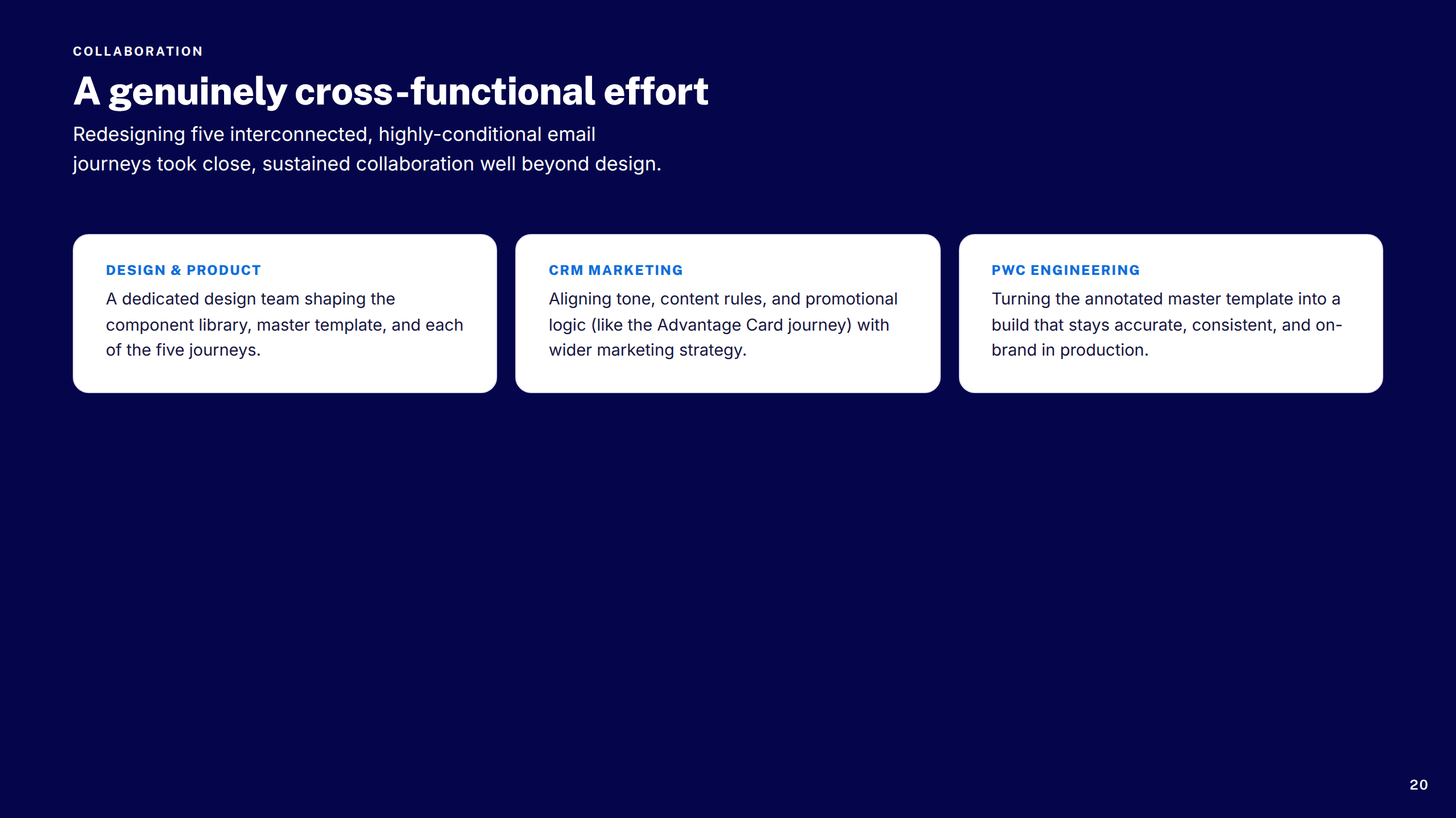
Collaboration
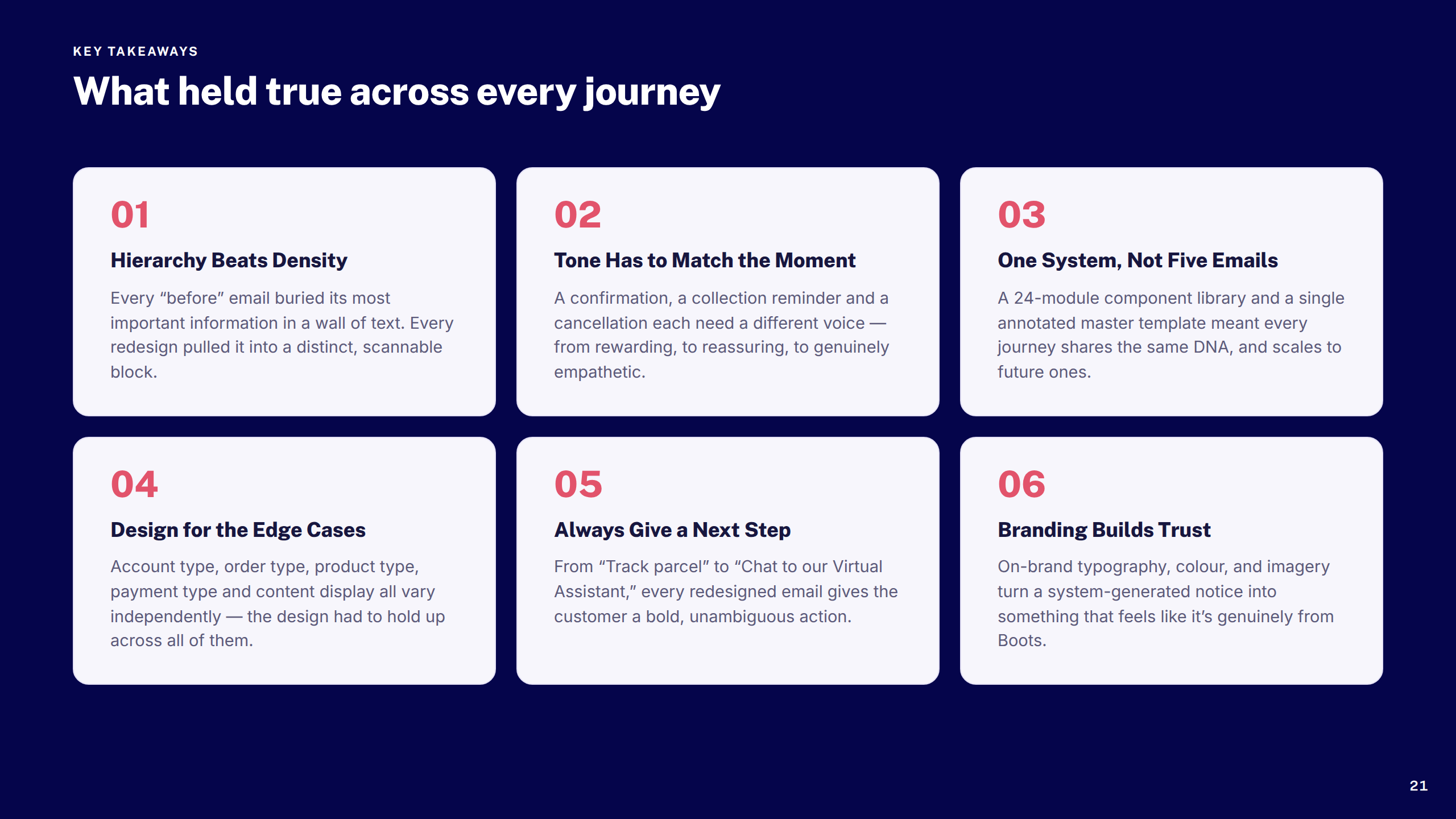
Key Takeaways
Thank You
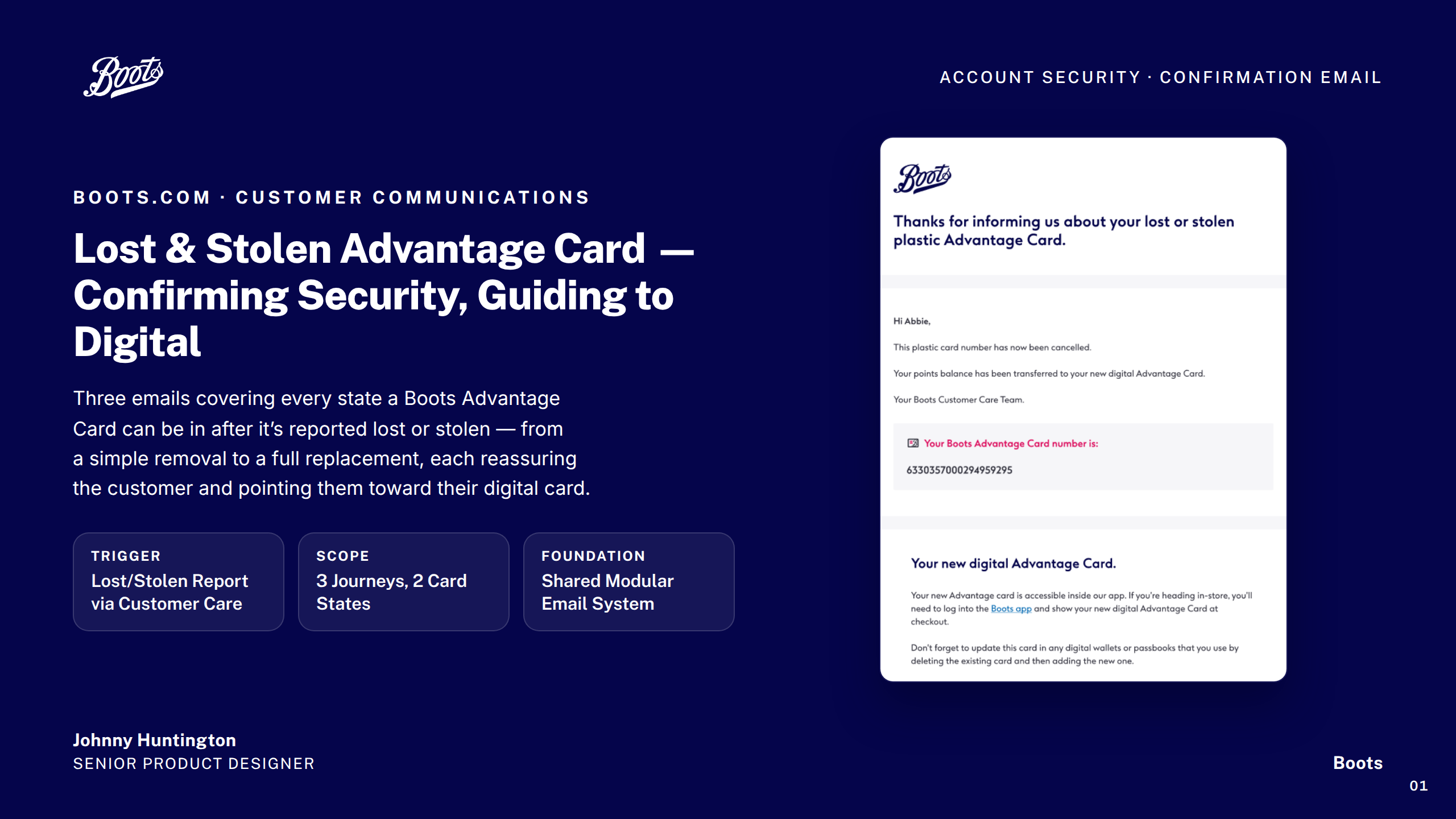
Boots — Lost & Stolen Advantage Card
1 / 17
Cover
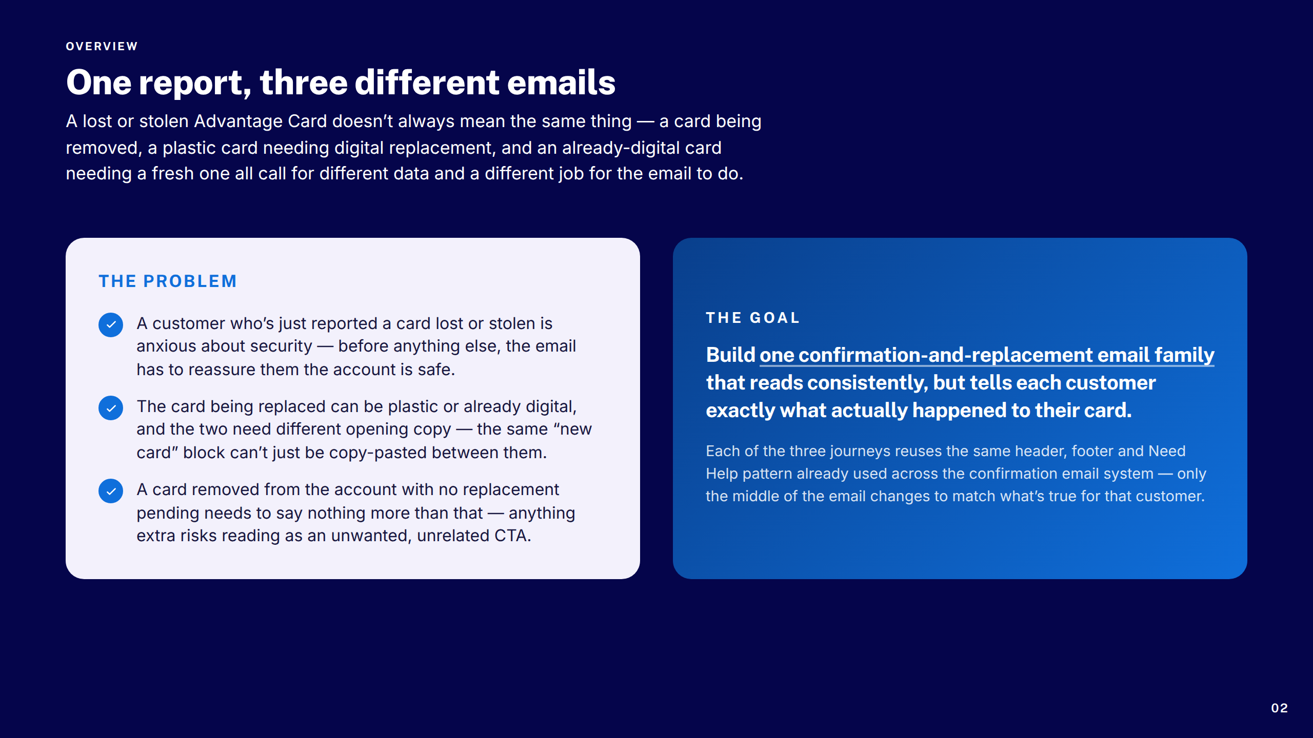
Overview & Challenge
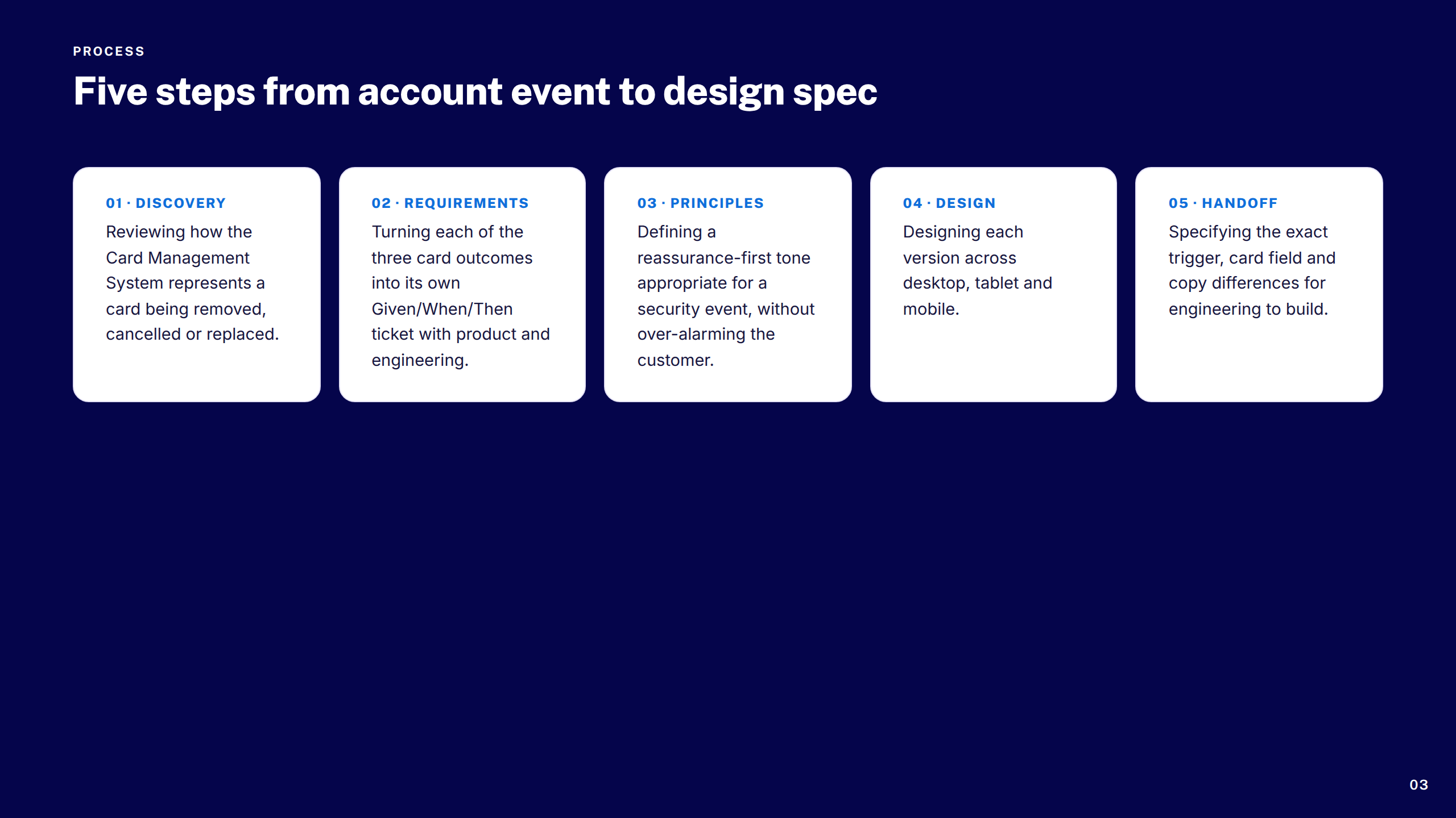
Process at a Glance
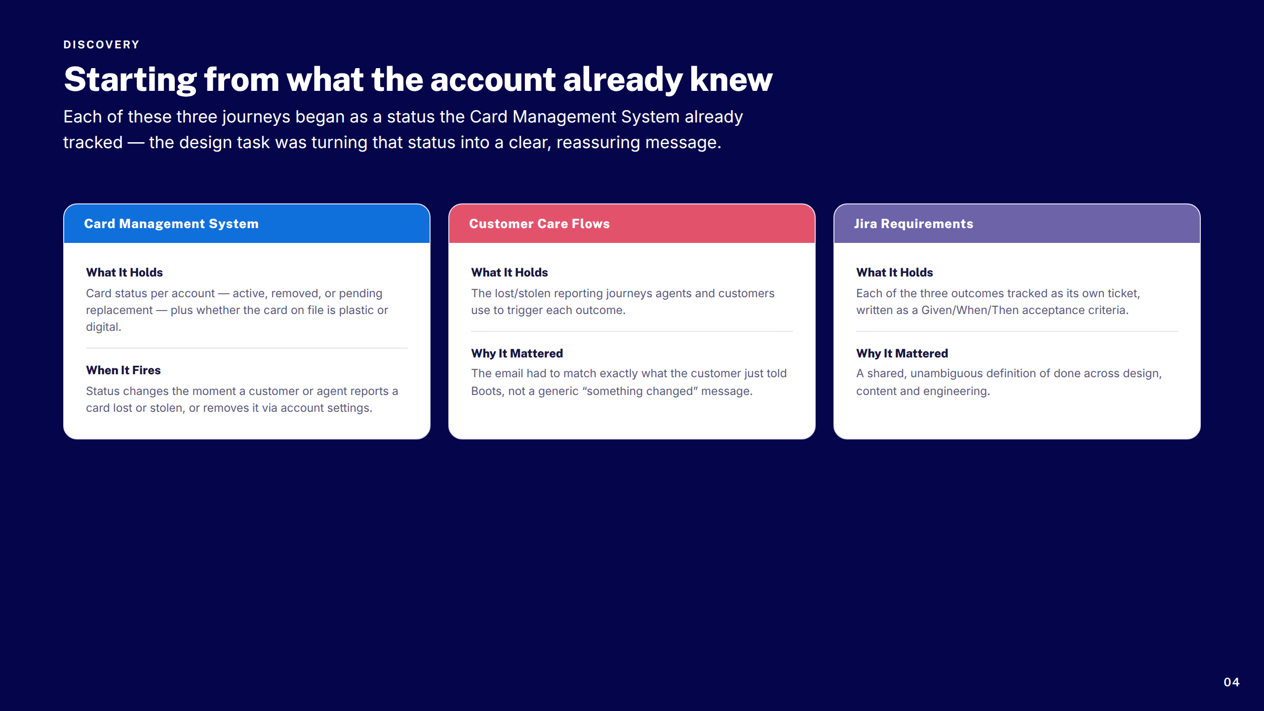
Discovery Inputs
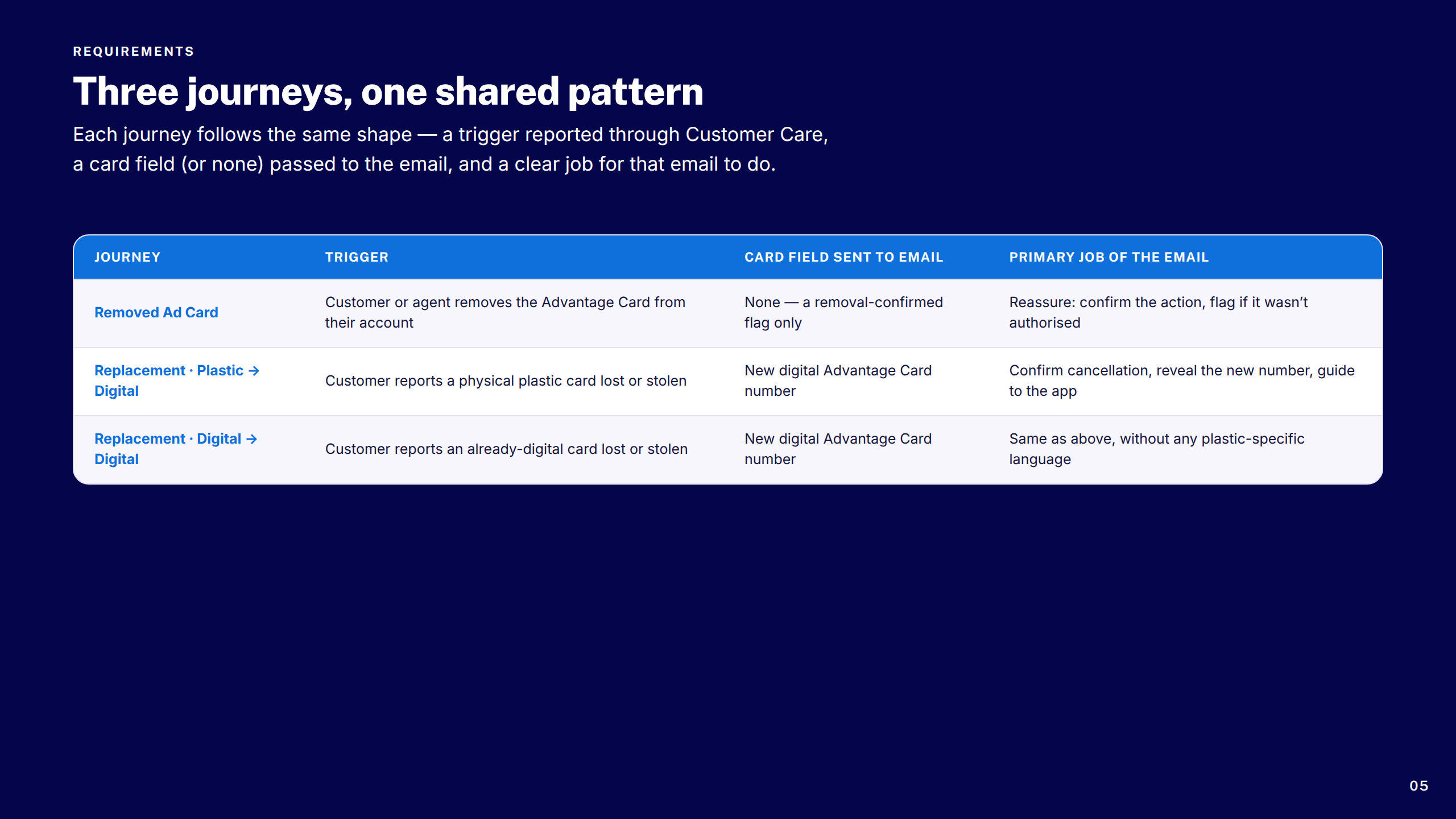
Requirements at a Glance
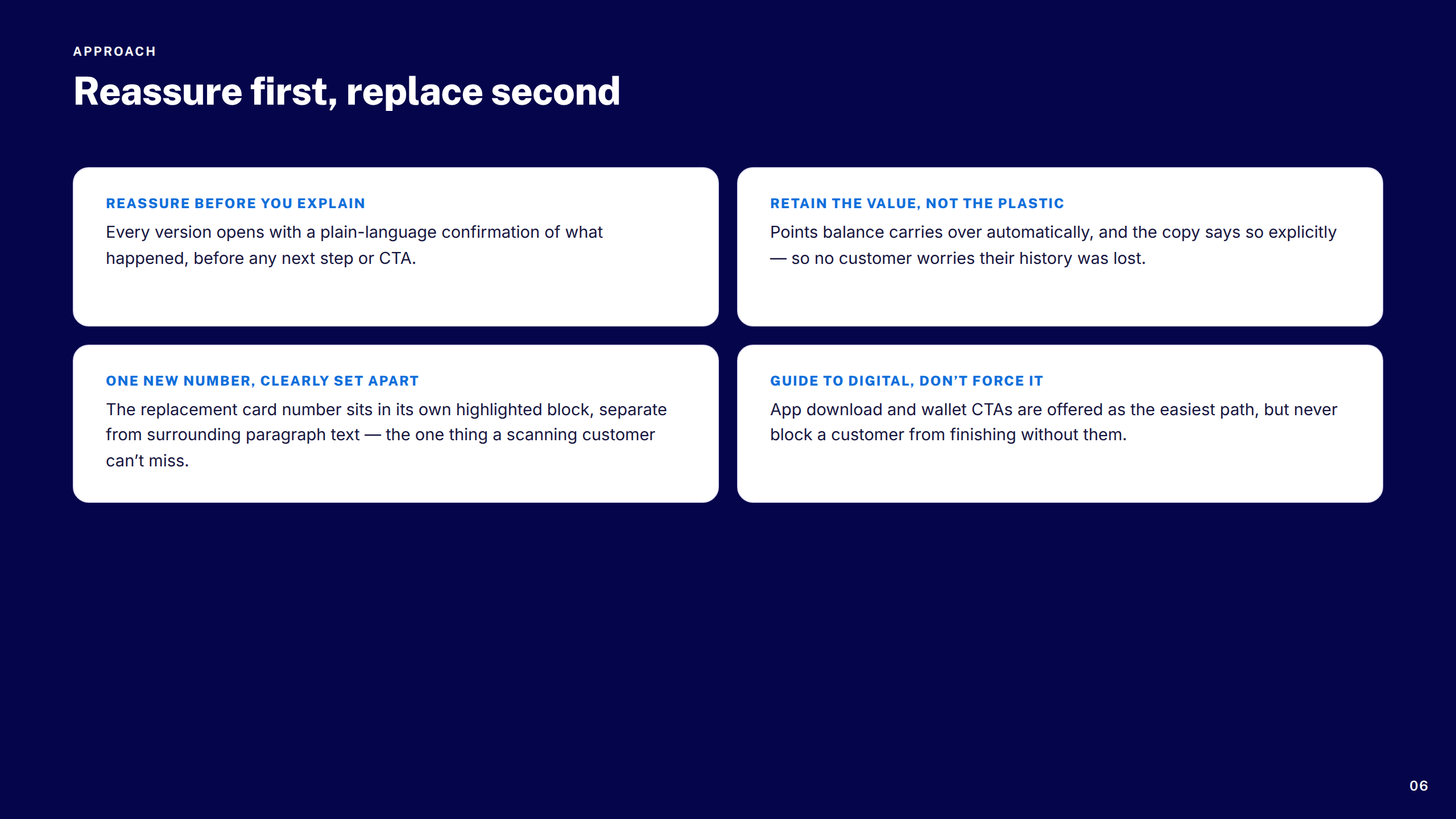
Design Principles
Section: Removed Advantage Card
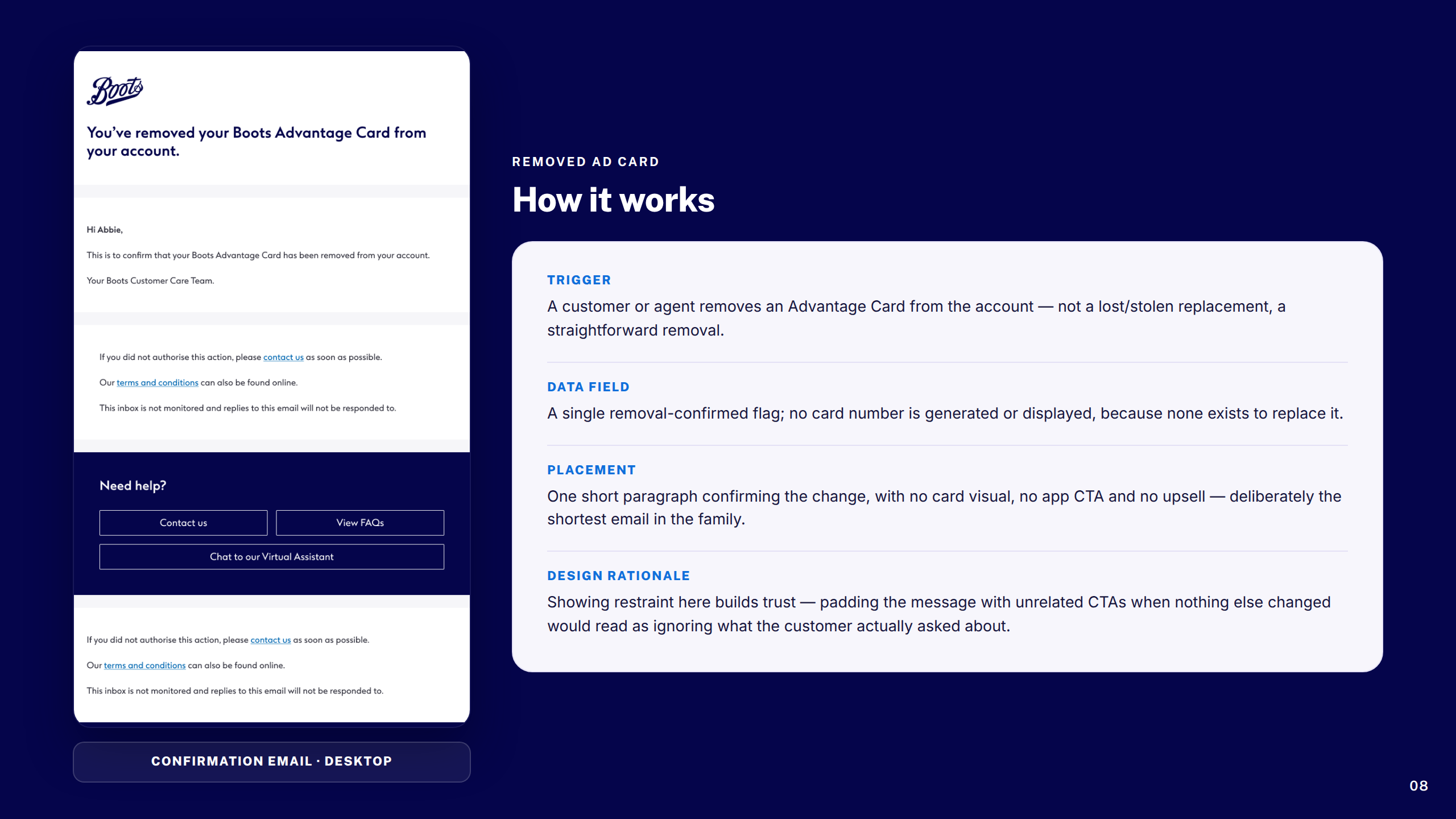
Removed Advantage Card: How It Works
Section: Replacement Plastic to Digital
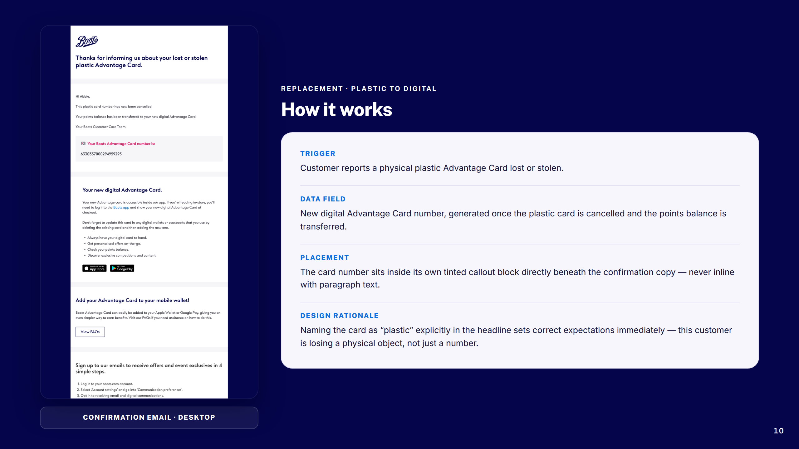
Replacement Plastic to Digital: How It Works
Section: Replacement Digital to Digital
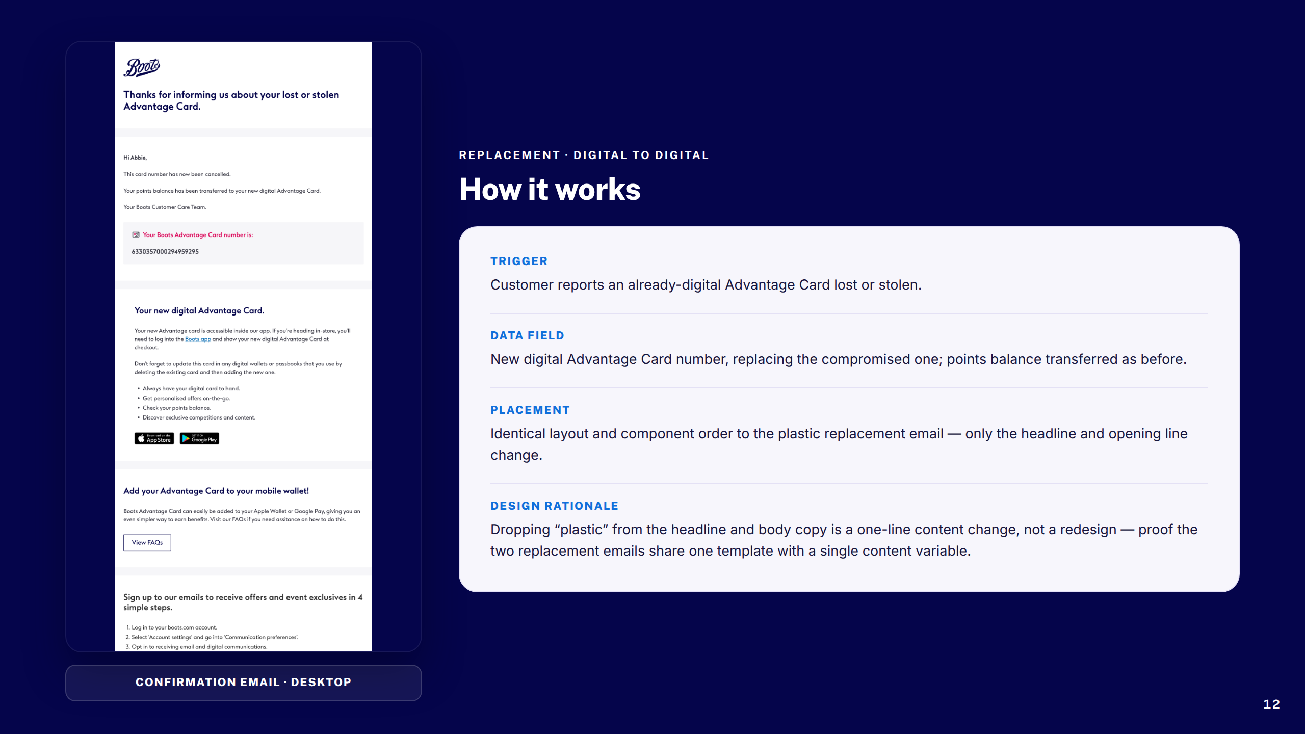
Replacement Digital to Digital: How It Works
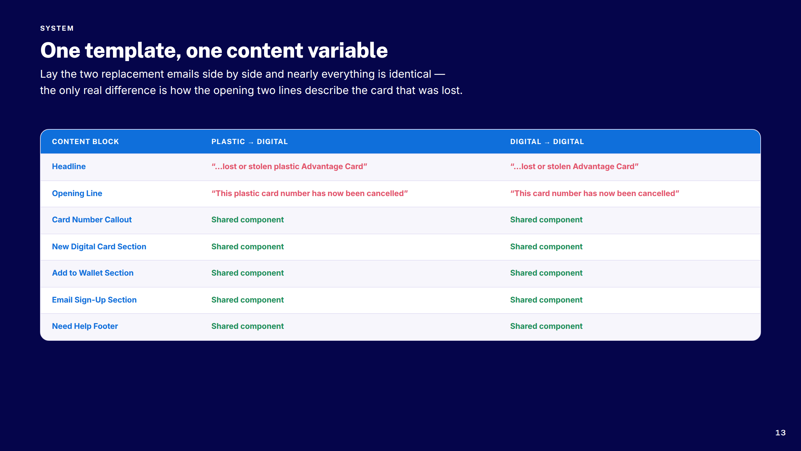
Shared Content System
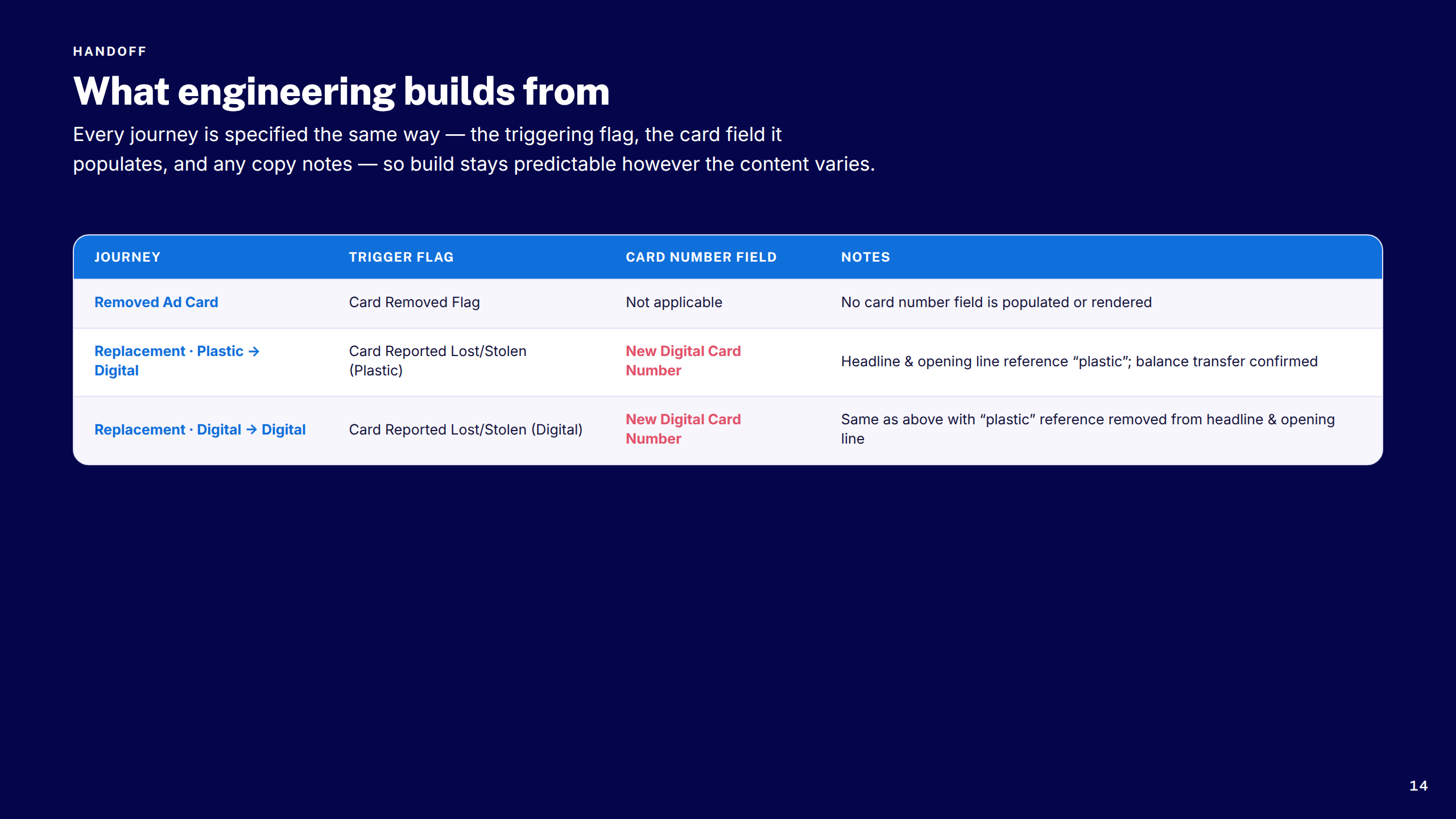
Engineering Handoff
Considerations & Edge Cases
Key Takeaways
Thank You
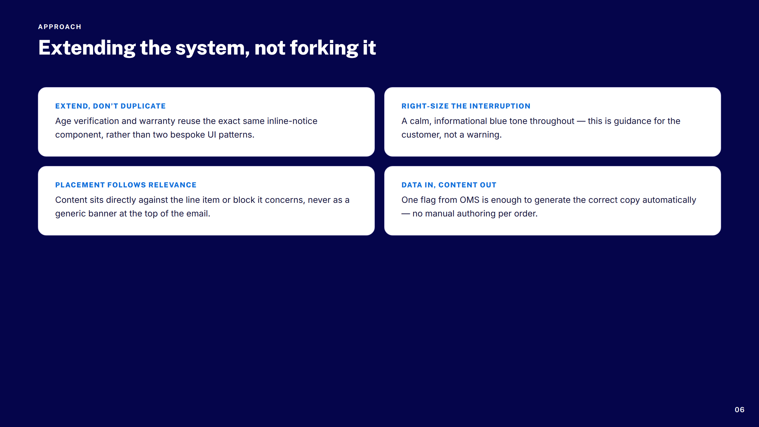
Boots — Age, Airports & Warranties
1 / 16
Cover
Overview & Challenge
Process at a Glance
Discovery Inputs
Requirements at a Glance
Design Principles
Section: Age Verification
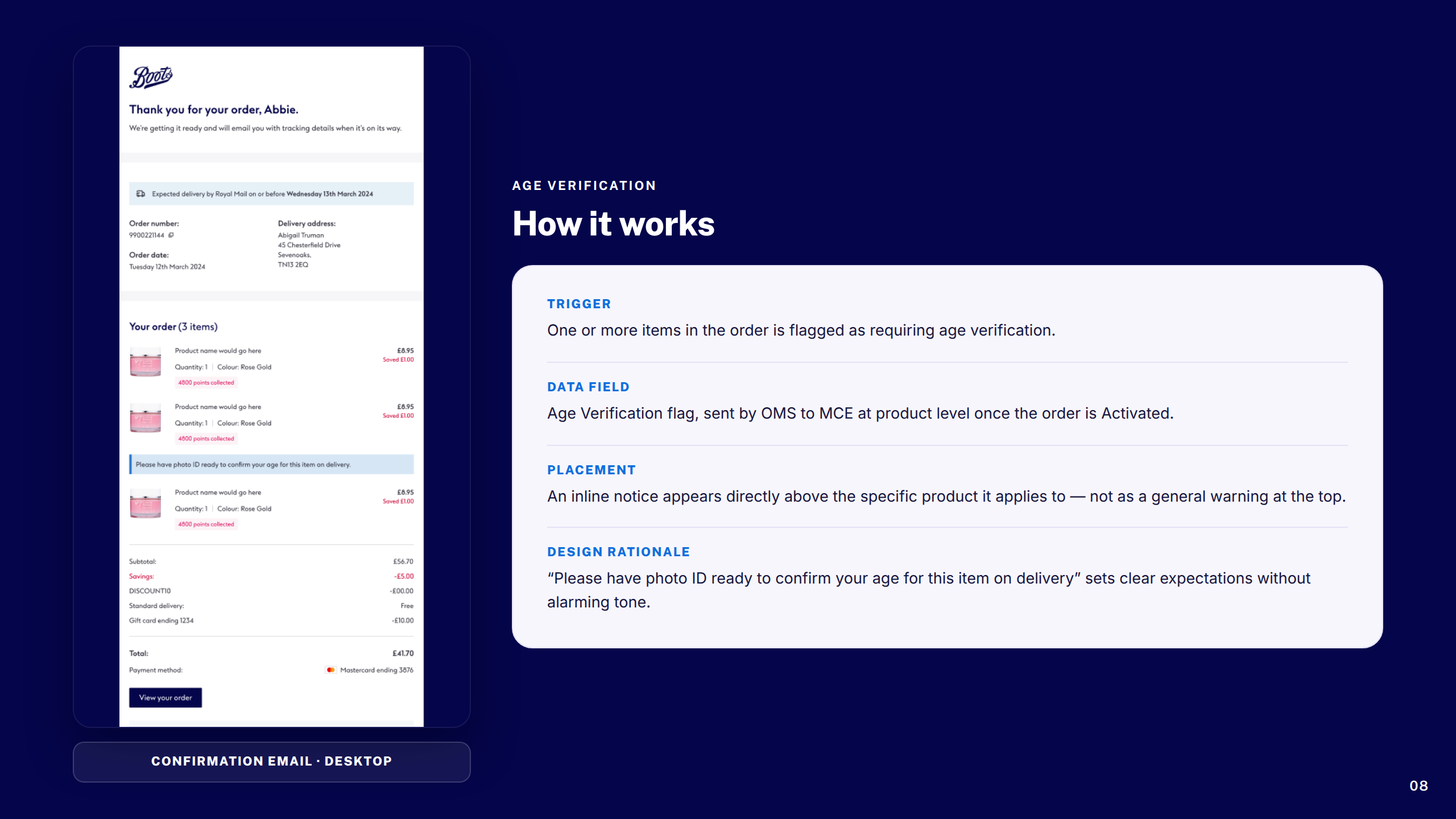
Age Verification: How It Works
Section: Airport Collection
Airport Collection: How It Works
Section: Warranty Data
Warranty Data: How It Works
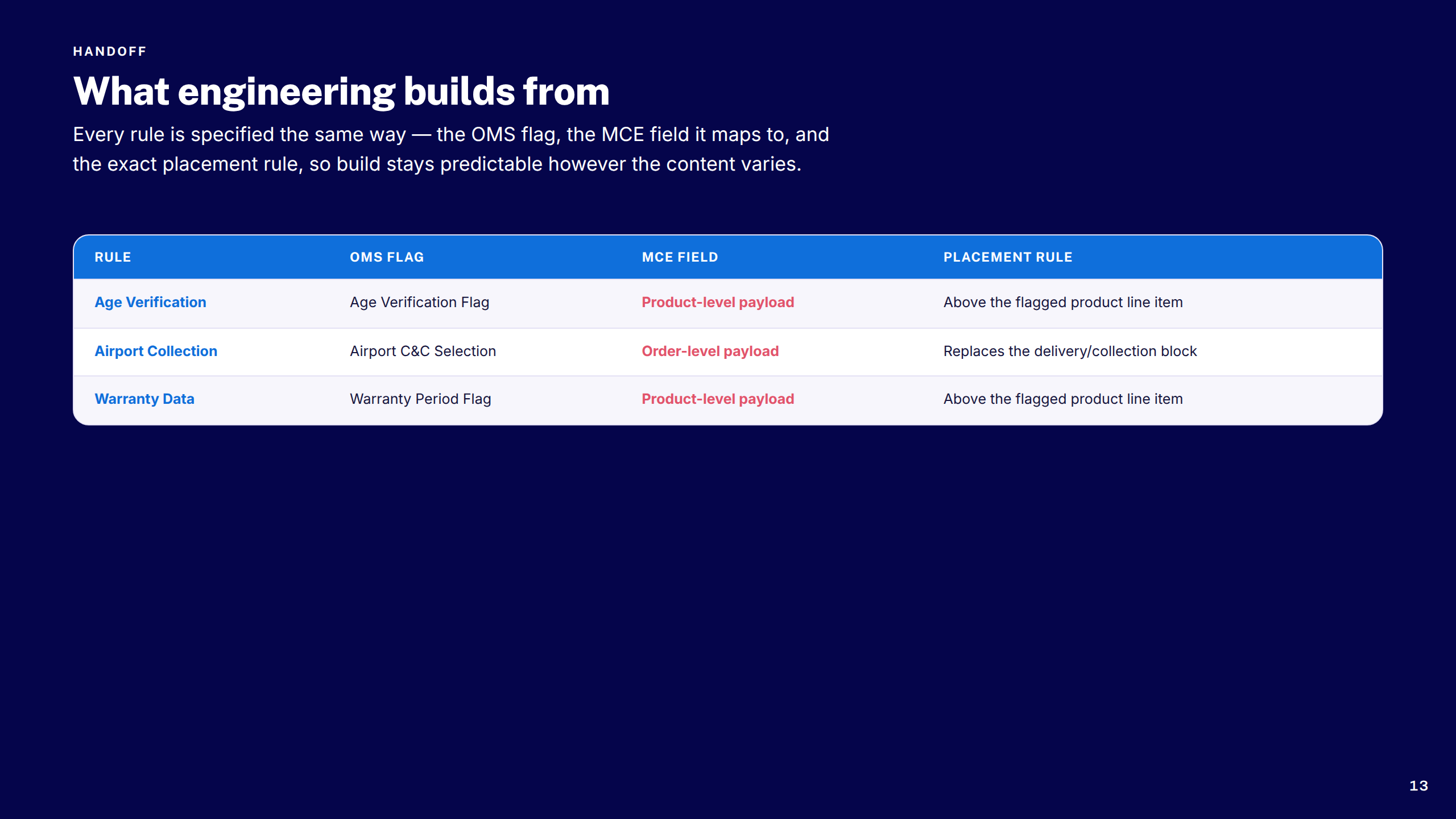
Engineering Handoff
Considerations & Edge Cases
Key Takeaways
Thank You

Constraints

Legacy platform architecture
The Boots.com frontend had significant legacy constraints. Components couldn't always be rebuilt from scratch — new designs had to work within existing technical boundaries while still improving the experience.
Design system governance
All new components needed to be compatible with the existing Boots design system. Deviating from established patterns required cross-team alignment before anything moved to development.
Regulatory & pharmacy requirements
The Pain Selector Tool touched healthcare product recommendations — which meant additional sign-off from the pharmacy and healthcare compliance team on copy, guidance, and product selection logic.

Trade-offs

Personalisation vs. speed
A more personalised tool would have required account data and longer sessions. The decision was made to keep it anonymous and fast — lower barrier to entry, wider reach, and no dependency on logged-in state.
Header scope vs. timeline
The header redesign surfaced additional opportunities in the mega-menu and category navigation. These were scoped out to keep the project deliverable within the engagement window — flagged as a follow-on workstream.
Consistency vs. differentiation
Some PST interaction patterns were genuinely new to Boots.com. Balancing innovation with system consistency required careful negotiation — introducing new patterns only where they clearly served the user better than existing ones.

Outcomes

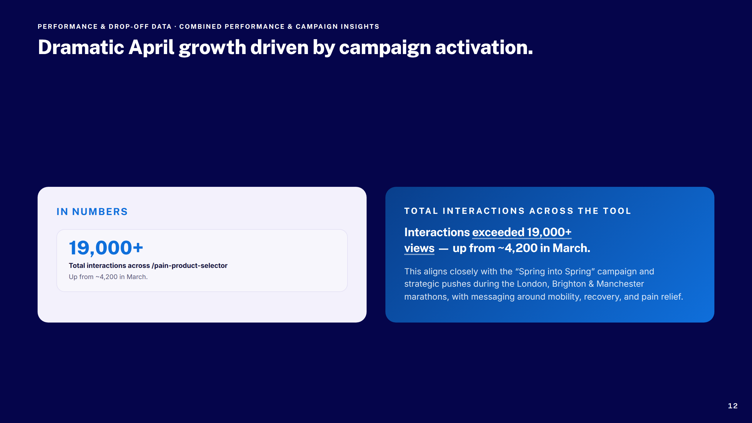
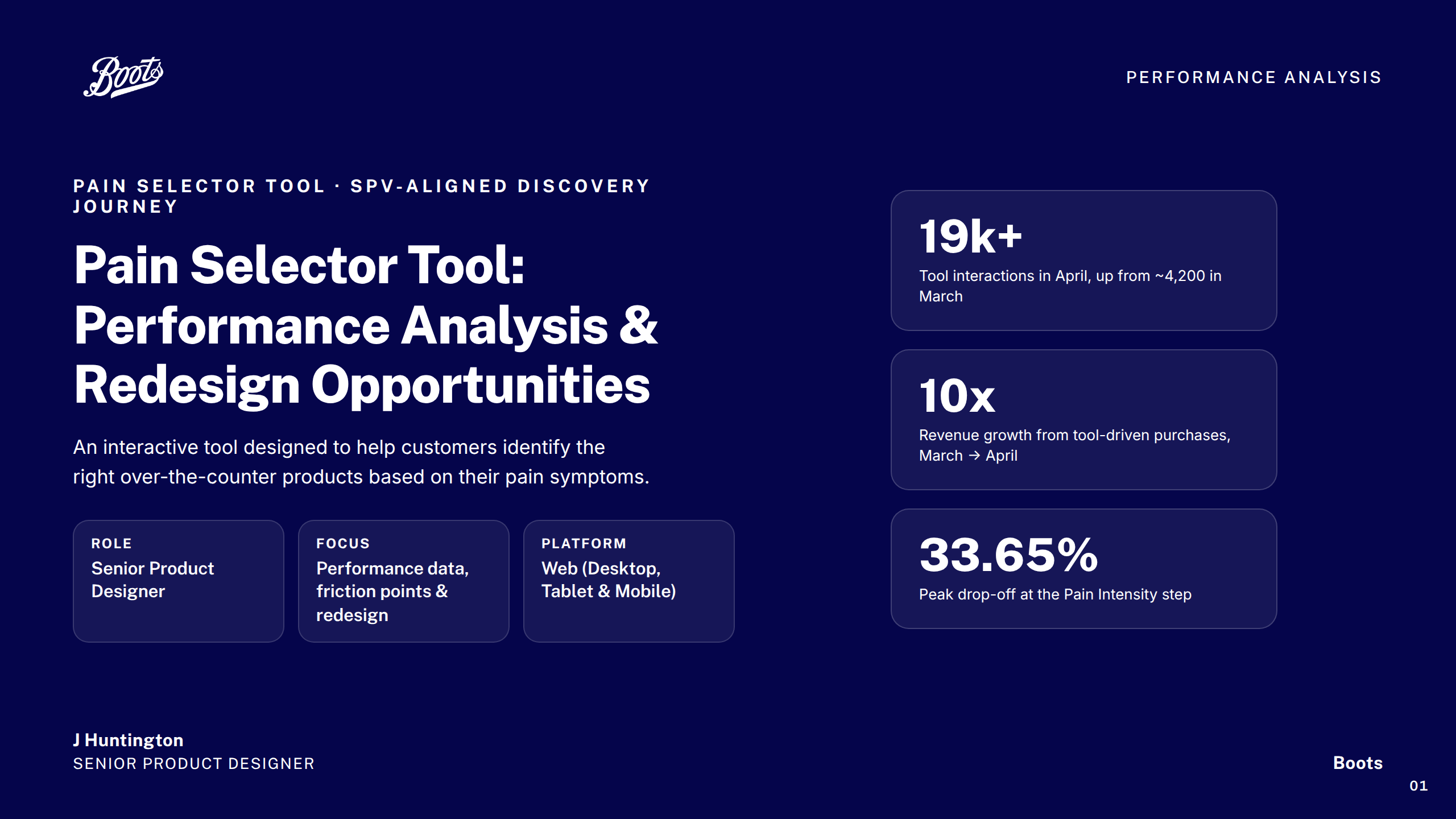
19k+
Tool interactions
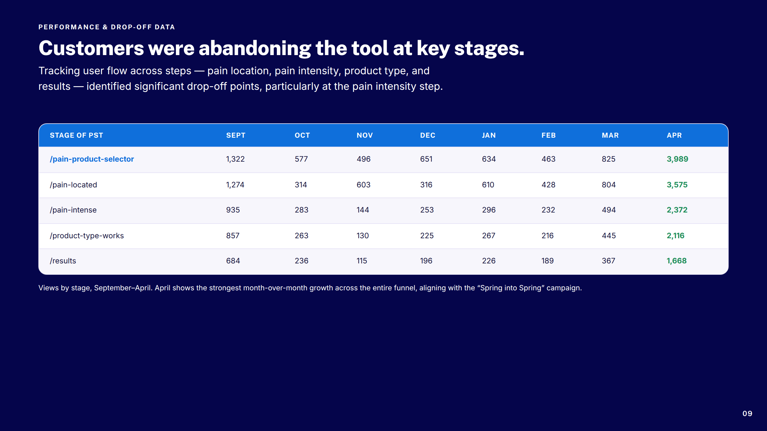
Pain Selector Tool interactions in April alone, up from ~4,200 in March — a 4.5× increase in a single month.
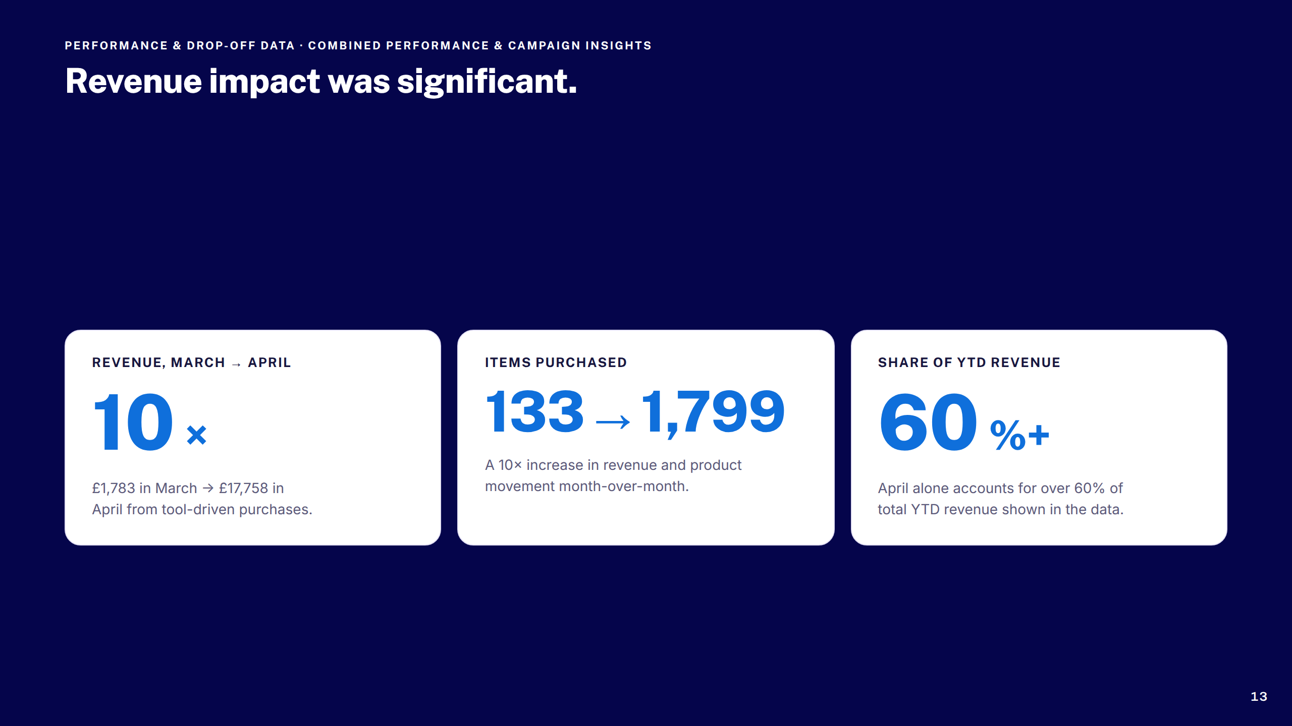
10×
Revenue growth
Revenue from tool-driven purchases grew 10× month-on-month between March and April after launch.
33%
Drop-off identified
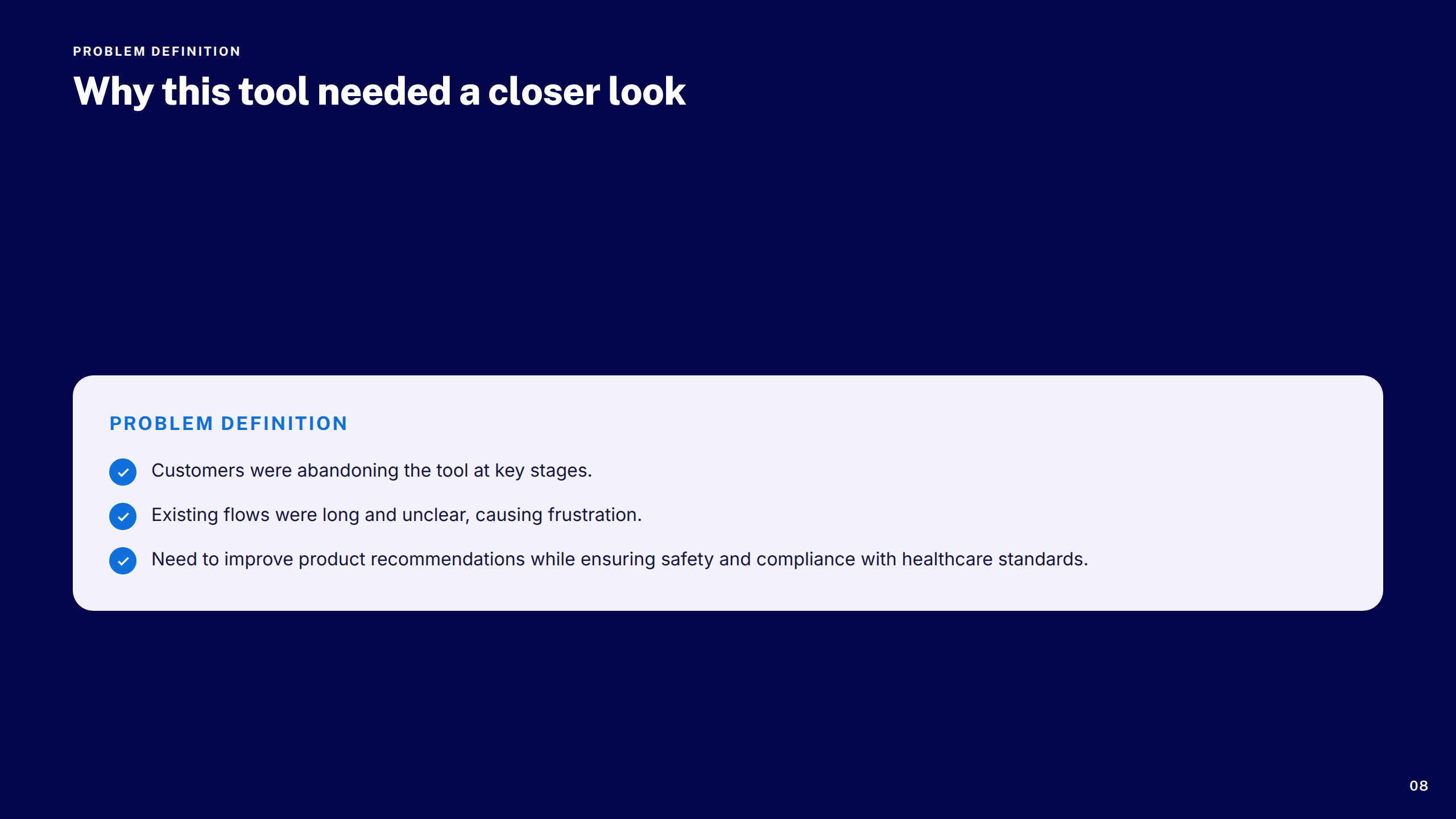
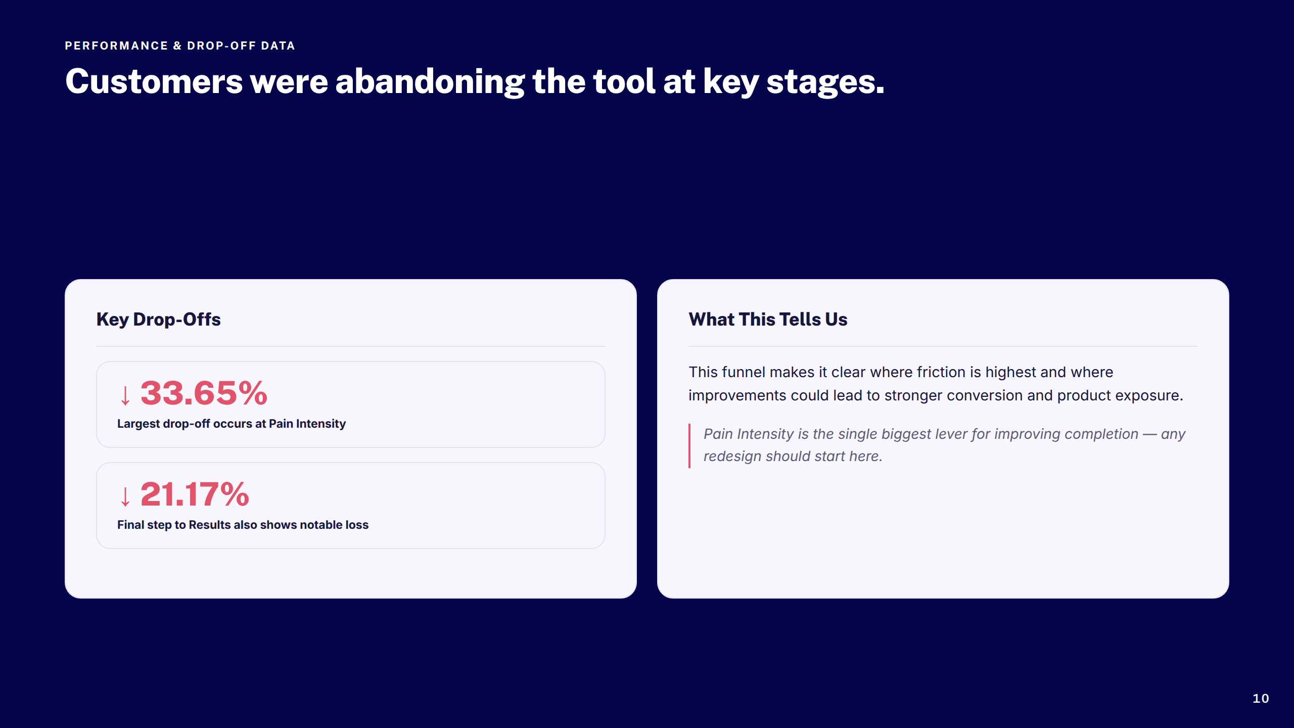
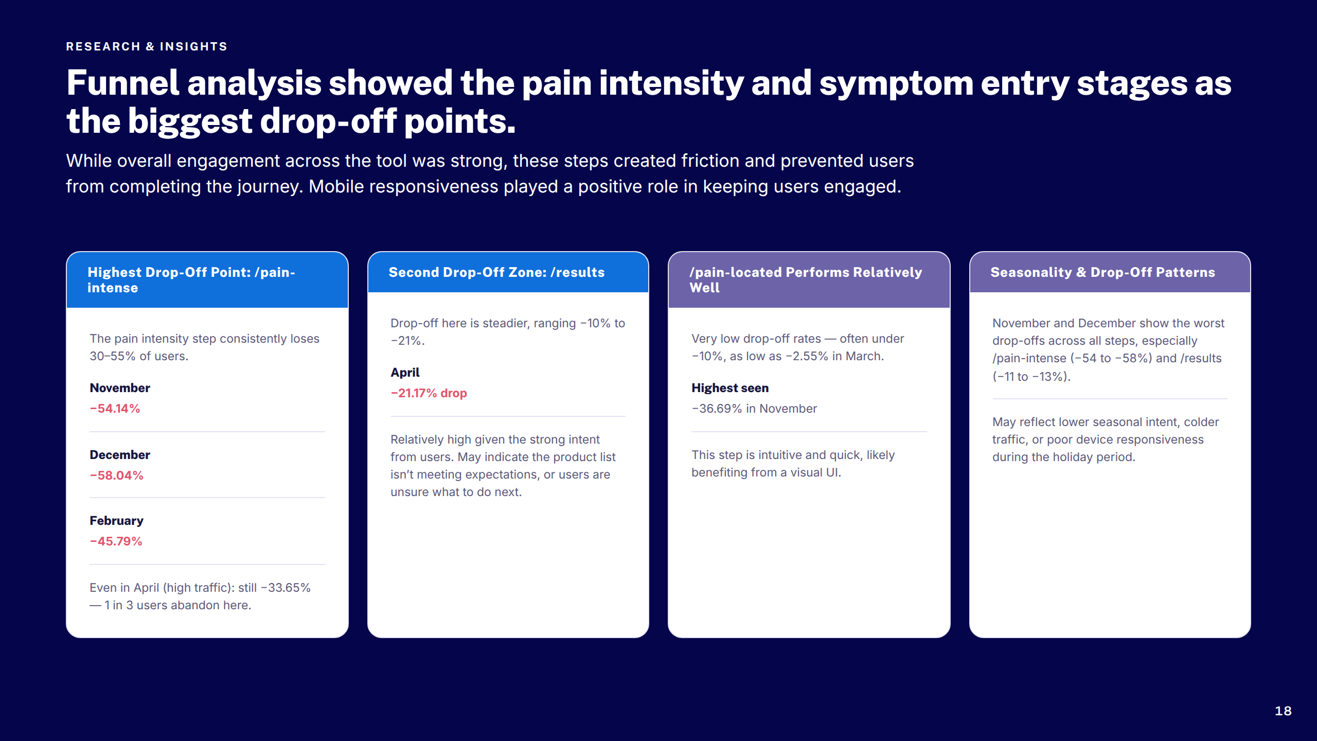
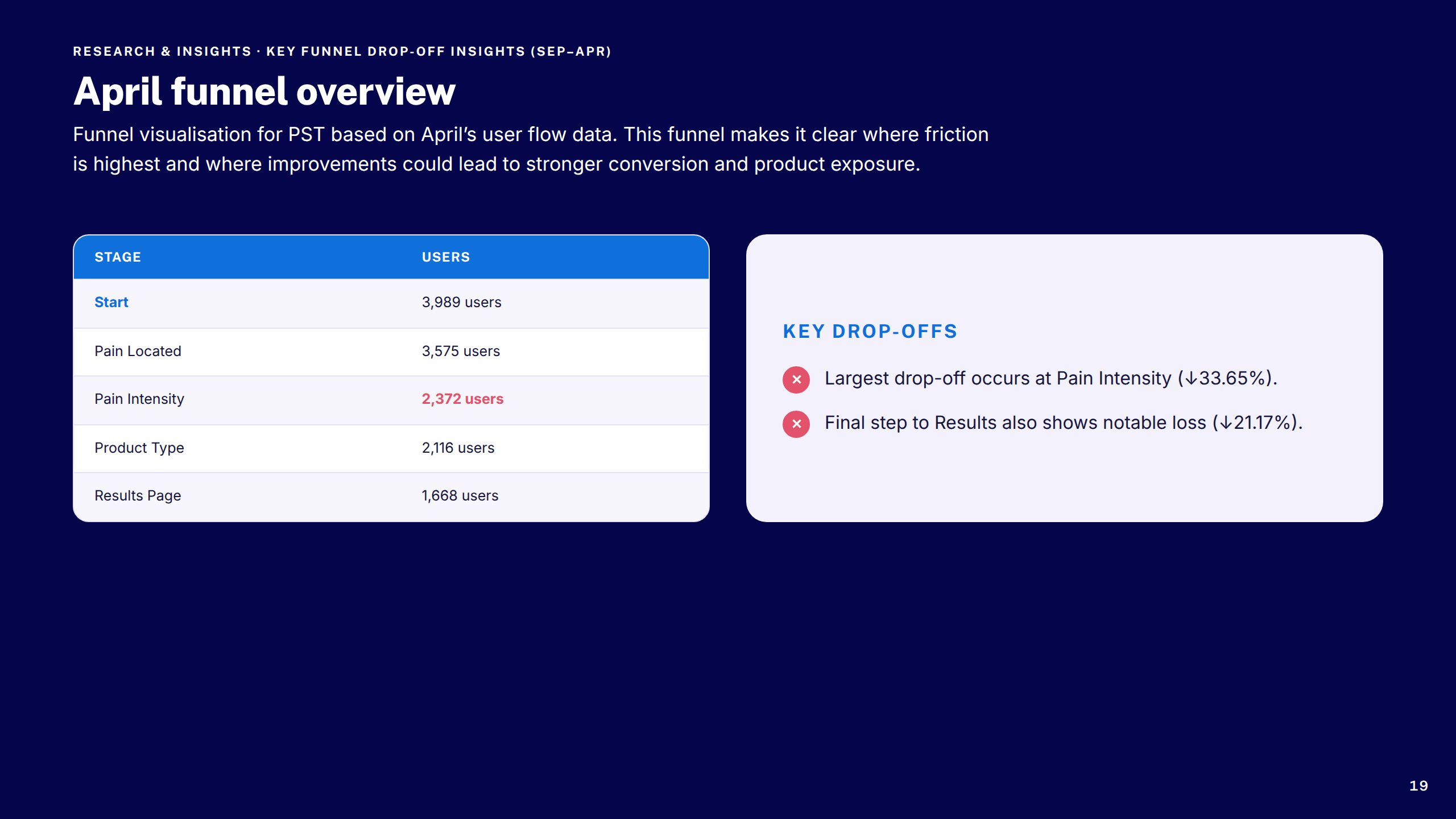
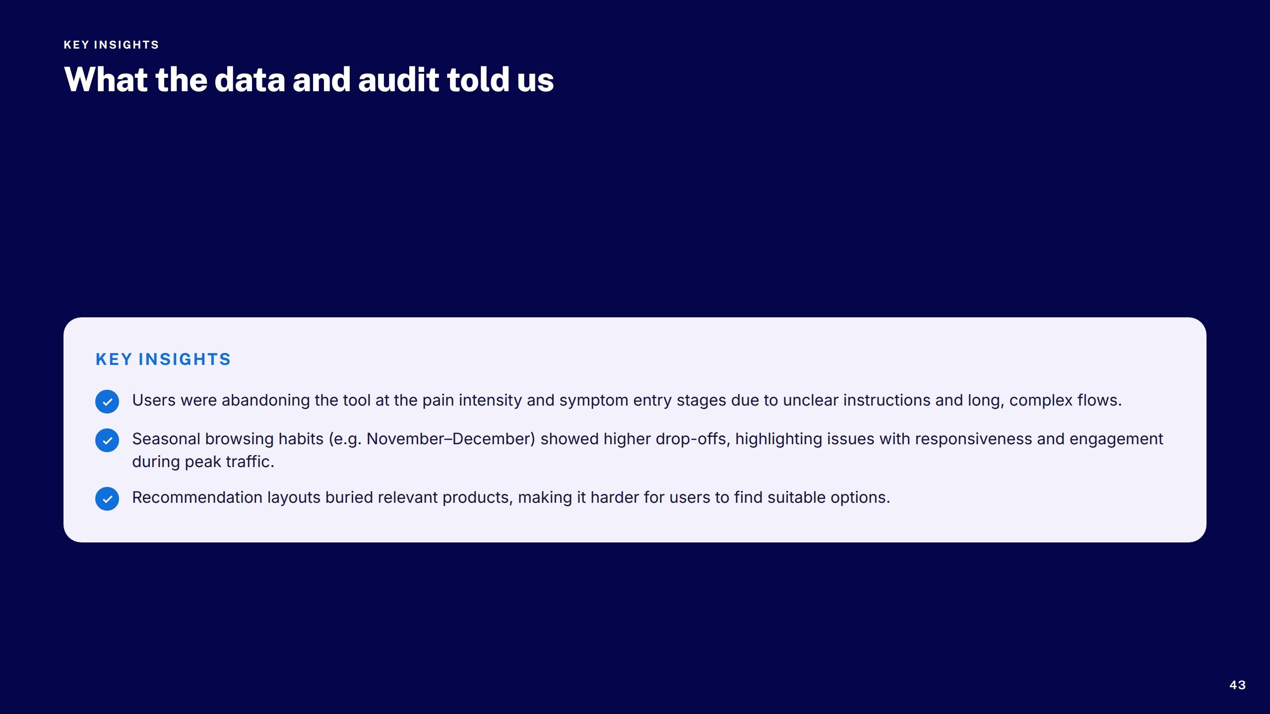
Peak drop-off at the Pain Intensity step surfaced through analytics — became the primary redesign focus.
3×
Platforms covered
All designs delivered across desktop, tablet, and mobile — mobile-first throughout.
6
Major workstreams
Discovery, navigation, search, checkout, transactional communications, and compliance features — all delivered under the same engagement.
AA
Accessibility standard
All designs met WCAG 2.1 AA requirements — colour contrast, focus states, and touch targets validated throughout.

Reflection & what I'd do differently

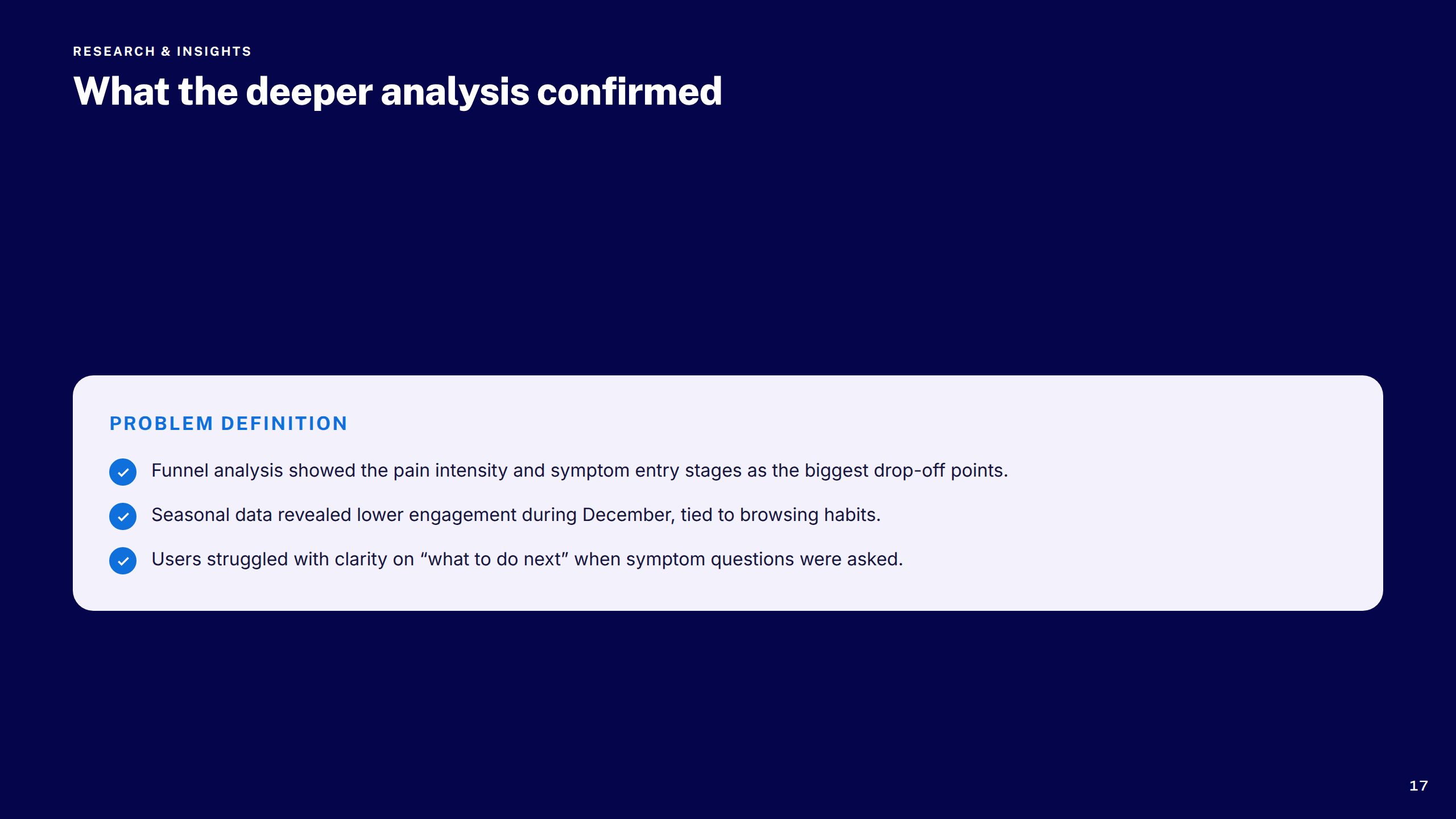
The Pain Selector Tool performance data told a clear story: a 33% drop-off at the Pain Intensity step was the single biggest friction point. In hindsight, I'd have pushed to run qualitative research on that specific step earlier — the analytics surfaced the what, but understanding the why would have sharpened the redesign direction faster.

On the Global Header, deferring mega-menu improvements was commercially sensible, but it left a visible inconsistency between the updated header and navigation patterns behind it. I'd advocate harder for at least a light-touch review of adjacent components before handoff.

The OOBO checkout work reinforced how much edge-case thinking happens late in a project. Mapping error states and payment threshold scenarios earlier — before high-fidelity — would have reduced back-and-forth with engineering considerably.

The transactional email redesign was a reminder of how much design debt accumulates in low-visibility surfaces. These emails had never been properly aligned to the design system — the audit phase took longer than expected because the inconsistencies were more widespread than anyone had assumed. A periodic comms design review would catch drift earlier.

The Age, Airports, and Warranties work was the most cross-functional of the engagement — three compliance-driven features running near-simultaneously, each with distinct legal, operational, and engineering stakeholders. The lesson: in compliance work, getting legal sign-off on copy and logic early isn't a blocker to design progress, it's a prerequisite. Starting those conversations before design exploration would have saved iteration cycles.

Across all six workstreams, the most valuable design decisions weren't made in Figma — they were made in the conversations before it. Earlier stakeholder alignment on scope and success metrics consistently saved more time than any tool or process change.

"Johnny's work on the Pain Selector Tool was exactly what we needed — rigorous, commercially aware, and genuinely user-centred. He brought clarity to a complex problem and delivered something the whole team was proud of."
Product Manager, Boots.com
Ecommerce engagement
More in Ecommerce
See all Ecommerce work

Projects shown include live work, pitch deliverables, and design produced as part of embedded or collaborative engagements. Some work was completed as part of a wider team. Deliverables reflect the scope and direction at the time of engagement — the live experience may have since changed, launched in a different form, or not proceeded to production. All brand assets and trademarks shown remain the property of their respective owners and are displayed here for portfolio reference only.

Previous case study
Ecommerce
Tesco — Returns & Refunds
Next case study
Design Systems
Sainsbury's — Design System

Available for new engagements

Let's build better platforms

Senior product design available for engagements across enterprise ecommerce, fintech, and regulated systems.

Get in touch →