Case Study

Indeed Flex
Hiring Platform

Designing the native app experience for a marketplace connecting flexible workers with shifts in real time.

Case Studies Indeed Flex
Client
Indeed
Platforms
iOS Android
Services delivered
Product Design Systems Thinking Design System Usability Testing Icon System
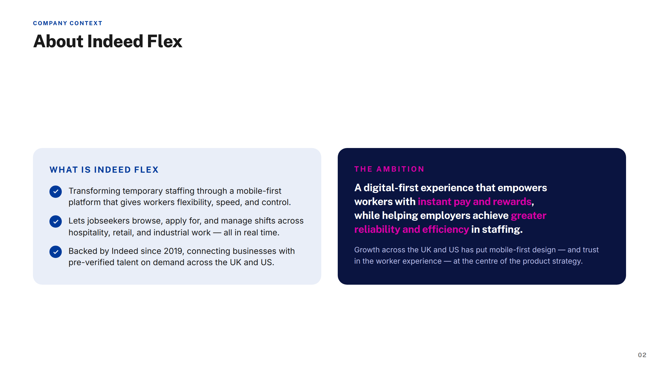
About Indeed Flex

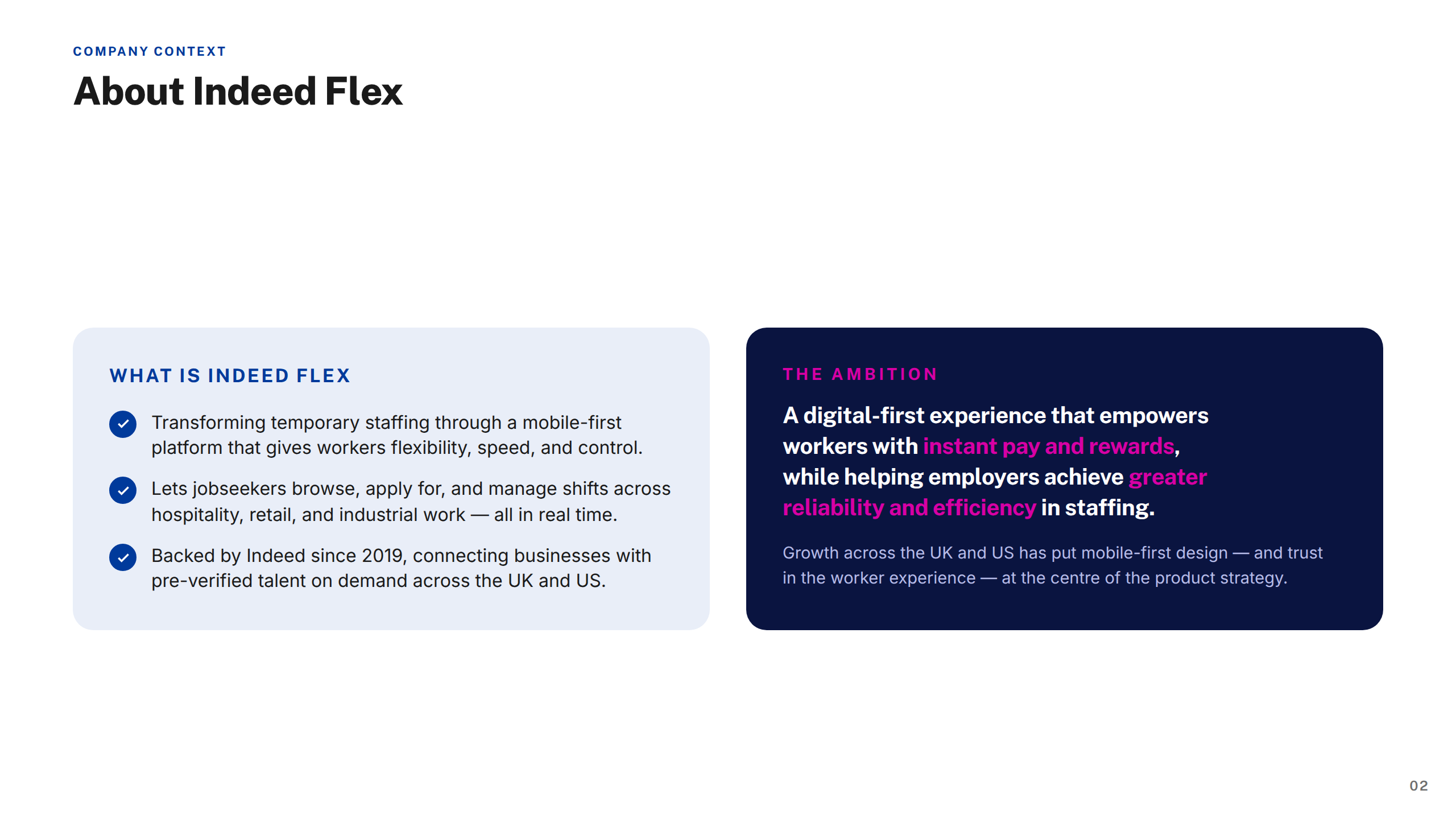
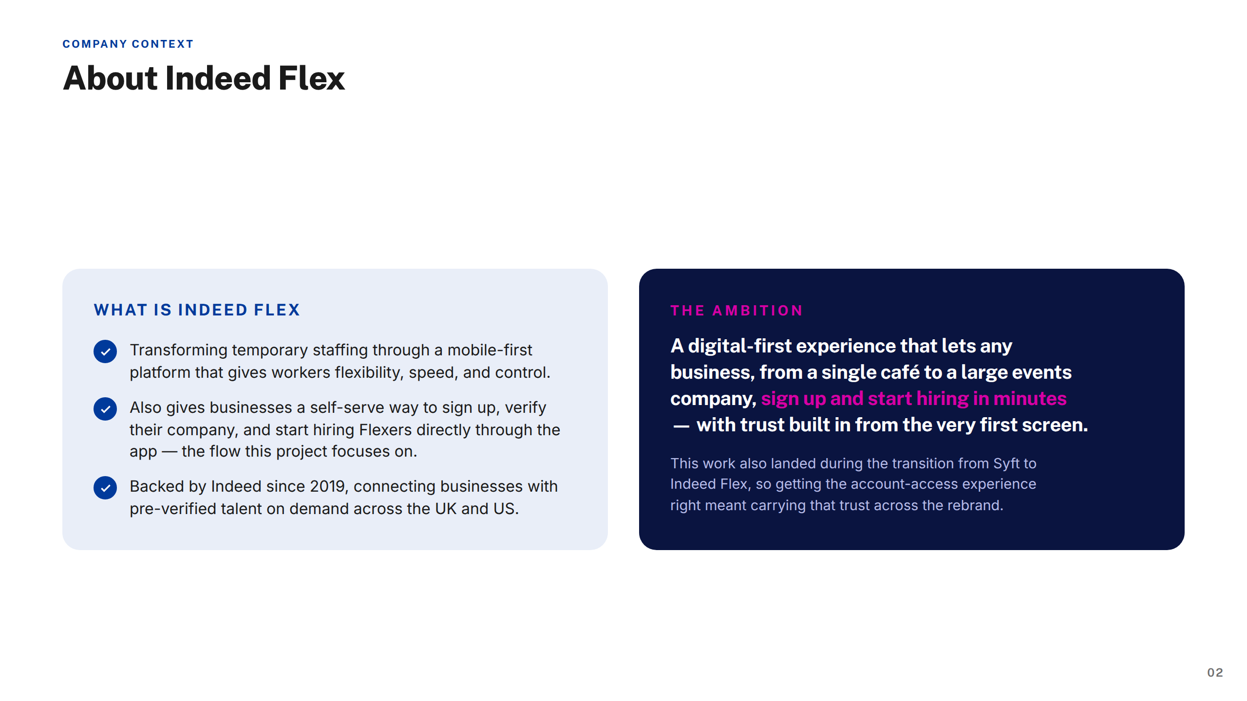
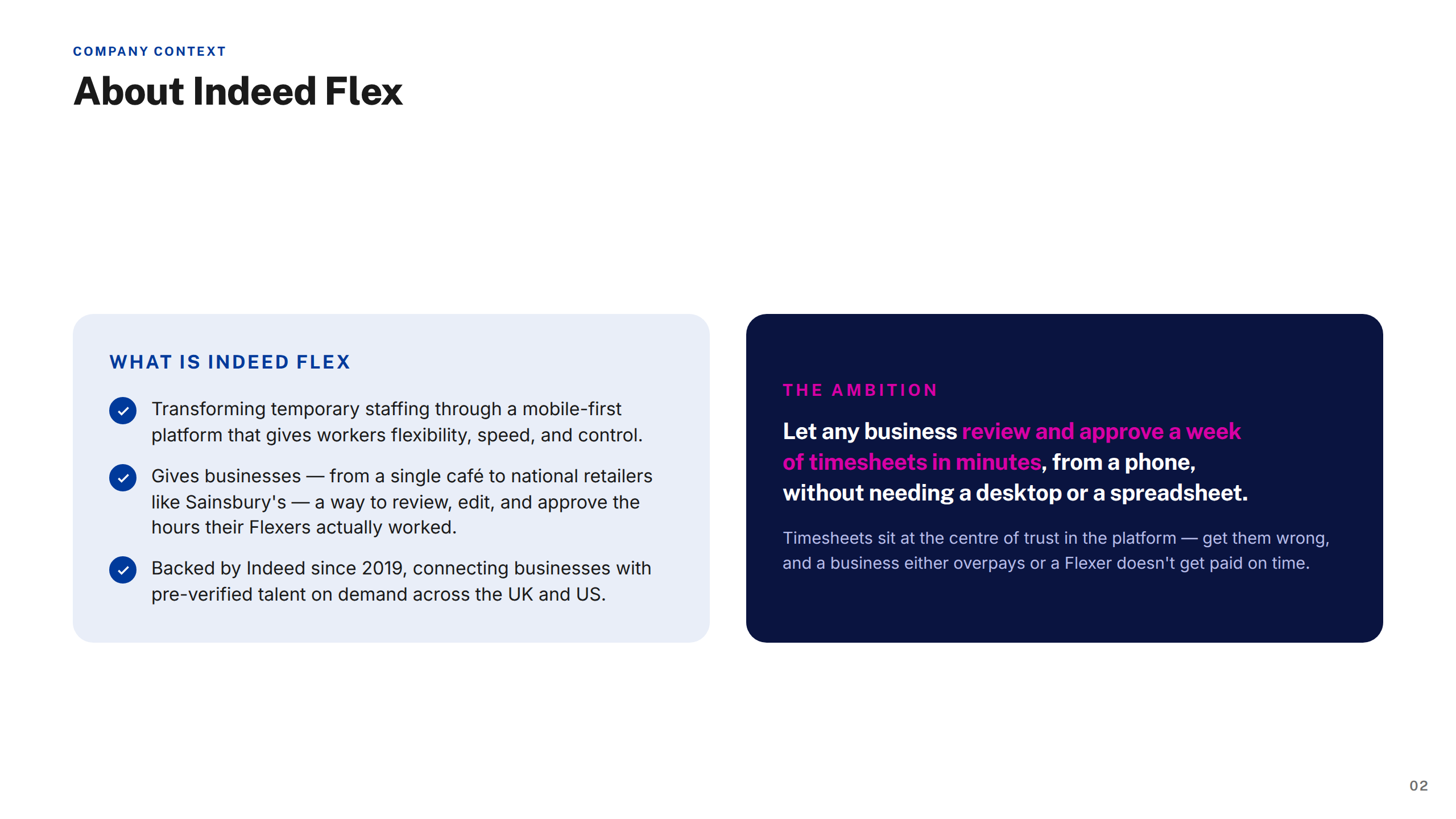
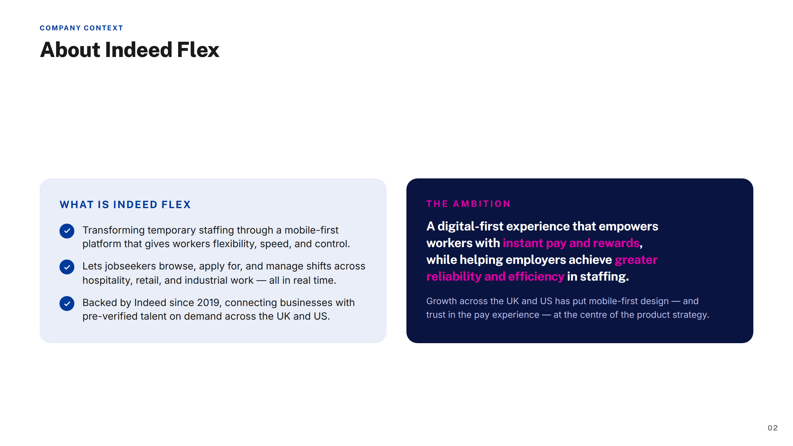
Indeed Flex is a flexible staffing marketplace — part of the Indeed group, one of the world's largest job platforms — connecting workers with temporary and flexible shift opportunities across hospitality, retail, industrial, driving, and healthcare sectors. Workers can find, book, and manage shifts directly through the app, while employers post roles and access a pool of pre-verified, rated talent on demand.

Operating primarily in the UK and US, Indeed Flex had grown rapidly since its acquisition by Indeed, scaling its platform to hundreds of thousands of active workers and thousands of employer accounts. As the product grew in scale and complexity, the native app needed to keep pace — handling increasingly sophisticated flows around pay, compliance, workforce management, and shift logistics. I was embedded as a Product Designer across a two-year engagement, owning end-to-end design across multiple workstreams on both the worker and employer sides of the platform.

The challenge

Indeed Flex transforms temporary staffing, connecting jobseekers with flexible shift opportunities across hospitality, retail, and industrial sectors. As the platform scaled, the app needed to handle increasingly complex jobs — pay visibility, timesheet approvals, strikes-and-bans policy, and worker profiles — without overwhelming workers or managers.

Inconsistent patterns across the product were slowing teams down and eroding trust at key moments like understanding pay or policy status.

My approach

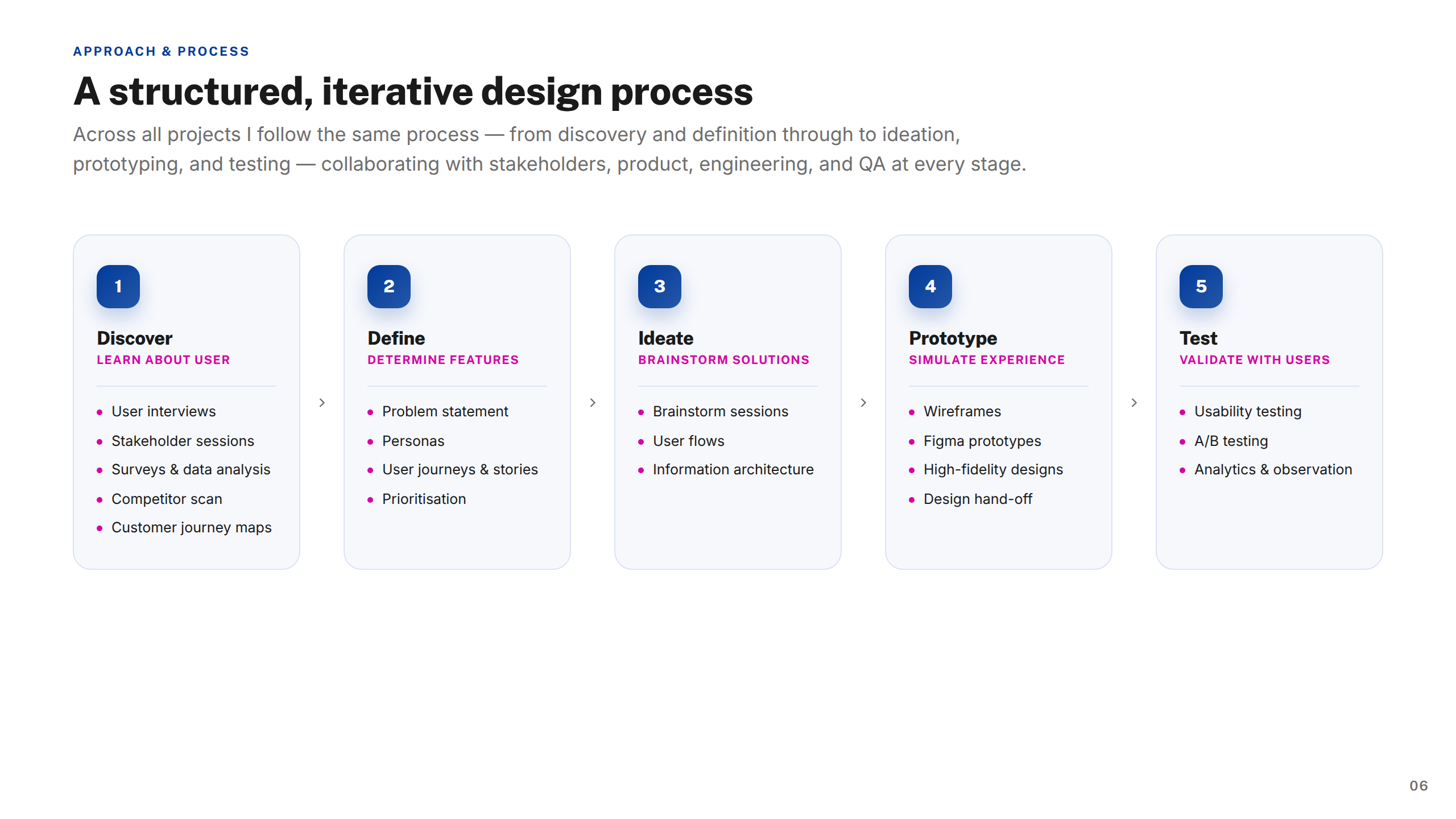
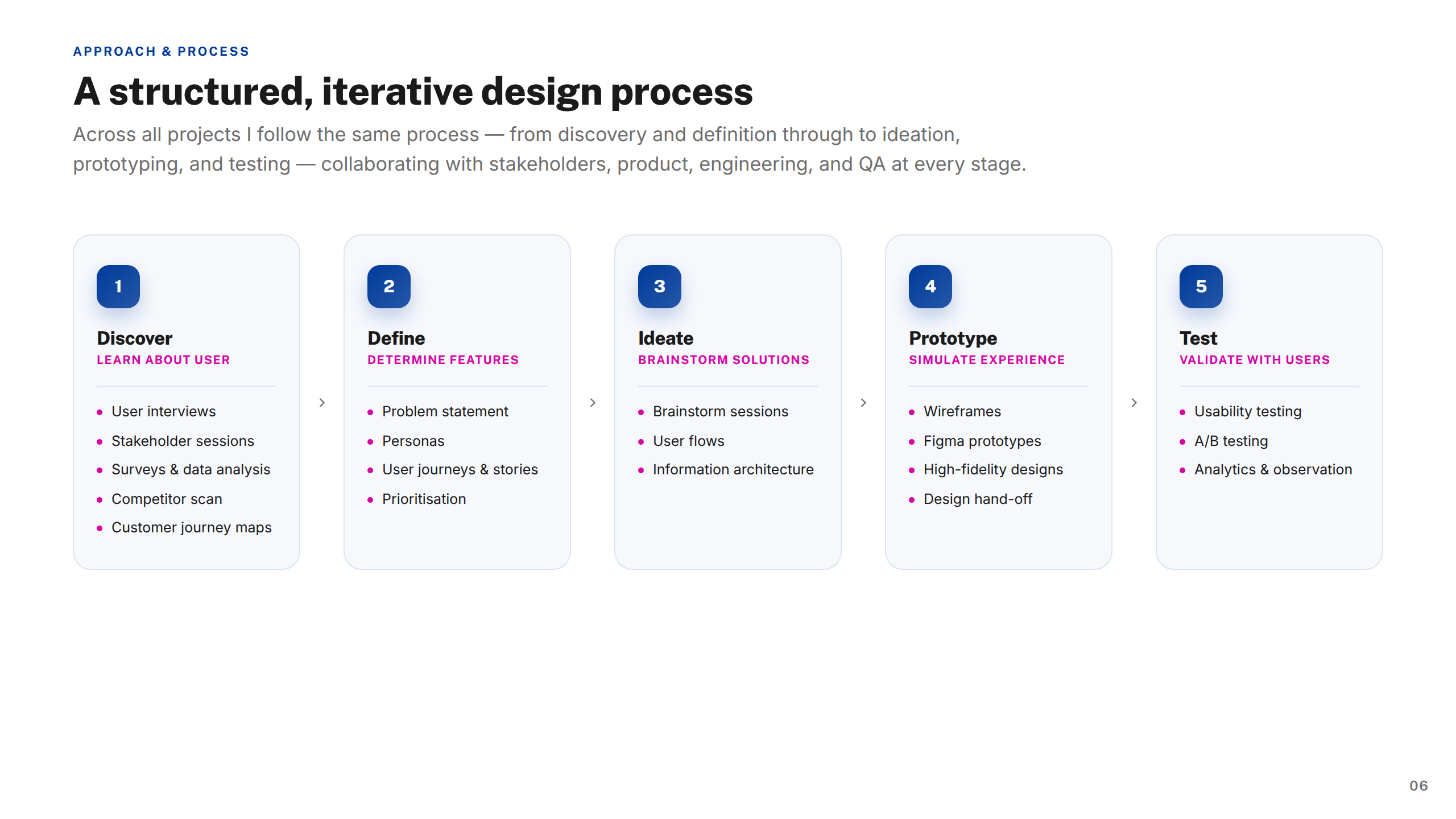
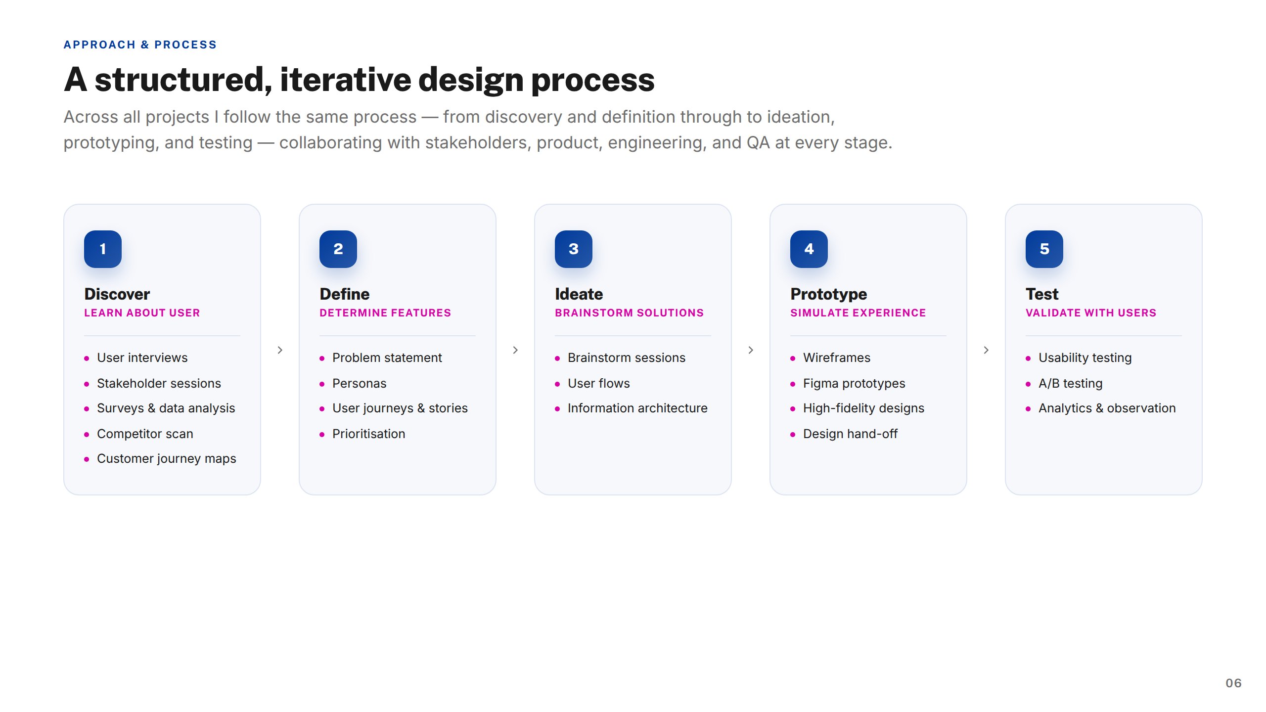
As part of an eight-person UXD team, I worked through a structured, iterative process — discovery, definition, ideation, prototyping, and testing — in close collaboration with product, engineering, QA, and research.

I built reusable framework templates for menus, navigation, and data-heavy screens, standardised components and interaction states for accessibility, and a 30+ icon system representing job roles across five industries.

The solution

A clearer, more scalable native experience — from a redesigned pay section and timesheet approvals to a complete job-posting journey and worker profiles.

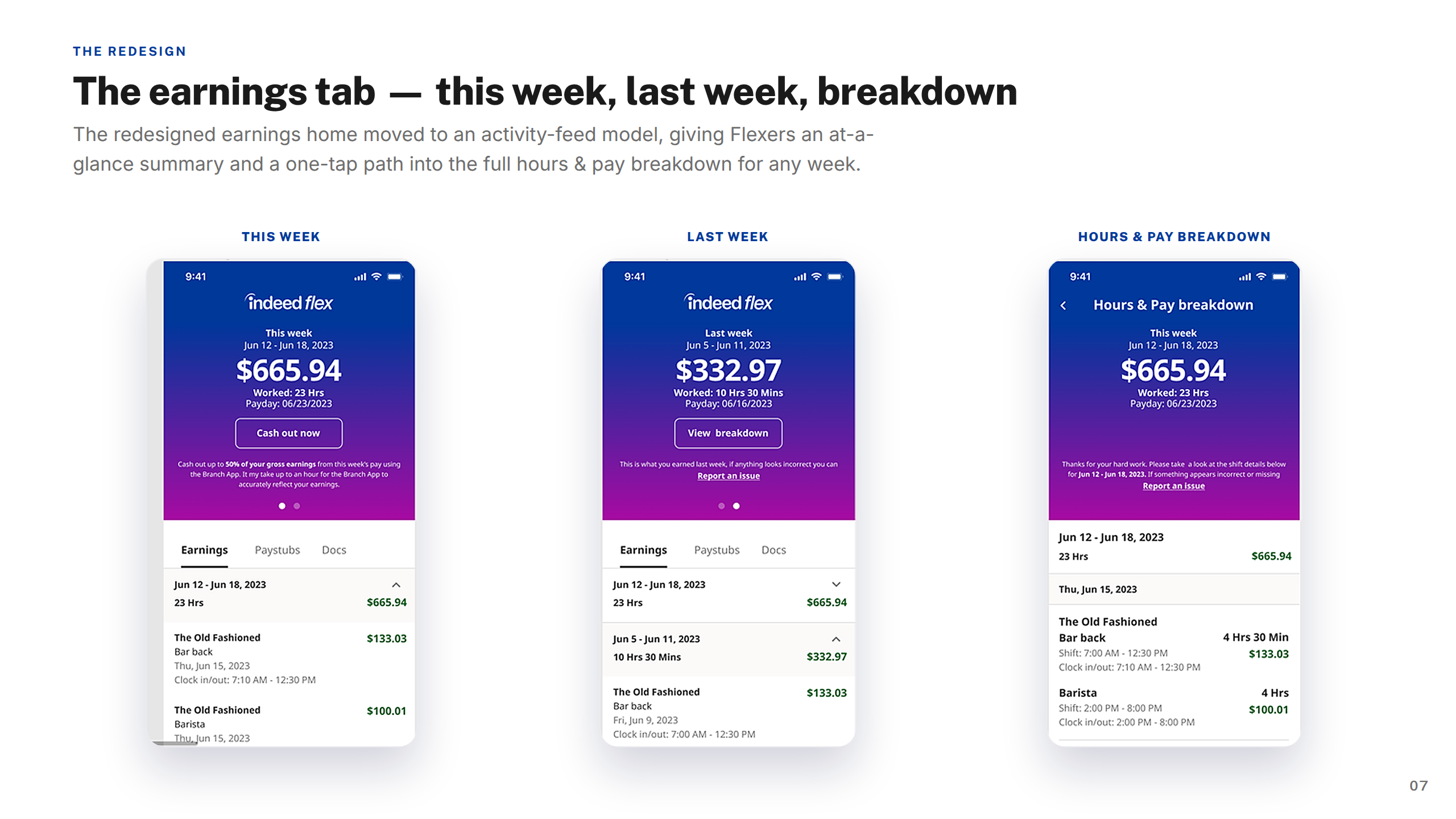
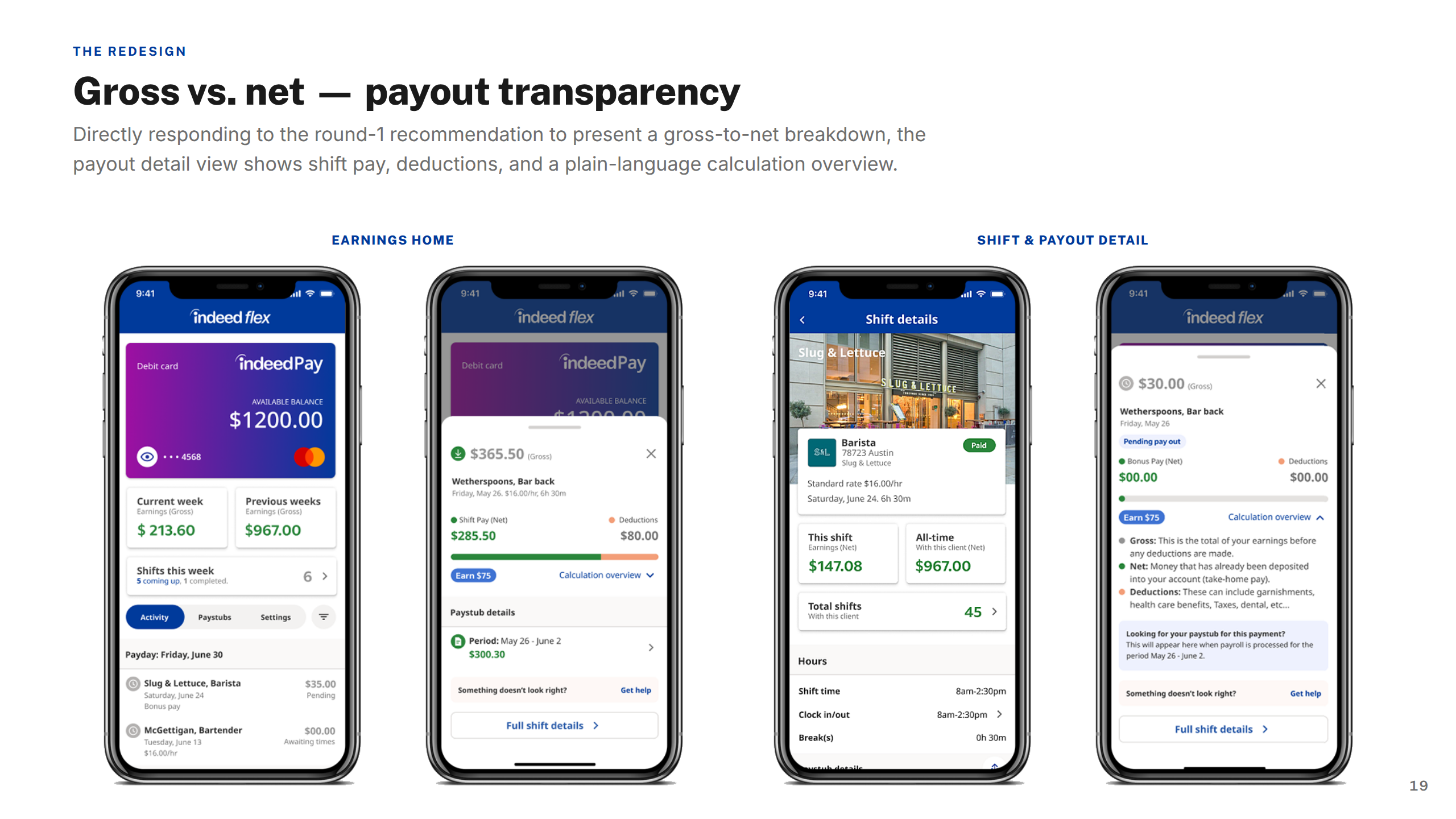
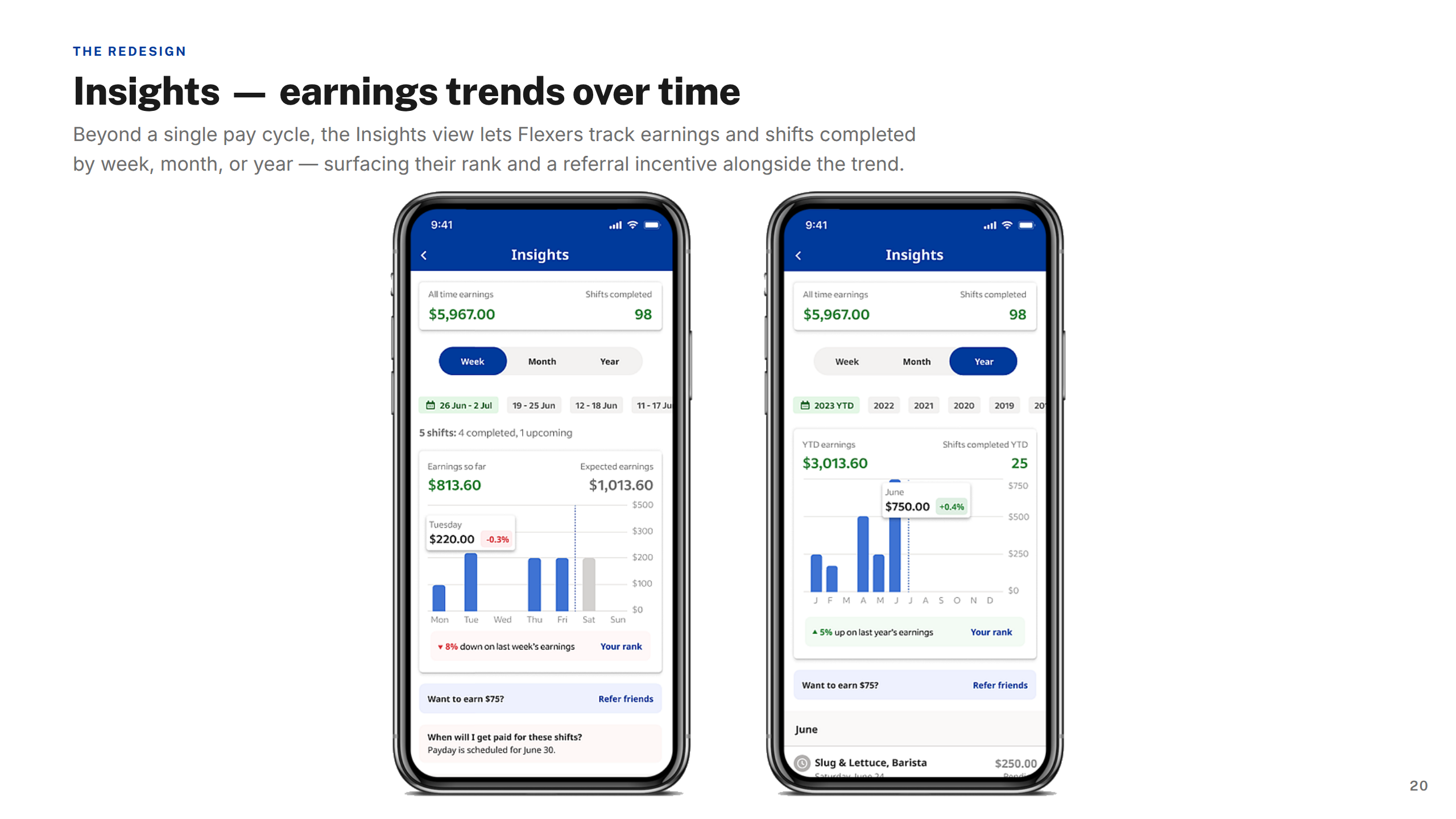
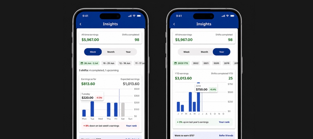
Key flows were rebuilt around clarity and trust. The Strikes and Bans redesign gave workers clearer policy communication and status tracking. The Earnings section introduced weekly summaries, detailed breakdowns, and historical views so workers always understood their pay. The job-posting journey let busy managers create and publish shifts entirely on mobile.

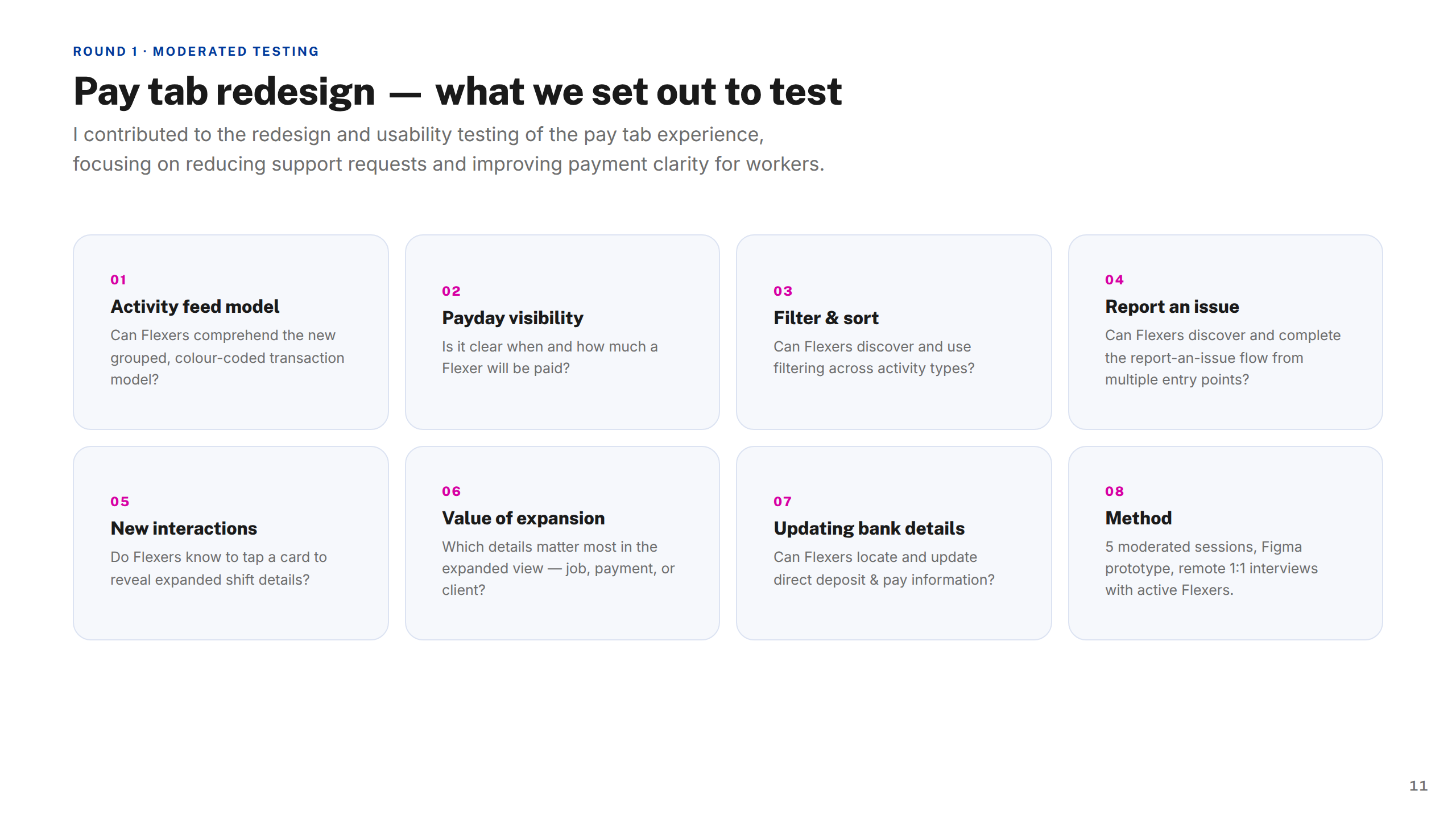
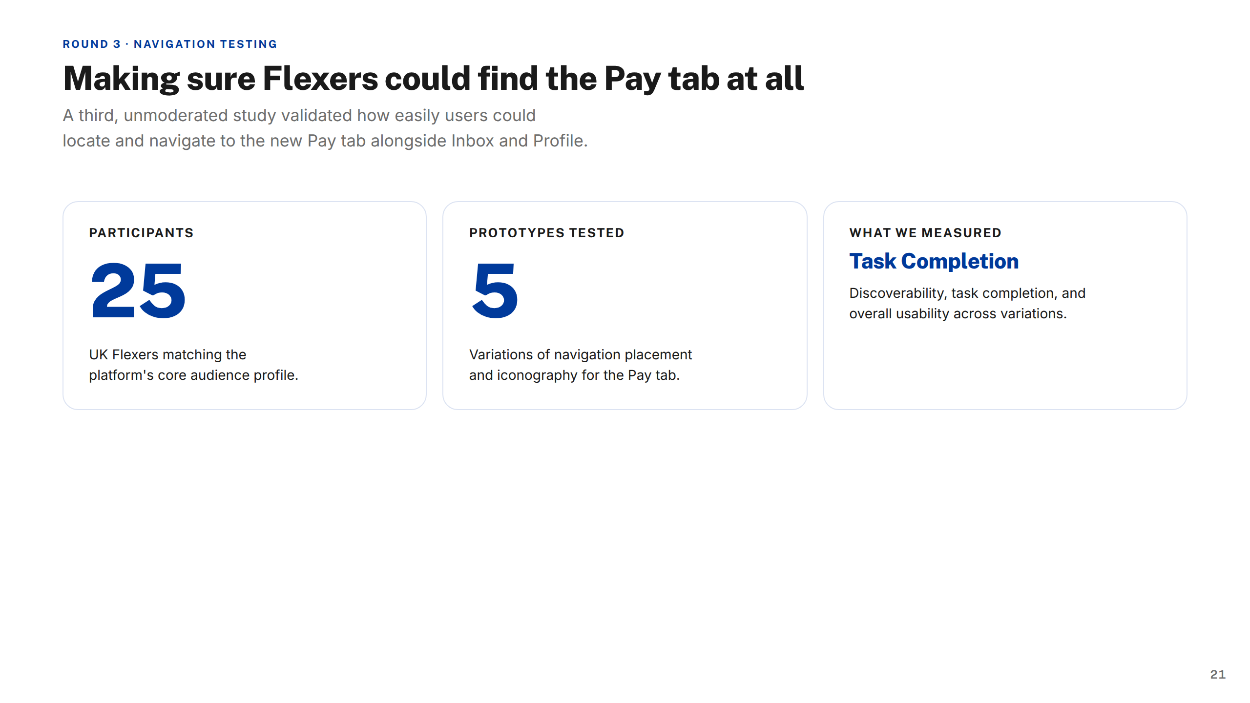
Every change was validated through usability testing — including a 25-participant study across five prototypes on the pay tab alone — ensuring the patterns held up before they shipped.

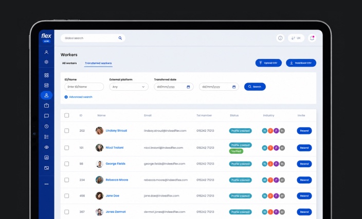
Indeed Flex workers platform — admin view
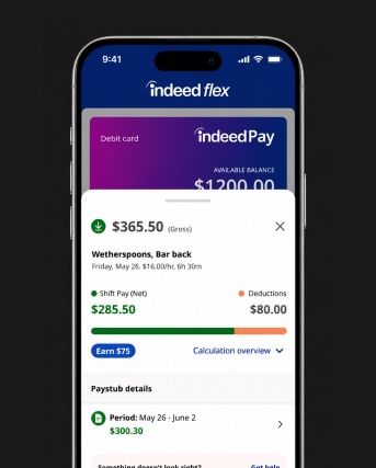
Indeed Flex earnings tab screens
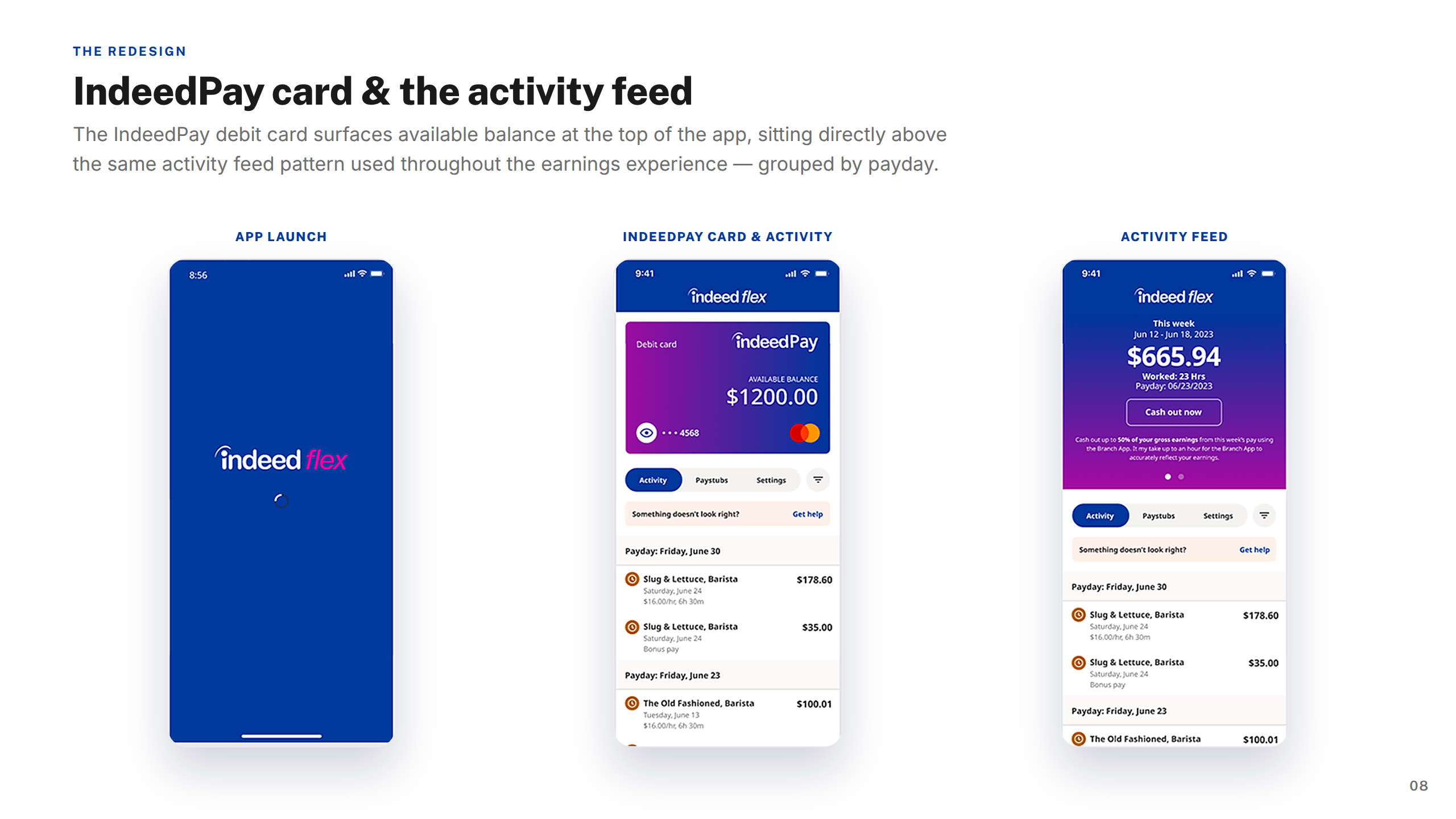
Indeed Flex IndeedPay activity screens
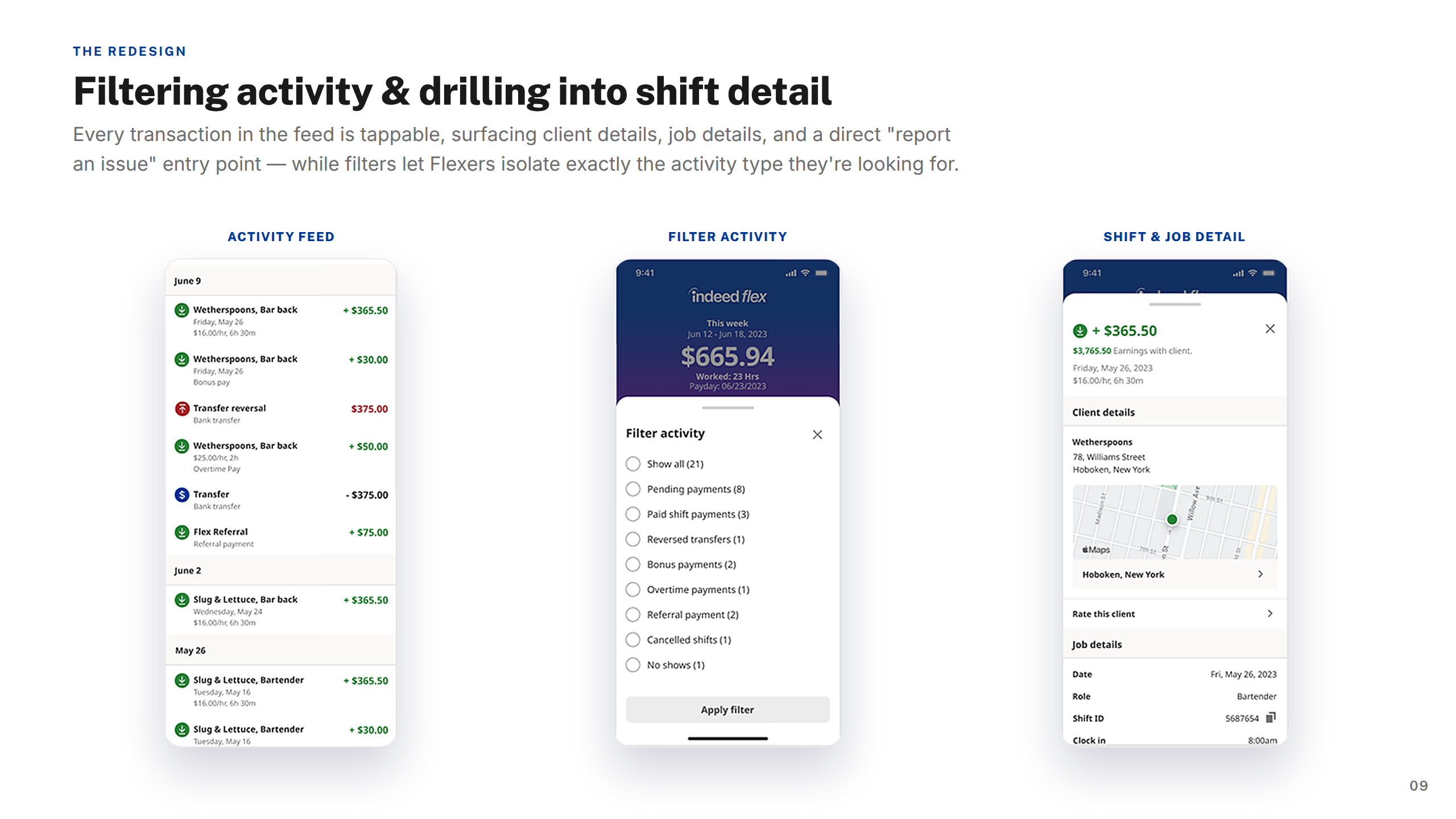
Indeed Flex activity filter detail screens
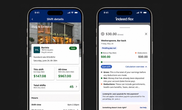
Indeed Flex payout screens
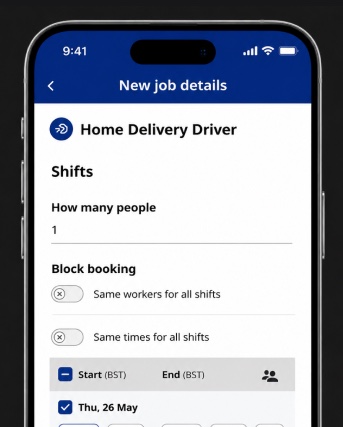
Indeed Flex mobile app screens

The end-to-end case study covering research, design evolution, usability testing, and key decisions made along the way.
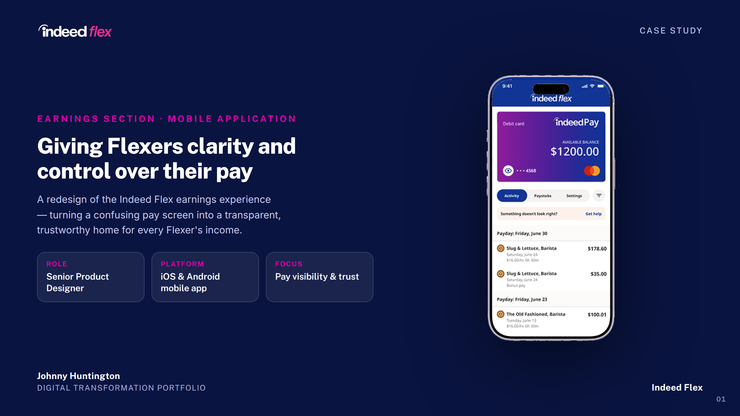
Indeed Flex — Earnings Section Case Study
1 / 26
Cover
About Indeed Flex
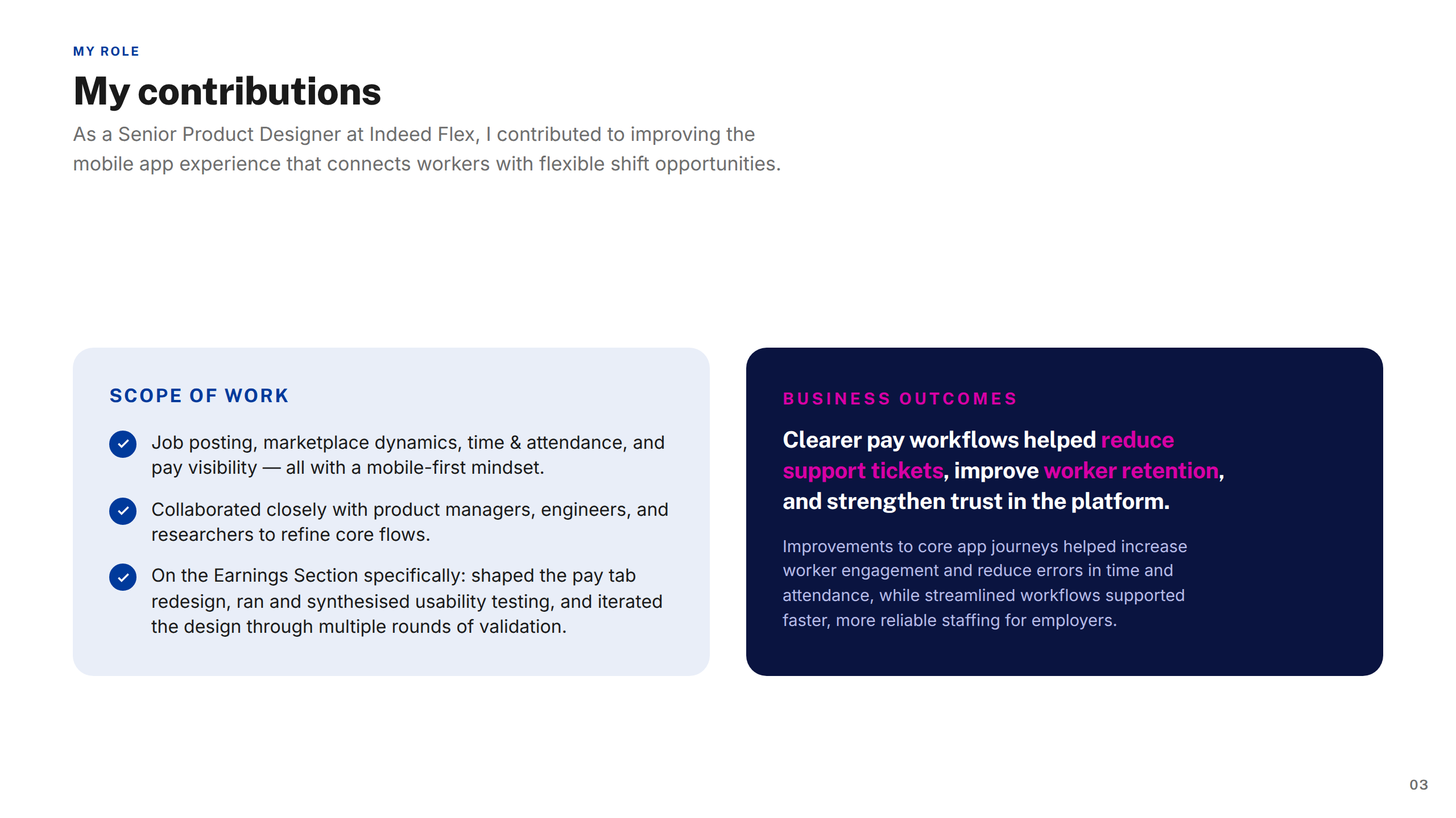
My Contributions
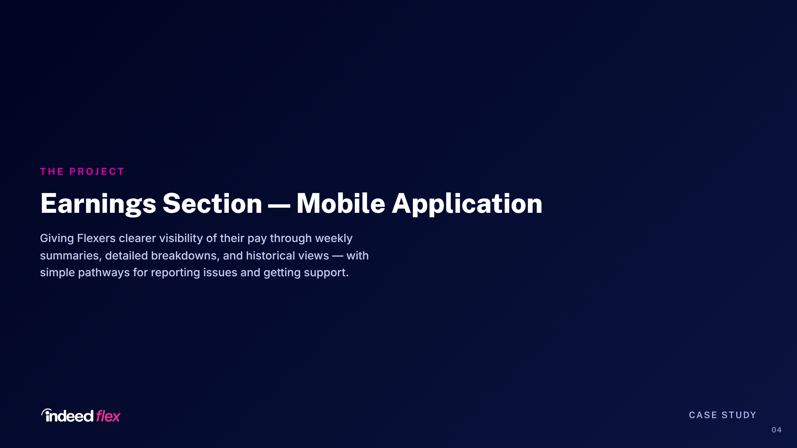
The Project
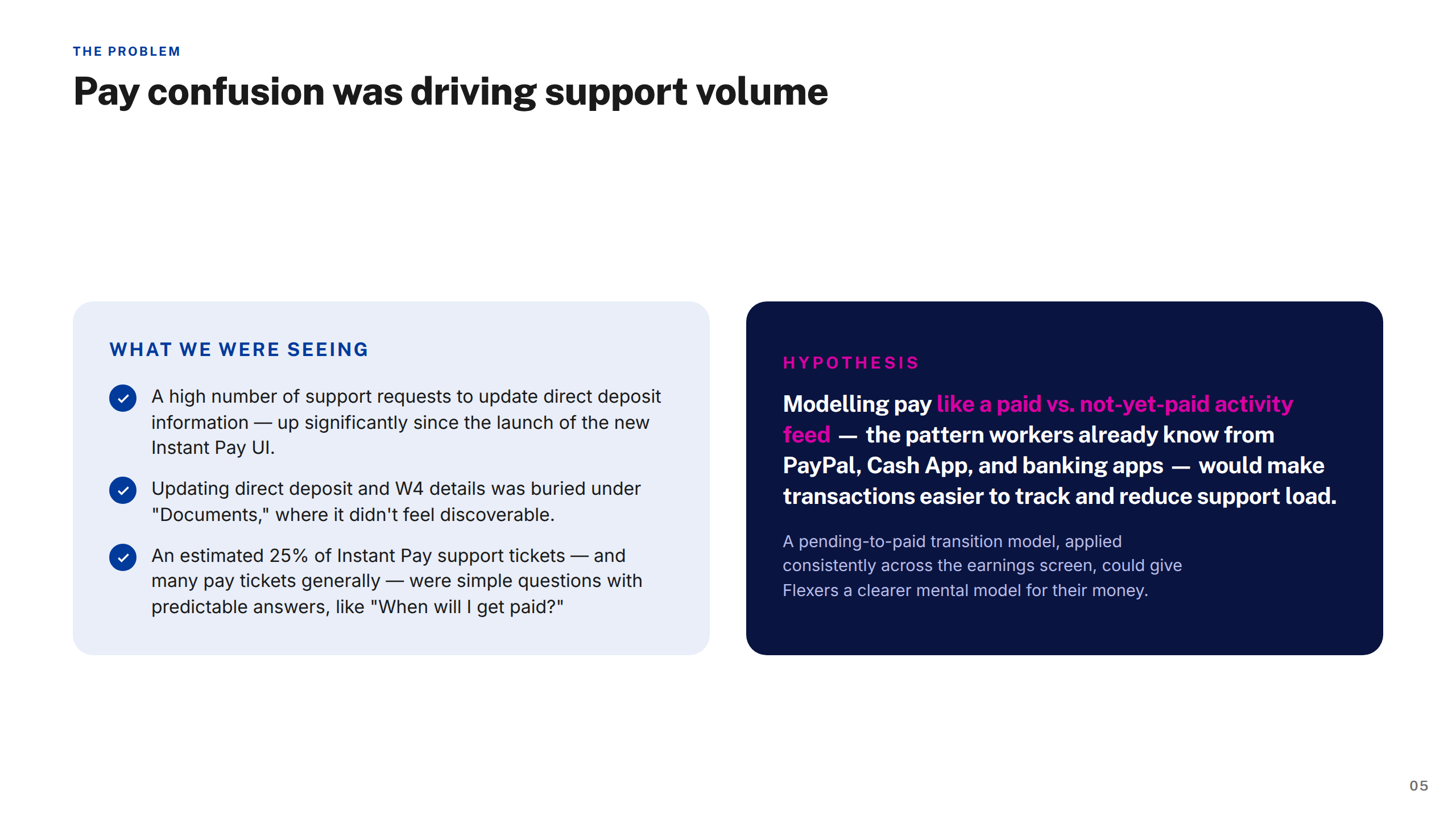
The Problem
Approach & Process
Screens — Earnings Tab
Screens — IndeedPay Activity
Screens — Activity Filter Detail
Testing
Moderated — Methodology
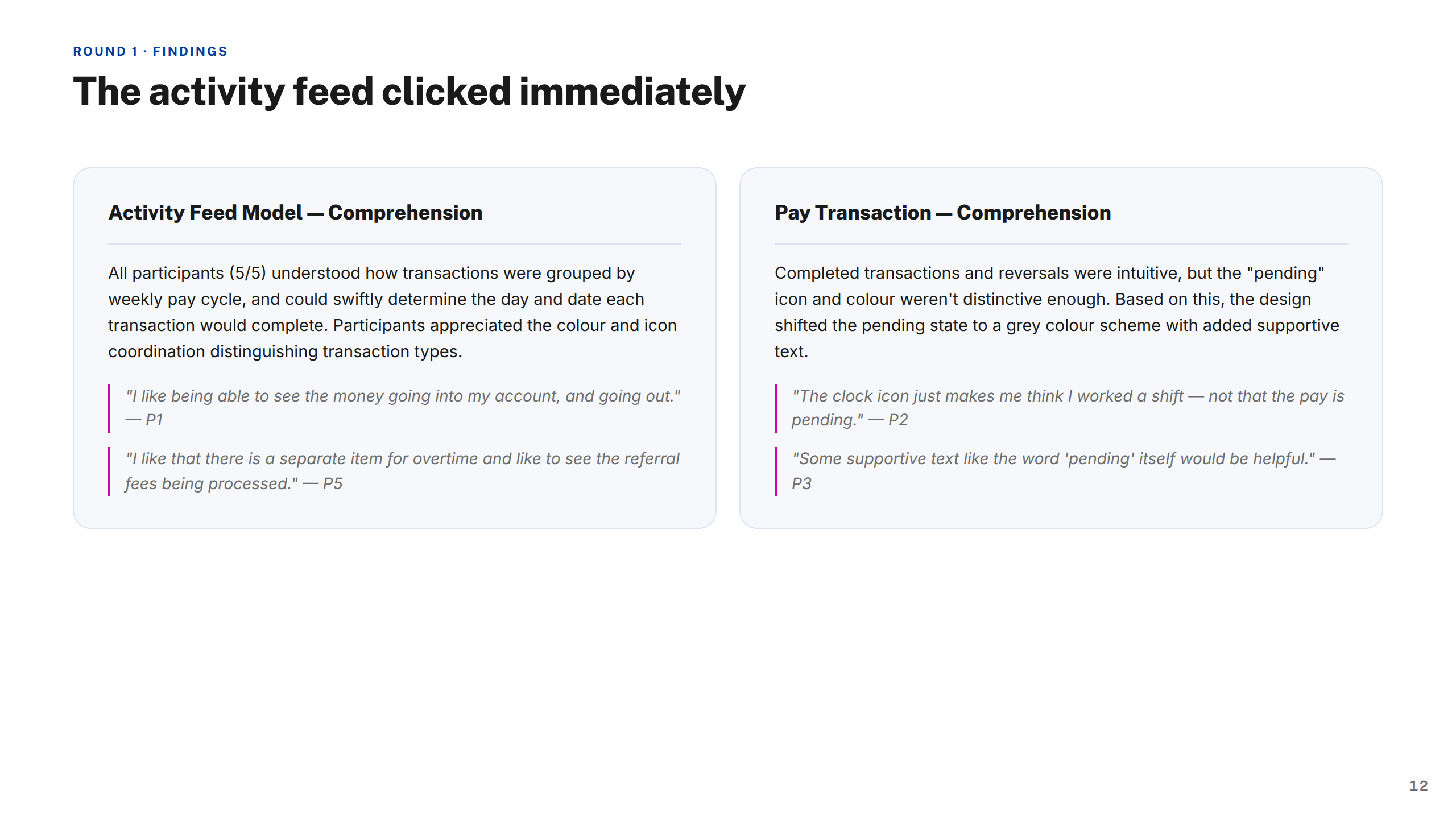
Moderated — Findings: Activity Feed
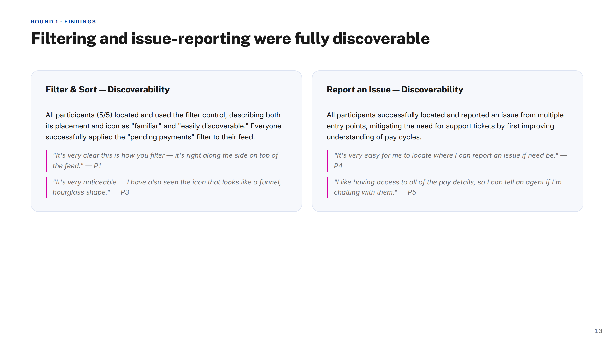
Moderated — Findings: Filter Issue
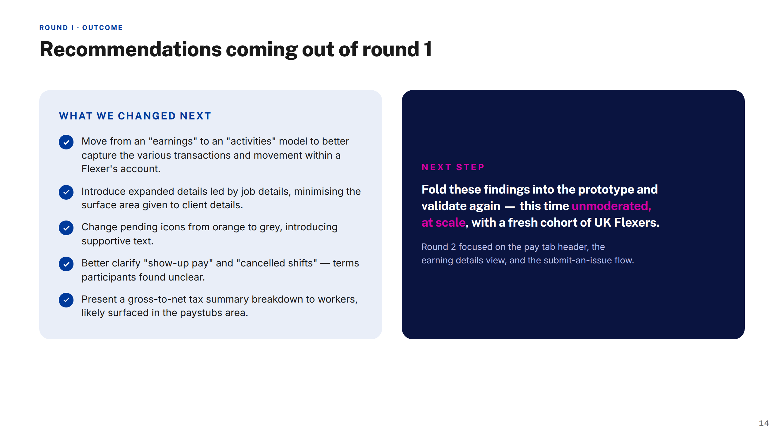
Recommendations
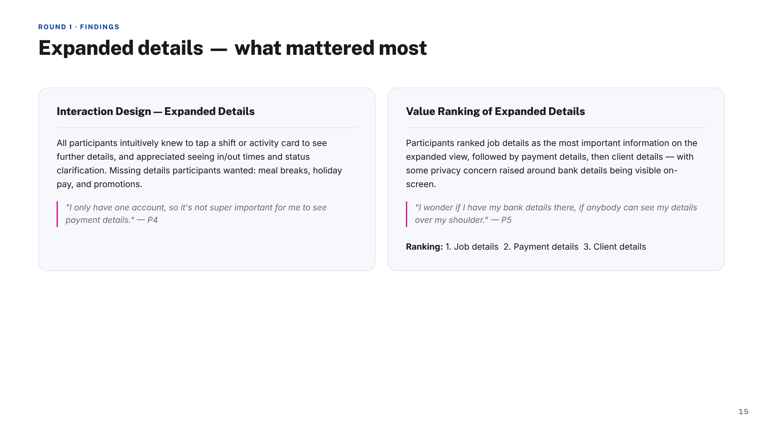
Moderated — Findings: Expanded Details
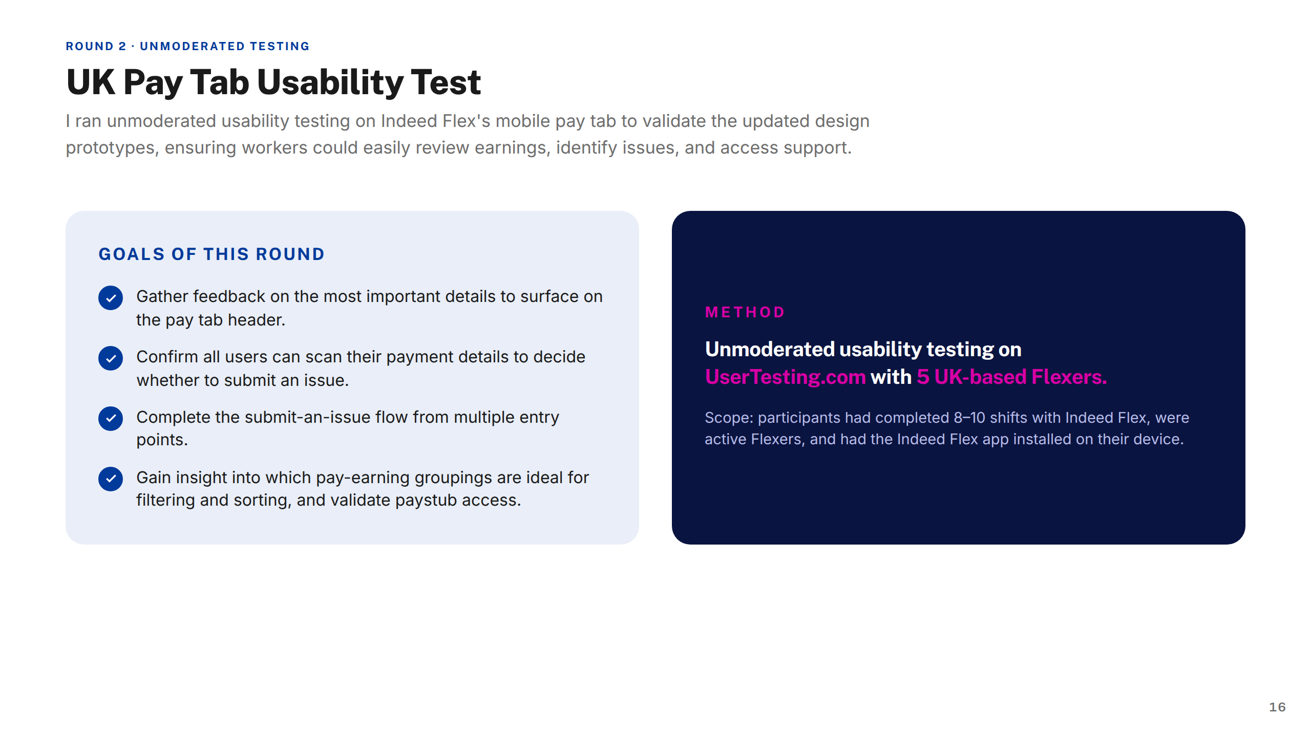
Unmoderated — Methodology
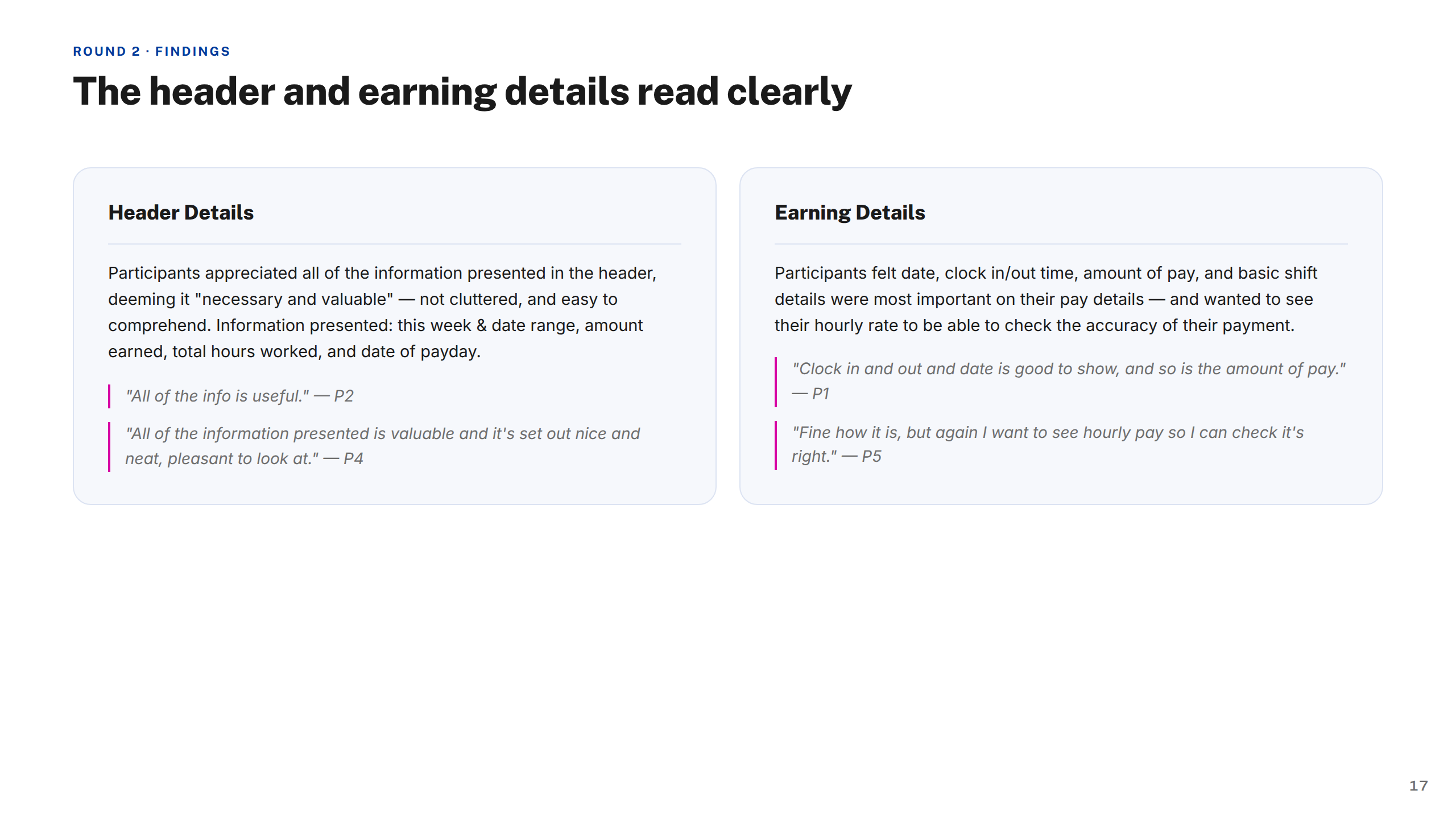
Unmoderated — Findings: Header Earning
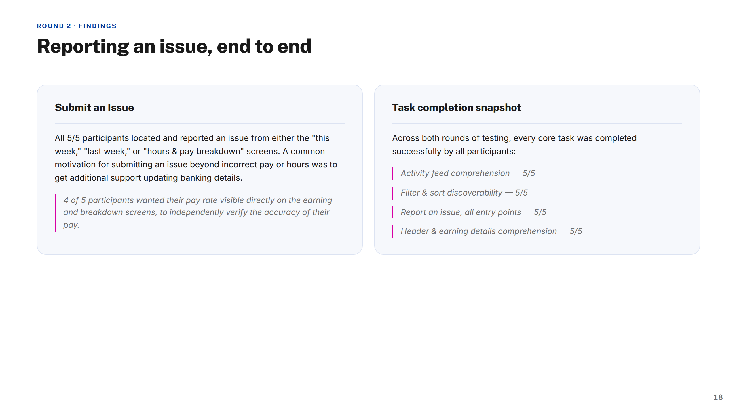
Unmoderated — Findings: Submit Issue
Screens — Payout Transparency
Screens — Insights
Navigation Testing
Key Takeaways
Tools Used
Peer Feedback 1
Peer Feedback 2
Thank You
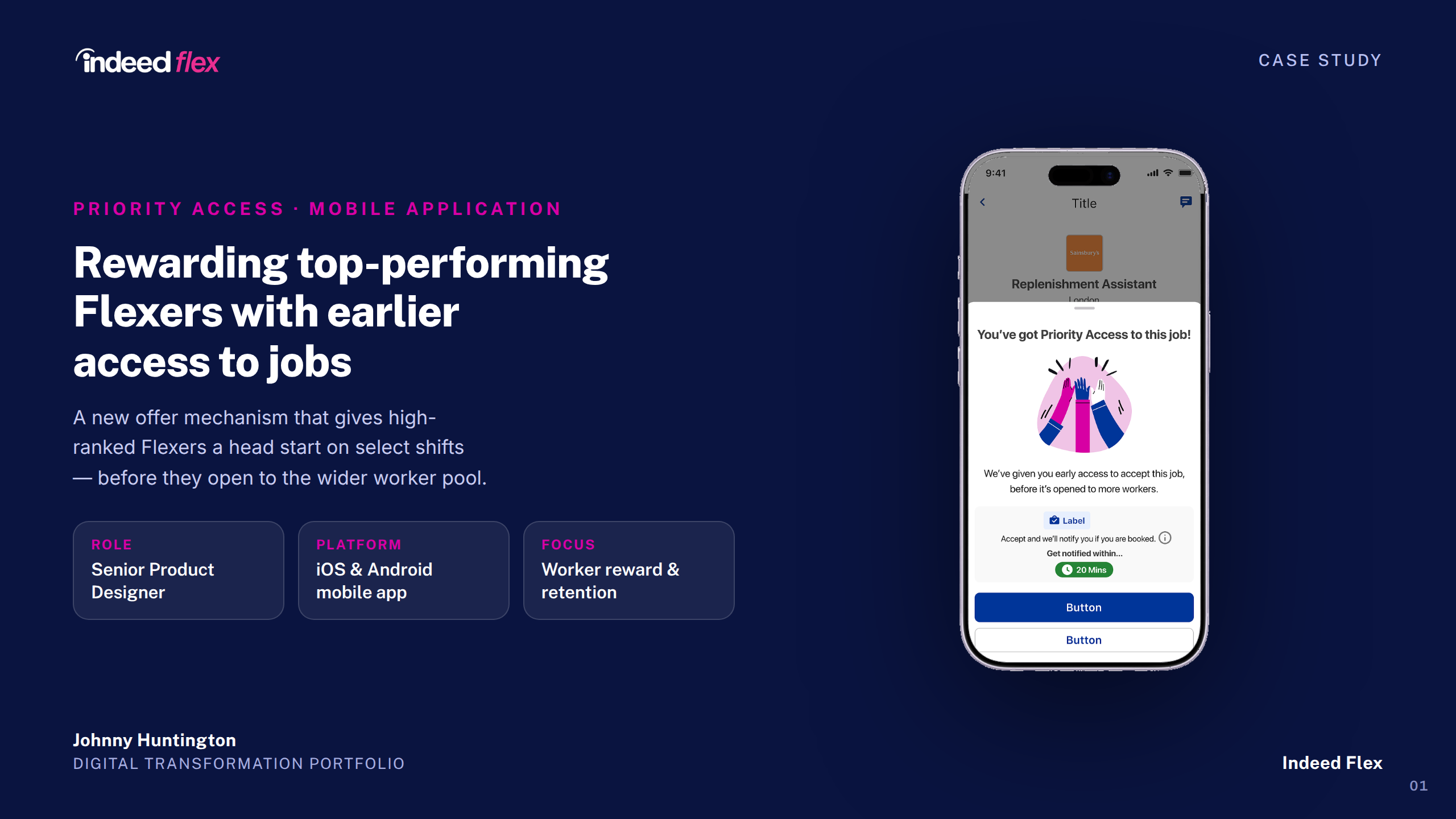
Indeed Flex — Priority Access Case Study
1 / 16
Cover
About Indeed Flex
My Contributions
The Project
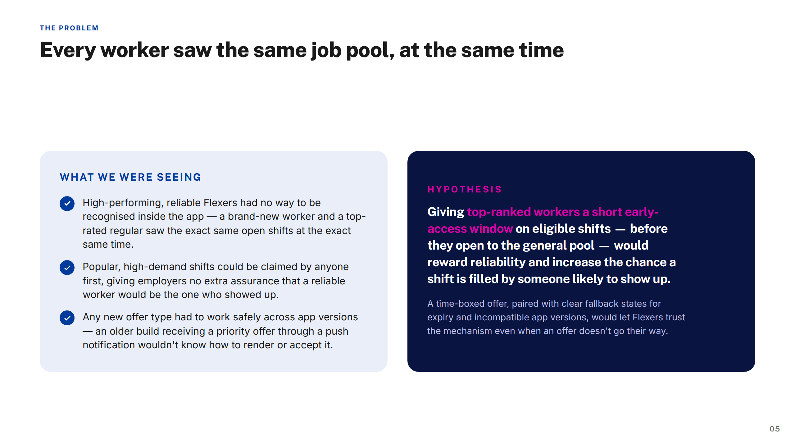
The Problem
Approach & Process
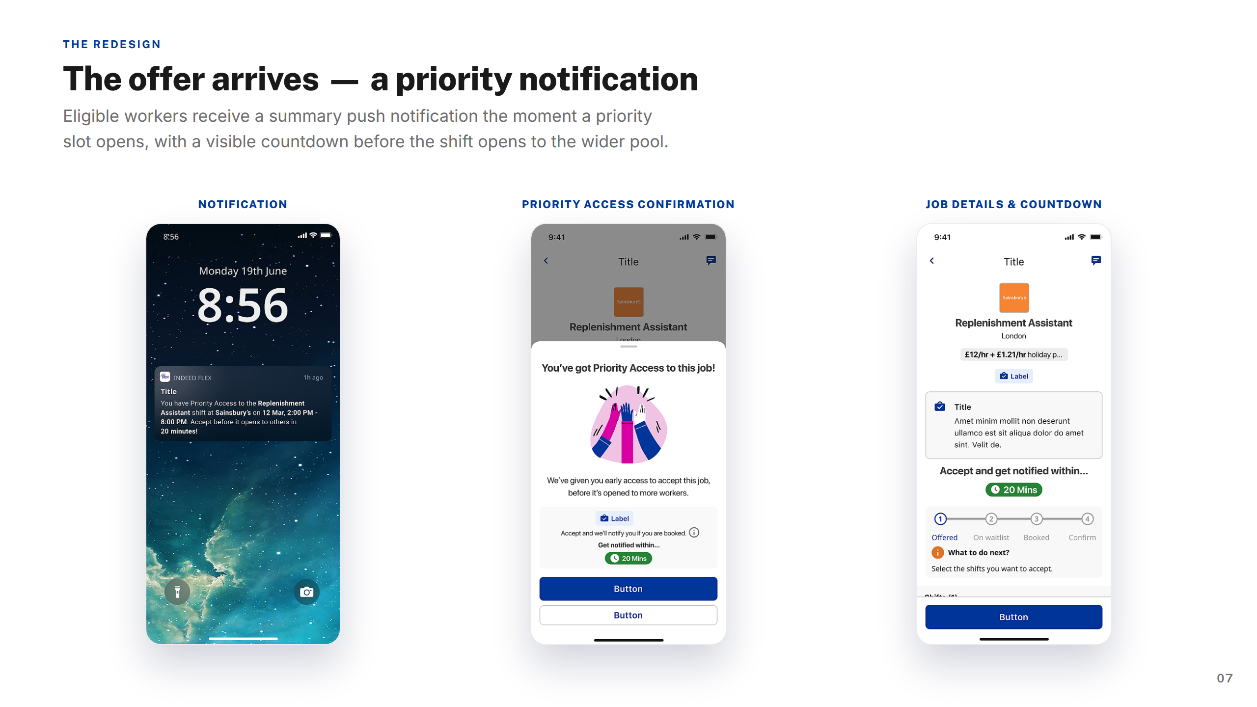
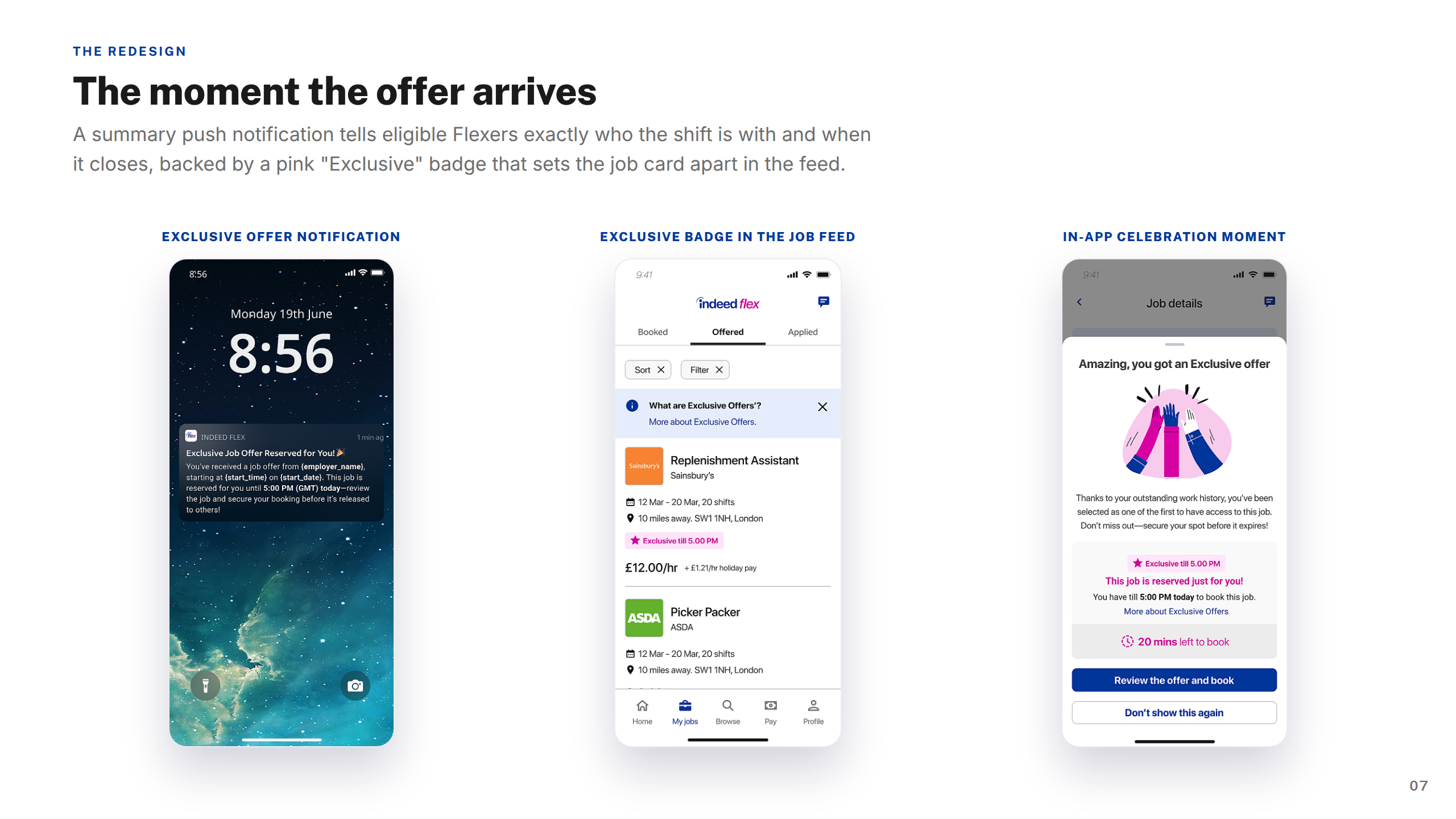
Screens — Offer Arrives
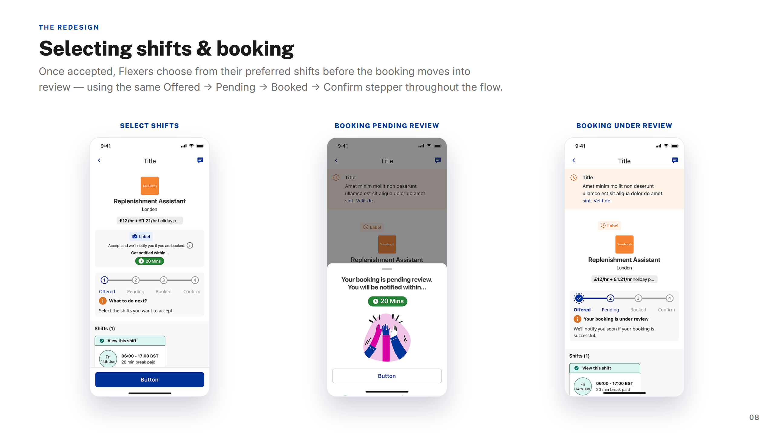
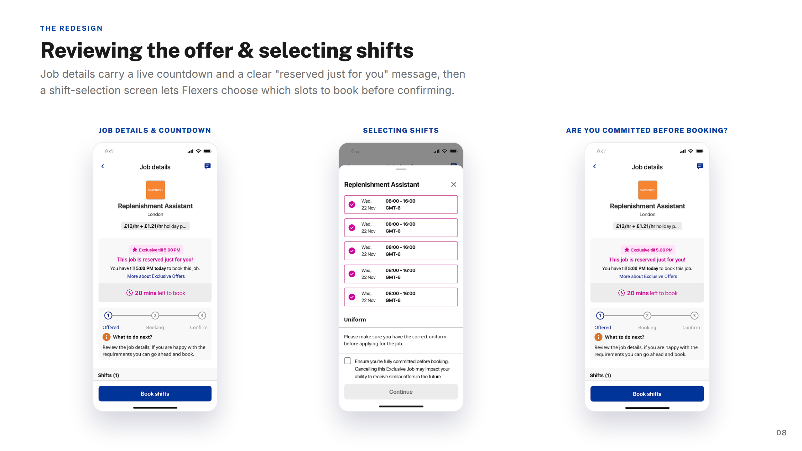
Screens — Select & Book
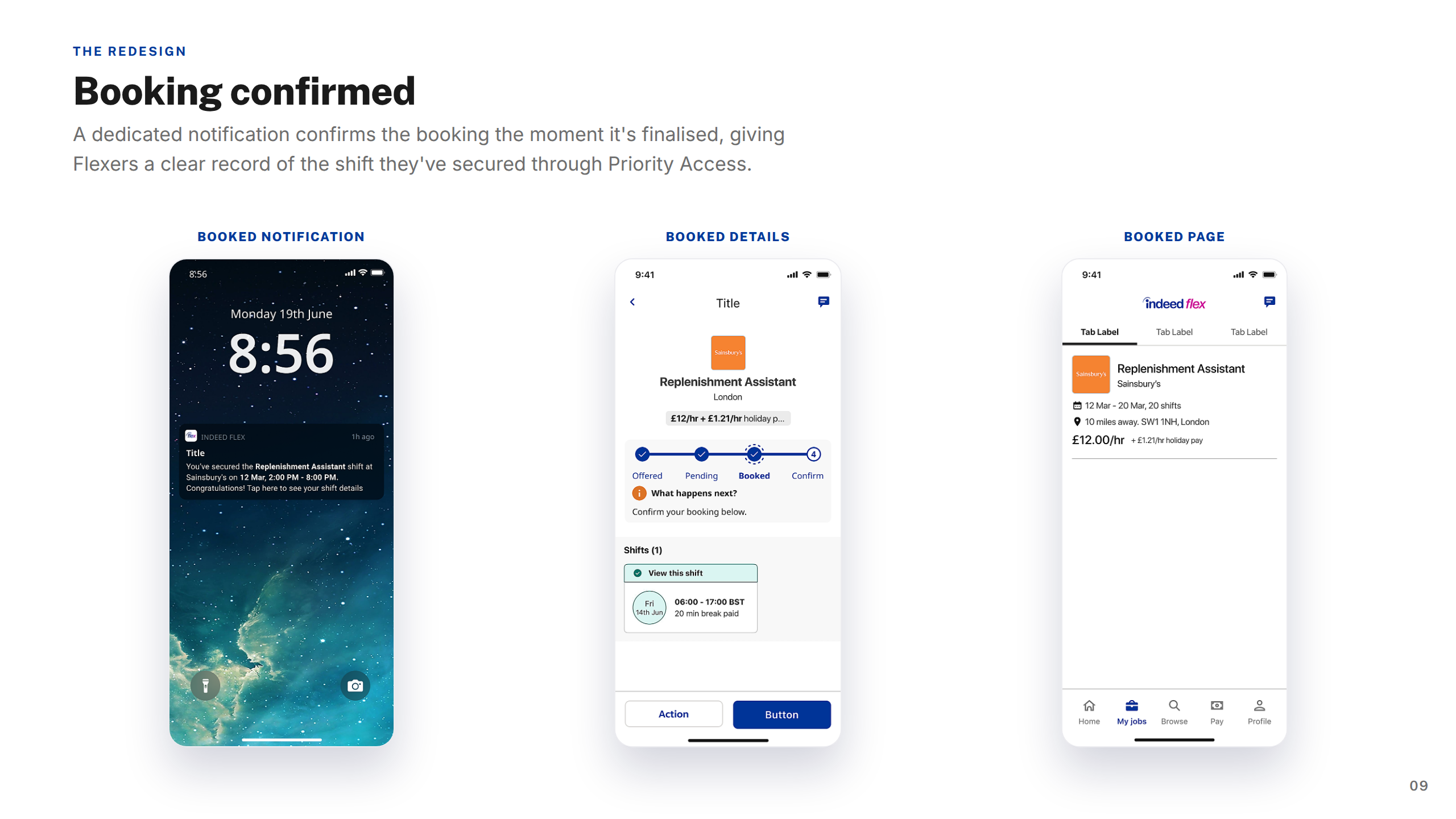
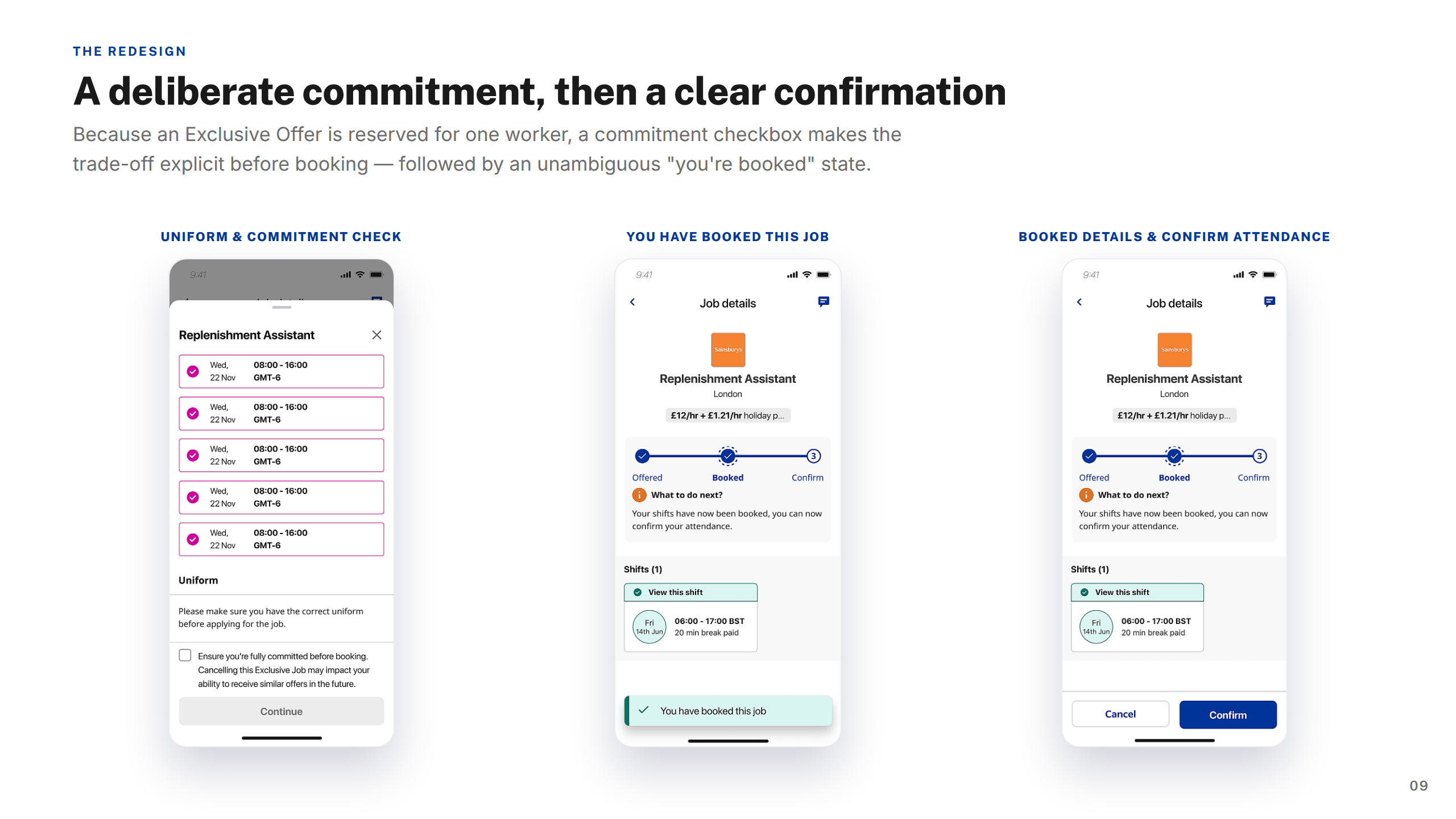
Screens — Booking Confirmed
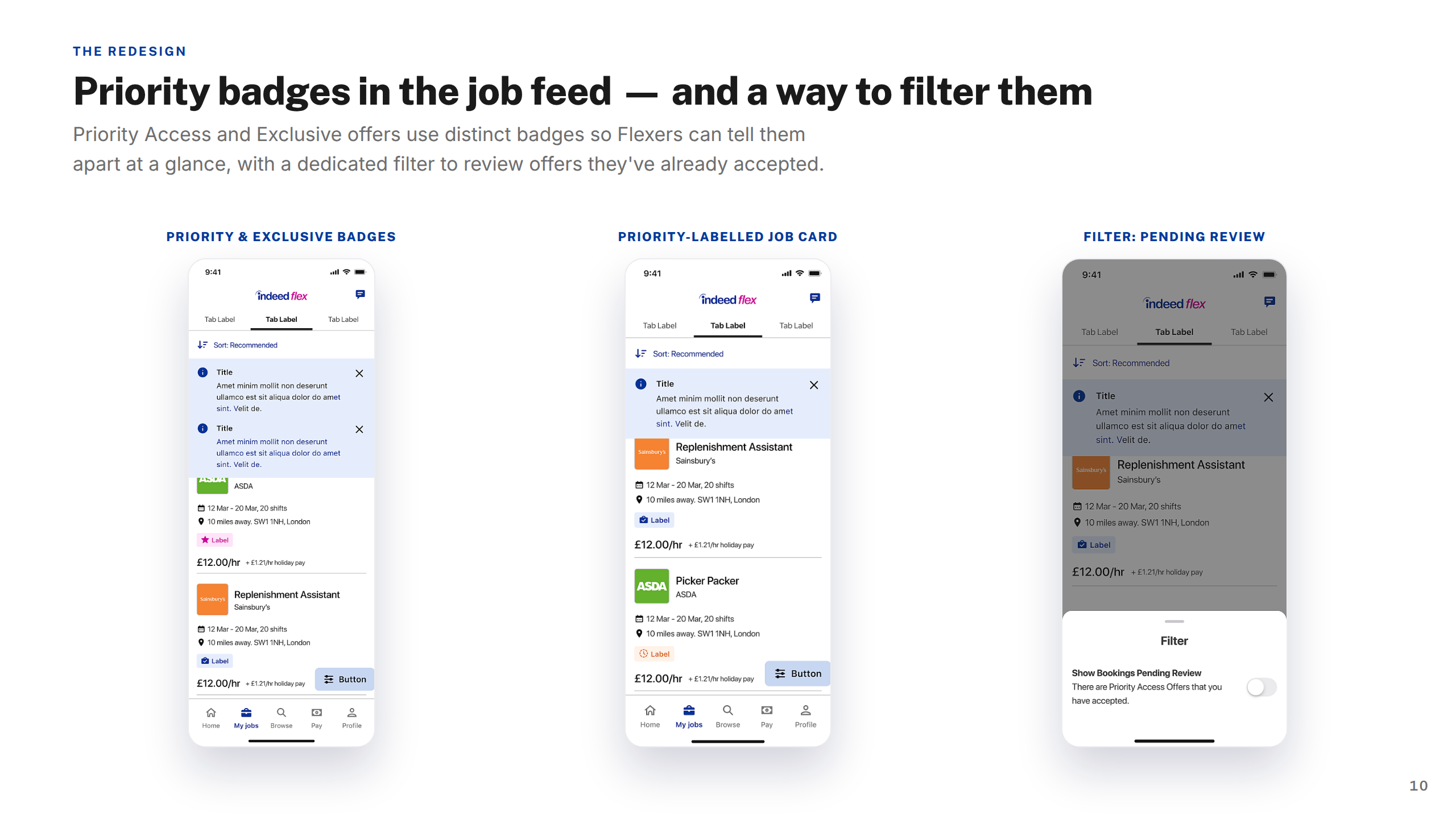
Screens — Badges & Filter
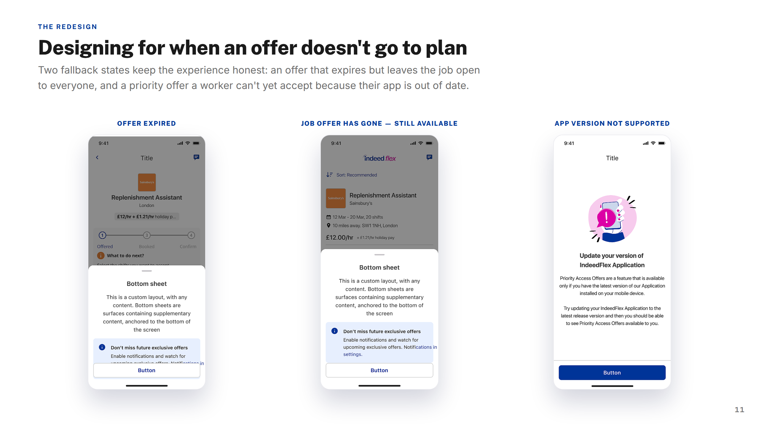
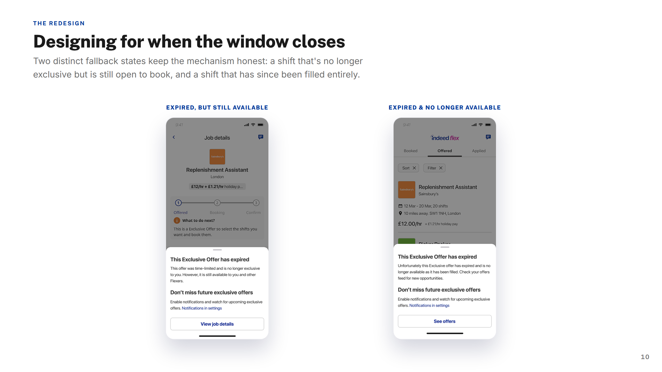
Screens — Edge Cases
Screens — FAQ
Key Takeaways
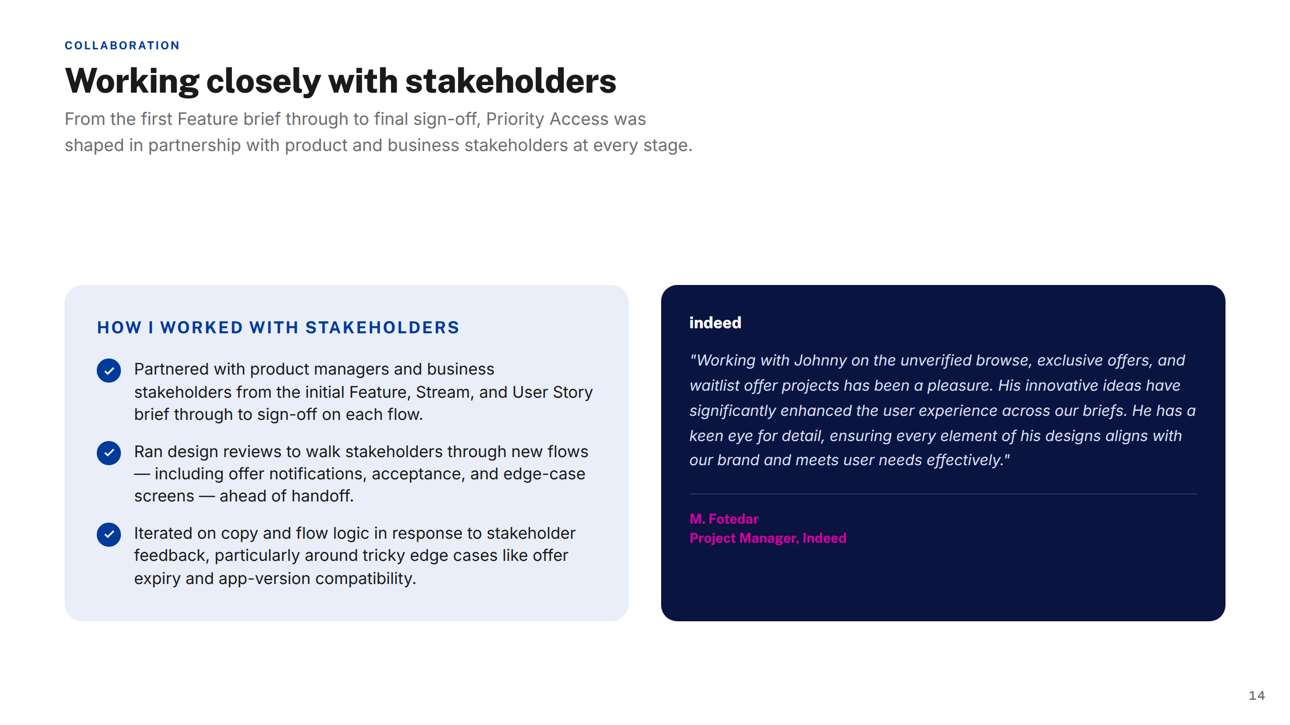
Working with Stakeholders
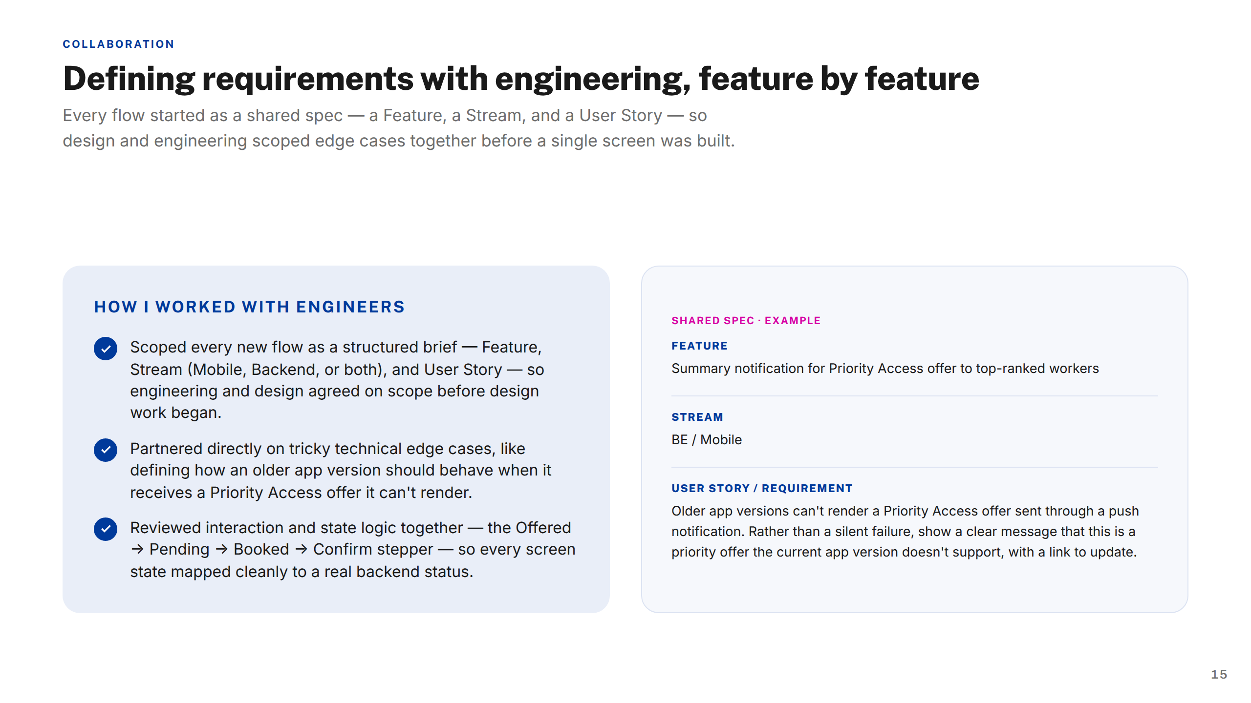
Working with Engineers
Thank You
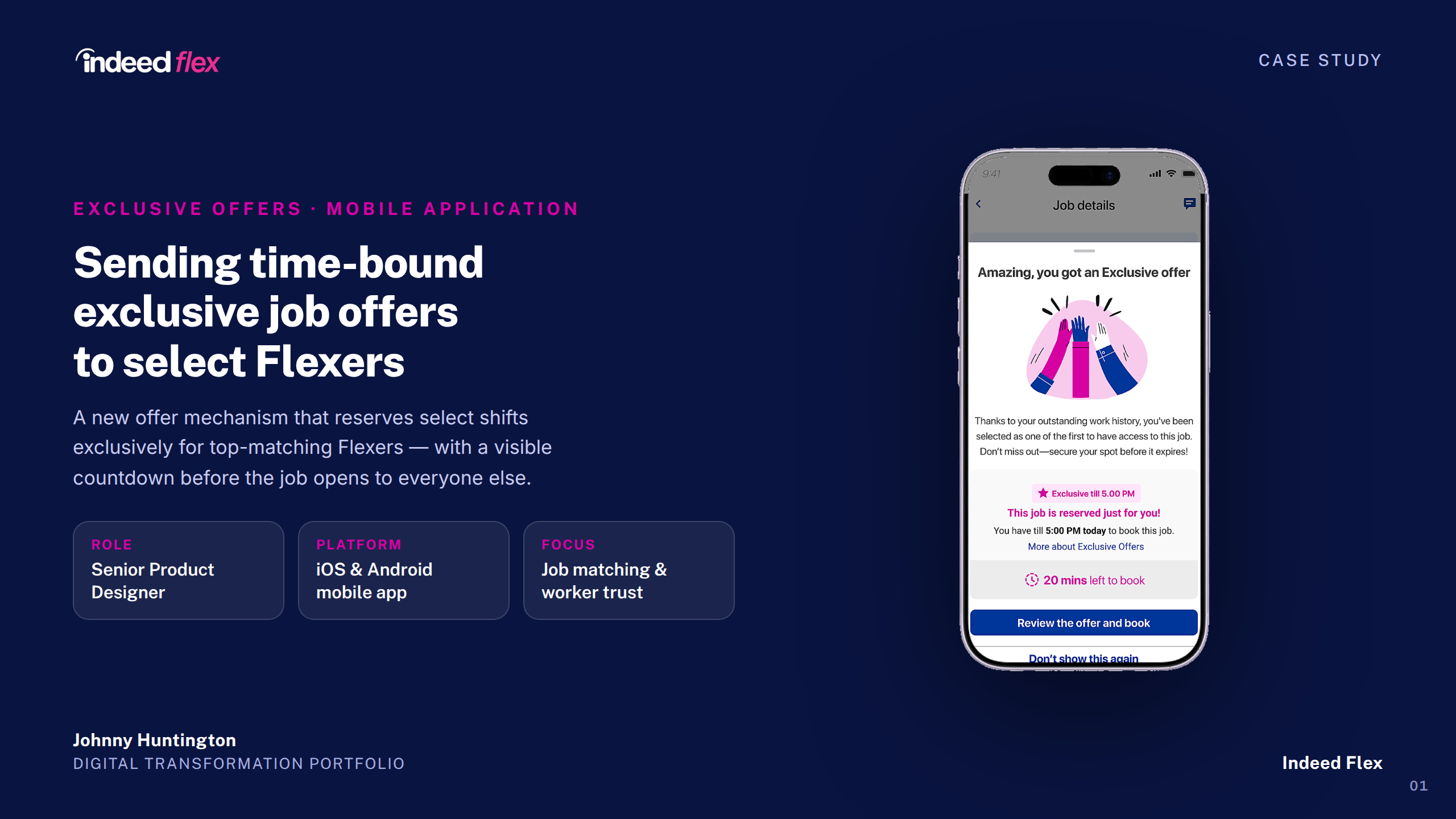
Indeed Flex — Exclusive Offers Case Study
1 / 16
Cover
About Indeed Flex
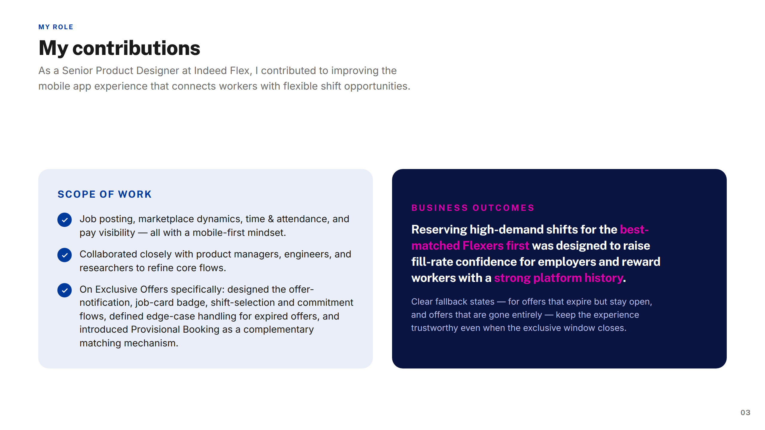
My Contributions
The Project
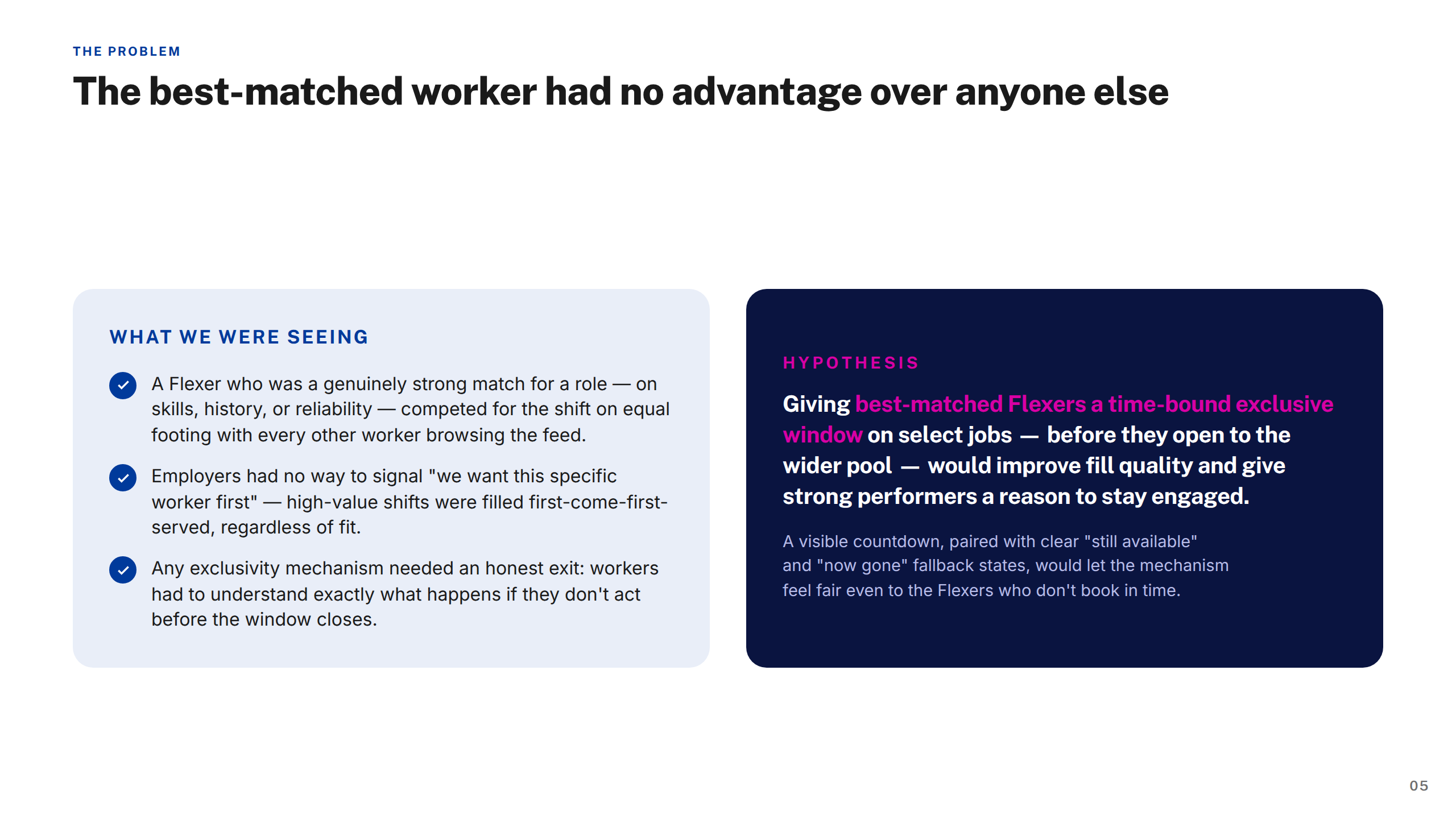
The Problem
Approach & Process
Screens — Offer Arrives
Screens — Review & Select
Screens — Commitment & Confirm
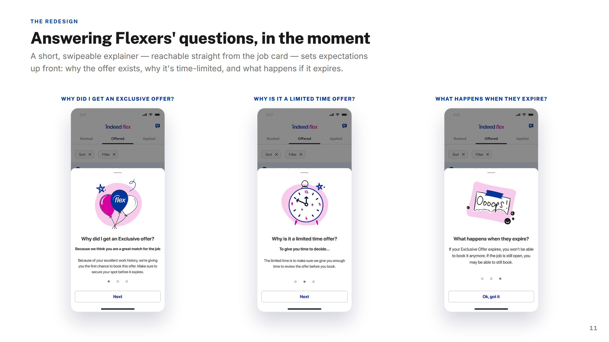
Screens — Offer Expires
Screens — FAQ
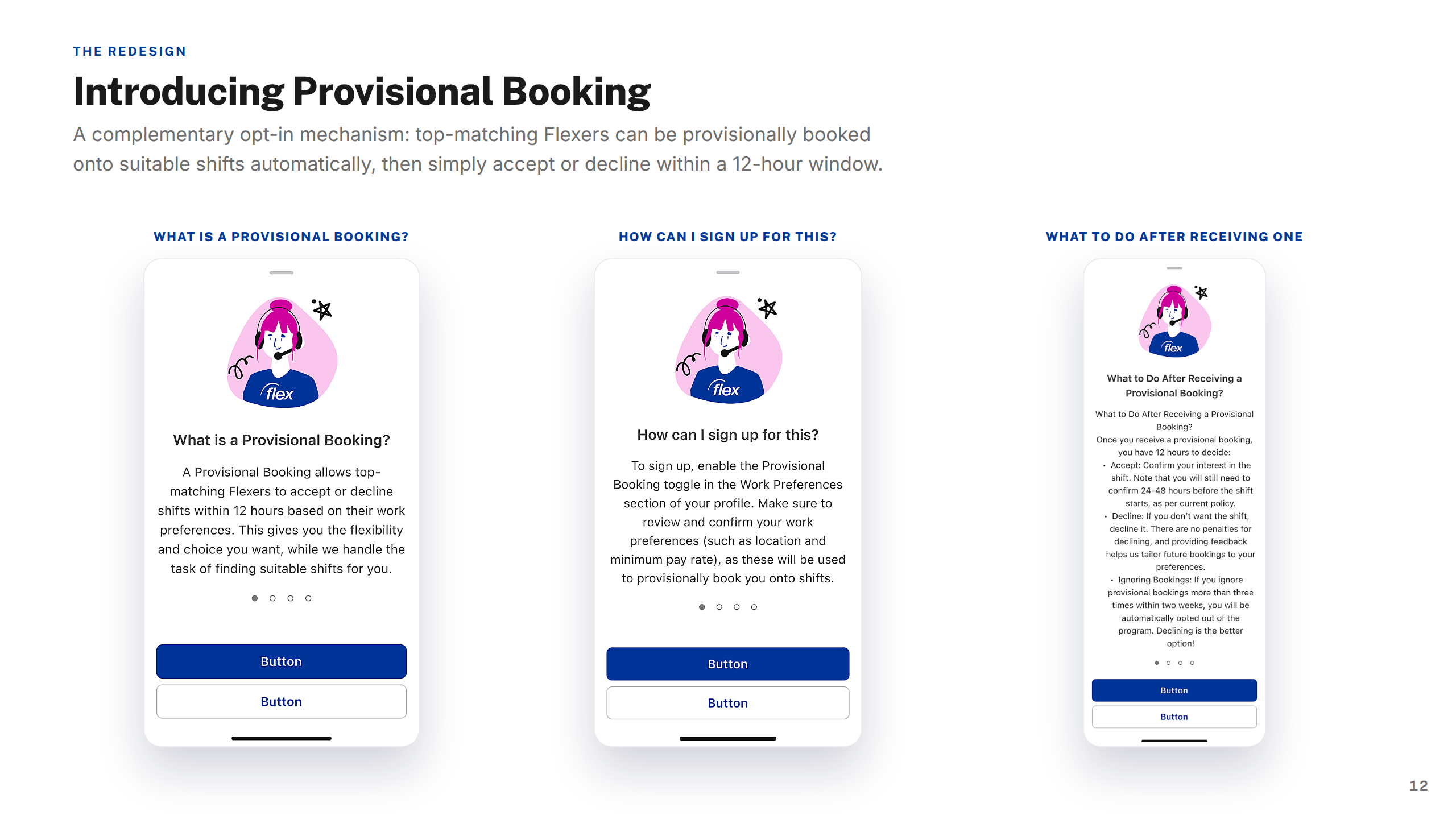
Screens — Provisional Booking
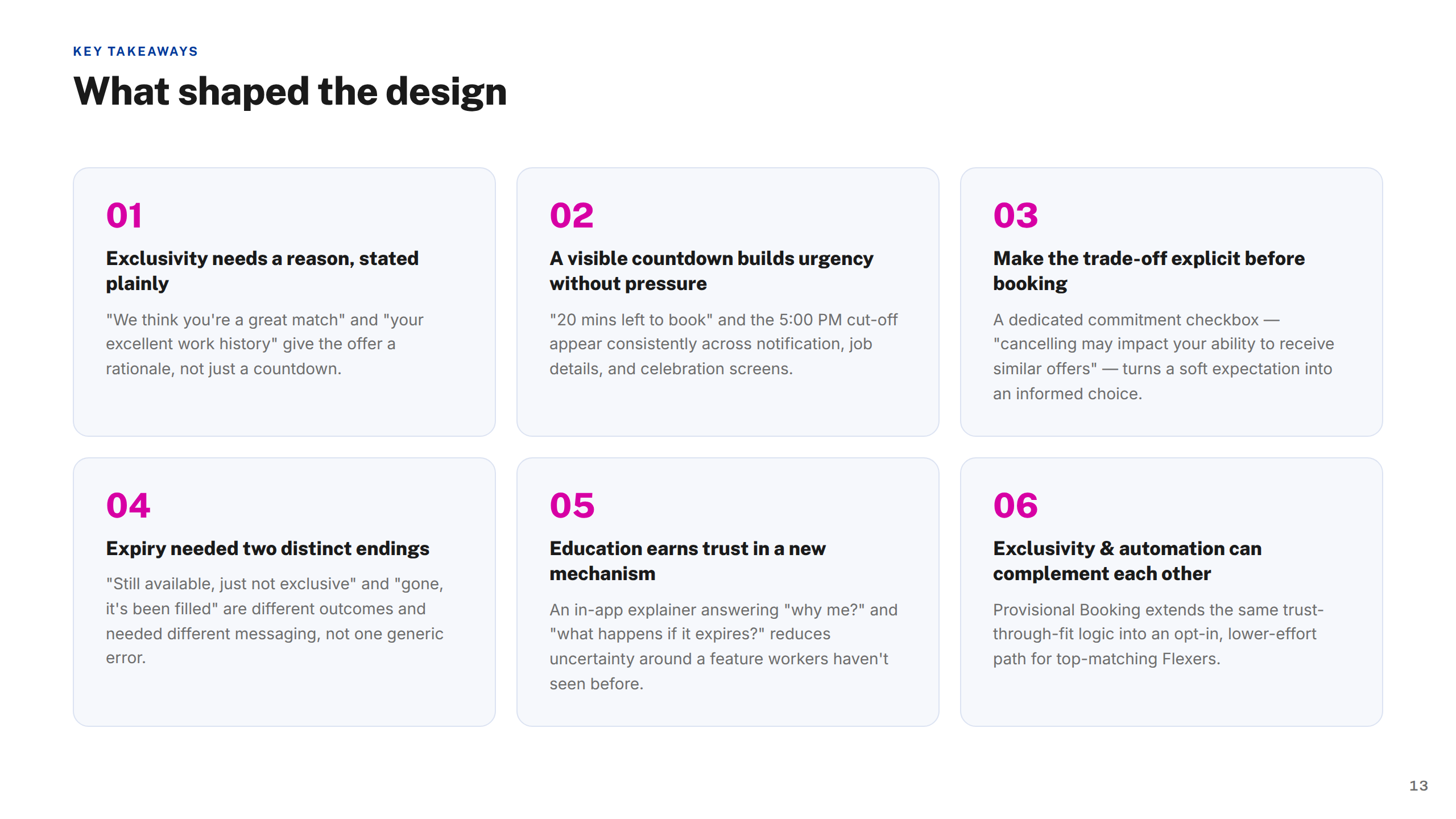
Key Takeaways
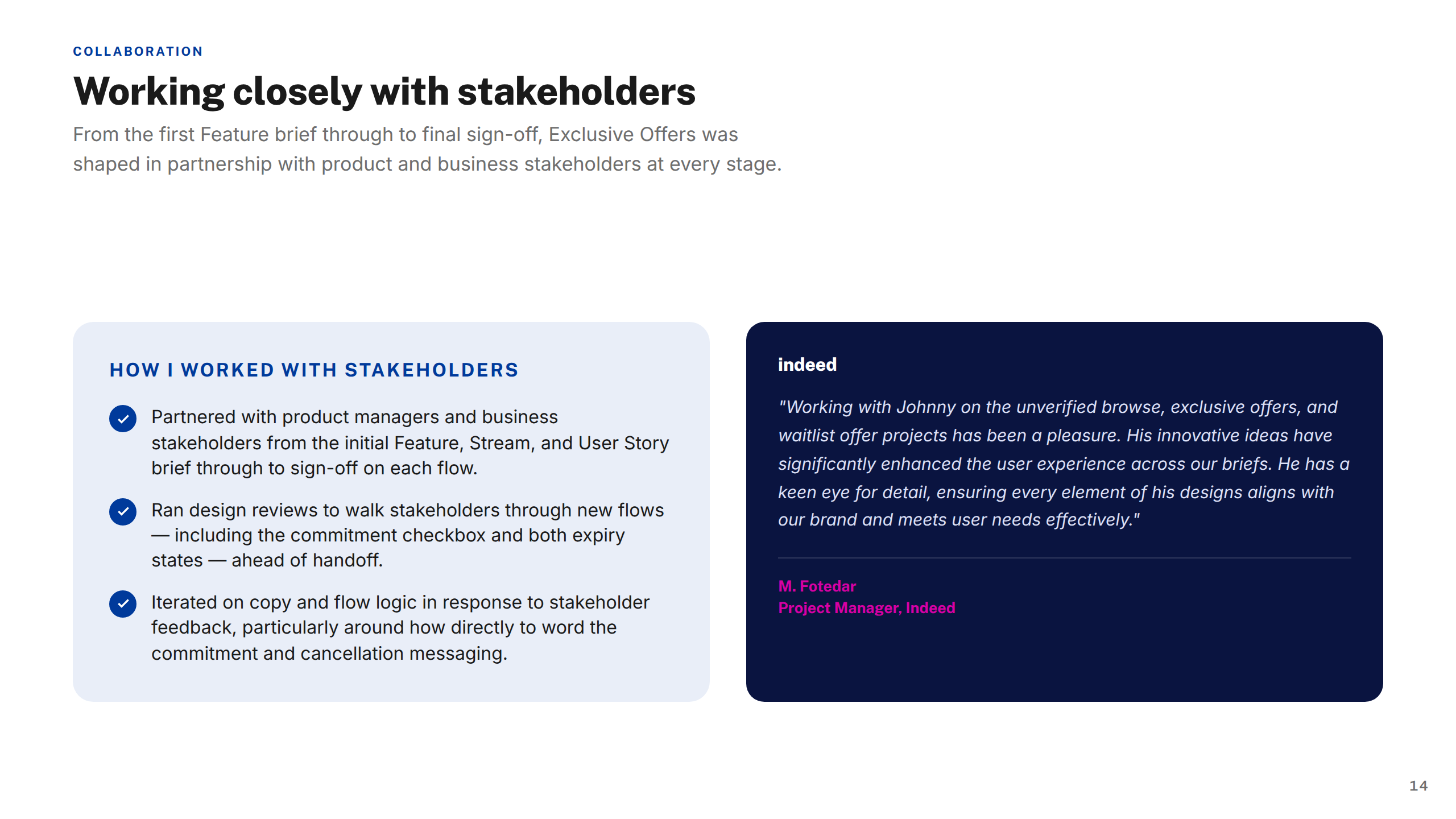
Working with Stakeholders
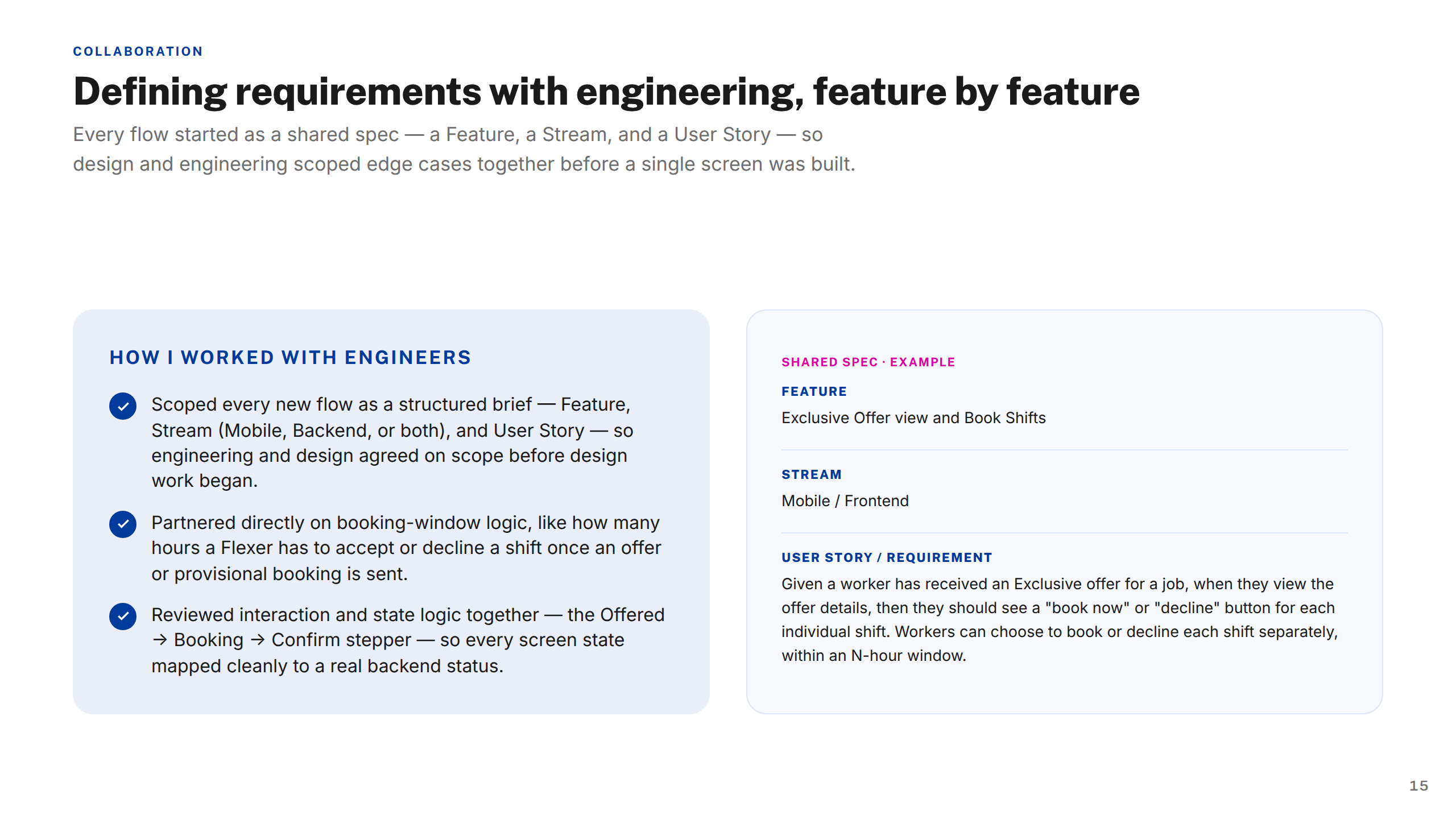
Working with Engineers
Thank You
Indeed Flex — Sign In & Sign Up Case Study
1 / 14
Cover
About Indeed Flex
My Contributions
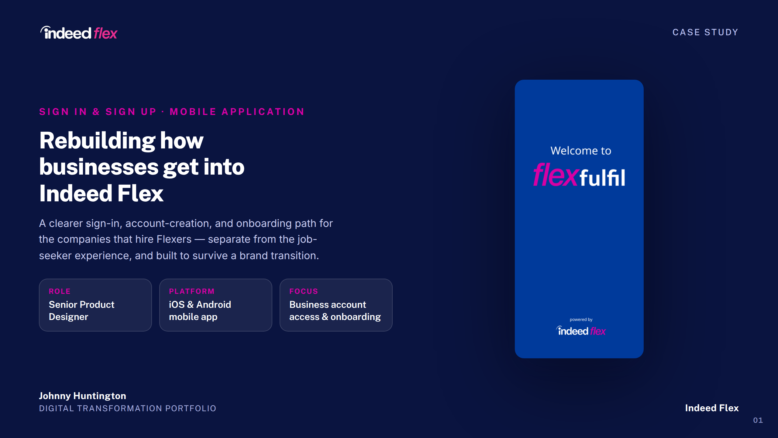
The Project
The Problem
Approach & Process
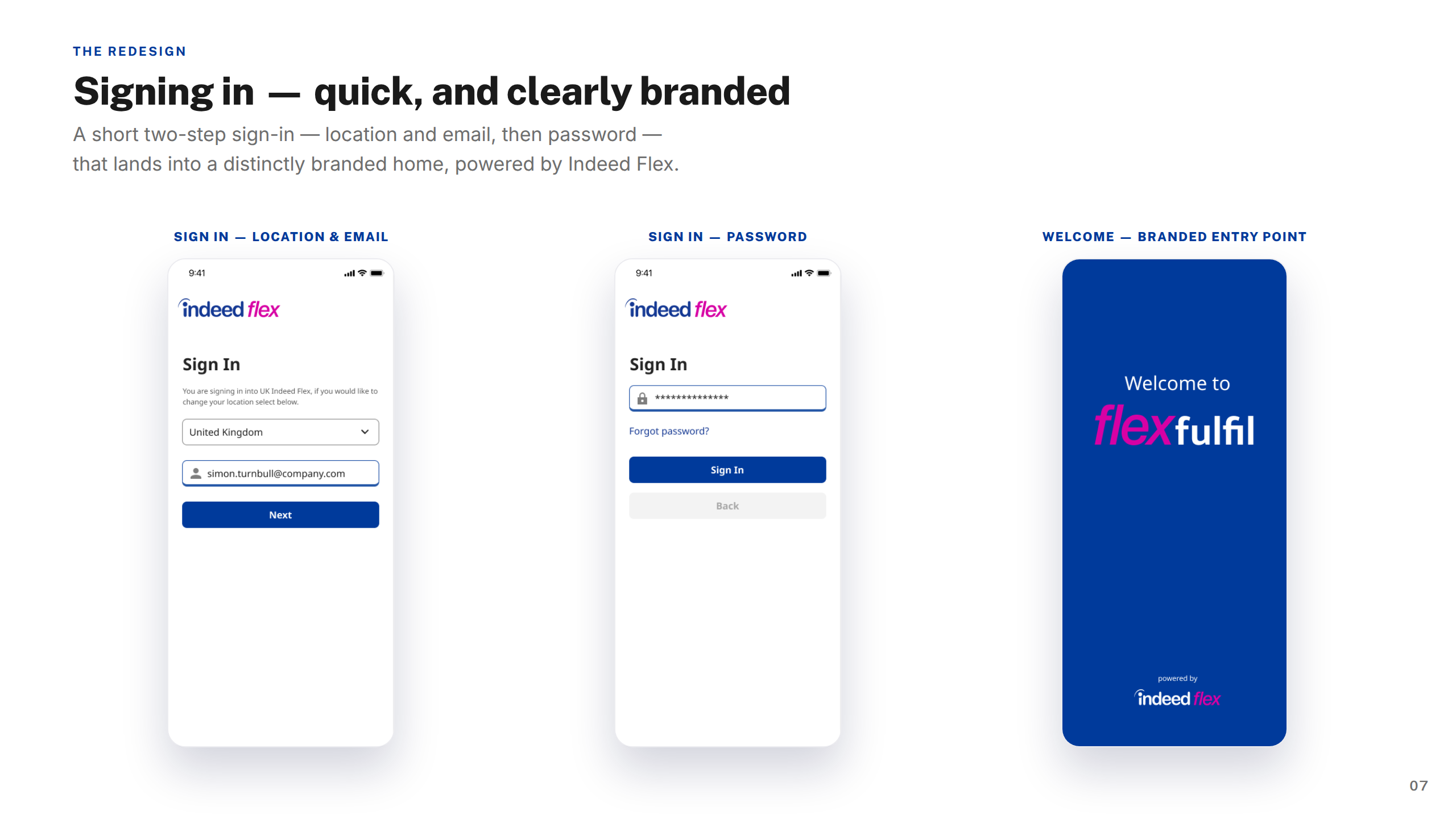
Screens — Signing In
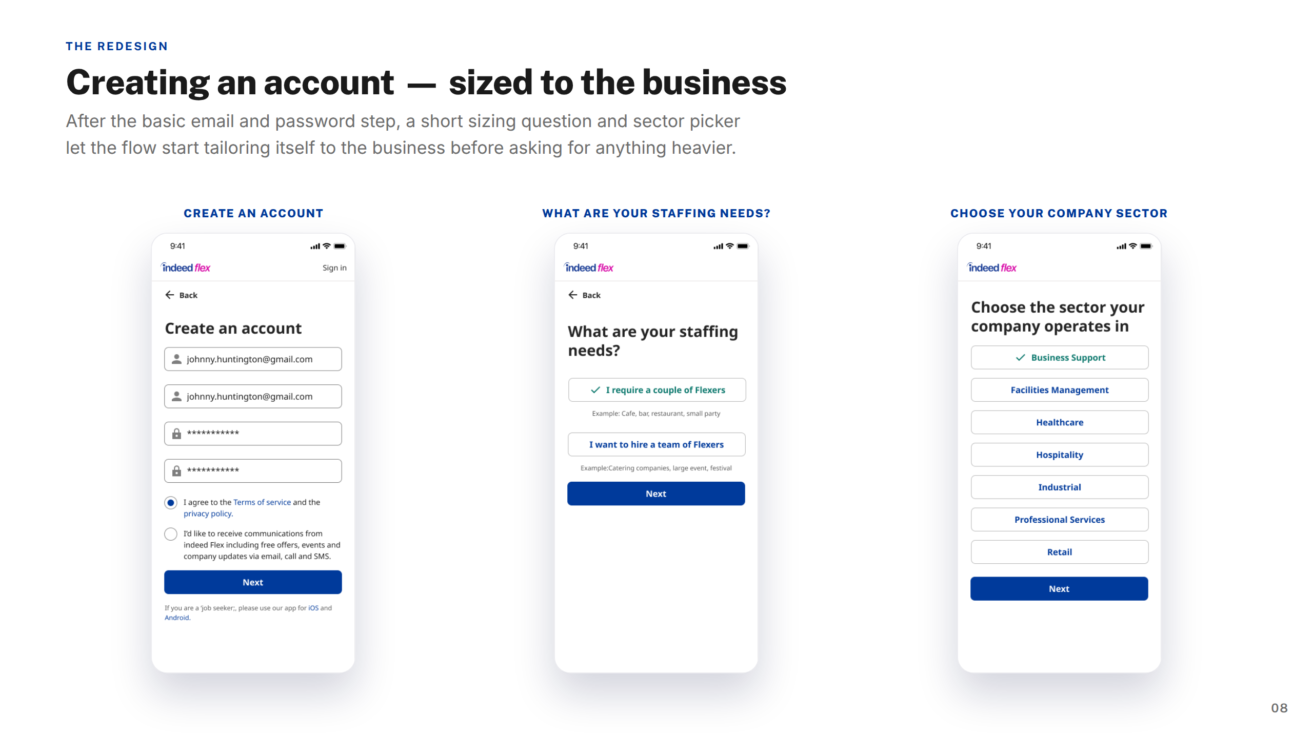
Screens — Creating Account
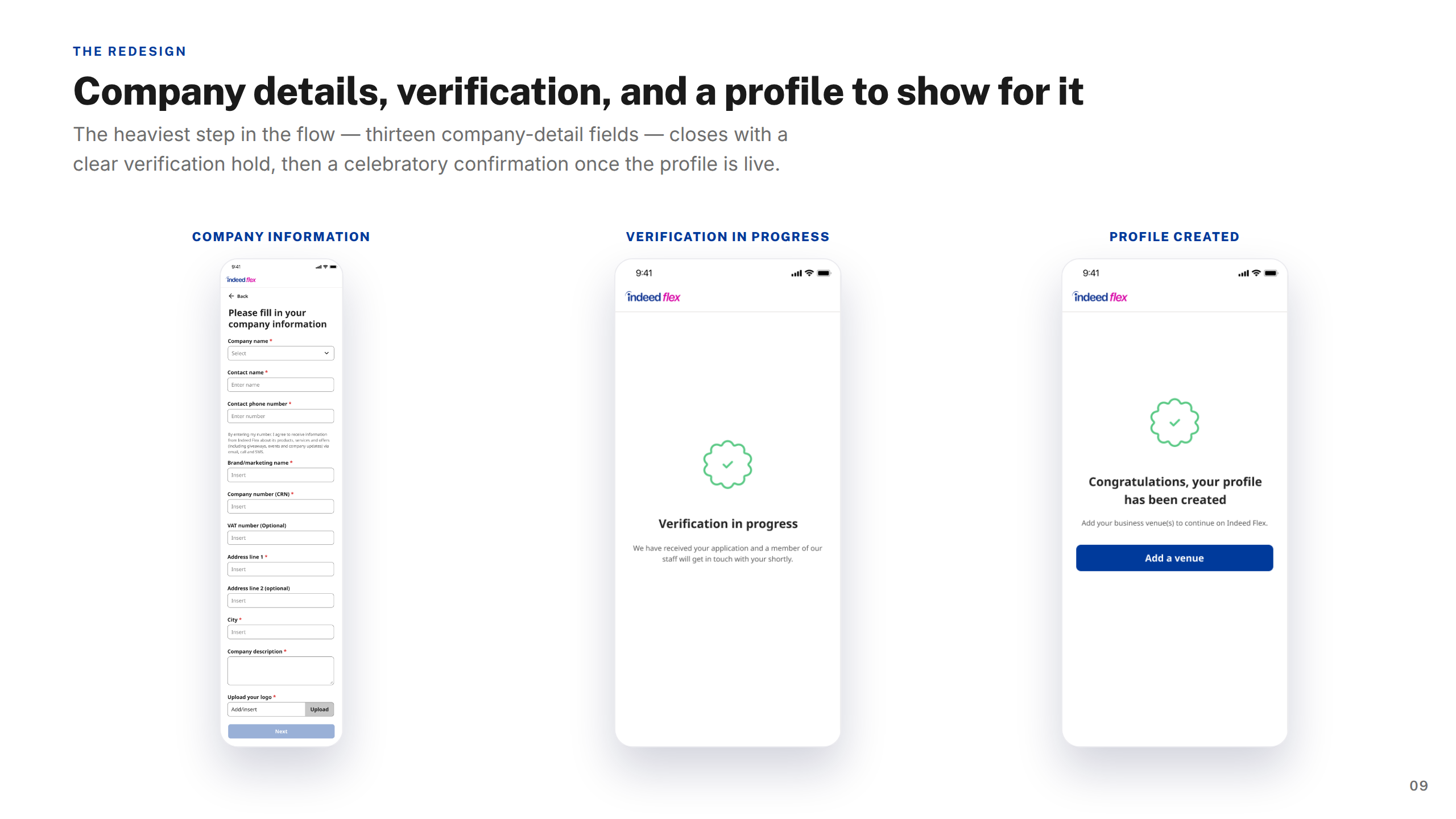
Screens — Company Details & Verification
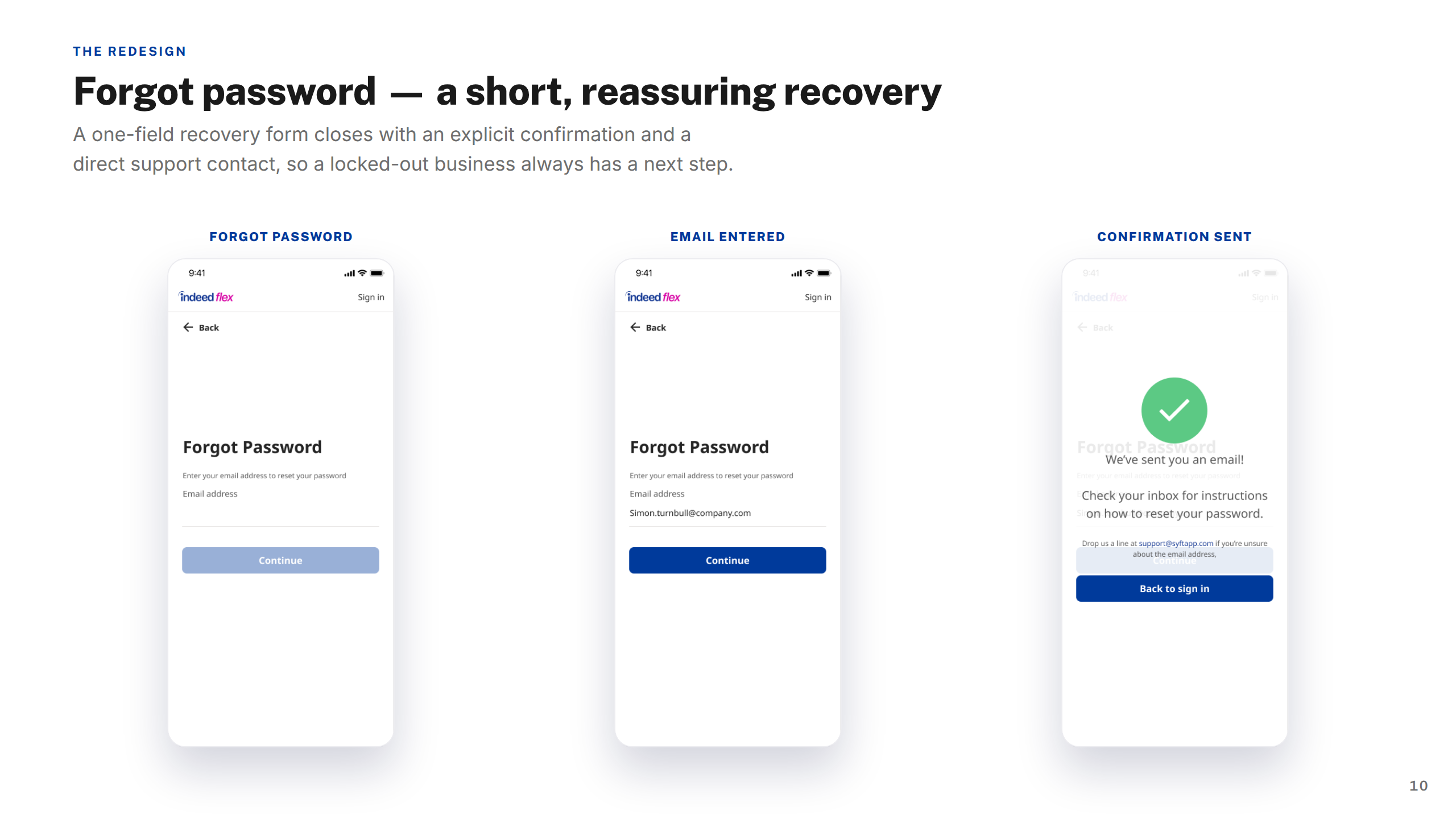
Screens — Forgot Password
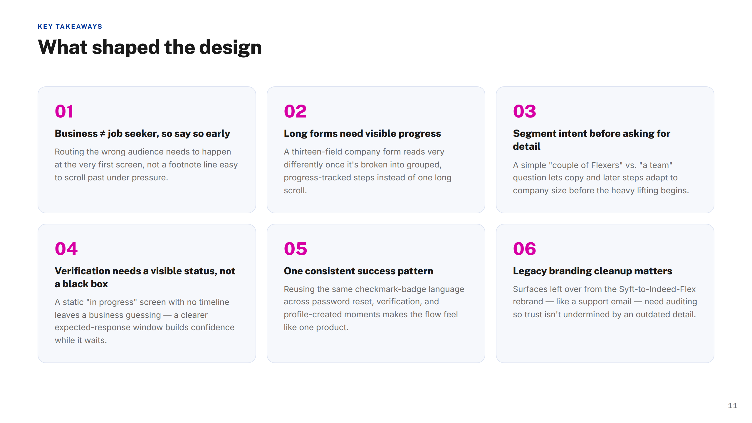
Key Takeaways
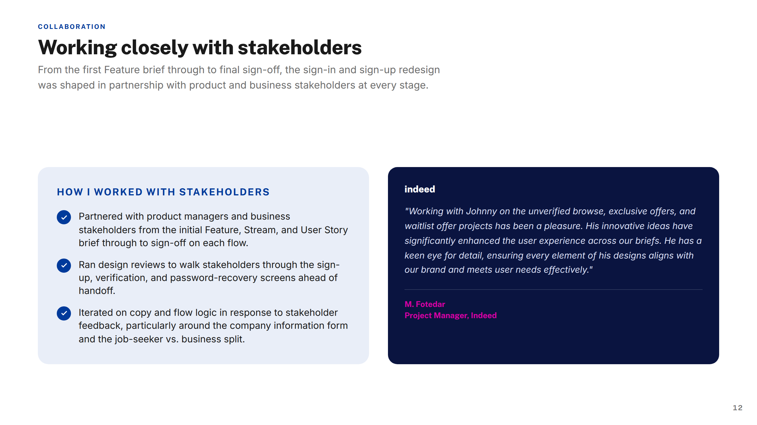
Working with Stakeholders
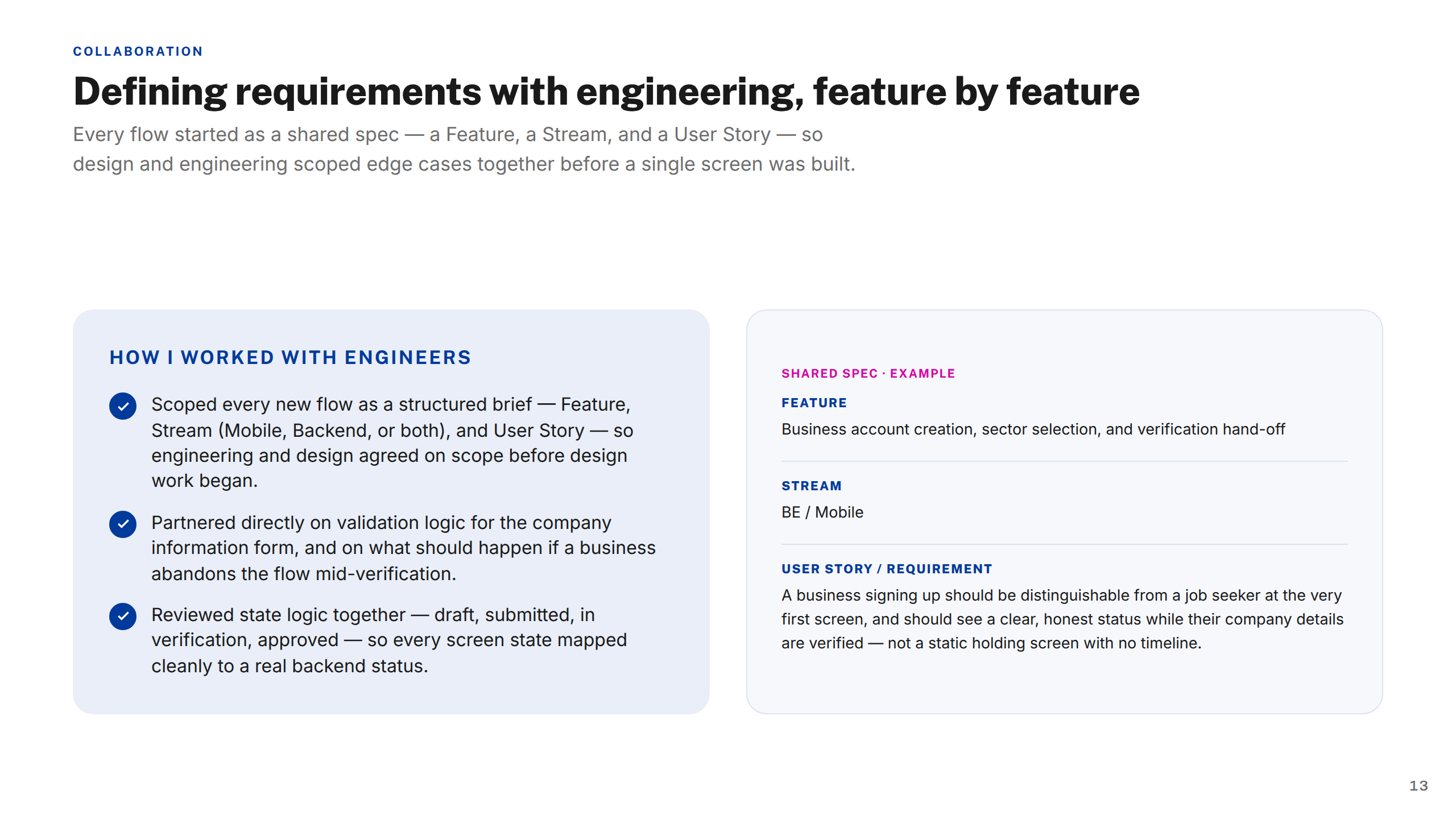
Working with Engineers
Thank You
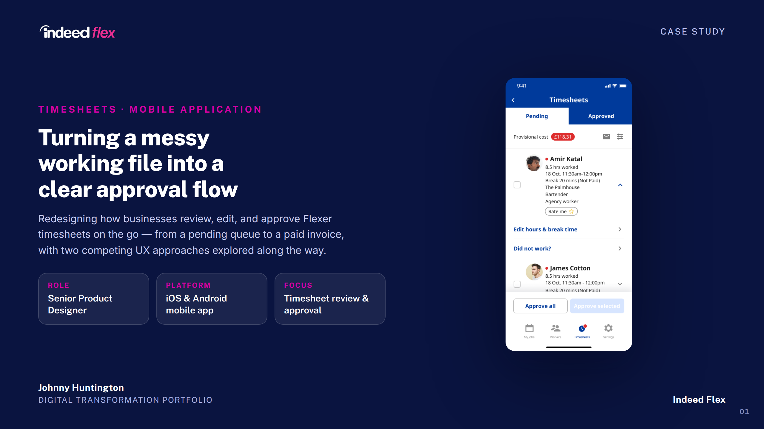
Indeed Flex — Timesheets Case Study
1 / 15
Cover
About Indeed Flex
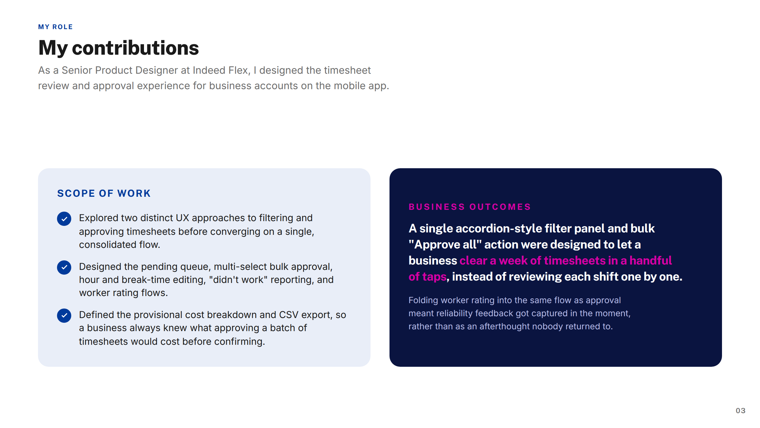
My Contributions
Section: Project
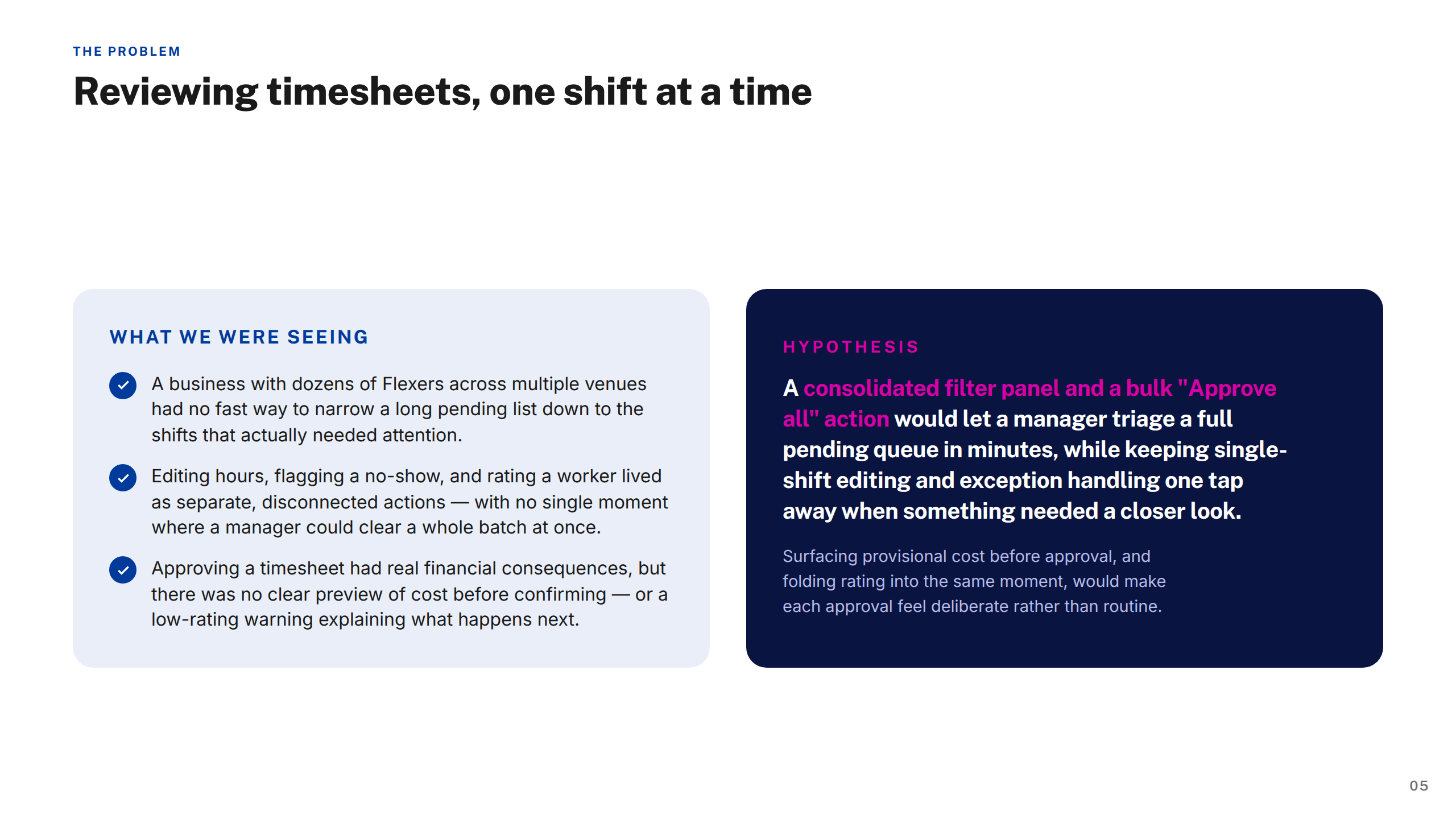
The Problem
Approach & Process
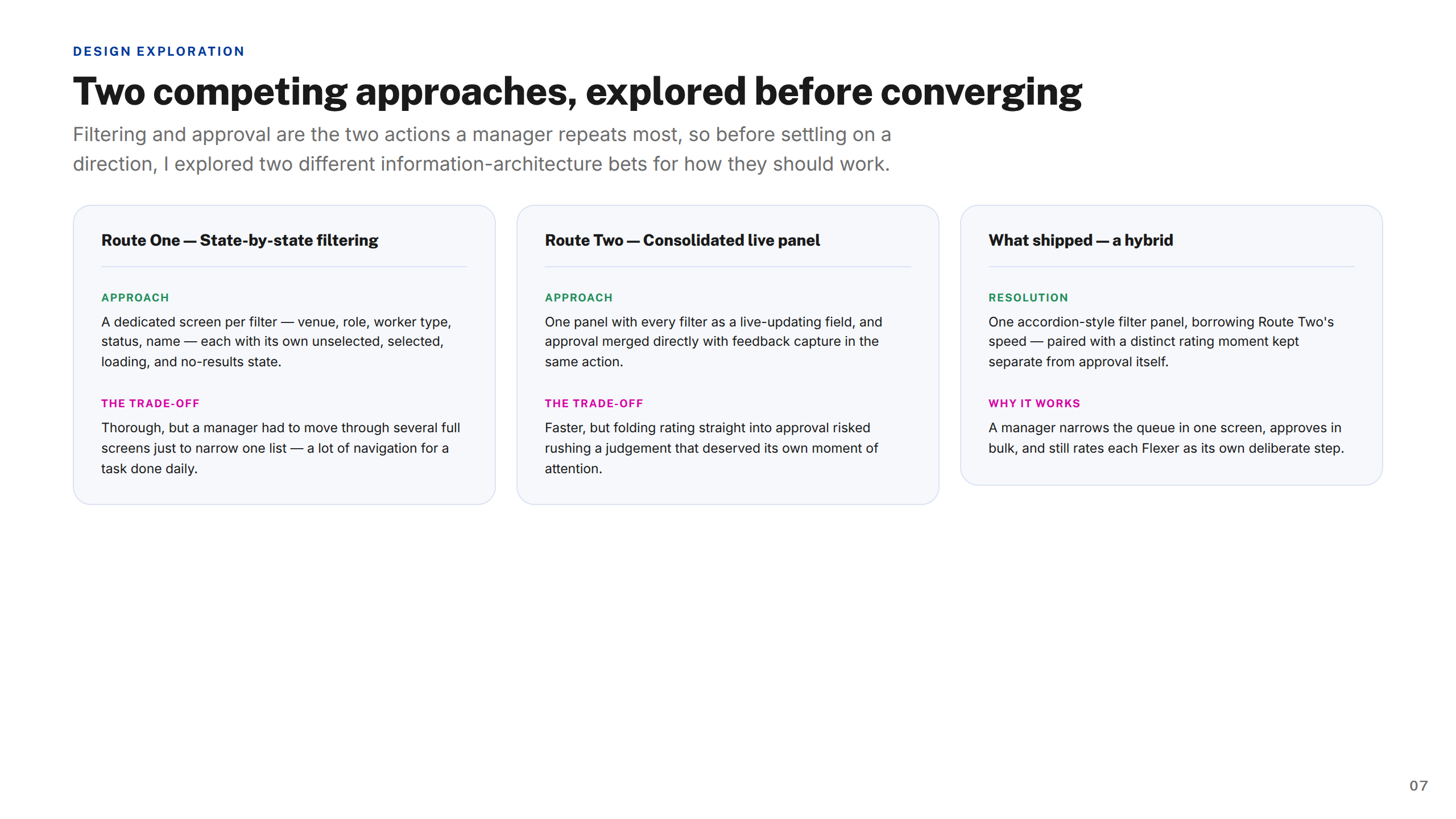
Design Exploration
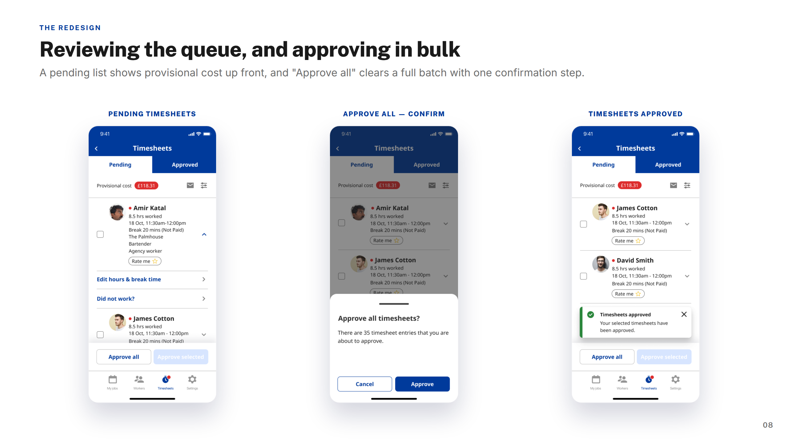
Screens: Reviewing & Approving
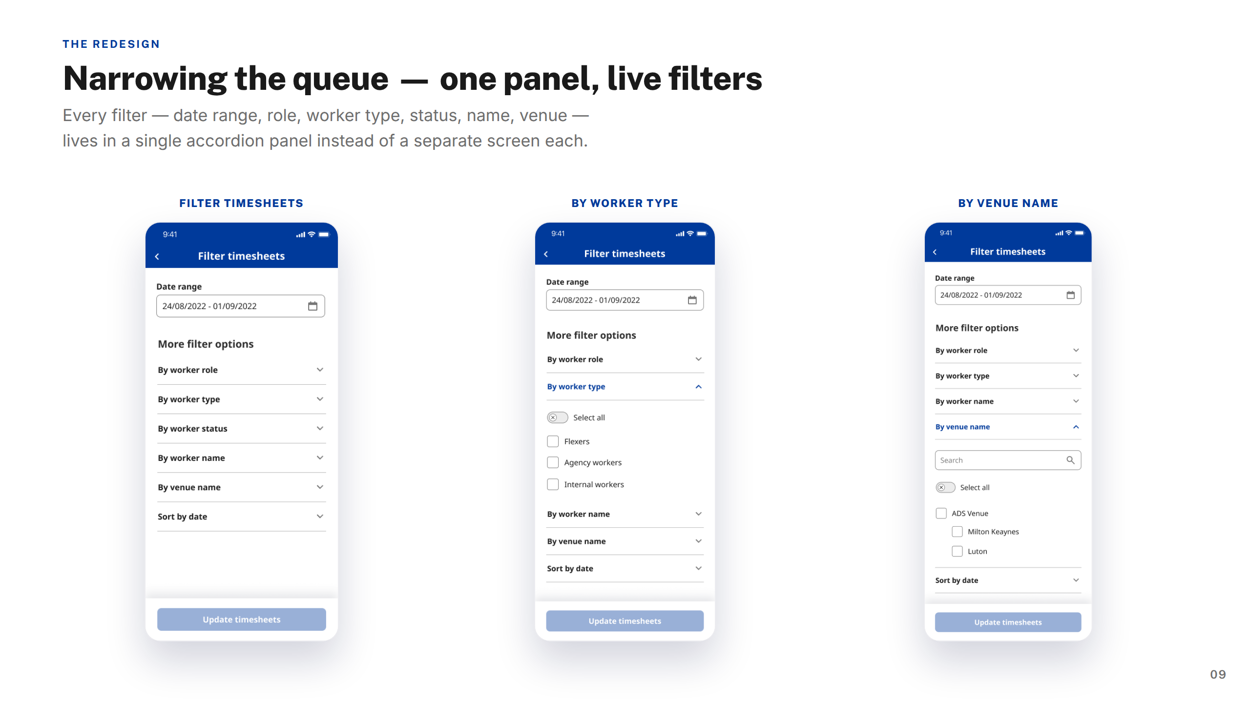
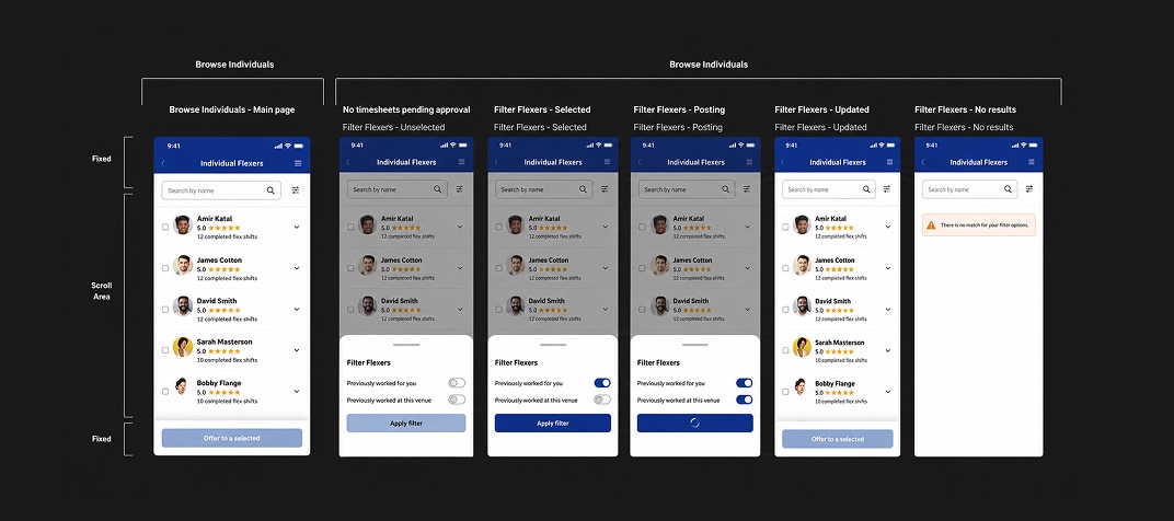
Screens: Filtering & Narrowing
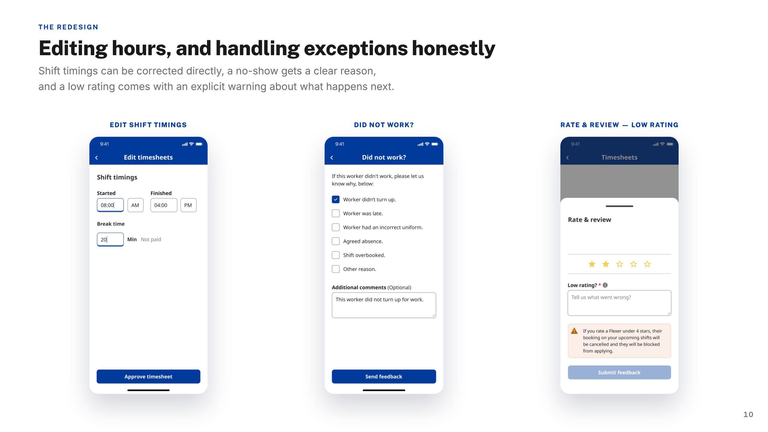
Screens: Editing Exceptions
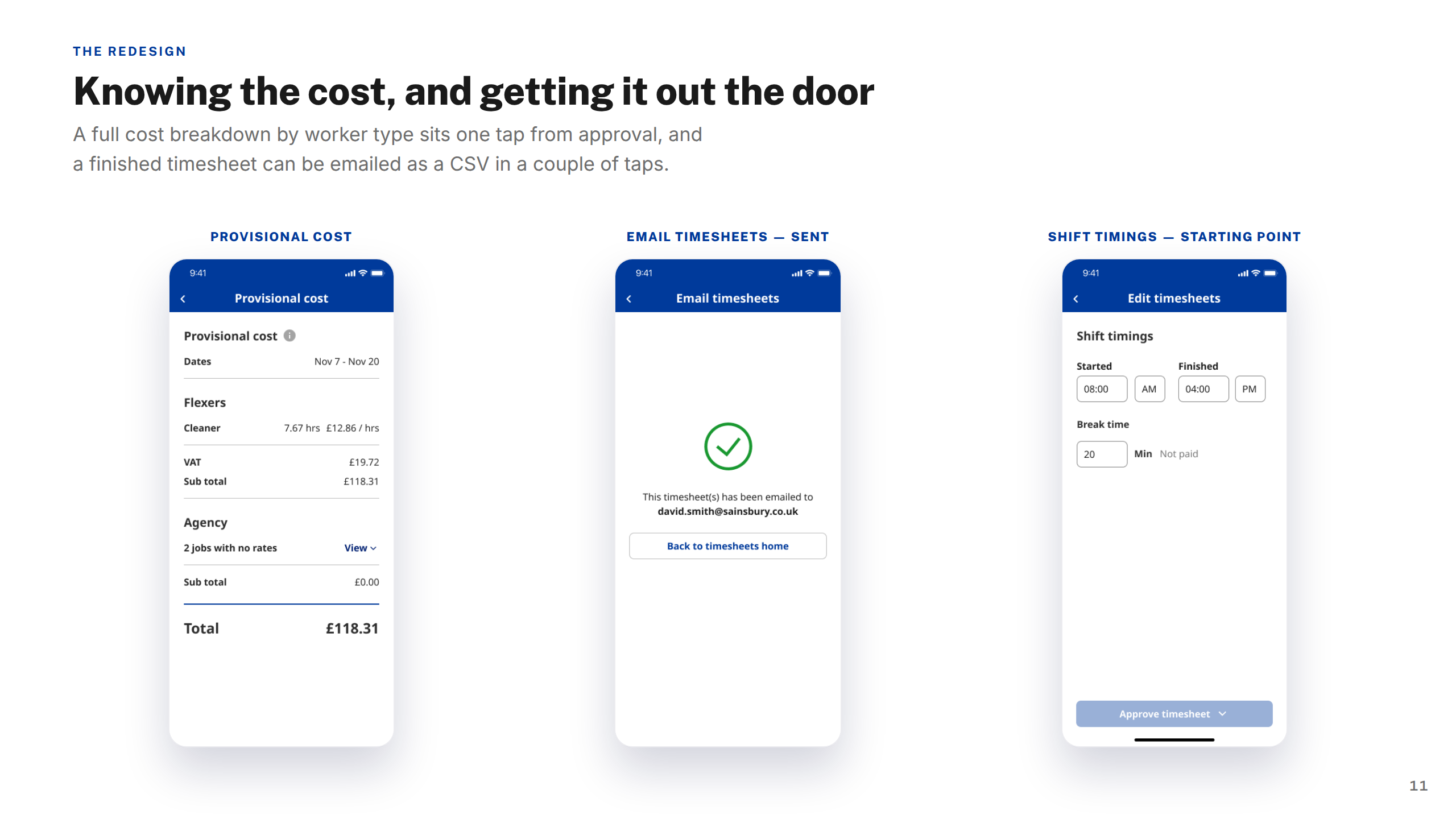
Screens: Cost & Export
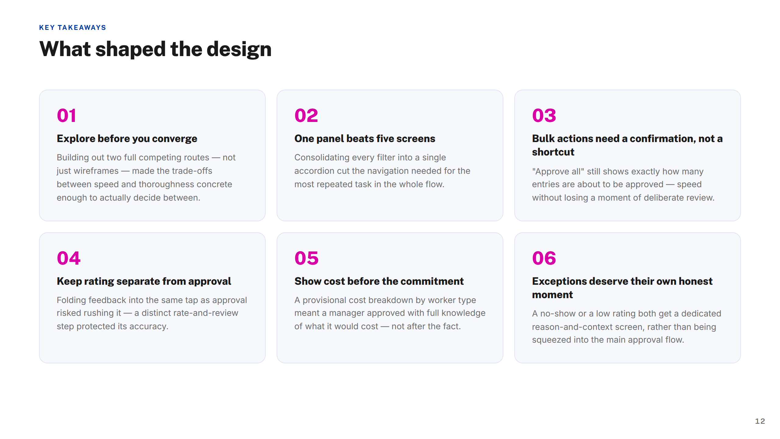
Key Takeaways
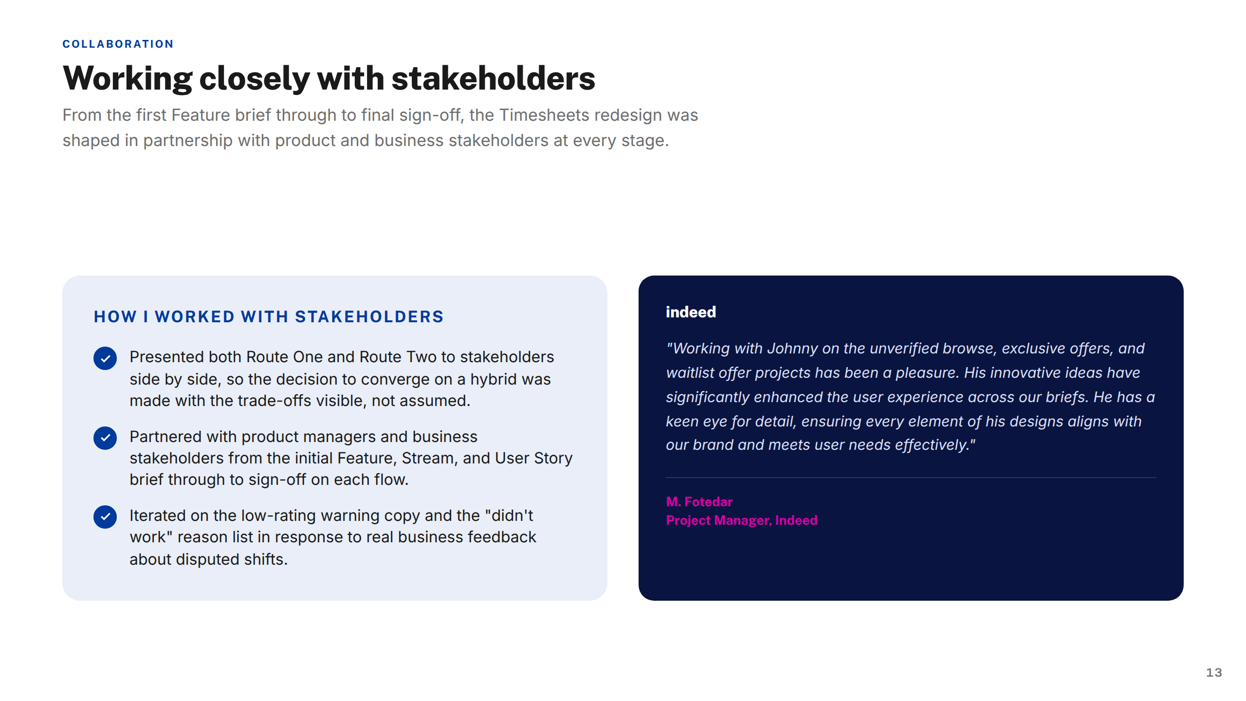
Working with Stakeholders
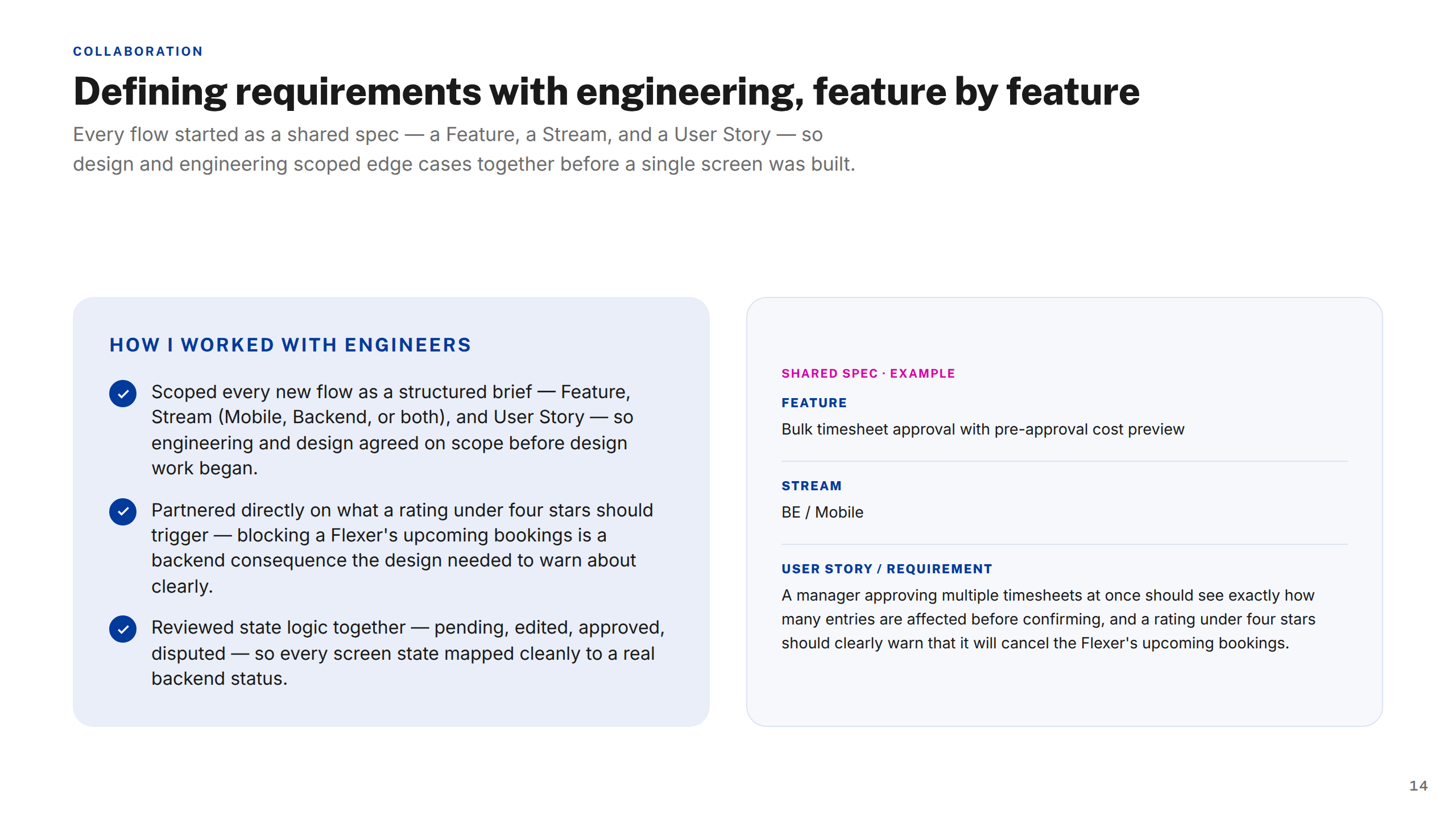
Working with Engineers
Thank You

My role

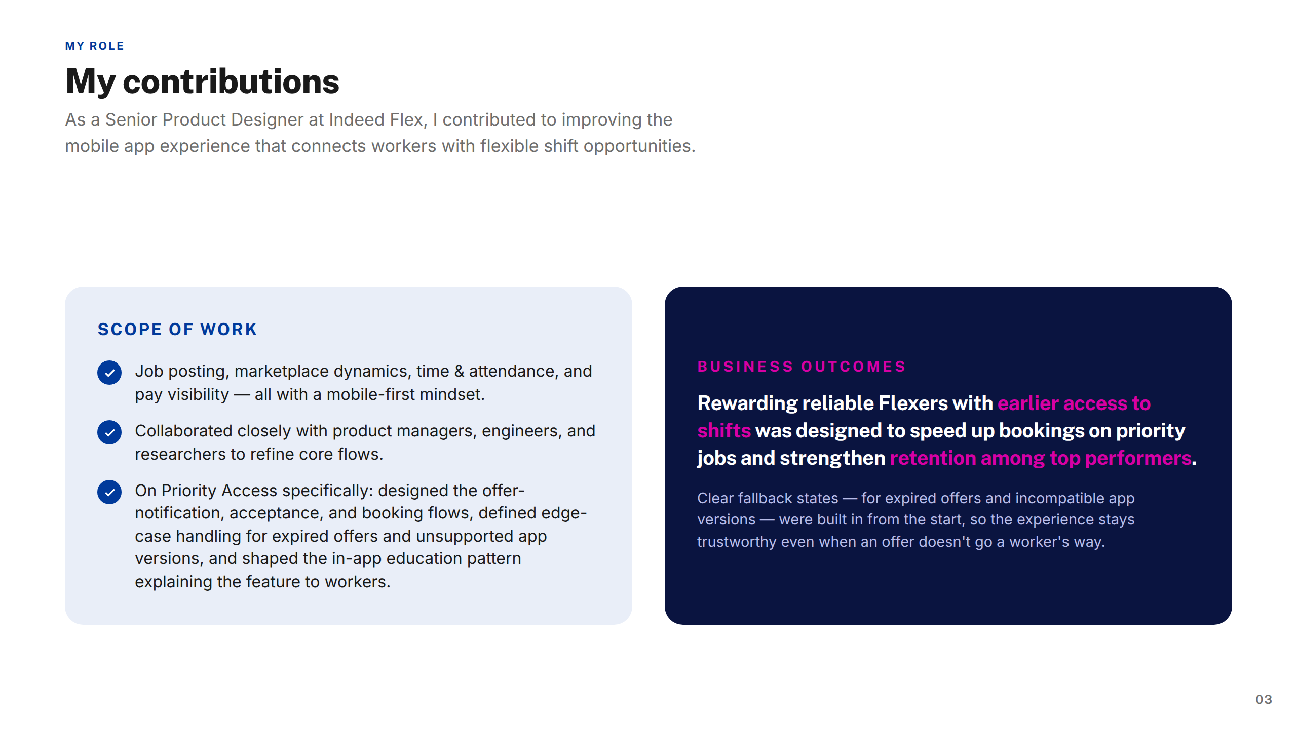
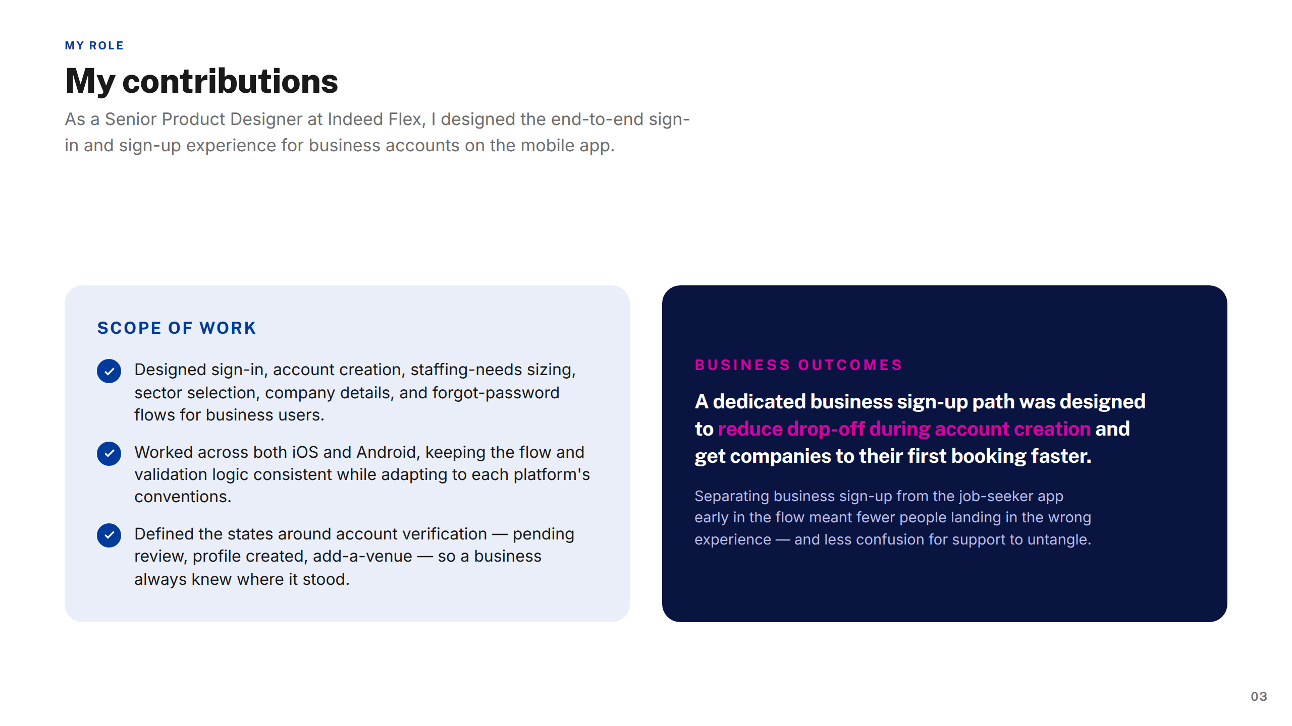
Product Designer (UX/UI), embedded in the core product team across a two-year engagement. End-to-end ownership of the Earnings section, Timesheets, Job Posting journey, Sign In & Sign Up, and the Strikes & Bans redesign.

Collaborators

Product
2× Product Managers, Director of Product
Engineering
Engineering Lead, 4× iOS & Android Engineers, QA
Design & Research
UXD Lead, 6× Product Designers, UX Researcher, Content Designer
Stakeholders
Finance, Legal, Operations, Customer Support

Tools & process

Tools used
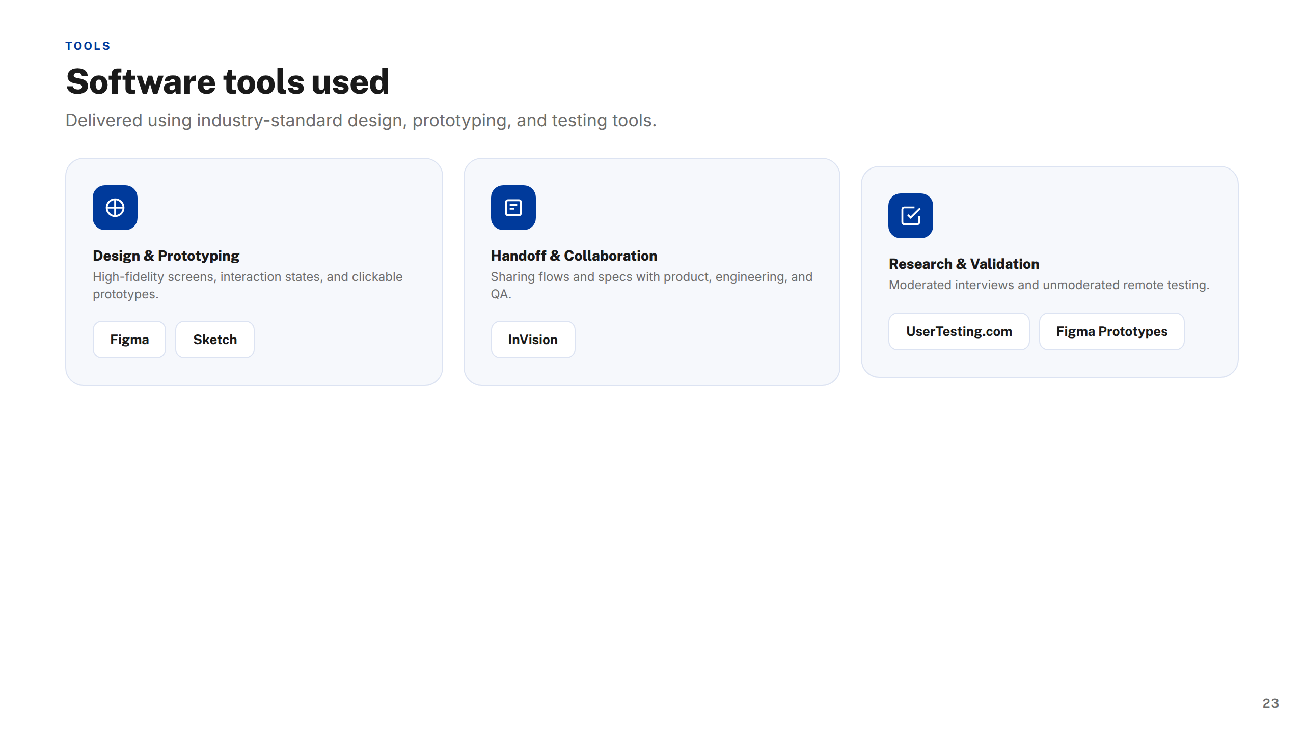
Figma Maze UserZoom Jira Confluence Miro Notion Zeplin Lottie
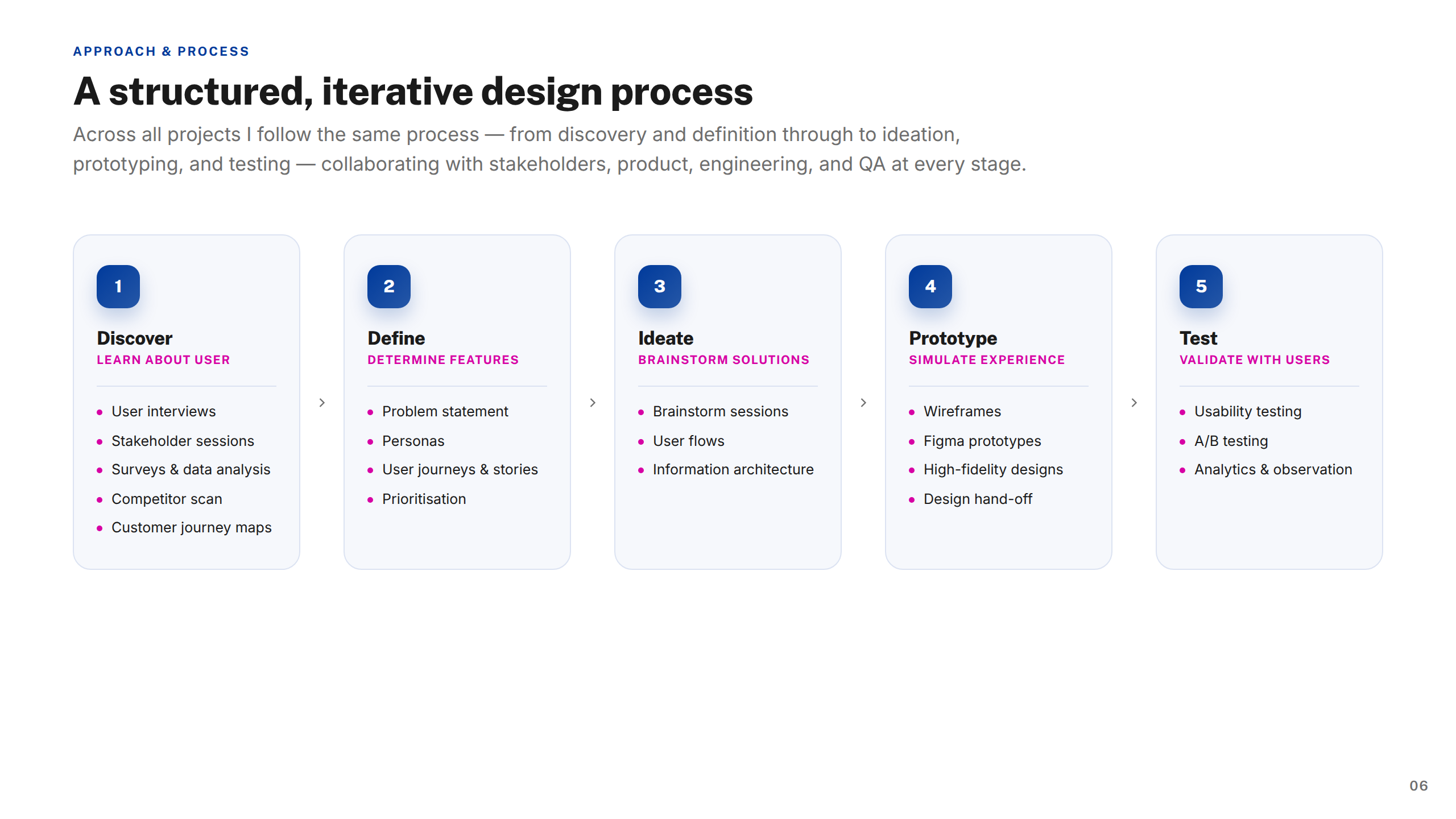
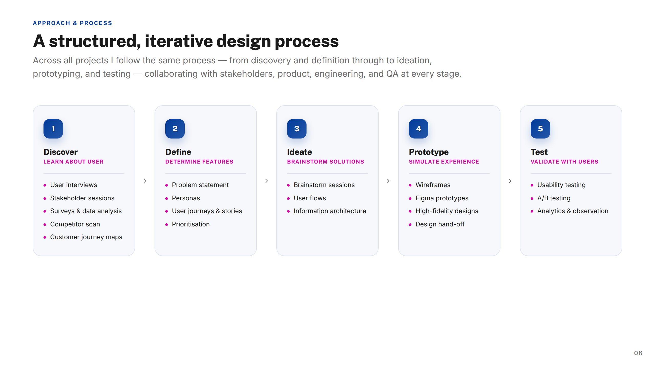
Design process
1
Discover

Stakeholder interviews, competitor analysis, analytics review, existing flow audits

2
Define

Problem framing, user stories, success metrics, design principles per workstream

3
Design

Low-fi exploration, component design, high-fidelity prototypes, annotation for engineering

4
Validate

Moderated & unmoderated usability testing, synthesis, design iteration

5
Deliver

Dev handoff, QA support, post-launch monitoring, retrospectives

Constraints

Dual-platform design tracks
iOS and Android native patterns diverged significantly on key flows, requiring two maintained design tracks and careful component abstraction in Figma.
Compressed testing windows
Usability testing had to fit within 2-week sprint cycles. This required tight test planning and prioritising the highest-risk assumptions over comprehensive coverage.
Multi-stakeholder sign-off
The earnings redesign required simultaneous approval from Finance, Legal, and Product — often with conflicting priorities around regulatory clarity and conversion rate.

Trade-offs

Scope vs. consistency
Strikes & Bans expanded mid-project to include appeal flows. We took it on to ensure the end-to-end experience was coherent, accepting a tighter timeline on the earnings work.
Polish vs. velocity
Several animation and micro-interaction ideas were deprioritised in favour of shipping faster. The icon system was shipped as static assets rather than Lottie animations initially.
Feature breadth vs. depth
The job-posting journey covered the full mobile flow but desktop edge cases were deferred to a later sprint — a deliberate call to unblock the employer team without delaying the worker-side launch.

Outcomes

38%
Job posting efficiency
Reduced average time for employers to post a shift by 38%, increasing listing volume.
93%
Marketplace fill rate
Improved shift fill rate to 93% through clearer job discovery and streamlined application flows.
22%
Worker engagement
Drove a 22% increase in active worker applications per week by refining marketplace dynamics.
30%
Attendance accuracy
Cut clock-in/clock-out discrepancies by 30%, reducing payroll disputes and admin costs.
18%
Worker pay transparency
Introduced upfront pay visibility, boosting worker retention by 18% month-over-month.
£2.8M
Revenue impact
Contributed to a projected £2.8M uplift in gross bookings by optimising worker–employer match.

Reflection & what I'd do differently

The biggest lesson from this engagement was the cost of inconsistency at scale. Pattern divergence across the product that might seem harmless in isolation compounds quickly in a team of eight designers — we spent meaningful time re-aligning instead of moving forward. A more rigorous design system governance process from day one would have paid for itself multiple times over.

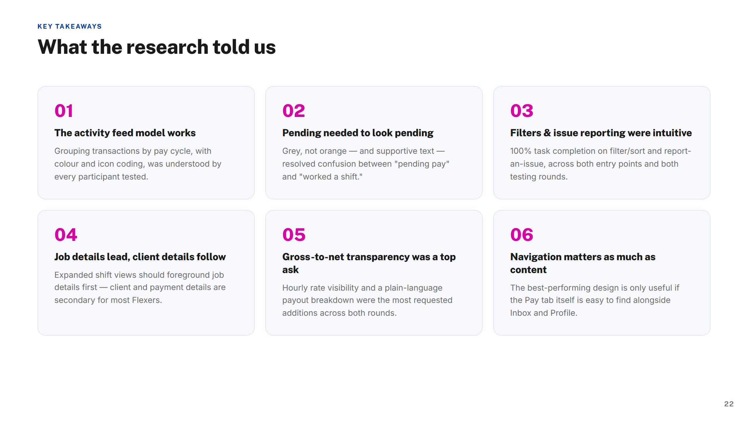
On the research side, the 25-participant moderated study on the pay tab was one of the most valuable things we ran. I'd push to front-load that kind of structured validation earlier — rather than running it as a confirmation gate after design, using it to stress-test concepts before they get detailed.

The icon system was shipped without formal usability testing. At 30+ icons across five industries, we relied on internal review and a single round of worker feedback. With more time, I'd have run a card-sort or comprehension study to validate recognition — especially for the more abstract role icons.

Finally, engineering handoff documentation was inconsistent across workstreams. Improving that earlier — standardising annotation templates, state coverage, and edge-case documentation — would have reduced the back-and-forth during implementation and freed up design time on the next sprint.

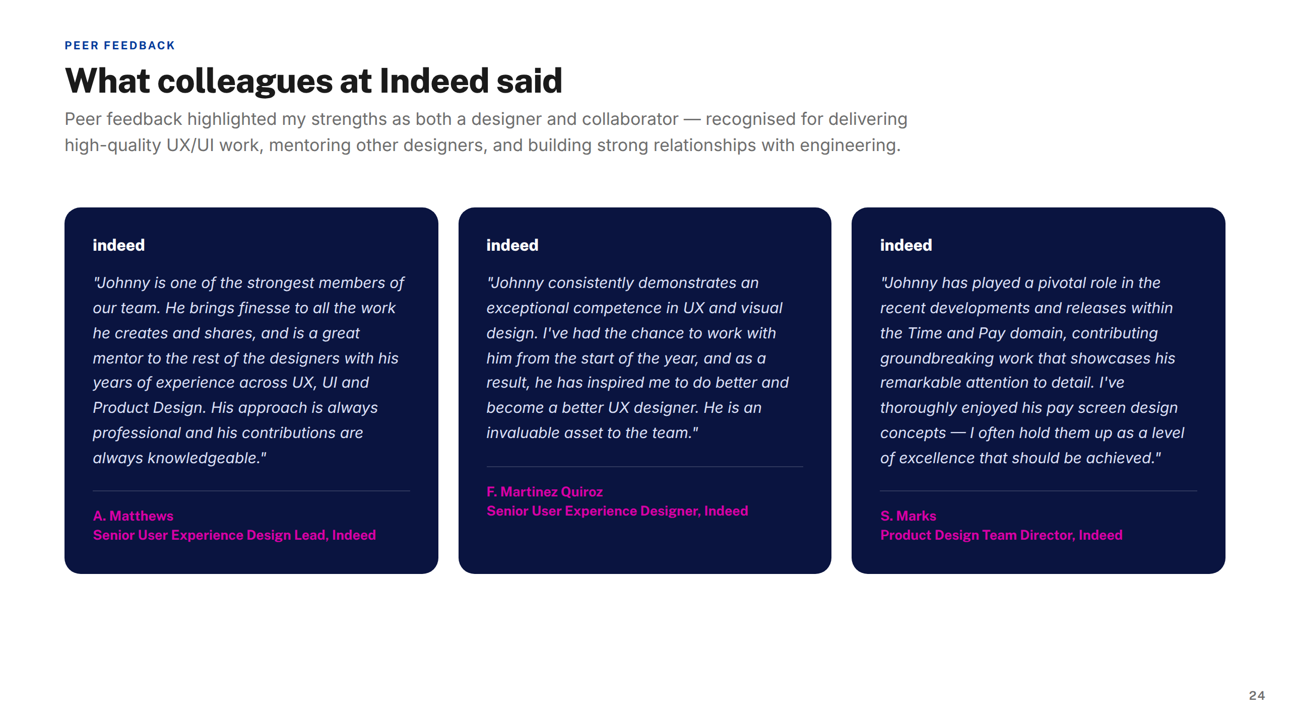
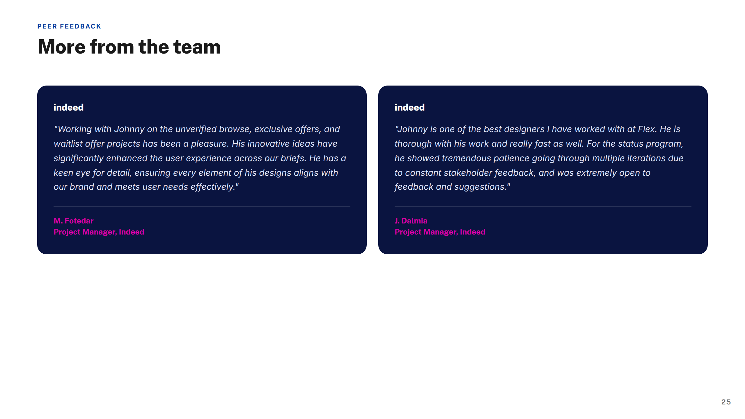
"Johnny brought a level of craft and rigour to the earnings experience that genuinely changed how we thought about the problem. He was always asking the right questions — and backing them up with evidence from testing."
Product Manager, Indeed Flex
Engagement 2022–2024
More work
See all work work
Related
Lloyds Banking Group
Digital UX for one of the UK's largest banking and insurance groups.

Projects shown include live work, pitch deliverables, and design produced as part of embedded or collaborative engagements. Some work was completed as part of a wider team. Deliverables reflect the scope and direction at the time of engagement — the live experience may have since changed, launched in a different form, or not proceeded to production. All brand assets and trademarks shown remain the property of their respective owners and are displayed here for portfolio reference only.

Previous case study
Mobile
DEWA — Consumer Platforms
Next case study
Ecommerce
BT — SME Broadband

Available for new engagements

Let's build better platforms

Senior product design available for engagements across enterprise ecommerce, fintech, and regulated systems.

Get in touch →