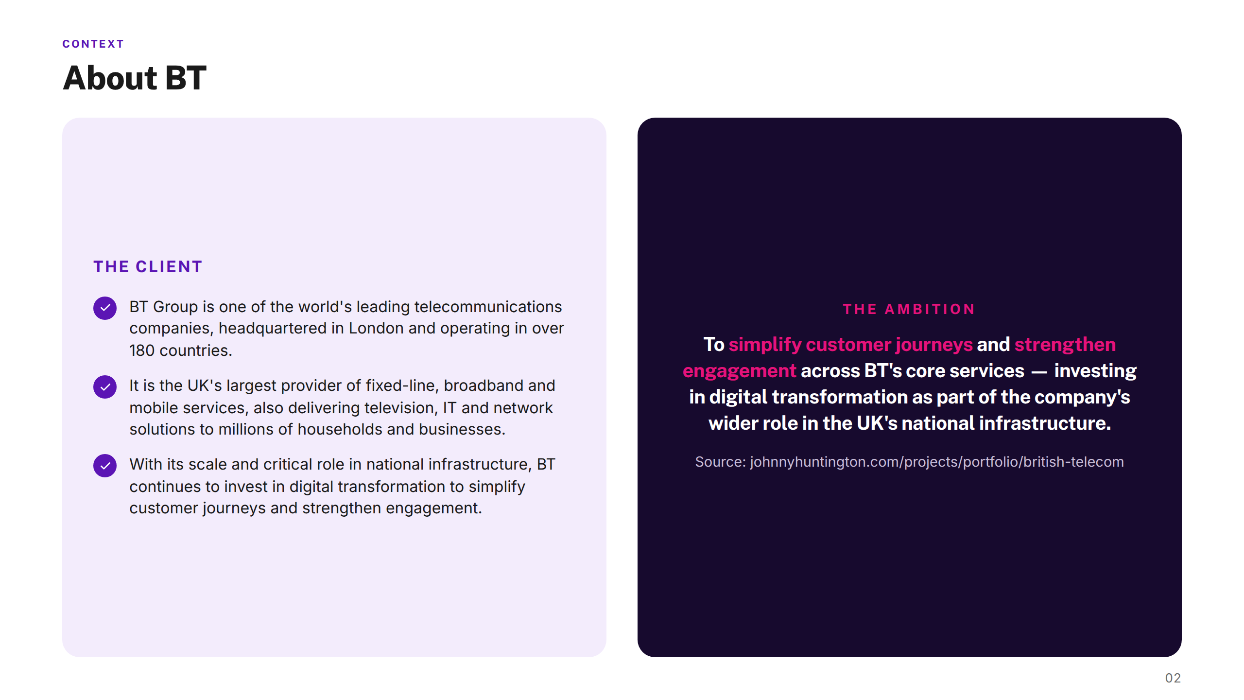
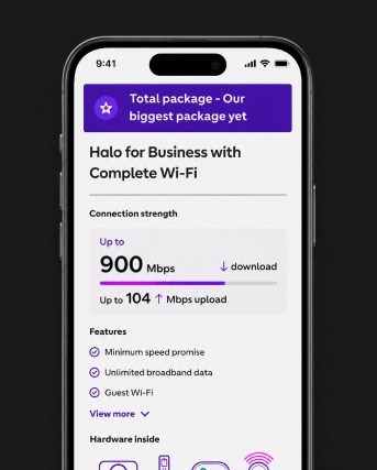
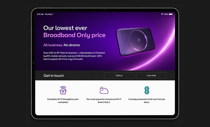
BT Group is the UK's largest telecommunications provider — serving millions of consumer, business, and public sector customers across broadband, mobile, TV, and networking services. Founded in 1846 and privatised in 1984, BT has one of the most recognised brands in British infrastructure, with a particular strength in business connectivity through its BT Business division.
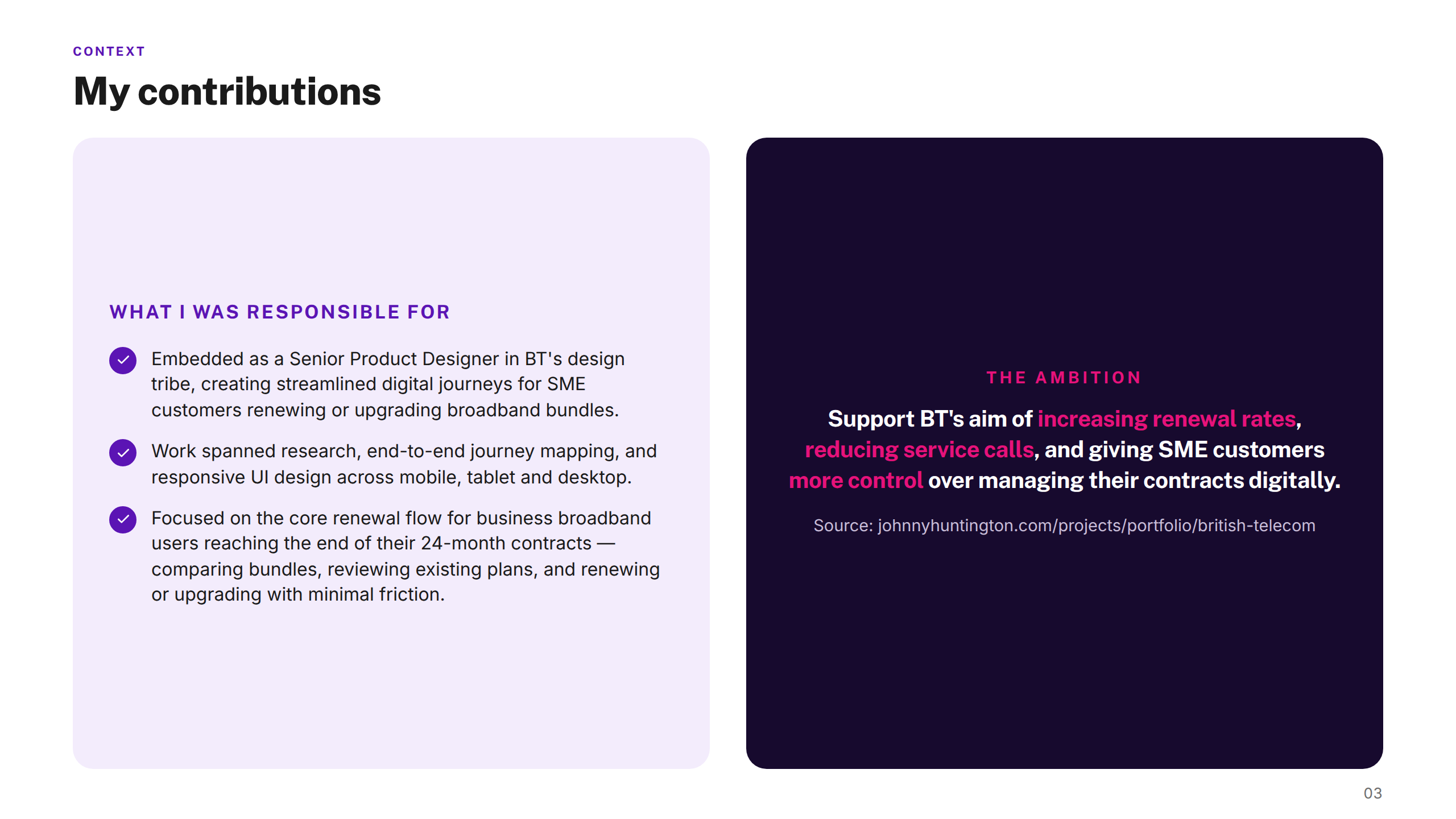
As a Senior Product Designer embedded within BT's SME digital team, I worked on a self-serve broadband renewal and upgrade journey for small and medium-sized enterprise customers — helping them manage contracts, compare bundles, and complete upgrades digitally, without needing to call.
The challenge
BT's small-and-medium-enterprise customers were managing broadband renewals and upgrades largely through service calls — a slow, costly channel for both sides. Renewal journeys were unclear and bundle options were hard to compare, leading to missed renewals and high call volumes.
BT needed a digital-first journey that SME customers could navigate confidently on their own, on any device.
My approach
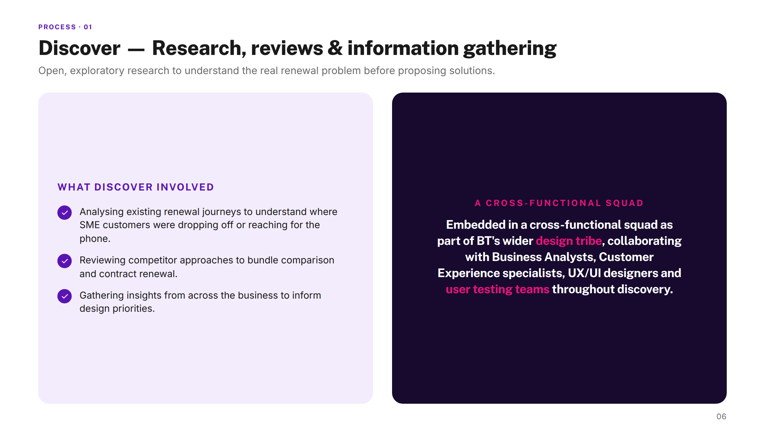
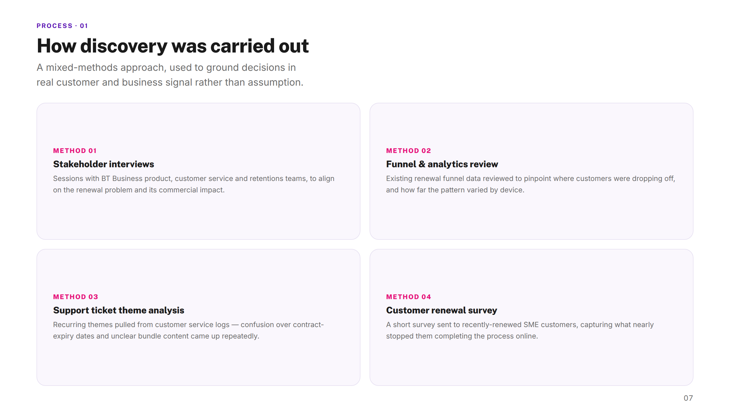
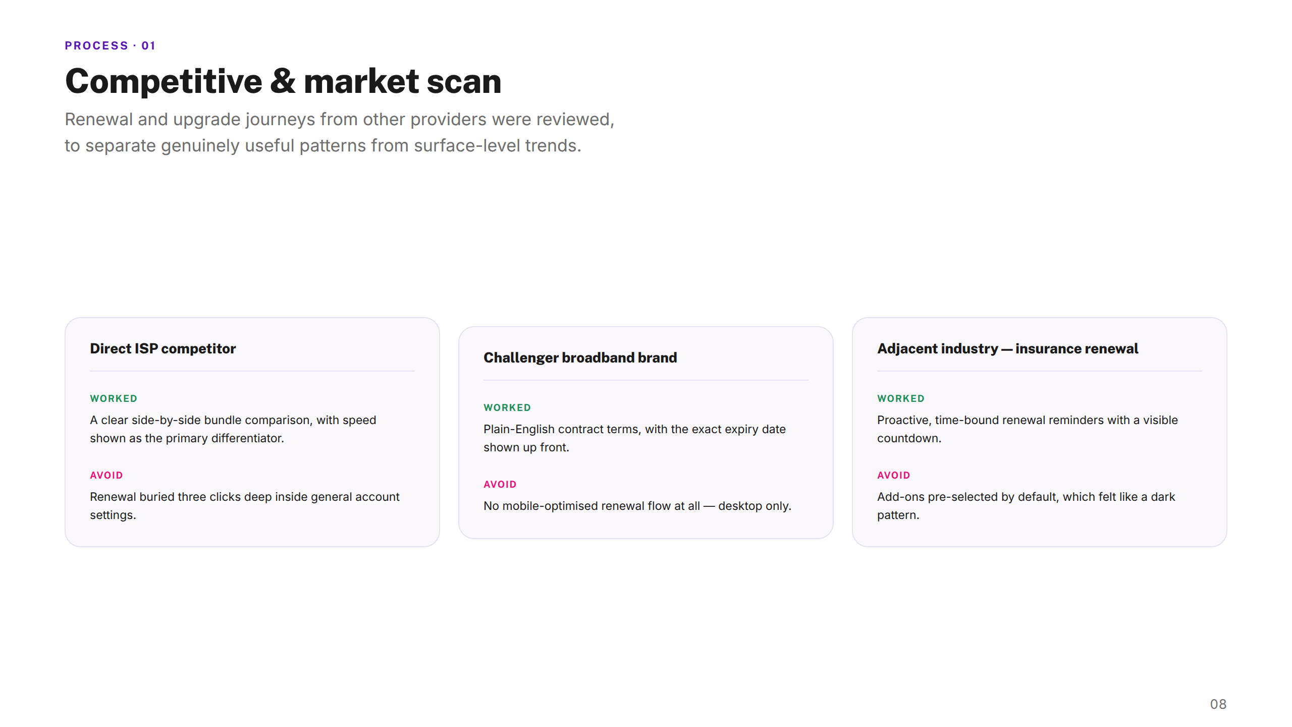
Embedded within BT's design tribe — alongside business analysts, CX specialists, and user testing teams — I started with discovery: analysing existing renewal journeys, reviewing competitor strategies, and gathering customer insights.
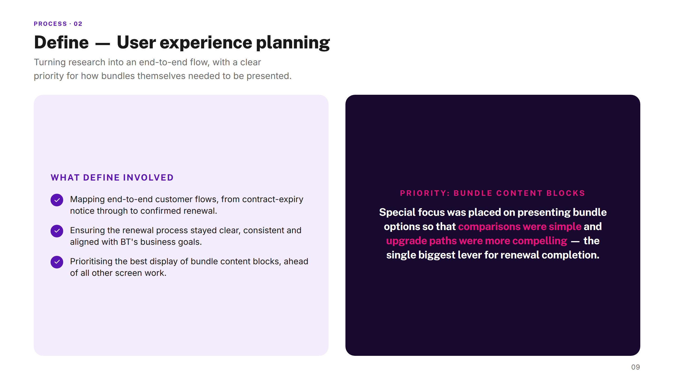
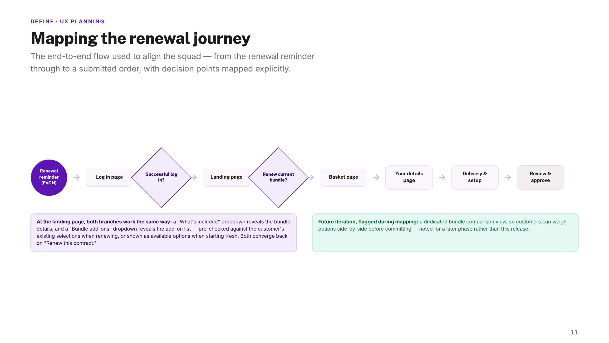
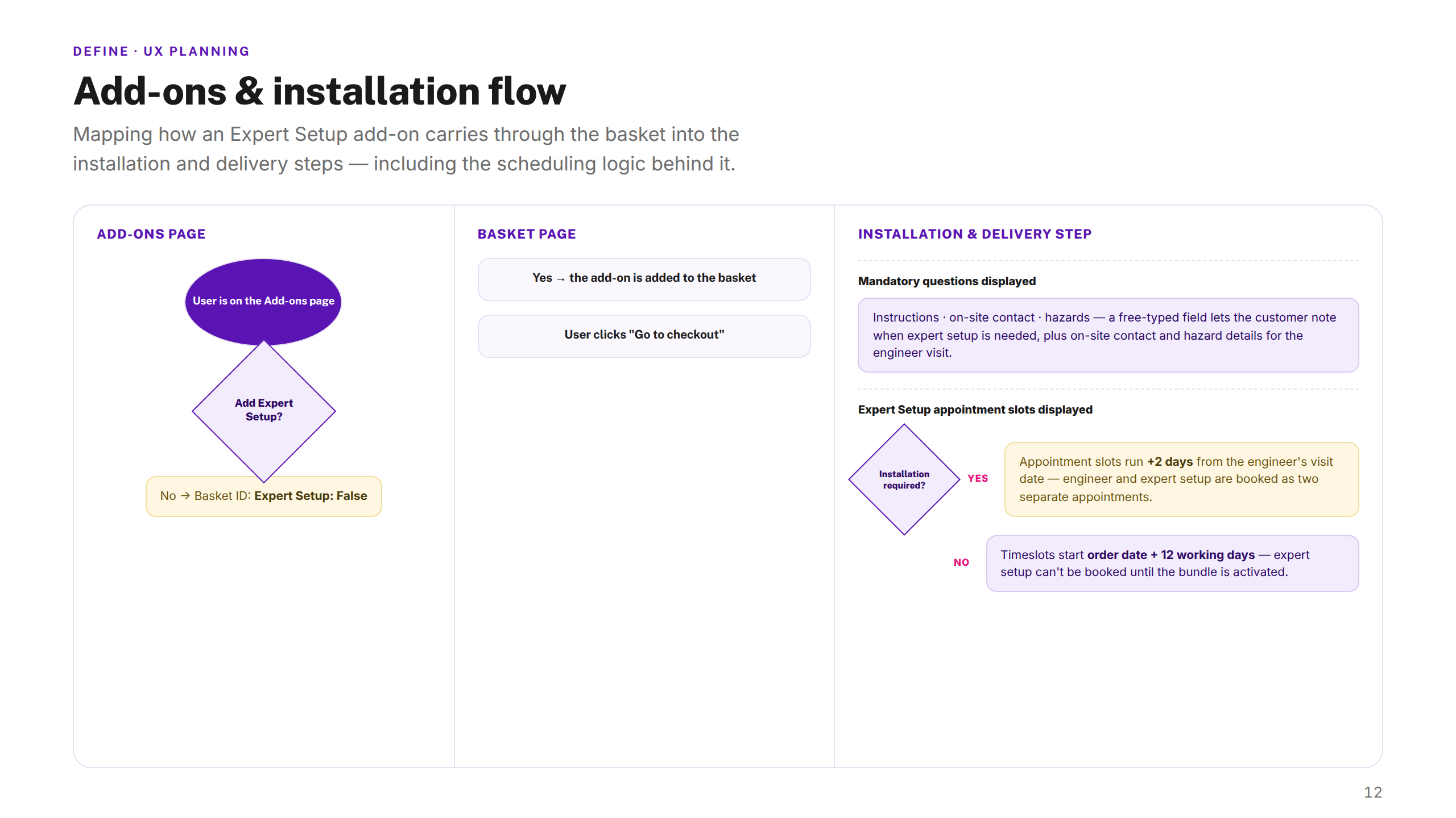
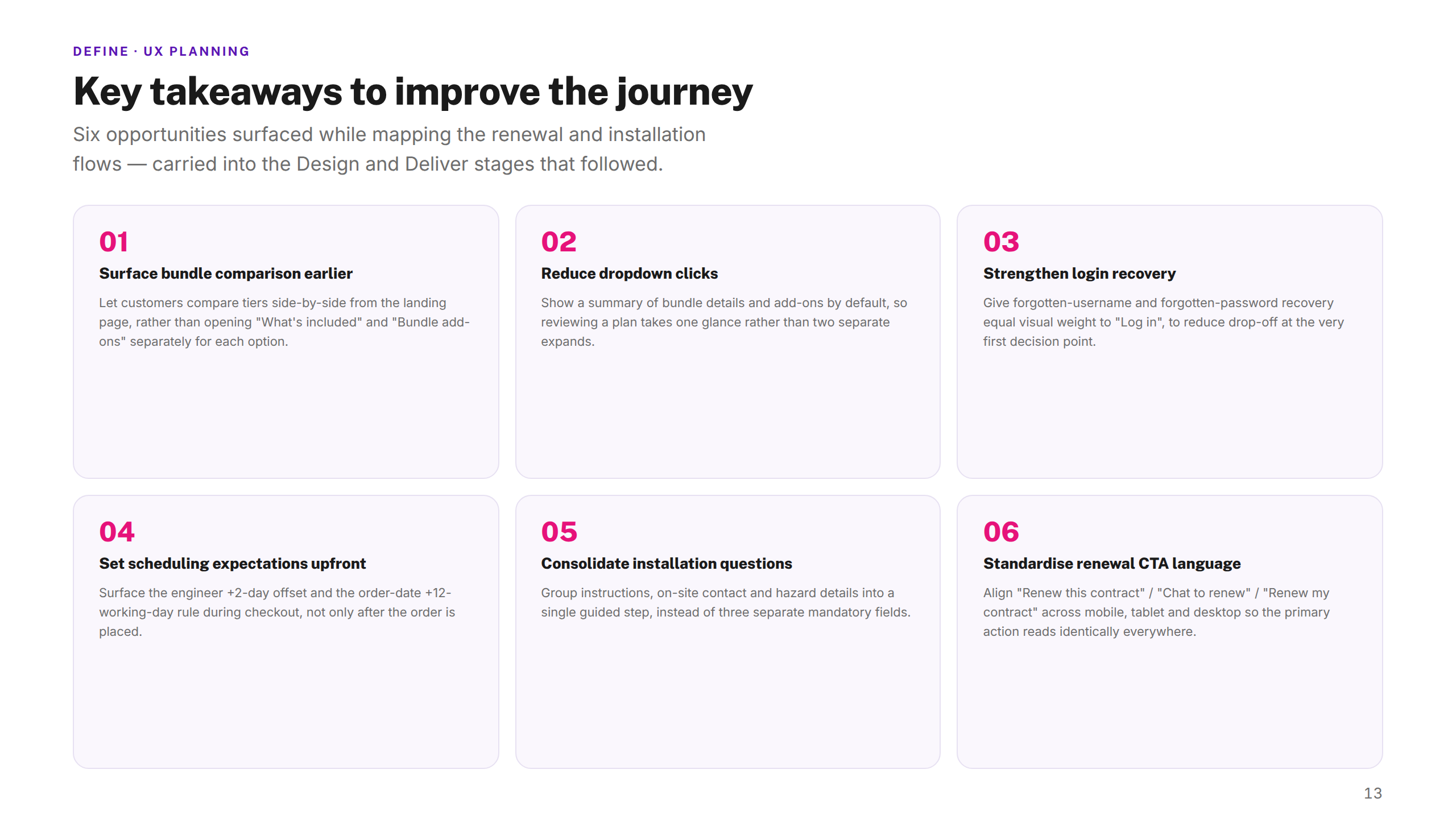
I mapped the end-to-end flow, designed mobile-first for the majority of users, and built reusable responsive components so the experience stayed consistent across mobile, tablet, and desktop. Iterative user testing validated each step.
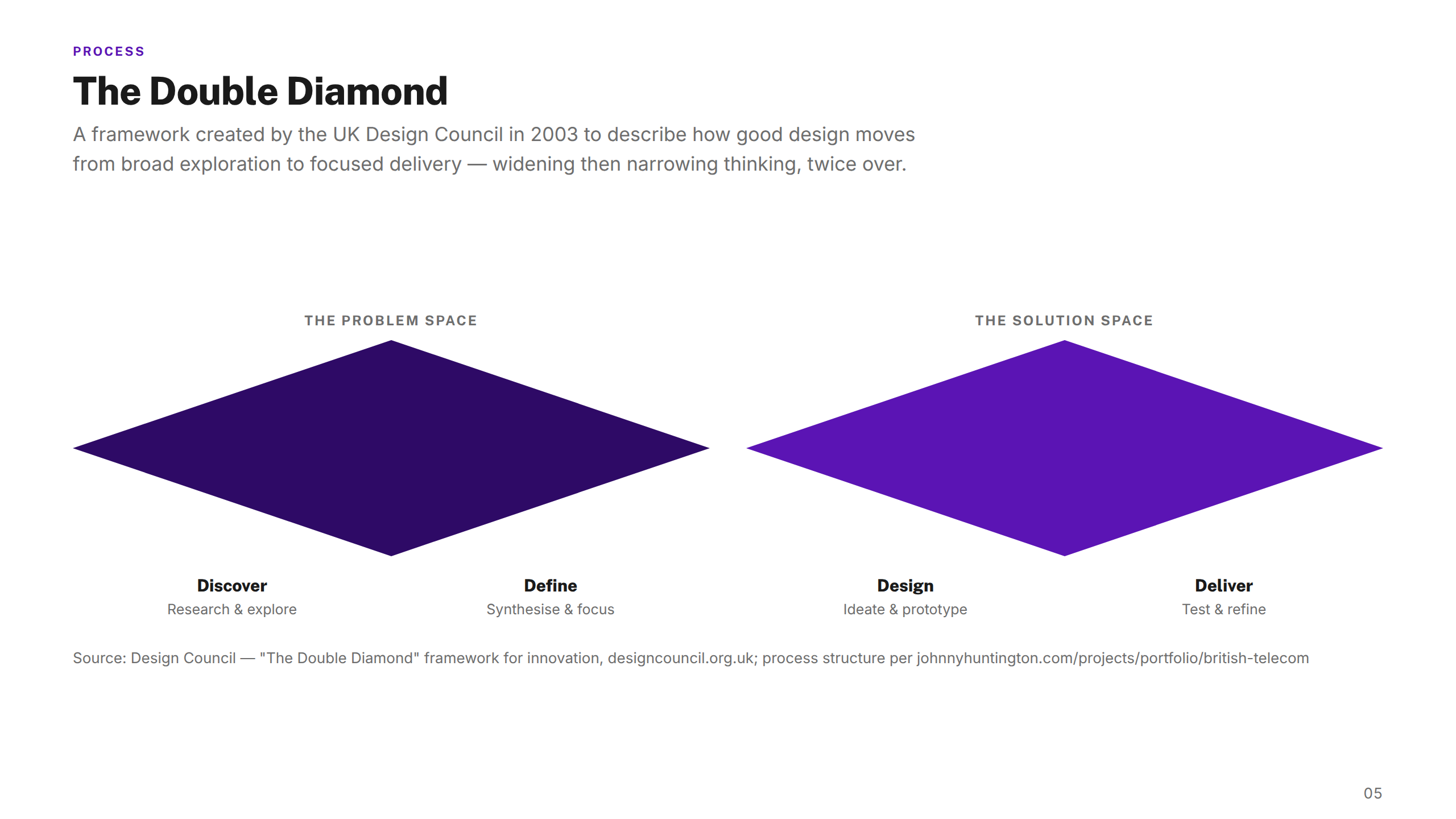
Process
01 — DISCOVER
Research & Analysis
Stakeholder interviews
Call centre data review
Competitor audit
Analytics deep-dive
Customer journey review
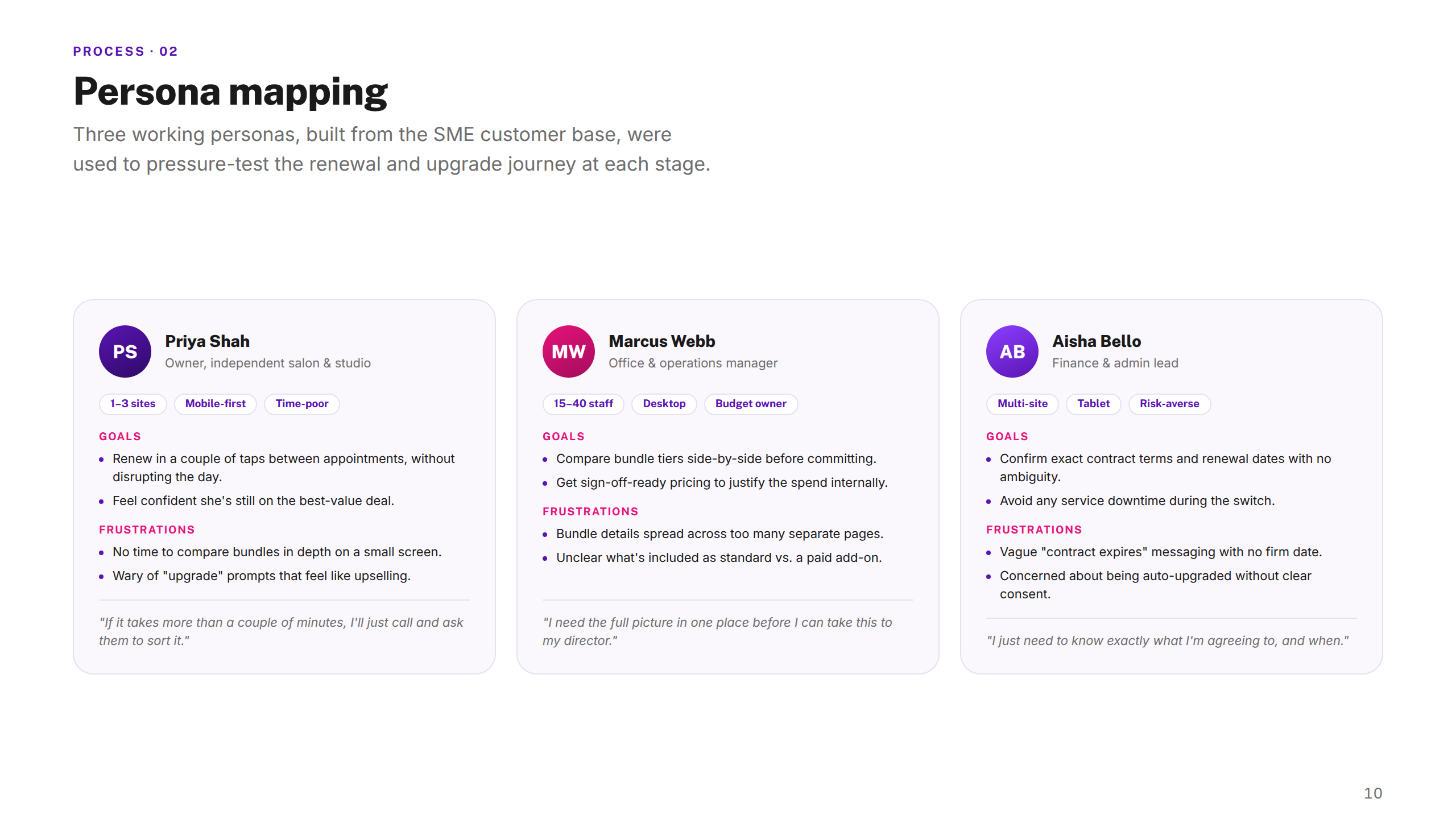
02 — DEFINE
Synthesis & Framing
Persona development
End-to-end journey mapping
Problem framing
Design principles
Success criteria
03 — DESIGN
Ideation & Build
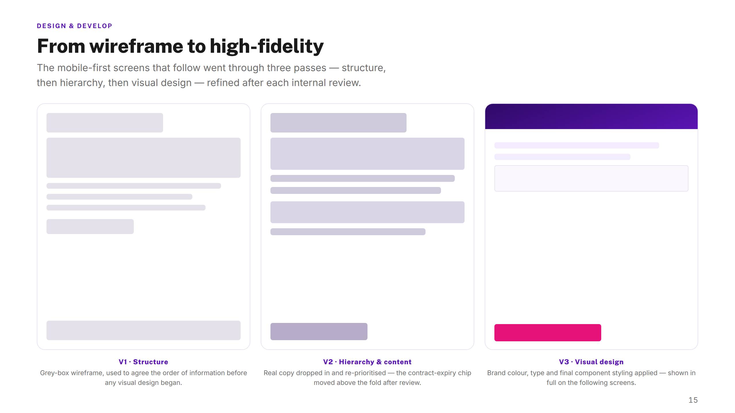
Wireframing & flows
High-fidelity UI
Responsive component build
Interactive prototypes
Design system alignment
04 — DELIVER
Test & Handoff
3 rounds of usability testing
Iterative refinement
Dev handoff & specs
QA & launch support
Post-launch review
The solution
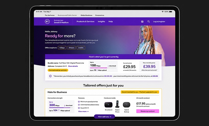
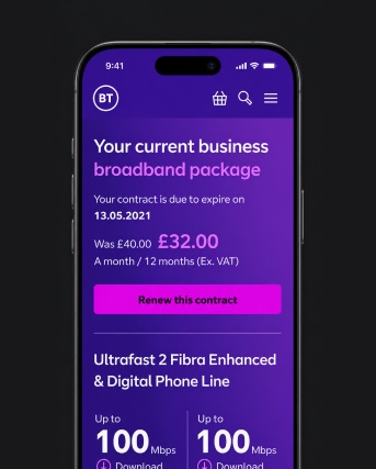
A simplified, responsive online renewal journey — making broadband bundles easy to compare, renew, and upgrade across every device.
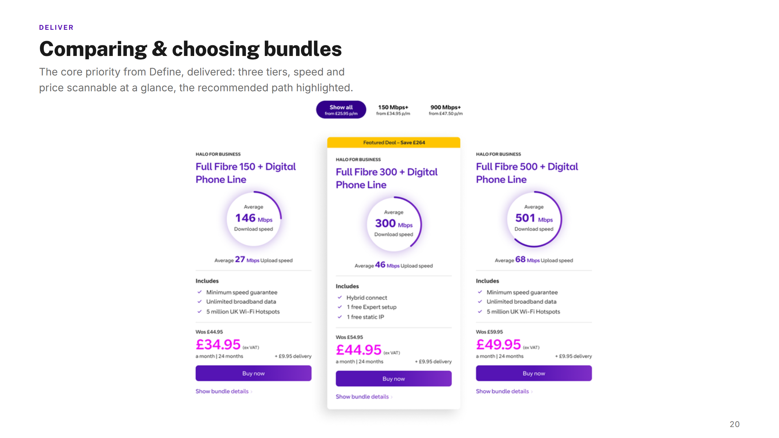
The redesigned journey made bundle comparison the centrepiece — clear visual guidelines helped SME customers weigh options and choose with confidence. The flow was streamlined to remove the friction that had previously driven customers to the phone.
Responsive UI designs, design system components, and tested prototypes gave BT a scalable foundation for the SME segment, with bundle presentation patterns that could extend across the broader product.
Research & Insights
72%
Started online, finished by phone
Three in four customers who began a renewal online abandoned the digital journey and completed it via a service call — pointing to friction, not intent, as the root cause.
#1
Bundle comparison was the top call driver
Call centre data showed that customers couldn't confidently compare options without agent help — the existing UI buried pricing and made bundles nearly impossible to evaluate side by side.
58%
Mobile-majority traffic, desktop-first design
Analytics showed 58% of SME renewal traffic was on mobile, yet the existing journey was built desktop-first with dense forms and small tap targets — a fundamental mismatch.
Device Strategy
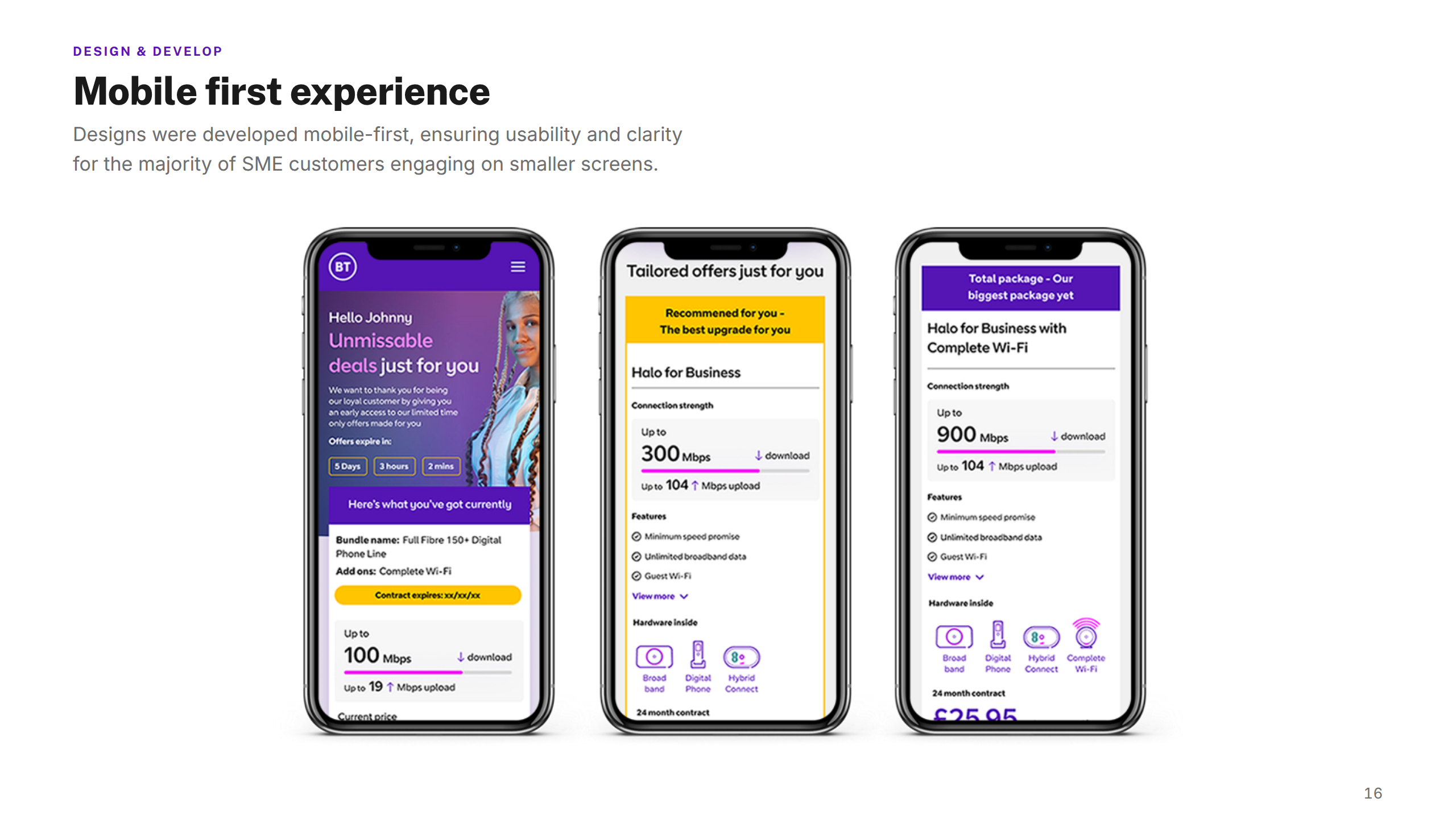
Mobile
Primary Experience
58%
of renewal traffic
Touch-first layout, large tap targets
Progressive disclosure — one decision per screen
Sticky CTA, minimal scroll to checkout
Thumb-zone optimised navigation
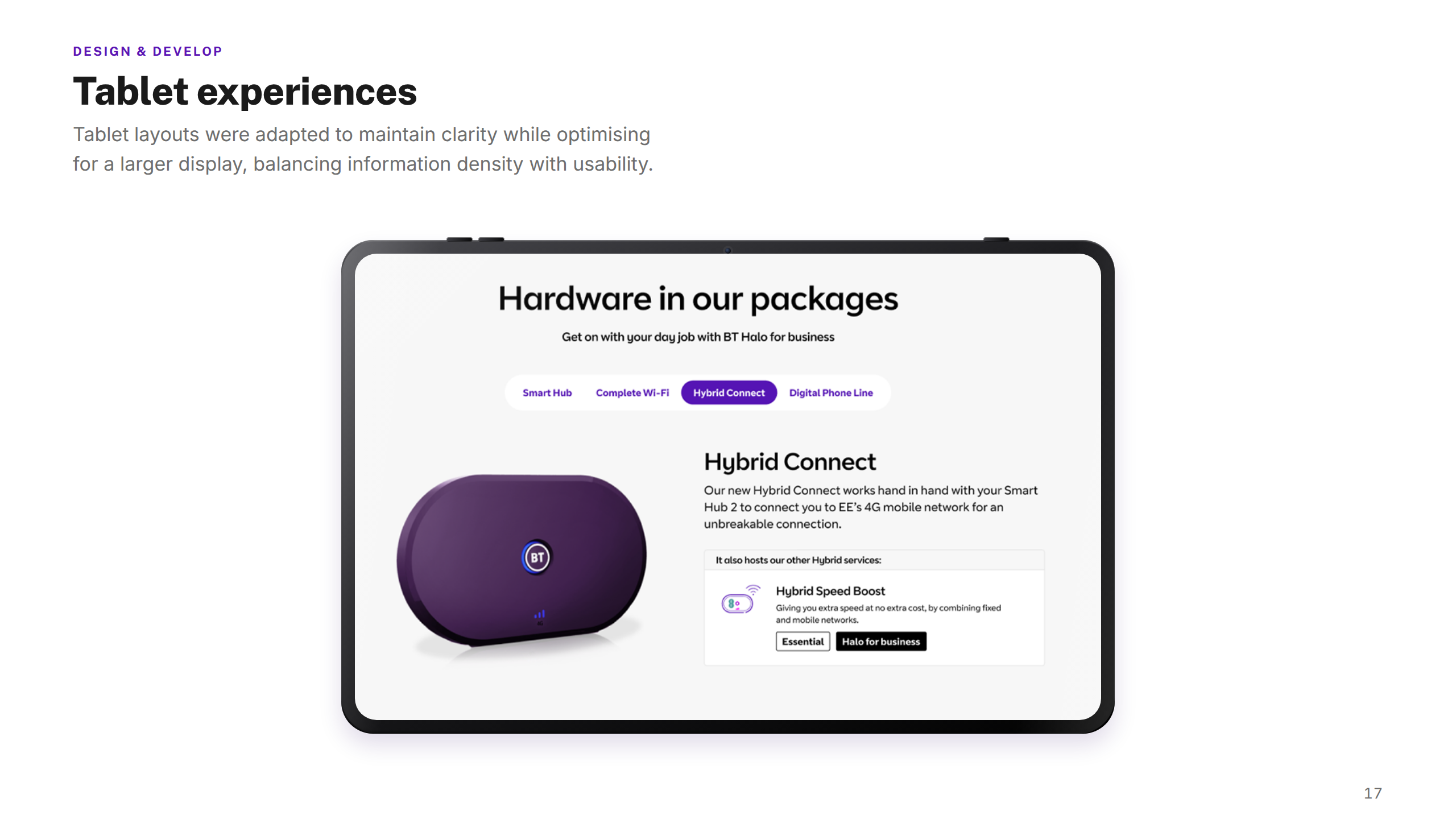
Tablet
Hybrid Layout
17%
of renewal traffic
Two-column layout where space allows
Larger tap targets retained from mobile
Bundle comparison in a scrollable grid
Sidebar summary on wider viewports
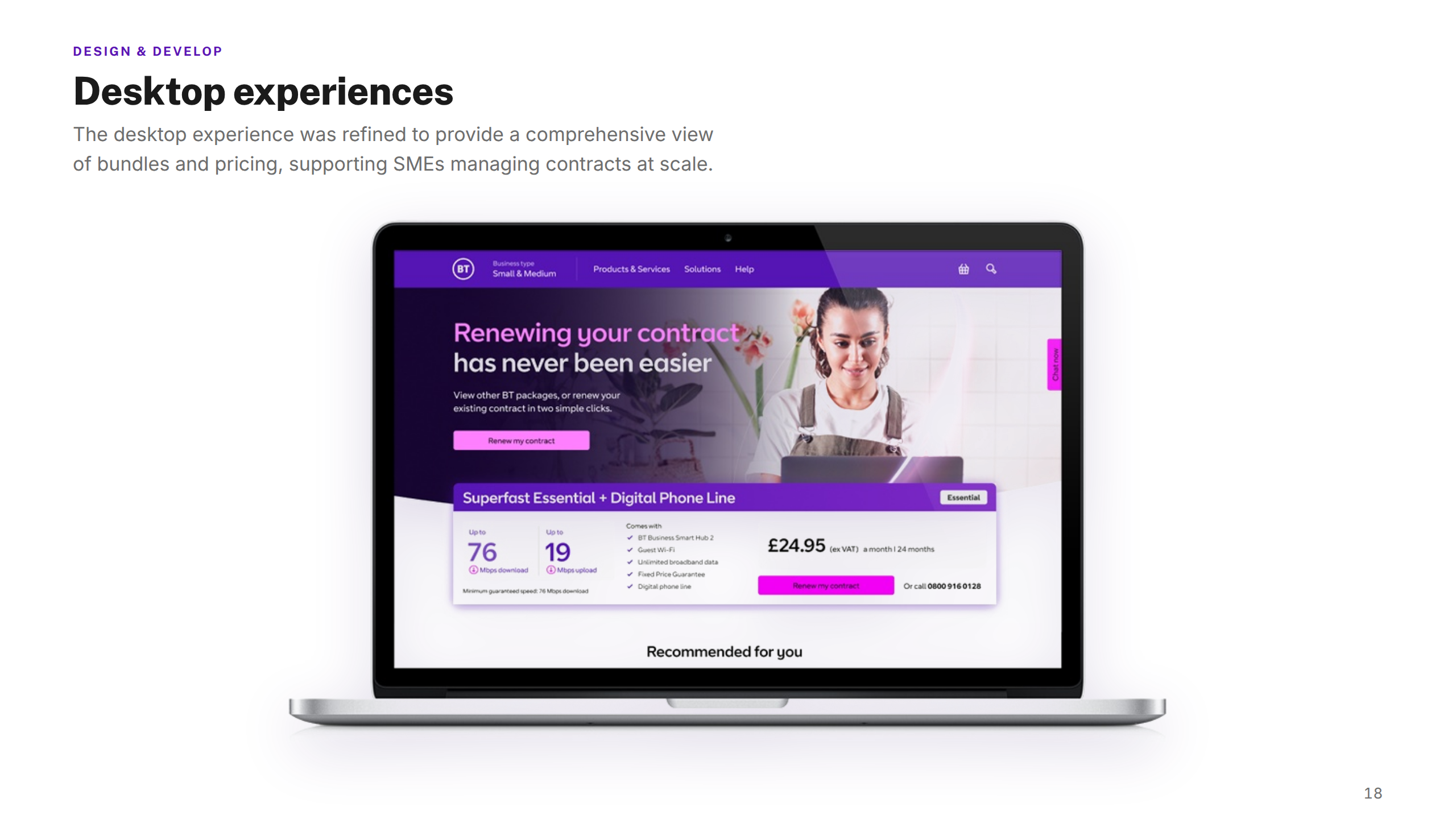
Desktop
Full Comparison View
25%
of renewal traffic
Side-by-side bundle comparison table
Persistent summary panel in viewport
Hover states for feature detail
Full feature matrix visible without scrolling
Key Design Decisions
Decision 01
Bundle comparison as the centrepiece, not a renewal prompt
Early wireframes opened with a "renew your contract" CTA. Testing showed customers lacked confidence without first understanding their options. We repositioned comparison as the hero, letting customers choose — then commit. Confidence went up, calls went down.
Decision 02
Progressive disclosure over a single long form
The legacy journey was one dense page. We broke it into discrete steps — each screen covering a single decision — reducing cognitive load and giving customers a clear sense of progress. Drop-off reduced significantly in testing after this change.
Decision 03
Mobile-first design system, expanded up to desktop
With 58% of traffic on mobile, we designed every component for the smallest viewport first. Desktop layouts were additive — taking advantage of space without breaking the core flow. This also reduced the surface area for inconsistency between breakpoints.
Decision 04
Typography-led pricing hierarchy instead of tables
Initial designs used dense pricing tables. Customers reported feeling overwhelmed and unclear on what they were paying. We moved to a typographic hierarchy — large price, clear period, secondary detail — making the cost immediately scannable and reducing pricing-related abandonment.
Usability Testing
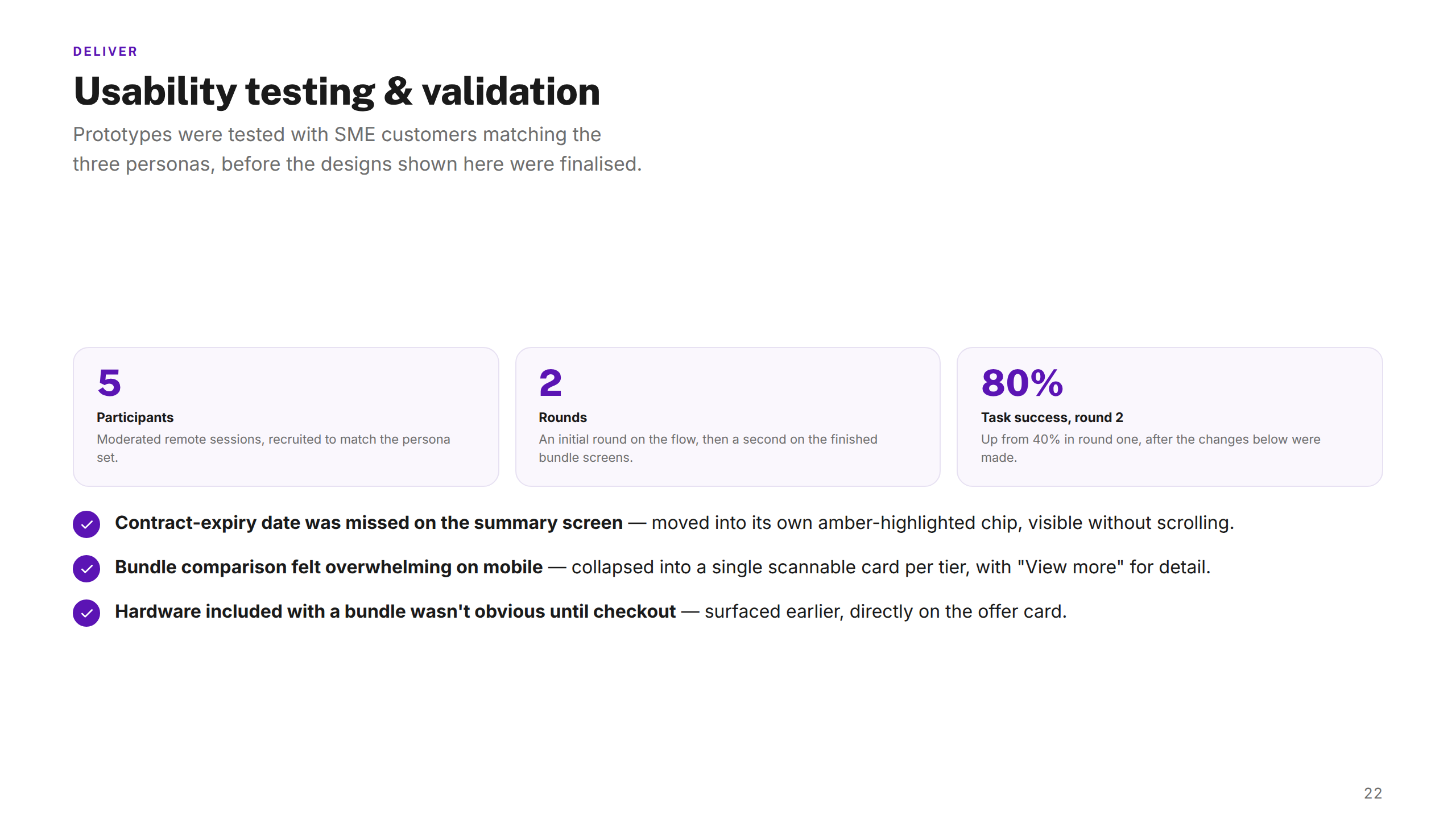
3
Testing rounds
Across discovery, mid-design, and pre-launch
27
Participants
SME decision-makers across mobile and desktop
90%
Task completion
Completed renewal end-to-end without assistance
4.5
Satisfaction score
Out of 5 — measured post-task across all rounds
Key findings that changed the design
Bundle switching was intuitive — 24 of 27 participants completed without prompting, validating the comparison-first layout
Pricing clarity improved significantly after round 2's typographic hierarchy changes — confusion dropped from 11 participants to 2
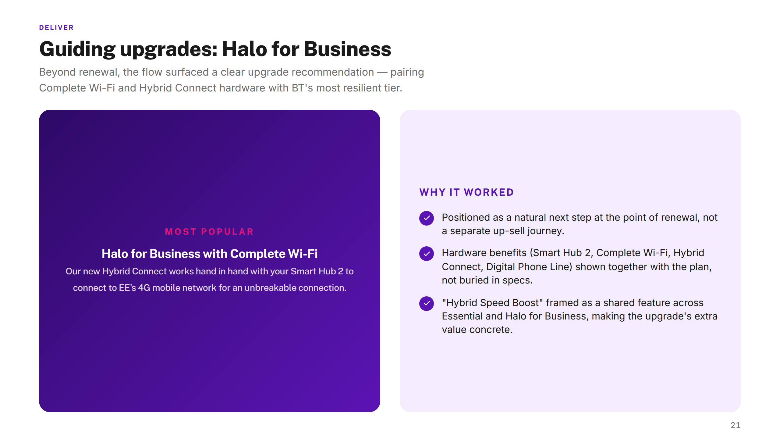
Add-on discovery increased — 18 participants explored the Halo upgrade unprompted after repositioning it within the comparison view
Progress indicators reduced anxiety — participants on mobile reported feeling "in control" of the process for the first time
BT — Nexus Case Study
1 / 28
Outcomes
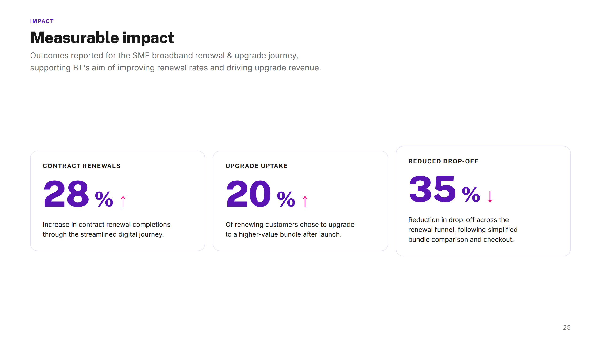
28%↑
Component reuse
Increased contract renewal completions by 28% through a streamlined digital journey.
20%↑
Upgrade uptake
20% of renewing customers chose to upgrade to higher-value bundles after launch.
98%↓
Reduced inconsistency
Achieved a 98% reduction in visual inconsistencies across journeys by aligning typography, colour, and spacing.
15%↓
Sales efficiency
Cut average call-handling time by 15% by moving low-complexity renewals online.
90%↑
Task success rate
Usability testing showed a 90% task success rate and a 4.5/5 satisfaction score with the new flow.
£4.2M↑
Revenue impact
Delivered an estimated £4.2M uplift in annual SME broadband revenue through improved retention and upgrades.
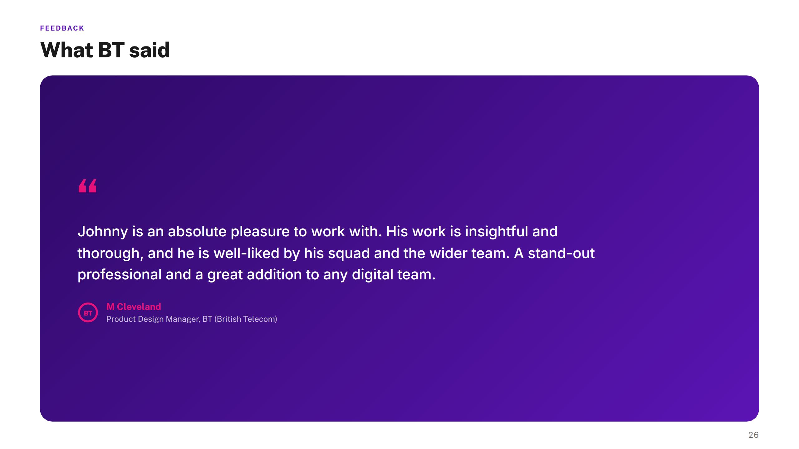
"The redesigned renewal journey gave our SME customers a genuinely self-serve experience for the first time. The design thinking was rigorous — Johnny pushed us to question assumptions, and the testing programme validated that the final flow really worked."
Projects shown include live work, pitch deliverables, and design produced as part of embedded or collaborative engagements. Some work was completed as part of a wider team. Deliverables reflect the scope and direction at the time of engagement — the live experience may have since changed, launched in a different form, or not proceeded to production. All brand assets and trademarks shown remain the property of their respective owners and are displayed here for portfolio reference only.